Part 3, exercise 3.3/3.4 – more monoprints and additional working
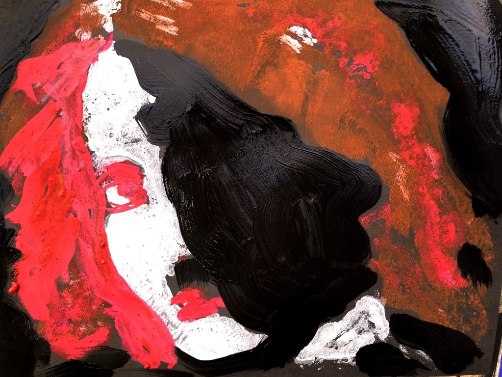
Using the same photograph as before, I made four more monoprints plus my additional fold prints. This time varying the palette by adding bronze acrylic to the T. white and Payne’s grey.
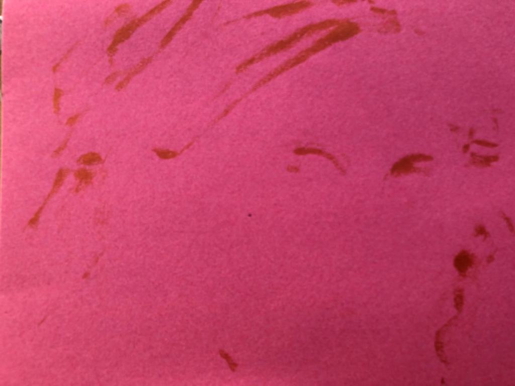
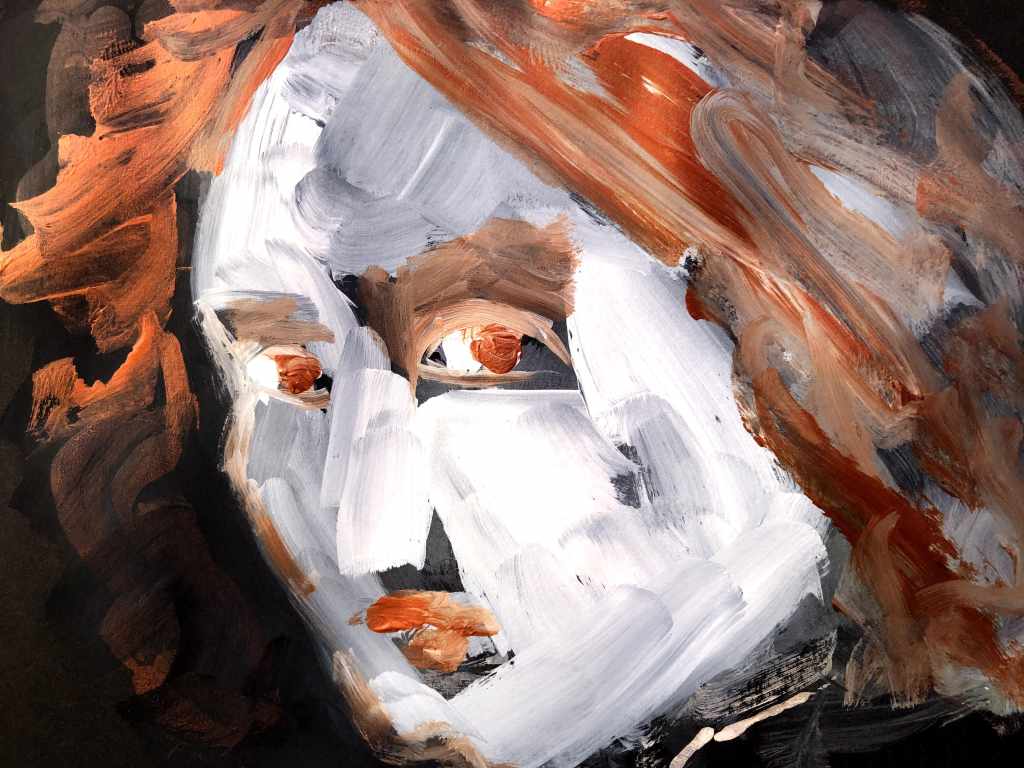
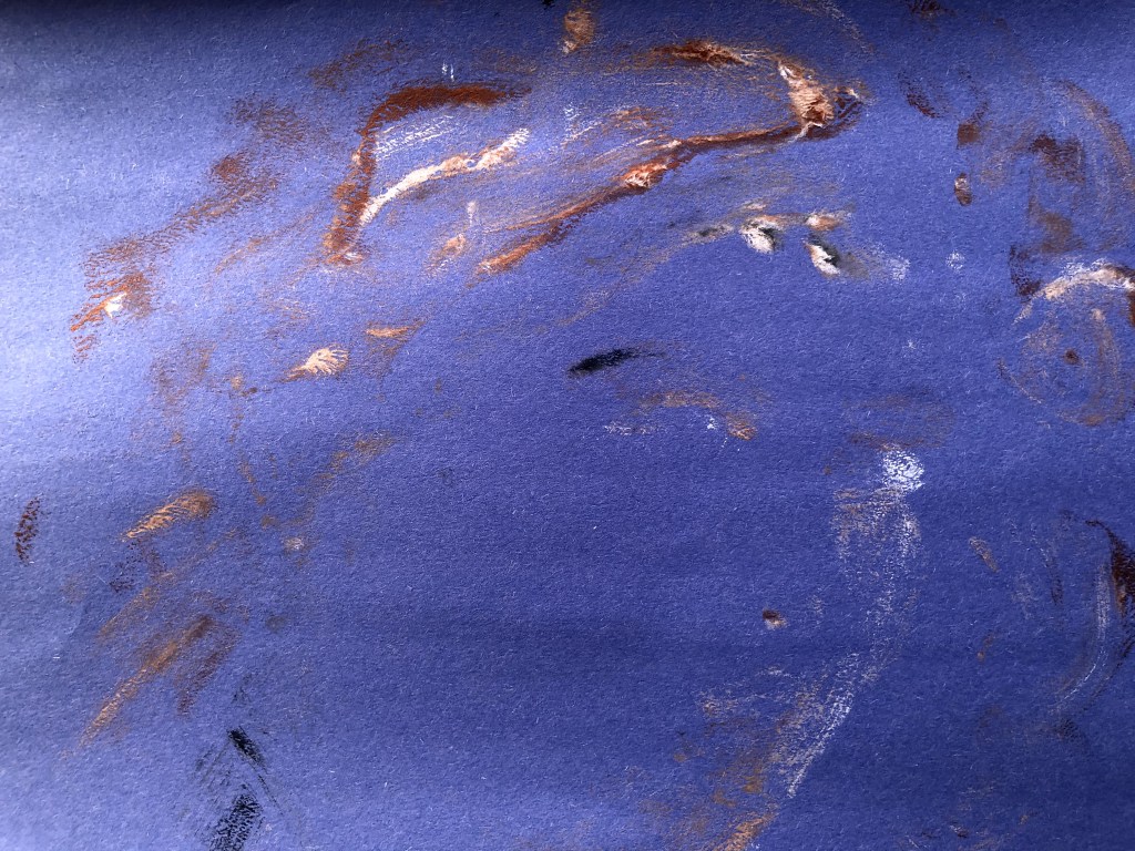
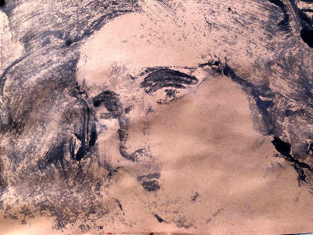
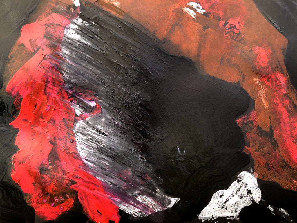
Sugar paper is very absorbent so it’s not surprising that a lot of the moisture had been sucked out of the paint by the time I had pressed a second sheet of paper onto the mono. I chose to work the two on black cartridge which is more robust but actually the one I like best from this batch is bottom left – a very minimalist print of Payne’s grey on brown paper. It reminds me of faded paintings on old walls.First mono – bronze acrylic on pink sugar paper. I like the minimalism of this, the expanse of negative space. Ironically, it’s the thing I destroy when I begin ‘working’ on things.This is the fold print which is even more minimal. I think there’s something quite mysterious about it with its hints at a face and nothing explicit to confirm that.This one is the worked mono – additional white, bronze, and P grey acrylic highlighting hair and some features but essentially making a mask of the face. It’s ok, it’s not riveting, and I’ve obliterated the negative space here.But if we’re looking for over-worked obliteration, here it is! I think I threw everything at this, from paint on the end of a pencil to stylus, pebble, and impasto. There are some marks that are interesting in their own right but as an image it’s an over-painted head with misaligned eyes and its hair still in rollers.This works better. Again T. white and bronze on blue sugar paper with no additional interference.The corresponding fold print is very minimal indeed but on both I like the way the paint ingrains itself and leaves trails that are almost highlights.This is my pick of the bunch. The grey paint seems to me to really work with the brown sugar paper and give a feel of a faded fresco. I really didn’t want to work anything else into this.Nothing to see here . Really, nothing. Too little available paint for a transfer but in fact pressing it onto the monoprint has most likely contributed to the effect I particularly like about that image.
What I’m learning, and keep being shown, is that I’m really bad at leaving well alone. On this occasion the task required a further intervention and I had at least judged that this might be unwise for some of the prints. But in then doing as asked with two of them, I was unable to avoid filling in all the blanks.
The other points to come out of this were much as with the previous batch and had to do with how paint works in this context, especially acrylics and especially on OHP film, neither of which is the recommended medium. I found that drying retardant does the job although it’s quite sticky, and that a spray bottle of water can create a ‘plate’ that then makes something unexpected. These are valuable tools for the future reference box.
Post production, as it were, a contemporary spin on an image from a time when thoughts of such things never even flickered in anyone’s mind. This has given me an idea for the assignment which seems to have come around rather quickly.
Black conte and white oil pastel.
3rd October. Having established that acrylics really don’t cut it for this kind of task, I came back to make another print from this photograph, using watercolours.
I don’t know if this actually is a monotype because I applied different coloured paint at different times and repeatedly printed from the film. Once completed, I made a few lines here and there either to delineate or to obscure an unwanted spread of paint. I wonder now if keeping the whole of the right side of the face black might be a better image.I should probably have waited till the black/green paint dried.Cotton bud aggression! I sprayed this with gloss varnish on the left and matte on the right and they both activated the paint so that it began to run. The effect was quite interesting but instead of leaving it alone, I tried to make some marks with a cotton bud to pull out the under layers. The result was a mess so I added to it.Something of a rescue here with a further print using quite dilute white paint.
It’s been an interesting process and one I might find a way to integrate into my other ways of working. As a technique, and lacking an A3 printer, it’s less attractive than it might otherwise be, due again to the small scale and to the necessity of leaning over the photo/film assembly to make the prints.
It’s kind of craft paper, I bought lots of it because it was on the DS1 list and it’s quite handy because of its absorbency and its range of colours. I’ve no idea why it’s called Sugar though, maybe Cartridge had a thing for it 🙂


What’s sugar paper?
LikeLike
It’s kind of craft paper, I bought lots of it because it was on the DS1 list and it’s quite handy because of its absorbency and its range of colours. I’ve no idea why it’s called Sugar though, maybe Cartridge had a thing for it 🙂
LikeLiked by 1 person
Never come across it I don’t think! Must get a bit and see what I can do with it.
LikeLiked by 1 person
Knowing you and paper, I think you’ll see its possibilities.
LikeLiked by 1 person