
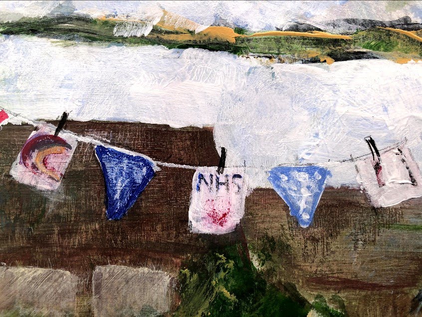
Probably the most timely of projects and exercises, given the current situation! The exercise is about choosing a view from a window and, after making a number of sketches, painting a final composition that reflects a mood. At the moment my favourite view is one that I’ve decorated for passers-by to hopefully give them something cheery. There is bunting in the tree with thank you cards for anyone to take, and painted pebbles on the sleepers that make my wall. Again for anyone to take.

As I was making the sketches, an elderly couple stopped to look at the bunting and the cards and smiled, and a young woman with a down-turned face saw the pebbles and walked on with her chin up and a smile. There was in fact a car parked right outside which I have ‘edited’ out as it added nothing to the composition. The focus I wanted was the colour of the flags and the stones. There are some intricate perspective lines involving the pathway from my garden to the horizontal public pathway, the edges of the sleepers, the grass verge and the tarmac running through that, then the road – narrowed by line of sight – the copse between that and the parallel road opposite the sheltered housing, and then the rooftops. Linear and aerial perspectives and maybe a hint of angular perspective too.
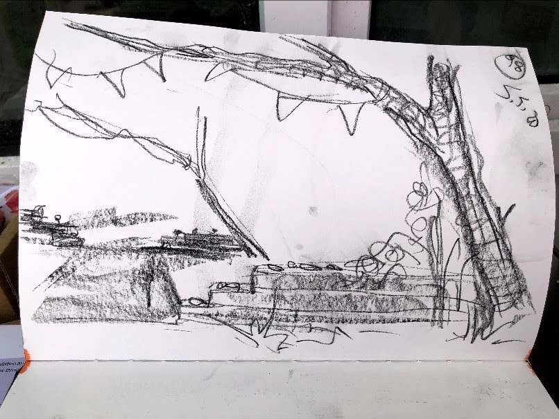
My first painting is a sketch because I’ve learned now that however this turns out, I will most likely make subsequent one that is different and, to me, better. The mood could be anything and until I start painting I am never sure what it might be but I wanted to highlight the bunting as much as anything; a commentary on the need for all of us to find something bright amongst the awfulness.
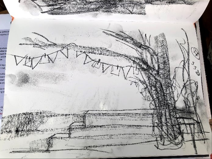
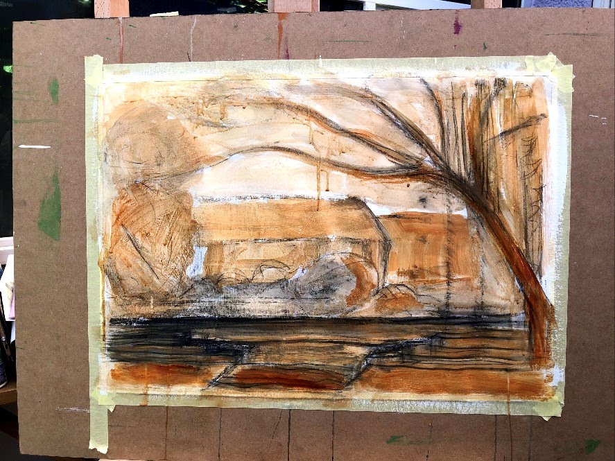
I began by preparing a sheet of A2 cartridge with white gesso to give it substance and provide resistance. Then I sketched out the shapes in a dilute wash of black acrylic (and forgot to take photographs). This is the result of several layers of acrylic applied using the side of a brush, the wooden end of a brush, and a damp piece of towel. All of these colours provide a base to go back to reductively after applying a more dilute colour on top. This photo showed up the perspective error in the short pathway between the road and the footpath, amongst other things.

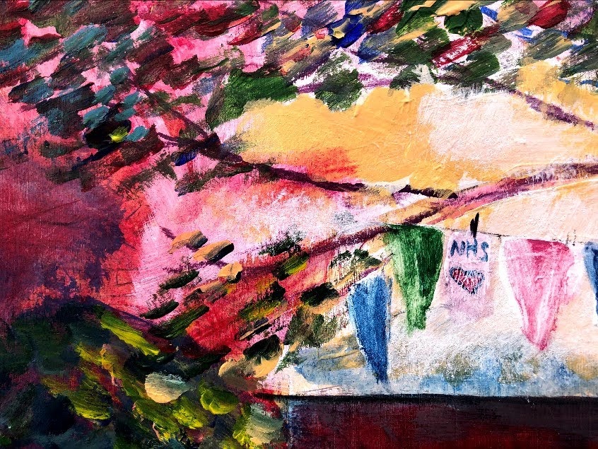
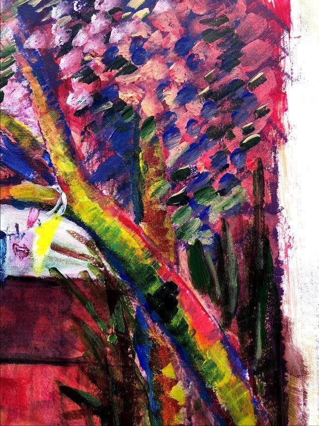
In this iteration, I have adjusted the perspective and added the flags and pebbles which remain uncoloured at present. I’m not sure where the brush stroke technique and palette have come from but they feel impressionistic and I need to track this down. There is a detail below.


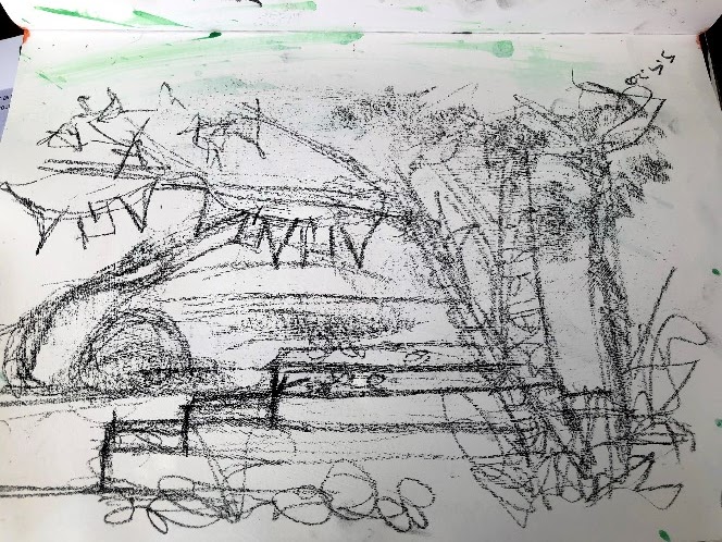
Some more adjustments for perspective, plus now detail in the flags and the pebbles. I like to layer these then scrub back with a damp flannel to take the sharpness out of them.

There are all sorts of horrors here but it will do nicely as a sketch to develop into something a little more competent. My first stop will be to discover whose style and palette I seem to be tuned into. Crops below show two areas I think have worked quite well. The mood? If ‘redolent of a muted English summer’ is a mood, then that’s the one.

Yesterday I started a second version of this painting, and I thought I’d added it to this post but it seems not so here is the sequence, including today’s new layers of brighter colour. Today was VE Day and as my whole lane was out with tables in their driveways and bunting on their hedges, not much else was done!
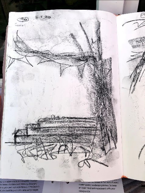
This is the burnt umber wash drawing with conte lines on gesso prepped A2 cartridge.
In contrast to the previous version, I was looking for a more dramatic effect. The method is still somewhat impressionistic which I’m enjoying doing.
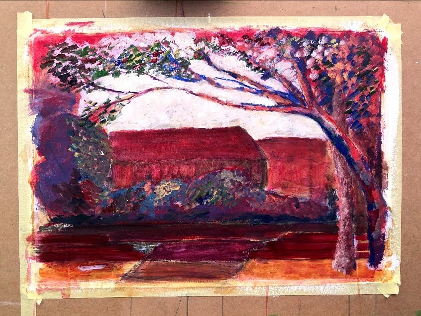
Today’s iteration adds more contrast, deepens some areas such as the roofs of the bungalows opposite, and brightens the trees and foreground.

I’ve a feeling I’ve fallen down a German Expressionism rabbit hole – primitive, bright colours, not much realism! I’m also seeing that, uncharacteristically for me, the composition has quite a central focus; this is a window onto another window which is the way the tree branch makes a frame across the path to contain the elements further in the background. The light is all focused on the centre too, including the shrub in the middle distance which arguably should be independently lit as it’s outside the sphere of influence of the arch. Have I made a grotto of the world that’s beyond reach for now? Possibly. My next step is to detail the flags, cards, and pebbles. This may not be the last step because, doing this may shift some balances and affect how I want other elements to behave. A really interesting observation, to me at least, is that while quite a lot of what happens is still serendipitous, more of it is becoming intentional. While I wouldn’t claim to set out with an idea of what I wanted to achieve and the methods or techniques I might use towards that, increasingly I have an idea of what to do at each stage to progress the work in the direction it seems to be taking. This is one reason I take so many photos to put here and elsewhere – they give me a new perspective on each reality that I can build on for the next.

I’m calling this the finished piece. I’m not entirely satisfied but I can’t see making any improvements, partly because cartridge won’t support too much more working and partly because I’m not sure where I’d take it. Ideally, I would start again but, given that even this version has a touch of the twee about it, it’s just possible that’s due to the subject matter in which case twee is fine because it reflects what is out there, and what is out there is aimed at making smiles, not great statements. Details below.


Time taken: I have lost track but at least 15 hours.
Learning outcomes 1, 3, and 4. I think I have evidenced here a capacity to use sketches as the basis of paintings and to adjust errors of, e.g., perspective as I go. I have also linked here to German Expressionism and Fauvism which I was just beginning to appreciate. Reflection is an ongoing component of my narrative.

Nice progression in your thoughts and experiments. I like how the stones shine out in your final piece.
LikeLiked by 1 person
You just gave me an idea – what if I could print this out on OHP film? I have some printable sheets A3 size, cut down the middle and it’s either bingo or bleurgh! Back in a bit …
LikeLike
It printed, which is a success in itself. Not very sharp, and I could do with a lightbox but it’s an interesting exercise even with white paper behind it.
LikeLiked by 1 person
Ha! Interesting! If you were to redo the entire piece you could look at doing it on that translucent drafting film I used a while back. But paint on plastic… maybe not… no idea!
LikeLiked by 1 person
It’s sitting up on the board with its white backing paper so I can give it a good looking over tomorrow. The thing I’m finding is that the automatic adjustments the camera makes seem to lift the light quality in the photo as compared with the original. Of course that could just be an effect of seeing it on screen where colour is a different process.
LikeLike
Oh yeah, magical image “optimisation” is definitely a thing. There are probably ways to make your camera deliver a flat image with less monkey-business, but you’ll need to manually do some things like setting a white point depending on your light source, and getting a non-averaged exposure based on the picture you’re photographing. Are you using an iphone? I might be able to point you towards some tips if you are… although in truth I do go back to a manual camera for my assignment photos (and assessment now of course).
LikeLiked by 1 person
I have enough trouble getting these things to look straight and not pink!
LikeLiked by 1 person