
Project 2
Exercise 1 Groups of objects.
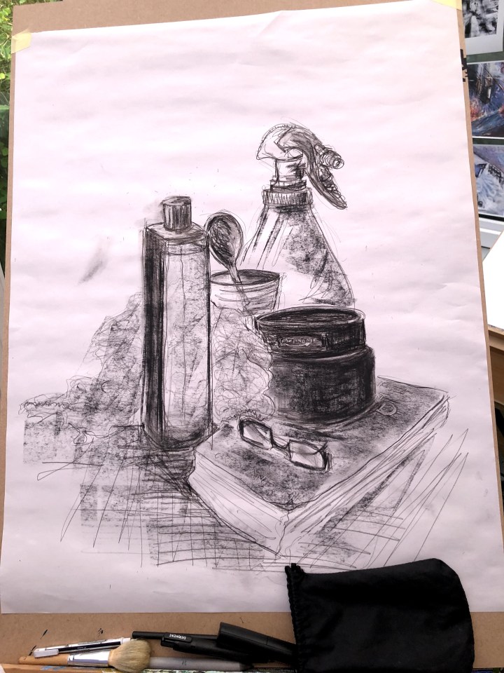
It’s a very long time since I worked with anything this size and it’s both exhilarating and alarming – the second because I feel I have much less control over what happens at the end of my arm, and the first precisely because of the second. I was trying to be tight in this first drawing, replicating my approach to smaller sized paper and so not exactly (but unintentionally, not) following the brief. Oddly, most of the items seem better drawn in the photo than they do in real life and I wonder if that’s to do with some sort of distancing effect whereby ownership diminishes as distance increases. It works with editing/writing, maybe it does the same with pictorial material.
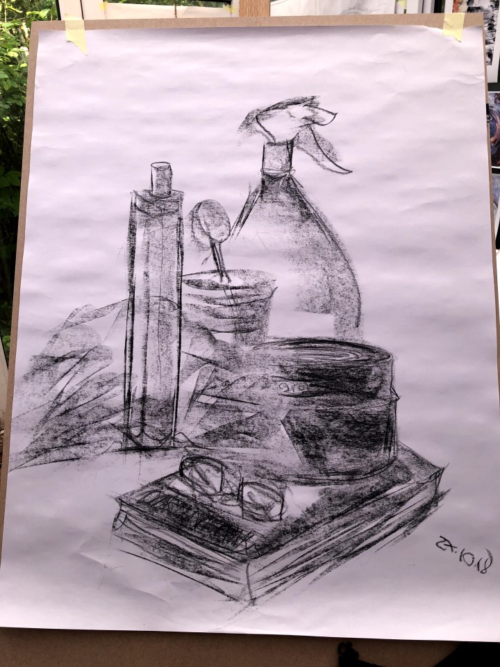
This was an attempt to be more loose and sweeping with fewer outlines and more suggestion by shade. Charcoal seems to lend itself to that kind of approach and, from here looking at the image on screen, I’m quite taken by the texture behind and around the bottle. It looks nothing like the dishcloth it actually is but there’s a hint of a painting style there that I recognise but can’t name, which is probably just as well as I wouldn’t want to appear to be drawing comparisons.

After black, I tried brown charcoal with vague notions of making a sepia kind of image as a change from the raw, sharp black ones above. I’m clearly not up to that yet and really didn’t like it. I did wonder, though, about the effect cold coffee grounds might have and so I applied some with a broad brush and let it dribble down the paper. There are some little granules there that could be interesting in the right place although I’m not sure this is it. The wrinkles – all of them unexpectedly horizontal – are interesting because of the shadows they throw up.
Exercise 2 Shadow and blocks of tone

How can it be so difficult to find pale objects with an entire house to look through! Eventually, I located this white pot and a very weathered shell. Not ideal as neither has much of a surface for reflecting light but a challenge nevertheless. I’m having to confront, finally, my problem with elliptical shapes – as in pots, mugs, bowls, and the like. If I get one end ‘right’, the other goes out of whack, and this pot has no proper foot. Again, using a charcoal stick I found it easier to sweep tone across the paper instead of picking away at the outline and detail of the embossing on the surface. It also allows for smudging and wearing at edges that, for me, need to be softened, such as those down wind of the light.

Addressing those ellipses, I wondered if inverting the pot might help. Maybe it would deconstruct it a little and allow me to see the shapes that make up the shapes. I also let rip with arcs as guidelines and tried to replicate them at the various points where the pot narrowed or broadened. I think it helped but more practice is definitely needed as the bowl [below] demonstrates. Thank goodness for erasers, although in this instance, my choice of medium wasn’t amenable to being erased. I used caran d’ache which I’ve had for donkey’s years in a closed tin. Maybe it’s always so resistant, but maybe it’s to do with being very old indeed. The result is I have to live with the guidelines and the marks I might otherwise have fudged out but actually, that’s quite illuminating in itself as I find I quite like what happened. It’s as if it’s still moving and could change again at any minute.
Exercise 3 Shadows from lines and marks
I’ve done a little of this on a Udemy course so I took a chance on my nemesis, those ellipses, for two of the four images.
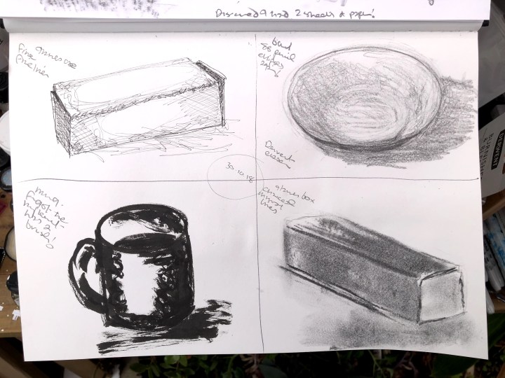
Top left is my glasses case, somewhat beaten up and misshapen. The smallest fine-liner made interesting spidery marks but I do have to get used to the idea of such light impressions as the temptation is always to beef them up with heavier lines. Hence bottom left – I had actually forgotten that the Pentel instrument was a brush and had a whole ellipse and side stroke on the page before realising. But here we are again – the top and bottom ellipses don’t compare. As for tone and shadows, I do think the weight of the inking allows for quite simple strokes to create something substantial that seems to add weight to the image.
Top right and it’s a bowl with no fewer than four ellipses. I used an 8B pencil for this and a Derwent eraser to hollow out shapes. The result is better than I’d expected if still a bit dodgy as regards shape. I’m becoming quite a fan of the eraser as a drawing tool and sometime use an electric one to create effects. Often if judders across the page, leaving a trail like little round foot prints. Bottom right is the glasses case again but at a different angle. I used the charcoal stick to help me avoid making too many outline marks and to give me a medium I could smudge into lighter/darker patches. I think it looks more like a rather dull gold bar than my functional specs case but perhaps its identity is not so much at issue here.
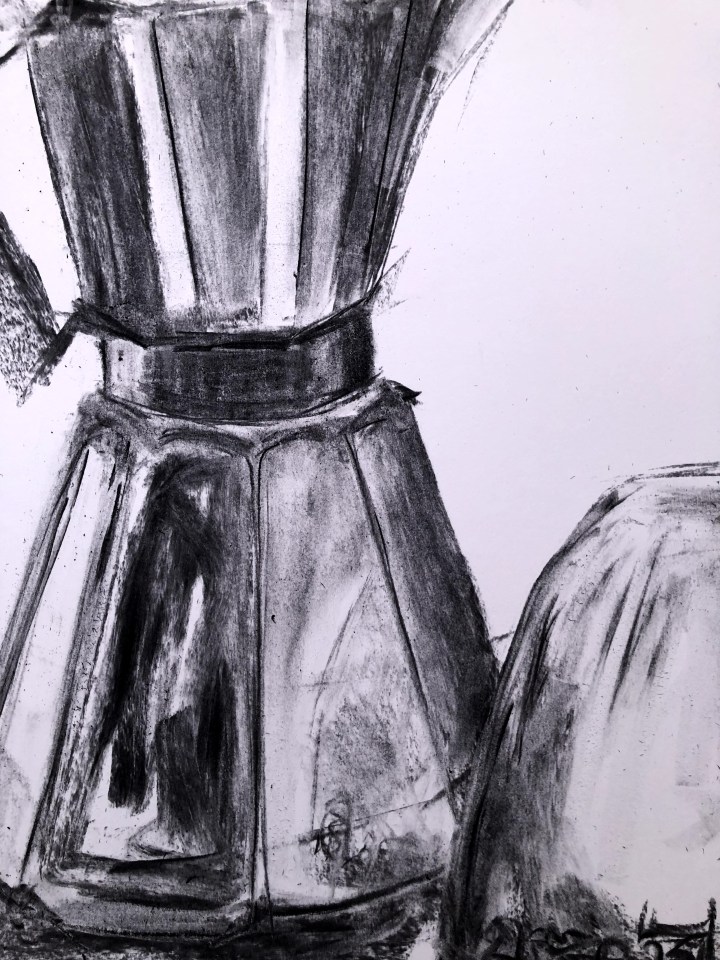
Exercise 4 Shadows and reflected light

Oh dear! Fell at the positional accuracy fence by not getting the upside down mug in its proper place ahead and to the right of the, erm, dalek. It also looks quite metallic while I’m not convinced the metal pot does. Satisfying exercise nonetheless and good to feel more comfortable with this A2 size. More of this and A1 might become less problematic.
Round 2.
This has become a race to the bottom – of the page at least. The pot seems less alien and better formed but that mug – dear me. Still, I can’t go through my drawing life without getting to grips with these darned ellipses and also handles. Rubbish lip to it as well.
Quite fond of this detail which cuts out lip, handle and inverted base. It’s there to show the reflection of the mug in the coffee pot, although I don’t think it works as well as it should. Enough for today, I need to go and draw sheep for a bit. [see below!]
****
Had to have another go at the coffee pot and mug. However accurate/competent/artistically descriptive this might be, I am intrigued to realise it took only about fifteen minutes which suggests I’m becoming more confident – however misplaced – about making larger marks than I’ve been used to, and that’s not a bad thing at all.

Even that darned mug with its lip and its handle seems marginally improved!

****
I’ve skipped ahead a little and found Odilon Redon, and in particular this cheeky little grob! I’m not fond of spiders but, if we could negotiate our living space, I’d tolerate this one. I’d include a picture but they’re copyrighted.
I also remembered about my ‘Three D’s’ – da Vinci, Dufy, and Degas – whose drawings and image-making seem both loose and tight simultaneously. I am attracted to da Vinci because of his dedication to documenting anatomical detail, his visionary approach to science in which he was way ahead of his time, and his ability to make what look like curls of cotton thread shape themselves into something so representatively accurate as to provide meaning, not just a ‘camera’ shot.
Degas – well that’s most likely down to early ballet lessons. I identified with the lightness and swooshiness of the costumes, the poses that seem so natural, and the juxtaposition of backstage reality with the sheer elegance of the art. If I can make an image of a tutu that comes anywhere near close by the end of this course, I’ll be a very happy person.
Dufy is a relative latecomer. I was at art college in the late 1960s and someone said my paintings reminded them of his. I was flattered, obviously, although the shine came off a little as the individual then went on to talk about reincarnation and spirit possession. Looking back and looking into his work, (and free of any thoughts of being somehow inhabited) I can see again that looseness of style that accommodates rather than encloses elements of the picture. Boats float and people are suggested. I like that.
****
Yesterday, following a random conversation on Facebook about an escaped sheep, I discovered a new favourite: who knew Henry Moore had a thing about ovines! His sketchbook has arrived today, and I have an invitation to go and visit some pet sheep near our village with a view to drawing them. A lot of standing expectantly in a field may be involved.
