
STARCK Official Website – Enter Philippe Starck’s universe | Starck 1949- Starck is reputed to begin any visit to a new city by checking out its rubbish because this, he feels, gives him a truer sense of the city’s identity. He’s probably right, although in terms of geopolitics, a city is rarely one demographic or social stratum so I would imagine he takes a look at the micro and not just the macro of its refuse. That aside, this website is a catalogue of Starck’s industrial design output which was passing me by a little until I discovered the magic – hover over any image and suddenly there is colour! How does he do that? How do his web builders do that? You cruise through and suddenly something lights up in gold. Brilliant!
https://www.alex-hanna.co.uk (alex-hanna.co.uk) What a conundrum Hanna is – from photorealistic pillows to unrecognisable shapes buried in impasto. Several of the latter have a feel of the pixelated images distorted by interference that many of us experienced waiting an hour for a photo to download over dial-up internet. Meticulous and thoughtful.
Giorgio Morandi 1890–1964 | Tate 1890-1964. The man of ice cream colours and neatly spaced bottles and jars, all of them tonal. I observed at my first encounter with his work on Drawing1 that this softness and simplicity might be a result of a need for serenity in Morandi, having experienced the horrors of two world wars. I have no evidence for that notion but if he were sitting in front of me, it’s a thread I would begin to tease out.
Kurt Schwitters 1887–1948 | Tate 1887-1948. These appear to be very much in the ‘found’ object arena. Again, a man who has been through two world wars but on the losing side, so again I wonder how that forms the thinking and creative output of an artist. Schwitters rips his found materials and re-forms them, and I would love to talk to him about that. [Caveat: I don’t believe there are winners and losers in war, the evidence seems to indicate that some sides lose, others lose worse.]
Official Website of ARMAN (armanstudio.com) 1928-2005. Is this the man? I really hope so because this steampunk/cyberpunk/mechanical repurposing and refitting ninja of an artist absolutely appeals to my sense of post-apocalyptic grunge glamour reality. The motorbikes embedded in a chopped up piano speaks to me of a society that no longer knows the purpose of either because they belong to a disappeared age; ditto those cars embedded in concrete – you would do that, wouldn’t you, if you had no idea what a car was ever for? Somehow these bring out the idea of cave paintings; a culture expressing itself by utilising whatever comes to hand. Arman would have had an absolute ball subverting today’s technology.
Tanya Wood. These are very small, delicate pieces of work; soft but precise, real but not photo-real. I envy that skill.
Tim Noble & Sue Webster (timnobleandsuewebster.com). There’s something of a wake-up welcome on their page, if what my gran used to call ‘language’ disturbs you. And it’s probably just as well because if you take the next step into their art work, you see a preponderance of penises and vulvas alongside some apparently early hominids, a swastika Christmas tree, and a lot more ‘language’. This is very knowing; they understand the impact of these images and words so I assume they’re using them for effect. Are we supposed to divide into two (maybe three) camps? The scandalised who won’t go past the welcome page? The aficionados who are shocked but pretend not to be? (Yes, three groups),Or the lurkers and leerers who are getting off on what they see but-it’s-art-so-that’s-alright-then? I would really really like to find out what makes these two tick.
Catherine Bertola – Contemporary Art Society. Bertola seems, in some of her work, to be channelling Victorian photographic imagery purporting to show evidence of ghostly apparitions and ectoplasmic extrusions. Delicate overlays of photographs and exposures that place figures, some with substance, some without, in grand environments.
The task requires a study of packaging or rubbish found nearby, placing it on white paper under a strong light. For once I had no packaging available, having just put it in the recycling bin, and picking up rubbish isn’t advisable at present. Luckily, the front page of the Mail Online turned up in my Facebook newsfeed.
My plan was to tear up the page, glue it to a piece of cartridge, and mute it with a white wash. Then to tear that out and screw it up, which probably reflects Schwitter’s approach. This would be the ‘piece of rubbish placed in a strong light’.


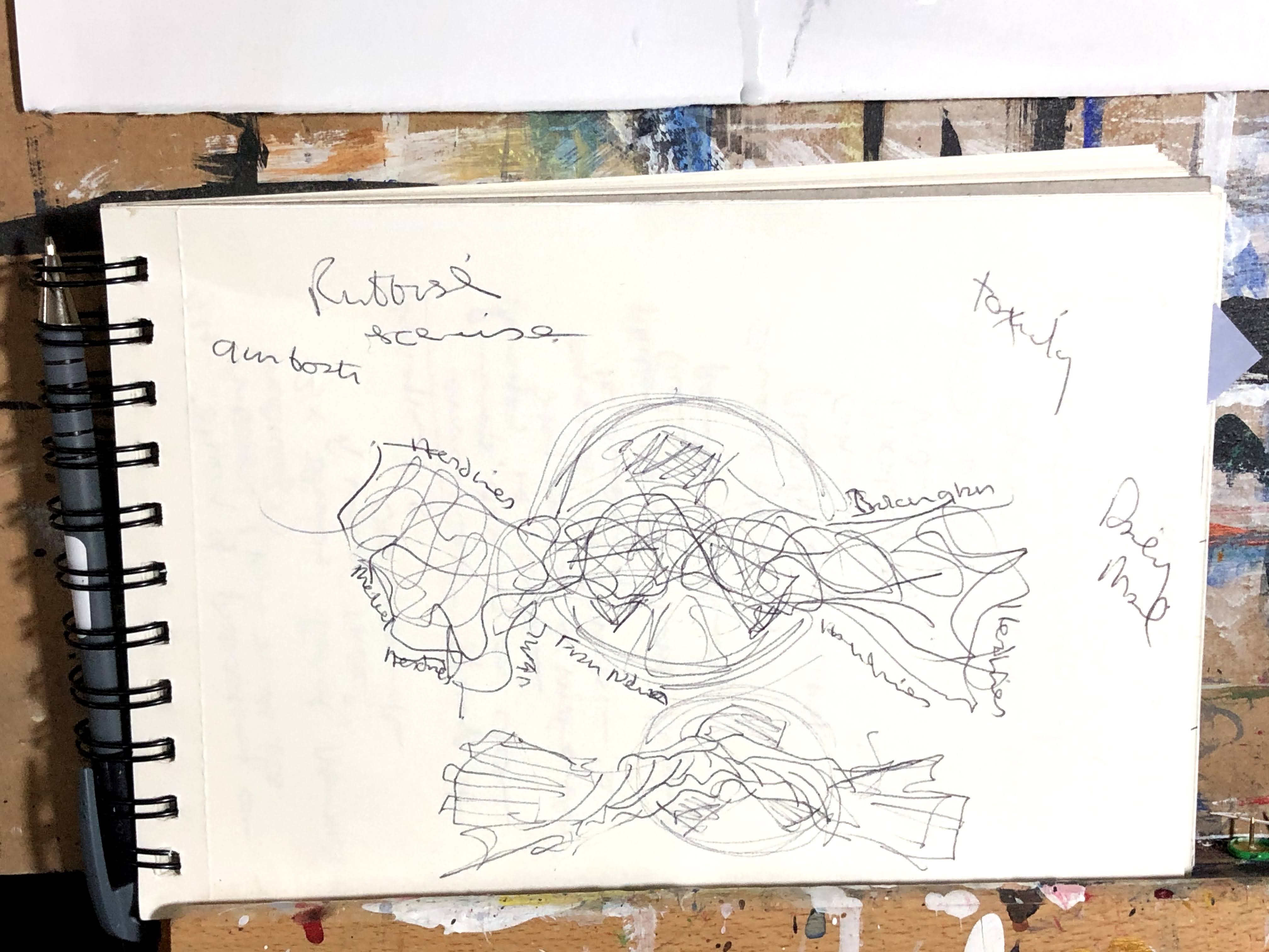

16th December. The more I thought about this, and with a creative kickstart from reading the samples of course units for the next level, the more I wanted to keep it 3D and to use paint to emphasis the shadows. There’s a touch of the Tom Deiningers in that.


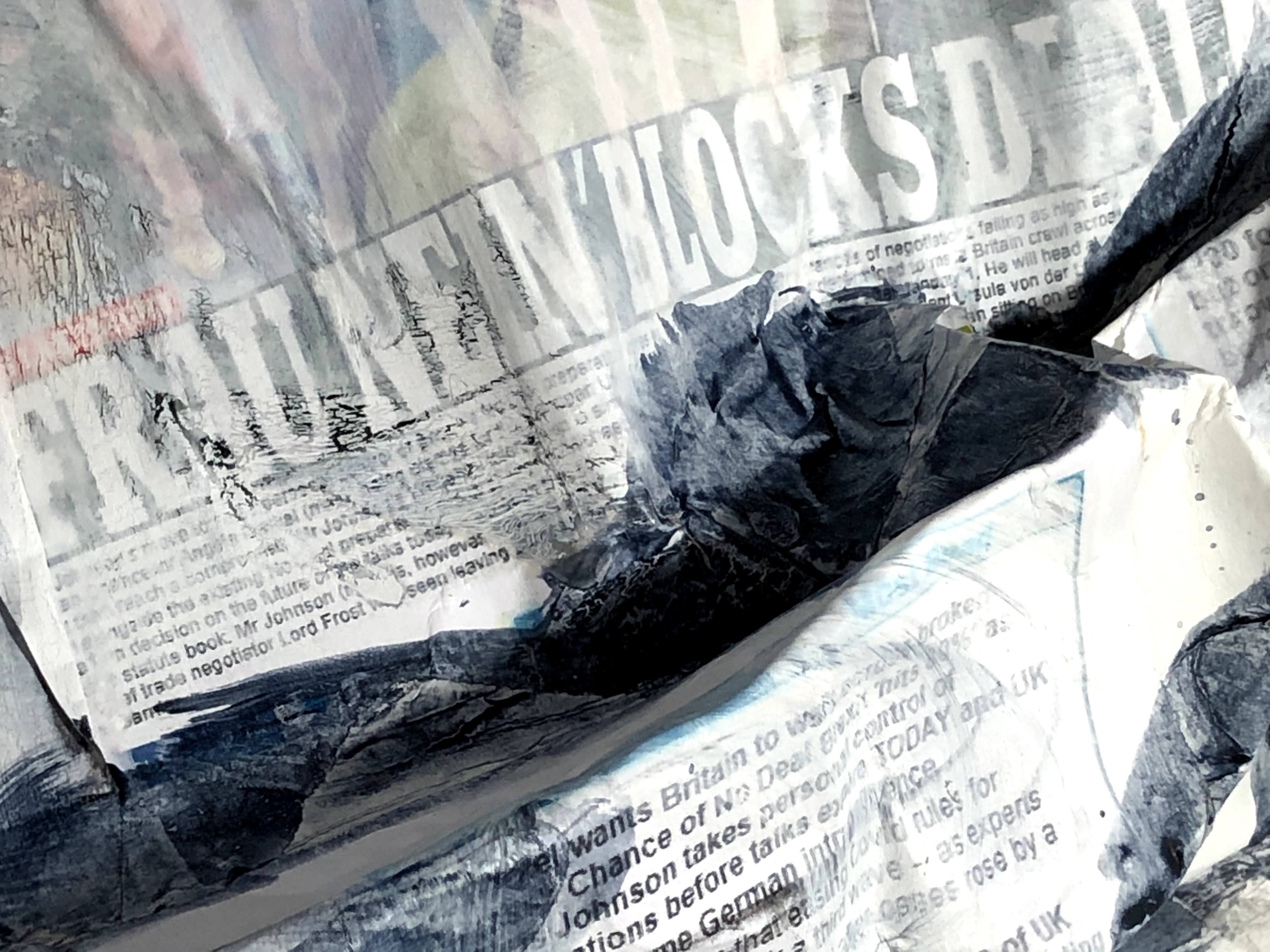
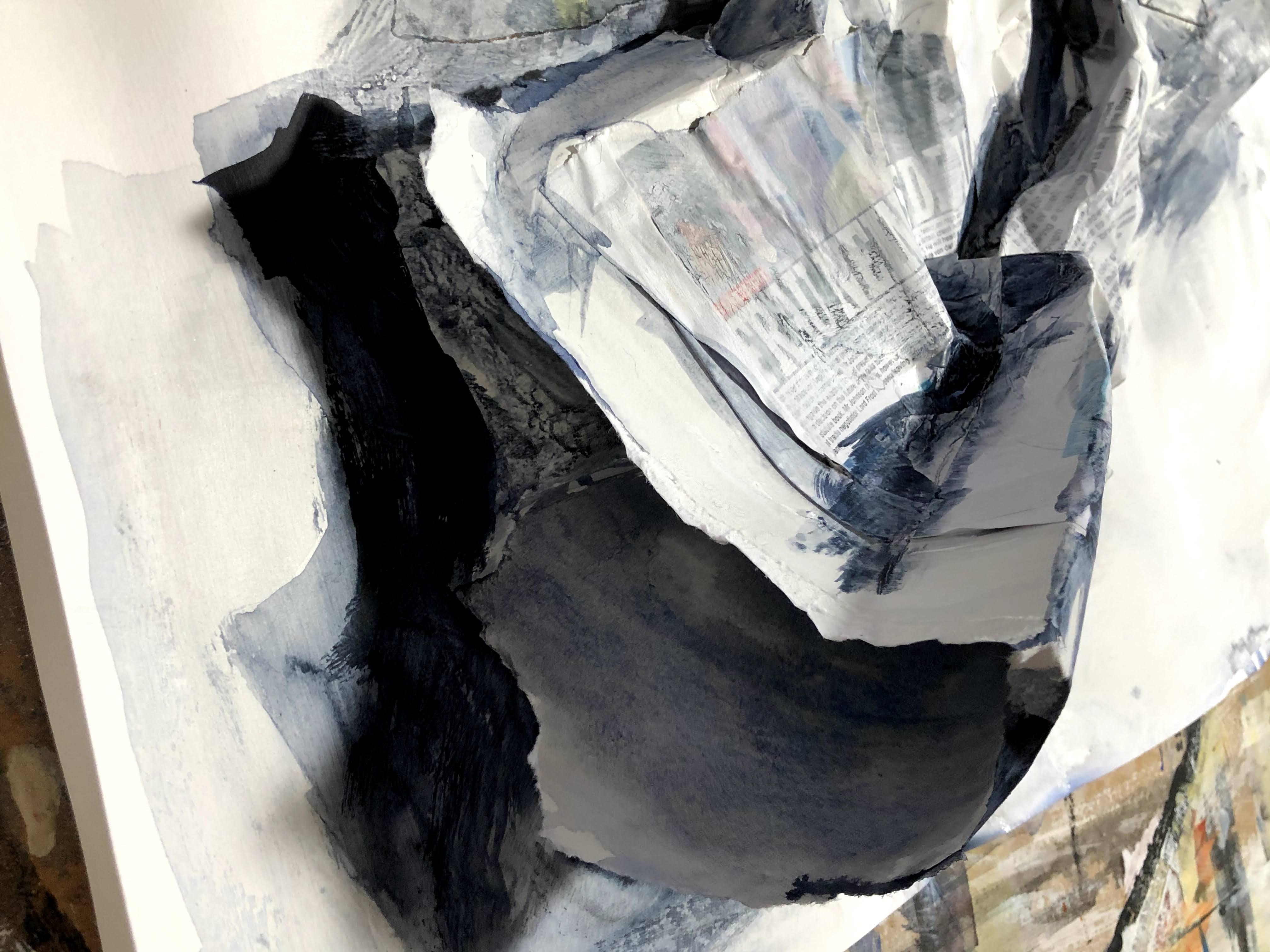
December 17th. I took out the toxic hazard symbol with a couple of layers of T. white then, after making a video using stills and audio, I wrote the text of the poem [see below] around the edges in black fineliner.

___
This is very much a ‘found’ piece of work, an object that existed in its own right before being reformed and subjected to artistic commentary. In this instance by being ripped and screwed up rather than folded neatly because it is not, in itself, a thing to keep. The poem too is ‘found’; taken from the words on that page. The audio structure owes everything to Mary Anne Hobbs’s reading from the Tao Te Ching in concert with Nils Frahm and Olafur Arnalds*. I would have liked to have borrowed her voice too, and those remarkable musicians.
FRAU NEIN
Frau Nein
Blocks Deal
*
Britain
must walk over broken glass
*
Boris takes control
It’s German intransigence he says
that means 80%
no deal
is real
*
Talks expire today
says the Mail
Online
in its headline
*
We all hope together
but for different things
Frau Nein. Found poem extracted from the Mail Online front page, December 13th 2020. (c)Suzanne Conboy-hill
Finally.
Advised to make more of the animations I have been posting as somewhat tangential afterthoughts, I’m popping back to give this one its proper place in the body of work. As a physical piece, it is political; there’s barely any symbolism to be interpreted in the tearing up and then screwing up of the front page of a newspaper – in this instance a printed copy of the Mail Online. Nor in the use of its headlines and text to construct a found poem. I’m very clearly positioned well left of this publication and the current government. The video takes the imagery one step further by allowing me to add a small tongue of flame to the bottom corner of the paper, as you might when lighting a bonfire and as, in my view, this newspaper has in lighting the ideological and racially politicised fires that have so divided our society.
___
*This was in a BBC6Music Recommends special released on the 4th December 2020 to prelude Frahm’s upcoming film ‘Tripping with Nils Frahm’. It will expire in 18 days (as I write) and unfortunately, Hobbs’s stunning performance is not included, being an unrehearsed inclusion.
Tao Te Ching. According to Wikipedia, its authorship is unclear but it is traditionally credited to the 6th-century BC sage Laozi. Multi-translated, the author of my copy is given as Lao Tzu and the translators Stephen Addiss and Stanley Lombardo. It was published by Hackett Classics in 1993.
Tom Deininger. Website Tom Deininger – Works (tomdeiningerart.com). Accessed 18th December 2020.

3 thoughts on “Part 5, exercise 5.4 – rubbish”