Part 2, project 3, exercises 1&2 – contrasts

The objective of this exercise is to demonstrate the influence of similarly toned or complementary colours on each other (ex 1), and experience the illusion referred to as ‘successive contrast’ (ex 2). Exercise 1 requires a base layer of mid-grey over which a series of squares is filled with colours of differing relationships. Squares 1-5 follow the brief, using ultramarine blue as the central colour with the surrounding squares filled with similarly toned colours including cadmium green, payne’s grey, and white mixed with the original blue. The sixth square contrasts the blue with its complementary colour, orange. In the next … Continue reading Part 2, project 3, exercises 1&2 – contrasts

Part 2, project 2, exercise 2 still life with flowers

I’m using an A4 sketch book for this, trying to keep things in one place after earlier experiences selecting which books had which best selection to send off with an assignment. This top page is untreated and I used wet-in-wet to make some general flower shapes before mopping with paper towel and training some of the pigmented edges in directions indicative of petals. When it was dry, I used a limited palette of reds and oranges (the flowers) and blue/green for the stems and leaves. Meanwhile, I applied a layer of white gesso to the page beneath for the next … Continue reading Part 2, project 2, exercise 2 still life with flowers

Project 2, Still Life. Research point 2, Dutch still life painters.

Research the still life and flower painting of the 17th century Dutch Golden Age. Make notes on particular paintings you admire and find out about techniques. Research at least one with iconographic significance and discuss the meanings ascribed to the objects. Explore still life through the 18th to 20th centuries and discuss how the subject matter was dealt with; in particular the early Cubist approaches of Braque and Picasso. Consider how contemporary artists are interpreting this genre. Specifically, this task refers to 17th century masters from what’s known as the Golden Age. Running an initial search, my first thought was … Continue reading Project 2, Still Life. Research point 2, Dutch still life painters.

Bisa Butler – portrait artist in quilts

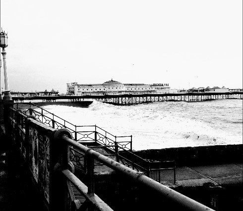
Somebody remind me of this for when portraiture comes around in this module. I’m a child of the flower-power generation, a hippy, a 1960s Brighton art student who somehow ended up in science. Butler’s colours sing from that palette but they’re singing a very modern tune, setting right some cultural wrongs by depicting black men and women with a dignity they were never quite accorded at that time and which our white world still struggles with. Butler trained as a painter and describes herself as a portrait artist, but uses the medium of fabric and thread to make her art. … Continue reading Bisa Butler – portrait artist in quilts

Bisa Butler quilts

Sometimes you look at something and absolutely wish you’d been the one who made it. These are quilts depicting black men, women, and children ‘whose stories were forgotten or overlooked’. Bisa Butler is essentially a portrait artist who uses fibers and quilting as a medium according to My Modern Met’s Sara Barnes (6th Feb 2020), and it’s spectacular. Perhaps the colours take me back to the vibrancy of the 60s; but if they do, these are the 60s grown up and giving a population of people, allowed at the time and for many years since, only to be niche, their … Continue reading Bisa Butler quilts