
The objective of this exercise is to demonstrate the influence of similarly toned or complementary colours on each other (ex 1), and experience the illusion referred to as ‘successive contrast’ (ex 2).
Exercise 1 requires a base layer of mid-grey over which a series of squares is filled with colours of differing relationships. Squares 1-5 follow the brief, using ultramarine blue as the central colour with the surrounding squares filled with similarly toned colours including cadmium green, payne’s grey, and white mixed with the original blue. The sixth square contrasts the blue with its complementary colour, orange.
In the next row, squares 7 and 8 surround the mid grey, again to demonstrate the effect these have on the central grey. The white squares beneath serve the same purpose.
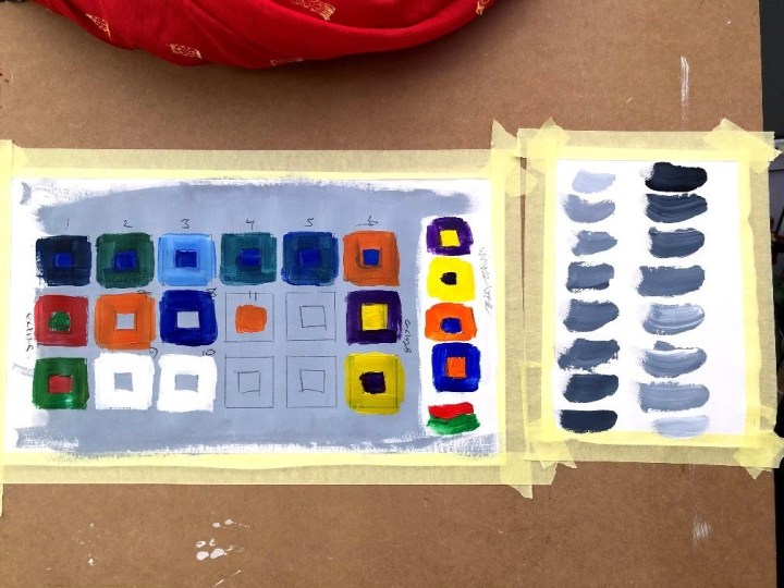
I’ve described the effects of juxtaposing colours in two previous posts (here and a little bit here) which, in summary, describes the ways in which complementary colours behave at their boundaries in a way that causes switching in the processing area of the retina and brain as it tries to resolve the conflicts. The impact of different tones on a co-located colour (such as those in the central square of each larger square) is to make them seem darker (or lighter) even though they are the same. This is the point of the grey wash base, although the effect may be seen in the top row with regard to the unaltered blue.
Personally, I find these difficult to see in these exercises, or the illustrations in the course notes, but it has been established as a neuropsychological phenomenon since the 1960s via Tom Cornsweet.
The Cornsweet illusion, also known as the Craik–O’Brien–Cornsweet illusion and the Craik–Cornsweet illusion, is an optical illusion that was described in detail by Tom Cornsweet in the late 1960s.[1] Craik and O’Brien had made earlier observations in a similar vein.
via https://en.wikipedia.org/wiki/Cornsweet_illusion accessed 27th February 2020.
This showed that grey, for instance, can seem strikingly different in tone depending on lighting and its context. The checkerboard illusion, published by Edward Adelson, MIT professor of vision science, in 1995, confirms this and, on the wikipedia page where it is described, is accompanied by ways observers can verify the effect.
Probably the most recent demonstration of the effects of light and contrasts is the infamous black/blue gold/white dress which fired up the internet about five years ago. A recent article in the British Psychological Society’s Research Digest revisited the phenomenon on its anniversary (Jarret, 2018) and concluded that, while context and prior experience seem to play a role (once you’ve seen it one way you tend not to change) and people who ‘see’ the white/gold version may be more interpretive thinkers (I like this one!), the key finding, if indeed there are any real findings at all, is that colour constancy is a defining factor.
Before any studies had been published, psychologists and vision experts were quick to explain that the #thedress illusion is related to a process called “colour constancy” whereby your brain takes environmental lighting effects (which are ambiguous in #thedress photo), and your own past experiences, into account when interpreting the precise wavelengths it believes are being reflected off a surface. The same automatic adjustment process allows us to recognise grass as green whatever the weather or time of day. The process sometimes goes wrong, though, like when the blue top you bought at the clothes store turns out to be black when you get home.
It’s just possible that the prior experience effect is a reason I don’t see the predicted impact in something I’ve made myself. I know what I put there and so reason takes precedence when I look at it. I’m just as fooled by the checkerboard/Cornsweet illusion as anyone else though when it crops up somewhere else.
I tried the effect with other colours (red/green, purple/yellow) just to see how they fared on grey, then added a strip on white to compare impact. For me this was much more pronounced, which might have to do with changes in retinal physiology and competence over time.
Exercise 2 – successive contrast – refers to the contrasting ‘after-colour’ or shadow which appears either around a strong block of colour or after shifting from one to a white ground. The exercise is experiential but the effect is described by Georges Roque in his 2011 paper on Chevreul’s colour theory and there is an illustration (plate 7, page 12) credited to Chevreul 1889 which performed perfectly for me, despite its now being much faded. In effect, the specialist colour receptors in the eye – the cones – can only respond to blue, red, or green light, (three frequencies within the visible spectrum demonstrated by Isaac Newton) and the complexity of colour perception is a central rather than a peripheral phenomenon (which is why there are so many arguments about variations, some people seeing a blue cardigan where others see a shade of green). When there is sustained focus on one reflected colour (light from an image), this is thought to exhaust the cones responsible for reacting to that light frequency so that a rebound effect takes place in a neutral area either around the stimulus or after looking away from it. Sometimes there’s an entire after image that can take a short time to shake off. This is successive contrast.
___
Jarret, C. 2018. Three years research into #thedress, digested – a lesson in humility for perceptual science. BPS Digest. British Psychological Society.
Roque, G. 2011. Chevreul’s colour theory and its consequences for artists. Based on a paper presented in Paris, June 2010 to the Colour Group (GB) meeting Colour and Textiles – from past to future.
See also R.L. Gregory’s Eye and Brain, the psychology of seeing. Fifth edition, 1998. Oxford University Press. There are chapters on Seeing Colours, Realities of Art, and Illusions. Although somewhat dated now, Gregory was a giant in his field and sets the foundation for understanding of much of what followed.
Time taken: five hours.

Thanks for letting me look at this post, it helps a lot!
LikeLike