
I’ve discussed elsewhere on the blog how Seurat and Signac, amongst others, following on from Chevreul’s meticulous account of colour the ways colours interact with those adjacent to them, how leaving a white space between dots was said to emphasise the effect, and what the optical impact was on the viewer.
Pissarro is reported to set his paintings in white frames in order to capitalise on the effect of complementary colours, and Monet used the principle to enhance colour intensity, his many poppy fields being cited as good examples of this. Seurat is said to have summarised ‘the six principles’ of Chevreul’s law and, along with Signac, used small dots of complementary colours to ‘increase the luminosity’ of their paintings.
My summary of the relevant section in George Roque’s 2011 paper Chevreul’s colour theory and its consequences for artists. https://conboyhillpainting.wordpress.com/2020/02/07/colour-theory-revisited-part-2-research-point-1/
A chemist in the textiles industry, Chevreul was a meticulous documenter of pigment and its performance in various circumstances. This allowed him to describe and evidence the way colours appear to change depending on their surroundings. Complementary colours – those from opposite sides of the colour wheel such as red and green – set up antagonistic responses in the eye due to their impact on the receptors (cones) sensitive to those specific light frequencies. My grandmother used to talk about such colours as ‘fighting with each other’ and that really doesn’t seem far from the mark.
Chevreul also showed that background colours could impact on the perception of colour tones and famously provided evidence to a Court which vindicated both the Complainant (the customer) and the Defendant (the printer) in a dispute about inconsistency of colour in a run of wallpaper.
His theory and the evidence that supported it, influenced artists looking for ways to enhance or brighten their colours, to use human physiology to build images from dots, or to shock them with antagonistic complementary boundaries.
There has been an advert recently where a parent takes a small child close up to a large painting and asks him what he sees. ‘Dots’, he tells her. She moves him back a little and asks again, but it’s still an amorphous mass of coloured blips. Finally she takes him right the way back and this time he sees the whole image as intended. I think it was Monet and that the point was not art but a newspaper advertising itself as presenting ‘the bigger picture’ but nevertheless, the core of it is sound. Monet close up is just dots.
Op Art, a product of the 1960s, is to me the awful grandchild of this understanding, except that standing back seems simply to amplify the dancing, eye-crossing, confusion of my experience. My preference had been for the brightly coloured ‘psychedelics’ of the time which seemed more fluid and certainly had more identifiable subject matter.
The Tate’s brief description lists Bridget Riley, Jesus Rafael Soto, and Victor Vasarely as key proponents of the genre. While Riley seems to have specialised in eye-wateringly challenging black and white geometrics, Soto appears to have moved from rather more subtle tonal pieces in shades of grey towards huge colourful installations in the kinetic style that followed. I don’t recall Vasarely but find his style to have been highly geometric and in both black and white and colour. A BBC website describes his work thus:
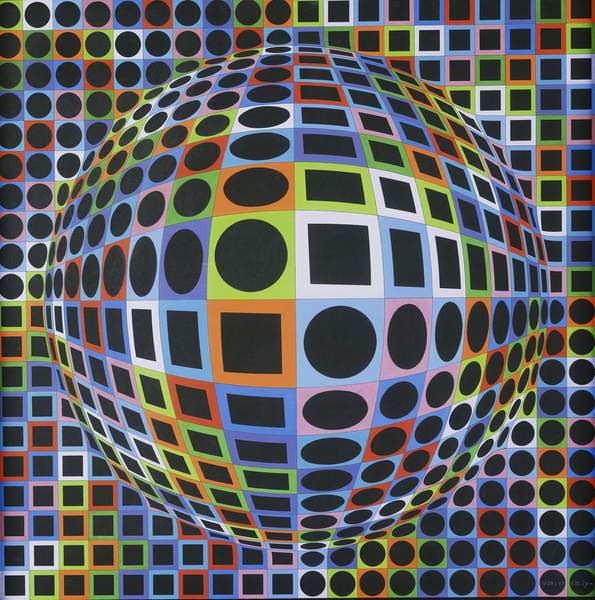
By the early 1970s, Victor Vasarely was everywhere. Regarded by historians today as the ‘grandfather’ of Op Art, the Hungarian-French abstract artist, then in his late sixties, had watched his pioneering geometric designs and hypnotising optical illusions come to represent his generation. Vasarely’s carefully calibrated patterns of bright squares and luminous circles, which make his paintings’ surfaces appear like warping space-time webs – now rippling and concave, now spinning and convex – was the hottest of hot demands.
http://www.bbc.com/culture/story/20190305-victor-vasarely-the-art-that-tricks-the-eyes accessed 28th Feb 2020.
It may not be a coincidence that there is a star called Vega which is the brightest star in the northern constellation of Lyra. via Wikipedia https://en.wikipedia.org/wiki/Vega accessed 28th Feb 2020
Some of these remind me of illustrations of gravity wells around bodies such as planets and from the title of the piece above, it seems to me very likely this kind of material may have influenced some of his work.

Image credit University of Liverpool. via Stephen Sandford’s Inverse.com blog accessed 28th Feb 2020. https://www.inverse.com/article/23022-stephen-sandford-gravity-hole-deep-space-travel-nasa-spacex-elon-musk
Gregory (1995) calls these works ‘extremely disturbing – jazzing and moving and generating ghostly shapes and colours’ and particularly refers to Riley’s work. The effect of parallel lines or converging rays were studied by visual scientist Donald MacKay in the 1950s where he reports a ‘beating’ effect (the creation of moires) due to a combination of retinal after-images and small eye movements. Gregory points to what is known about ‘accomodation’ – the hunt by the eyes’ lenses for sharp focus – which means they are in constant motion and writes:
As the repeated lines must be quite closely spaced, the image may shift from dark to light and back again at each border – stimulating the retina’s on-off receptors, associated with the normal signalling of movement. (Eye and Brain, pp 200-201).
This goes quite some way towards explaining the effect they have on me and why, as my lenses alter in their capacity to adjust focal length (until recently and since 1972 I have needed glasses for distance and now I need them for reading), the constant re-focusing required for these pieces of work gives me a headache!
Bridget Riley
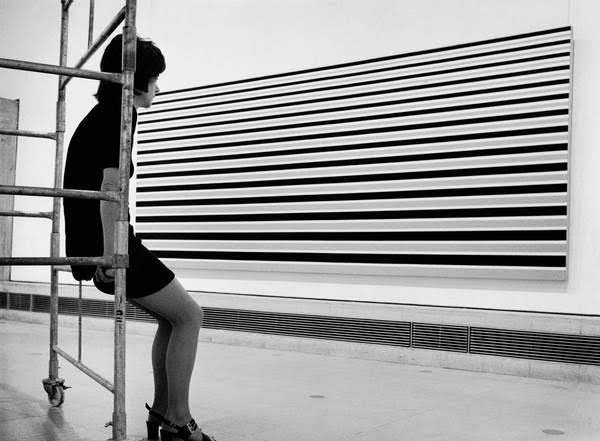
Taken by photographer Jorge Lewinsky in 1971, this image nevertheless epitomises the op art facet of 1960s art. Image via Bridgman Edu, accessed 28th Feb 2020.
Jesus Rafael Soto


Image left: Sphere Lutecia (1995). Image right: Grand écriture (Large Writing) c.1963-66. Both via Bridgeman Edu, accessed 28th Feb 2020.
Roque, G. 2011. Chevreul’s Colour Theory and its consequences for artists. Based on a paper presented in 2010 in Paris to The Colour Group (GB) meeting: Colour and Textiles: from past to future. Published by The Colour Group (Great Britain).
Gregory, R. 1995. Eye and Brain. Fifth edition. Oxford University Press. PP 200-201.
Time taken: four hours.
