
The task is to make a still life using two complementary colours and white. I chose sap green and cadmium red.
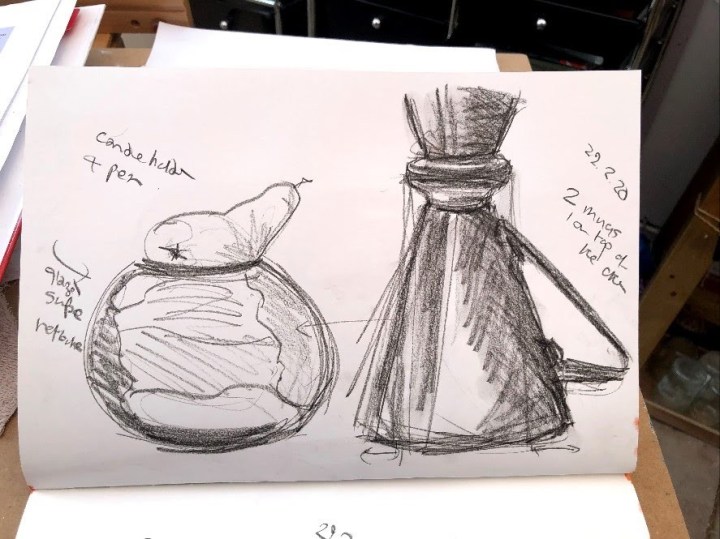
First some sketches using a charcoal pencil.

Then drawing out with a watercolour pencil on hot pressed watercolour paper, which I find to be quite robust.
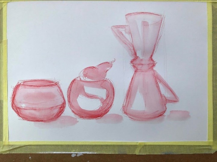
These are the first layers, finding the shapes, highlights, and tonal differences.

The items are on a shelf in front of a window that looks onto a fence covered in ivy. I wanted to reflect the two colours in the foliage and to show that it was framed in a window. I have trouble with straight lines and I don’t have a steady hand – maybe that will come.
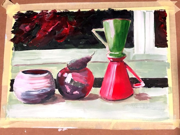
I did a lot of ‘fixing’ with those lines; sometimes they were too strong and began to make the background more of an item than the items so I tried to minimise them. I like using quite solid layered paint that will take a later light wash and also respond to being rubbed with a piece of damp towel to expose its texture. I did that along the bottom both to remove some colour that was too strong, and in the window area to ghost a small part to hint at some light reflection. Overall I’m relatively pleased with the textural contrast in the shiny ceramic mugs, the very glossy candle holder (with a pear sitting in it!), and the glazed coil pot – made at school in around 1965. I’m less keen on the background which looks to me to be overly fussy and detracts from the main items. I’d be happier with a simpler treatment, the window view and maybe not the window edge to the right.
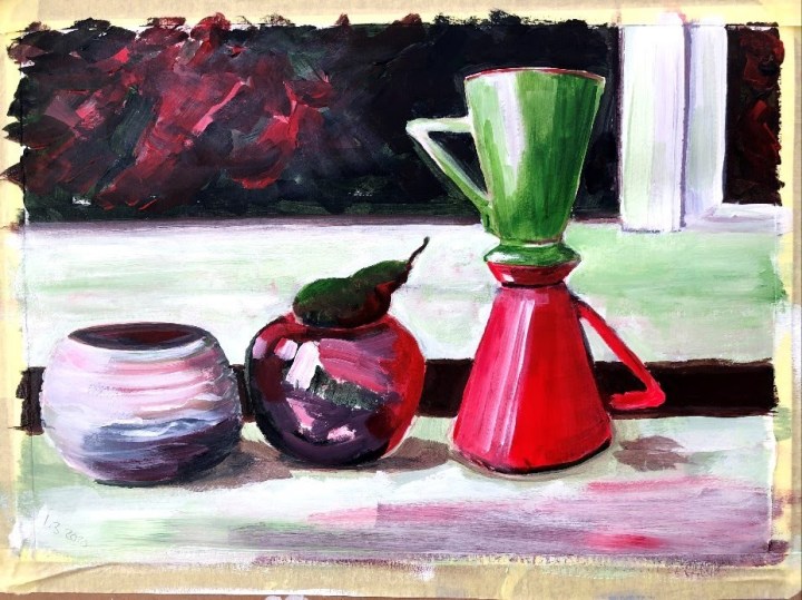
Time taken: 9 hours.

One thought on “Part 2, project 3, exercise 4 – still life complementary colours”