
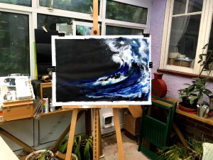
This roughly 8×12 piece is based on a crop from the much larger piece that preceded it and came from a headline about ocean warming. The evolutionary process is detailed below.

___


The A1 piece from which the final piece was drawn is made in acrylics and came about following an exploration of ways in which the sea is represented in art. I ran a search via Google images and then scrolled through the results, settling on only the images that caught my eye. I wanted images that were visually impactful and as my knowledge of art and artists is still very limited, it seemed to me that this might introduce me to and pique my interest in work I wouldn’t otherwise have noticed.
In the end, the pieces that drew my eye were largely by artists I knew of but only really from a distance. This time I had been drawn in by their work and not their name or reputation. They also, very conveniently, came from different time periods and different artistic traditions. I printed out copies of each and then made drawings from them in different media, which inevitably meant interpretation as this, and my own developing style, impacted on the copies.
First was The Great Wave (1829-1833) by Katsushika Hokusai, a Japanese artist working largely in wood block and print. The result is a very formal and stylised image. I copied this using soft pastels, changing the background to black and omitting the boats drawn up into the wave so as to focus as much as possible on the construction of the wave itself. Hokusai makes tendrils of the foam and fixes the water in position so that, in effect, it’s no less solid than Mount Fuji in the distance. I liked the drama of that and the sense of power it evokes, despite its being static.

Next I looked at what I then discovered was Turner’s Fishermen on a Lee-shore, (1802), an acknowledged masterpiece of grandeur and drama. This was a daunting piece to copy and it felt presumptuous to attempt it. Again, this is soft pastels in an A5 sketchbook and I felt pleased by the way my rendering of some of the elements turned out. I like the motion and the effect of blending and how, without realising how I did it, the marks that form the tumbling foam in the foreground seem to work.

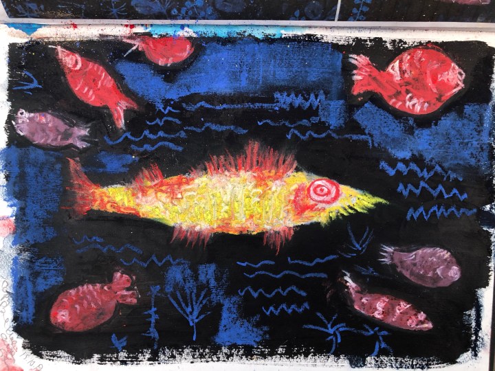
The third piece was Paul Klee’s Golden Fish (1925). The colours deceived me into thinking this was by Kandinsky so I was surprised to find it wasn’t. Klee’s image is almost naive and childlike, a semi-stylised piece that verges on abstract in that realism is barely described. I used soft pastels again for this copy and made the image on black gesso. I like the colourful representations of the fish and the merest suggestion of the surrounding element – water. It was fun to do.
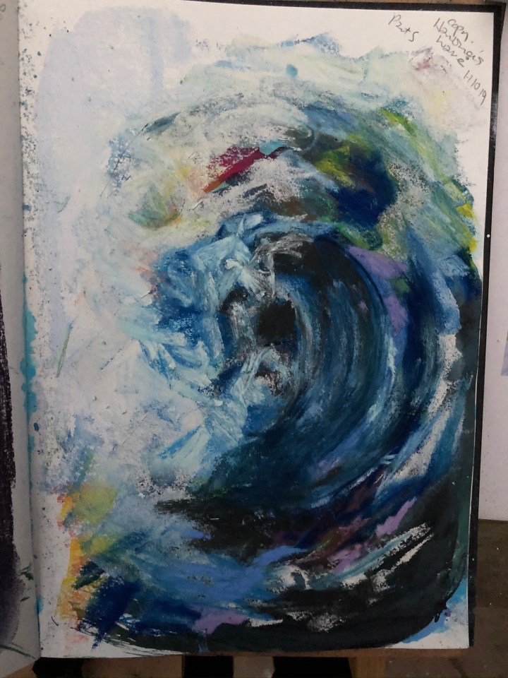
Finally, I took on one of Maggi Hambling’s series of hugely energetic gestural pieces (circa 2012) describing waves, most of which are in portrait orientation and towering so that the impact of power comes across without any further context. Hambling makes broad marks in an expressive style that speaks of the essence of a wave rather than its objective anatomy. I like the way she incorporates unexpected colours into the water, maybe reflecting the way droplets act as prisms to fracture white light; but maybe not. My copy is in soft pastels which are also quite large – especially on A5 paper – and tries to home in on that expression.
My first intention was to make larger versions of these and to weave into them text relevant to the period in which they were made. I had seen typographic art in galleries in Brighton earlier and liked the idea. Later though, I was drawn back to a poem by Marianne Moore called The Steeplejack (c 1930s) which I’d drawn before starting the course and thought to return to that.
After completing the A1 piece, I did return to it and made a series of images owing something to each of the artists, with accompanying text from a particular stanza speculating on how Durer would have liked to ‘live in a town like this, with eight stranded whales to look at’. This is on A3 hot pressed watercolour support; each image is drawn directly onto it and the surrounding colour is black gesso with outlines of white conte.
The ‘D’ of Durer is made by a great wave after Hambling; and the stranded whales wearing lettering spelling that out, is black ink on white gesso with deliberate spaces left between them to emphasise their edges as a Hokusai woodblock might. Beneath is blended soft pastel representing the ‘sweet air’ (after Turner), and last is Klee’s golden fish accompanied by text that describes the water as being ‘etched with waves as formal as the scales on a fish’. Ideally, I would have used letraset for the text but had to resort to handwritten and typed text which I don’t consider ideal. As I have no capacity for calligraphy or even well-controlled handwriting, this remains an exercise until a better way of handling the imagery occurs to me. Also, I’m still quite fond of my pre-course drawing based on this poem and that is interfering with progressing the new way of looking at it.

In the meantime I made a series of drawings and paintings based not on the original art works I’d chosen but on similar real-world photographs which seemed to lend themselves to my chosen styles.
The whales. Top right is from a photograph attributed to Walmart.com, top left to Unreal Engine.


The great wave: this one from a representative photograph attributed to a still from a Youtube video via NASA – as no one was there for the actual incident – of the largest wave ever recorded in the north Atlantic (2012).


I began to put these into a composition, first as separate images in a sequence reflecting the stylised through to the expressive, and then as part of one whole piece with quite explicit reference to Hokusai’s and Hambling’s waves, Turner’s blending around the whales, and a couple of red fish nodding towards Klee. The bottom image shows in more detail both the formalised structure of the Hokusai wave and also begins to reference a more modern notion of structure drawn from 3D computer modelling when I discovered that one of my reference whales was in fact an animated construct. The red lines represent the wire frame stage of the animation process. Also in this image is my Fibonacci layout, something that had come up while observing NASA engineers in the Mars rover live lab as they inadvertently one day fell into exactly a classical golden ratio tableau. I drew this out in orange conte to find where the focus should be and it was clearly not there.


This led to a further composition which moved the whales closer to the wave and eventually dispensed with both the stylised wave and the additional whale although I retained the red lines for a while and used dots of orange to hint at Klee’s fish.

I tried also using portrait orientation as had Hambling because at one point it seems that the expanse of dark sea and sky to the left was draining the energy from the elements on the right. This is made in inks, oil pastels, and coloured conte on a black gesso ground and while I like the effect of rubbing and scraping at the surfaces to reveal the colours in the layers beneath, I’m not wild about the composition or the rather insubstantial feel of the media I’ve used so I returned to acrylics.

This required yet another iteration of the basic composition and, after checking again both onscreen and on the easel from a distance where the focus needed to be, I printed and cut out multiples of the feeding whales to position under the wave and determine how many and where they should go. This led to the final composition as shown beneath.

Unfortunately, I could find no way of eliminating reflection of light on the black gesso and moving the camera closer led to the black being rendered as grey by the digital algorithm. The better shot is at the top of this post but from a distance. It can be zoomed for detail. Here, I want to describe something of what remains of the artists whose work brought me to this point. For me, Hambling’s expressiveness dominates the wave structure and contains small patches of colour which reflect her style and also a little of Klee’s golden fish. Some parts of the foam are more stylised than others where I manipulated a stylus in the wet acrylic to make curls in the edges, then further down is a very clear-cut edge to a rising component of the wave, marking with a thin line of turquoise the foreground water from the central melee of the whales. This is the Hokusai influence. I have used blending – by finger – on the foam in the large wave and also in the turbulence around the whales where the behaviour of the water reminded me of the waves in Turner’s piece.
As additional notes, there are two small patches of dark red wash in the black area to the left which I’ve intended as both an indication that this is a ‘live’ area (sky) and not simply one that hasn’t been addressed. The colour reflects those in Klee’s painting. Then finally I’ve placed a dot of orange in the sweep of the wave just between its base and the whales to both reflect again Klee’s fish and also to pinpoint what, to my eye, is the centre point of the Fibonacci spiral.

I have learned a great deal in the making of this piece. First that copying great works needn’t be intimidating and doing so delivers ideas and motor skills subliminally. Second, that repetition (up to a point – I do become very tired of seeing some things after a while!) improves those motor skills as these are refined from many stiff movements to one or two large swift ones. And thirdly, that innovation is born of practice and looking, listening and feeling. I’ve used music quite often throughout this work, in particular the score for the ballet Woolf Works by Max Richter (2017) which describes the tormented life and tragic demise of Virginia Woolf. The final scene is danced before an enormous monochrome sea moving in the slowest of slow motions. I’ve also made audio and video clips of the waves crashing onto the beach at Lancing and used these too to keep the sense of power and fluidity in mind. Most of all though, I’ve had at the front of my thinking the terrible losses we’ll experience if we fail to protect our oceans, our wildlife, and our planet. This is not a political message piece, but for me the subtext certainly is.
A day or so after finishing this post ready for submission, a headline about ‘ocean warming’ on my Echo Show caught my attention and led to an image I found I couldn’t ignore. So despite not setting out to politicise my whales, I used digital means to add new layers to one of my crops, and I’m in the process of translating the result into a physical piece. Paint layer via Rebelle3, detail layer via Flamepainter.

This is the final image. Made in gouache, and acrylics on hot pressed watercolour paper prepped with black (left) and white (right) gesso, it is the physical interpretation of the digital rendering above. I’ve used various brushes plus my index finger which I find actually gives me a more direct communication with the medium and support and I found, after completing it, that I could not see it as a subsidiary or an afterthought. I found it challenging and exciting to do, the colours hit me hard in terms of their implications, and I like the balance and the way the gesso supports the textures. This feels like the best piece of work I have made on this course and as such I can not relegate it to the position of support act.
Woolf Works, Ballet performed by the Royal Ballet, score by Max Richter. 2017.
Paul Klee, The Golden (or Gold) Fish. (1925).
J.M.W. Turner, Fishermen on a Lee Shore in Squally Weather (1802).
Maggi Hambling, Bold Breaking Waves. (c 2012).
Katsushika Hokusai, The Great Wave off Kanagawa. (1829-1833).
All sites last accessed 18/01/2020.
NB I may edit this post prior to submission, but will not do so subsequently.
Edited for reference attributions re images used 20/01/2020.
Edited for change of submission image 23/01/2020.

Lovely description of your process. And of course a great end result: fingers crossed for you at assessment! 🙂
LikeLiked by 1 person
Thank you, here goes!
LikeLike