
Line drawing.
Influences: David Hockney’s simplicity of line even in his paintings, and Henry Moore’s circular wire-frame marks. I am including Egon Schiele because of his expert economy of line although I abhor his subject matter; nevertheless he comes to my conscious mind enough to suspect that his techniques are woven into my impressions. Finally Paula Rego whose robust figures draw me for all sorts of reasons, including the volume she achieves with lines and marks.

Hockney. This tiny clip of a clip illustrates just how simple lines can be and still suggest shape, volume, and texture. The pillow is depressed under the weight of the arm, there’s crumpled hair over to the right, next to loose sleepy fingers, and the bedding is rumpled in a morning way. There is little else there but line and yet there is also a whole picture.

Moore almost weaves his images out of hair, making deep, dense depths and shadows just by scrambling long marks – this may be biro – and making them flow in directions that indicate shape. I always think of them as wire frames and of course as a sculptor I imagine he was very familiar with that idea. Moore makes nets with his marks and fills space in a way neither Hockney (above) nor Schiele (below) do.

Schiele. This tiny clip shows just how economical Schiele was with his lines and how all the shape and volume indications come from an understanding in the observer of what the lines represent. The same could probably be said for Hockney’s drawing above but I think Schiele’s stark style, with its more confrontational content, is perhaps challenging us to just get over it and get on with it as many of the painful images are of himself.
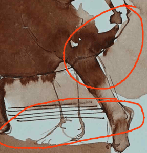
Rego. Most of the pieces I’ve seen of Rego’s have been pastels and this clearly isn’t. Here she seems to be using inks to make her lines and then allowing the colour to complete the shapes. I chose this small corner because there is a rejected leg, abandoned in the centre. I find that encouraging as I serially abandon all manner of features in the course of producing a finished piece.
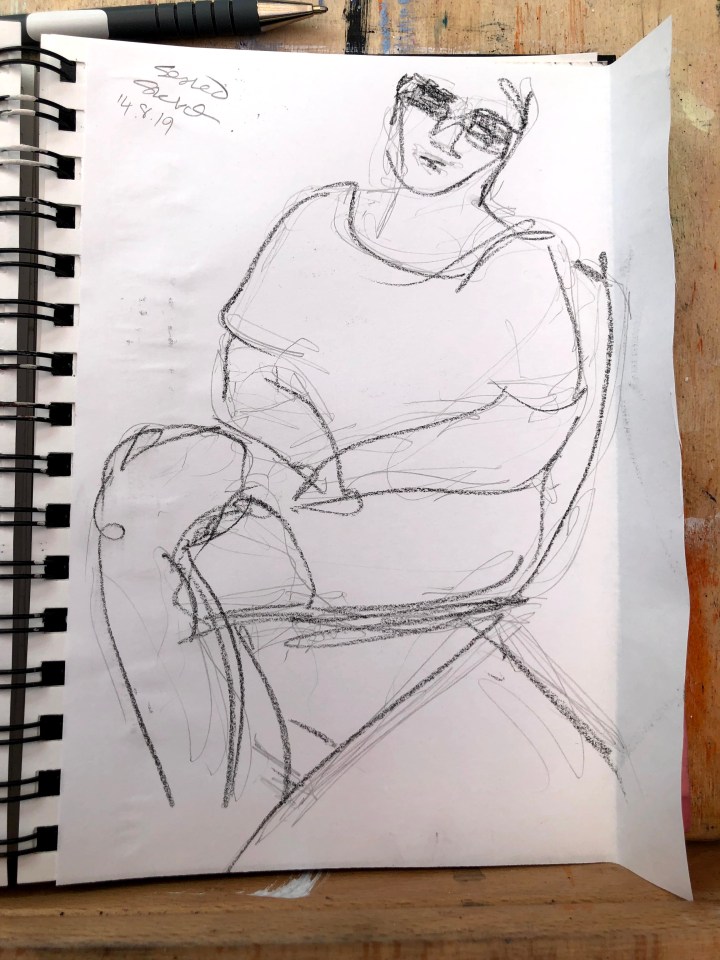
This first sketch is almost completely line made in charcoal pencil. It’s largely gestural and aiming for simplicity of shape so I can get a feel for what is there and teach my eye what to look for.
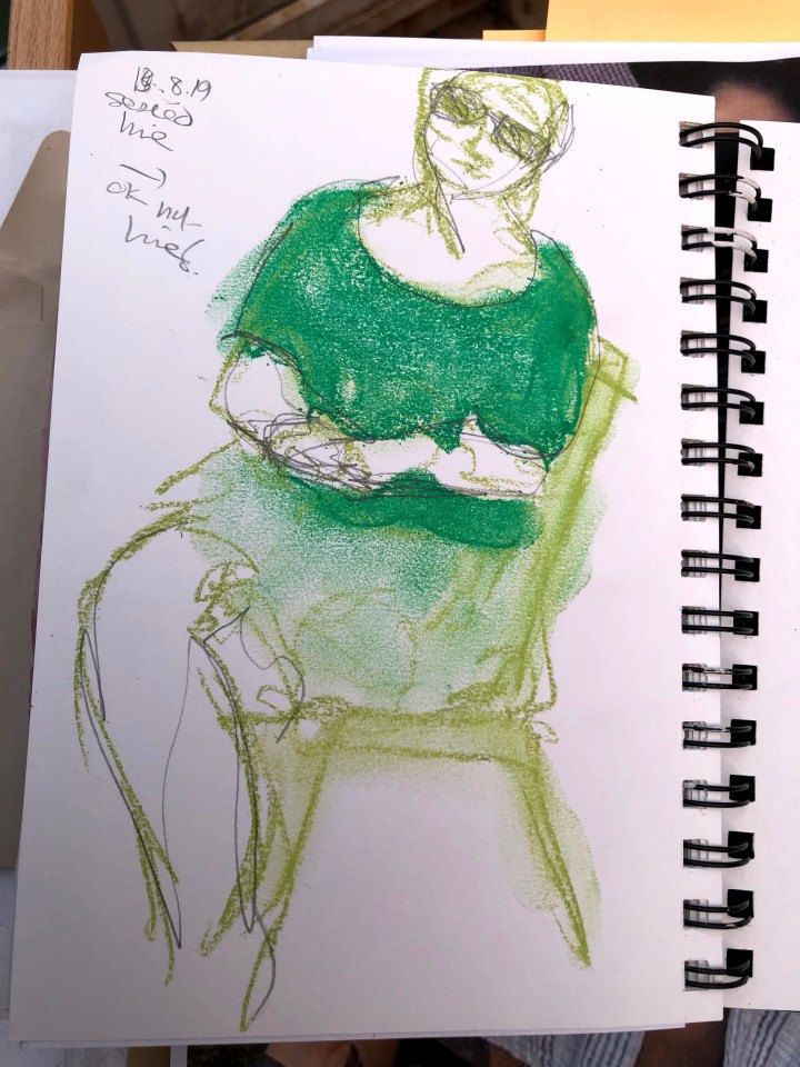
The second sketch is pastel and although the task requires monochrome, I’ve used a variation here to emphasise shapes so that volume becomes more obvious to me.
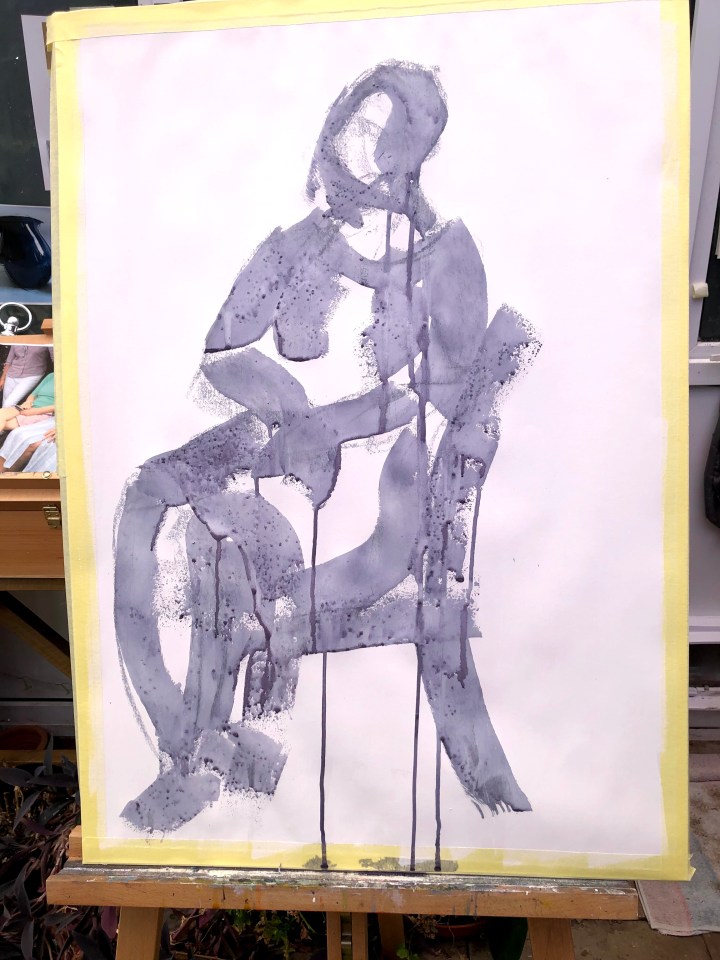
This is an A1 sized sketch and still preparatory in that I need to develop the appropriate arm and hand movements for the lines and shapes I’ll be forming. I used a 2″ roller to make lines in a mix of white gesso and grey ink.
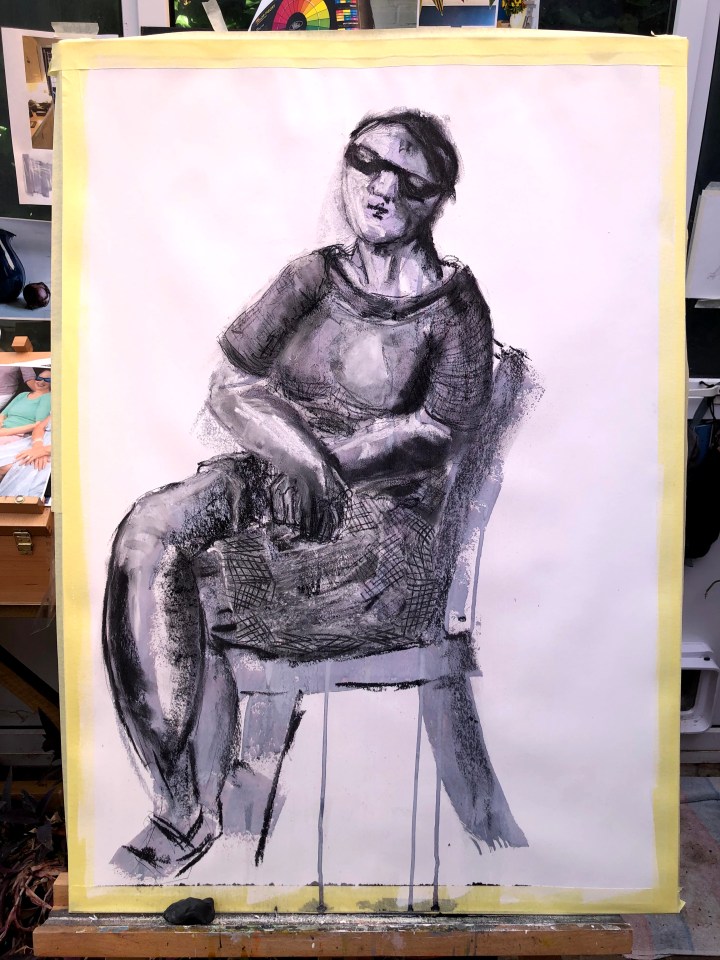
Perhaps a little outside the brief, this is the same piece elaborated with pastel and detailed with conte. Distance lends more credibility to the texture of the shorts, I think, because close up I find them a little less convincing.

Messing with those hands again – will I ever get the hang of fingers! I’ve also over-done the Moore-ish marks on at least the left side, and the texturing seems quite heavy handed. I’m always aiming for simplicity and so often blow it by not leaving well enough alone.

This image is a high contrast construction via Paintshop Pro to show up over-done detail that I might be able to fix. Hopefully without then having to endlessly fix the fixes.

A little fixed, I think, and I’ll leave this now to try another approach.

One thought on “Part 4 Assignment 4 preparatory work seated figure”