
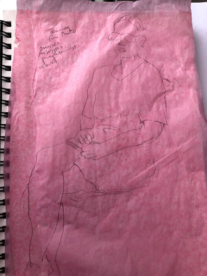
Continuing from an earlier series of preparatory sketches, this is a tracing of the photo I took of the pose. My aim was to ‘feel’ the shapes and angles – head tilt and vertical neck line and how that is reflected in the body posture.
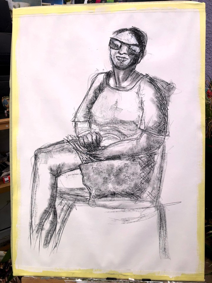
This is a pencil drawing from the tracing. The execution of the hands has definitely paid off but I had a problem with the mouth. Rubbing some of that out, I’ve given the teeth a toothpaste zing!

I actually like this better on-screen than on-easel! Is it line? I’m not sure but I’m realising that the more I try for accuracy via measurement, the less I’m likely to achieve it. I’m an overall picture sort of person, not the meticulous grid it and replicate kind. I think it’s possible to be meticulous about representing presence and the occupation of space rather than a more photographic reproduction. Is there more life in the former than the latter? I think there might be. This is soft pastel on gesso-prepped A1 cartridge with pencil underdrawing.

I may try right handed drawing next, to capitalise on the non-dominant looseness of attack.
So, first draft, as it were. Conte on gesso.

After sticking the blue figure up on the window, some adjustments became a little clearer. I imported the photo in Rebelle software to try out some ideas and then made an attempt to replicate these on the physical drawing. As one has zoom capacity and tool size adjustment and the other doesn’t, this was not so easy but in the end I think I’ve made an improvement.
This is the Rebelle edit.

and this is the physical version. The changes are all in the mouth and teeth which were tricky due to there being some foreshortening of a smile on the left of the figure, and also the sheer fact of a smile and teeth. I found these enormously tricky.

And just to emphasise my incapacity, my dominant hand ‘edit’ of the previous drawing is less worthy of attention now than the original. Mess! I see from the course notes that I should spend only about two hours on each of these tasks, but I may come back to this one after tackling the reclining figure.
Bit of a mess but slightly better fingers and hand shape I think.

After keeping an eye on the clock, I decided to go with the blue drawing. While I like some of the shapes and textures in the others, I think this meets the brief with its simplicity. I have a long way to go with hands and features, angled heads and partial profiles but I believe these drawings show some progress.

One thought on “Assignment 4 – seated figure”