
Well, to learn you have to challenge yourself and, after sitting in front of a screen for what feels like months (about four days!) getting to grips with Adobe Aero and After Effects, I absolutely had to paint something. Generally, I like a large space with lots of room for arm waving, but I chose a relatively small canvas to make a painting based on the work of Christy Lee Rogers who composes and takes the most stunning photographs. I won’t be posting the photo I’m using because of copyright but if you saw episode 2, series 1 of Extraordinary Portraits, it’s that one.
I’m not aiming for a replication or even anything recognisable as having arisen from that image, which is just as well because my capacity to paint people is dismal. Instead, I’m looking for the movement in it, the colour, and the core value.
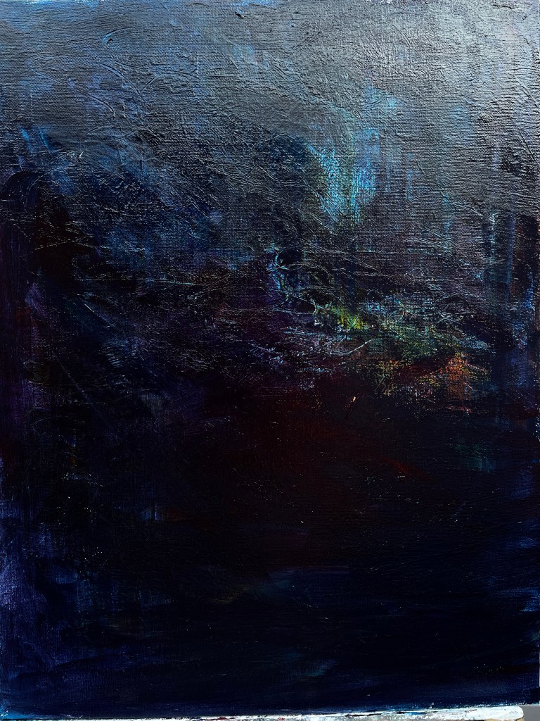
I started by drawing out the shapes in the painting in soft pastels, then wetting those and letting them run. The photography is all underwater and looks like a fluid Dutch vanitas for the 21st century so those colours and the movement are important. Of course, I forgot to take my own photos until I’d masked everything underneath so there will be layers to pick away at and highlight so here’s where I am with the blue/red thick wash. The light top right is an annoying consequence of using acrylics and a camera that likes to pull up the illumination without asking. You can see the shadows of layers under the blue/red, and the textures made with a stylus into thick paint (impasto, if we’re going to go art-speak over it). The idea is to make a populated surface rather like water which, in its natural state, is inhabited from its surface to its depths. At the moment, I see myself as looking down into it, much as you might do from the end of a pier or jetty.
29th August. I’ve had a lot of struggles with this and I’m afraid it’s noses again. For some reason my brain goes all Picasso when it sees a face and puts eyes, noses, and mouths in all the wrong places. I’ve bought two plastic heads so I can at least put in some drawing practice. One of them is a bit small but it will do.

The other impediment turned out to be somehow replicating without replicating the original photo, so when it went wrong for the umpteenth time and I’d obliterated the face yet again for a new start, I decided to tackle the mid and foreground to see it that helped. The result was a complete transformation.
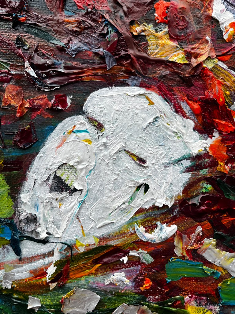
But first, the painful struggles:
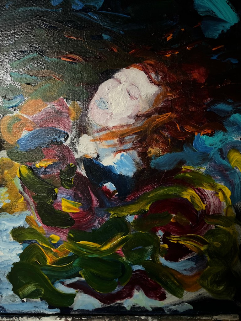
Spot the huge flattened nose, the ridiculous mouth, everything in outline instead of subtle brushstrokes. No way was this going to do anyone justice. This is when I took a swipe at the face with T white, then picked at it with a stylus when it was dry. It looked like a corpse in a river. Oh …


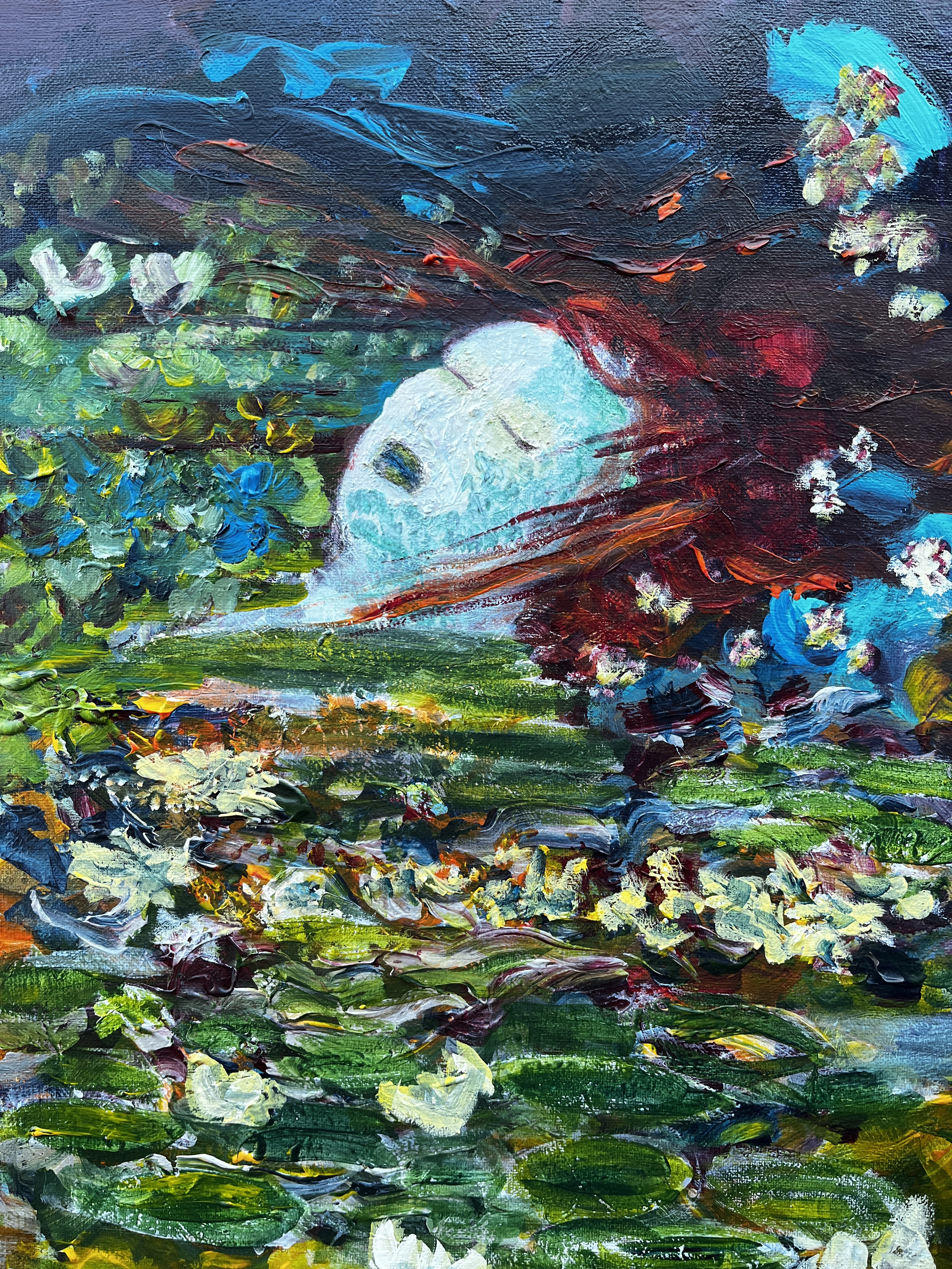
Millais’ Ophelia came to mind, pre-Raphaelite colours, and probably a bit too much crime drama.
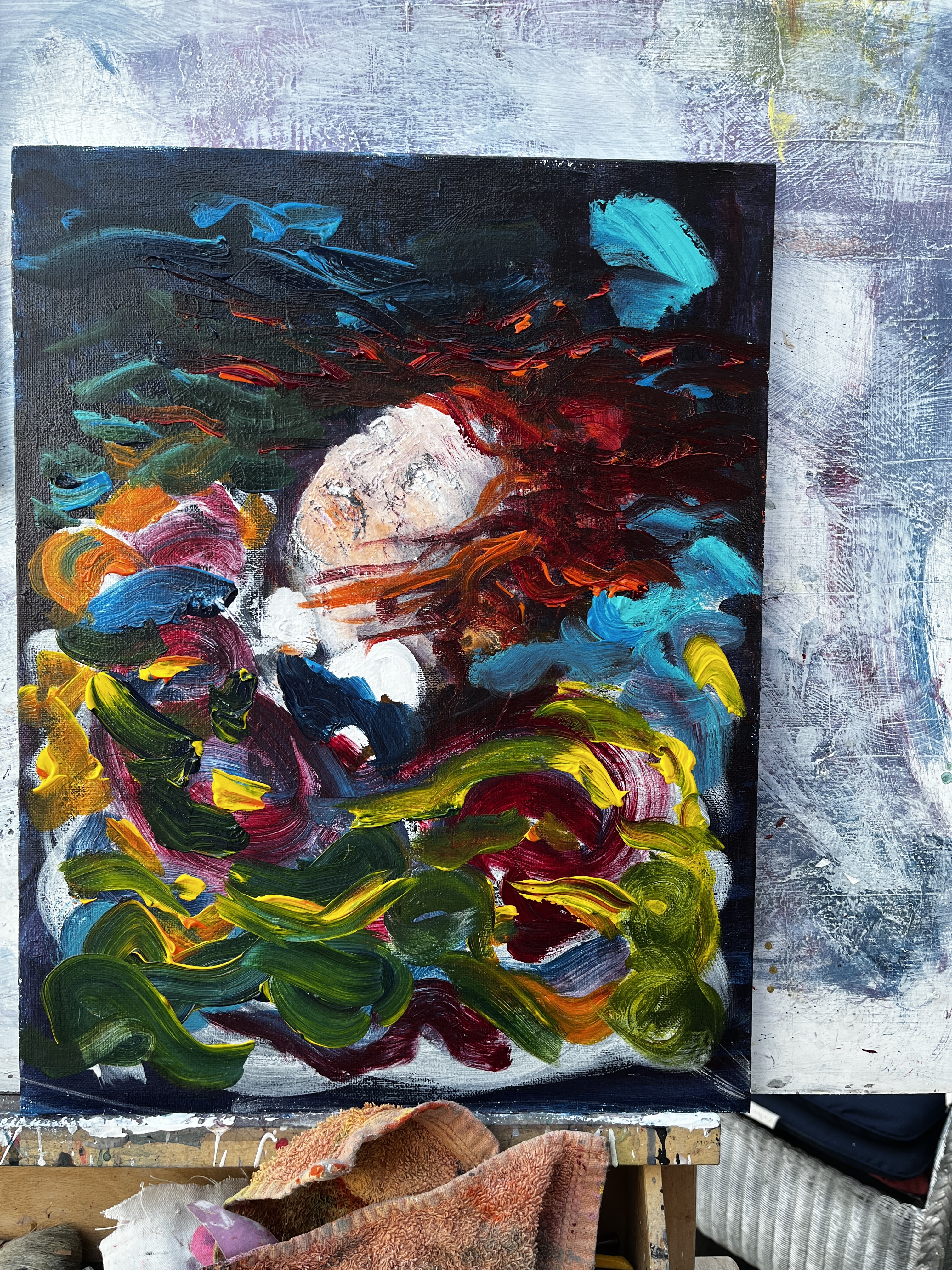
Now, instead of the bandana the original model was wearing, there’s red and orange hair swirling around a deathly white face. The blue lips are a bit extreme so I’ll be tackling those later, but I’ve succeeded (I hope!) in fudging the nose.
The composition needs a bit of attention – where does the water start and end? Is she under it or or just at its surface like Ophelia? And is the swirling colour all her hair, reflections of it, or something else in the water? And what about the edges, the margins of the painting? Take the painting right over them and maybe round the sides?
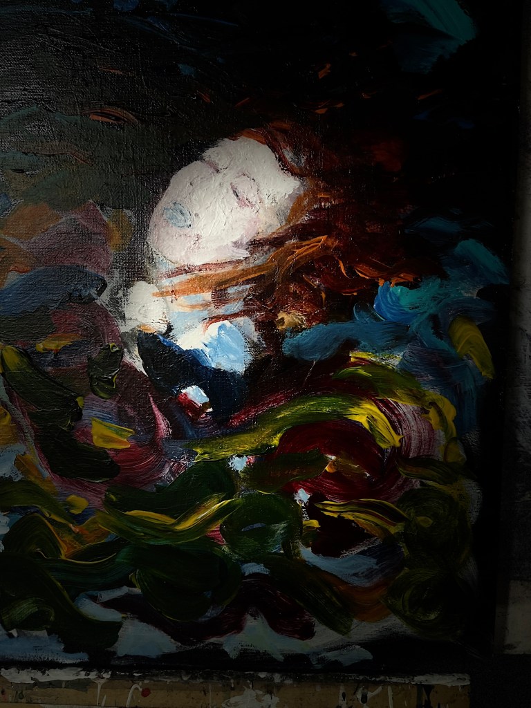
30th August. Last night’s photos using different exposures. The one far left is a ‘spotlight’ image.


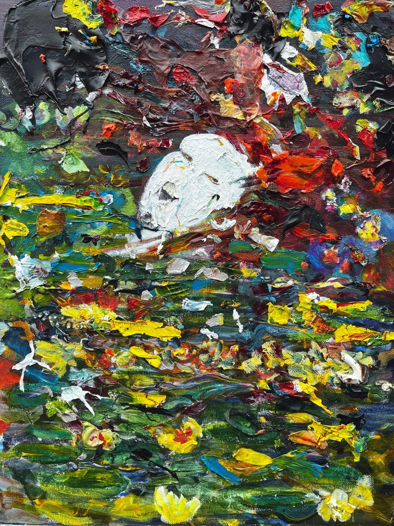
I’ve applied silver acrylic in varnish onto the face and as ripples in the foreground, mixed with blue or red or orange. To make those marks, I take a largish flat brush and load different colours onto different parts of it so that, pulling it across the canvas, it leaves a trail of thick paint in toothpaste stripes behind it. Anyone who’s seen seaside rock being made will get the idea. I’ve also continued the colours onto the sides. (Someone remind me to do the bottom strip!)

I’m probably going to give it a scrubbing with a scratchy flannel later. That’s what all the varnish is about – making it easier to pull off paint and leave texture.
31st August. I’d spent some time yesterday thinking of the cross-over I’ve developed between the original image by Lee Rogers and Millais’ 1851-52 painting of Ophelia. The sentiments are entirely different; the photo an empowering one with drama in the colours, the fluidity, and the lighting, the painting depicting desperation; but the essential elements are similar. In each there is a woman in the water, there are flowing billowing fabrics, and there are vibrant colours. To emphasise the hybridity of my image, I have begun adding flowers and foliage to the surface of the water.

There’s some ambiguity now in the woman; while deathly white, her lips are green rather than frosty cyanotic blue – is she dead or is she a sleeping elemental of the water, a selkie maybe, or something like Sara Maitland’s Moss Witch? I have more to do here, I’m still leaning towards a touch of Dutch vanitas so pond life could make an appearance!
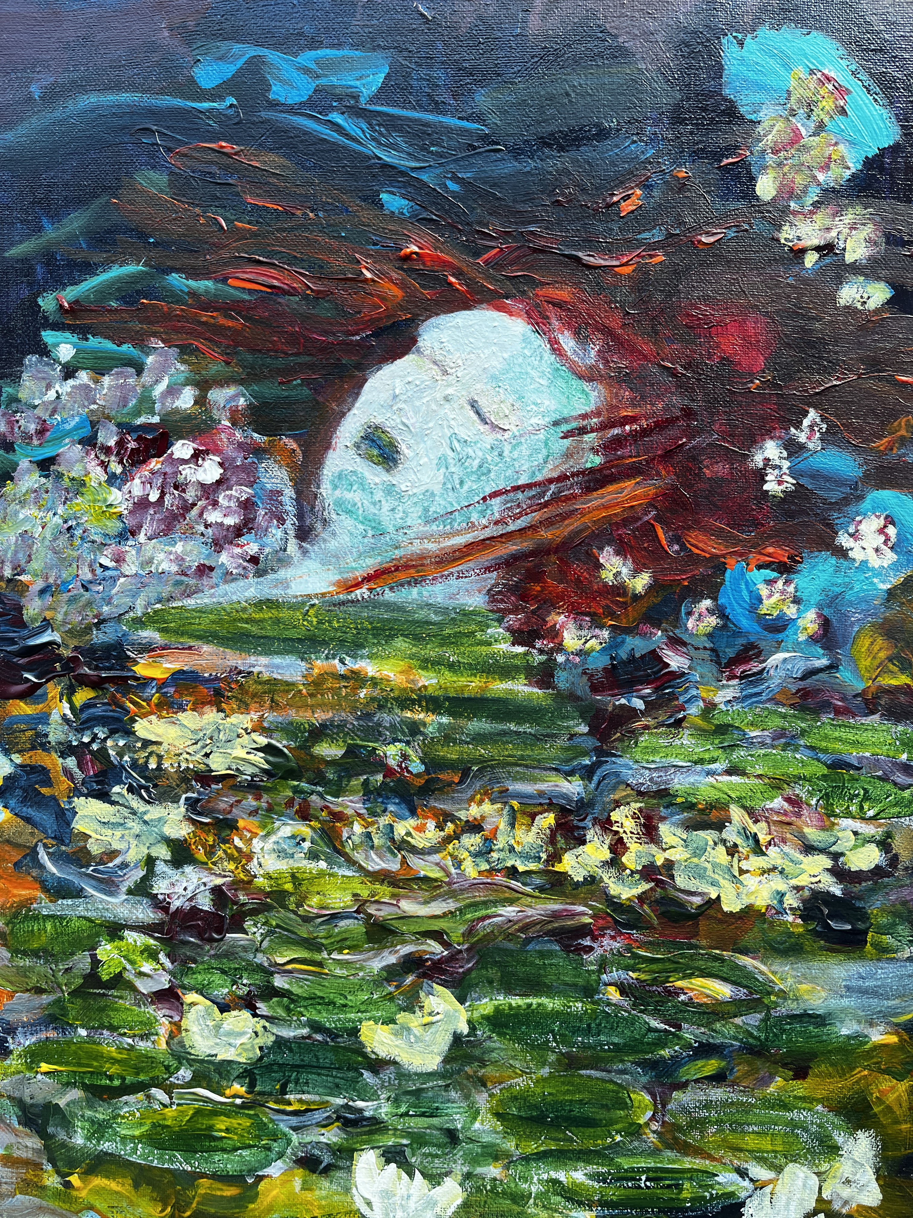
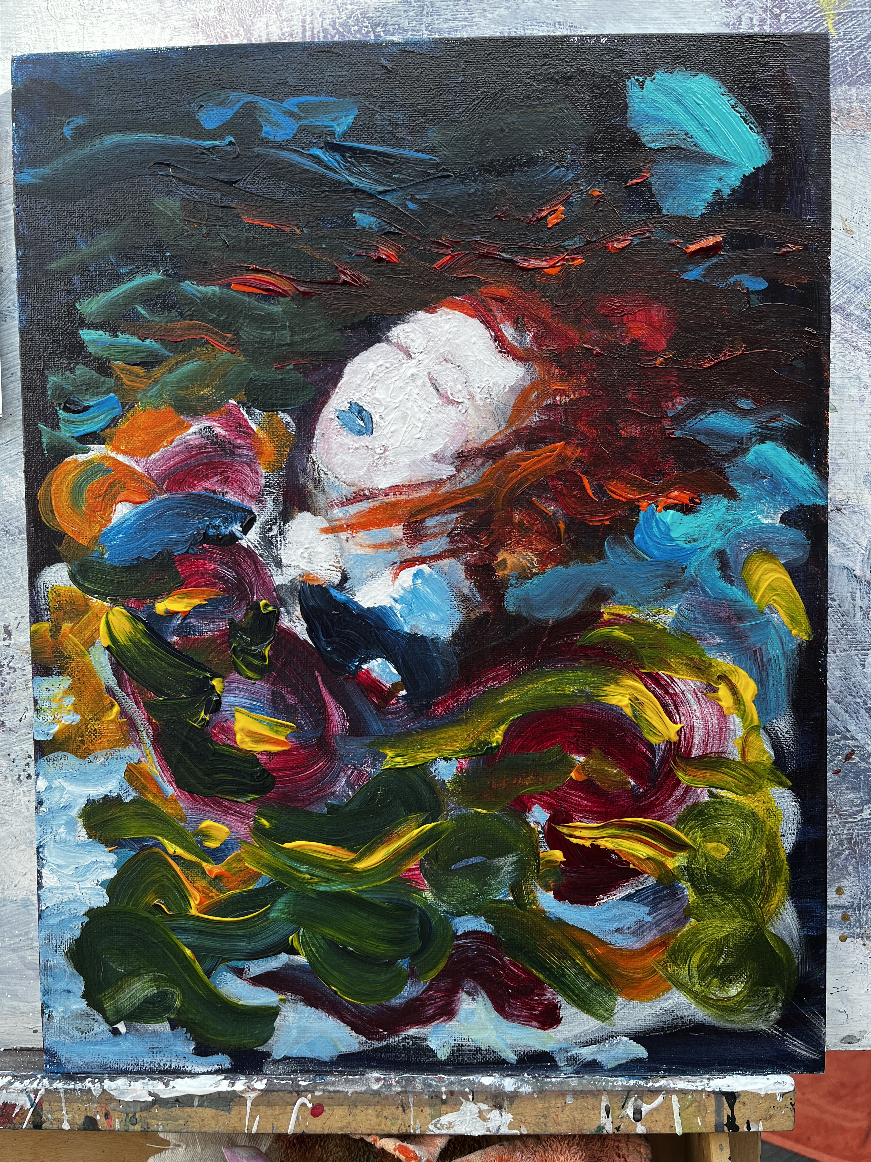
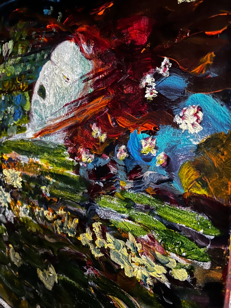
I’ve used green acrylic ink to make ‘scales’ on her face and washed them with dilute T white to knock them back a bit. I’ve also straightened her neck out so that she’s lying in the water rather than hanging vertically in it like the model. The flowers and foliage are coming in but I’ve no idea what that large aggregation of dots and splodges is next to her face!
I wonder if a hint of an eye would be the spark it needs now?
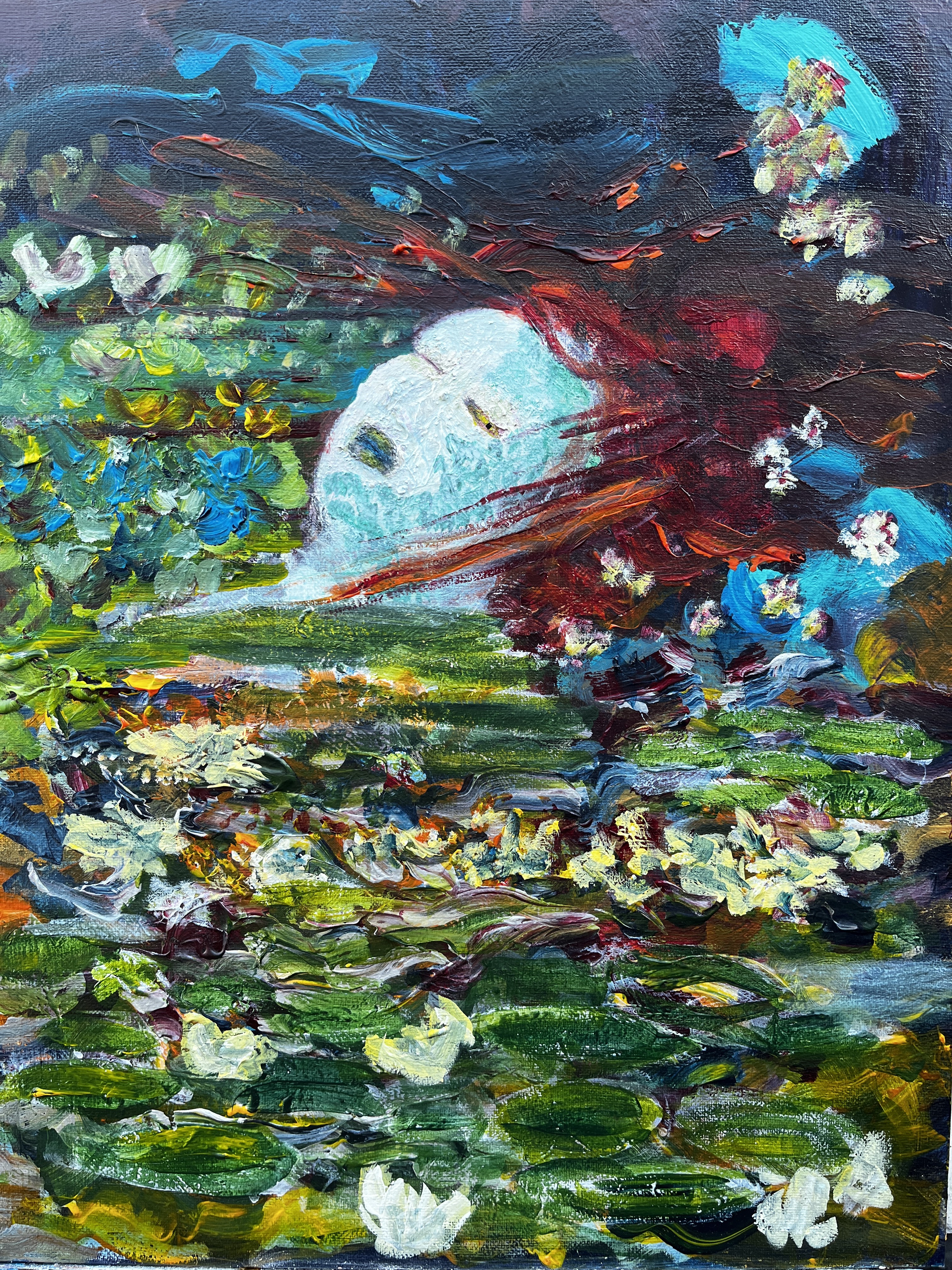
Not a fan of that pinpoint eye although the eye itself looks promising. It’s assisted in its expression by a fortuitous lump of thick dry paint. I used a watercolour pencil to make an outline, partly by leaving pigment but also by digging a small channel down to an earlier, darker layer. The amorphous blob is gone, now there are more flowers and streaks of hair.
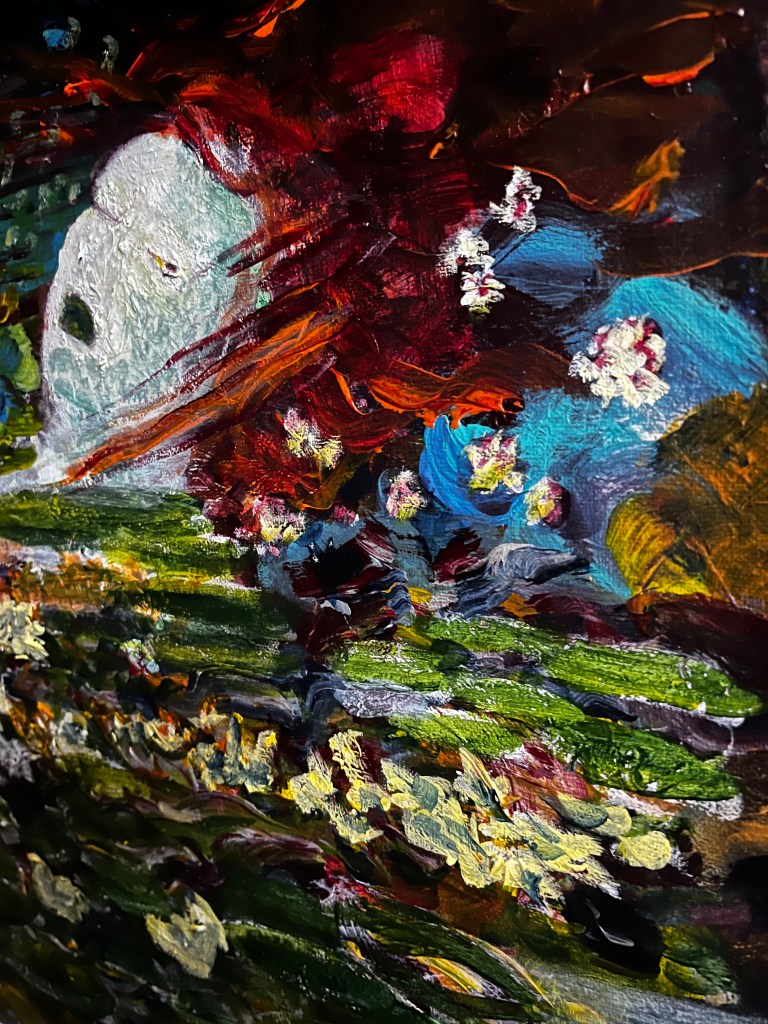
Better. Needs muting a little now; acrylic pens are not shy retiring violets and I want this to sneak into a viewer’s awareness, not stab them in their own eye with a look-at-me-I’m-not-human signal!
The shape has change now, and there’s no pupil to be seen.

Inktense pencils, nice fine point so ideal for getting into places where wiggly-ended brushes might not fit. I’ve used greens and yellows to make that eye, and also to bring up the lips. She’s looking like someone (something?) I wouldn’t argue with now!
I’ll leave this now till tomorrow and assess its good-to-go status.
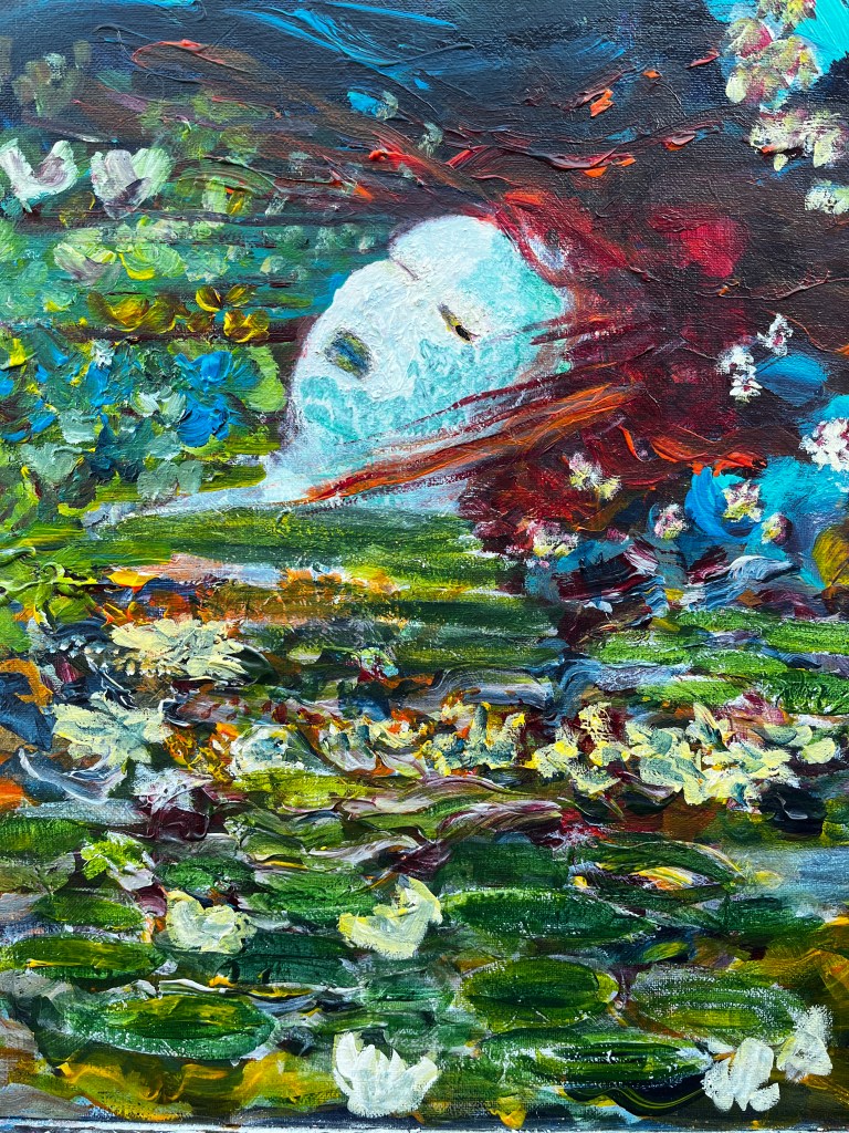
1st September. I took several photos last night from different angles which created some interesting effects in the painting. The facial expressions, for instance, are quite different in the various perspectives and seem to me to go from contempt to fear. There’s movement in the water surface too with plant life streaming across the space like a rushing tide.


Today though, I’m going to take the direct perspective image into Rebelle and take a look at what dripping wet digital paint on it looks like. I’m hoping I can make a screen capture recording of that without the workspace surround.
Rebelle was a little disappointing in that the paint layer was barely visible despite full opacity settings. But we’ve moved on.

I have some animations and maybe greenscreen to make from what emerged as a result of flaking paint off the face. Suddenly, I was put in mind of a podcast (Lost at Sea) I heard recently about the disappearance at sea of a fisheries observer. These people are responsible for monitoring adherence to animal welfare and fishing quota regulations and spend months at sea with the people they’re inspecting, which makes them very vulnerable. Some of what they see includes the illegal dumping of live fish back into the sea after they’ve been stripped of their valuable fins. This is horrendous cruelty as the fish can’t then swim so they starve to death.
So, at one level, the painting (and video) is a mermaid fantasy whereby the lovely lady turns into a howling monster; at another it shows how fishing makes monsters of us all. There’s a video settling into shape on the compositing deck.
The video uses several iterations of the painting. Animation is in MotionLeap, the video suite is PowerDirector, audio is from Epidemic Sounds, and interpolated video is via Pexels.
I’m considering trying to remove the black borders as both the painting and the video element are the same rough 4:3 aspect ratio but I’d somehow made the final composite in 16:9. Can it be done without starting again, that’s the question!

Reblogged this on Practice and Research and commented:
Post Level 2, pre level 3 and a continuation of the disruptive theme in image making.
LikeLike