
My strategy for this exercise is to use my own work for the imported materials (there is a lot of this as I’ve just cleared out two portfolios full of work from previous modules and available now as ‘resources’) and to have my own project in mind with regard to the outcomes.


The surface is the print on black paper of dilute white acrylic, the remnants of which can be seen in the first five images. They are approximately A5 size and laid out on a black board.
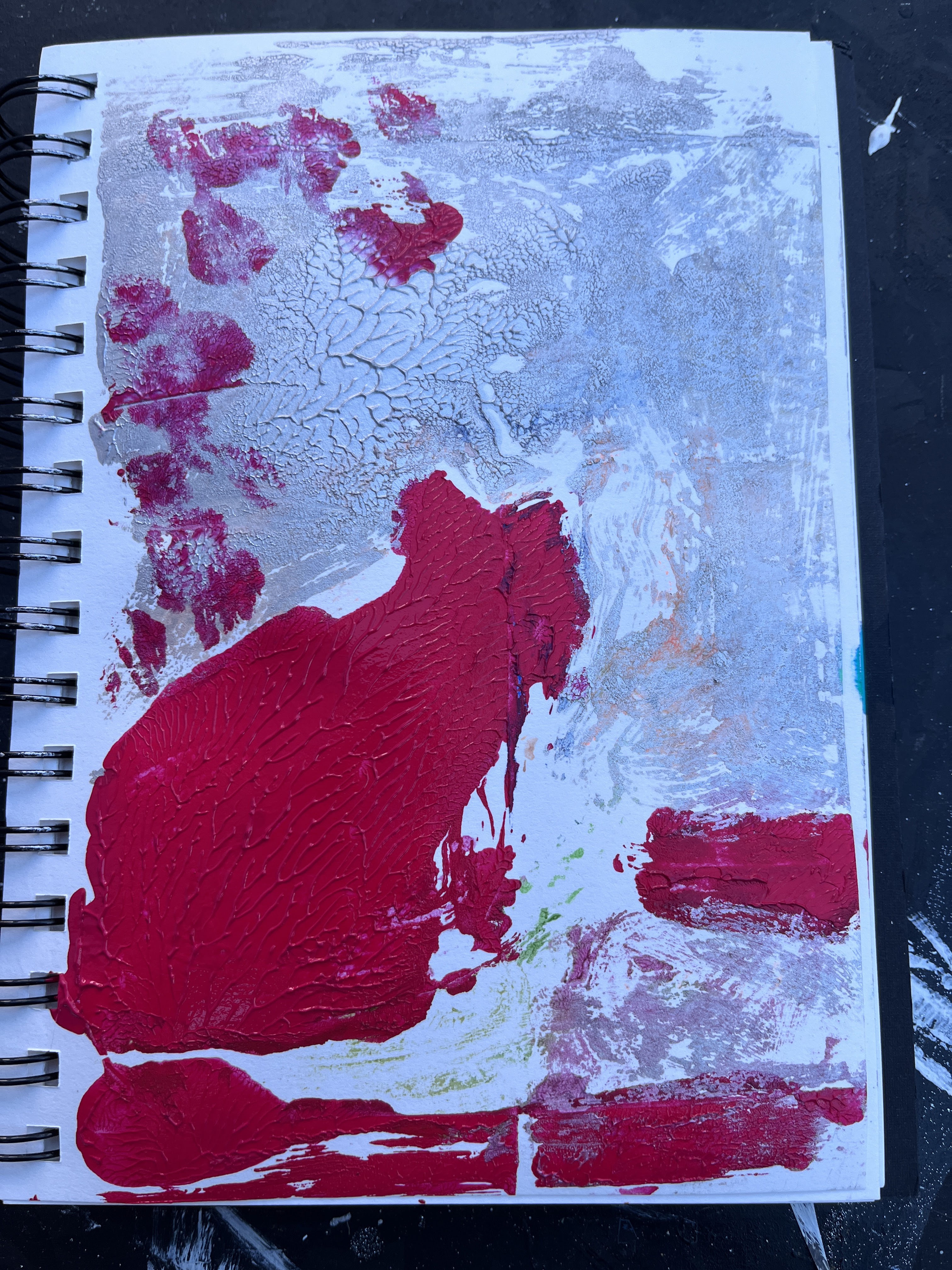
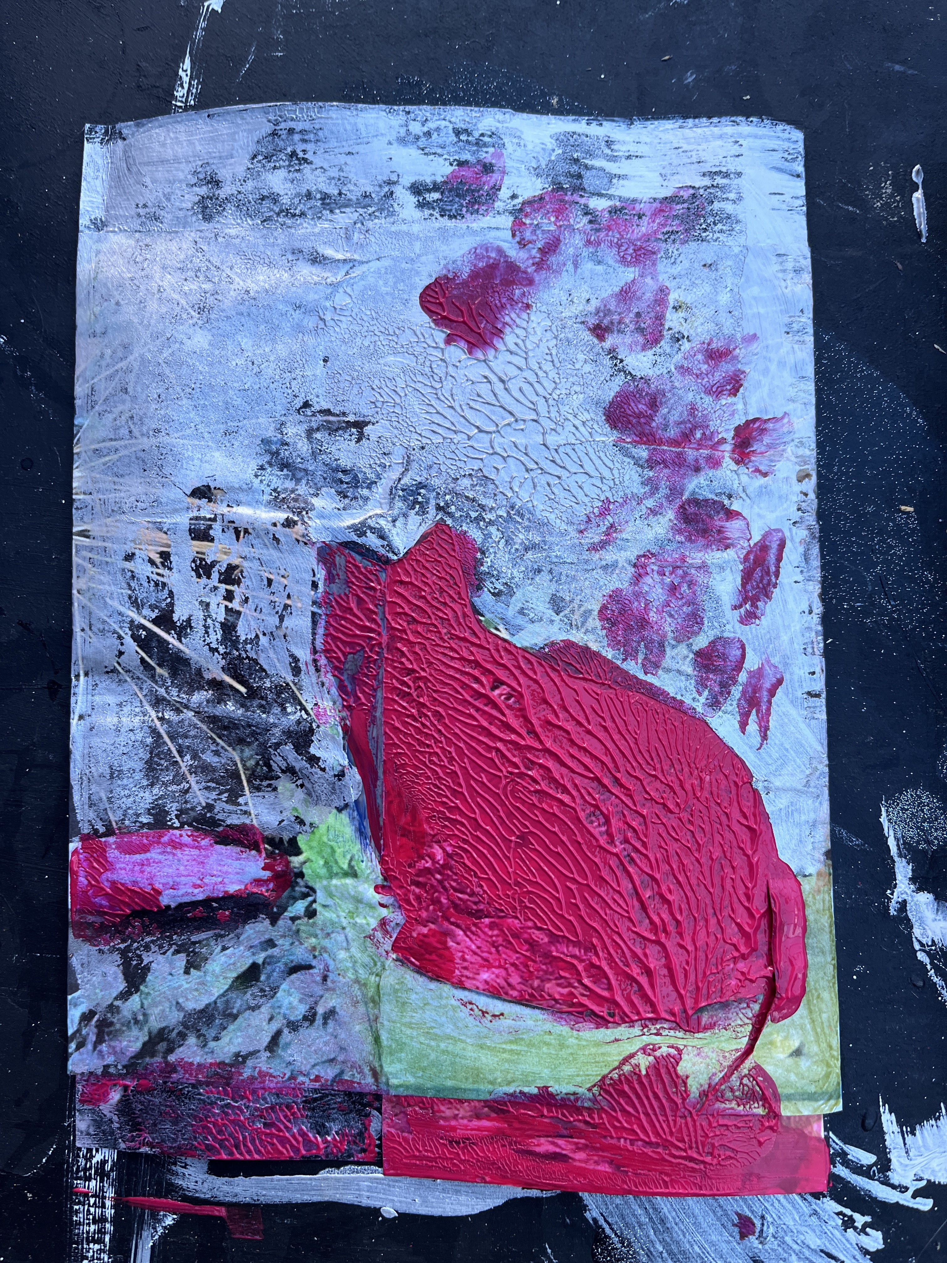
The first two images use the same photo featuring a cat which is both the filled space in the first and its reverse in the second – the paper is itself recycled from another work. Underneath are sections from photos of other pieces of work or scenes such as the fields or sea.
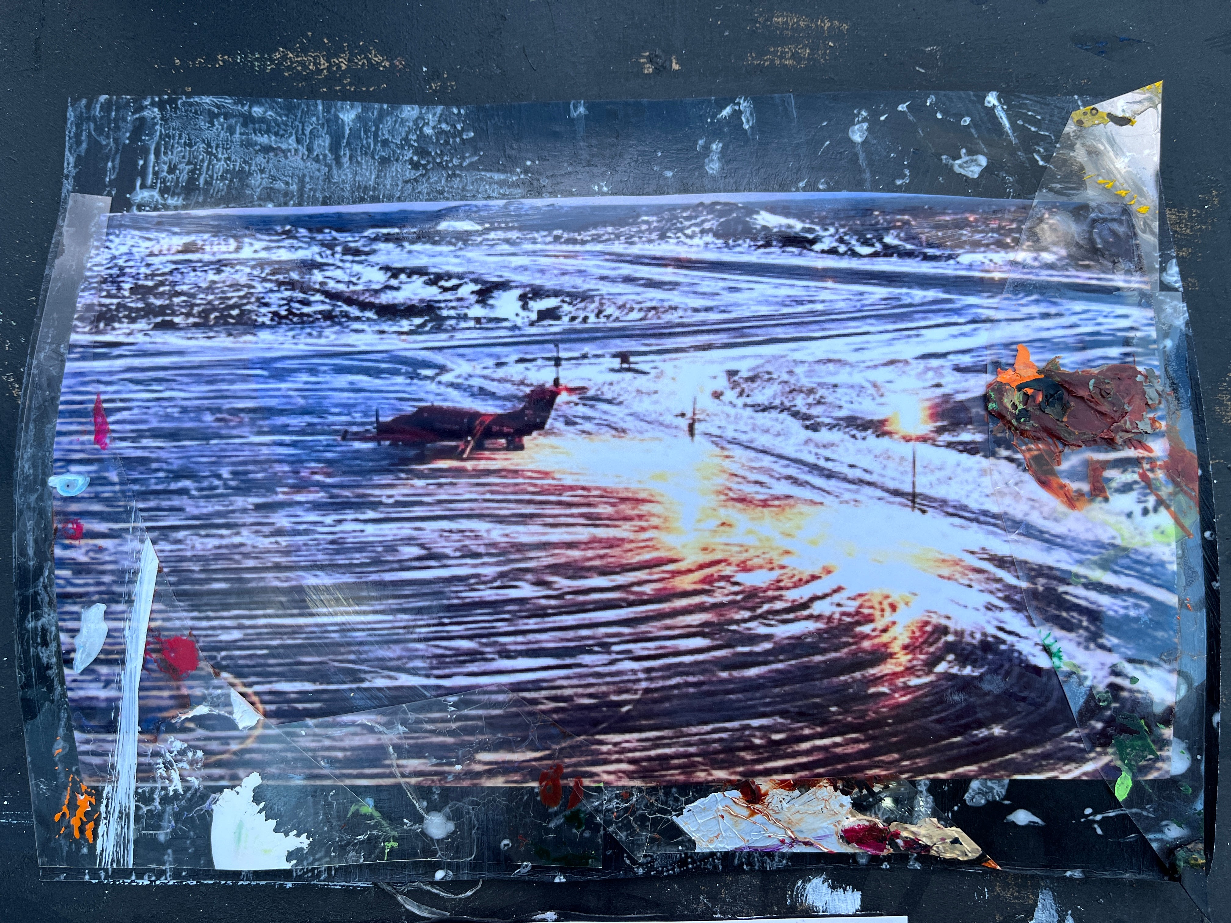
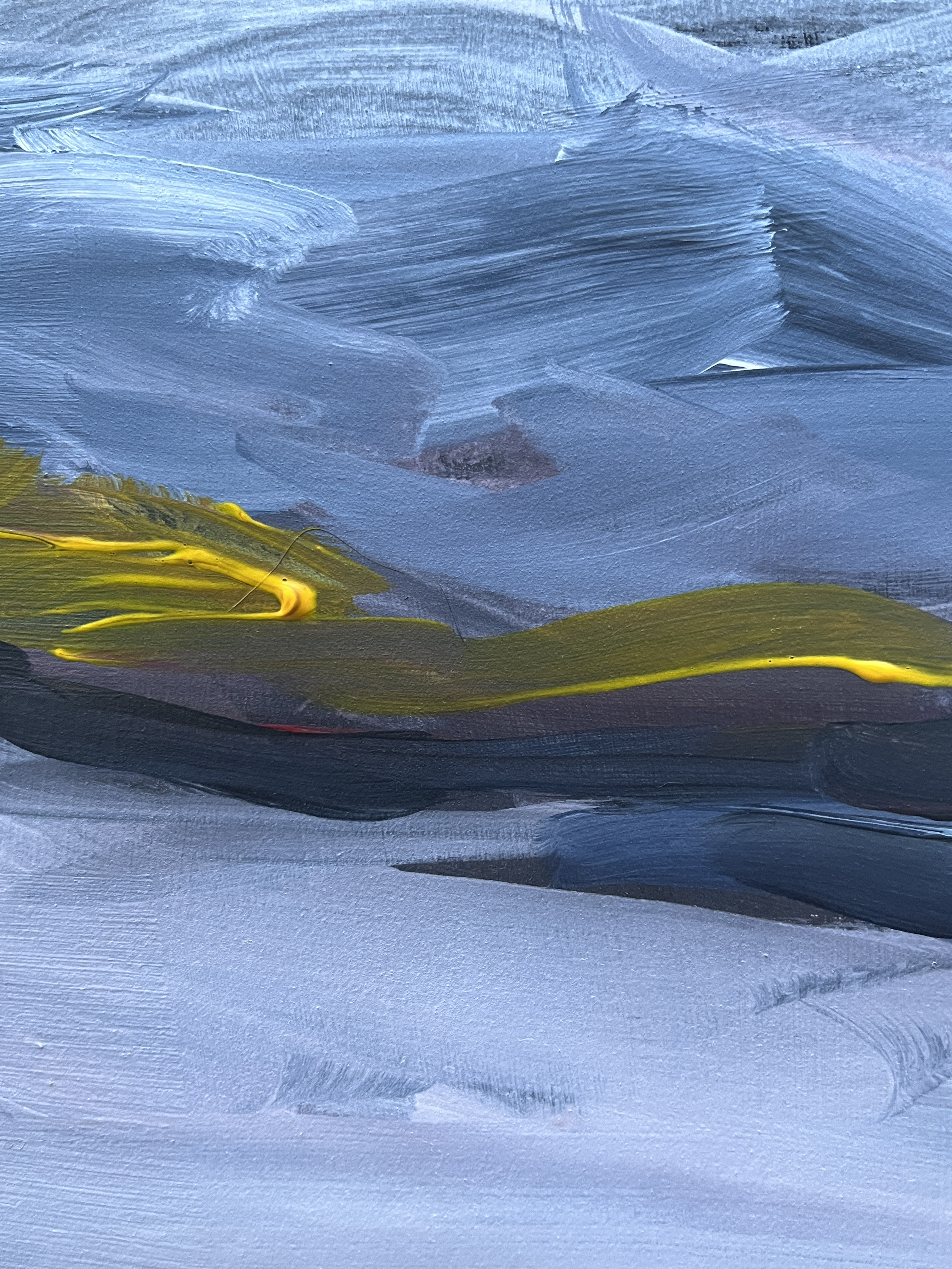
The next four images are based on screenshots from a live stream of Nuuk airport. The colours are magical and with the spots of white on black from the paint, give a sense of space that transcends skies. In the first, I have left that space – which really deserves a capital S – in the centre with a strip of airport at the bottom and a strip of natural sky with upside down trees under it. A surrealistic alternative universe, maybe. The second airport scene is a darker section where the planes park; Space is still present but there are pieces of glossed gold on black and parts of the OHP film I use to cover my palette. The two final Nuuk images use the same materials because, thinking of texture and how photographing these small pieces would render them flat, I wanted to maximise the textural profiles of the originals. This group is probably the one that attracts me most for its colours and sense of space and Space.
The final two images I find less attractive despite much of the colour being similar and the materials also the same.
I went on then to try printing across from one image to a blank white sheet of cartridge.
While I am not over-enthused by the result, I suspect this has as much to do with having little idea quite what I was aiming for, which feels fine for where I am in this process. I have printed across before, and also used palette film and collaged materials so I know how these might work.
The second part of this exercise is to paint (I think) a series of A5 paintings drawn from or based on this first part. The idea is to work quickly but to emphasise the illusion of texture.
I have enlarged this to A4 because my close vision is not up to smaller scale work. In fact I often work at A2 or A1 scale and make detail by standing back to get an impression of the whole before moving quickly in close to execute approximate marks. Impressionistic and gestural is definitely a better bet for me than photorealism although I have detailed a jumping spider using acrylic pens.
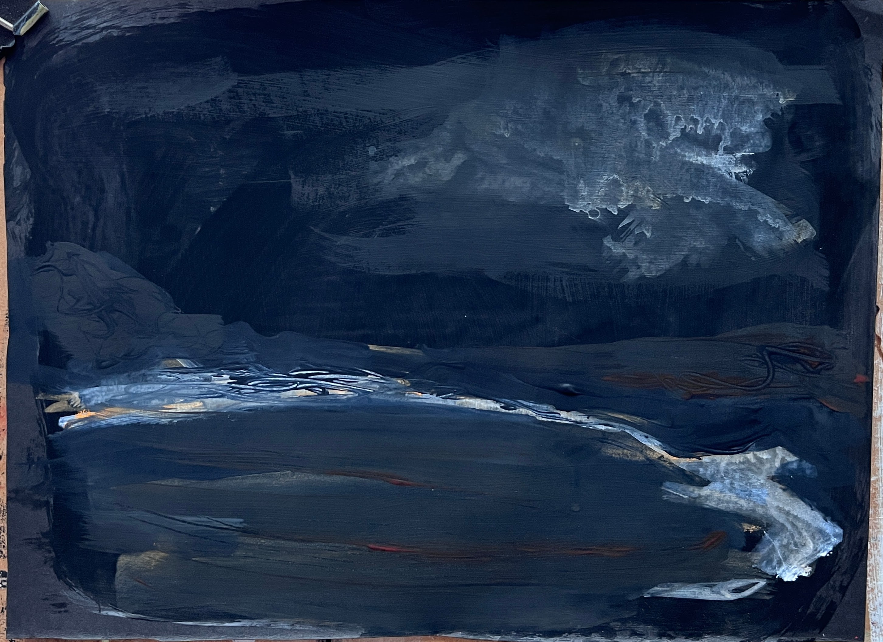
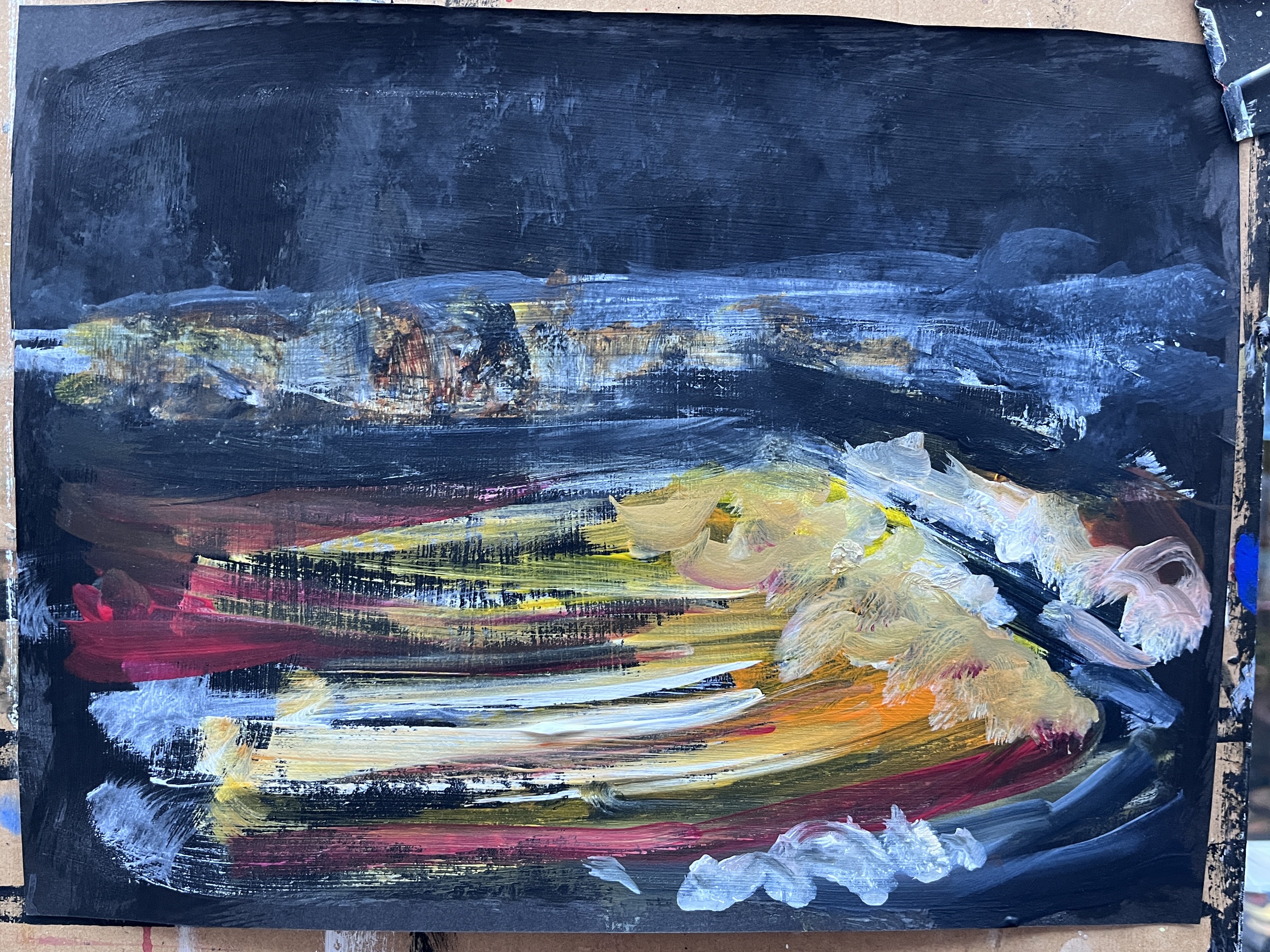
My starting point is 4x A4 sheets of black cartridge strengthened with clear primer, and because I’ve chosen the Space series, the next layer will be matte black.
29th December. I’ll admit to feeling somewhat adrift here but I think I may have stumbled upon a solution that meets the brief and also my own agenda.
After contemplating a series of cats and rejecting that option despite the fact it offers many ways of showing fur, I returned to the airport. These A4 pieces are on black cartridge prepared with transparent primer and a layer of dilute matte black 3.0 (Semple). I based them on screenshots of Nuuk airport at different times of day or under different weather conditions.
Black doesn’t photograph well at the best of times, not even Stuart Semple’s matte version, so I’ll need to try again under natural light tomorrow for at least one of these.
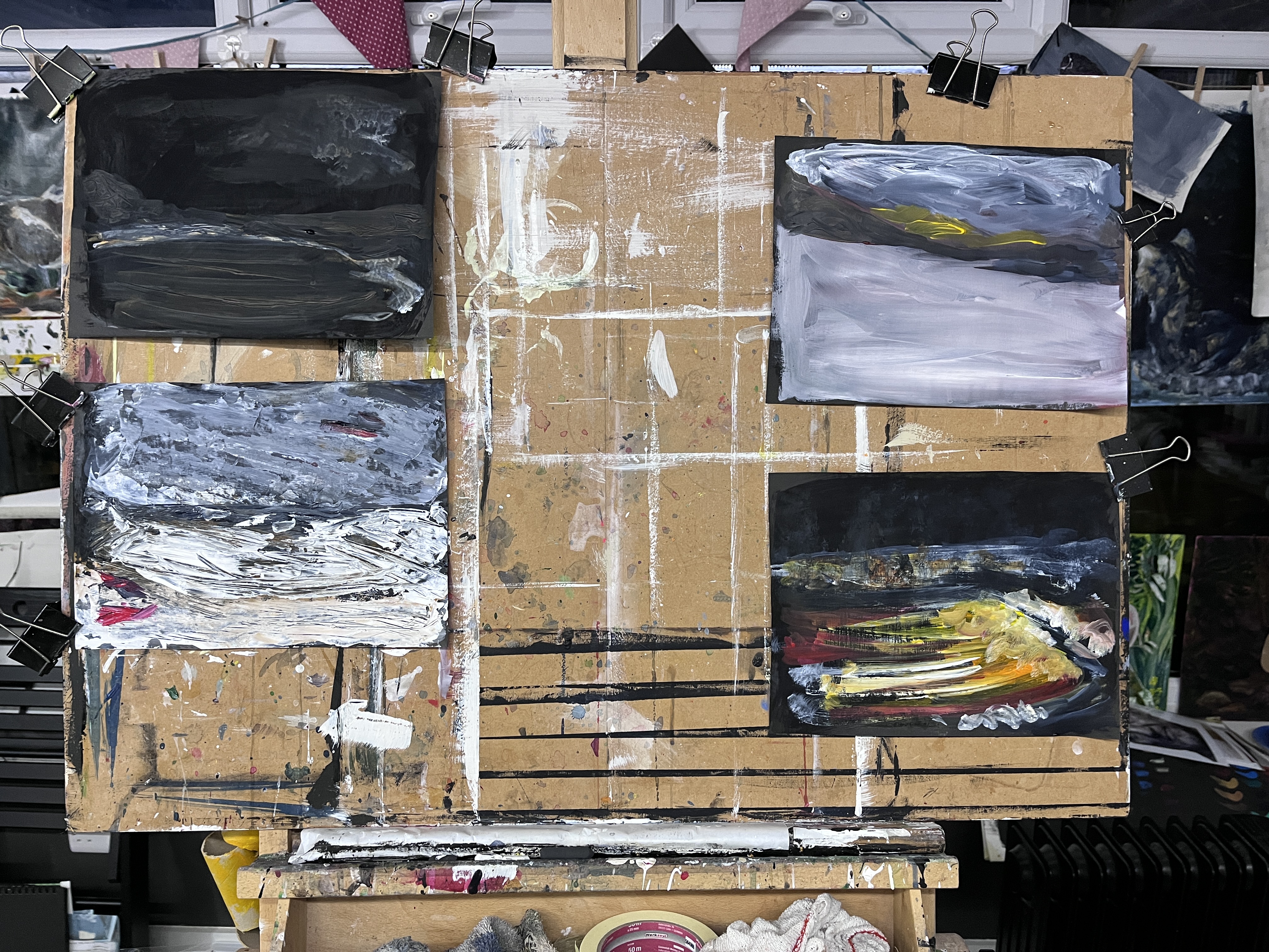
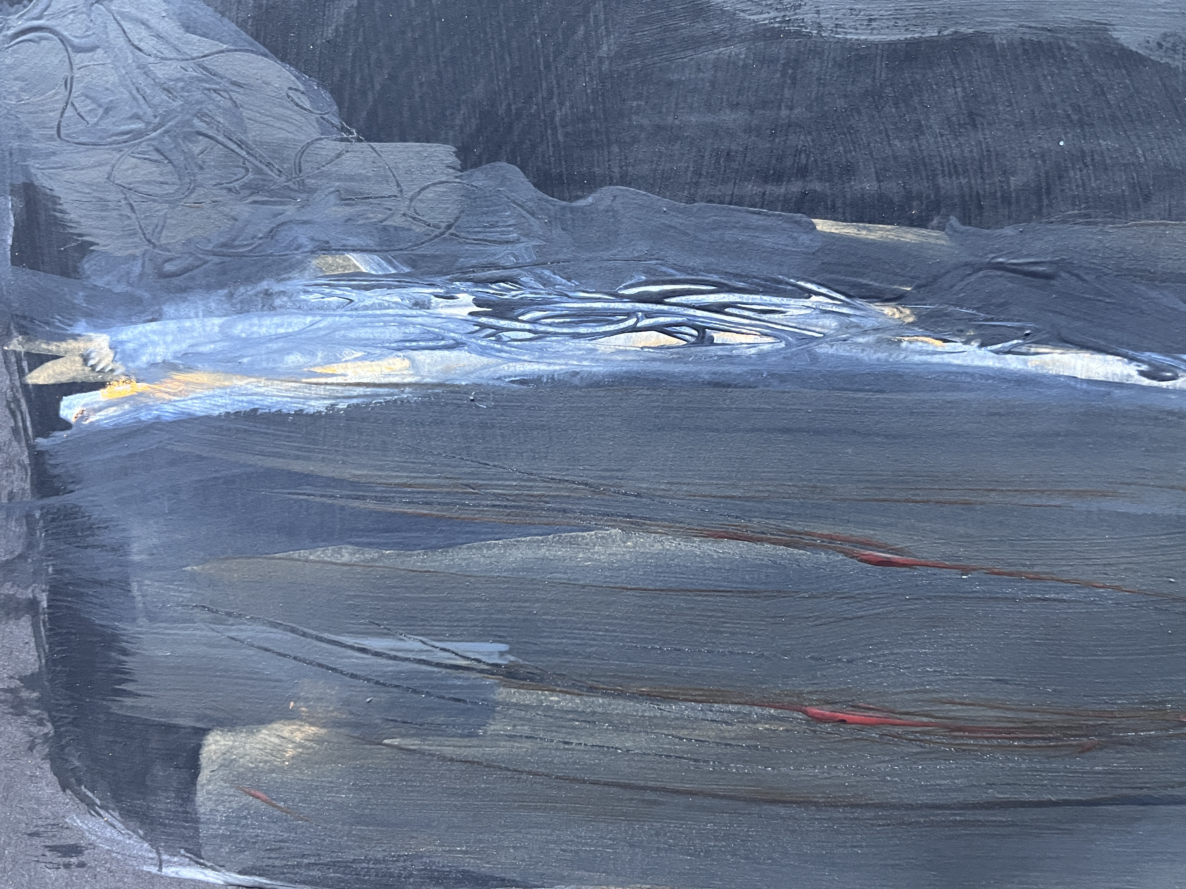
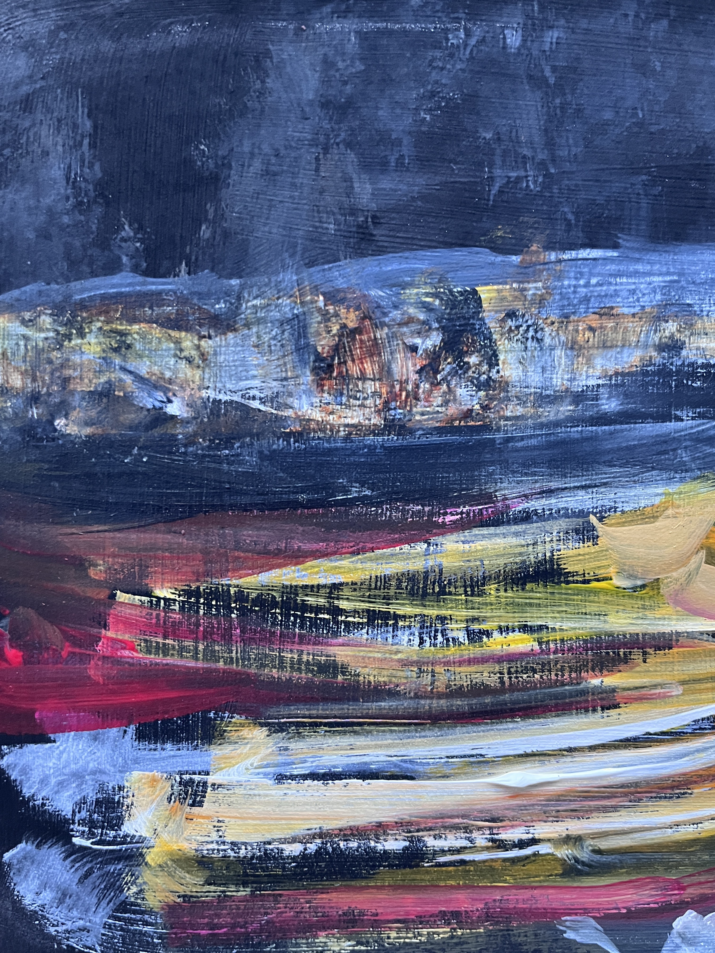
Using dilute paint which I let drift down and then up the page to leave watermarks, I added small streaks of colour to indicate residual snow and the lines on the tarmac area towards the front. I supplemented brush work with some dabs of a sponge.
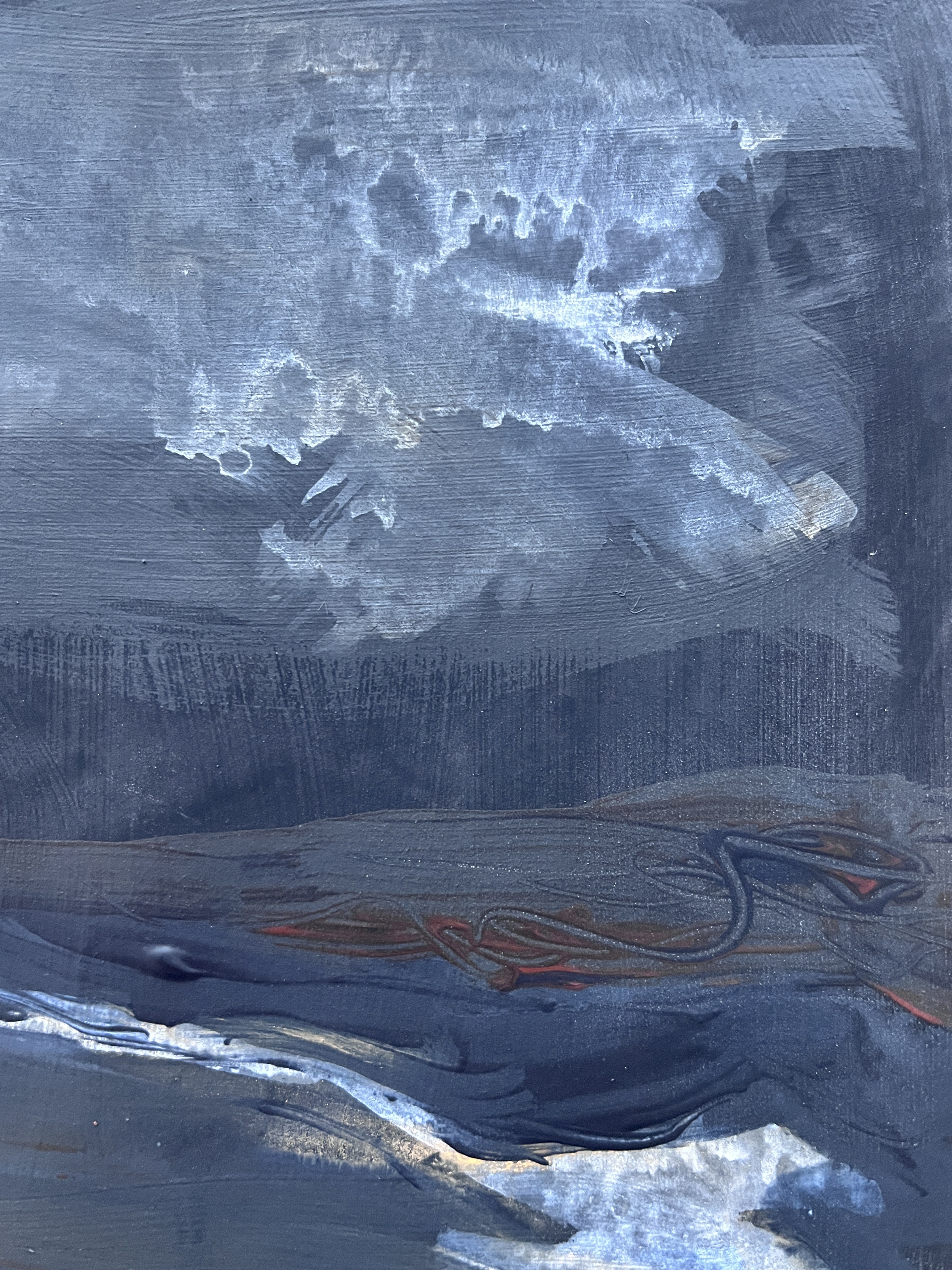
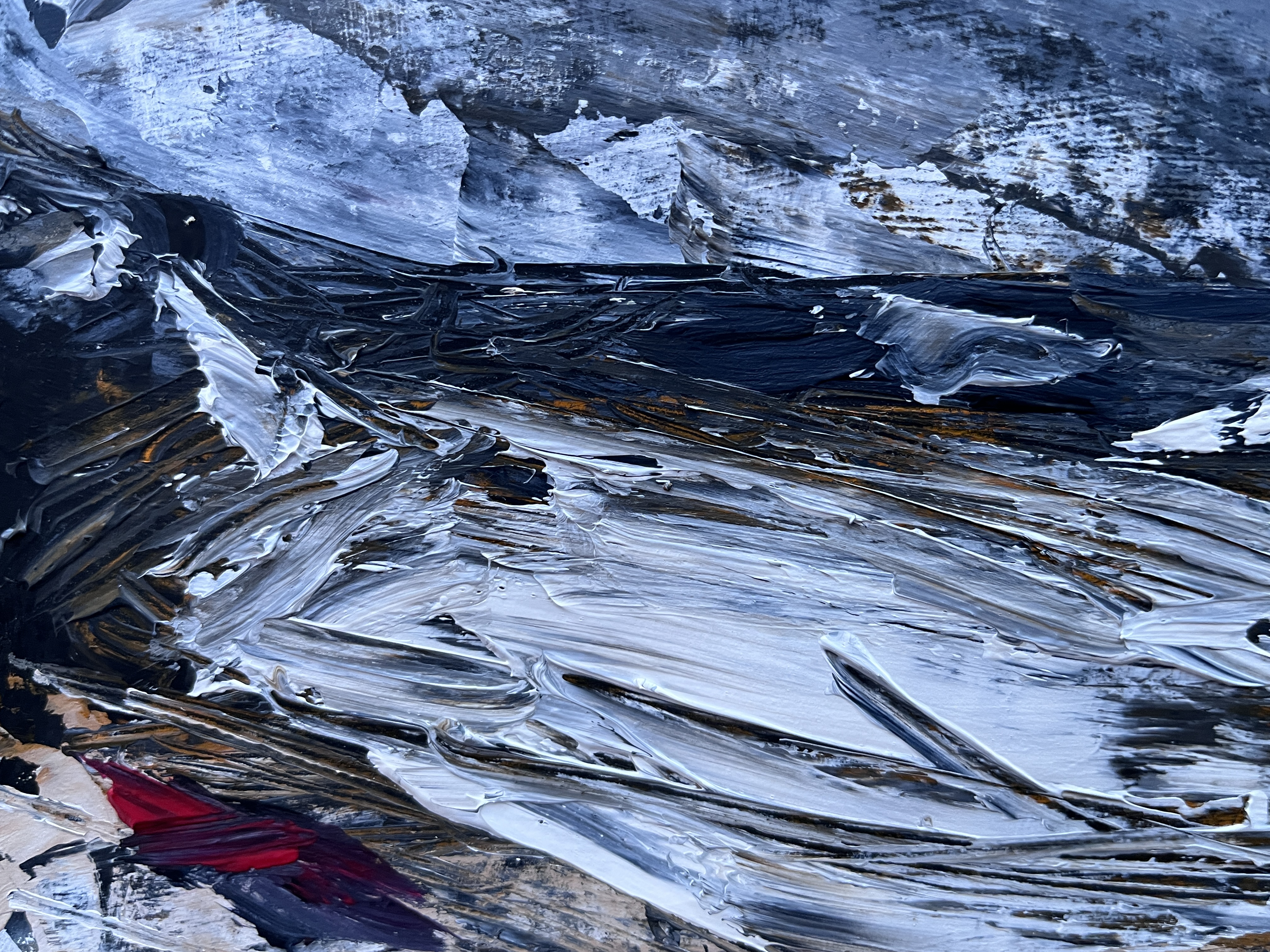
This is the airport under heavy snow. I’ve used broad brush strokes to make the smooth snow, a smaller brush for the turbulent sky, and a round brush for the sun leaking over the hills. A damp flannel helps to smooth out unwanted marks.

This is the airport at night. I’ve used the primer texture to add grain to the brushwork and a dry flannel to scrub down some of the top layers. There was some snow in this scene but the tarmac had just streaks where it had been cleared by a large plough. In the background, the lights are those reflected up from the town below, and the white streak at the horizon is the strange glow that also appears sometimes.

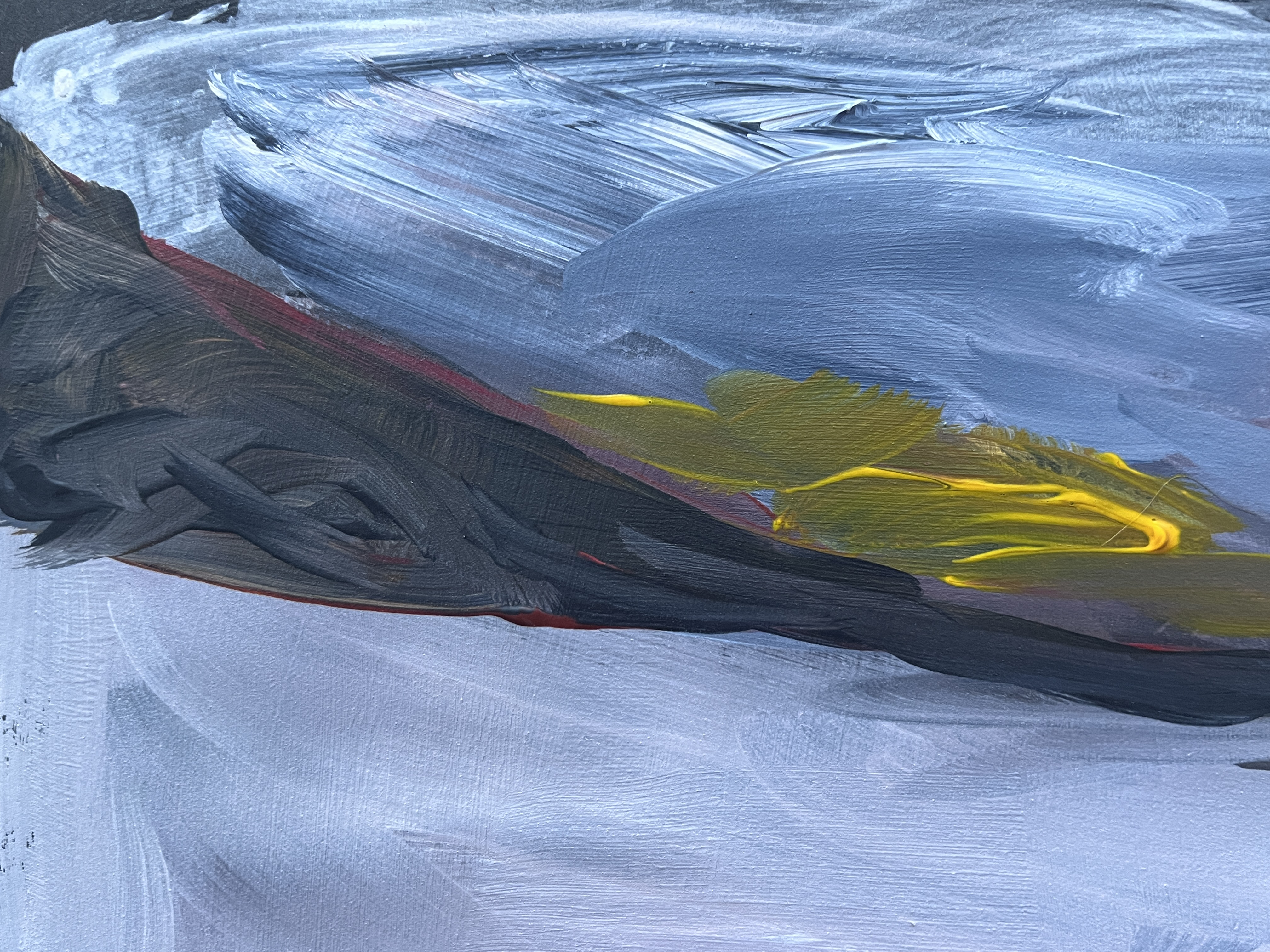
Again a very snowy scene with little of the hillside rocks in view. I used a palette knife to indicate bulk and to render the two planes – one on the tarmac, the other just leaving the runway. Further texture, lines in the snow made by vehicles, is made using the point of the knife. Unlike the others, this piece has inherent texture due to the thick application of paint.


I wasn’t optimistic about how this would go because, as usual at the start of a new module, the territory is strange and expectations hazy. But there was advice to work quickly and that always stops me from fiddling unnecessary detail into things. When I do that, I over-work the paint and the support and ultimately the energy of the painting itself. It dies in front of me. So having to put some pace on, to work loosely and, by choice here, with implements such as a sponge and a dry flannel that might lead to the inference of texture, there’s half a chance I won’t stifle it.
I wouldn’t actively choose such a small scale for reasons I gave earlier, and in fact I discovered in a previous module that, if I worked large with the smaller task somewhere within it, I would often meet the requirement by cropping it from the whole. I’ve yet to figure out the mechanics of this; why I can make something small in a large painting but not in a small one. Possibly the larger scale allows for a more intuitive and gestural application of medium that frees me from the constraints of those narrower boundaries.
This Jumping Spider, for instance, is painted at A1 but the detail survives in the much smaller crop:

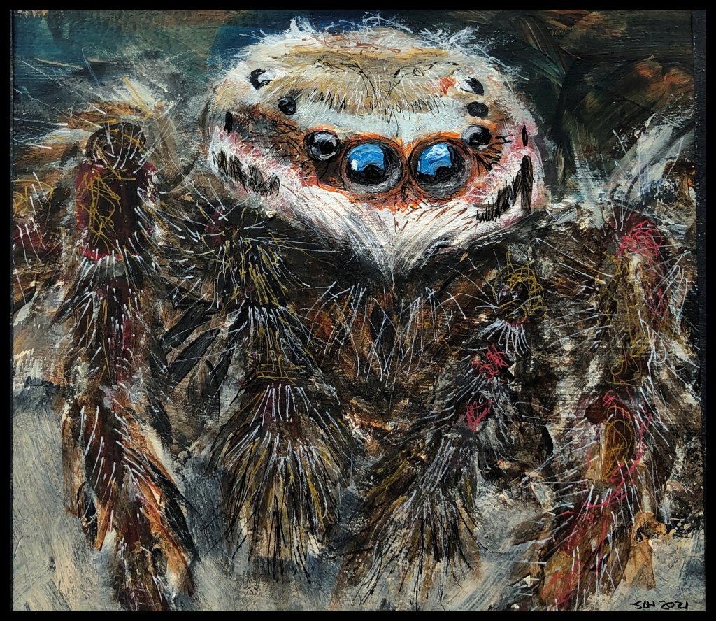
The fact that members of the insect group and others thought this was a photo when I posted it, suggests that, given the right motivation, I may be more capable of photorealism than I would like to believe. That said, the actual photo looks barely real and so I have probably benefited from that!
What worked and what didn’t? I think that depends on the objective and I’m not sure I had one beyond producing something interesting enough to keep in mind for future reference. Every effort; however skilled, ambitious, inept, or mundane; is a step along the way to something I would not have been able to produce last month/last year/before I started the course and that feels good enough for now.
