
I am following a Coursera course on modern art which has just been discussing Barnett Newman’s (1905-1970) ‘zip’ paintings. According to the MoMA site:
His zips streak through fields of color in spare compositions that prompted critics to dub him a Color Field painter and Minimalists to look to his work for inspiration. But call him what they would, Newman maintained his own view of his abstractions. Claiming that he sought “to start from scratch, to paint as if painting never existed before,” he saw his compositions as forms of thought, as expressions of the universal experience of being alive and individual.2
Museum of Modern Arts https://www.moma.org/artists/4285?locale=en

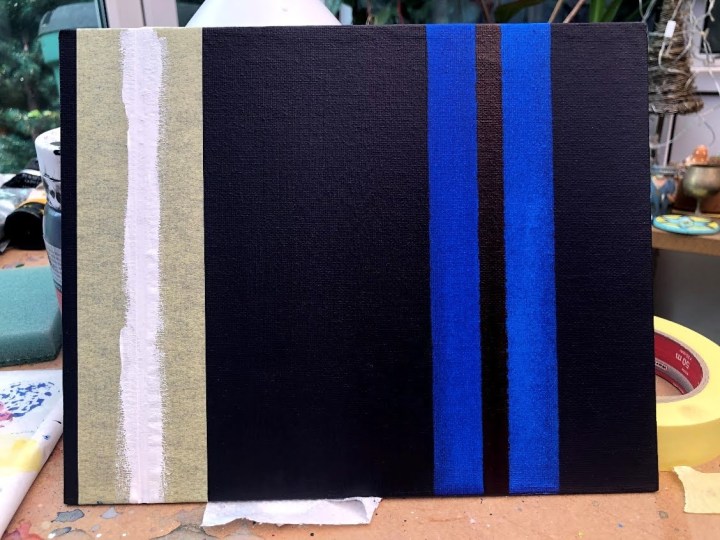
The next part of this section is to produce our own ‘zip’ paintings and so I have begun by preparing an 8″x10″ canvas board – a solid surface is recommended because this better accommodates the first stage which is to apply masking tape to a prepared surface – and prepped it with black gesso over a number of masked strips. Some of these will be zips in their own right, others will create zips of the gesso.

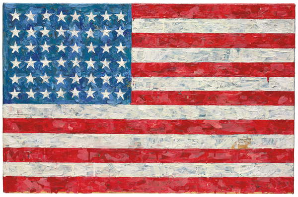
I have a plan (but not a design as yet) to use colours and painting style similar to those of Jasper Johns’ (b 1930) Flag (1960-66).
Fist pass with dilute phthalo blue washed over the entire board to deepen the black gesso and add colour depth to it, and to make transparent zips.
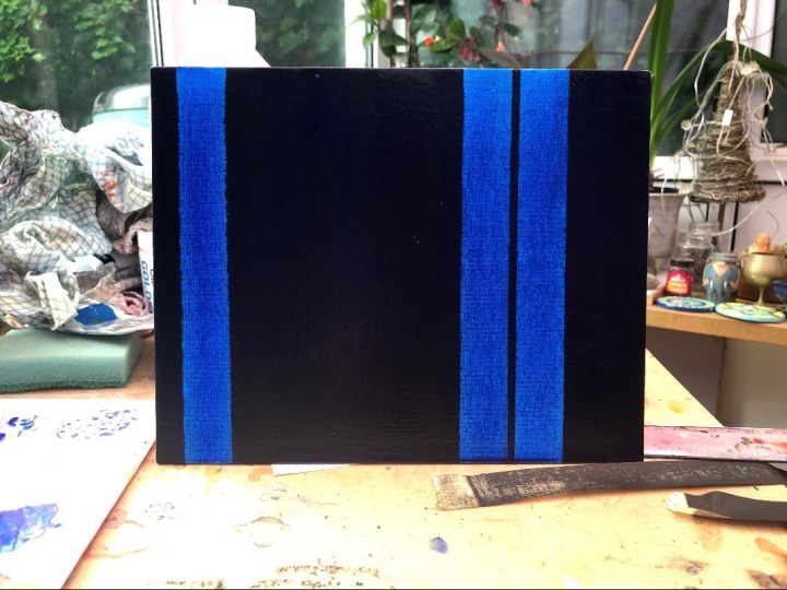
Next, I taped for another colour layer – Alizarin crimson – as a solid layer in the black strip on the right and as a wash for that whole section. Then I went for a narrow white zip on the left, next to the blue strip but messed that up trying to be clever-clever and drag some pigment out into the centre area. I’ve re-gessoed that area and washed the whole again with phthalo blue. Now it’s taped with the titanium white added quite thickly.
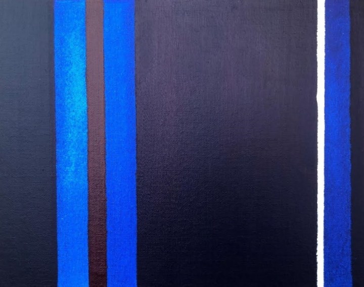
I’m not sure how valid this is as practice but, in painting the final layers I turned it upside down and I think I like it better!

Dark colours don’t fare well in digital photography because it tends to average out the darks and lights, taking out the extremes (so I’m informed by a photographer friend), and so I’ve taken some detail shots which minimise the amount of available light differences the algorithm can work on. The first shows not just the red strip to better advantage but the ‘shadow’ strip to the left of the blue where I’d masked the blue wash layer and added a phthalo blu/Payne’s grey wash to darken the edge without losing the hint of colour. The detail on the right I think shows up the crimson wash a little better.

So what did I learn from this? First off, a five year old could not do it! This is a challenge of intent, balance, off-setting, accuracy, and brush/paint technique. The video (Cory D’Augustine – Coursera Week 2) prior to this exercise on making that first layer smooth and being sparing with medium was invaluable. Paint handling has to be more precise than is necessary in my blocky, impressionistic style – water makes bubbles if a brush is used energetically, and it runs and pools so the position of the support is important along with softer, more controlled brushwork. I set mine vertically with some paper towel at the bottom to wick away run-off. It’s also a challenge of message – Newman seemed to have something to say in his work even though it might have been inaccessible to many and while I had, it wasn’t obvious to me how I might do that never mind how a viewer might ‘get’ what I was saying. Does it matter? I’m not sure. Reversal didn’t, in this instance at least, so maybe everything is in the title – a cue as to how to view it and where to start on thinking about it. Or it would be if it were going anywhere.
Another thing I’ve learned is that trying to replicate a style (as opposed to copying a picture although that is a valid practice activity too) engenders a new respect for the way a given artist might work and the product of that effort.
So what was my theme, and why these colours? This is very topical. The pandemic has put strains on all our public services, not least the National Health Service. Blue and white are the colours of the NHS logo while red symbolises the lives it saves without charge. White is the thin line of resources it has to do this, and the shades of dark are the hidden properties of COVID-19 and the unknown numbers still infected. Very immediate and not at all philosophical but in Maslow’s hierarchy survival comes much nearer the base than esoteric thinking.
Cropped (Microsoft Paint) and straightened (PaintshopPro 2020).
I’m seeing after images of zips and I hadn’t expected that; something to capitalise on when making paintings like this, perhaps.
Barnett Newman, Museum of Modern Art. [online] Available at https://www.moma.org/artists/4285?locale=en. Accessed 27 June 2020.
The Barnett Newman Foundation [online] Available at http://www.barnettnewman.org/. Accessed 27 June 2020.
Abstract Expressionism. MoMA Learning.(undated) [online] Available at https://www.moma.org/learn/moma_learning/themes/abstract-expressionism/the-sublime-and-the-spiritual/
McLeod, S. 2020. Maslow’s Hierarchy of Needs. Simply Psychology. [online] Available at https://www.simplypsychology.org/maslow.html Accessed 27 June 2020.
