
The first page of this section advises looking at the assignment before going any further, presumably to help direct our thinking around the various exercises that build up to it.
The task is to make a series of three to five paintings linked by subject, technique, or common theme and, while this may change as I progress through the preparatory work, at the moment there is really only one show in town – lockdown art. I have tagged almost every piece I’ve posted to Instagram from this module in this way, and so much of my work has been constrained, inspired, and motivated by this context. Like many, I’ve been emotionally battered and also freed up to flourished by lockdown, isolation, and the fear of an unseen killer.
26th June – today I’m making a start with some ideas. Lockdown brings the obvious to mind – locks (and keys) so I ran a search for some interestingly rusty ones as most of us will be rusty in some respect or other when we finally break loose. Driving for instance; there are already reports of an increase in accidents as restrictions are lifted.
Locks also feature on rivers or canals and one of the more calming activities I’ve found through this mayhem of defined and undefined threat has been Slow TV. One of these is an eleven hour journey up a Norwegian fjord where we all pause at multiple points to rise up a level towards the source of the flow up in the mountains.
Lockdown has also been a comedic feature of Pointless when a number of participants find themselves at an elimination crossroads.
And also more obviously there is the dramatic lockdown of prisons in a crisis of control.
Wikipedia says this:
A lockdown is a requirement for people to stay where they are, usually due to specific risks to themselves or to others if they can move freely. The term “stay-at-home” or “shelter-in-place” is often used for lockdowns that affect an area, rather than specific locations.
The term is used for a prison protocol that usually prevents people, information or objects from leaving an area. The protocol can usually only be initiated by someone in a position of authority.
Wikipedia [online] Available at https://en.wikipedia.org/wiki/Lockdown. Accessed 26 June 2020.
This is quite a sweep; one that goes from the institutional through entertainment to the leisure industry via a pandemic. All of them though, authoritative.
I made a start with shapes and colours, drawing on my experience of ‘booklet’ printing. This is an A1 sheet of cartridge prepped with transparent gesso, drawn out in black conte, and painted using a mix of System 3 copper and PVA which I’ve established adds a slight gloss to any medium. In the meantime I’ve found some texture on a wall in my studio and pulled this out with oil crayon. I intend to do the same with other textures around my house as this is the environment to which I’ve been confined since mid-March and where I’ll most likely be obliged to stay for some time yet. The internet has been my window on the rest of the world and my source of references for almost all my work in this module.
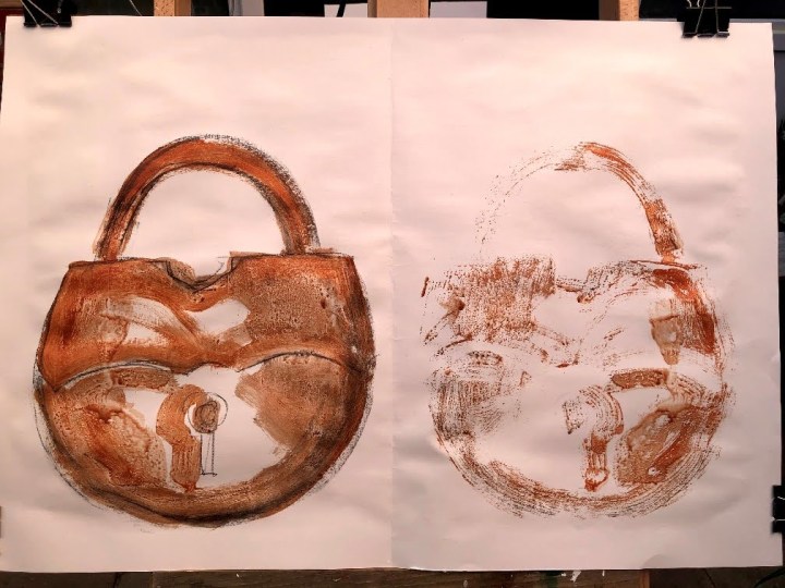
Next, I applied some Payne’s grey quite thickly to the image on the left (source) and folded the sheet over to pick up paint on the right (print). When it’s dry, I’m going to scrub some of the paint back on the source to expose the gesso texture. The print looks like an open padlock, or maybe one with the illusion of being open which might reflect the current political position of failed messaging and apparent loss of contact with the science it claims to follow. The paint roller is my ‘printing press’.

In experimental mode, I dragged titanium white across the source with a pebble and printed it to the other side. This wasn’t at all interesting even after spraying it with water and rubbing it with a flannel. So I mixed Payne’s grey with cad yellow and polymer varnish medium.

This produced an oily khaki effect which may take some time to dry. The keyhole looks like an interrobang, an amalgamation between a question mark and an exclamation point often used to express a WTF position but with more decorum.

This did not respond to being scrubbed the way I’d hoped so I added another layer of colour – this time bronze – and printed across. It seems rather flat and there is only so much that cartridge will take so I will probably end this phase here. What I’ve found is that the print is very secondary and I need to focus on the source; to develop that more and look into aligning this version of a lock with some of the others. I’m also thinking of integrating collaged pieces of text referring to my vital delivery services; largely food and supplies from the supermarket, the local fruit and veg box people, and Amazon which is the source of almost everything else.

June 29th. I dribbled and mopped some inks into these – orange, purple, brown – to work with the bronze and the white gesso. Then I used black conte to bring out the under-textures. I also found some old eyeshadow and rubbed this into the surface – bronze and green – but this disappeared, as did some of the conte, when I applied a layer of liquitex gloss varnish. Both have dulled considerably which is really not what I’d wanted. However, in the process they have become independent entities needing different approaches and treatment. I want to lift out the negative space in the print and burnish the source with bronze, the red-gold and some of the green eyeshadow, then find a way to fix these without altering their nature if that’s possible.
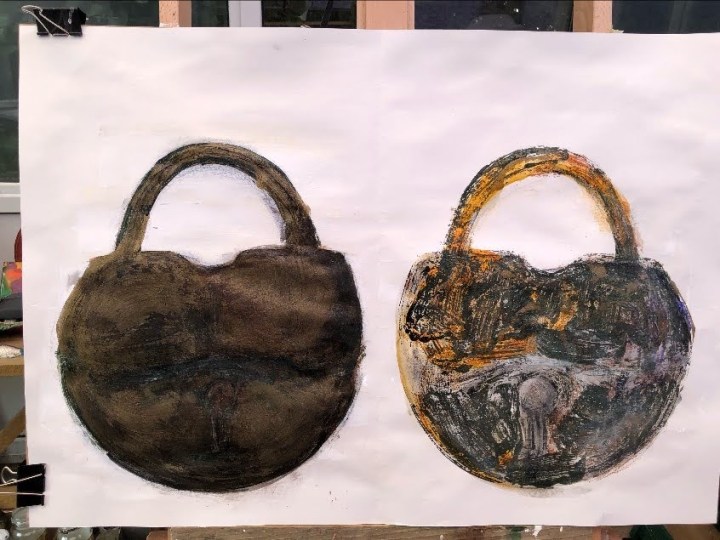
Last pass – eyeshadow in green and rose gold rubbed into the surface, black conte used to define the key hole on the left and white on the right. Detail crops below.


These each have interesting qualities I can consider for later, and failures (the varnishing for instance) I can avoid. I see I’ve lost the interrobang.
Time taken: approx 10 hours.

Dunno if this is any use, but something you could do with your monoprint side is to consider masking with a bit of paper cut into a shape or a textured thing like netting or something…
LikeLiked by 1 person
Erm, which side is the monoprint side?
LikeLike