
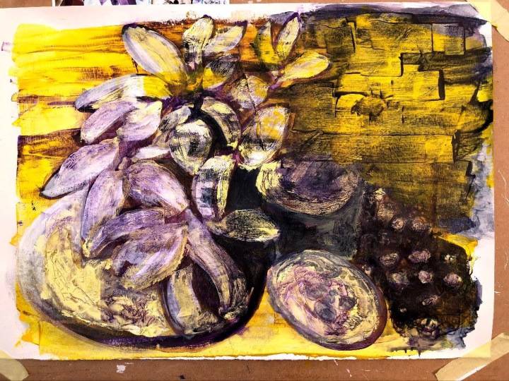
Abstract art is not my favourite genre to view so it’s not surprising I’m finding it difficult to find a way into this task. First though, I found some shapes in a Hoya plant in the conservatory, took a photo, then reversed the colours so that the shapes came out more prominently having lost their immediate identifying shades.

I prepared an A3 sized piece of cartridge with white gesso, determined it to be portrait orientation, then folded the photo in half for a better composition so that it became landscape. I drew out the major shapes in watercolour pencil then filled them one at a time with plain water, dabbing medium into the water to let it run. Thereafter, I added and subtracted colour with a brush and a flannel, and dragged a complementary colour across using a pebble. More reduction was obtained by swirling the pebble in areas of wet medium, and then it was left to dry.

This feels like progress. Yellow mixed with white and applied with a tiny pointed palette knife then scored in lines, circles, and hatches while wet. I laid the other half of the A2 sheet on top of this while it was still wet and got a yellow print. That’s drying while I think about how to use it. The image is reversed left to right so I think I’ll be forced into looking at it as a different image.


Running repairs! I was a little too enthusiastic with the scratching and scrubbing and lifted some of the surface off the support so I’ve flooded it with white gesso. As an unexpected benefit, this has removed the very linear leaves on the right and improved the composition so I will work with that – gently!

20th June. Repaired section and unwanted element obliterated with a layer of undiluted yellow then a wash of purple/Payne’s grey mix, each dragged across the space with the long edge of a pebble. This brought out the texture of the under painting and so I did the same towards the left, lightening the tone along the way. Some interesting ‘brick work’ emerged on the right.
This is about as far as I can push this, given the probably condition of the support underneath the paint. I think it qualifies as abstraction in that shapes and values have been converted into complementary colours but otherwise left without detail. The shapes are primarily circles, ovals, and now some serendipitous rectangles.
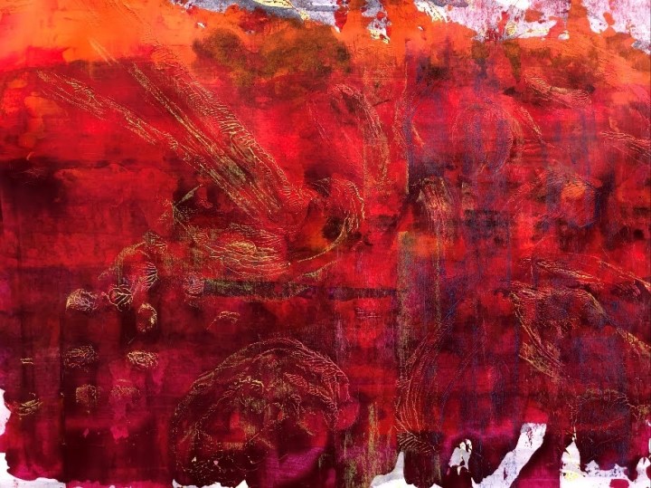
The second string to this exercise is the print made by laying another half sheet of A1 on top of this when it only the yellow/white marks had been applied. Dried over night, I applied three large strings of paint – orange, red, and magenta – to the left hand side then dragged these across the surface simultaneously with a ruler. As the surface was unprepared, much of this was absorbed and settled as a transparent layer over the impasto. Some more pulls with the ruler exposed more of the underlying lines. These don’t show up too well in the photo but, once dry, I will pay more vigorous attention to those peaks, those little ordnance survey contours, to draw them out a little more.

Not quite as planned, I washed the surface with dilute purple/payne’s grey mix which darkened it more than I’d intended so I dragged some more orange, red, magenta across to re-energise the colours. Then when it was dry, I tackled the contours again with a rough rag, and pulled them out further with hard, coloured, conte crayon. 
Not overly impressive but the details are quite nice …

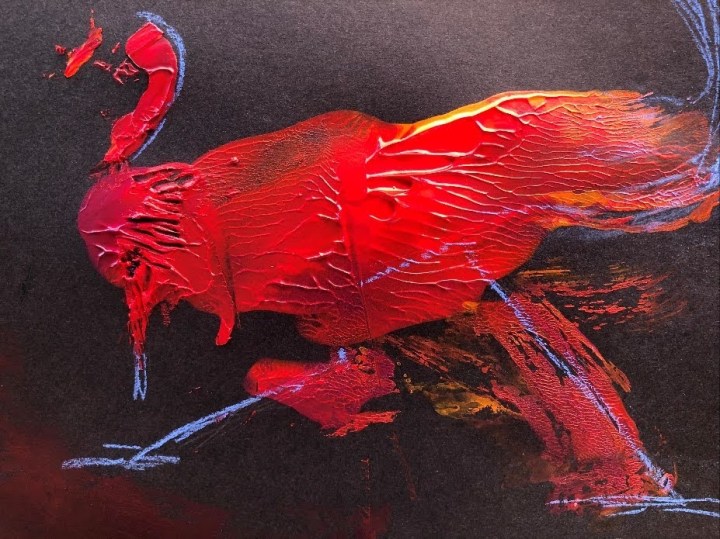
… and if you press remaining paint on the palette up against some black cartridge, you get a bird.
I enjoyed this more than I expected. Hopefully, that will transfer to the next exercise – an abstract based on manufactured objects.
Time taken: around 8 hours.
