
I really should have turned over the page before making the previous painting! Still, this is about line being more important than colour which makes it different and also even more difficult as there’s nowhere to hide with just these elements.
I have four candidates; three of them photos, one a sketch from before lockdown.
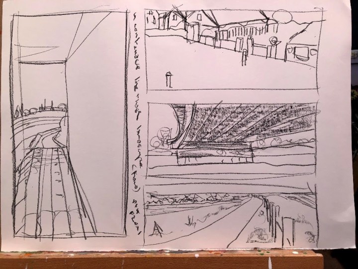
These quick sketches in black conte give me a feel for the territory, the composition, and also how well each one might fit the brief. I am tempted by the idea of using just one continuous line for the one top right, or a series of horizontals for the one at the bottom.
Middle right has quite a lot going on in terms of foreshortening and some quite complex perspective shift in its shape. The left hand drawing has potential for drama – a big, weighty concrete underpass (the part visible actually in the middle right image) with some interesting serial curves following the footpath, the bank, the river, and then the repeated physical elements over the other side.
The bottom image shows houses at a distance and a very long perspective along a foot/cycle path near the beach. There are several converging lines: shoreline, beach, fence posts, gravel, path, scrubby vegetation, a freshwater area, houses, and trees. The shoreline continues towards the right into the distance and catches a small (in relative terms) area of sea.
I’ll be looking at these for a little while to see which leaps out, if any, as the best contender for this piece of work. I’m slightly biased in favour of the townscape and the seafront because I did a few underpass pieces for the Drawing module.
I chose the seafront for perspective, line potential, and the distances involved. I prepared a piece of recycled A3 cartridge, drew out the various lines in black conte, which turned out to be a mistake because it then merged with the transparent gesso in the centre of the support. I had used white gesso on the wide borders top and bottom to retain the letterbox dimensions.
Then I tried to make lines with a brush, something I find difficult enough when I can use a large flat one but this called for something much smaller and pointed. I really didn’t get that in place at all.
Then the ‘wash to indicate colour’ morphed into my preference for something rather more meaty and while the lines are still their, I’m not sure this is a reflection of the brief as intended. Still, I do quite like it. There’s a simplicity to it that I don’t usually manage, and at this slight distance, there are shadows and tones I hadn’t realised I’d achieved – the form of the fence posts in the bottom right corner for instance, this is something I had tried for but I couldn’t see it until I had it onscreen. Also the sunlit part of the beach has come out better than I had thought. The rough scrubby foliage on the left could do with a bit more definition probably, although that would really take this away from the purpose of the exercise. The support is quite fragile and won’t take much more so I will leave it as is and try for another version tomorrow.
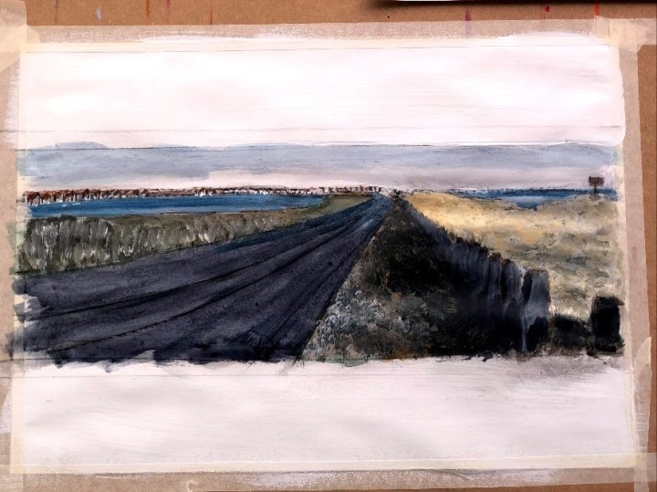
Details:

This time I’m using a piece of A1 mounting card on the grounds that it is little use for its prime purpose at present, and maybe never. It’s black, chosen to provide contrast with the white gesso I have applied in the letterbox aperture for the painting.
I have tried for line again and somehow managed to go off-piste, following my preference for broad brush strokes. We’re only at the beginning just now, so things will probably change after I’ve prowled round it and seen it on screen a few times. Looking at it now, things really will have to change and soon!

In this version, I’ve added weight to the monochromatic landscape, emphasising the lines of demarcation between blocks of light and dark. In places, the paint makes edges of its own as an impasto line. I might capitalise on that.
What I can see straight away now is that there needs to be some intensity balance at the horizon so I’ll probably bring up the tone on the left, adding sharper blacker lines to the roof tops. The paints I’ve used here are titanium white and Payne’s Grey which has a lovely bluish tint to it. After advice from OCA regarding photographing of images, I’ve used portrait mode on my iPhone. Apparently this mode uses a different lens from the regular one and I do find I have to stand much further away to accommodate any given area. I’m not certain what that does to the quality of the image though, and in any case, I resize them before posting so that I don’t run out of media space on the free version of the blog.
I’m beginning to like this.
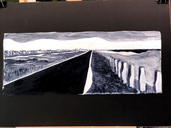
This, I think, restores the balance, emphasises lineality (I believe I made that word up), and removes spurious detail. I’m going to leave the edges where paint has encroached beyond its letterbox margin so that it doesn’t feel too precise at that point for its core imprecision.

I still struggle with lines even though that was where my whole drawing skill seemed to be located when I first began again at a local art club a few years ago. Admittedly, those drawings were on a much smaller scale and didn’t rely on controlling a flexible end point on a relatively lengthy tool. But this has ended up better than I’d expected and, as usual, better than the first iteration.
Time taken: I have lost track but I began this exercise about four days ago and worked on it every afternoon. Estimate is around 16 hours.
