
Aerial perspective has nothing to do with dangling from a hang glider to make sketches. It’s about how tone and saturation bleed away with distance. Take a look at Turner’s Woman with a Tambourine (1840-50) – everything, including definition, loses substance and becomes less tangible as it retreats into the far distance.

Image from Bridgeman Education. Accessed 25 May 2020.
This exercise is aimed at developing that skill, using tone, saturation, and definition to indicate distance rather than, as in the previous exercise, explicit lines.
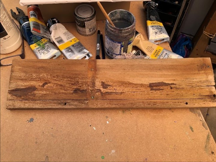
I had picked up a piece of wood while out exploring nooks and crannies in my garden that, until recently, only the wildlife knew about. It’s wonderfully plank-shaped with whatever aspect ratio a plank generally has, and after I’d cleaned it up a bit and removed a couple of lethal-looking screws, it revealed some interesting lines and shapes.
My brain made a deserted beach of it. Rocks on the edge of the water, the coastline fading away up towards the left with low hills or dunes building into that corner. The whole image is sepia and the sky a kind of burnt orange.
So, having not-so-subtly established a cognitive bias for the result so far:


I had no idea how acrylics and this untreated wood would behave but I assumed it would be very absorbent and that washes would sink into it, leaving only a hint of colour so I used this by building layers of wash to lighten, saturate, de-saturate, darken, and illuminate various areas as the developing image seemed to require. I used Payne’s Grey, Naples Yellow, titanium white, and burnt sienna.
While the result feels a little end-of-the-pier and in reality it is something of a cheap shot, taking less than an hour to produce, I’m actually quite pleased at how this seascape has rendered itself. I can even see a fairly convincing and completely unintentional wave. Totally fictitious and born of a plank. #PlankArt.
For something a little less populist, I thought I’d try my hand at the painting I’ve been calling Men in Hats, which is actually by Caspar David Friedrich who calls it Evening Landscape with Two Men (1830-1835). I’ve seen it before in passing but this time found it in a book I’m intending to review by Norbert Wolf (2107), a lovely little condensed trot through western landscape painting from Dieric Bouts the Elder’s 1465 St Christopher to David Hockney’s 1980 Nichols Canyon. My aim is to use the structure which nicely illustrates aerial perspective, but to interpret it so that it is less copy than ‘after’.
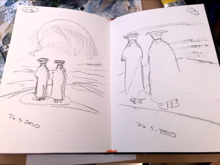
I had intended to subvert the original by using a different support and chose Duck Cotton because I had thought Bouts’s was on panel. It isn’t, it’s on canvas. I do like the challenge of a support like this though; it makes me use paint differently and that’s always interesting. I have prepared with transparent gesso a piece of support of non-standard dimensions but which fits just inside the edges of the A1 mount board to which it is stapled. It has folds and wrinkles in it so I may need to iron it when it’s dry. In the meantime I’ll make some sketches of the original, which is tiny at 10 x 12 1/4″. Scaling up will be another challenge.
Looking at the painting from images on screen, I can see a lot more detail in the dark foreground than is evident in the book. This makes the painting even more interesting – the men seem to be at the end of a footpath, or maybe it’s just exposed rock, at a high elevation with no sign of civilisation in the landscape stretching out beneath and beyond them. Who are they and what are they doing there? How far did they walk to reach that point? And what are those hats about? They add drama to the men’s silhouettes for sure; the whole composition would be a lesser thing entirely, in my view, without those horizontals sitting like the tops of two capital Ts. Wolf describes the painting as romantic and sentimental which is about as far from my interpretation as it’s possible to get, that being closer to an alien landscape than something cuddly and heart string pulling. Maybe this is my way in.
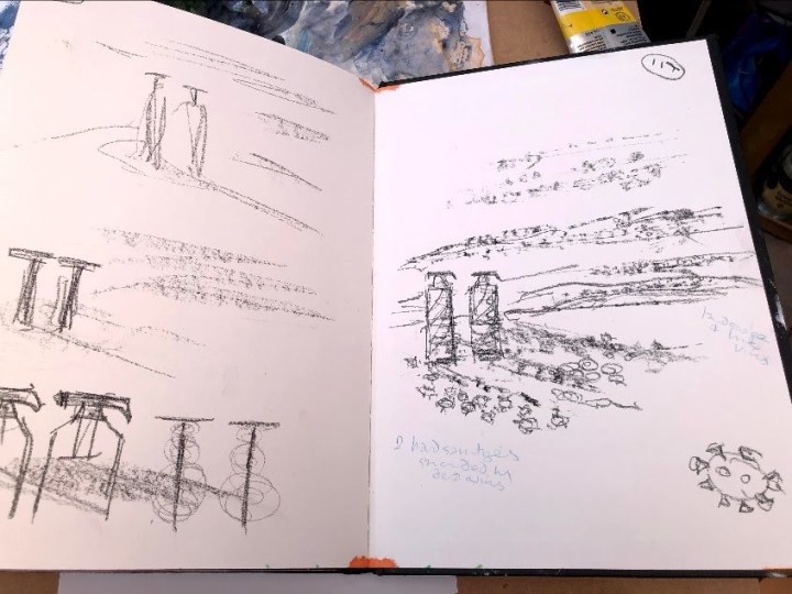
Today I’ve been making a few very quick sketches to see what I could pull out of the shapes in the original painting. the T shape interests me but didn’t really amount to much in a landscape which is what this exercise is primarily about. The first is, predictably, quite tight but by the second the flat tops and triangular necks (collars, I think) became more of a unit and the cloaks less defined.
Here on the left, I tried making them much smaller, almost symbolic, but then got distracted by the only topic of the day, COVID, and turned them into miscellaneous keyworkers before going back to the T idea.
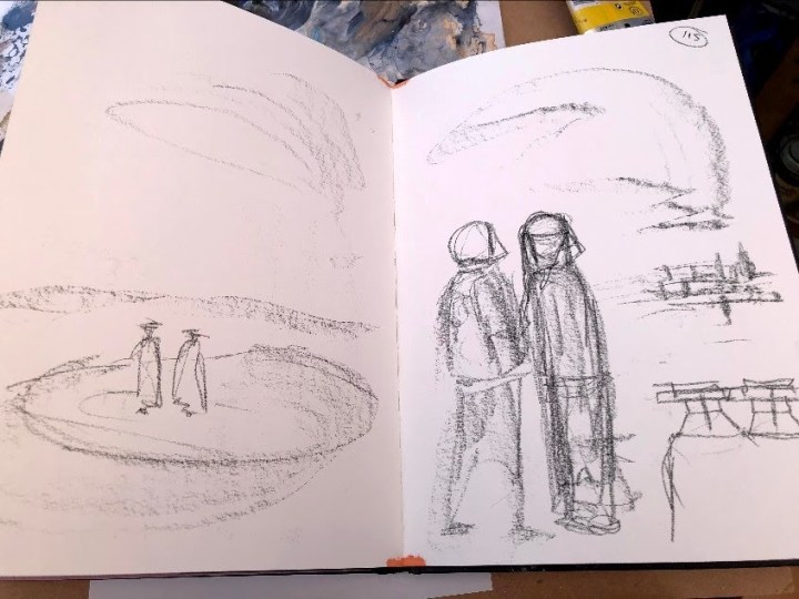
On the left, making a less pronounced T, then giving it a kind of viral wrap led to bottles of hand sanitisers and on the right, there they are surrounded by dead virus that had been scrubby foliage in the original) with a landscape full of live virus in the air as well as on the ground symbolising the huge job still to be done to eradicate this disease.
My intention in the painting is not to make these bottles the main feature by giving them shape and labels beyond the silhouette, nor to make the virus explicit either, rather to use the shapes to glue the landscape together in a way that makes a more subtle statement. These may be famous last words but for better for worse, that painting will end up here!
I ironed it in situ, it being stapled to the card. Fortunately for me, the crease falls at the exact point I want one of the key horizontals. I wonder if wetting it first then stapling it (with more staples) would solve the problem. Not too wet, obviously, or that would make the card soggy and ineffective.
This is a foundation wash, a ‘dirty’ mix of titanium white, payne’s grey, and burnt sienna, with rather more of the grey towards the bottom. Already, I like the roughness of this and the way some of the colour disappears into the support.

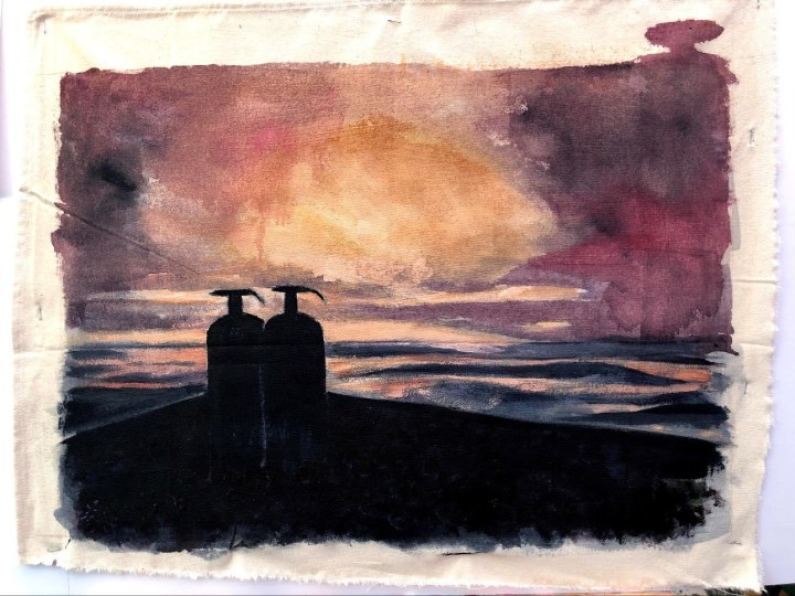
This feels like progress. I need to add some light to the horizon, tone down but also define the mid ground, and add dark detail to the foreground. The mushroom cloud top right is where I forgot where my margins were, not a further commentary on the trouble we’re in. At least I hope not.

A few more wash layers, highlights subsequently muted, and some detail in the foreground using payne’s grey and alizarin crimson placed where the foliage is in the original but which I’m going to subtly re-cast as the corona virus. In the imaging material we see of this virus, it’s always ridiculously and disarmingly beautiful. Do I go down that route or give it what it deserves, something dull and insignificant as we all hope it will be in due course?
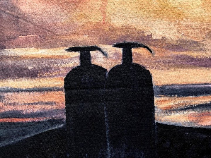
Meanwhile, I wonder if I’ve met the requirements of the task which is to portray aerial perspective using reduced focus, colour saturation, and temperature?Maybe not quite yet – some muting towards the horizon wouldn’t go amiss. But I think focus, saturation and temperature do indicate distance, especially with the sharpening up of the outlines around the bottles. I’ve also made a hard outline around the prominence(?) the two men in the original are standing on where Friedrich has foliage to reflect more the 21st than the 19th century. I think that actually gives it a slightly surreal appearance and harks back to one of my earlier ideas of an alien landscape.
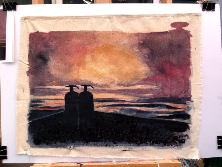
Not sure about the foliage in the foreground. I’d used titanium white to make marks I could wash with various muted colours to reflect the image of the virus, moving from its actual shape through small flowers to tumbleweed, which could reflect its eventual irrelevance but might be a commentary on how quickly some seem to have forgotten it lethal nature. It looks a bit cartoon-ish at the moment so I need to slap some pigment on down there to mute the white. The rest I’m leaving alone – thin wash moving to heavier pigment top to bottom.

Unless I’ve uploaded an older photo, this still needs some muting. Details though, I quite like these details:


I’ve had to mute so much that I may have lost the foreground detail. I won’t use white next time, also I’ll iron the canvas before I start so there isn’t a crease in the middle. The one on the left though is helpfully describing linear perspective along with the line beneath it. Done, I think. Again, the feel of canvas and the behaviour of paint on its surface gives rise to a very different way of approaching a painting. This time I’ve used washes much more and avoided my usual blocky style. That feels useful. I’ve also, I believe, made a copy of an existing work my own by bending it to current circumstances.
Wolf, N. 2017. Landscape Painting. Taschen Basic Art Series 2.0. Evening Landscape with Two Men is described and illustrated on pp 60-61.
Post script: my Men in Hats turns out to be a group called Men Without Hats whose claim to fame is a track called The Safety Dance, and if ever we needed that … It’s on YouTube here.

One thought on “Part 4, project 2, exercise 2 – aerial perspective”