
Some of the palette and quick-draw experiments are in a sketchbook, but much of this work is not because I am finding scale a newly interesting phenomenon and the business of using an extended arm with a lengthy implement is an important area of learning for me. I am describing the piece that was almost the submission also as a sketch because, having finished it, I realised what a difference the Duck cotton support made to how I worked and to the way paint behaves in comparison to the various kinds of paper I usually use. This has been an adventure, and feels like a turning point. Like the moment I first made it round the ice rink on new skates with a sense of fluidity and no stumbles.
This, one of the exercises, was where the colours transcended, for me, the forms and the composition. It was a difficult task and frankly, the beetle came out of it best!

My goodness did this surprise me. I had gone for a more limited palette and struggled with the lemons (they are still rather blotchy, to my eye), and the composition seemed to float in space with the edge of the plate looking like a separate entity altogether. Then, inspired by nothing I can put my finger on beyond a vague notion of a rural French kitchen, I made those big, sweeping curves with incomplete detail and found I liked what had happened. To me, this was about following the spirit of the elements rather than documenting them. I learned more about dilute paint on dry brush undilute paint in this exercise, and leaving open spaces alone.

I am less keen on this as an outcome. My aim had been to represent the paint and the painted with tubes of paint sitting next to the metal bird ornaments but the result seems to me to be quite disjointed and inconsistent in style.

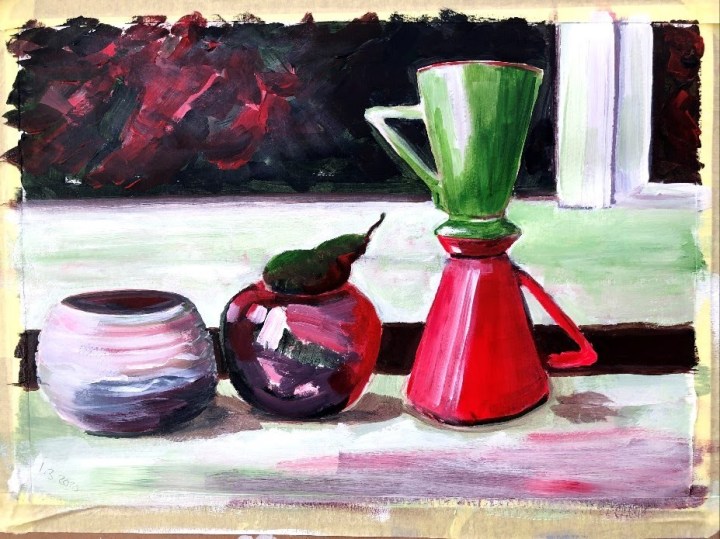
What I liked most about this was the fluency I was beginning to feel in the application of paint, and the fact that out of this came reflections from shiny surfaces that seemed consistent with what I was seeing in front of me. I also liked making a representation of the dark foliage on the other side of the window, and subverting the colours so that they picked up those in the items in front. The window frame itself felt less successful but at the same time, I felt that the composition benefited from those strong horizontals and verticals as contrast to the very rounded shapes in the foreground. The pear, it has to be said, is in a league of its own, I just don’t know which one!
This was the mood version of that still life and while it probably established in my unconscious the palette for the eventual assignment pieces, I find it rather cartoonish and a bit trite. It has a Disney glow that feels a little naive and were i to do this again, I would take much more of a firm, dry brush approach with stronger, more bullish colours.

These are the ’round the house’ sketches I used to think about the interiors/perspectives task, the one at the bottom right being the eventual candidate. I chose that because, even though I prefer (or did prefer) the view in the other direction, I had done that on a previous module so it seemed right to try the reverse.


I made it bigger and extended it from beyond the view point of the sketch, used a muted palette, and tried this time for quite dilute medium. I am constantly surprised at how trying something I haven’t done before gives me results I couldn’t have expected, and simultaneously astonished that this surprises me. Looking at this makes me think of van Gogh but really I can’t claim that his work was any kind of inspiration except maybe subliminally. Perhaps it’s the colours, or maybe the blue with the small dabs of white in the string of lights having resonance in my mind with his starry skies.

These two, building on the perspective drawings and painting and the still life exercises, were significant steps in using this new support. Even prepared with gesso, this stuff sucks down paint and leaves naked texture that can be flooded with dilute wash and i really enjoyed working it to the point it was about to be the submission.

But part of my practice is to put these photographs onto rotation as background in my PC screen, and also my Echo Show devices. This means I am suddenly presented with my own images though they are someone else’s, which gives me the objectivity of eye that distancing offers. When I saw this as it popped up behind news items or projected temperatures for the day, it began to feel a little populist. Something I might like because of its ruddy colours and bright lights but not something I would find particularly ‘painterly’. I had used a red wash to underpin this painting and my feeling then was to use a green or blue one instead to darken and deepen the tones. I also wanted to go a little larger. These are some of the stages of this iteration; gradually building the image with layers of bright colour and washes of darker medium. The final adjustment, again after putting the previous image on rotation through my devices, was to mute the lights to subdue what looked to me like more hints of Disney.


The final piece is, for me anyway, a more mature image that, at this stage in my learning, feels like a triumph. I painted these things on fabric and somehow or other they look like an actual painting!

There are crops of detail from both iterations in the Assignment post, and a contemporaneous account of the process.
Time taken: 2 hours.
