
This was a revelation and really supported the course materials. Details such as the ideal tilt, and brush shape that aren’t covered in the text, and the concept of the bead – that leading edge of dilute medium that sits at the bottom of any horizontal stroke – which I’d never heard of and had no idea of its actual use. Liron is using watercolour but I need to try it with acrylics. My guess is it will dry more quickly but we’ll see.
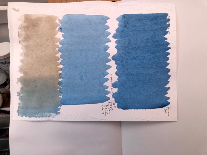
First attempts, some with stretched paper and some not. These are prussian blue and raw umber; dark, light, blended.
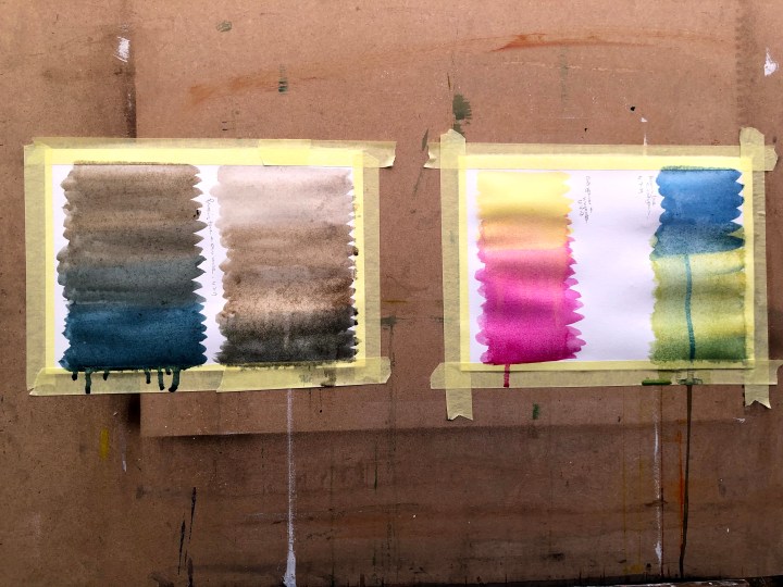
These two, on an easel that just won’t tilt any further back hence the running, are prussian blue and cad yellow, magenta and cad yellow, raw umber and prussian blue (light) and the same, dark. The paper is from a sketchbook and, despite stretching, still buckled and looks grainy. It was only just dry though, it may have changed further over night.
There’s another video on washes by the same man and I’ll check that out tomorrow. These seem to be a good resource.
This second video tackles wet/wet, wet/dry, heavy pigment/dilute, and various other permutations in a careful, fully explained sequence. The main principles to grasp are that drier applications won’t run into wetter areas – the reverse will happen; two dry applications abutting each other won’t blend very much at all, and two very wet applications will blend readily across their common boundary. Tilting accelerates any merging process, affecting the wetter application more readily.
