
Again, I’ve rather strayed from the plot but not without gaining a bit of valuable experience. This is just one of several sheets, most using the lighter grey background but all both grasping and failing to grasp the purpose of the task.

I have three kinds of yellow and two of red. Some of these are student grade (the second and third yellow and the second red – all Royal Langnickel) which means their pigment load is not high, and two are professional grade (first yellow and first red – both Winsor and Newton). The brightest yellow and deepest red are the pro-grade paints but mixed they make, to my eye, a shade resembling decaying meat.
I’m not sure of the rationale for the grey ground as it takes the luminosity out of the paint, but I think the contrast effects are demonstrated across the four grades of tone, with that of the yellows diminishing and the reds increasing as the ground lightens. Maybe that’s the objective.
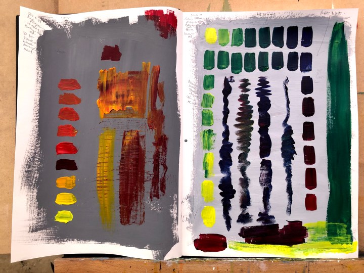
Definitely preferring the blue/yellow/green series’; also the lighter grey ground. Found myself mixing on a palette knife which somehow worked better than an actual palette for these small amounts. I hate to waste paint though so some other pages have taken up the slack.
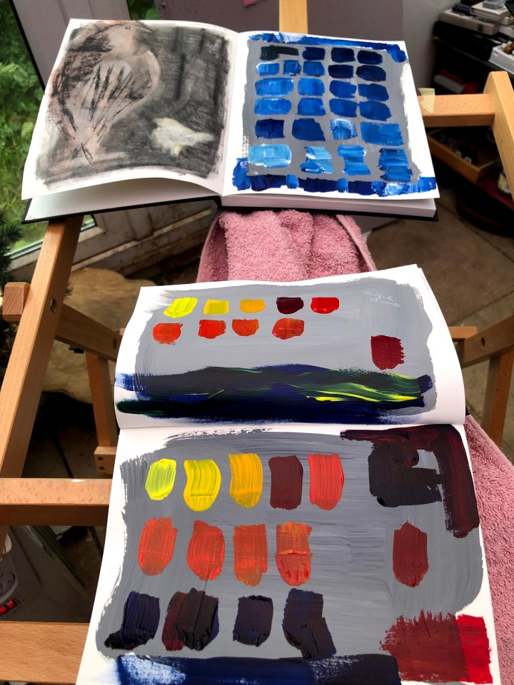
I understand the principles of mixing and of tone, and the issue of contrast and luminance, but I do find it hard to become involved in tasks that have no essential meaning, no ‘why’ to underpin the effects beyond observing the task itself. This may come back to bite me but if it does, I know what to do – get back on it!
On the matter of colour perception, these papers via the British Psychological Society’s Research Digest, which summarises significant pieces of research and links to the original paper, deal with some interesting themes.
This one, by staff writer Emma Young, talks about how people blind for birth can learn to perceive colour. Original research by Striem-Amit, Wang, Bi, and Caramazza (2018).
Another, also by Emma Young, discusses the impact of language on colour perception. Original research by Maier and Rahman 2018.
And this one by Christian Jarrett details the brain scan research relating to the blue/black gold/white dress phenomenon. Original research by Schlaffke, L., Golisch, A., Haag, L., Lenz, M., Heba, S., Lissek, S., Schmidt-Wilcke, T., Eysel, U., & Tegenthoff, M. (2015).
