I needed to get my head round the whole additive and subtractive colour mixing thing before going any further, particularly in relation to complementary colours and why they have the effect they do on each other. It isn’t the first time I’ve been round this block and that’s because the terms themselves seem counter-intuitive. Let’s start with light.
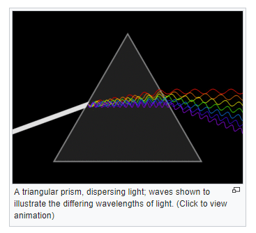
Light is, to all intents and purposes, white but it is so because it’s a composite of all the visible frequencies that comprise the whole. As Isaac Newton demonstrated in 1666, it can be broken into its component parts using a prism. Thus, the more frequencies you add, the closer to white the perceived colour becomes. The process is additive – white is a pool of all the frequencies and where there is black, there is no light frequency at all.
This screen clip is from Wikipedia, you’ll need to go to the page to click on the animated gif https://en.wikipedia.org/wiki/Prism
Paint, on the other hand (and ink and any other physical representation of colour), is a surface which is reflective of light frequencies. It absorbs some and bounces others back. What we see is the last man standing, the survivor of that process, and so the process is subtractive. Black is letting nothing through, and white is reflecting it all back.
Even as I write this, my brain is disputing it because it has to do a handbrake turn to think of mixing paint as subtractive. I hope I never need to explain it and I’m not at all sure it has relevance to the question of complementary colours but I’m struggling to find a decent neuropsychological position on that matter. Do subtractive and additive complementary colours even operate in the same way? My gut feeling is that they don’t, but I don’t know and I can’t find an answer in psycho-physiological theory.
What is evident though is that, however the light frequencies leading to the perception of, say, adjacent orange and green patches are generated, the jarring impact will be much the same. So what’s going on? Human eyes are geared up to receive light frequencies via specialist retinal receptors called cones. There are three types, each geared to a specific range of wavelengths roughly corresponding to but not directly mapping onto red, green, and blue. What happens next takes place in the visual cortex and not in the eye at all.
Two complementary theories of color vision are the trichromatic theory and the opponent process theory. The trichromatic theory, or Young–Helmholtz theory, proposed in the 19th century by Thomas Young and Hermann von Helmholtz, as mentioned above, states that the retina’s three types of cones are preferentially sensitive to blue, green, and red. Ewald Hering proposed the opponent process theory in 1872.[8] It states that the visual system interprets color in an antagonistic way: red vs. green, blue vs. yellow, black vs. white. Both theories are now accepted as valid, describing different stages in visual physiology, visualized in the adjacent diagram.[9]Green←→Magenta and Blue←→Yellow are scales with mutually exclusive boundaries. In the same way that there cannot exist a “slightly negative” positive number, a single eye cannot perceive a bluish-yellow or a reddish-green.
From Wikipedia accessed 21/06/2019 https://en.wikipedia.org/wiki/Color_vision
The last part of that quote may be what I’m looking for – the boundaries in visual physiology that limit what can be perceived by ‘an eye’ at the same time. Perhaps complementary colours jar or heighten each other because they hit those boundaries and cause our perceptual process to dance back and forth across them instead of being able to slide gently along a progressive scale. My gran used to say they shouted at each other and maybe that’s what happens; they don’t rest easy and they’re a bit uncomfortable – edgy and spiky and snarking at each other about who’s the brightest and sharpest. They’re complementary but not at all complimentary.
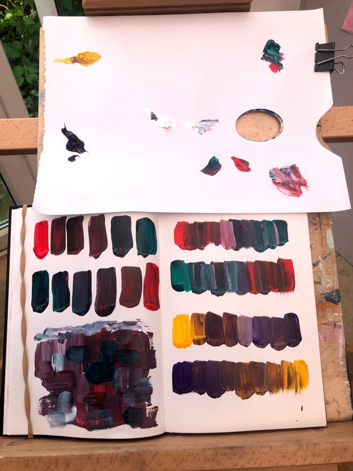
This is exercise 2 – progressions from one complementary colour to another with what’s termed ‘broken’ colours in the middle. Mine are red/orange to blue/green and orange/yellow to violet. I’ve done them in two rows each, working in different directions to control for mixing bias which, for me, is adding too much of the coming colour early in the sequence. I use a palette sheet for the paint pools and mix on a palette knife which seems to contain me somewhat. I’m not sure how I came up with that but it does seem to work for me.

Bottom left is disposal of leftover paint. I absolutely hate to waste it and I’d rather blotch it around aimlessly (for now anyway) than throw it out.
Exercise 3 is to make a colour wheel after Chevreul’s model. Unbelievably the first challenge was to divide a circle into twelve and I had to resort to YouTube for that!
I have not been so obsessive about the measurements – quadrants, each more or less subdivided into three seem adequate. My brushwork is unlikely to stay within the lines in any case.

I found myself lost in the instructions for this exercise but succeeded at least in making a wheel with primary, secondary, and tertiary colours, albeit with less distinction than I’d like. I’ve also popped the complementary colours into the inner ring, and couldn’t resist a bit of black conte drama along the lines. Makes a decent dart board if nothing else.
***
Additional reference: Eye and Brain by Richard Gregory is an absolute classic in the psychology literature. Gregory was an outstanding British psychologist, influential in his field, and sadly no longer with us. This edition, published by Princeton University Press in 2015, is the fifth edition but could not have been updated.

3 thoughts on “Part 2, exercise 3&4 – broken or tertiary colours, research point 1 colour theory”