
I may have missed the point of this, and also got a little carried away! Top left is what I think is the bare bones of the exercise; a progression of mixed paint going from unmixed white to unmixed black. Underneath is a series of mid-grey patches roughly but not completely equivalent in tone aiming to show how much darker they seem towards the left of the line when sitting beneath the lighter patches. Not the best representation.

The rest are streaks made by dragging a pebble across two patches of pigment and, at the bottom, more dilute wet-in-wet applications of paint showing something of the variability of impression depending on pigment load.
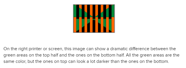
The contrast issue, and also colour perception issues in differing pigment contexts, are researched psychological and neurophysiological phenomena. The images below demonstrate the principle of simultaneous contrast whereby an adjacent strong tone has the effect of heightening or reducing the tone of another.

These are both from ExtremeTech, accessed 19/06/2019
The most argued about illustration of the impact of neuropsychological impact on colour perception was the much tweeted gold/white black/blue dress which divided opinion across nations. Was it black and blue or was it gold and white? And why did it look so different to different – and very convinced – people? After much argument, this has [for now anyway!] come down to the idea of colour constancy, whereby a colour holds its status whatever the lighting or contextual conditions, being thrown out of wack by the lack of contextual detail. When this happens, the brain sets about making it up and for some, it offered blue/black, for others gold/white.
But it seems that the most popular explanation … [see] ASAP Science … is that this is an example of a phenomenon known as color constancy. This ability ensures that the perceived color of an object remains constant, despite changes in the illumination conditions. That means the context, or surroundings, in which an object we are looking at appears in, influences our perception of its color. In the case of this dress, it is photographed so close up that we don’t actually know its surrounding environment, so our brain starts to make interpretations about the light falling on it. If people envisage that it’s located in, say, a room lit by blueish natural daylight, perhaps near a window, they may see it as white and yellow because our brain tries to remove the blue as a possible shadow.
From IFL Science accessed 19/06/2019.
Schlaffke et al 2015, via the British Psychological Society Research Digest, October 2015, has the science.
The idea that there is no objective measure of colour, that colour is a function of biological and psychological processes and so subject to variation within and between individuals is, I always think, worth bearing in mind when producing images of any sort. The colour I see is the colour I see and there are no guarantees that anyone else will see it in exactly the same way, but context will manipulate what is perceived and can be used to that effect by visual artists.
Schlaffke, L., Golisch, A., Haag, L., Lenz, M., Heba, S., Lissek, S., Schmidt-Wilcke, T., Eysel, U., & Tegenthoff, M. (2015). The brain’s dress code: How The Dress allows to decode the neuronal pathway of an optical illusion Cortex, 73, 271-275 DOI: 10.1016/j.cortex.2015.08.017
