
You could probably describe Steyning in west Sussex as a relatively affluent middle class market town. It has a history as a port in the 8th/11th century until the mouth of the Adur at Shoreham silted up and left it stranded. Before that it was a key player in the trade in textiles and spices from the far east, routing them on to London. Much of the town and surrounding villages is 15th – 17th century, and while it is quite arty, it is definitely not Brighton.
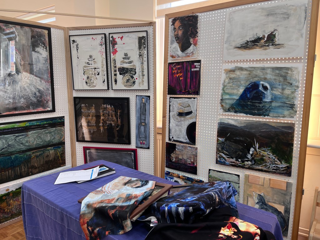
I took twenty pieces of work, some also as cards or artefacts. But the reason for this post is to describe and detail the underpinning of much of that work with augmented reality (AR) layers, and the use of both AR and greenscreen technology to supplement our publicity effort. The videos below are of work by the five other artists, plus my own, but are presented here as examples of the treatment of work that has not been custom made for either AR or greenscreen. Critically, the artists had to feel that their work had been properly represented, and the placement of it, along with the text, had to fit within the greenscreen area.
But first I made animations of the work and, as far as possible, let each artist see this before adding it as a video layer to the final piece. I use two apps, PhotoMirage by Corel and MotionLeap by Lightricks, for this. PhotoMirage is a desktop application, MotionLeap is made for smart devices. This means input and manipulation are different but the principles are the same and, arguably, comprise an additional way of making marks. I’ve called it painting with movement because, while the magic happens underneath the bonnet, this is driven by the lines, stops, masks, and directionalities I put in on the surface. Below is a very simple one made to swirl the sky and add some dramatic effects. Each of these, including the sky effects, are individually applied, edited, moved, and altered in speed and/or intensity. For me, these are increasingly becoming deliberate artistic choices, although ‘happy accidents’ are always welcome.

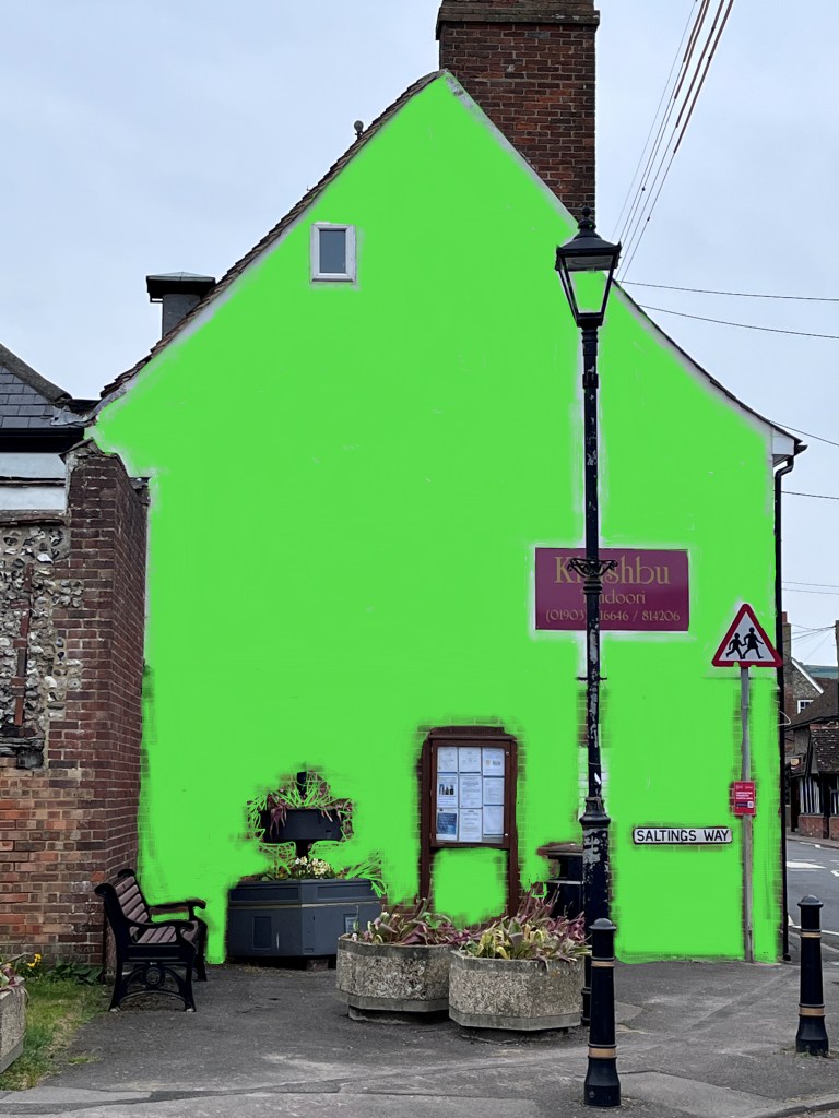
The starting point for greenscreen is an image, and the best image for Artivive is one that is both complex enough to be recognised as unique and unlikely to change during the period of AR activity. Change alters the image the app picks up in the real world so it may not match the one stored on the app’s bridge.
Bridge? Like two landmasses joined by a physical bridge, this bridge joins the target image to the displayed video or overlay on the account holder’s page in Artivive and sends it to the app on the device. Like a physical bridge, all the rivets have to fit together, and rivets in this case means the detail the app uses to match the two elements.
Greenscreen is essential to the selective mixing of elements such as a static image and a video. The green paint here blocks out the wall of the restaurant but leaves their sign and various pieces of street furniture untouched. This ensures the video material only appears in the marked areas and doesn’t encroach on elements you might want to keep intact as anchors to the physical world. I discovered later that it’s possible to use ‘feathering’ which means the green pigment is applied like scratches and gives the impression of viewing moving images through dirty windows.
To open this magic green box, you need a key called a chroma key. I searched everywhere for that until a YouTube video pointed me at a small category in the Effects tab*.
The process after that involves learning a bit about how your preferred video editing software works, but the principle is that the green area, once activated by the chroma key, behaves like a window so that anything placed on another track (below the greenscreen track) will show through that and be masked by areas that are not painted green.
These are the videos – animations first, full video second – made for each artist.
For the grand finale, I wanted an expansive digital canvas through which to project fireworks so I extended the green area into the sky around the building while keeping the physical anchors – roof lines, chimney, street furniture, and more distant buildings. At the time, I had only a vague idea of what might fill that space, but text would be part of the display alongside the fireworks.
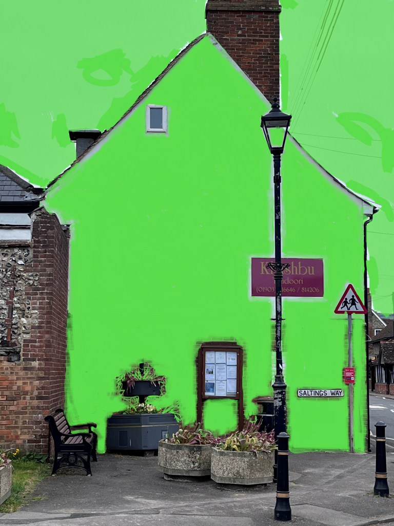
The final video extends beyond the original aspect ratio to one of 16:9 and allows the fireworks to spread across the whole area with the building in the centre. The flag is my own painting and added as a nod to the Queen’s Platinum Jubilee which was itself wrapping up that day.
And on the subject of wraps, I couldn’t resist riffing (predictably) on that when I came across a video of a rapper moving slowly backwards, as if leaving. This piece then, comprises a greenscreen track (a repeated still image); text boxes timed and positioned within the original aspect ratio so as not to get lost over the margins; the flag image also timed and positioned as required by the story of the trail’s end; the fireworks video (by CottonBro via Pexels and free to use**); and the rapper video positioned to sit in the corner of the building, above the pavement and below the line of the eaves (by Production and also via Pexels**). The audio comes with the fireworks video but could be stripped out and replaced had it not been appropriate.
I had not known how the Artivive app would manage the different aspect ratio but it simply adapted and flooded the screen with pretty lights!
I want to comment now on the reaction to my embedded paintings. Bearing in mind that this is a semi-rural and somewhat traditional area, and that our venue was on the outer arm of Steyning’s spiral galaxy, this created quite a lot of buzz. Mostly, and I’m gritting my teeth here at the stereotypy, among men who turned out to be engineers or IT aficionados, followed by children who wanted to know what it did (rather than how it did it – that was the men again), and women who by and large were more caught up in the aesthetics. Very few people were less than fascinated, and no one made negative comments; although, as exemplified by one person who said, ‘I don’t like that kind of painting’, universal social restraint wasn’t necessarily a factor in this!
Conditions were perhaps the best I’ve experienced on this trail; the room was large, light, and airy, and there was free wifi so visitors had room to move and could access the videos via the app once shown how to do so. For best engagement, I took my iPad and let people target whatever they wanted. This worked very well, often resulting in inquiries about how to make these images and the videos. Some visitors came because they had heard about this novel approach to art. Most were engaged by the stories that arose from knowing a bit more about the paintings and how the videos or other elements extended that context. Views recorded by the app came to around 700 over the four days of the trail compared with around 100 pcm.
Sales? Well, one – a cat! So not exactly cost effective as an exercise. Outlay was £40.00 to participate, and for me, the cost of hiring someone to help with the physical manipulation of the pieces and covering lunchtimes. Without this assistance I would have found such an event extremely difficult, and I pay because I stood to gain should my work sell. This feels fair. If I also costed in my time and I relied on exhibitions to support myself, this would be untenable.
But I am lucky; retired and with a guaranteed income, I was not reliant on sales for my next meal. Other artists there were working their craft, it was their job and they needed sales so it was important to me to do my best for them as I was sharing their space. This meant understanding the work they had made and talking to visitors if they approached the display of an artist who was unable to be there at that time; taking collaborative responsibility for creating a welcoming environment; and helping visitors who seemed a little lost as one or two did. The venue is a church and our room was to the side of the main hall so occasionally people drifted in looking for the usual café or a service.
Another bonus was learning on the hoof how to present technologically enabled art to a variety of people across several demographics. (Also how to smile at them engagingly but not terrifyingly!) I have a better idea now of how this might be improved and in particular how to facilitate and target a receptive population. I’ve written before about engaging the people who are not in galleries because they believe art is not for them, and from conversations over the two weekends, this appears to be a way of bridging that yawning gap of expectations.
I will need to think about this with a view to future work. To me, the digital element is becoming integral to the way I make art. It takes me beyond the painting into communication and inclusivity and, at a personal level, has the potential to make exhibiting more of a possibility as my capacity to lift and shift large pieces reduces with time. Presence is important, but I know from extensive research by the likes of Bailenson et al that ‘presence’ can be engendered in, for instance, a virtual world as long as there are enough cues, and embodiment depends more on human-like behaviour than appearance (see Oh et al 2018 for a recent overview). Bring on the holograms!
Oh, C.S., Bailenson, J. N., and Welch, G.F. (2018), A Systematic Review of Social Presence: Definition, Antecedents, and Implications. Frontiers in Robotics and AI: virtual environments. [online] Available at https://doi.org/10.3389/frobt.2018.00114. Accessed 7th June 2022.
*This was in Filmora Pro which is being discontinued in terms of upgrades; I’ve yet to find it in Filmora 11 which is now Wondershare’s primary product. It won’t take long, I’m sure.
**Whenever I use work posted to Pexels, I take the option to make a donation to the maker.

Reblogged this on Strayfish Arts and commented:
First appearance of augmented reality at Steyning Arts trail? Probably!
LikeLike