
I was thinking this time of socio-political rifts and what more fundamental one could there be but the impact of Brexit on the union? Scotland, which has been pressing for independence for many years, is closer than ever to having the weight of its population behind it. Northern Ireland, the rump end of earlier catastrophic political will, may eventually become reunited with Eire should the practicalities of Brexit trade deals jeopardise the hard-won Good Friday Agreement. And Wales, the last of the Celtic nations, how long will they be willing to sit alongside an England increasingly isolated by its own actions on the world stage?
I thought of our flag; red, white and blue for England and Scotland but with no green and no dragon*, and currently being draped everywhere for the Queen’s platinum jubilee, seems at risk of dissolution. Rending and ripping with not much left but our red cross of St George who was, in fact, Greek and didn’t have a dragon either. Jasper Johns came to mind and his treatment of the US flag. I was particularly struck by the 1955 version which looks like scrubby dirty white dough on a rough brick wall. The Met’s description doesn’t help me to understand Johns’ motivation much but it appears he had just been discharged from the US army after two years service during the Korean war which seems likely to have coloured, in this instance, bleached, his view of nationalistic symbolism.

I sympathise. I felt thrown into a very new understanding of my own country following Brexit, because it was not just a loss of the unity I had felt with the rest of the EU and the benefits it had conferred on both science and the arts through grants, employment and ease of travel; it was the unleashing of an anger about ‘others’ that I had not seen before. This intolerance, hatred, and rejection of anything that, let’s be honest, wasn’t White and male, had always been there but had become unacceptable, and now it had a voice apparently supported and validated by politicians.
The divisions I see here are those of social and political cohesion and may, if I can bring Johns’ idea with its raw simplicity into my own context, form the basis of this next piece in my body of work I’m calling Rift.

This is A1 card with strips of a previous piece of work glued onto it. It’s deliberately imprecise and at present isn’t very obviously the union flag but I have ideas drawn from Jasper Johns’ flag to introduce some colour and then mute it, leaving something more textual as the holder of the image. The card is untreated so I expect it to absorb dilute paint after which I may seal that with transparent primer and employ scrubbing to rough it up a bit.
Thinking ahead and reflecting on my earlier green screen experiences, I know now that I don’t need any green in the painting because I can apply it digitally and use that for filmic material. The painting needs to stand alone and I’m going to try very hard not to over do it.

Soft pastel is exquisitely messy – it leaves dust trails, gets in nooks and crannies, and shatters unexpectedly, so it’s ideal for making a grunged up surface.

I’m not sure where I’m being led with this, but each layer of work has been driven by the appearance of the previous one and this time it called for dandelions. Clearly these are temporary, they have their feet in the pond now and the insects living on them are back in their own world, but the idea of weeds being seen as valueless while simultaneously having high ecological value as long as they’re in the right place struck me as part of the paradox of our political systems. One argument, and some evidence in particular individuals, suggests that the yen for power while in possession of financial assets and an old boy network promotes the unworthy into positions of influence. Cultivars with no notion of what it is to struggle. ‘Weeding out’ is what we do with unsuitable candidates in all kinds of settings, and the two together suggest that weeds are undesirable.
Talk to the insects. Cultivars flowering at the wrong time with the wrong shapes, the wrong messaging and protected by chemicals have infinitely less value than a dandelion to bees and butterflies, hoverflies, and the tiny, tiny, shiny black beetles living in mine today.
So my aim now is to incorporate this colour contrast and its subtext in some way, whether directly into/onto the physical piece or later in the filmic version. At present, this is just a dirty flag; degraded and unkempt, and there have been plenty of those over the years (cf quick google search for artists who have painted the union flag), so it needs something else and I’m going back to the idea of muting the colours as per Jasper Johns. This is admittedly not very original, but then neither is a mucky looking national emblem.
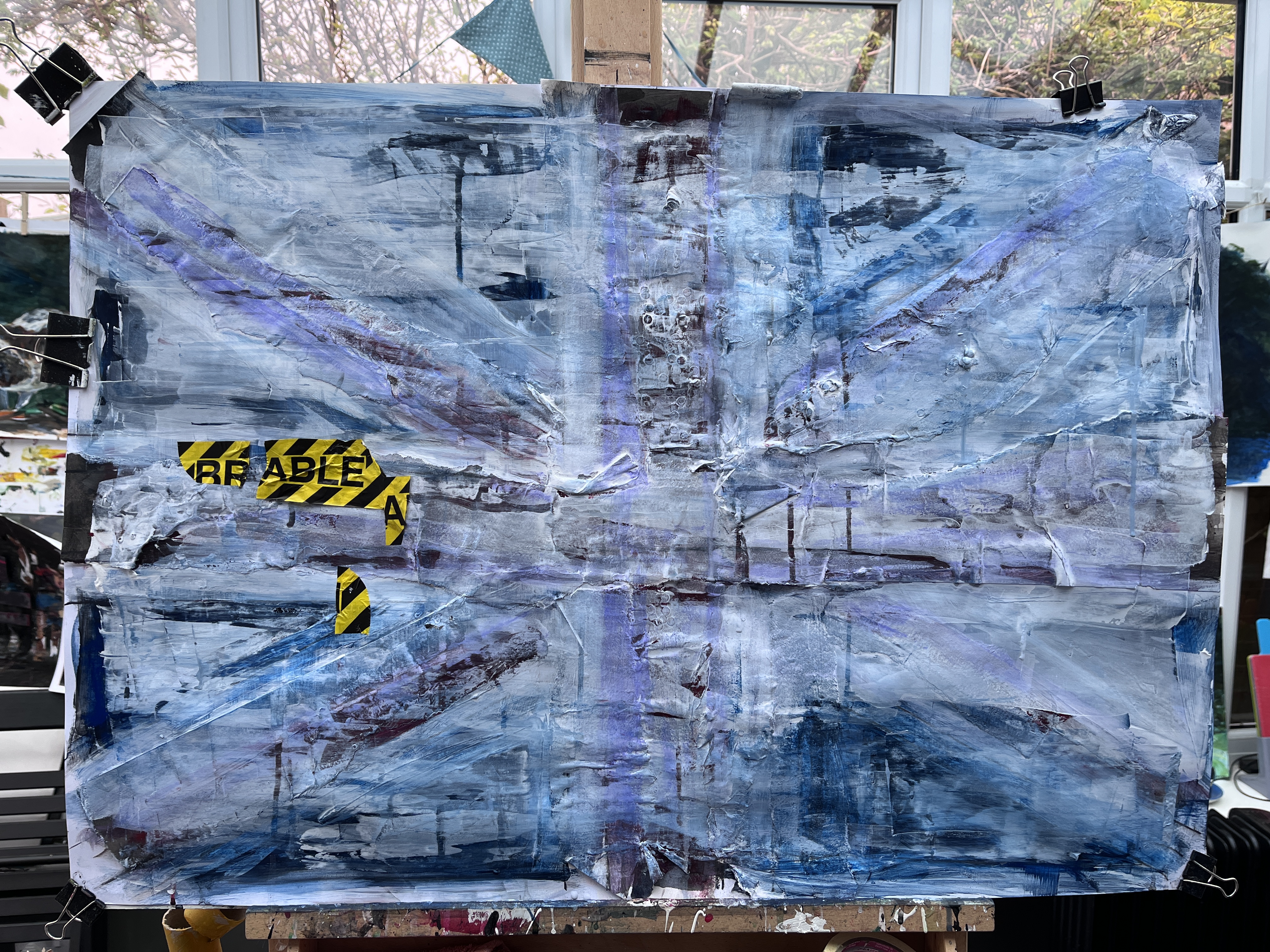
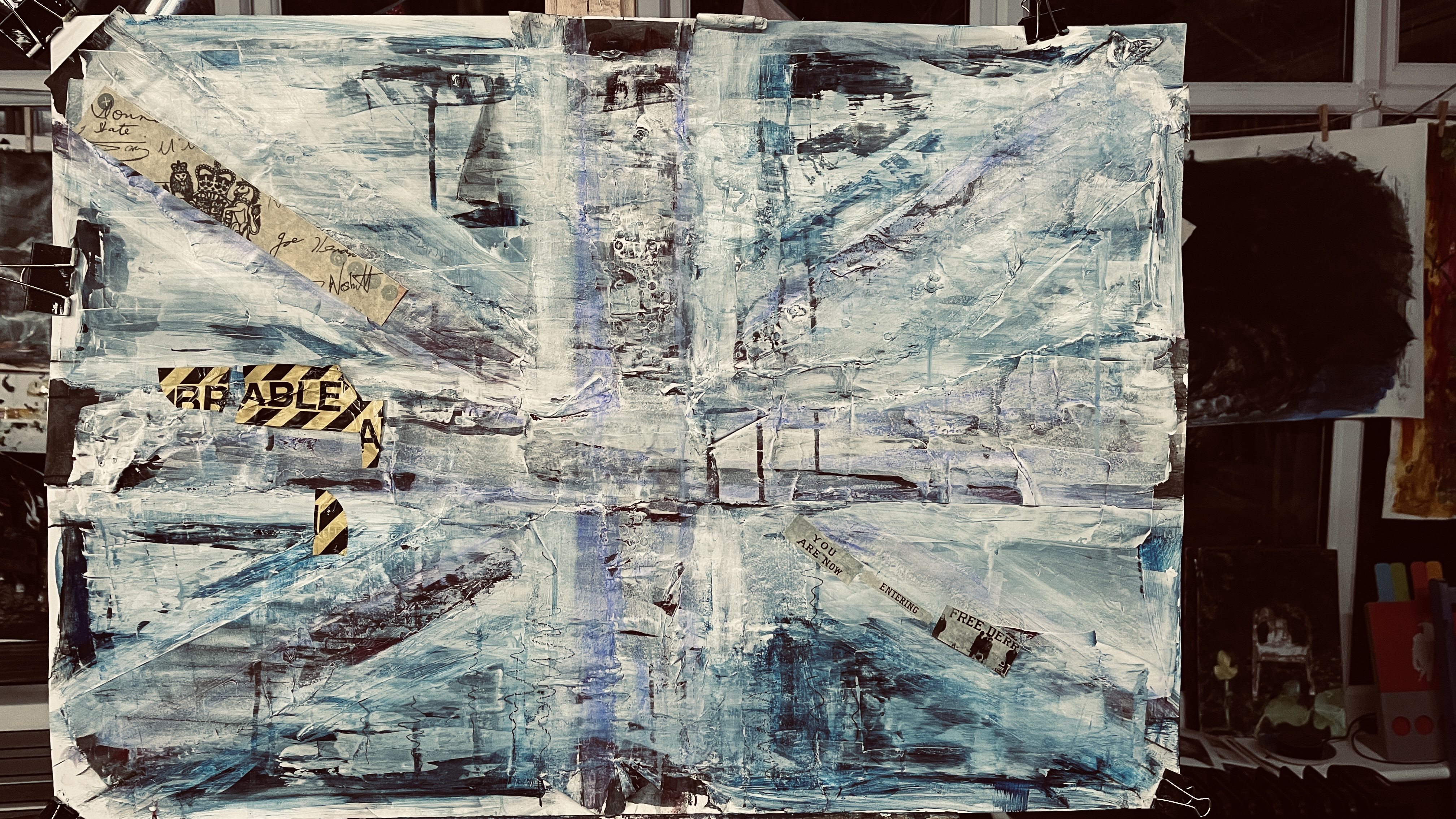
Yellow dandelion replaced by yellow Breakable tape over white acrylic+gloss medium scraped across the surface and selectively thinned using water and/or a flannel. I can see an eye in the top left quadrant. I’m not convinced about the placement of that tape but I’ve already found I can move it, and if I can’t, I can paint into it.
29th May 2022. Today, I was listening to one of my favourite podcasts, Cautionary Tales put together and fronted by Tim Harford. These are always entertaining and illuminating and this one was about the extraordinary visionary, Clive Sinclair, and how his revolutionary EV, the Sinclair C5, fell on its face. Harford makes the point that evolution works in incremental steps rather than by sudden escalation and this is because each stage needs other stages to be in place before it can happen. He argues that humans work the same way and likens the stages to rooms; go through the first door and you’ll see three more and this is how ‘adjacent possibilities’ occur. Sinclair frequently saw beyond the first, second, and possibly third room and so nothing was ready to make his idea work. In the early 80s he spoke of devices in people’s homes that would answer questions, look things up, give you information if you asked them, but he couldn’t say how they would do that because there was no internet, just phones. He was whole houses away from adjacency.
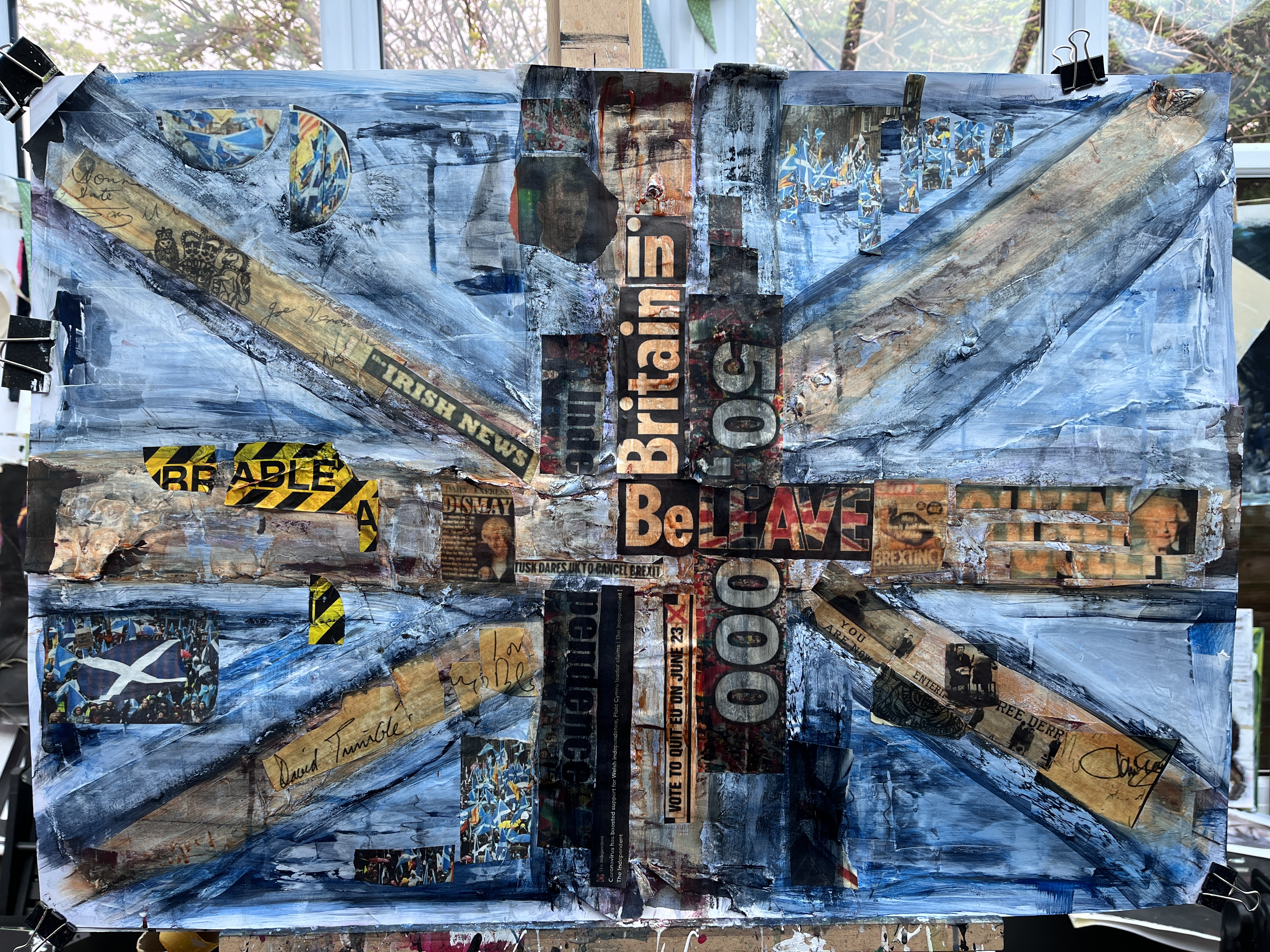
It has me speculating on the ‘painting-led’ way of working that many of us prefer to the meticulously planned style. Does each brush stroke or layer of collage open up ‘doors’ to more options by creating new adjacent possibilities, and is this why the blank sheet can be so intimidating? It would be convenient to think so, having just layered on clips from newsprint relating to the UK and the impact of Brexit on the union; and looking at it from a distance, I can see some of the doors in this new room are visible both at close quarters and in the piece as a whole.
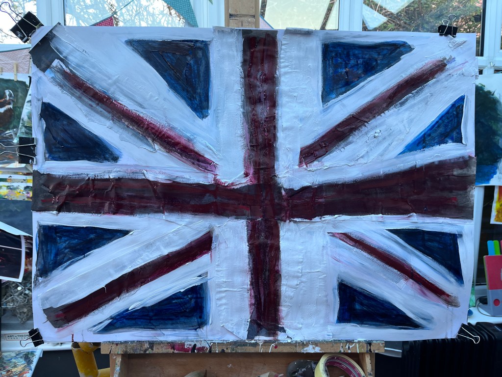
So this got grungy pretty quickly! One of the advantages of using PVA glue liberally is that it remains malleable for quite a while, especially if livened up by a wash. Here, I’ve made the red crosses with burnt sienna, and dirtied up the white areas with Paynes grey. The lines aren’t straight and part of me wants them to be lined if only faintly, as an anchor for the central image. I like the small amount of red from the newsprint (printed in inkjet on parchment paper), and the small patches of Scottish colour. As I’m making this, I’m thinking of the art trail starting late May and how this would go down like the proverbial lead balloon! Text relates to Brexit, the Scottish independence referendum, the Good Friday Agreement, and Welsh independence.
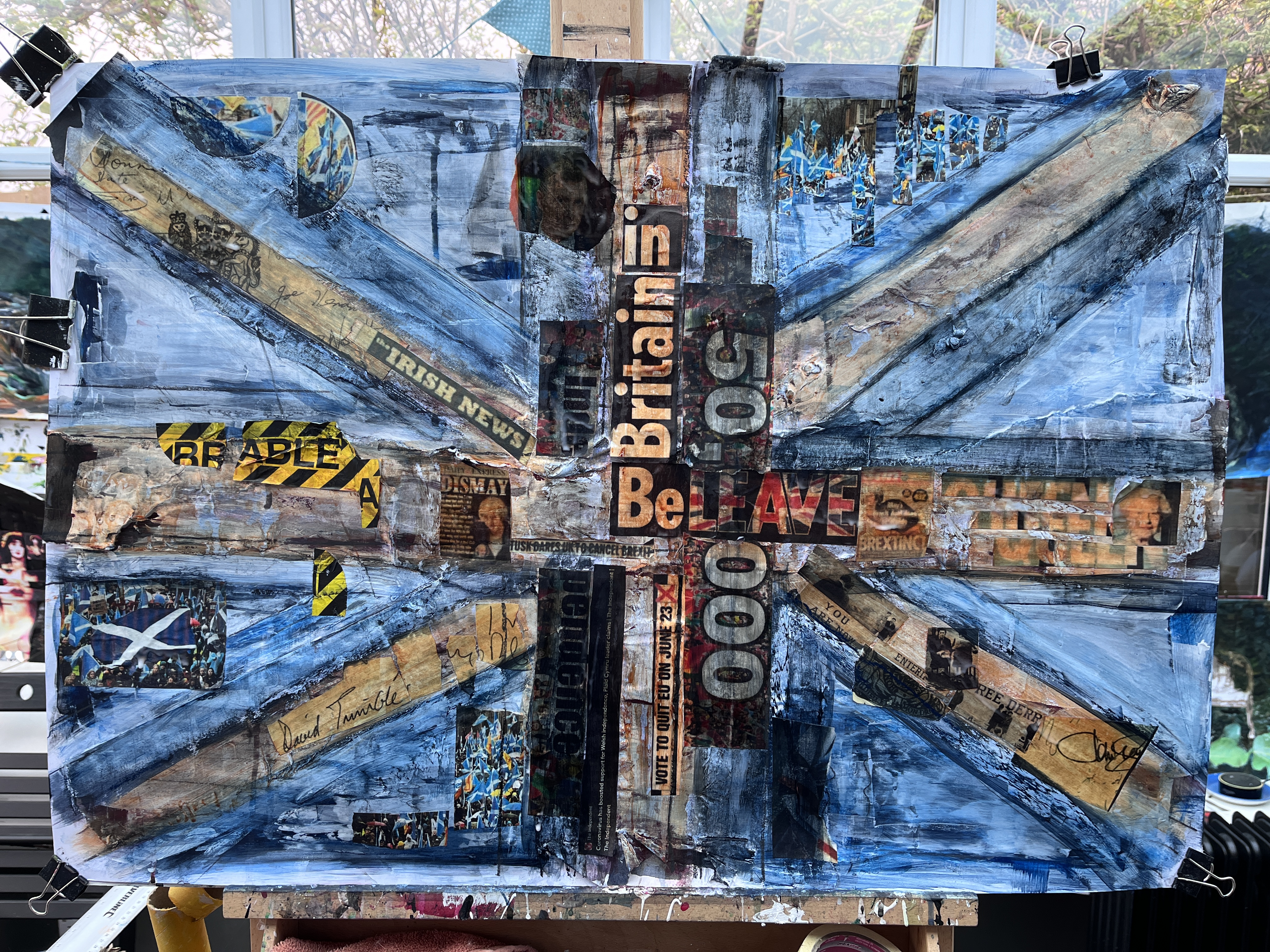
I have more or less glazed this with glue now with a view to brightening some colours and providing a mechanism for reducing some others. The hints of lines now show just what an odd flag we have – where I’d thought it symmetrical, it is anything but, with its white stripes wider on the upper margin of the red on one half, and lower margin on the right. This makes the triangles (of blue in the actual flag) variable in size because, as the official specifications state, the blue is actually the background or negative space and not, as I’d thought, representative of Scotland. The clue is in their actual flag – that large white diagonal cross on the blue. The result is a baffling assemblage of what my eyes certainly have always construed as symmetrical shapes.
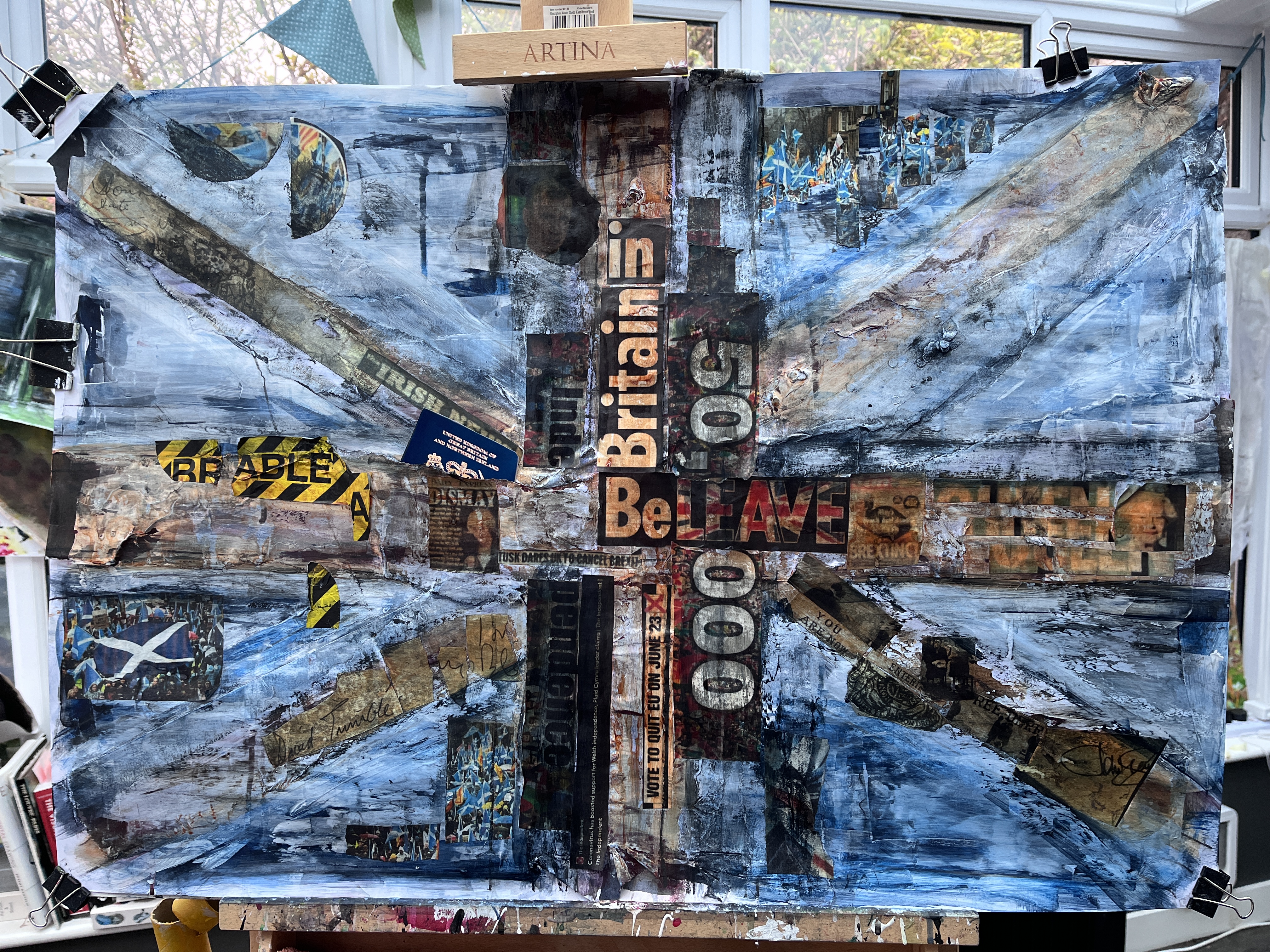


In the pocket, blue passport, and there we have the title.
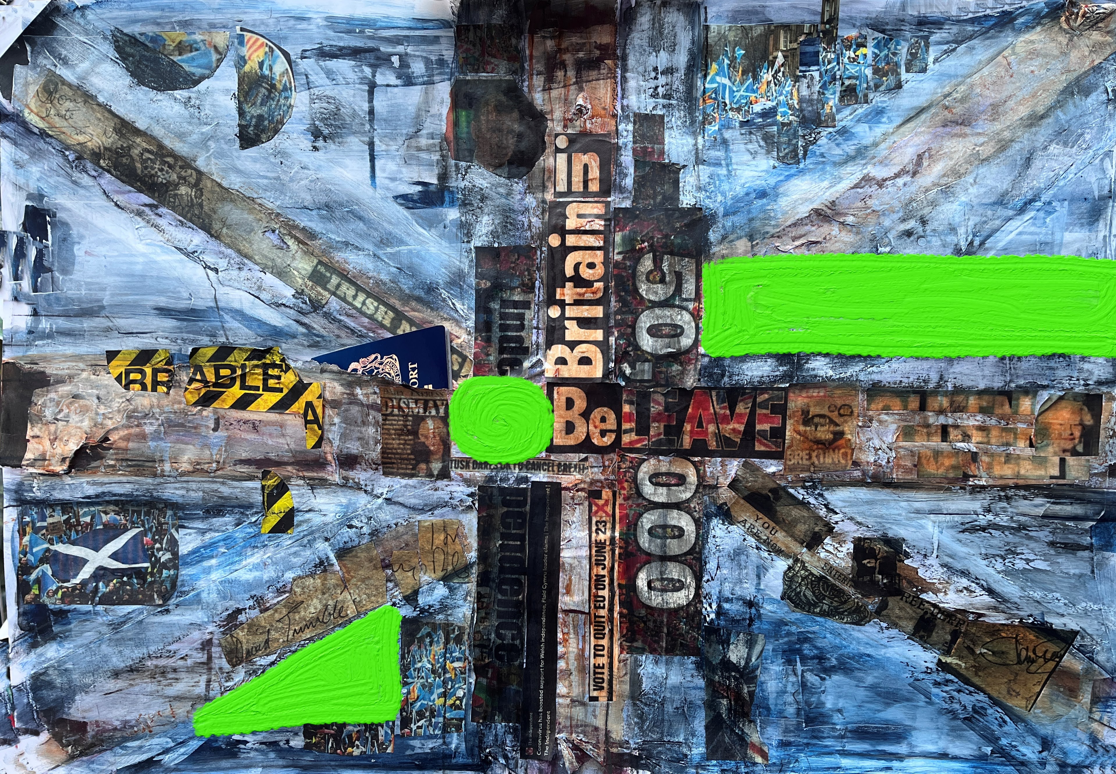
The next phase is animation and greenscreen when I’ve got the image properly in my mind. There is a welcome freedom associated with being able to greenscreen any part of this digitally and to place that in the video with no detriment to the original. I like the mess of this, the tattiness and disjointed elements, the sense of a concentrated core which is losing its integrity to the outer corners.
These are the two video components which, along with some stills of the original painting, comprise the final Filmora edit. Blue passports figured throughout the Brexit debate, trivialised by the Remain opposition as ‘dead cat’ distractors from the important issues. But we could have had them all along without leaving the EU.
The MotionLeap video has an array of pixel disintegrator filters and also allows adjustment of saturation and contrast. This feature blew the meaning out of the central strand of text in the core image.
PhotoMirage allows for motion pathways to distort the image and, depending where you put them, deep folds and schisms ensue. Ideal commentary on the actuality.
This is the greenscreen image made digitally in Rebelle5 Pro. I selected areas of the painting where I thought windows into a purchased video would play well. I am experimenting with this and today took photos of garage doors, telegraph poles with notices pinned to them, and my own shadow to extend this very interesting line of inquiry.
The final video allows access to the purchased video (by Shadow Warrior via Pexels) through the greenscreen elements keyed out using the green chroma key in Filmora Pro. The elements can be adjusted for size and position independently by locking the other tracks and manipulating only the part you want to change. In this way, I also unlinked and clipped the audio from the Scottish band video to make it more staccato, and then left some of the greenscreen unfilled as the video reaches the end.
Harford, T. The False Dawn of the Electric Car. Cautionary Tales. Podcast from Apple Podcasts. 8th April, 2022.
*According to the official specifications, the red is St George, the white the St Andrew’s saltire, and the red St Patrick’s saltire. The blue is not a cross but the background. The flag’s proportions are 3 units wide and 5 units long (which visually, corresponds to H and W as it’s essentially a landscape orientation). The width of the diagonals is, puzzlingly, 6 units – 3 of white, 2 of red, and 1 of white. There are other specifications involving units that seem inconsistent across elements, but I do know that the broader white diagonal should be uppermost, nearest to the flag pole, with the narrower strip uppermost furthest from the flag pole. See The Flag Institute. [online] Available at https://www.flaginstitute.org/wp/uk-flags/the-union-jack-or-the-union-flag/union-flag-bill-2008/. Accessed 27th April 2022.

2 thoughts on “Personal Painting – Rift #3”