
It’s taken a while but the first of three paintings is underway. Rifts can be of many types, some very personal, some geopolitical, some very much out of this world. This first is geopolitical and concerns the appalling way in which key people of the then British Empire divided up the countries over which it had ruled. This took place in 1947 by the drawing of arbitrary lines through towns and villages to create India, Pakistan (west), Pakistan (east), and Bangladesh. The populace had no say in this and, as India was largely Hindu, Muslims were compelled to leave en masse for Pakistan and Bangladesh with Hindus migrating the other way. Localities, communities, farms, and even homes were divided; something that had happened in Ireland in 1920/21 as Northern Ireland was brought into being using the same inhumane process. They had clearly had learned nothing from this.
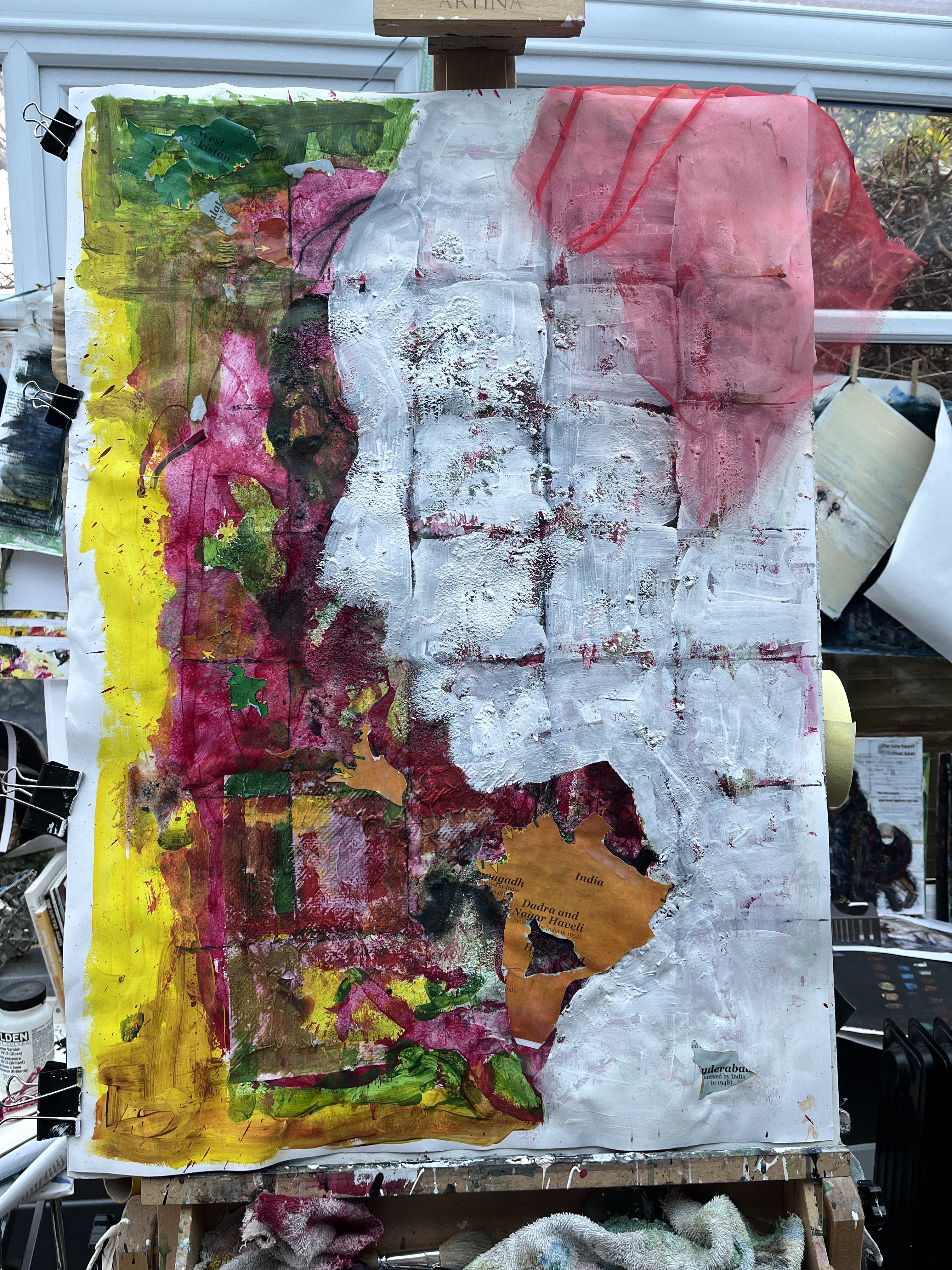
I used a reference photo and gridded the profile onto what had been a directionless preparatory space. This was an A1 sheet of cartridge, on the other side of which was an earlier iteration of Rift. This would provide texture and form, and I added pumice medium to the random application of colours. I was looking at it in landscape view but then, a propos of nothing, I turned it upright to portrait and it took on a new flavour. The colours were the basis of iconic India, and the gritty shapes were land. The profile is, at present, white which is the colour of mourning, and the head is angled downwards.
As yet, the background says less about the countries affected than I’d like, but the gridding gave me a sense of the division, this time small patches like a quilt. I need to let this settle for a little while so I can decide whether detail will be important, and if so, what. I want to make a landmass from the patches somehow, perhaps with an outline drawing; but to leave the woman’s profile unfilled unless with just white paint and a clean edge. The support is very lumpy though, so ‘clean’ may not be an appropriate ambition!

12th April. I like the structure of this but the shapes aren’t saying very much.


The cut out of the eye, drawn in a sketch book, has been placed on my homemade green screen in the same sketchbook with a view to using it in an overlay video.
And now I can see another face just peering out from behind the primary one.

Tomorrow, I’ll see about translating that into the physical work. I may have some canvas off-cuts or left-over net curtain that will do the job of the headscarf. The eye outline may be more difficult because of the heavy textures underneath, but it won’t be impossible.
13th April and I’ve had some ‘happy accidents’ in the process of trying to get the mouth looking less like a smile. I’m really not good at perspective drawing and this is not quite full profile so the mouth has a shade of its other side over to the left. I made a mess in correcting it and found I had almost a full face at one point. This is partly to do with having that abstracted and stylised eye which I want to keep for its drama and because I have plans for it in the eventual video.

Right there on the left of the white image, is the shadow face which has been causing me perspective problems beyond my inherent ones. But I like it.

So this is where I am now; not quite where I thought I’d be but actually much more raw and less twee than my original idea. Happy accident #1 – that shadow face, happy accident #2 messing up the mouth meant finding the angle and tilt from nose to chin and that gave me the position of the rift. It cuts across the land and also this representative woman. A third happy accident is that all this manoeuvring has made her much less reminiscent of Amy Winehouse which was a likeness that kept sneaking into my mind earlier.
I have glued and trimmed the net so that it’s anchored in place but still free at some of the margins. The next step will be to clean up the edges to make the primary video image and then look at selective animation and some green screen images.
14th April. Today, I made an animation in PhotoMirage and drew some green screen images in soft pastel to position within the eventual composite video. I’ve discovered now how to position these anywhere I want over the primary image, and to resize and adjust them as required. Filmora Pro has a lock facility which, I’ve also now discovered, means I can chop and move elements on their timeline without chopping and moving everything else, something that frequently made a dog’s dinner of my earlier efforts. The green screen is just a sketchbook page painted bright green.


Locking also meant I am able to introduce other video material more easily, resize it, and jiggle around with its timing without interfering with any of the other tracks.
I’ve deliberately left transitions as sudden changes rather than merged continuities. This felt appropriate, given the shock of Partition and the massive social upheaval that entailed. The animated section uses the motion facility of PhotoMirage to create a chaotic backdrop to the woman’s face where green screen elements overlay the flat image with expressions. I’ve aimed for a story that describes pre-existing peace, then shock, fear, and eventual resignation.
There are many helpful video tutorials for Filmora but I’ve found I need to know what I want to do, the gaps I’m trying to fill, before they stick; so I search for ‘how to do X in Filmora Pro’ rather than just working my way through the catalogue. Key frames are looming, I think!
So, Partition, a shameful episode that still drips the poisonous elitism and entitlement of Empire down the decades.
1st May 2022. I’ve been revisiting this painting for a while now, not quite satisfied with its execution but with no clear idea why, and today, having uploaded what feels like a much more finished product, I’ve been giving it the gimlet-eye treatment. Abstracted or not, the nose was wrong and it definitely needed another eye, the subtle one to the left was not enough.
It turned out not to be a massive job following all that Blue Passports rehearsal with soft pastels. This feels better, and luckily it also fits well into the video sequence.

2nd May. ‘Barely any change’ wasn’t good enough in the light of a new day so I remade the animation and adjusted the original accordingly. I’ve learned quite a lot since I made the first iteration so it was an easier process than it might have been earlier. Win!
17th June – I’m revisiting this again because, once the subsequent paintings took shape, this one felt out of place due to its very different palette. A change is not difficult to justify as, in common with the rest, it has Britishness at its root so the flag is a prominent element.

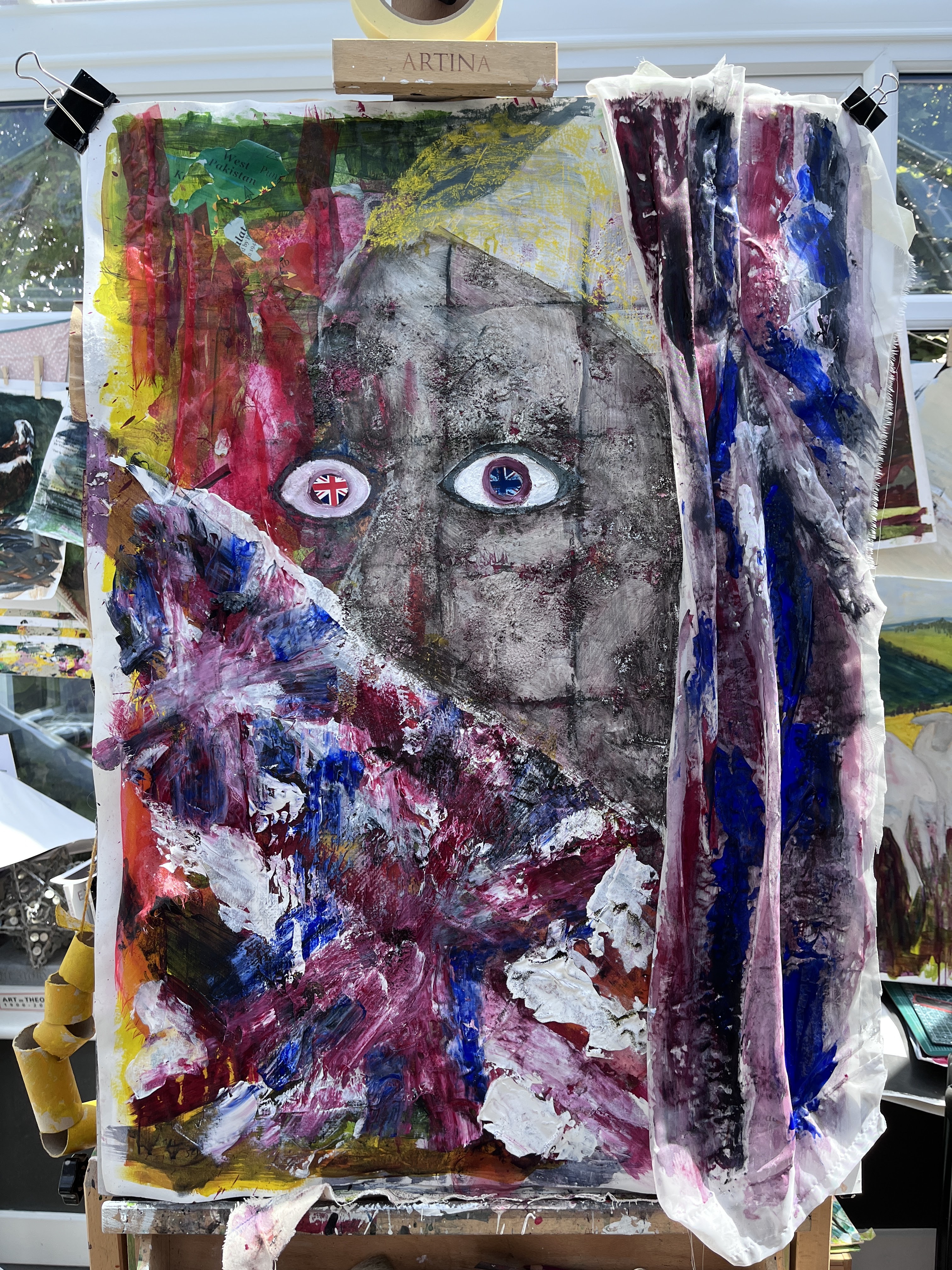

At the moment, I’m unsure about the eye on the left, whether or not it distorts the image too much with its abstracted position. The colours of the flag in the iris also seem too bright and the white of the sclera too pink. The face colouring now feels much better, along with the soft pastel yellow of the scarf at the top of the head, which resonates with what is left of India in that corner.

Bingo – that’s the expression I didn’t know I wanted! I’d started off with a kind of meek passivity; a woman going along with the change inflicted on her country and showing sadness but no resistance. This woman is terrified and I think she will act.
Full frontal photo. And is anyone else seeing a hint of Pearl Earing Girl in this, or is the heat getting to me?
Cropped and tidied.

