
I strongly suspect this has little to do with NASA and everything to do with the table. Exercise 1-2 is about perspective and the use of collage, but I’m not sure I understand the projected process.
The expectation is that the same items as in the previous exercise will be in play but having dismantled that grouping and because a) I’d like to tackle glass/glasses/water, and b) in tutorial feedback we talked about dilute paints and transparency, I’ve assembled a new array.


There’s quite a lot going on here, and I think I can use some inks to good advantage. I also have some watercolour paper.
20th May – foiled at the opening the ink bottle stage! I decided instead to use up some duck cotton off-cuts and pinned the remnants to foam board backed by card and clipped together on the easel. The medium is acrylic; I’m not keen on gouache or watercolour although I might use some of what I have in this set of try-outs. Consider this a vertical sketchbook.
I painted one glass into one piece with no sealing or primer to see what would happen. It was patchy and odd so I began taking it off but in fact the reverse side looked to have some potential. The other pieces are primed; some with transparent primer, some with white, and one with a scrub of Payne’s grey.

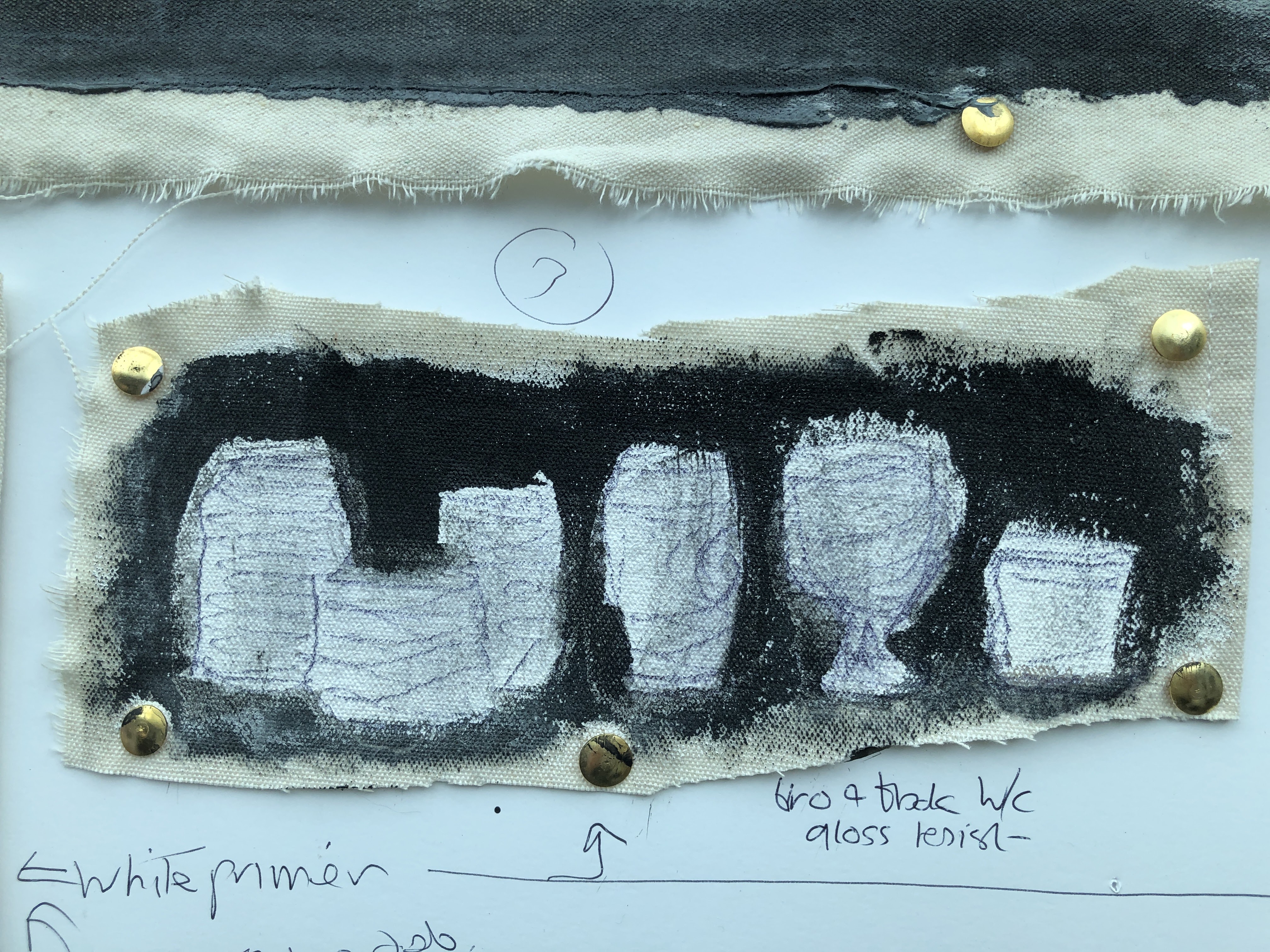
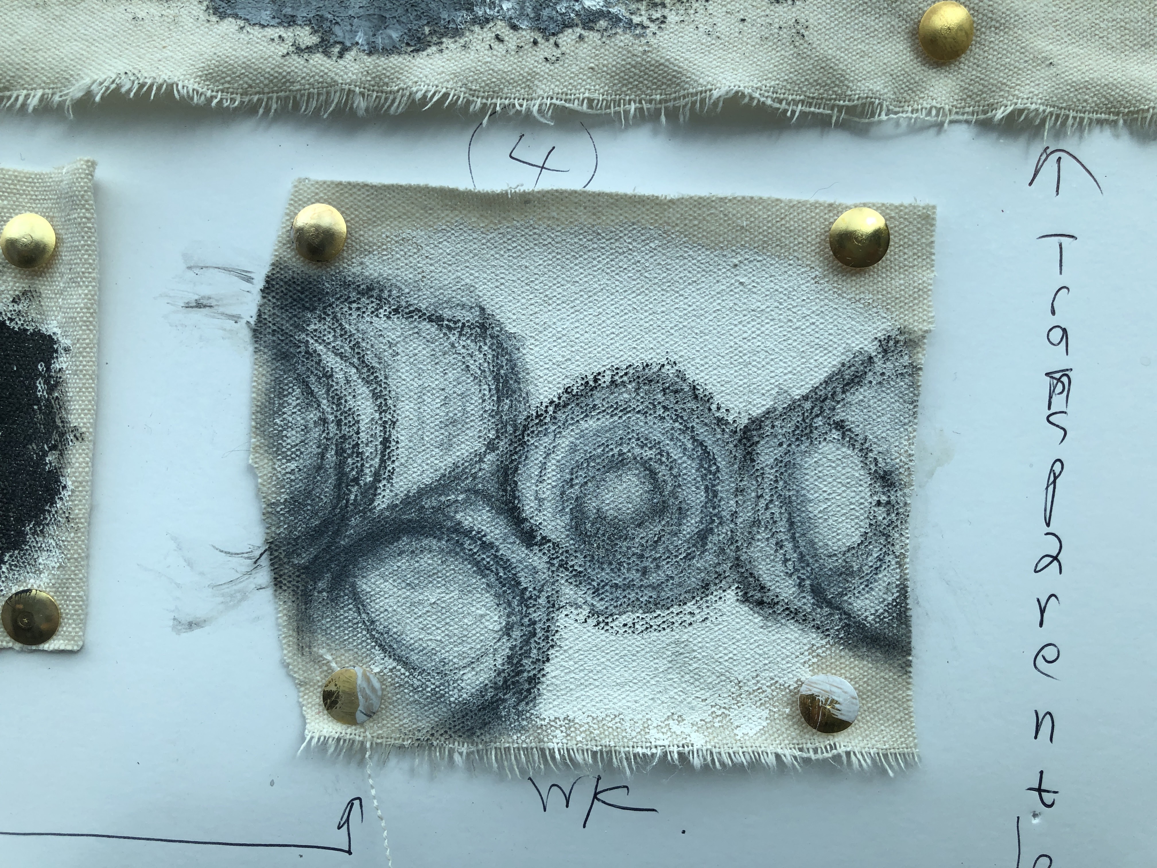
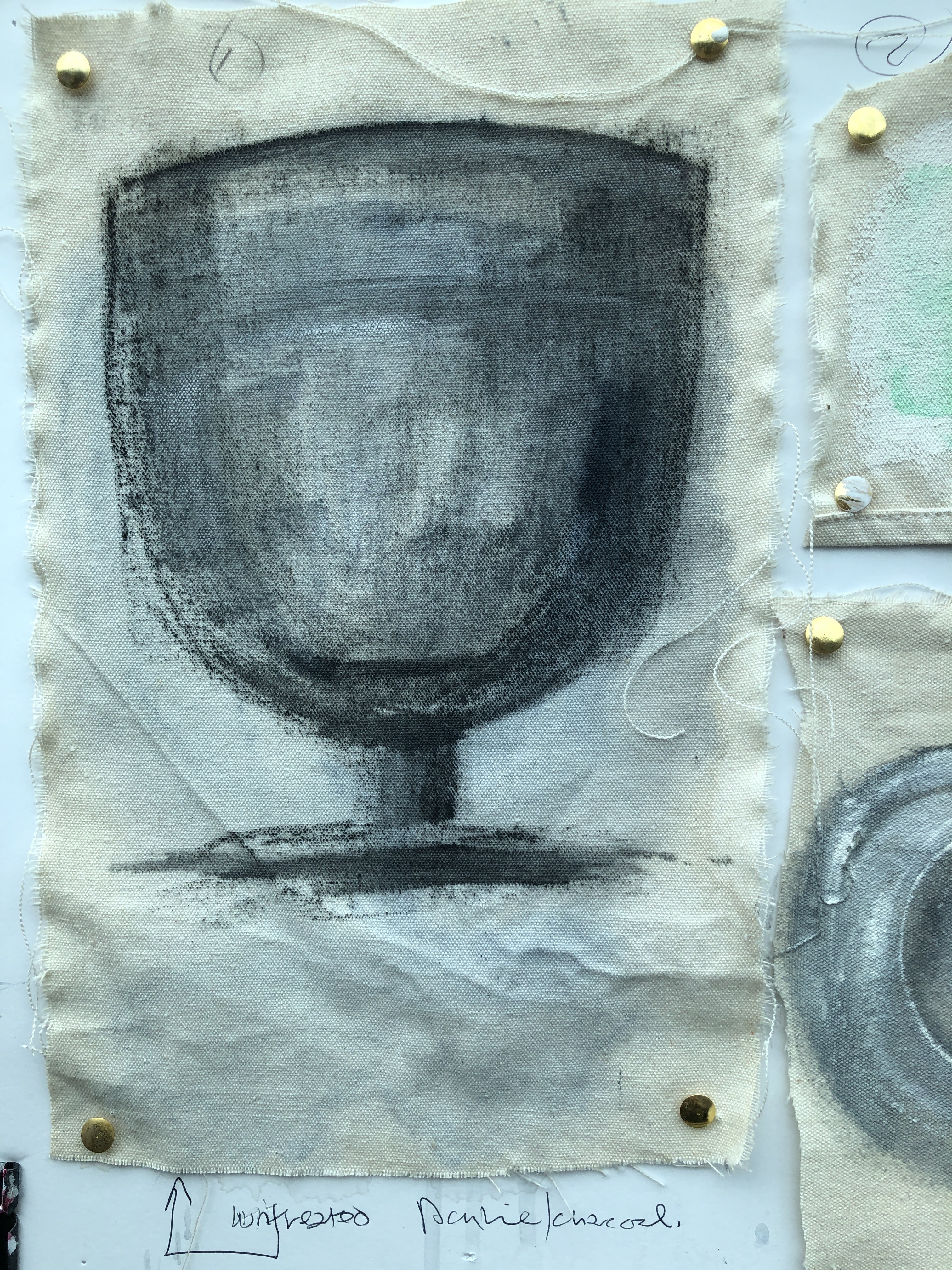
21st May. A series of sketches in charcoal, acrylics, watercolour, Inktense, biro, and oils.

Left to right along the middle: 1. large glass in acrylics and charcoal on untreated canvas and worked to death; 2. pale green – dilute watercolours on primed canvas, looking for translucence and ghosting so allowed to bleed into each other then sponge-reduced; 3. narrow strip white primed but painted black around biro drawn glasses then glossed to resist the background; 4. from above but with camera distortion – watercolour and charcoal on white primed canvas focusing on shapes but without too much success.
Bottom row: 1. three glasses from above on transparent primed canvas, watercolour, gestural, attempt to remove fiddling options; 2. transparent primed canvas with Payne’s grey scrubbed across then painted in oils using a palette knife.
Top ‘frieze’: imagined shelf of glasses painted with a pebble in horizontal and vertical blocks; oils on transparent primed canvas.


Part of the requirement for this exercise involves quite extensive use of scissors which clearly I haven’t done, choosing instead to make shapes using the various media I have to hand as this, ultimately, is a skill I’m more likely to need as I go forward.
What I can do though, is to make a collage using slivers of the photos I’ve taken of the array of glassware. I’ve often used pieces of the film that covers the palette and helps to keep the paint moist, sometimes it’s the one used in the painting but often it’s from a different piece altogether. This will be the next task.
Or that was the plan. Actually I think I like this as it is and given that leaving well alone is one of my constant battles, I’m going to follow my instinct here. I’d made the shapes by painting (w/c) onto cutouts of the photographed items then applying the painted side to the primed canvas board to make an incomplete print. The plan then had been to introduce a background and to begin filling out the shapes with collaged pieces, but the sparseness of this, it’s lack of balance and completion, is appealing. I’ll use something else for the actual task.

22nd May. I’ve prepared a piece of cartridge (A1 cut across to A2) with transparent primer so it will have enough substance to support collaged applications. Then I painted it to roughly match the table – a dilute then thicker wash of Payne’s grey acrylic which I let run down the paper, finally blotting it in places with a piece of flannel to give the paint a texture.
Once semi-dry, I applied the three pieces cut from photographs and which I’d used to print shapes onto the white canvas board. The wet paint held them temporarily while I moved them into position, then I glued them (pva) and adjusted them.

I was really tempted to leave it at this, and perhaps I should have because the simplicity of the shapes and transparency of them is appealing. But I didn’t; I still intended to collage those shapes from other materials I have to hand. And then the subtle colours from the photographic paper caught my eye and I brought in some blue, white, black, and green gouache to bring this out.

These are very different images. Applied with my fingers and pulled off with a flannel, this also pulled off the gloss surface of the photographic paper which left some areas with a cracked glaze appearance. At this stage, I’m a little less happy with the glass on the right which has become quite heavy, more metallic, and has lost the tiny pink strip on its left. The two other glasses, I think, are different creatures in their first and second iterations – it’s like comparing your kids when they’re eight to how they are as teenagers making a judgment as to which version is preferable. Technology allows me to have both even though the ‘teenager’ is what’s materially persistent. I think I might try to find a way to pull out some of that weight. All a bit Cezanne though, those outlines, and if it’s good enough for him …
Sometimes a wet flannel is your best friend.


This is a combination of cutting, painting, and positioning where what I’m beginning to think of as my artist’s eye makes judgments that affect every aspect of the work’s appearance. Simple as it may seem to cut out shapes from photographs, there is a decision even at this stage (and in fact the photography itself, then choosing which photos to use, which ones give the best shapes for which items) as to which will be most representative of the class ‘glass’. Then there’s the cutting – faithful or macro-accurate? The decision to use the ones that had inks and paint applied to then earlier. Then the background – not just a layer of colour comparable to the colour of the table, but a layer painted on to primer with particular qualities and that could be reduced by absorbing into cloth before it dried. A patched, cloudy background, not a flat one. The next decision was the positioning of the cutouts – in a straight line, in the middle, in a group, at one side or the other, at the top, bottom, all in one corner perhaps? Wish I’d thought of that one actually!
I went with a relatively conventional arrangement because I wanted the fancy footwork to be in the glassware – I know from previous work how photographic paper responds to having wet medium of some sort on it and what happens then when you pull some of that back off. It’s interesting because it adds texture and often depth, especially if there’s pva glue or gloss varnish in the paint mix as there is here.
The remaining decisions are quite small – smear a particular dab of paint here or there and what colour, pull the paint back a little further round the top or the side? And when to stop.
I’ve stopped now and I like the eight year olds and the teenagers for different reasons. This is arguably the most satisfying piece of work to date in this module. I’m breathing again and I’ll be posting it to Instagram which are decent indicators!
Mandatory video:
___
We’re asked to look at Mary Heilmann’s (1940 – ) work after reading a passage in which she describes her experience of Chinese art where perspective is considerably less architectural than in Western work. The examples I found (Mary Heilmann — Artists | Hauser & Wirth (hauserwirth.com)) seem, on the whole, to have largely abandoned the notion, barring one or two looking like road markings. That said, there is something of the cubist about a few pieces with perspective arising from the placing of different planes of colour.

Comparing and contrasting this work with my own is, at one level, a simple matter, but on another, quite complex. I find abstract work on the whole to be unrelatable; I would give it a nod and walk on by unless the colours drew me, unless it were more design than painting. Because of this, comparison is difficult and I’d say there is none; but contrast – yes, there’s plenty of that. My work has recognisable objects in it and relies on that for its relationship with the viewer. Ordinarily, I would also be emphasising meaning and communication but this is an exercise with limited opportunities for that although I do have an animation in mind which will combine the imagery with sounds made by the individual glasses with their different water levels. If pushed, there’s scope for some stop/motion material too.
Another obvious contrast is skill – Heilmann is clearly an excellent technician in terms of application of paint and drawing out of shapes. Style and motivation apart, this is a long way from my capabilities at present. There are also sculptural/installation elements which I know can’t be in my repertoire.
We’re asked now to consider which of the approaches discussed in this exercise we might most relate to and what our intellectual or emotional response might be. I honestly can’t answer this at present. I know from past experience that relevance can take some time to impinge, especially when, as now, I find almost nothing to engage with. This is partly due to my own physical limitations which I had never considered likely to be a hindrance to a painting degree. An inconvenience, possibly, but nothing that would preclude large parts of a module’s core approach. Much of this work is 3D, sculptural, and requiring manipulation of materials in ways no longer possible for me so that I’m resorting to ‘in spirit‘ working where possible and actually contemplating skipping some tasks altogether.
I discussed earlier the question I’d been asked about whether I saw myself as a painter and I think the answer was yes but …, the but referring to not being wedded to the classical oils on canvas. But if the alternative is being someone who works in ways profiled in this module, I’d have to say that I am, definitively, a painter; albeit one who’s happy to incorporate different media and contemporary approaches within the context of a piece of something on an easel and with paint on it.
I’m heartened by the parallel project and by hearing that at least one student has presented work from that for assessment, ignoring anything arising from the rest of the module.
That all said, this isn’t a criticism of the module per se; it’s clearly written and presented and the tasks are well described. As a younger person, or even now if I were working in a studio with other people who could help me out with some of the physical demands, I would have been excited to take on the challenges.
Gerhardt Richter 1932 – : Kleine Strasse 1987 – perspective by the book. Small Road [629-3] » Art » Gerhard Richter (gerhard-richter.com)

One thought on “Part 2 – contemporary approaches to still life: exploring space”