
This section brought up memories of circular horrors marching up the staircases of elderly aunts so I wasn’t looking forward to it. In the end, though, it’s just a painting that’s round instead of rectangular and because of that, draws out a different notion of what composition means. Or that’s the impression I gained from reviewing the work of other artists who have used this format in the past. Instead of some grand expositional landscape or ‘framed’ portrait, containing an image within a circle seems to set a new focus, one that’s quite intimate and doesn’t care much for the bigger picture, like looking down a tube or a microscope and focusing only on that small delineated area. My aversion has been dispelled by this thought although not necessarily the suggested subject matter, so building on the thought and on the conclusions I came to from the research, I am looking for images that describe a brief moment, a cameo or clip that intimates a story but doesn’t tell it.
The exercise requires five paintings, initially in thinned down paint but with one selected later to build on, and since it isn’t clear that these should be of the same or different subjects, I chose the latter for interest and practice in making unique paintings in this new (to me) format.
I took a number of photos around the house, framing each as if I were seeing them in their eventual tondos. What would be in the frame? What sits outside or behind? Is there a detail that provides that intimate focus?
I’ve worked quite large, circles cut from A2 cartridge, to accommodate my near vision difficulties.
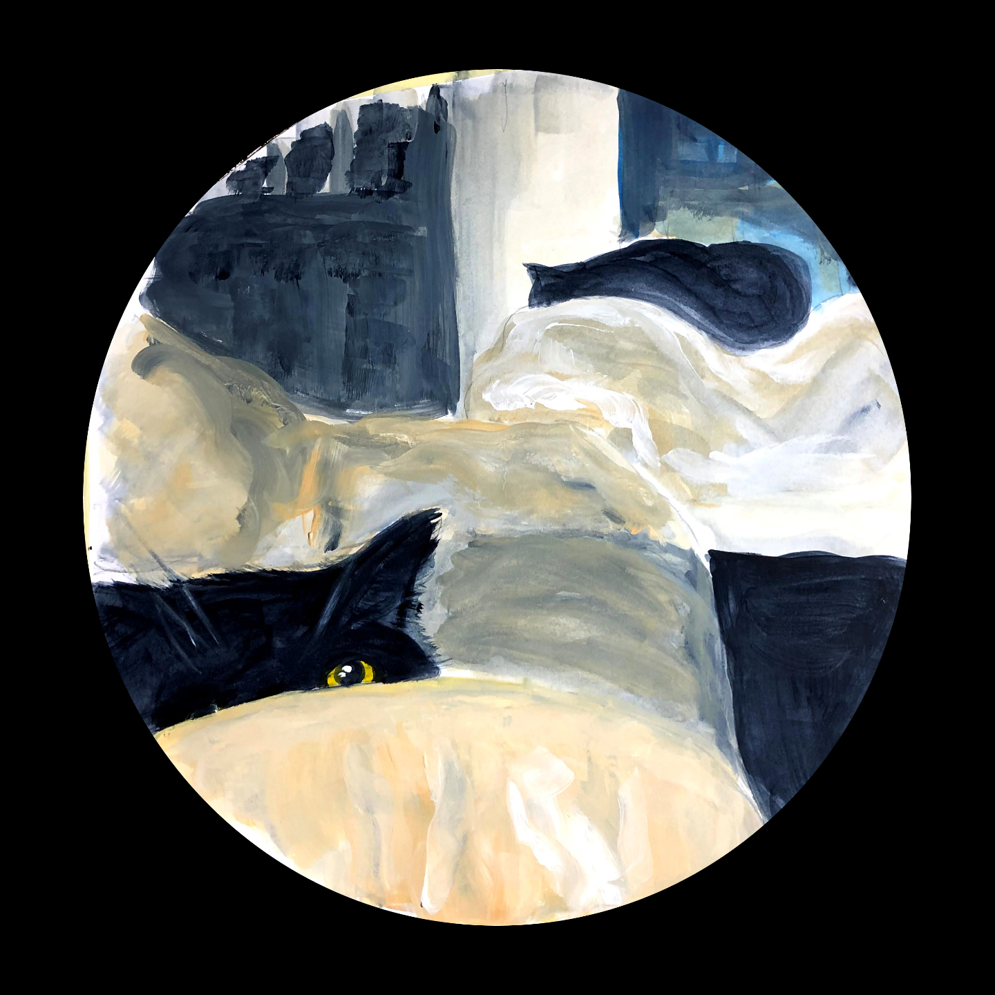
This is the first, and while the instructions suggest to add more paint to one of these later, my inclination is to leave this one at least as it is. On-screen I can see the shapes I was hoping I was making and I absolutely know if I come at it again I will over-work it and lose the simplicity I’m trying so hard to achieve. I’m certainly not touching that eye again, and I really must draw attention to my first legitimate use of a fan brush on the fur!
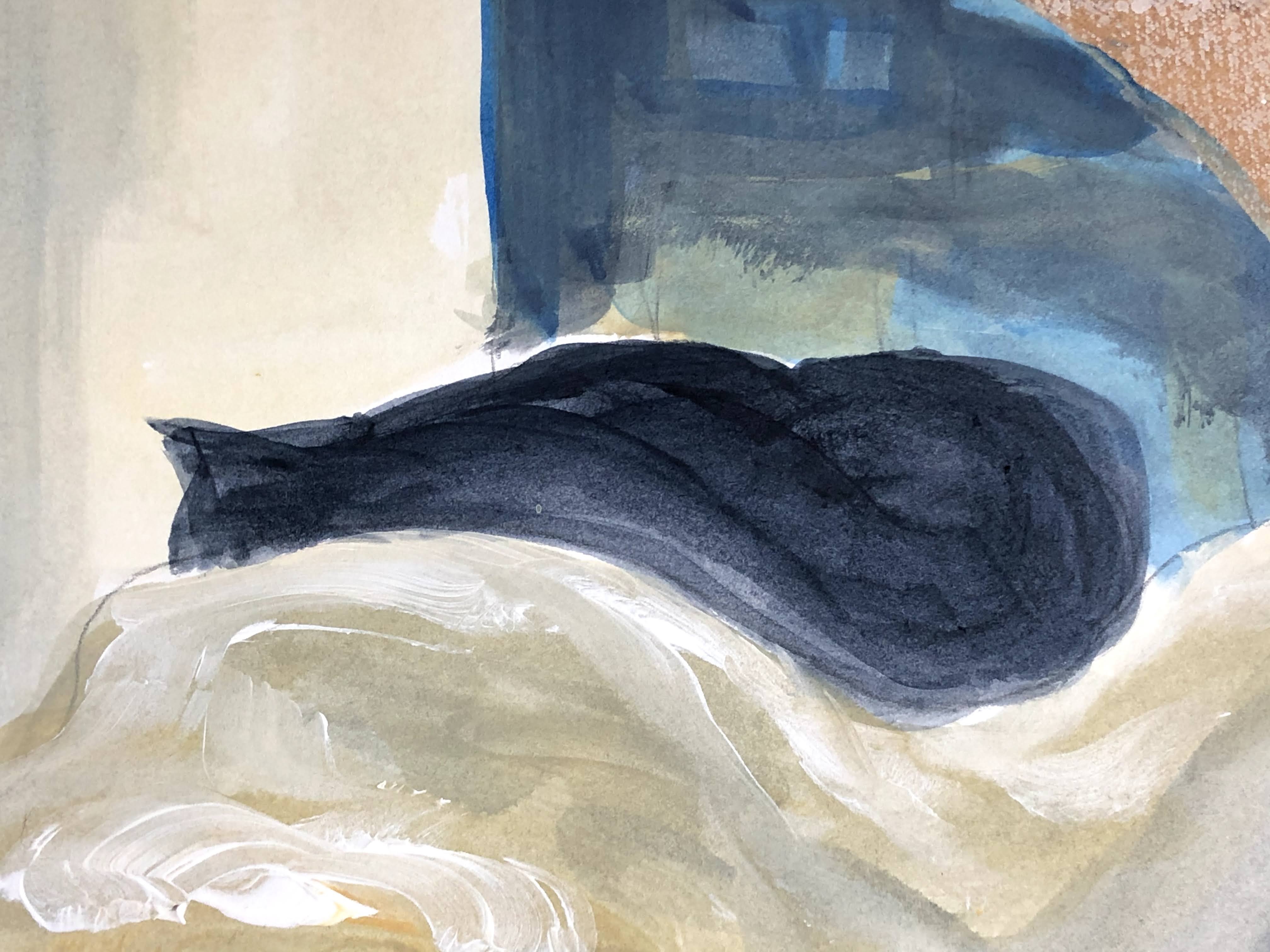

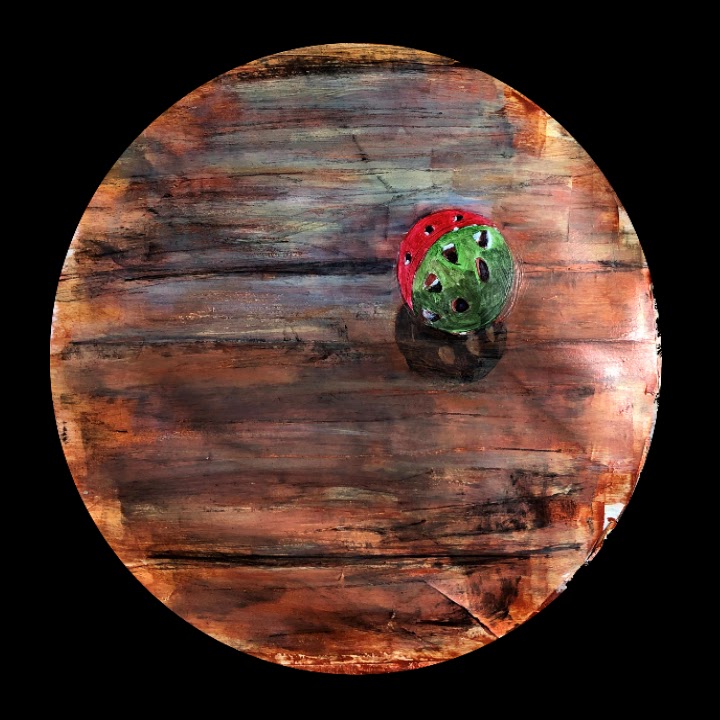
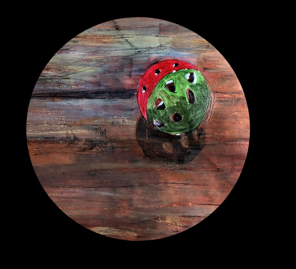
24th November and this is tondo number 2. For a simple image, it’s been much more difficult to paint than the first. There have been more layers, more adjustments, more washes, which rather militates against the initial instruction to use thinned down paint. To add to the mix, I’ve used charcoal to help make floorboards.


Overall, and for this phase, I’m happy with this piece. The board is beginning to look interesting too!
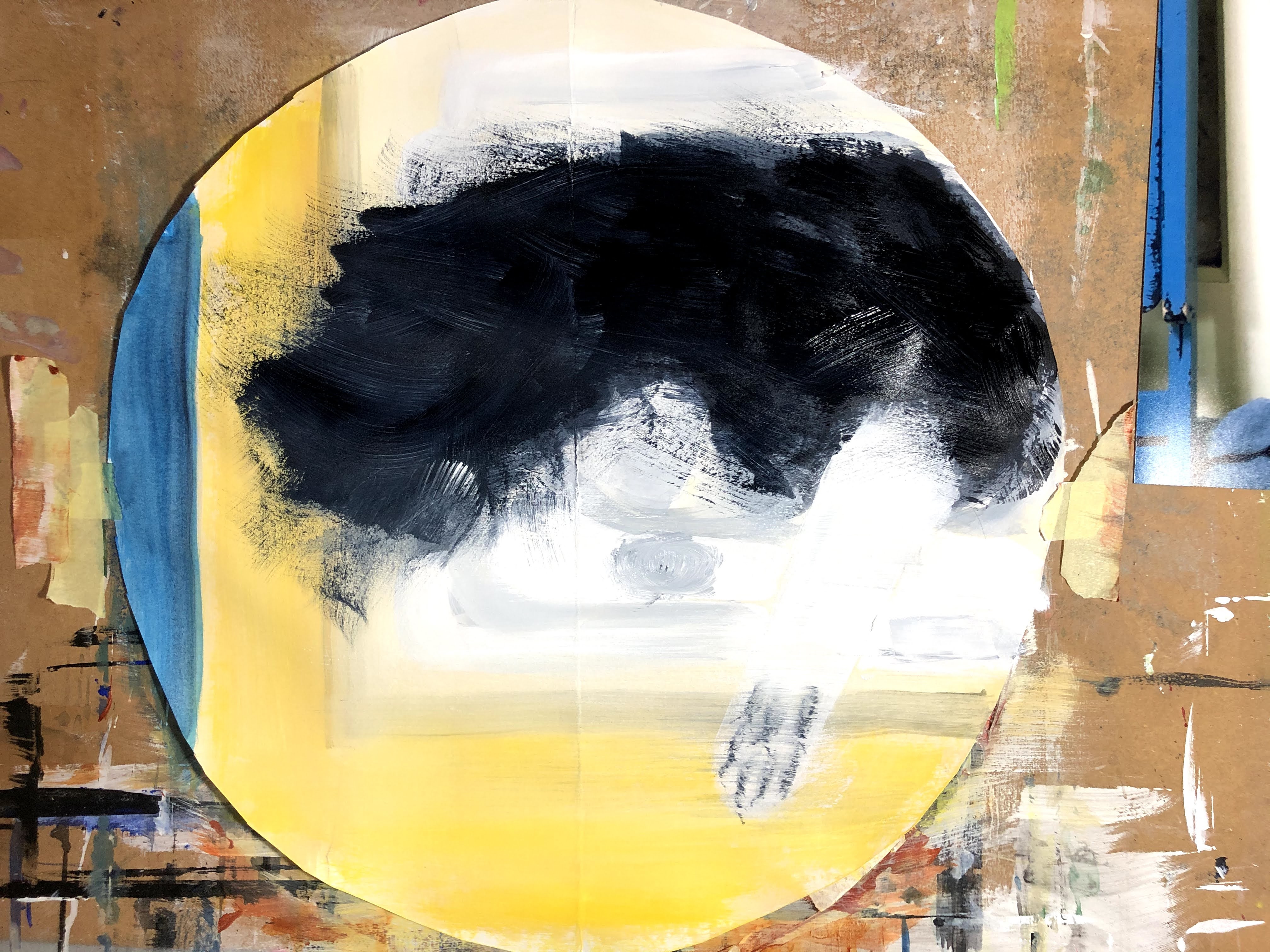
25th November, tondo number 3. This photo is of the catflap with a fast disappearing cat exiting through it. It’s blurred as you might expect, but only where there is movement. The static elements of the door frame and catflap structure are clear. It put me in mind of time, how a single millisecond is irretrievable, and how this particular image in this particular moment will never happen again. Perhaps a little esoteric for this exercise but still, I’d like to nod towards those ideas.


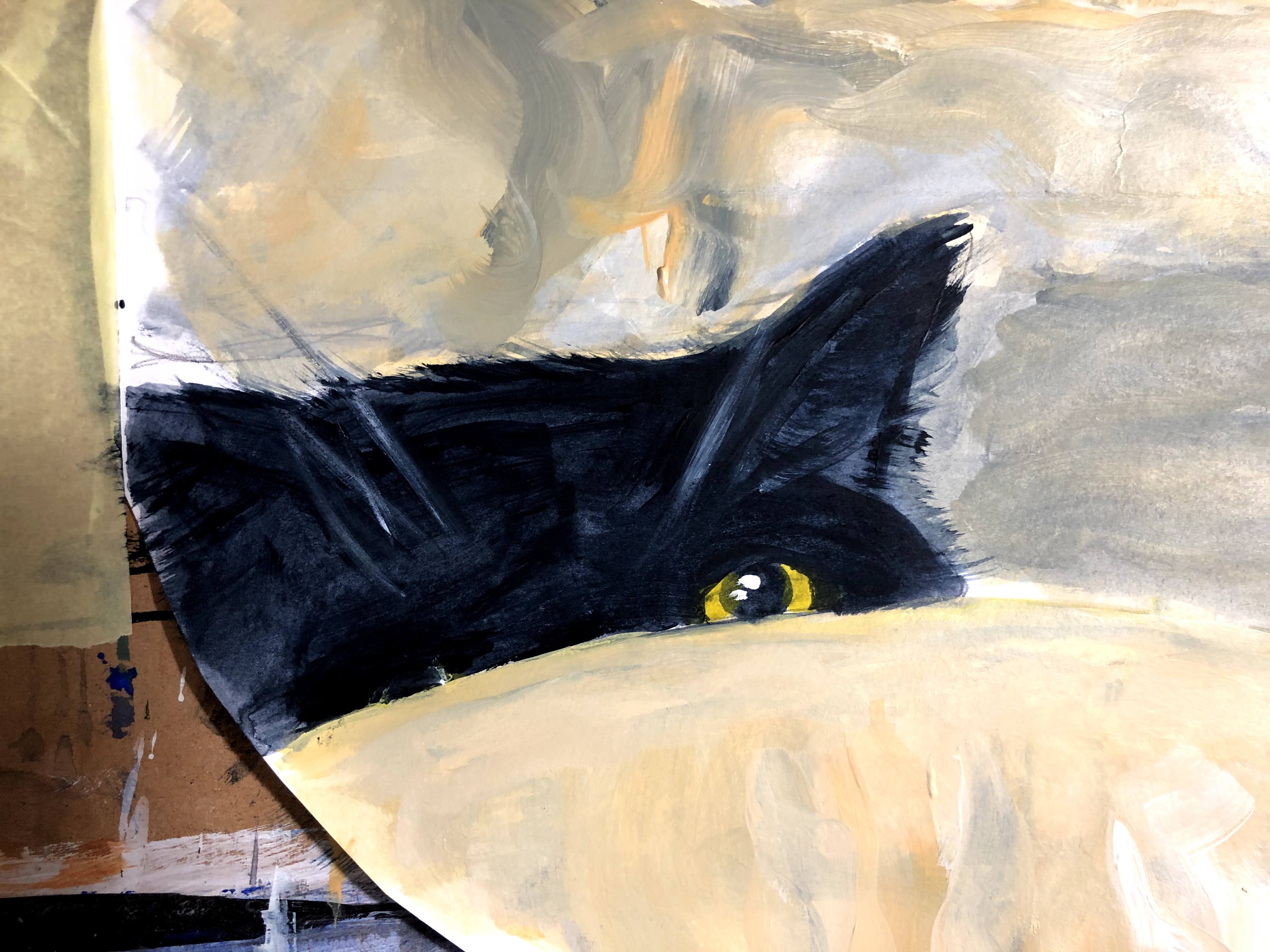
26th November. I’ve adjusted the size of that tail, added some shadow to the left foot and the right leg as it exits the aperture, and used the fan brush to make suggestions of movement.

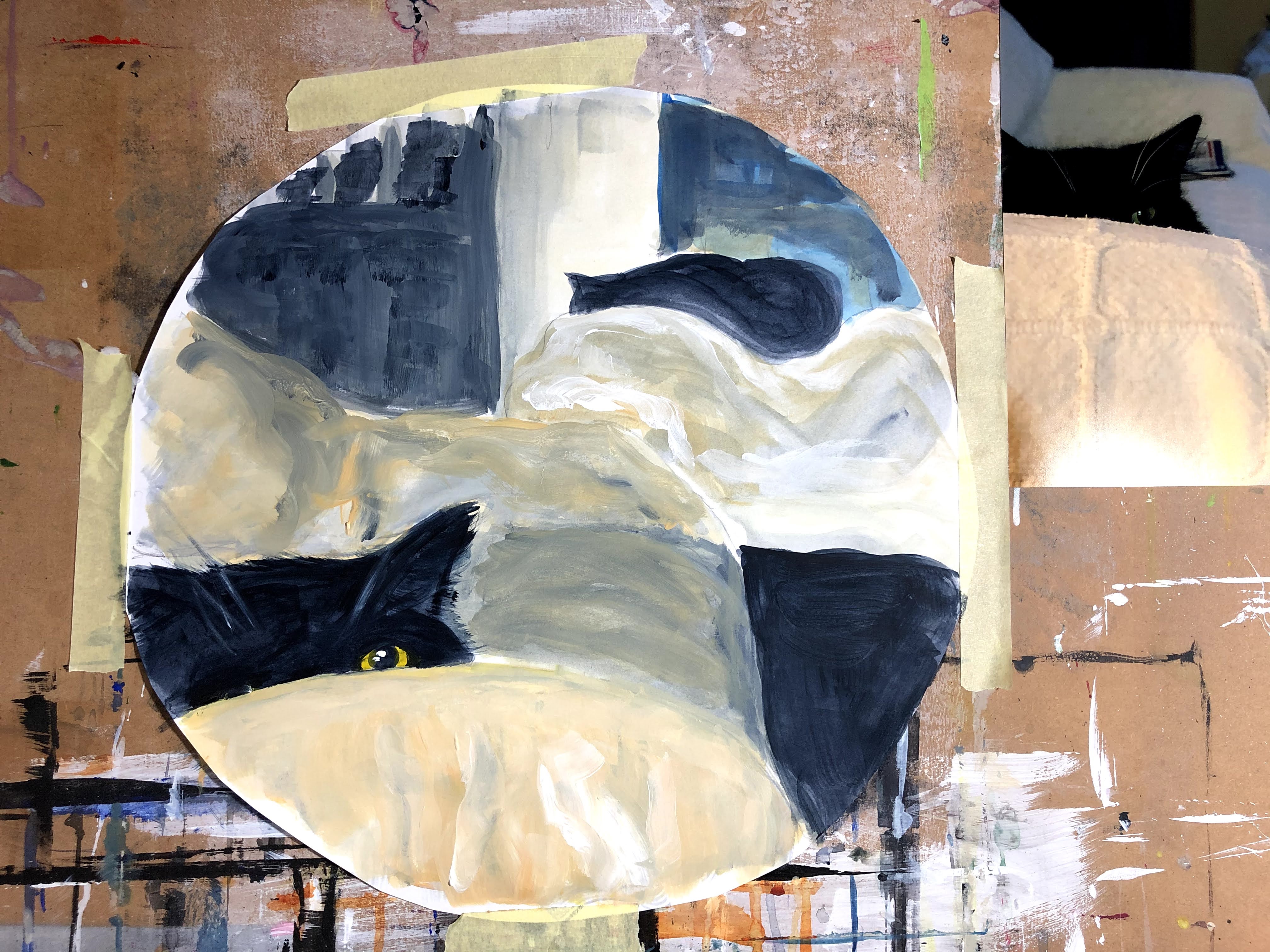
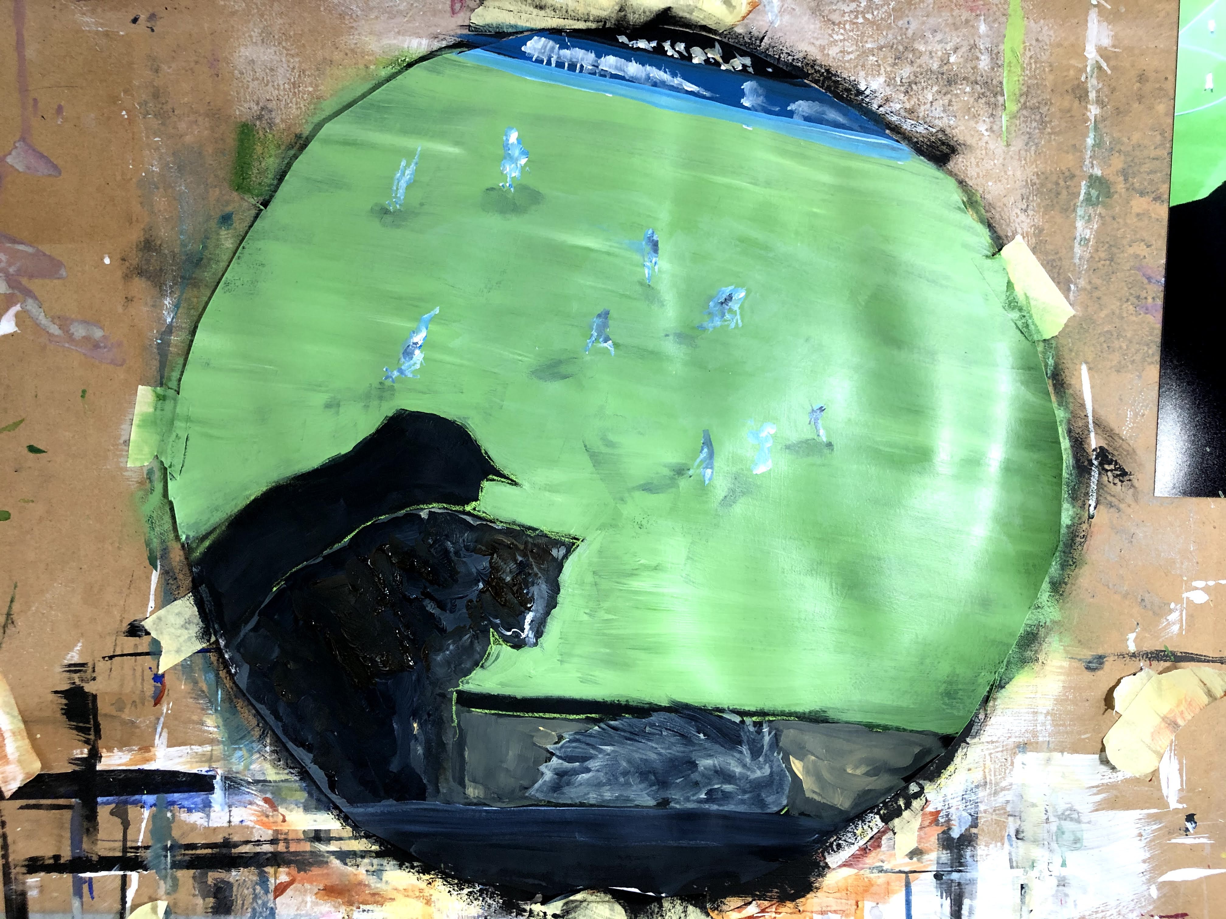
This is how I watch TV. I don’t watch football though, so why that’s there is anyone’s guess.

27th November and the sudden realisation that a) I have conflated 4-1 with 4-4 by posting photos of all these pieces at each stage from thin paint to, in some cases, thicker applications, and b) that cropping is my solution to scale. When I’m asked to paint small I feel confined and tense, partly because my focal length doesn’t accommodate close work of any intensity, but also because my more natural gestural style feels cramped. I remembered though, what my first tutor told me about how, when a painting wasn’t working and she felt she’d tried everything to remedy this, she suddenly realised that there was a particular part that was and if she cropped this out, it would do the job for the whole piece (my paraphrasing). By this principle, I can not only paint at a scale that suite me but also crop out the part or parts that have that zing. Looking back now, I can see many more tondos than are actually required and so I will use my photo-editing software to pull these out. First though, the (now) final large tondo.
And initial crops.

New crops made in Paintshop Pro.


Impact of additional paint and reasons for leaving some unchanged
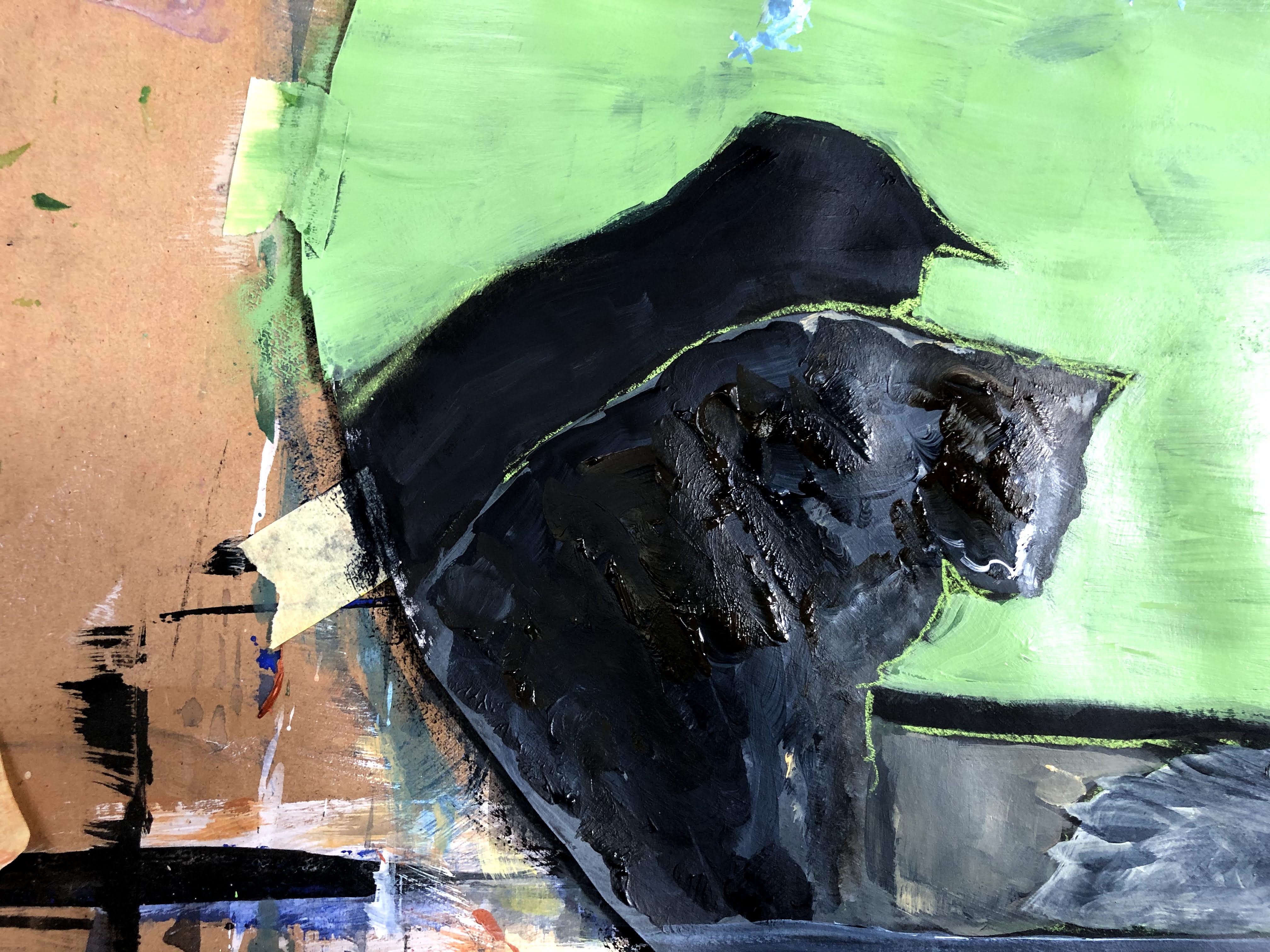
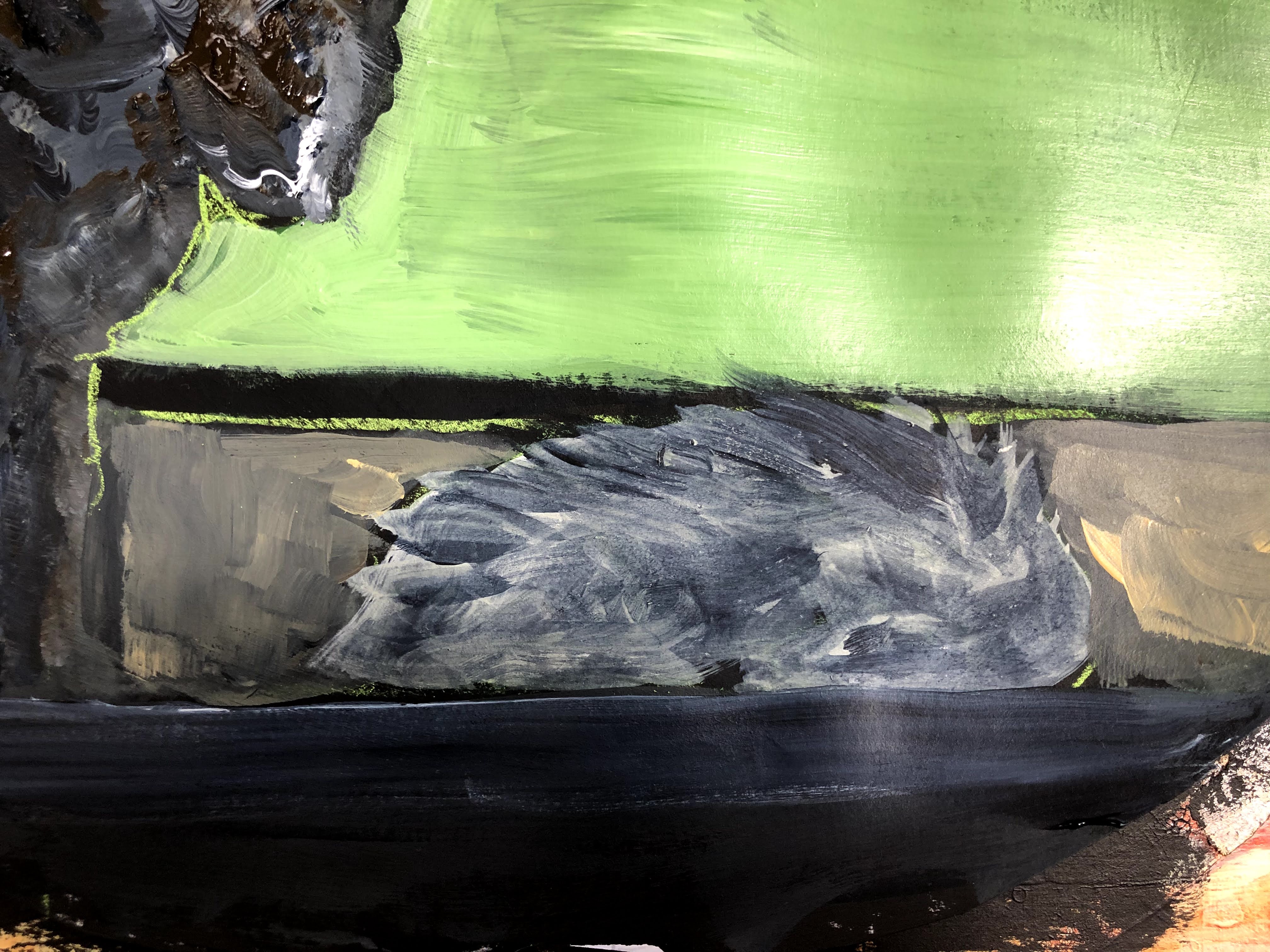
I think, given the serendipitous way in which exercise 1 has merged into exercise 4, I have followed my instincts regarding leaving or adding to different layers of paint. And because one of my driving mantras at present is to avoid over-working and over-detailing, there’s a chance I will drop out too early in the process sometimes. But that said, the TV piece was the final large tondo out of which three smaller ones emerged and I think those crops show the difference between working and leaving alone. The cats (left) are worked and I don’t think are as successful as the pitch + players (centre) or the dragon (right) neither of which comprise much more than touches with a flat brush.
A very helpful finding with this series of exercises has been that, to produce a small end result, I don’t need to begin with a small surface. Painting on a larger scale gives me the gestural freedom to make the kinds of marks that suit my style and requirements and quite serendipitously gives rise to what another tutor described as ‘moments’ whereby a smaller area (or areas) carries the value of the whole better than the whole itself. This is a really important realisation for those times when small is the final objective.
A further useful discovery has been the circle selection tool in Paintshop Pro which I had somehow never seen before.

3 thoughts on “Part 4, exercise 4-1/4 – the tondo”