This first image comes from a book published in 1957, detailing the history of the school I attended from 1960 to 1967. It has significance because, back in the late 1800’s, Cleckheaton was denied a grammar school, the council awarding that to a neighbouring town. But instead of just accepting that decision, the local businesses started a fund to build one themselves, people chipped in, the site chosen was on top of a hill beneath which was a coal seam. The choice was a symbol of the value of education to the local people because that seam would never be mined.
At first it was unfunded and so took only fee-paying pupils, but even before the turn of the century, there were equal numbers of boys and girls in each class, and that is how it continued. The Foundation Building was the first to be erected and sadly it was demolished recently, applications to List it denied. I wasn’t sure where to go with this painting, made from the architect’s sketch of the proposed new science block shown in the book, but gradually, it took on a grunged appearance reflecting the decay that had been allowed to take place and also the rebellious efforts of so many of us to save it.
11. Unjustly. I started with a watercolour pencil drawing, the lines activated with a Derwent watercolour brush. The school colours were bottle green and the House colours red, lime, yellow, and blue, all of which are represented. Once dry, i washed it with several layers of T. white to ‘ghost’ it; applied gloss varnish just to the building, applied more T. white wash, and then added ‘water mark’ lines in biro. Finally, I made ink blots with ecoline black to represent both the children who were taught there, and the carelessness of its abandonment.
I find appealing the randomly placed position of the blot next to the small tower that I left out of all the washes. There’s something bleak about the whole that reflects its ending much more than its inception and I wonder about making something larger.
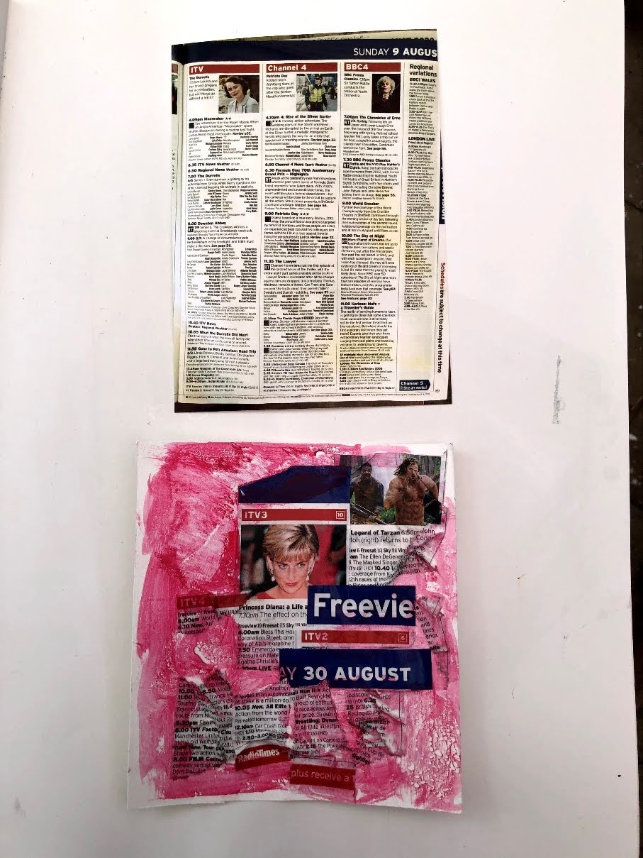
4th September. I’ve begun tackling these on a conveyor belt system – surface preparation, preliminary layers, drawing in, more layers, and so on. This first is based on the found image of a page in the Radio Times but the more I looked at it, the less I felt either able to or interested in making a painting of it. I went back to the RT for more inspiration and tore out another Sunday page so it had the same colours. It turned out to be the page commemorating the death of Princess Diana, an event I recall hearing in shock on the radio late at night, so shortly after it the crash that reporters were talking about hers and Dodi Fayed’s admission to hospital. The next day was the beginning of the most international mass mourning in living memory.
I don’t know if this qualifies as a painting although there is paint on the surface, but to use selected pieces of the Radio Times to tell something of the story seemed more appropriate than trying to produce a single painted image.
In this image, there is a clear photo of Princess Diana with part of the word Freeview alongside, a commentary on how she was public property and ‘free to view’ by anyone. Just above on the right are two men running – in pursuit? The date is there too although it was in the early hours of the 31st that she died, and underneath are some unrelated TV schedules, speaking for the ordinariness of the people now so unexpectedly drawn into a tragedy.12. PVA glue allows for crumpling of the adhered paper – again a symbol of the crash and her crumpled vehicle. It also makes an interesting surface for paint, especially a dilute wash. This crimson has obvious connotations and I’ve used the glue to (s)wipe the colour away and to make rain patterns. Or perhaps they’re tears, there were many of those. I was running a workshop on grief and loss not long afterwards and the room was in almost paralysed silence – stiff, rigid, containing it all. These professionals torn apart by the death of someone they had never met.
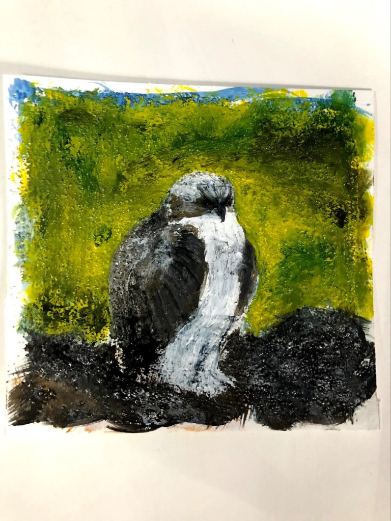
5th September and a more cheerful note. Like a lot of people I watched the Loch Arkaig ospreys as their eggs hatched and the nestlings grew. This is one of the chicks, now almost full grown.
There’s a lot wrong with this – the shape of the head is too rounded as is its posture. This is a big budgie.13. I had prepared the surface with pumice medium for texture and resistance, really just to see how that would play out. The paint is acrylic and some of the brush work is my finger. I had trouble with the background, and with the bird’s feet which are just discernible beneath tufts of feathers. It is nowhere near as majestic as it should be and another to come back to later. The finish is gloss varnish.
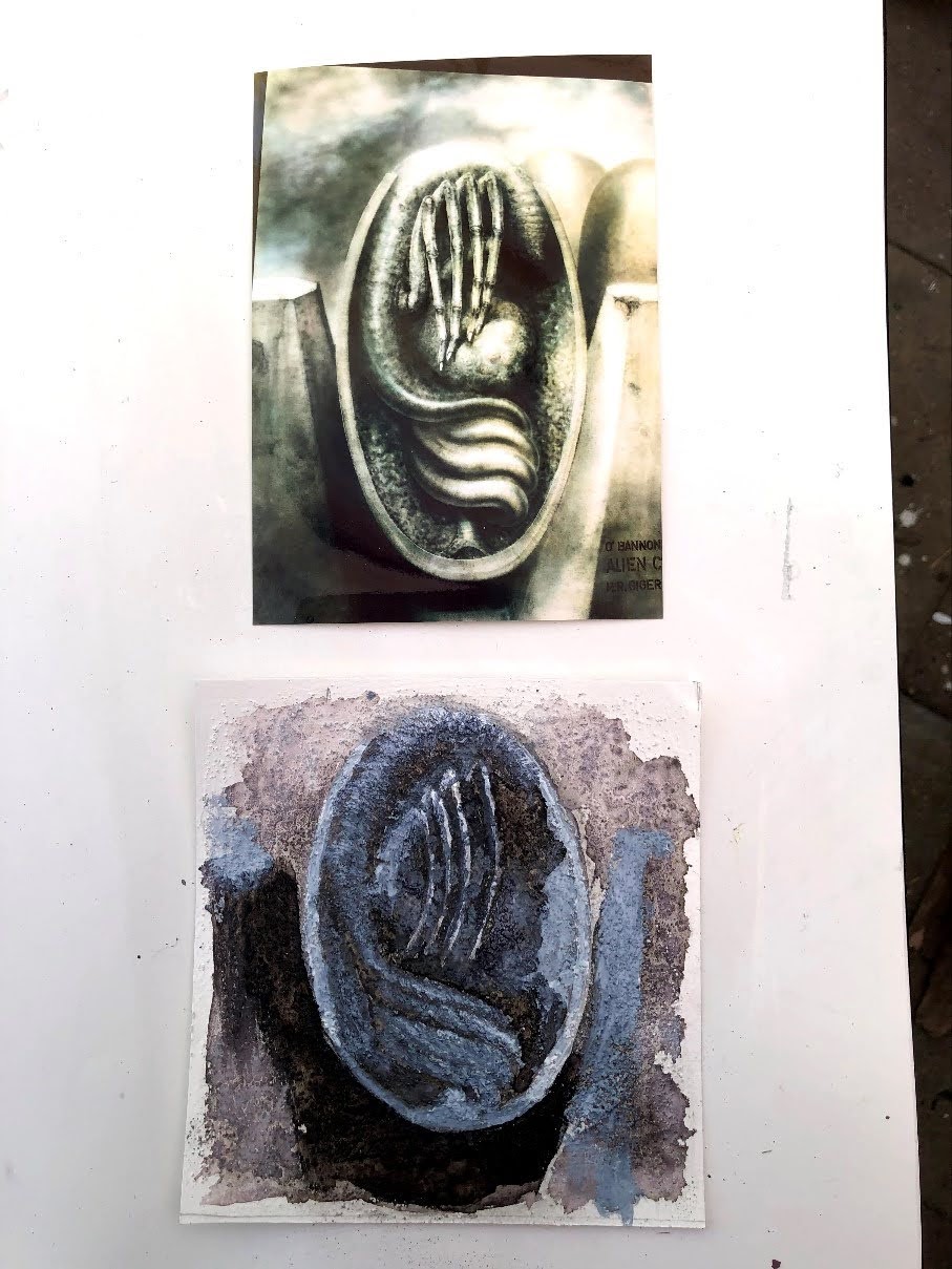
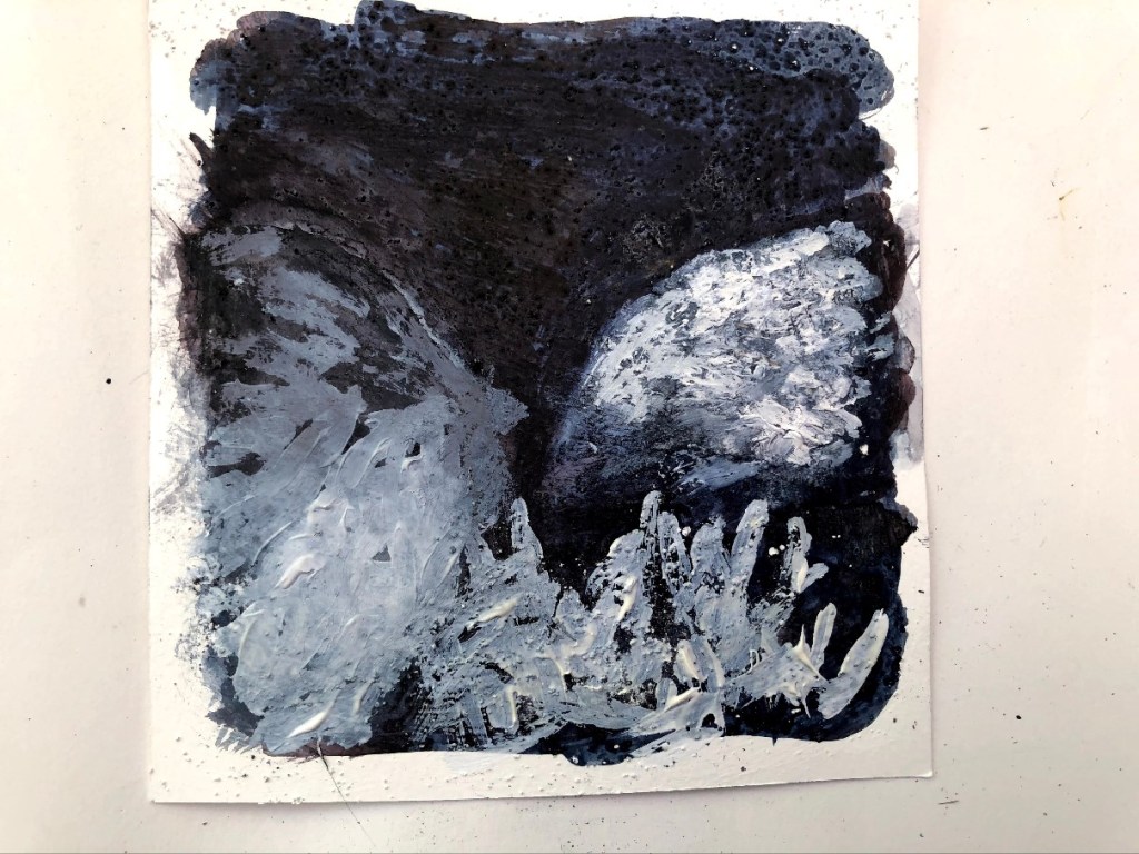
The next image comes from the designer of some of the most horrific science fiction sets we had seen up until that point and I’m really not sure they have been bettered. The film was as far from 2001: a space odyssey as it was possible to get with its massive Gothic structures and an alien that took one horrendous form after another. I’ll admit though, that towards the end when I should have been sweating for Ripley, I was preoccupied with the whereabouts of the cat!
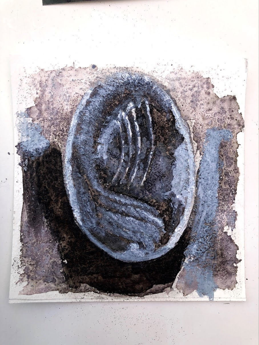
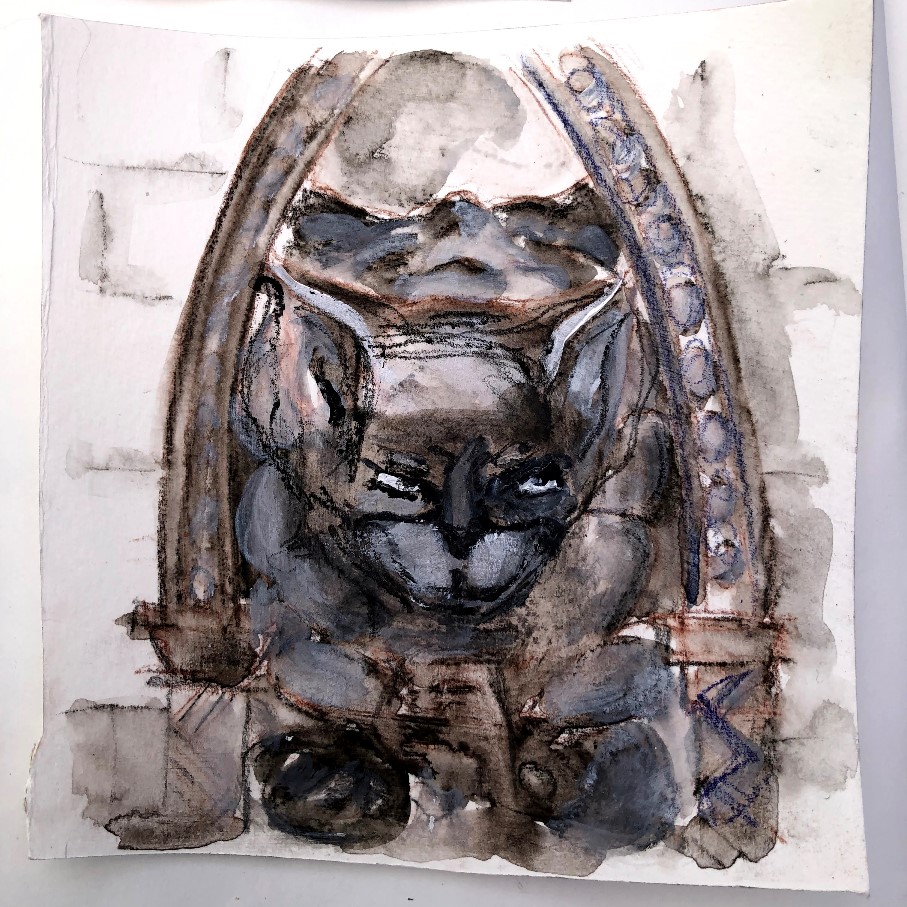
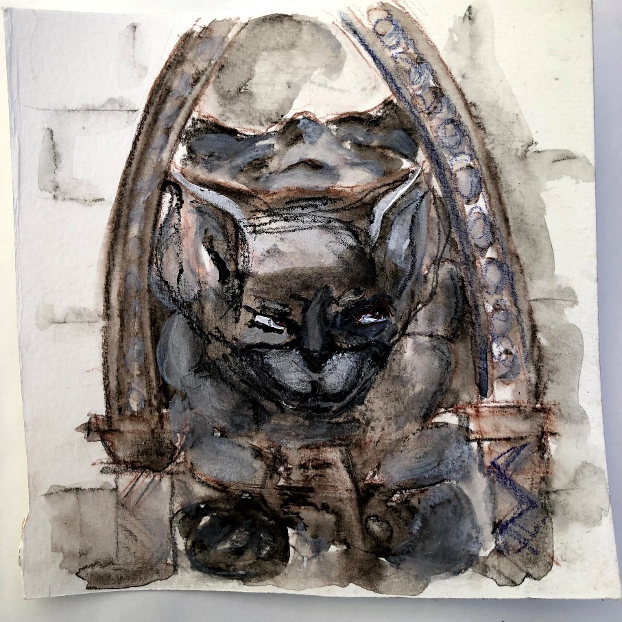
This is from Giger’s designs for the Facehugger eggs in Alien. As there is no way of out playing Giger at his own game, this is another subversion, again with pumice medium mixed with white primer.14. I mapped out the shapes with charcoal and powdered graphite, moving the medium around with a brush over and between the grit of the pumice. Then I made the shaded areas with ecoline black ink, sometimes very dilute, sometimes as it comes. I let this drift, pushing it around into the shapes and dabbing it with paper towel to restore the under layers. The white is T white, some of it dilute, some blending into the white primer. The image is raw, the antithesis of Giger’s, and while this too could be much improved in subsequent iterations, I am happy with the fundamental principles.
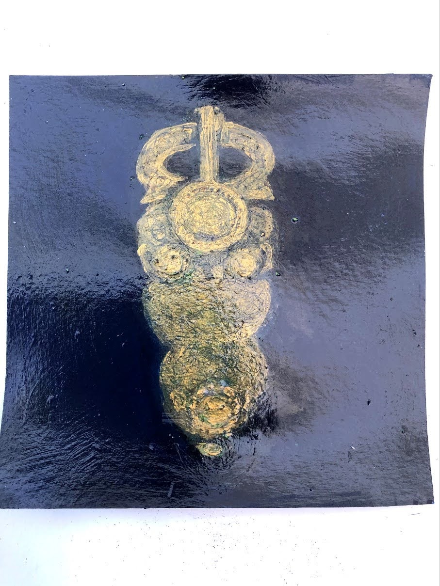
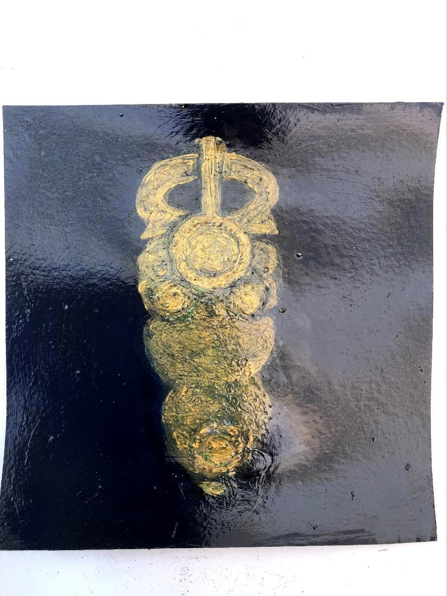
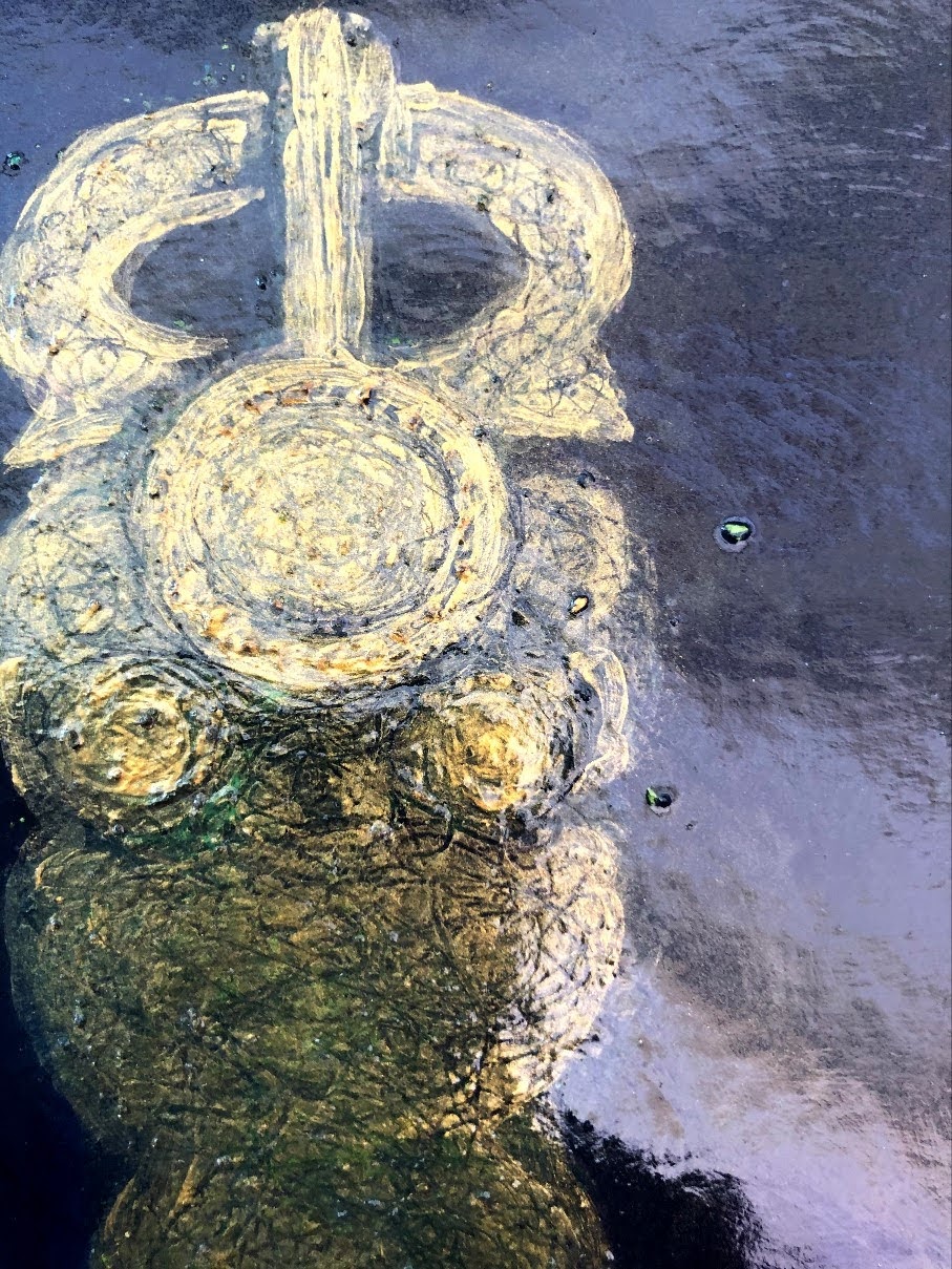
I remember being introduced to the Sutton Hoo burial site at school and, whether or not we actually visited or the treasures were toured, this buckle made an impression on me. I had never seen anything so old that looked so perfect.
The more I focused on this for the painting, the more it took on a female form and I think I’ve given it hips and a belly that don’t exist in reality!15. I prepared the surface with black primer then varnished it. The subsequent layers are bronze and gold acrylic with washes of blue, green, and payne’s grey. Some green pigment is crushed soft pastel, sprinkled randomly. Between layers, I used a stylus to scratch out an approximate tracery to indicate the intricate metal work on the buckle itself, sprayed it with matte varnish to seal and then brushed on a layer of gloss varnish. Following that, I added more gold acrylic, this time to make some texture over the tiny dots around the larger circular areas, then again sealed it with matte spray varnish and finished it with gloss.
This is difficult to photograph due to the gloss finish; the first image is slightly different from the one above, and the crop could almost be underwater.
This is a very intricate piece of work which I really can’t do justice to, certainly not at the moment or at this scale, but I have appreciated the way this assignment has, with its own scales, pushed me into trying new things and taking risks, and the closer I get to the twentieth, the more risky I expect my output to be. It may be tosh, but with any luck it will be interesting tosh.
A still from a video taken by my wildlife camera. These two hogs were circling and huffing almost all night. It’s mating behaviour; the circle-er being male, the circle-ee female.16. Again, this is on pumice because I wanted texture but there is no other priming medium. The paint is acrylic Payne’s grey (for its blue-ish tinge) and T. white. I used the pumice to roughen all the elements in the image because the setting is amongst leaf litter and gravel and anyone who’s tried to pick up a hedgehog will testify to that particular texture. The animal most in shot is a large male, puffed up and huffing round the female; his shape was tricky to set because the perspective is distorted by the camera’s focal length and for a while, no matter what I did he looked like, well, a massive tit on an X-ray plate. I resorted to artistic licence to shift him round a bit so there was more rump and less inopportunistically protruding nose-end.
I can’t can’t vouch for the timing but at the moment there are three baby hogs in one of my huts. First time ever.
6th September. This painting is based on another wildlife camera still, this time of a regular visitor, Buttons. He often chunters to the camera as he passes. Proper little character.
T. white acrylic applied with a palette knife and drawn into with a stylus. Raw umber mixed and applied with a brush.17. It took several attempts to get him in proportion. He’s a sturdy little chap and walks as if he owns everywhere he goes. I went for a streaked appearance because this is what happens when the camera’s batteries are running low, and also because his markings are like patches of shadow in bright sun. I was more concerned to get his face right than anything else and really I’d like him to look a little more world-savvy and slightly bored with the whole on-film thing than he does.
This is my next challenge, straight off the subs bench it’s the DVD of Avatar, one of my very most favourite films. Because I haven’t used it before, I’ve started with a sketch using watercolour pencils to find the shapes. The white is finger-smudged T. white acrylic. I may quit while I’m ahead!
7th September. Two more sketches and I’m glad I didn’t quit at the first.
Started in watercolour pencil, completed in acrylics. Seeking a square shape in the original to translate onto the required piece of HP paper, I already favoured the eye but had a go at the lower half of the face just to see if it brought a different drama. I don’t think it did so I will go for my first choice for this painting.All sketches plus the final painting. This is such an iconic image it’s hard to come close to doing it justice but I was actually surprised to see, when I was looking really closely, the brush strokes; I’d assumed it was a still from the film. Nothing to live up to there then!18. Drawn out in watercolour pencil, this is painted in acrylics: Payne’s grey, T. white, Cerulean blue hue, and primary yellow. The finish is a sheen of BWC white eyeshadow which has a slight sparkle to it, and matte spray varnish.
This has been one of the more enjoyable of these pieces – I like the colours, the film is spectacular (try it in 3D if you haven’t already), and the shapes are decisive. I would have loved to get more luminosity into the appearance but as yet, I don’t know how I would do that.
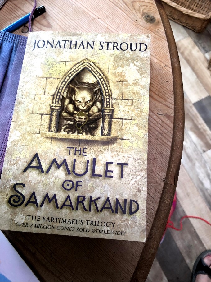
Number 19 of 20 – an evil little critter on the front of a book, The Amulet of Samarkand, which is part of the Bartimaeus trilogy by Jonathan Stroud. I don’t clearly remember what this is about but I remember enjoying it very much; which isn’t a good guide as my re-reading of Imajica made me wonder how on earth I could have missed the salacious misogyny and rampant religiosity of it. Still, Bartimaeus.
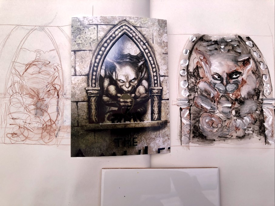
This is another substitute image which is far more interesting to paint than the carton of eggs it replaces, and since I haven’t tackled it before, there need to be shape-finding sketches.
Sketches are initially watercolour pencil, then fineliner looking for that hint of brown in the original. T. white makes the highlights. I’ll refine the features in subsequent sketches, especially the not-at-all-evil-enough eyes and the hamster cheeks.
8th September; third sketch. This time the eyes and mouth are a little more evil and I have more of a handle on what to do for the actual painting. HP watercolour paper is much more substantial than cartridge but still, I might give it a coat of transparent primer to bump that up and give me some room for pushing and pulling the medium.
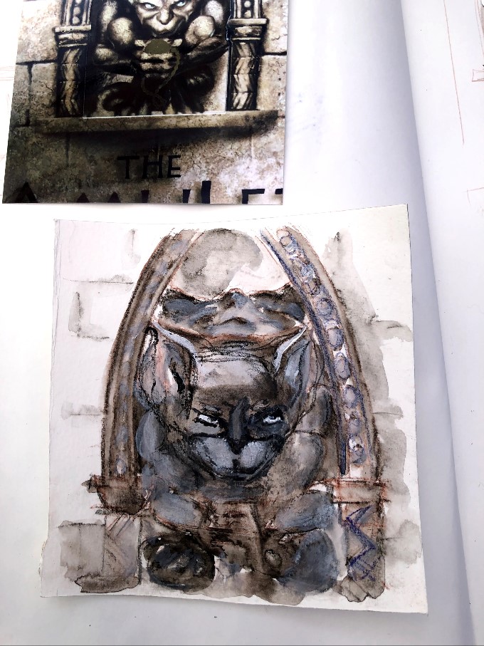
There is a blue note to those eyes that I want to get into the final painting. Wicked little beast, isn’t he?Not quite wickedly cheeky enough but the paper is unlikely to survive much more poking around .19. Bartimaeus. Watercolour pencil and acrylics. Some of those shapes are demonic in their own right. I have discarded one attempt that began with promise but then morphed into first a cat and then a fox. This one, while not as evil as the previous pencil sketch, is less like a cartoon and I think the colours match the tenor of the image better. I’d adjust the direction of the eyes but there is so little room for manoeuvre in the tiny space. Maybe later when I feel less like turning it into frog spawn.Better? Maybe, maybe not.
Sometimes you need significant space between a thing that doesn’t work, and the right time to try again. For now, it’s time to move on and leave this particular gremlin with its not-quite-evil eyes and its less-than-wicked mouth.
Grand Finale – number 20 of 20 and going out with a bang. This is, for me, the very best photograph of Brighton’s collapsing and now skeletal West Pier. I bought it many years ago in the North Laines; it looked to me then like a fallen space ship or a palaeolithic leviathan. Now it brings to mind those hidden object games for computers where you find yourself searching an underwater shipwreck or an abandoned derelict building – nothing is horizontal or vertical, ceilings are on the floor and the floor is draped down into the cellar. More recent photographs and paintings are of the stark black bones of the structure; evocative in their own right but nothing quite like this. Credit is to Roger Bamber, the photographer.
I’ve taken a crop of this for my piece; having finally realised that this is the way to translate rectangular images onto square cards. This shows the unbalanced folds of the building but also the huge murmuration above it, now gone as the starlings have nowhere to roost in such numbers.
These are my first sketches. Inkense pencil and block. I am looking for shapes, colours, and composition, and actually think the first with its low horizon is my preferred image.
I think sometimes it’s inadvisable to tackle a painting that already has substantial meaning. At least until your skills are better developed. I’m very fond of this photograph and quite invested in making a good job of a painting, but I also know that a good photo doesn’t necessarily translate into a good subject for a painted image. This might have been too good a photo, too strong in its own right for me to do anything very original with it, which might have been why I found it hard to swerve the idea of a gift shop card.
I’ve used watercolour pencils, acrylic paint, and a fineliner pen to make this painting. The pencil marks set out the shapes and then I applied a coat of gloss varnish to change the surface. Dilute acrylics washed back and forth made the sky, then more solid paint made the substance of the pier structure. I’ve used fineliner to outline many of the elements in the manner of a gift shop card – almost making stained glass of the coloured panels. The birds are also fineliner and drawn in short bursts so as to keep the fluidity. Too long and they become scribbled spiders.20. The good thing is that almost no one would recognise this even from the photograph or have any idea what it was without some context! I would like possibly to make a larger version of it sometime, incorporating more of the original photo.
The next task is to arrange all twenty and consider groupings. This will be a separate post.
Giger, H.R. 1979. Giger’s Alien – film design. Big O Publishing.


One thought on “Assignment 1: 11-20 paintings of found images”