
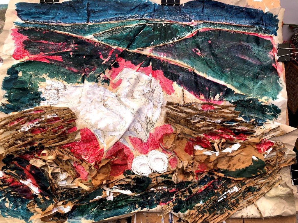
One of my found photos is a still from the Loch Arkaig osprey cam taken just after the first chick hatched and while there were still two eggs. Of all the photos, this is the one I actually wanted to paint and, for the assignment, I will. But the specifications are that each painting should be on a 6″ x 6″ square of HP watercolour paper and I really wanted to make something bigger. So that’s what I’m doing; getting it out of my system, maybe!
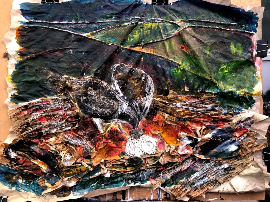
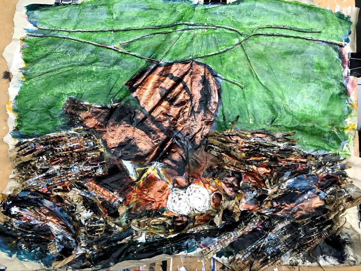

This is the tipping point; the support is flimsy and won’t take much more medium or pressure, the risk of over-working is high, and the background isn’t what I want just yet. Also those ‘eyes’ that make the larger bird look like a cartoon. How is I see this so clearly in a photo but not face-to-face?
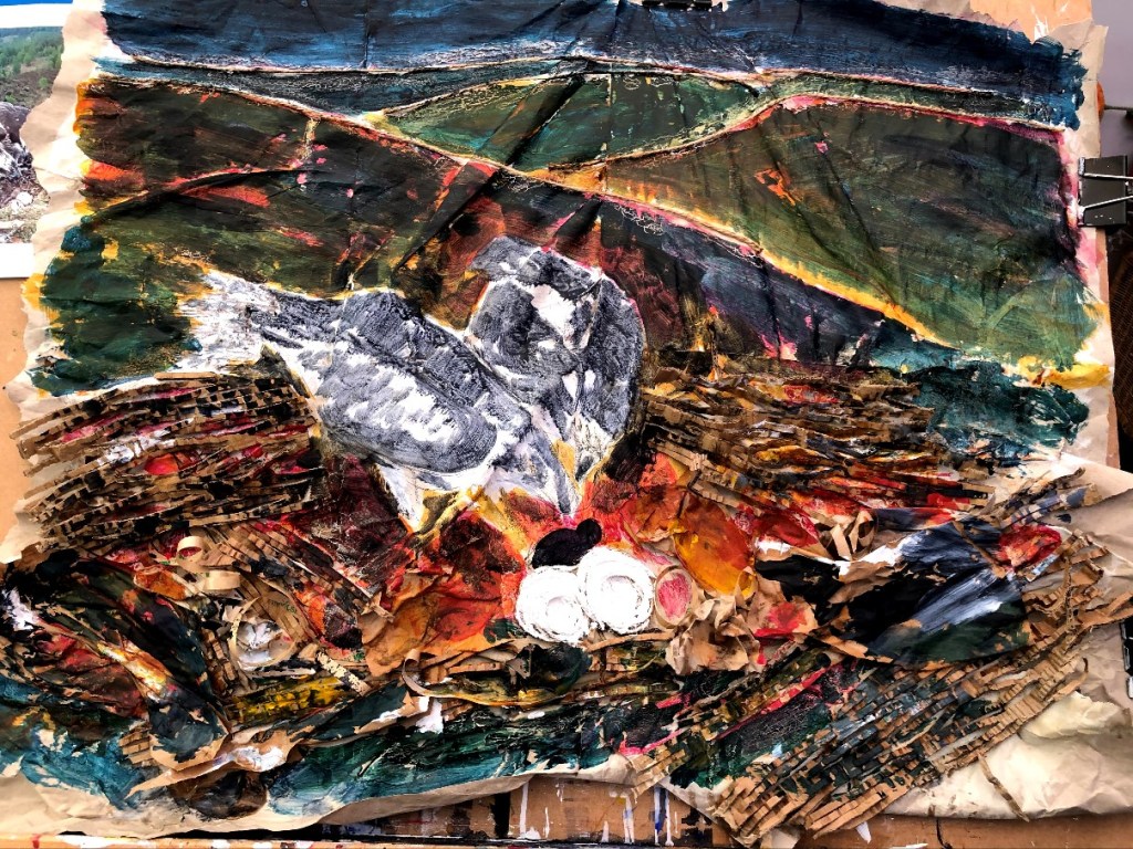
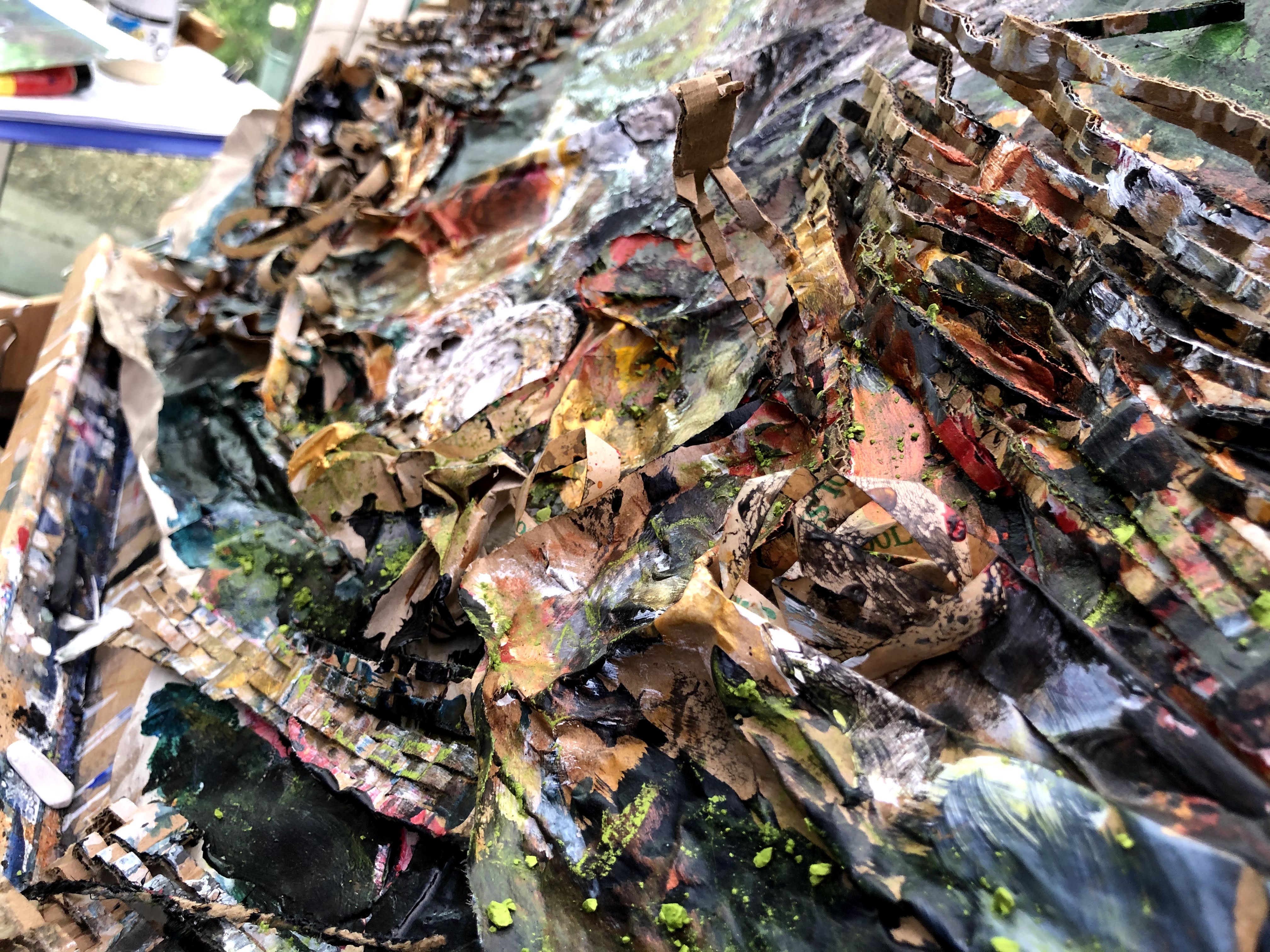
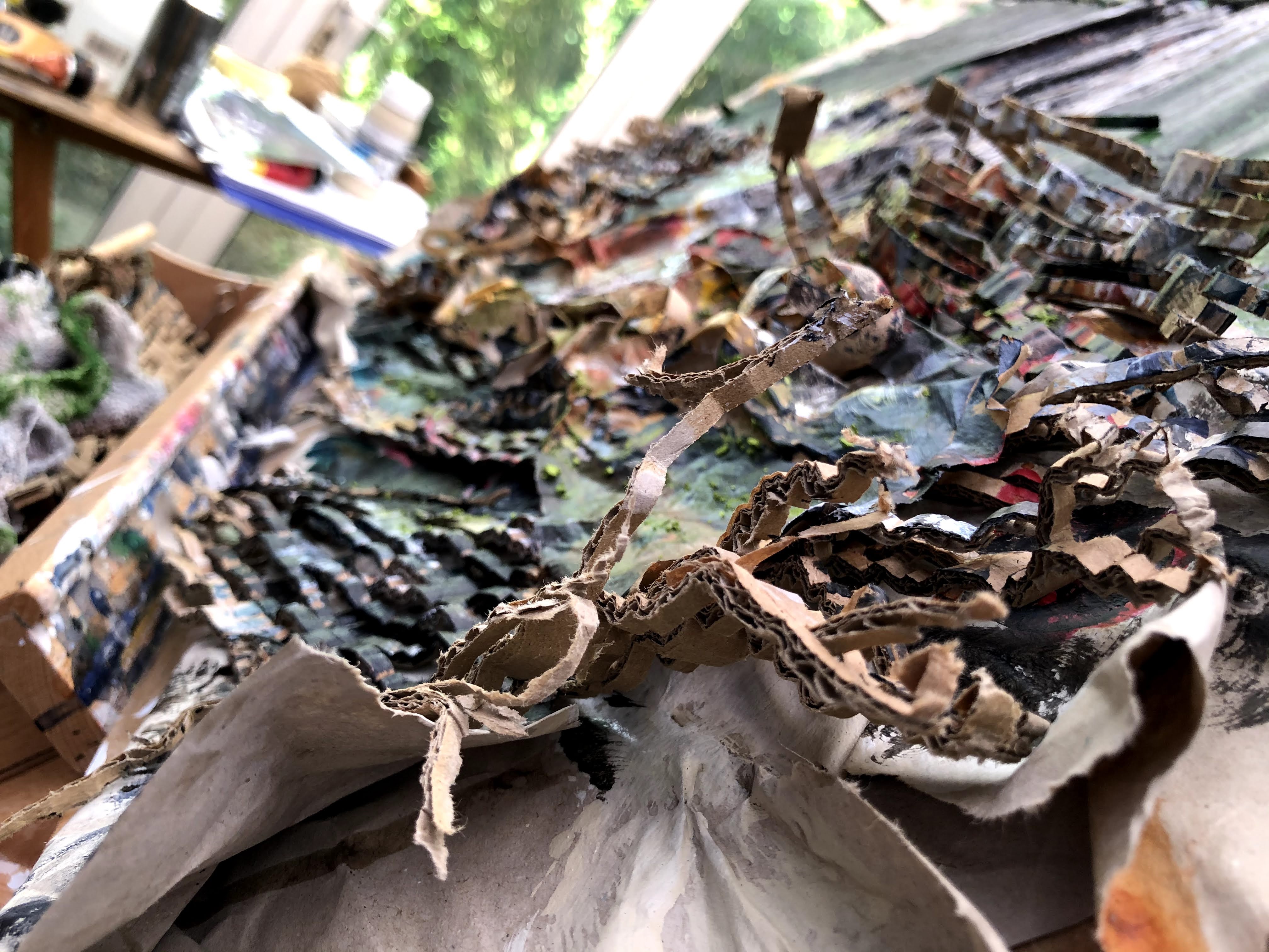
I’ve applied matte varnish by spray to fix the soft pastel – some of which is glued on after I dropped a piece and shattered it. Ground up, it gives texture as well as colour. Hopefully, once fixed I can wash the background with some darker tones without losing the effect of texture where the pastel has acted on the folds and crinkles of the paper.
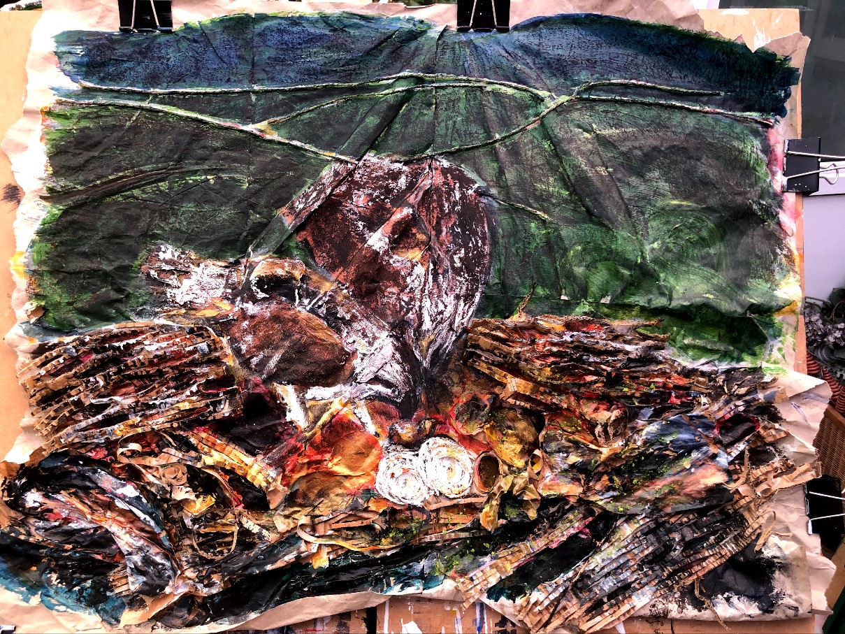
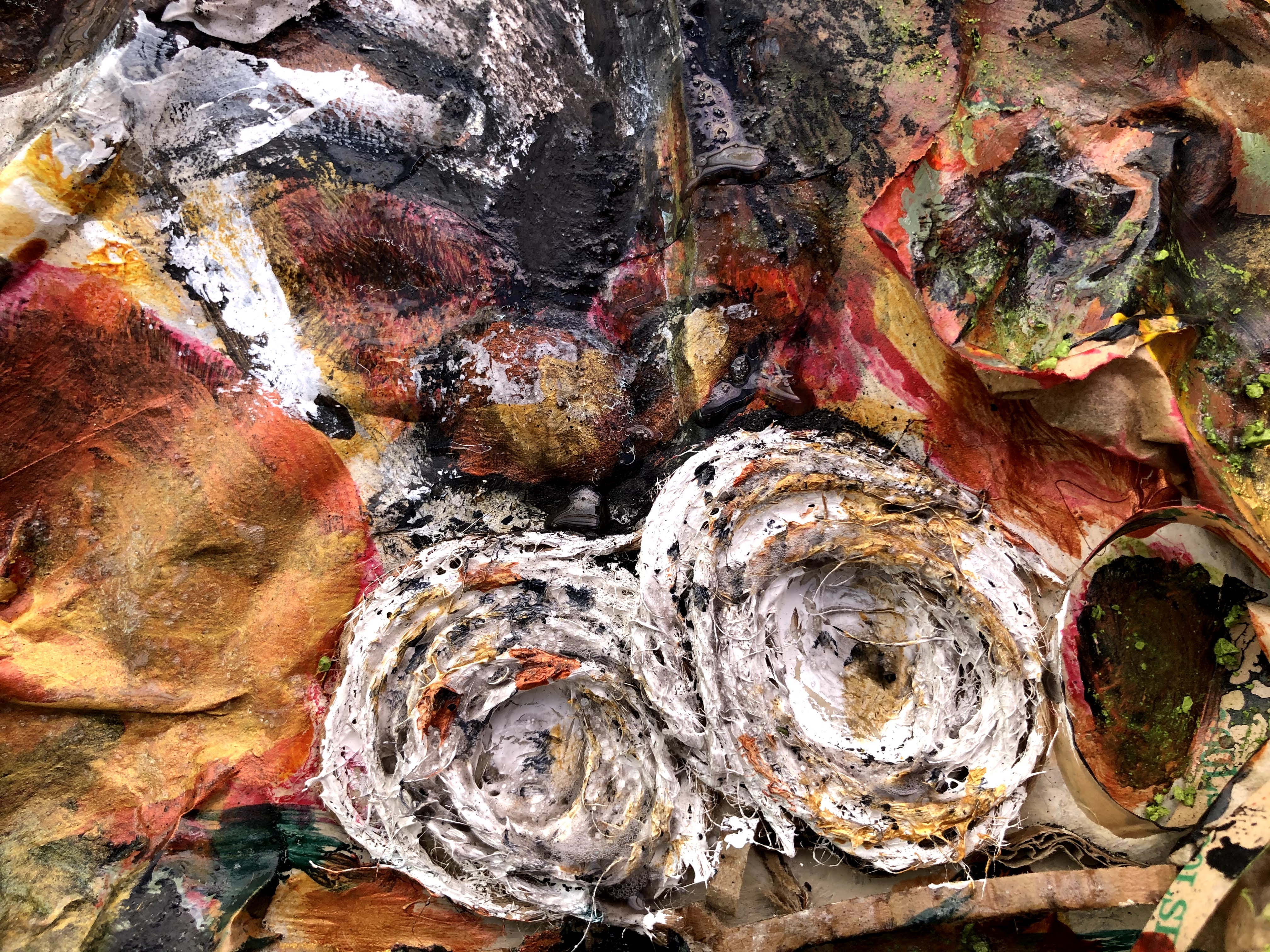
Neither bird is particularly satisfactory – the one on the right is an odd shape and the one on the left looks a little like a parrot. I have never yet got that larger bird properly formed. The last thing now is to use gloss varnish selectively on the birds and parts of the nest.
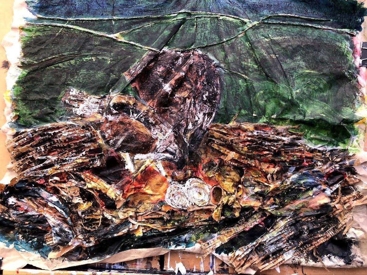


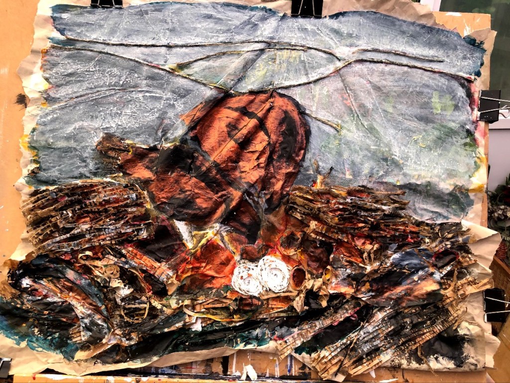
Done, the eventual 6″ x 6″ of this image doesn’t have much to live up to! The problem is drawing and I haven’t at any time drawn those birds with any sort of accuracy. Even with a more gestural expressive style, drawing is an essential or the shapes don’t work and these don’t work. <—- note to self.
