
The notes present a table of artists grouped according to style: slick, flat paint; loose thin paint; photo-realism; black and white; colour and pattern; and messy. The task is first to look two (at least) from each category and write a response to works that particularly appeal; then second to make a visual response in the form of copies or sketches and to reflect on this work as compared to theirs.
Since I’m unfamiliar with most of them, albeit a number of names are recognisable, I searched on each name and looked at what was, on the whole, their most recent work. I made brief notes in the book I use to keep track of work to do and to be done. It is not a sketch book but I do sometimes paste photos in there. It is also not a log as such and would be useless as such, given the nature of my handwriting.
I marked the ones I found most interesting. These include Sarah Morris and Brian Alfred from the ‘slick flat’ category; Alli Sharma from ‘black and white’; Mimei Thompson and Eleanor Moreton from ‘loose thin paint’; Peter Doig and Daniel Richter (colour and pattern); Robert Priseman from photorealism; and Carole Benzaken, messy.
The ones that struck me most were Sarah Morris’s soundgraphs made using household gloss paint, Brian Alfred’s very flat stylised paintings that could easily be prints and with which he also makes animations; Mimei Thompson’s very colourful work that looks as though it might be tiny – a dead fly on yellow has stuck in my mind, and Robert Priseman’s tiny little photo realistic paintings about which he seems to write extensively. None of these comes close to what may be my emerging style and so copies will be a challenge but after experience making ‘my own’ Rothko, Newman, and Kusama with a MoMA course then copies of a Matisse (Amelie) and a Homer (The Water Fan), I am very much geared to giving these a go.
Because none of these artists are out of copyright, I will post links rather than images although I will print out the ones I will be using and take photos of them pasted into either my notebook or my sketchbook.

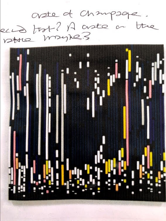
This is Sarah Morris’s Crate of Champagne https://sarahmorris.com/paintings/soundgraphs/ These pieces intrigued because I can’t tell if she has taken audio of events and used a printout of the audio track to inform her work, or if they are fictitious. I like to think the former as this would be a visualisation of an auditory stimulus and I recall elsewhere in the course materials the question ‘can you paint a buzz?’ in reference to a fly. Well, perhaps this is one way of doing that.

These are, at the top, a still from Bryan Alfred’s Light (I’ll review the video to see the lower section obscured by the progress bar) http://brianalfred.net/animations/2019/6/13/light
I am something of a technophile, an early adopter and self-taught geek so this fascinates me, especially as I’ve been making videos of my own work with soundtracks constructed from my own audio clips of the sea, dripping taps, a tidal river on the turn, a drum via a music making suite. It’s new to me but I really do like this translation of static paint into something more multisensory.
At the bottom is Mimei Thompson’s Dead Fly, the only image to benefit from my printer’s over-use of yellow. http://www.mimeithompson.com/work/collection/2014-15/ It was the colour, the choice of subject, and maybe some subtle influence coming from the idea of painting a buzz, that drew me to this. Also, I think it resonated with a video my wildlife camera caught in the hedgehog hut (three babies in there, last count) where a buzzing fly knocked itself out doing that crazy thing flies do when they can’t find a way out. This still makes me chuckle.

This is Robert Priseman’s minute piece from his book, Sumac. http://www.robert-priseman.com/wordpress/wp-content/uploads/2019/07/Sumac.pdf At around 7×6 cms – and is that a frame or part of the painting? – I don’t really have a hope of making a copy even if photo-realism were within my grasp. I chose this because, unlike many artists who leave it to the viewer to make what they will of the work, Priseman writes about his, makes books and essays about them. He is political in his expression. This, Nazi Gas Chambers – from memory to history is a collaboration with Rainer Schultze and Peter Vergo which, without yet having read it, I’m guessing is a reference to the loss of living survivors of the Nazi atrocities so that there will soon be no living witnesses. Holocaust deniers may then have the stage almost to themselves and recorded history will be critical but increasingly remote.
17th August
I can safely say I will not be challenging for this niche, although I do like the idea of translating sound into something visual, if that is actually what happened.

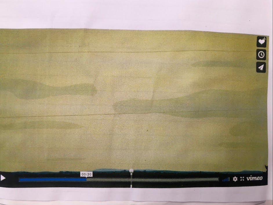
Watercolour doesn’t sit well on acrylic and it makes some interesting shapes while it adjusts itself there. I like what happened with the ink outlines (a Pilot writing pen), the brush texture in the acrylic base (T. buff – unbleached T white), and how leaching some of the fluid off creates spaces between the nearest and furthest ranges of hills. The colours are informed by my printer which seems over-fond of yellow. The birds are not in this frame.
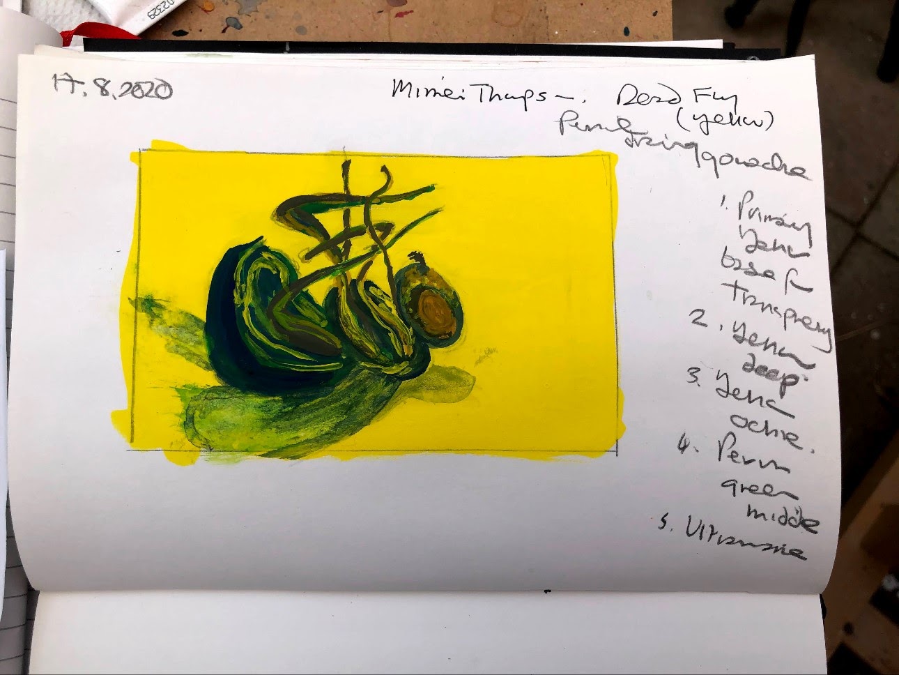
I hadn’t found the materials or dimensions when I began this painted sketch so I inadvertently set myself a more challenging task than maybe I could have. But then this module is about painting media so using one that differs from the original and that I don’t normally use seems to fall within the spirit of that brief. I find gouache hard to work and a little leaden, which means I don’t have the technique right. I didn’t get the brightness of the original or much of the detail, but I think I have the shapes and to some extent the colours. Given that ‘small’ is not my forte, this is quite a satisfying outcome.

I know what it says.
___


Note and reminder to myself August 17th 2020: WordPress has changed its editing interface so that nothing is where it was or behaves as it did, which will be thoroughly annoying until I get the hang of it.
