
With yesterday’s A1 composite sketch taped up on the window, and another sheet of A1 prepped with black gesso, two A4 sheets of cartridge prepped with white gesso and glued into the places where I needed a white ground to bring out the colours, I began another version. The instructions say ‘any medium’ so, not having used paint at all in this module and noting that, quite clearly, artists draw with paint or what else are they doing, I broke out the acrylics. The difference for me in doing this now from before I began this course is that I was much more aware of the medium, its capabilities, and limitations. As I was also reflecting the four styles I’d chosen which range from energetic gesture to quite controlled delineation of form, and seeking to merge these at their margins while still differentiating them, this seemed quite a challenge.

The white lines are the edges of the glued sheets of cartridge and I’m intending to make those an integral part of the composition – the liminals my tutor had asked me to think about. In this case, rather than the negative space between two forms in the same object, the separations of style, approach, and emotional connection with the sea. As yet unfinished, Hambling’s energy is on the right with the putative Turner at the centre, Hokusai’s stylised detailing next, and finally an image drawing on the spirit of Klee rather than his technique. As I’d discovered earlier, the reference photo for this whale turned out to be an animation and so I’ve begun mechanising this one with red lines indicating the underlying structure as might happen with sculpture but certainly happens in 3D animation development. This is the Tron of whales and as such, of no real emotional value.
I find looking at the photo of a piece of work and writing about it very helpful in perceiving gaps and over-doings of areas, and working out what my head might have been driving at when it worked particular patches in particular ways. Perspective, I think it’s called! Also, onscreen it’s somehow less ‘mine’ than the one sitting a few yards away and as such it’s easier to see it for itself. Right now, I think the composition needs attention and, in the literary spirit of murdering your darlings, that wire-frame whale may have to go or be re-located. Also, the post-Hokusai waves are discontinuous with the horizon to the right. I hope there are points for ambition!
Update: my NASA-watching has unexpectedly paid off. A while ago, I took a screenshot of a cascade of engineers and scientists around the Mars rover in its clean room and realised it had all the qualities of a composition. I drew a Fibonacci spiral on it and I’ve done the same with this piece and it reveals the compositional problems.
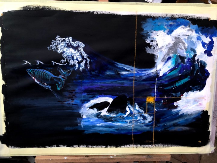
While there’s a substantial amount of content towards the right where it should be, the focal area is empty and the elements to the left have too much prominence. Tomorrow I’ll start a third iteration with the whales moving up and right and the Klee and Hokusai elements shrinking, fading, taking a position elsewhere, or disappearing. That orange area is where the focus needs to be, for this piece anyway.
