
Contemporary and historic artists working in different ways on the head. See in particular Graham Little and Elizabeth Peyton.
Extraordinarily, Little has no Wikipedia entry and doesn’t appear in any of the books I have to hand. An internet search brings up gallery reports, blogs, and news items, with The Guardian in 2010 introducing his Artist of the Week slot thus:
The women in Graham Little’s virtuoso drawings inhabit a world of sumptuous beauty. Realised in a muted Merchant Ivory palette, these long-limbed belles recline gracefully in designer interiors. This is an 80s world of midnight-blue suits and earth-coloured bed sheets, of abandoned stilettos in burnt orange and mustard-yellow upholstery. Even when Little’s exquisite handling of light hints at baroque painting, the contours of everything he depicts look downy-soft.
reference accessed 2nd September 2019
while the blog, Flash Art, talks about his drawings as designed to show “effortless luxury and beauty, a women-only world where the main requirements are to look good and pose elegantly, maximizing the effects of the clothes worn and the hairstyles sported.” and adds:
The fascination of these women for Little has its roots in adolescence, in a sense of disappointment about being male and an over-awareness of the powerful ’80s image of the self-assured, emancipated female. “Being brought up in the ’70s I noticed that in advertising from the ’80s the man always came off looking stupid and the woman always looked super powerful,” he explains. “It’s easy to feel quite down being a man. That’s why I started making sculptures. I just loved women’s clothes and wanted to be part of that. I think it was that I didn’t like being a man.”
reference accessed 2nd September 2019
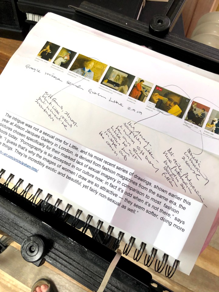
This google search for images brings up a string of tranquil domestic poses although it’s the one circled that struck me most – the colours reminded me of something, and the imagery, a woman soft brushing her own skin while Little soft brushes her whole face onto his canvas, seems to exemplify Little’s modus operandi.
The blog, It’s Nice That, headlines that image and, enlarged there, it dug deeper into my mind for traces of what it was this not-quite-photorealistic style reminded me of. There’s a soft focus about it but also a sense of the whole being painted, like a film set.
Suddenly the root of the image emerged and it is indeed filmic. This is a direct comparison between one of Little’s works (untitled, 2004) and a still featuring Rachel from Blade Runner. The same perfection, similar tones and colours, lighting and shade, and for me the key underlying truth – neither is a real woman.
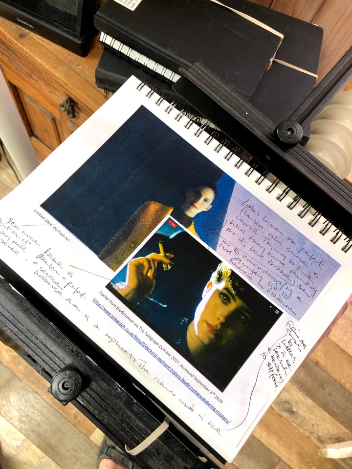
Little’s history is hard to track down but this reference says he was born in 1972. Did he see Blade Runner at some point? Did the film’s aesthetic influence his art? If it did, is he aware of that? These are unanswerable questions without access to the artist himself and he seem less keen than most to be publicly available.
Elizabeth Peyton is a different kettle of fish in terms of style although she too, according to her wikipedia page, tends towards idealism:
Elizabeth Joy Peyton (born 1965) is an American painter who rose to popularity in the mid-1990s. She is a contemporary artist best known for stylized and idealized portraits of her close friends and boyfriends, pop celebrities, and European monarchy
https://en.wikipedia.org/wiki/Elizabeth_Peyton accessed September 2nd 2019

Thoughts: Little seems to favour a kind of soft focus realism that doesn’t exist; Peyton uses a blocky technique to make images of friends and celebrity icons; Vermeer paints domestic scenes that represent the reality of his contemporary life. Is Little portraying women as he wishes they were, Peyton as she feels they are, and Vermeer as they actually are?
I see from further along in this module we’re asked to consider the meaning of a portrait and it seems to me that these artists say something about three possible dimensions: idealism, realism, and essence. Whether they look like the people they represent is hard to judge because I have no external or objective yardstick, and does it matter that I may not recognise them from their painting if I had? People frequently fail to recognise people from images designed to be wholly recognisable, as in photos of known criminals to compare with someone they witnessed committing an offence. People’s faces change when they change expression, when the light is different, when they’re animated, when they’re not posing or being made to stare at a camera. Faces are not static and so, perhaps, neither should portraiture be.
