
After a bit of a hiatus due to finding there was more to do on the Drawing1 course than I’d realised, I’m making a start on this. I have a jug that defeats me every time I draw it and an onion that doesn’t – not so much anyway – and the colours are marvellous. Elsewhere, I’ve been up to the ears in brutalist concrete and grungy graffiti so going smooth and shiny will be a challenge. Here’s the image (my own) that I’m working from:

I love the colours and the reflection, and the tiny hint of a demarcation between horizontal surface and the wall behind. Very simple shapes that both contrast and resonate with one being manufactured and glazed, the other from the ground but with its own inherent gloss. First step is to prepare a piece of A2 cartridge with white gesso because that seems to lift the colour of subsequent layers and also makes the surface more substantial. I don’t have anything this large yet in board or canvas form so paper will have to suffice. I’ve applied the gesso and smoothed it horizontally with a pebble to minimise texture, but what texture there is will be something to work against with the lines and blocks of colour.


There’s a lot to like, for me, in the different methods of application.
[Side note: WordPress’s new editing interface is driving me UP. THE. WALL.]
19th May. I’m starting with the onion because, frankly, I have more success with this shape than I do with the jug. I’ve used acrylics in dilution and also with a dry brush applied over some lines made in wax to see if I can make that papery effect. I was going to use just the magenta (student grade) and Pthalo blue (pro grade) but soon found myself drawn to some touches of white and more than a touch of cadmium orange. I’m avoiding making brown though.
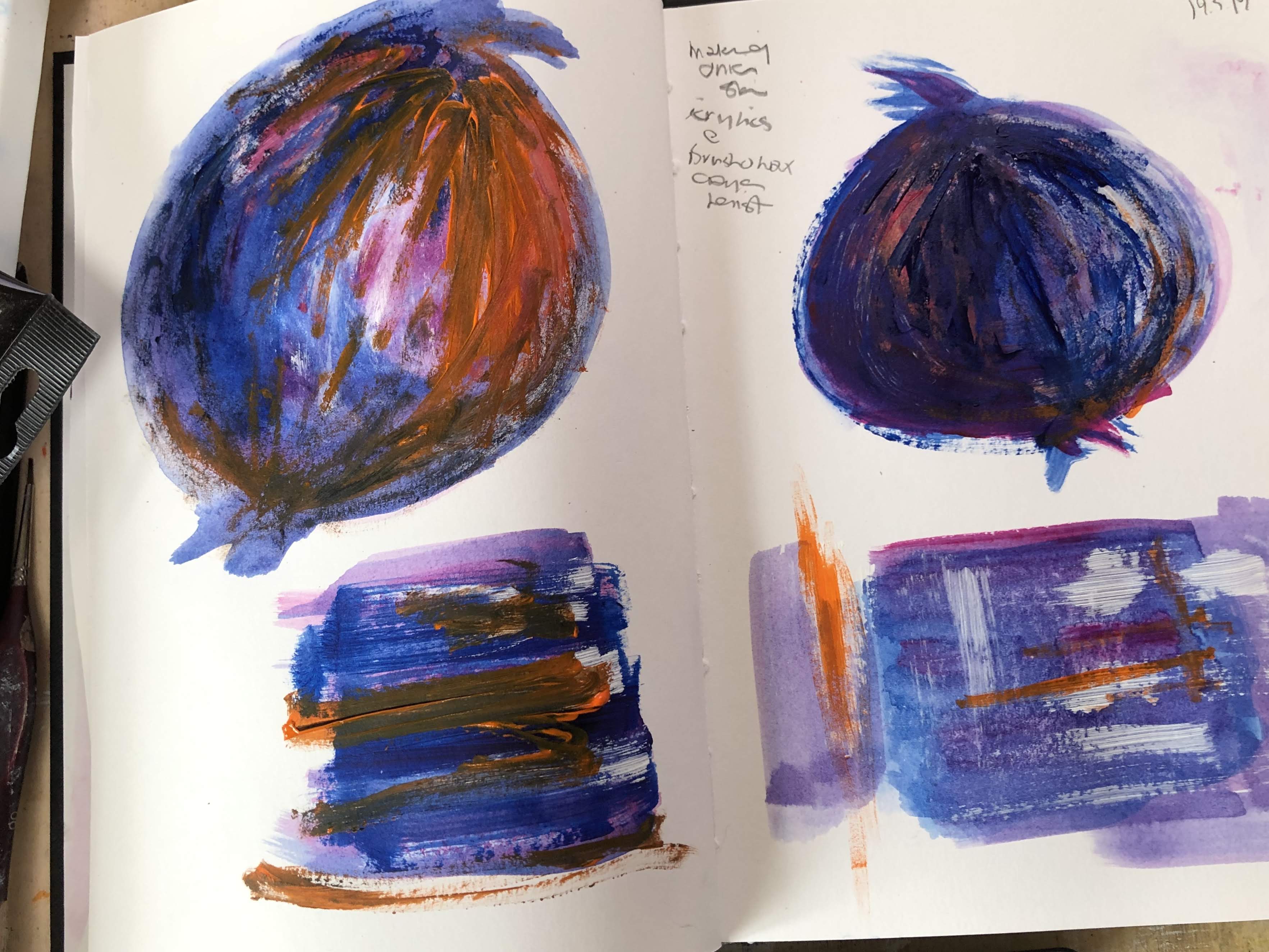
Not so subtle, this application of undiluted acrylic with a palette knife; also maybe slightly more pumpkin than onion, over on the right. I like the layering though.

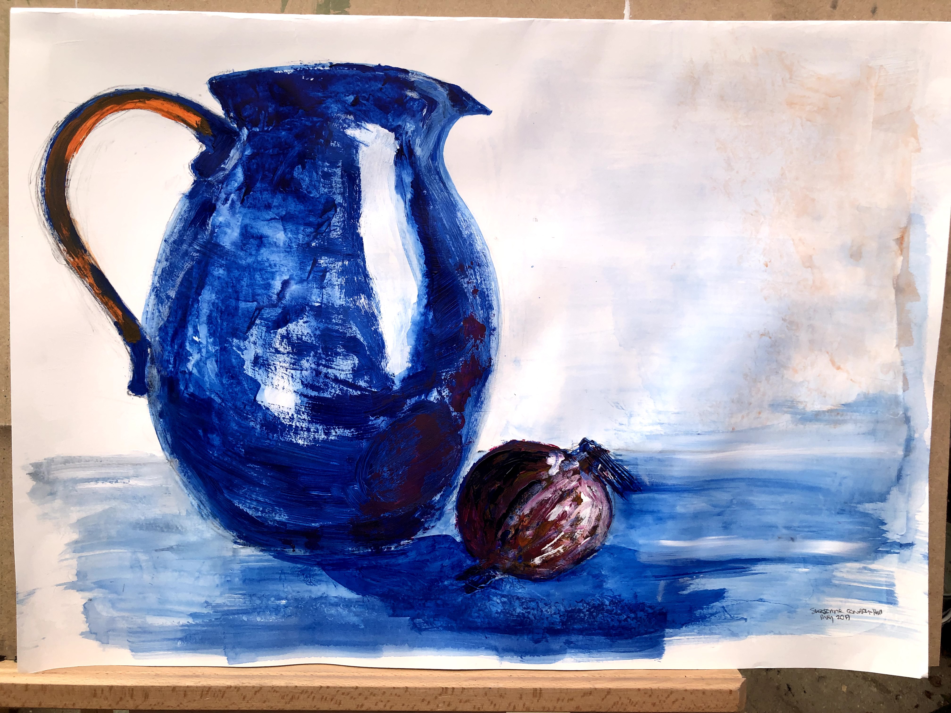
First ‘draft’ of the piece and I’ve already discovered that the little trowel-shaped palette knife is very good at making texture lines in acrylic and also at poking holes in cartridge. I’m marvelling at my relatively new easel that tilts to horizontal and allows for spreading and containing very wet paint. For the jug, I’d filled much of the space with water then dropped, brushed, and knifed acrylic into it along the lines of the reflections and also the shape of the object itself.

A little further on. Onion needs a ‘bottom’ and that background wash could do with some attention. What about edges though? Do I want sharper edges on that jug? Edges or not, I’m pretty pleased with that – it’s by far my best rendering of that kitchen item I’ve ever managed.

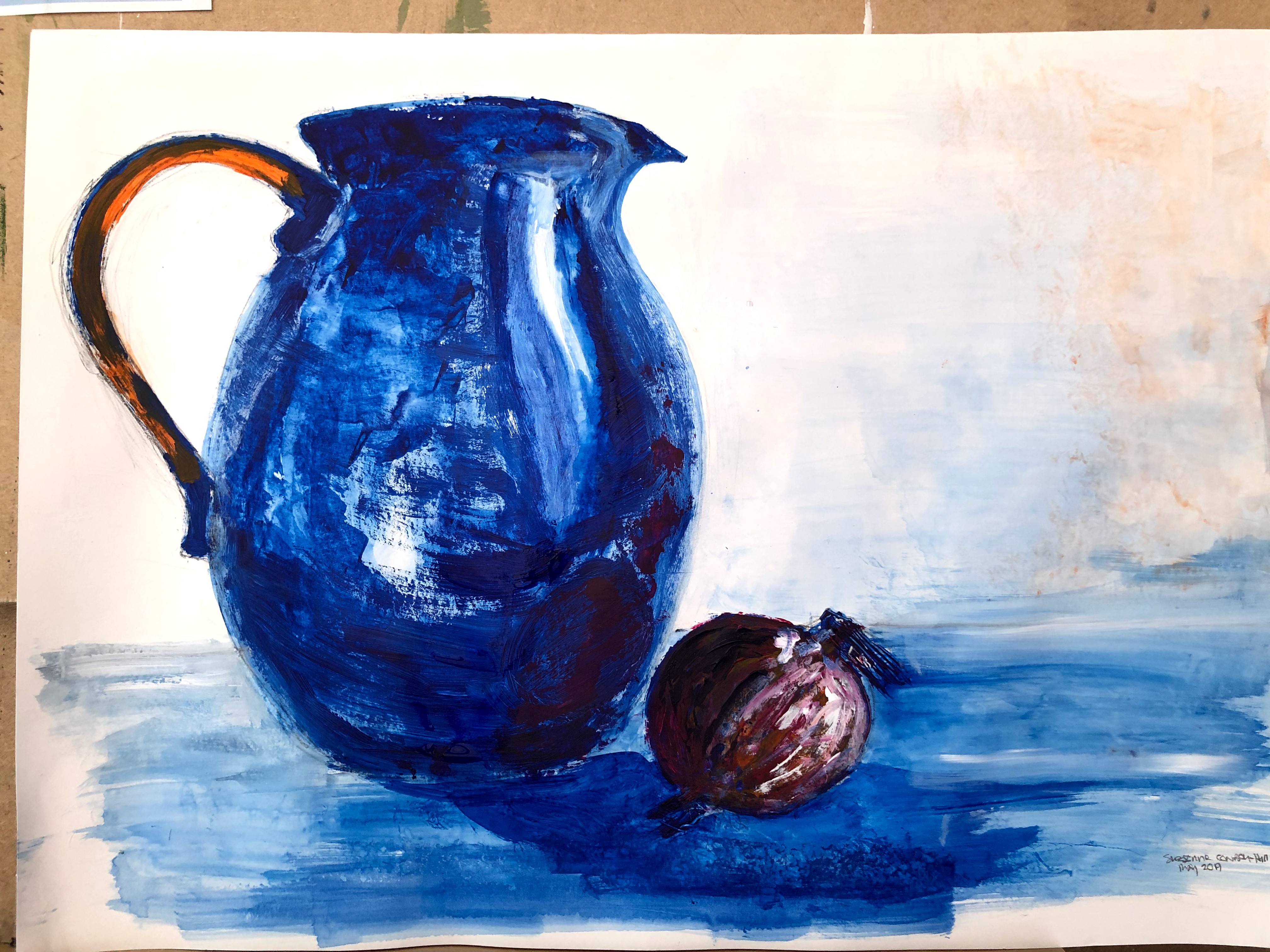
One bottom and a bit of background adjustment.

May need to attend to that white stripe.
[Further side note: suddenly much of the text is centre aligned even though it isn’t in the editor. They really do want me to use the glitchy new version.]
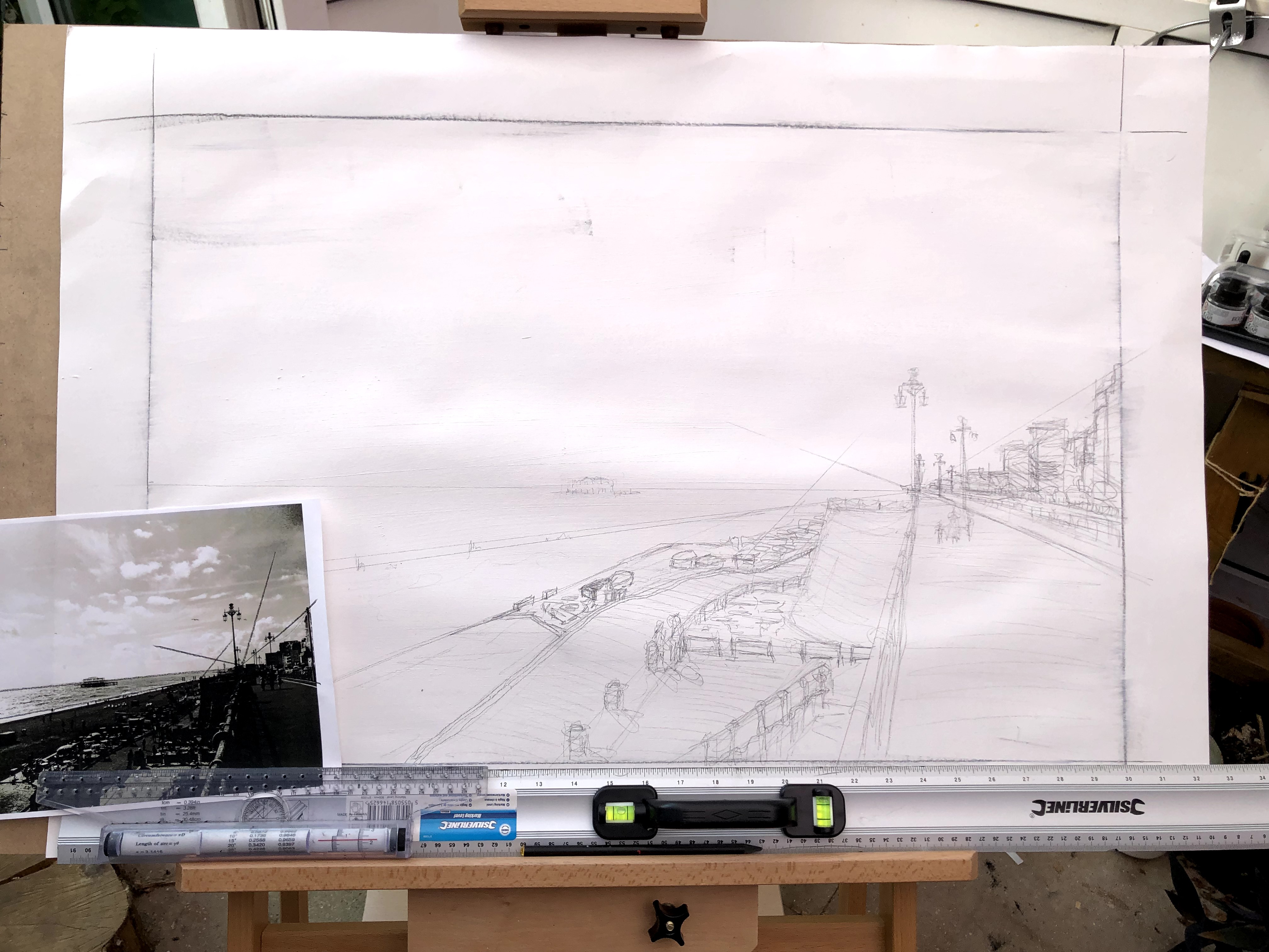
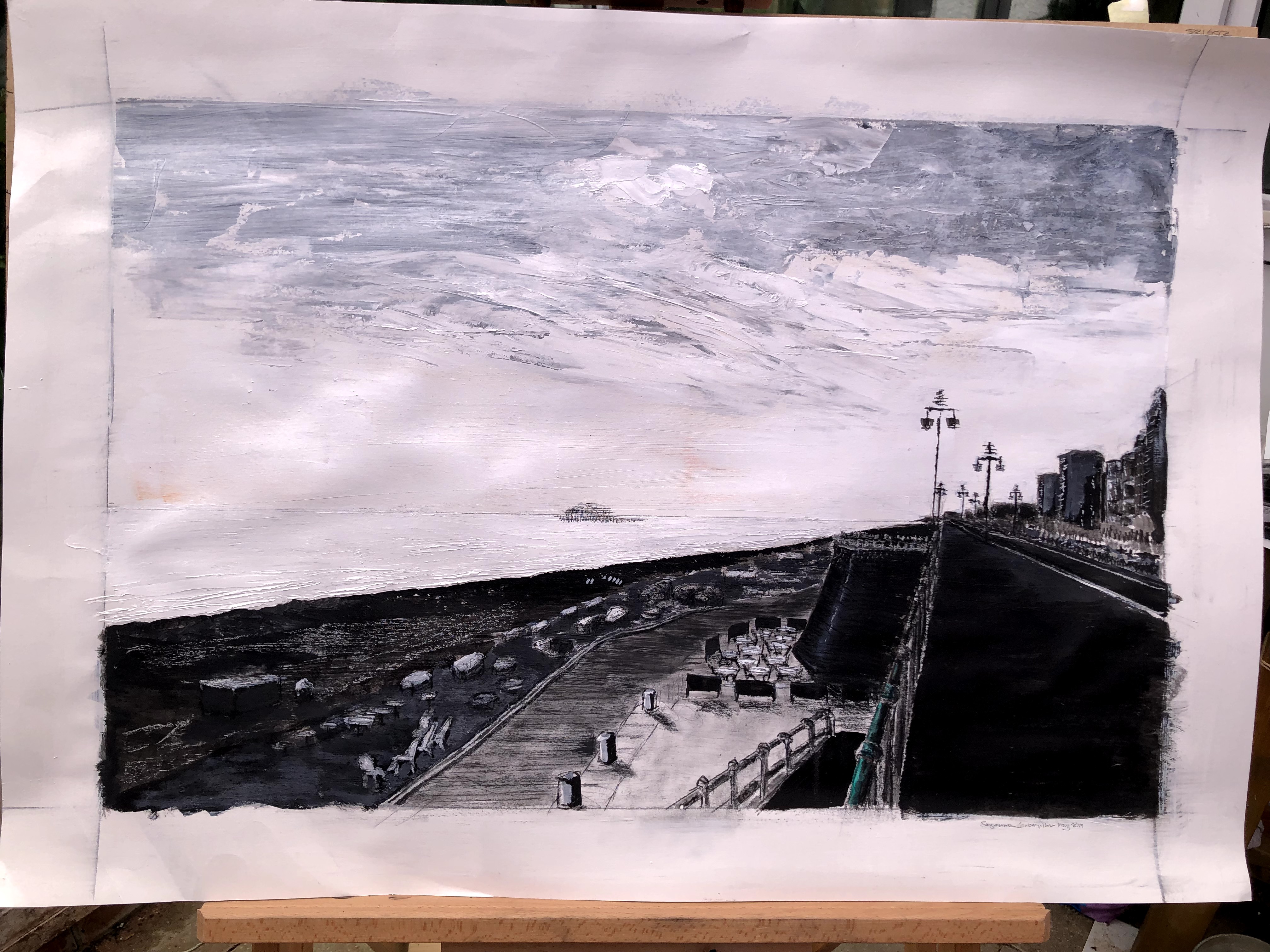
May 21st and I’m taking a run at another painting. I’ve already had a go at this in inks for the Drawing module but I really wanted to ladle some acrylics onto it with a knife. I’ve taken it up a notch to A1, prepped with white gesso and begun mapping out the areas. I have absolutely no mathematical brain at all and so figuring out ratios turns into guesswork. My strategy is to work from a photo (my own), drawing out the perspective lines and getting a rough sense of how to upscale the shapes. Then I use the ruler – a massive thing that’s absolutely perfect for this – to mimic the angles of convergent and other lines visually then drop them into place on the support. This is Brighton seafront and because it’s almost always represented prettily, I’m planning on producing something a little more angsty.
[And I’ve discovered, I think, the reason this post is lumpy. I switched from the new WP editor to the classic version and it has messed up all the formatting in a way that seems unresolvable. I’m sticking with it for now but it looks like I’m going to be saddled with the ‘upgrade’ in future.]


Coming on, I think. Must remember to tidy up the edges at the end or the sky will be a wild sea with battleships on the horizon!

Who knew conte behaves like paint if you wet it! I’ve filled some of the spaces in the railings and added a streak of Brighton jade. The lower level pathways, drawn in conte and modified with water, are beginning to look more solid; and I’ve drawn a very fine line on the horizon to differentiate sea from sky. I’m aiming to keep the disintegrating West pier an understated feature rather than the feature as it so often is. The buildings feel better now after some work to correct lumpy perspective.

23rd May. Adjustments with paint and dilute acrylic to add in the mid/foreground detail. There’s a lot of clutter in that area between the pathway and the beach; the photo is pre-i360 so it might be some of the preparatory construction apparatus. The beach needs to show a tiny bit more pebbly and, while I’ve realised (by putting my glasses on) that the turret-shaped protuberance in the centre is actually rectangular, I’m not sure there’s much I can do about it now. The step up from the pathway onto the cluttered area needs a little emphasis to make its function clearer.
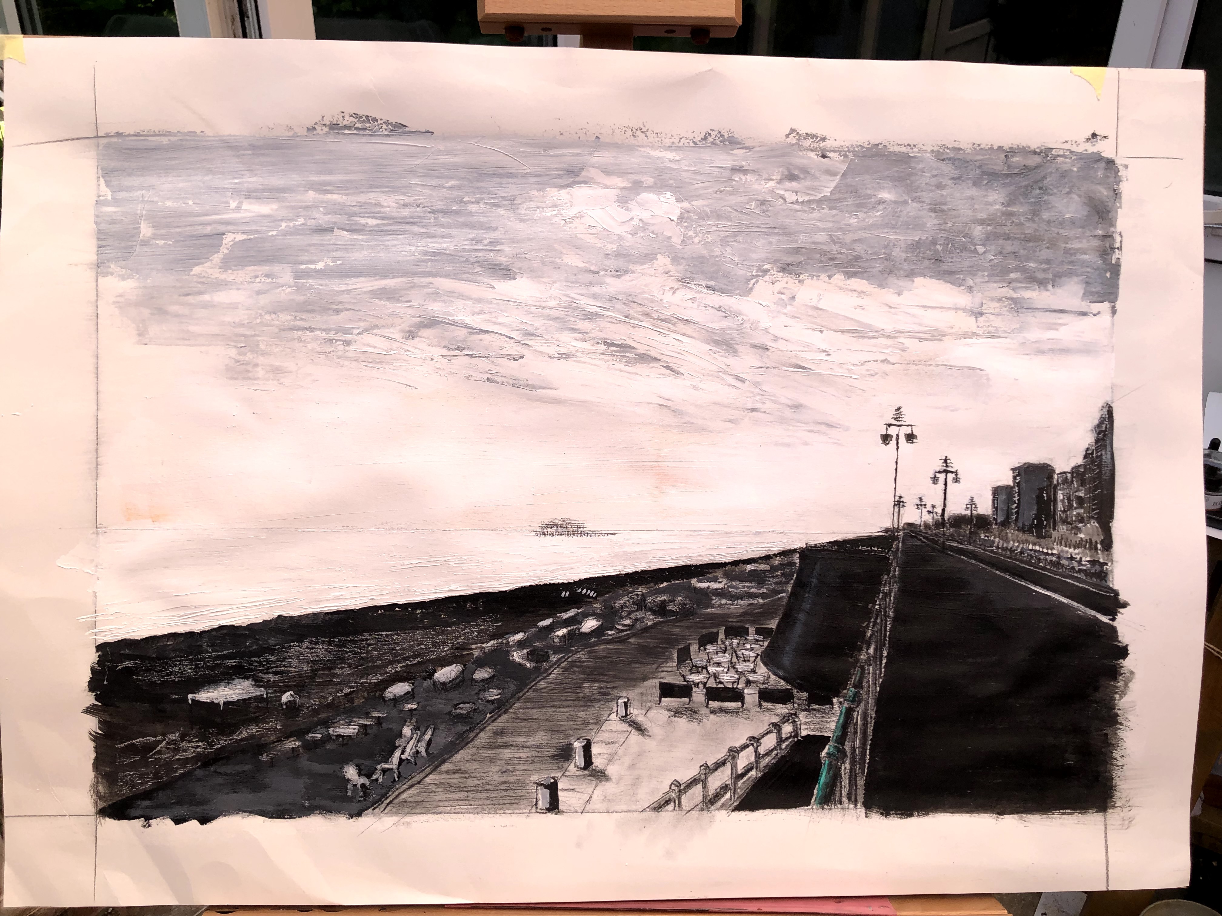
I’ve noticed an orange leakage into the white area above the horizon; it’s unintentional and I don’t know how it got there but I quite like that slight hint of a colour that speaks of sunlight and also complements the jade of the railings. It’s so subtle, I’d guess it has its impact without being noticed as an element.

Details.


24th May and different light. That’s more like it.
After some thought, I think I’m going to submit the jug and onion. I like the colours, the marks, and the fact that it’s the first time I’ve got the shape of that thing right.
