Another dreaded attempt at forcing buildings into a proper line on a page. This time I’ve used a soft 7B pencil so I don’t get too involved in sharp corners and points. It’s a little childlike but better than I’d expected, particularly as one of my cats settled on my knee while I was drawing.

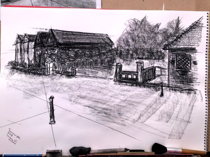
This is our car park, conveniently empty of vehicles. This may not be strictly ‘line’ but I think it may be close enough. There are many points of variance from real perspective but I’m relatively confident that anyone local would recognise it so that’s a win.
What would I do differently another time? Probably make some soft guidelines for that curved angular perspective, and check proportions a bit more carefully. I somehow always end up with larger elements than I set out to draw – big and fat instead of diminutive and delicate. Favourite bit? That post in the foreground.
3rd May. I’ve posted these in the ‘limited palette’ exercise post. They should be here, but it’s really all the same developmental issue – perspective.
I’ve done my thing with a monochrome image, feeling out the perspective lines and then drawing them on a separate sheet.

I’ve also simplified the content, used sweeping applications of medium where detail doesn’t matter, and picked out detail with a sharpened piece of conte where I think it does. A suggestion of brick work for instance, or fencing. One of the posts is channeling its inner Pisa still!