This is Exercise 1 and here’s the dreaded blank sheet.

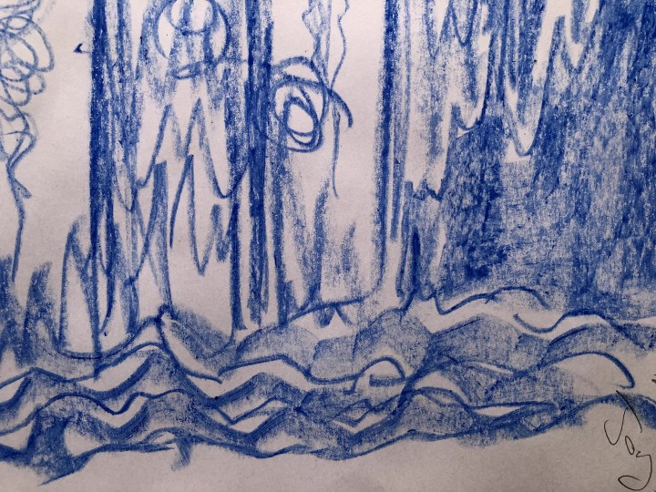
First up, Anger as there’s nothing quite like chasing a cyclist down a no-cycling path for getting the grrr factor going.

So that’s what using Public Service Broadcasting as background to ‘no, not a clue thank you very much’. PSB’s music is quite fast so it made for more energetic sweeps of the media, and the predictably jagged appearance of most of these is consistent with the association between word shape and perception of softness/spikiness (the Bouba/Kiki effect) which is an influence I can’t really escape very well just because I know about it.
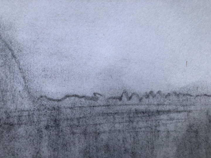
The top corner is a charcoal stick with some finger-blending. It actually looks better to me in the photo than in reality, and the detail pulls out the texture that the medium achieves despite the rather smooth, thin, nature of the A1 flip chart paper.
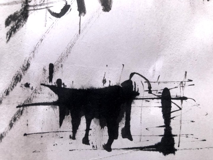
The top right corner is ink. I tried using two pens but, as I’m discovering, they’re not the best for left handers so there’s a little bit of right handed marking in there too.

Both pens splattered ink down the page into the bottom right corner so I tried with the Pentel brush pen which makes quite nice marks but feels too smooth for this part of the exercise. An old stick from the garden scratched nicely but didn’t hold enough ink. I’d have liked to have covered it in paint and rolled it down the paper but again, that seemed a bit too smooth for the anger component.
Bottom left is oil pastel: greasy and clingy and somehow confident in its own permanence. I do like to use oil crayons in mixed media paintings because they blend nicely or they dodge across ridges of other media.

Bottom right and possibly the most satisfying, is neat watercolour applied with a finger. I like the sense of brooding menace in it and how it sits thickly on the paper.
Next, Calm, and again I’ve been predictable by using blue and generally rounded marks. 
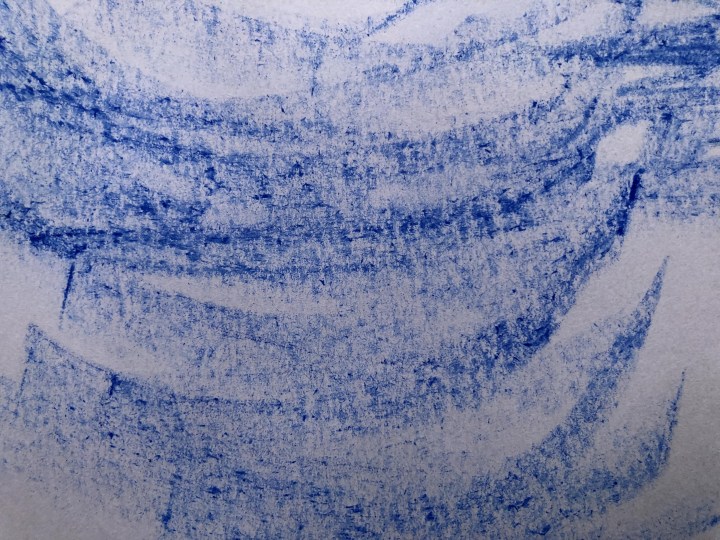
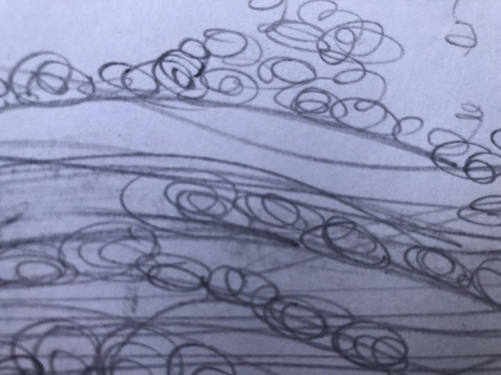
Top left is ink poured onto the paper and swept with a grout cleaning brush after dribbling water on it. The paper absorbs wet media quite quickly so any spread is limited (although not if you’re a cat – to wit, the footprint in the middle of the top right corner!) This is also quite brooding so maybe Enya wasn’t the best choice.

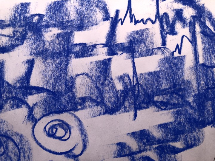
Top right is a charcoal block (plus footprint) which lends itself to sweeps and curves but also has some quite sharp edges useful for a bit of limited detailing.

Bottom left is oil pastel again. I think I’d run out of shapes at this point so again they’re quite rounded, but this time with a bit of weight to them. From a distance, they look a bit like strange vegetables on a table which hadn’t been the intention at all.
Bottom right is watercolour pencil run across a piece of meshed masking tape and wetted with a Derwent waterbrush. I’ve used this before to make tiny lights on buildings but here, it’s about the sense of order that often brings peace and quiets a noisy mind.

I’ll have to think about Joy. My instinct is orange but that’s not one of the permitted colours for this exercise. Similarly Satisfaction which, despite arising from getting all smug about pursuing a cyclist on foot, at speed, and in full flow about what the law actually was, I’m nevertheless in Rolling Stones override so …
It’s a new day and time for Joy. This morning, the absolute first thing that came to mind was Ode to Joy which is the most exuberant piece of music, although at the moment carrying other less joyful connotations whichever side of the debate you’re on. I went for blue again and threw ink at the top left quadrant. I know these are supposed to remain separate but joy isn’t meant to be confined, is it?

So, top left is splattered ink with semi-dry brush strokes making not quite feathery explosions skywards. This music has so many layers; tiny dancing top layers, big rising mid layers, and a deep channel of undertone (or even undertow because it can carry you off) running beneath.

Top right is charcoal stick. This part was flamboyant and strong. The music sounded wide and a lot like a heart beat. The width of a charcoal stick seemed right for the energies needed to reflect that.
Bottom left: sharpie. At this point Joy was dotting around all over the place being both staccato and flowing. It’s very easy to feel along with this piece even if joy as a personal experience is hard to grasp and pin down for examination on demand. I don’t think I’m keen on sharpies, but they probably have a place.

Finally, oil pastel. With Ode to Joy on loop, this section has had the most exposure and really felt like an incremental scaling of peaks with huge bursts of energy at the top. Underneath is the foundation, the solid stately rhythm of consolidated surety that must underpin authenticity. The oil crayon has a smoothness that felt right for this part but also gave me the potential for smoothing and blending which I chose not to do. Raw seemed best.
Satisfaction. The cyclist is long gone and I’m moving on from classic orchestral to classic rock. It occurred to me that satisfaction is generally a very internal experience; it’s not good form to exhibit it too much especially when it’s about achievement – possibly at someone else’s expense. The Stones track also, is about defeated entitlement – not getting something the character believes is theirs by right. Maybe that’s noisier but the others seem quite contained and private.

Top right is charcoal pencil (and I’ve used a piece of willow charcoal bottom right so, oops!) which it’s possible to sharpen so it’s capable of clear, strong lines. The boxes come from that feeling of boxing up satisfaction and locking it away so it doesn’t cause anyone else discomfort.

Top right is a right old piece of nonsense! The carpenter pencils arrived and goodness me what a palaver sharpening one. I also found it difficult to hold, it kept slipping out of my grip and wandering off. The objective had been to make long, containing, faint marks and fill them with little bubbles of satisfaction that would never see the light of day. Hm.
Bottom left isn’t sago pudding, it’s inky water applied with a large-ish brush, then dots of water further dotted with ink. Again, containment and privacy, and possibly resentment at that.

Finally, that burning entitlement. This is a piece of willow charcoal that felt just right for almost blending away out of sight. ‘No’ is the peak and it’s almost obliterated, the rest is the depth of historical perceived rights that make this kind of satisfaction something that ‘ought’ to be achievable. Don’t recall thinking anything at all like that at the time!