
Gearing up now to begin the last lap in this undergrad painting enterprise so naturally I’m starting with my most compelling and esoteric subject matter – an overweight cat and a whole lot of leaves.
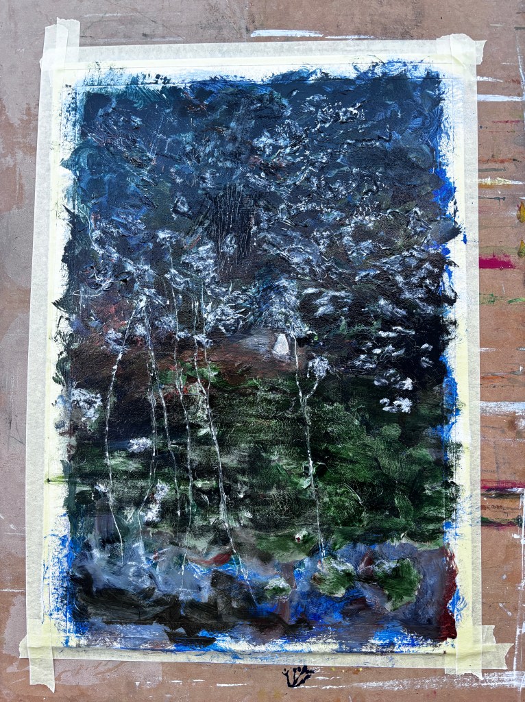
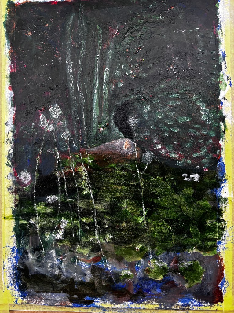
It’s the colours though that I’m here for. I don’t manipulate my camera (an iPhone 15) so what comes out is what comes out and this time it totally muted the greens with black/blue, turned the small intrusions of light through the foliage into silver flashes, and conferred a blue/black/ rich green onto the huge viburnum that fills most of the background.
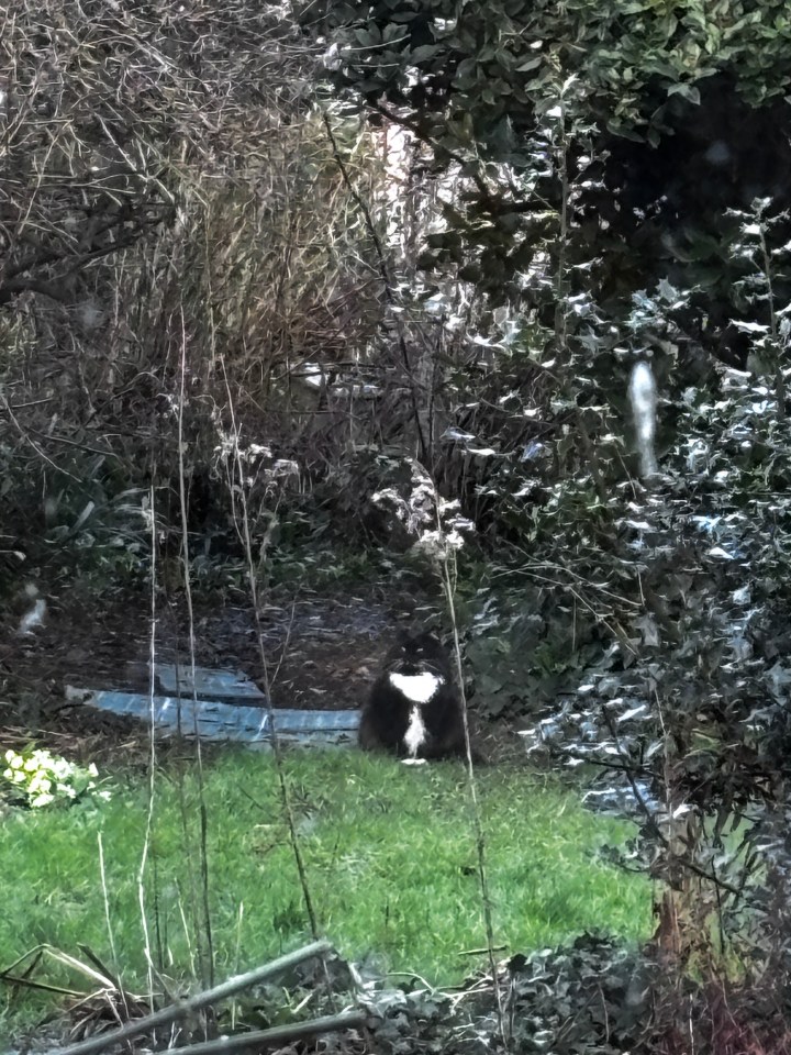
This is Nora who is to other cats as the Viburnum is to a medium-sized apple tree.
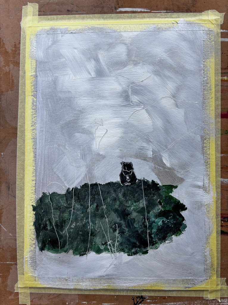
While I was tempted to go for a deep orange or bright pink as the underpainting, I think I may have seen it enough times on Landscape Artist of the Year to consider it a trope. This is a white acrylic gesso primer with silver and white paint scrubbed into it and a mix of Hooker’s green, Viridian green, and Payne’s Grey forming the grass. The white threads are the thin remnants of Golden Rod (solidago) in the foreground, drawn into the paint with a stylus. It’s a little darker than I think I want at the moment, but I’ll know more when I start on the foliage. The size is A3 card and for once I’ve felt driven to give it a border by applying masking tape. At this point I’m willing someone to stop me at the crucial moment.

Post hoc review 3rd March – I like this one for its spontanteity, and even the cat looks ok now. I’ll crop this and put it into one of those series’ that only people who document the whole process digitally have the opportunity to do.

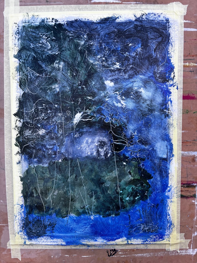
26th February. Probably needs a little less blue and more black/green in the top third.

Wondering why everything seemed to be underwater, grey streaks all across the image. Realised they were on my screen.
Somewhere around here, I applied a layer of gloss varnish which I find bulks up the colour and seals in the layers beneath, which then allows for some scrubbing with a rough piece of cloth (a flannel with dried-on acrylics is perfect).

It can take one small thing to change everything. No matter what I did, that cat remained twee so I though maybe painting over it would be the answer. But then I remembered it was a collaged piece and instead, pulled it off leaving a pristine patch of white card. I filled this with white oil pastel to reduce the impression of a cut-out (or plop-on) and began using the oil pastel on the highlights coming from the shiny evergreen leaves. I think it’s a little over-done at the moment but that can be adjusted and it adds texture to the painting.
Also, there’s a rather weird slithery section in the middle that slips and lsides down from the top into the central focal point. That could be an artefact of reflection but I’d like to tackle it.
Interestingly, I’m seeing the grass now as water – a pond maybe – and the blue there as sky. This has imagineering mileage!
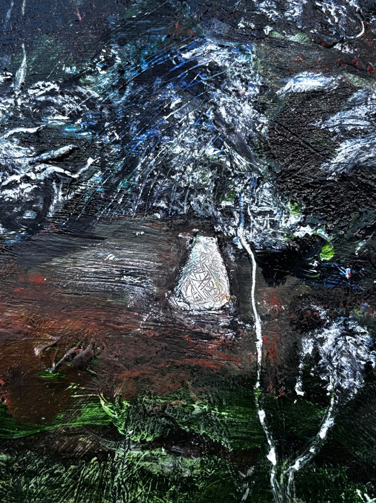


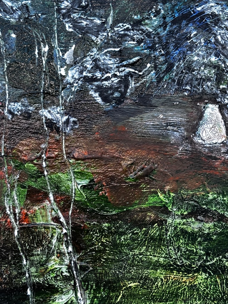
This selection and focus is more for my purposes than it is to promote ‘a good bit’. I want to see how that tunnel operates close up, what the patterns in the various layers of media are doing, how things move from front to back, and also whether a judicious crop would be of value.
What I think I can see is that there is a tunnel and it curves to the right but there isn’t enough change of tone to illustrate that. I’m quite taken with the patterns, especially in the grass/pond, and also the white foliage (last summer’s Golden Rod) which I scratched into the paint with a stylus. These are foreground elements and these need to take their place in that capacity while still being fragile. Then I need to make better sense of the scramble of elements towards the top; at the moment some of them look more like a giant spider than a mash-up of overlapping branches and twigs curving into a central space! Tomorrow and tomorrow and tomorrow, to-borrow from the Bard. (Macbeth https://www.poetryfoundation.org/poems/56964/speech-tomorrow-and-tomorrow-and-tomorrow)
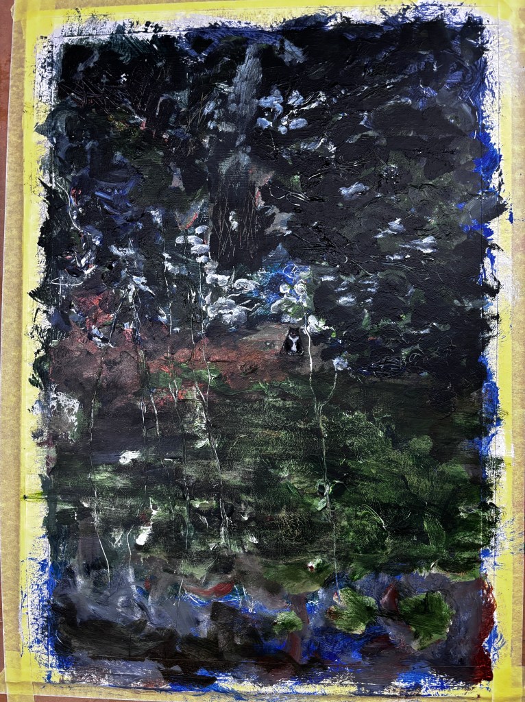
28th February. So this is different.
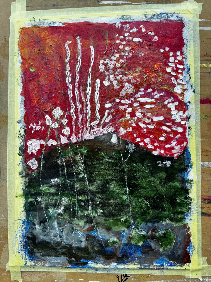
Part strawberry, part deadly fungus, this is the new under-painting for the top half of the painting. I quite like it as it is though!

This is a broad brush approach to layering. Relatively dilute and made from the existing palette, I’ll be using a stylus on some of it and a scrubbing cloth on other parts to pull out form and texture.
1st March.


Last night’s painting additions. This needs another layer of gloss varnish to lift the new areas of acrylic into equivalence and so I can see what that cat’s doing. I’d like it to be there but not as the star of the show, and certainly not cute.
The other issue that became increasingly apparent – and not altogether unfamiliar – was that this was at least three different paintings. There were large brushstrokes at the bottom, something more translucent in the centre, and some bizarre foliage at the top. I corrected this, choosing the large brushstrokes as the more painterly option (and also the area I liked best), and made this the style for the top. The translucent area would sit well with the more cohesive top and tail so I judged it to need no intervention. That cat though.
One of my problems with painting cats, especially my own cats, is that I am too close to them and tend to attempt more realism than I want anywhere else in a painting. One solution has been to paint without my close vision glasses because that stops me detailing everything. It’s not perfect though – or rather the attempt to present the cat as perfect is a residual issue. This cat went through several iterations, sizes, and shapes until I had a more spontaneous representation of, not the cat in the photo but the one I find the most difficult to paint, my small brown tabby. Aiming for subtlety and something more cat qua cat than clear representation, this took quite some time and definitely no glasses.

The result, for now at least, is below. Central but not prominent, and much closer to essence of cat than any particular cat, this cat should be as unobtrusive and near-invisible as my actual tabby can be sitting in that exact spot. When this is dry, it will have probably its third coat of varnish for consistency, then I’ll decide if it’s finished. The problem now is that I know exactly where this cat is, and so do you, dear reader, which means neither of us can be objective as to how discreet it is.

2nd March. Seems to me, winter light turns blue for photography much earlier than it does for eyes. Tomorrow morning then.


Crop of the version now languishing beneath about 20 quids’ worth of paint and an interesting metaphor for life in that you can never be again the child you once were.
(c) SCH 2025
