
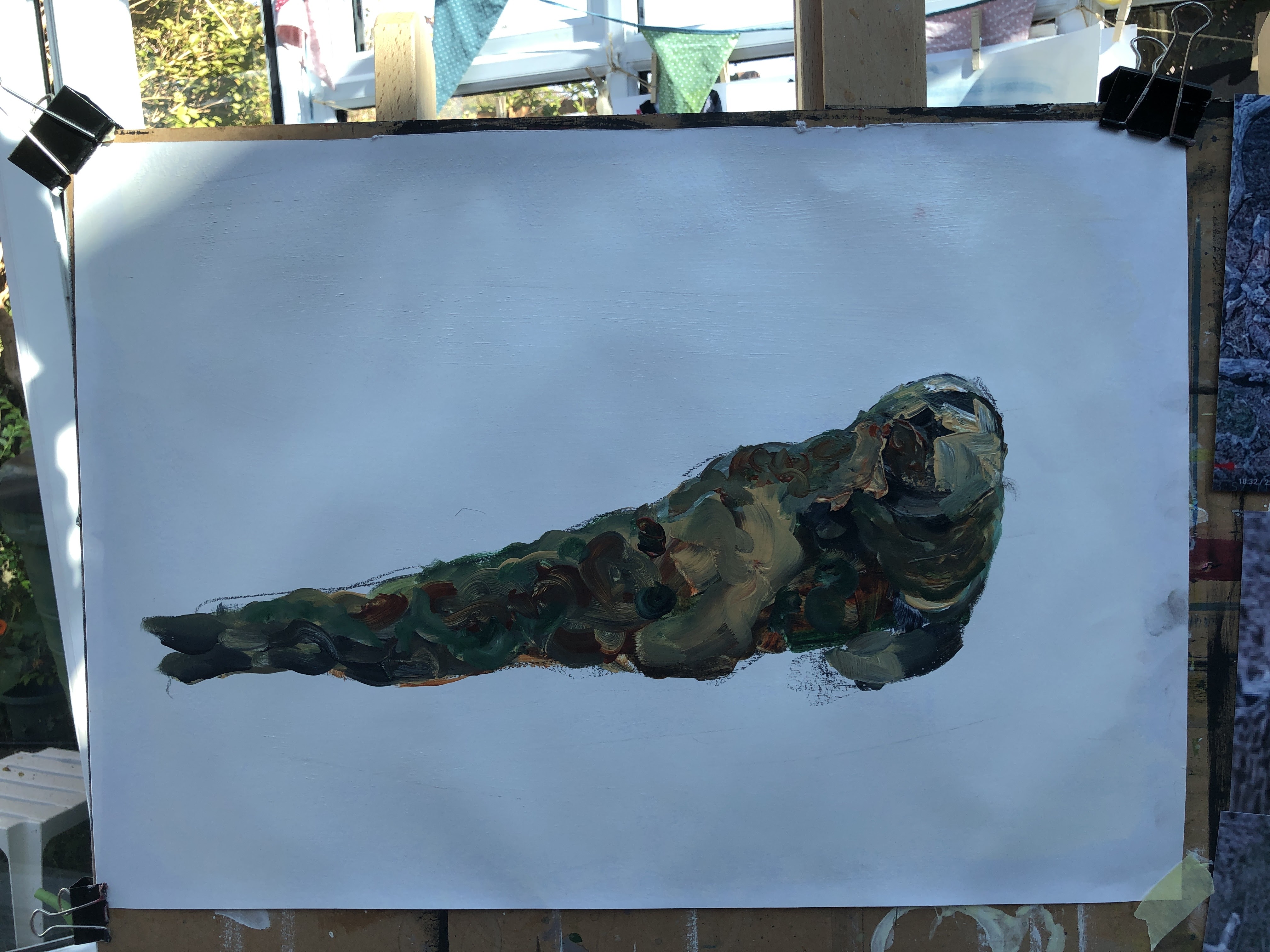
Back to the lounging seal but this time with more camouflage, less inconsistent, incompatible background.
I’m starting with a piece of A2 cartridge, primed in white then layered with gloss varnish because I want the surface to be slippery.

These are quasi military colours, designed to camouflage soldiers in a European countryside. My seal is becoming the countryside because I can see hills and meadows in the patterns, achieved by brush-dancing (twiddles and swirls) over the gloss surface, but I risk over-working it if I get too deeply involved in that. The simplest thing will be to allow these layers to dry then pareidol a face into it. I think for a minimalist back ground, I might just draw some very straight, architectural, horizontal lines to intimate the shelf the seal is hauled up on, and a couple of levels of bank behind.
What a difference a few hours can make to the light – or at least my phone’s response to it.


I’ve used the vivid setting on the phone to compensate for the adjusted light balance. This is actually closer to my real-world experience of it. I’ve gone for the random patchwork approach which sits well over the previous layers, and while I can see a face in there, it’s a little too human and it seems to be howling! Probably fixable with some more patches, now I know what I’m doing.

I’ve used the vivid setting again. Tomorrow the light will be different so I’ll take another, but before that, I’m planning horizontal lines. These will be thin, singular, and as precise as I can make them. It’s about providing a platform for the seal in complete contrast to the disruptive nature of camouflage.
Half an hour later …

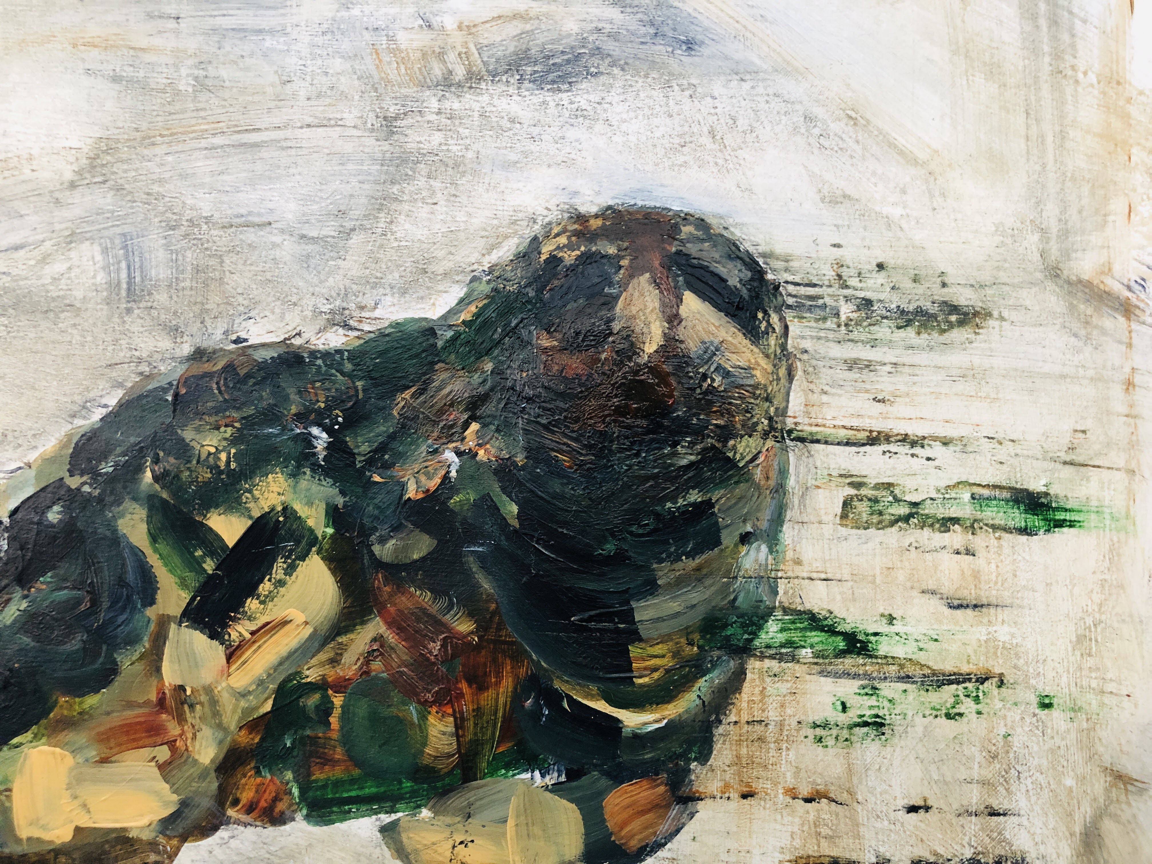
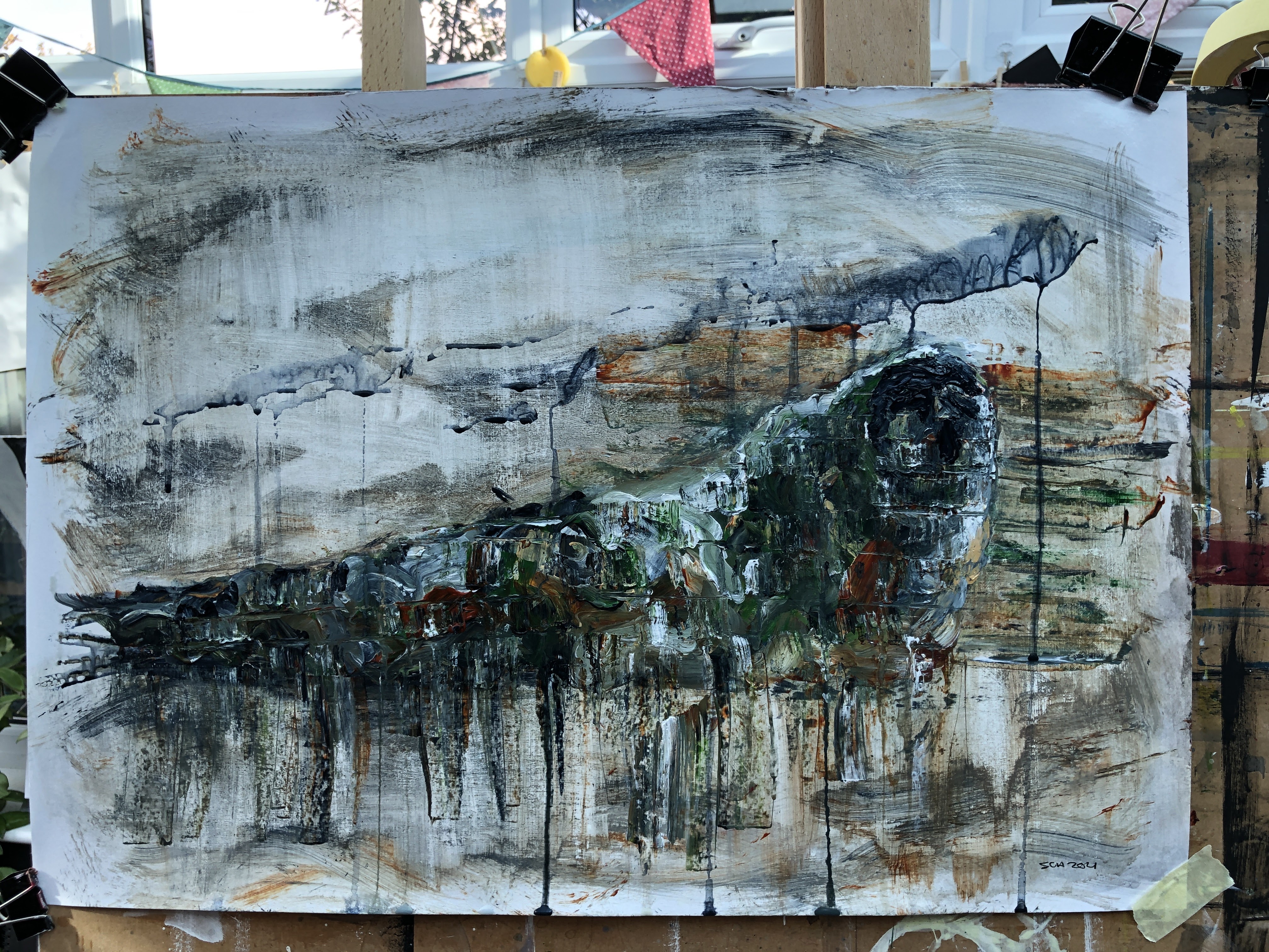
This is what I mean about following the painting. No sooner had I decided on clean lines than I reached for the charcoal to make some very light marks, indicative of foliage and mud. Then I wet the marks with a brush and let the pigment run. Soon after, I scrubbed it with a dry flannel (this is what a glossy surface lets you do), then picked up random pigment left on my palette and wiped that over the surface. A few more damp and dry wipes, swipes, scrubs, and scratches with a well-used crunchy bit of flannel and I had an image that takes the camouflage into the background. It reminds me of a cave wall that’s been eroded over centuries. I inadvertently picked up some paint from the seal so that joined the background too, and gave me the courage to swipe some to the right out of the head area. This, to me, adds to the camouflage, making the seal almost hooded and blending a few pixels at a time into the surroundings. From where I’m sitting, I can see at least three faces in there – some masked, some in a helmet, some in a balaclava. SAS Army Seal.
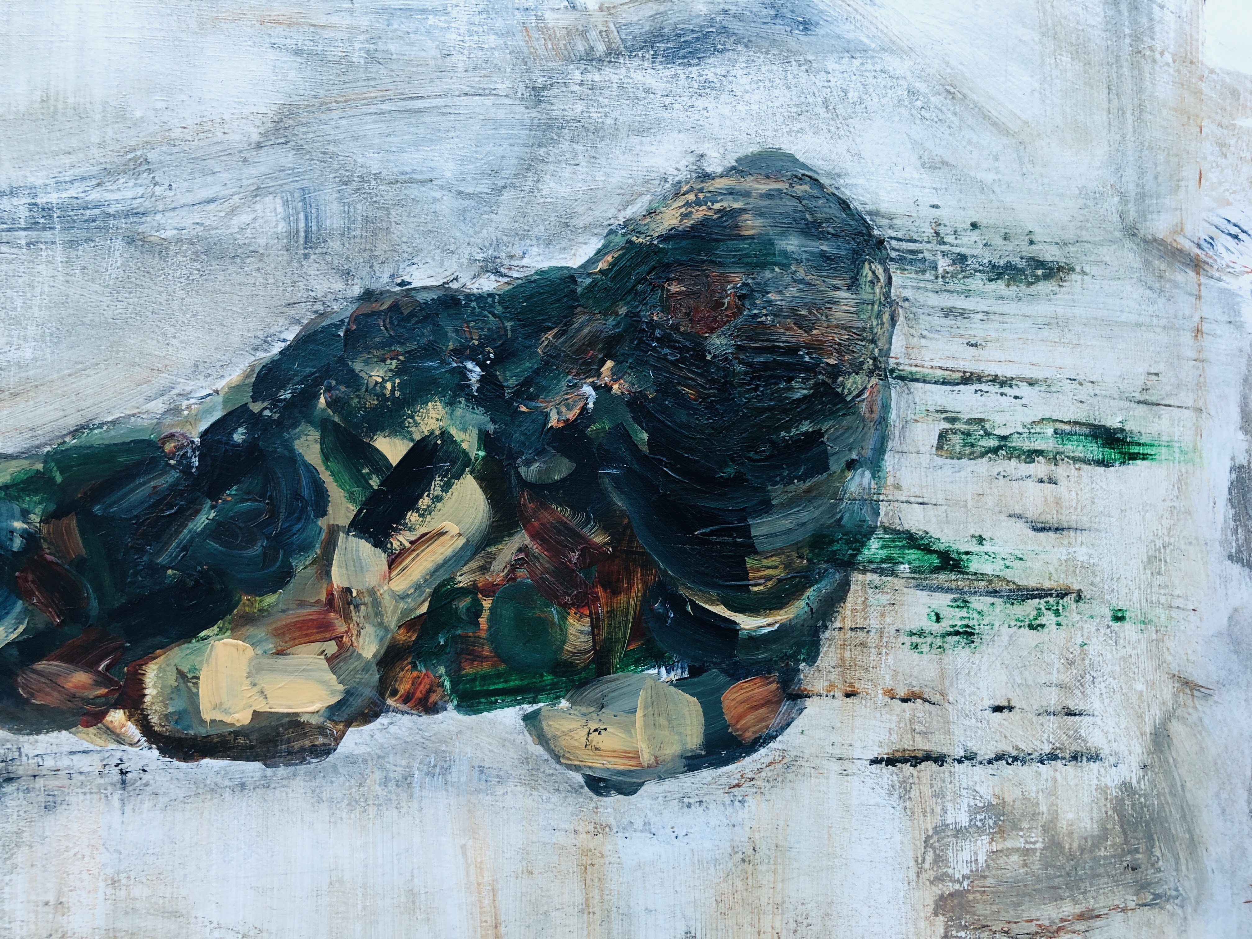


This pareidolia business has its downside – I can see a large frog mouth now that needs to be fixed.
Vivid setting but also different light – the LEDs are on. I’m happy with the eyes now; their oblique shape associated with a tilt upwards of the head and the way they sit in their sockets. They’re barely visible but that’s exactly the point; and they’re still crucially what makes a shape that could be anything, uniquely a seal. Of course, I know where they are …


26th September. I’ve been revisiting the two seals.

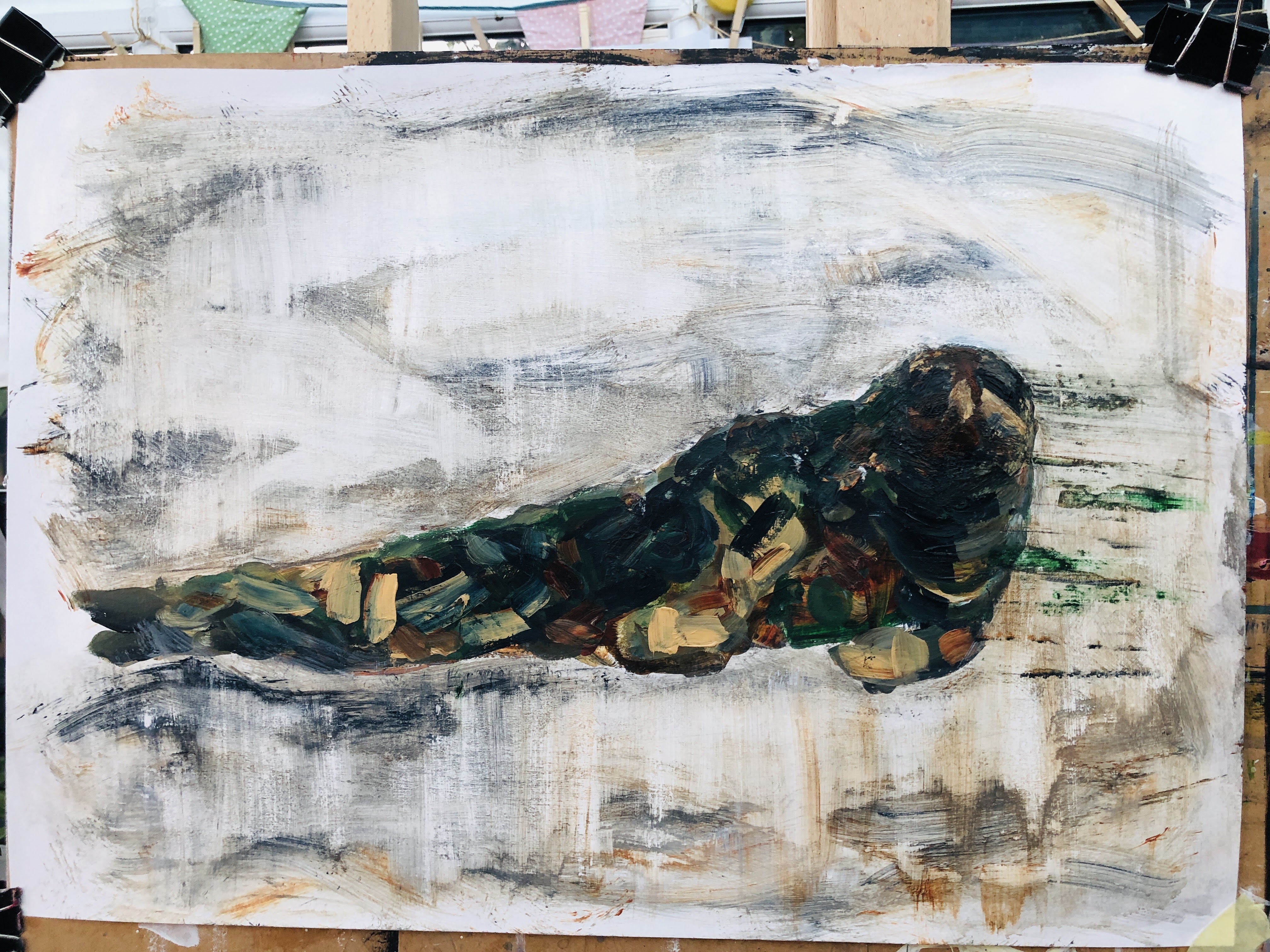
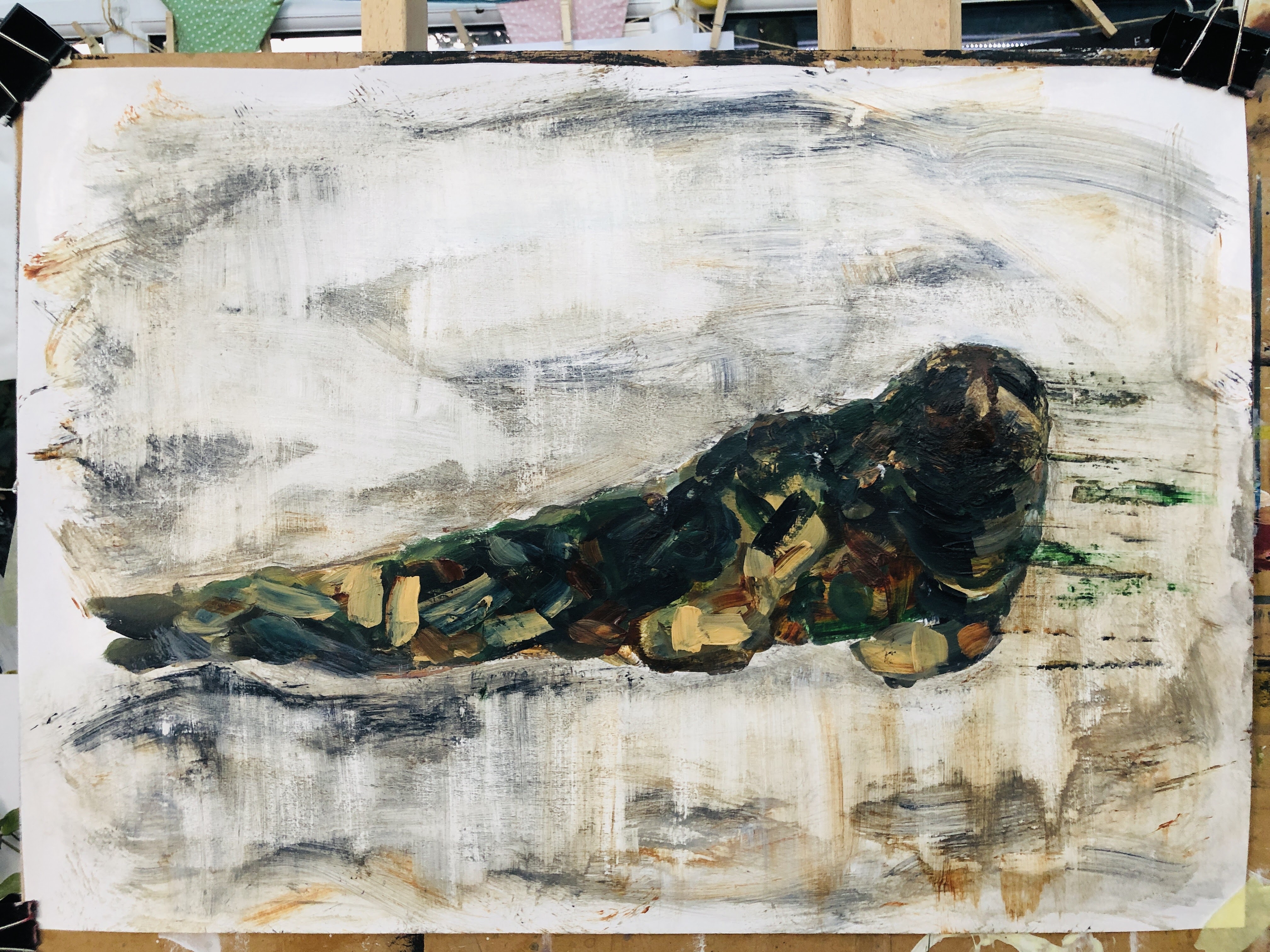
First, some scrubbing with a dry flannel, then an army camouflage patchwork.
This morphed into drips and dribbles which needed some further scrubbing and paint application. I’m at risk of over-working it now and I need to leave it to dry so I can scrub some of this down to texture and intimation. I like the colours, and I like the military reference. Seals are ideally suited to water and muddy places so often very difficult to spot, which of course is exactly the purpose of military fatigues. The drips recall the shadow/shape baffling webbing placed over tents and tanks and, below, I’ve also broken up the image with horizontal lines then pulled wet paint down in some of the rectangles. This recalls pixilation, another disrupter of shape and features.
Didn’t like this one either – way too heavy, cumbersome, and over-egged. So at the risk of wearing a hole through to the board, I’ve whited out the seal, scrubbed it with a damp then a dry flannel, and varnished it before what really has to be a final transparent wash. If that doesn’t do the trick, I’ll start again.

27th September. I should probably have stuck with the seal four iterations back, although I wasn’t happy with that and would still not be. So today I’ve been thinking about the camouflage element, and the army reference. In both wildlife and armed personnel, blending into the background is a life-saver and so, while seeing the seal on the bank was a delightful thing for us, it wasn’t necessarily so for the seal.
Camouflage is disruptive; it makes the wearer invisible by matching the irregular patterns of their environment. My tabby cat, for instance, is undetectable in the garden even when sitting in plain sight, and much the same goes for my black cat in front of the flat screen TV when it’s off. Totally evolved, that cat.
Machinery, transport, habitats, have all been camouflaged to protect personnel. Mostly using a contextual palette – muddy for temperate terrain, white for snow, and sandy umber for deserts – these have rendered troops less visible to whoever the enemy is. For a time though, some ships were painted in extraordinary patterns by Norman Wilkinson, the aim of this Dazzle camouflage being:
… not to conceal but to make it difficult to estimate a target’s range, speed, and heading. Norman Wilkinson explained in 1919 that he had intended dazzle primarily to mislead the enemy about a ship’s course and so cause them to take up a poor firing position.
https://en.wikipedia.org/wiki/Dazzle_camouflage
Seals are not dazzlers, they’re shapeshifters on mud and borrowers of colour under water.


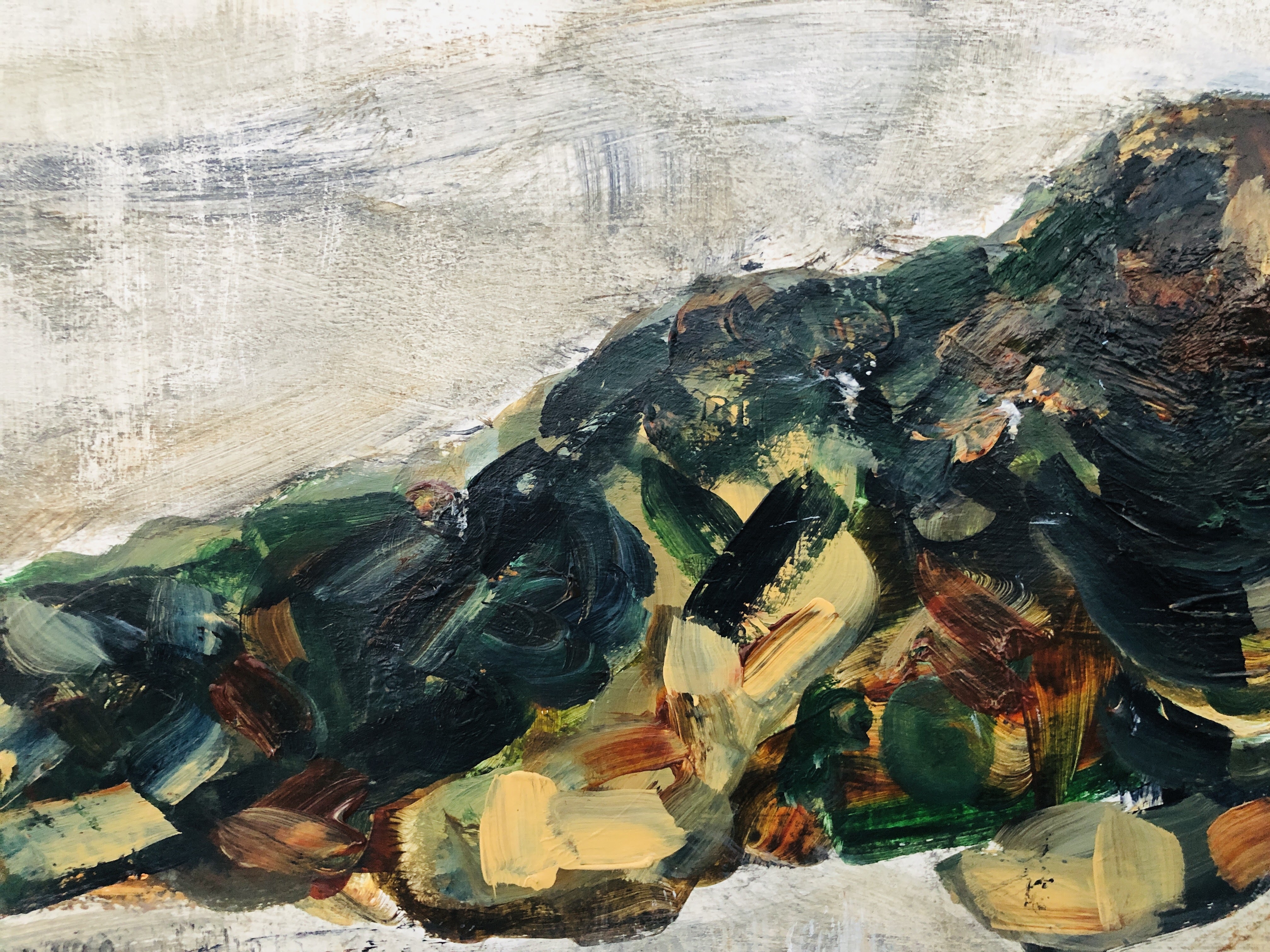
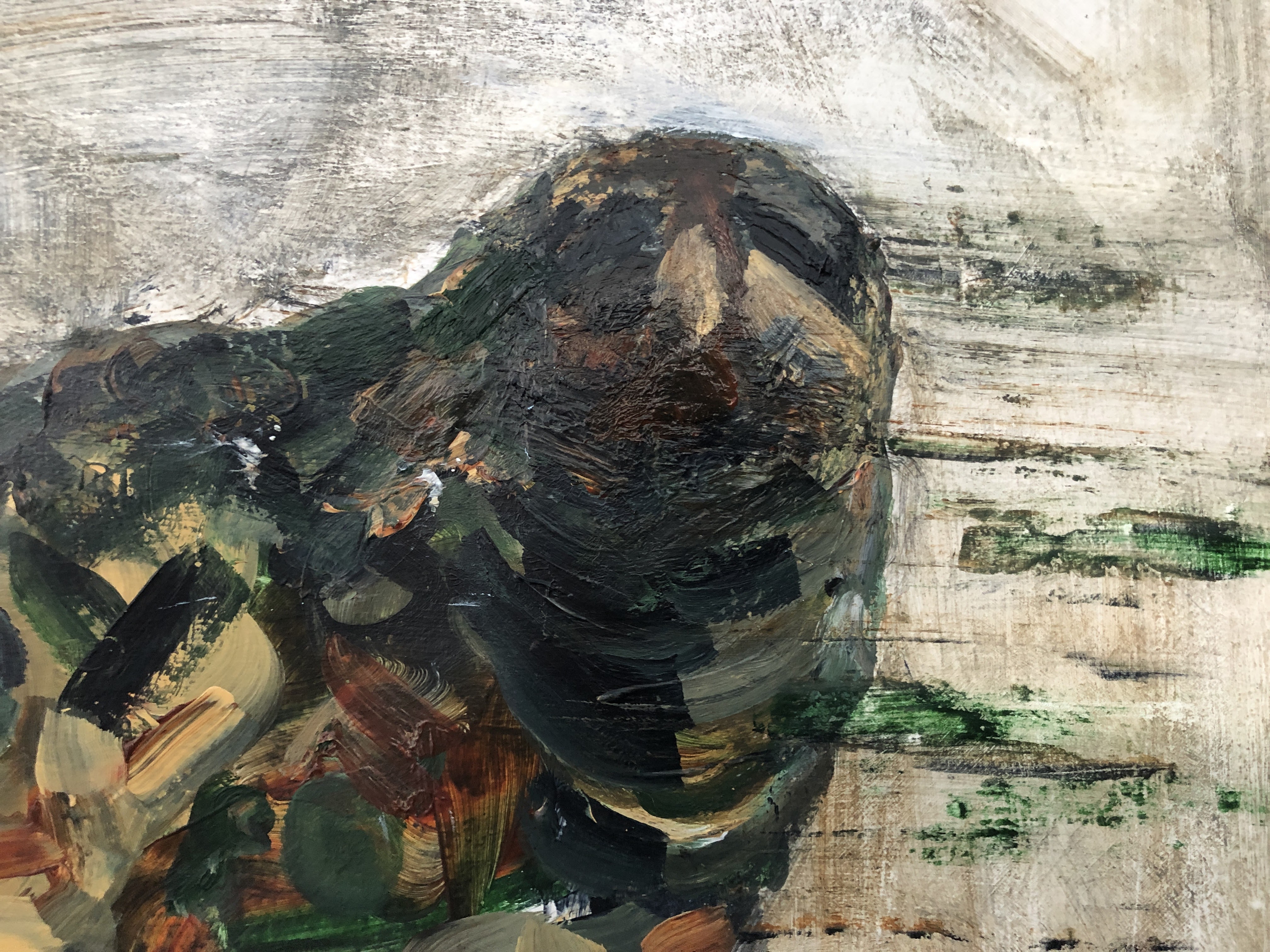
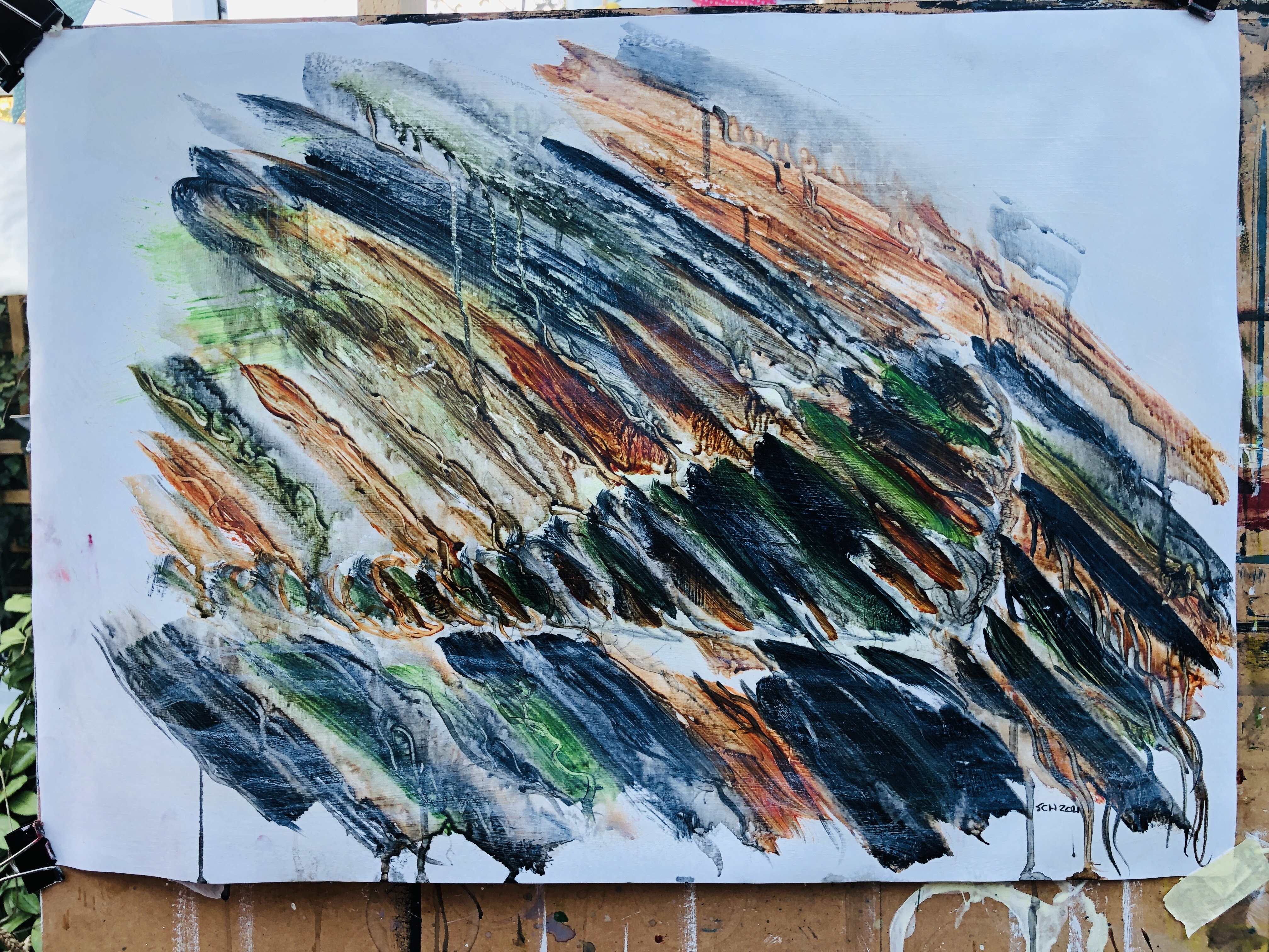
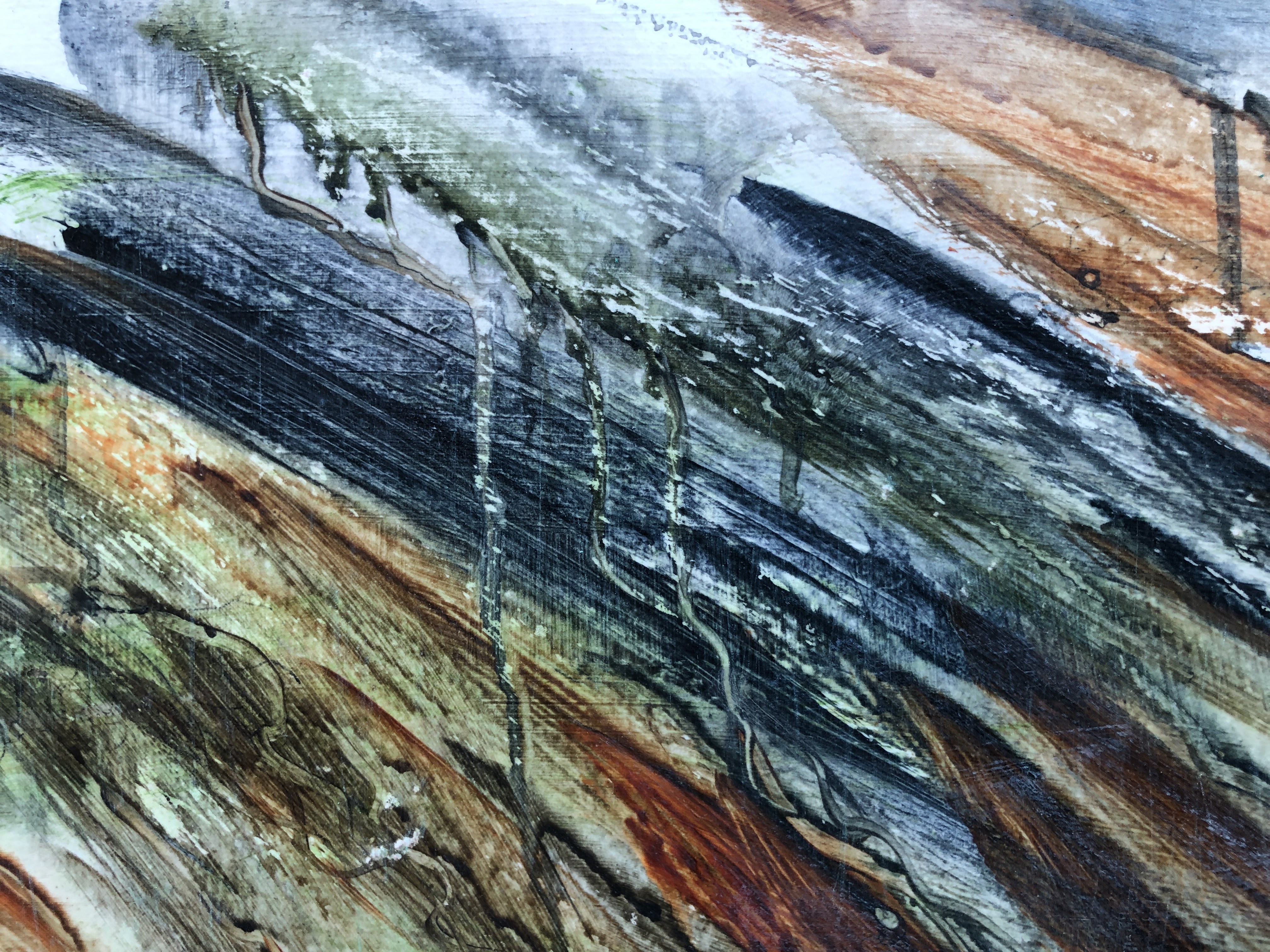
The new marks are dribbles of dilute paint that follow ridges of thicker medium. I’ve followed these actively with a small round brush which had the effect of trailing pigment around the surface, and also reducing it in small channels. In the image below, I’ve used a small air blower (for removing debris from keyboards) to push dilute medium around so it makes tiny tendrils. The effect I was looking for is a kind of fantasy landscape of roots and the tracks of small animals such as worms.
After a further layer of gloss varnish, I washed some of the painting, top and bottom, with T white to mute the lines a little and to suggest distance (top) and water (bottom). Then when it was dry, I scrubbed it with a rough flannel – old paint fused into the cloth is ideal – to reveal textures.

I think this time I’ve held onto the transparency of the medium, all of which I’d chosen for that quality, and to make a semi abstract, partly metaphorical, but fundamentally descriptive image of a seal hidden in plain sight on a river bank. Army Seal.
The paints are Sap Green, Payne’s Grey, and Burnt Sienna with a light wash of T White.
28th September. Let’s call the previous pieces full size sketches. I learnt a bit more with each one about what I was trying to make – something evoking camouflage but light, not heavy, and with shape but not quite definition. I think I have it now and I’ve used painted collage to help get me there, discovering in the process that polymer glue is even better for the application/reduction process.

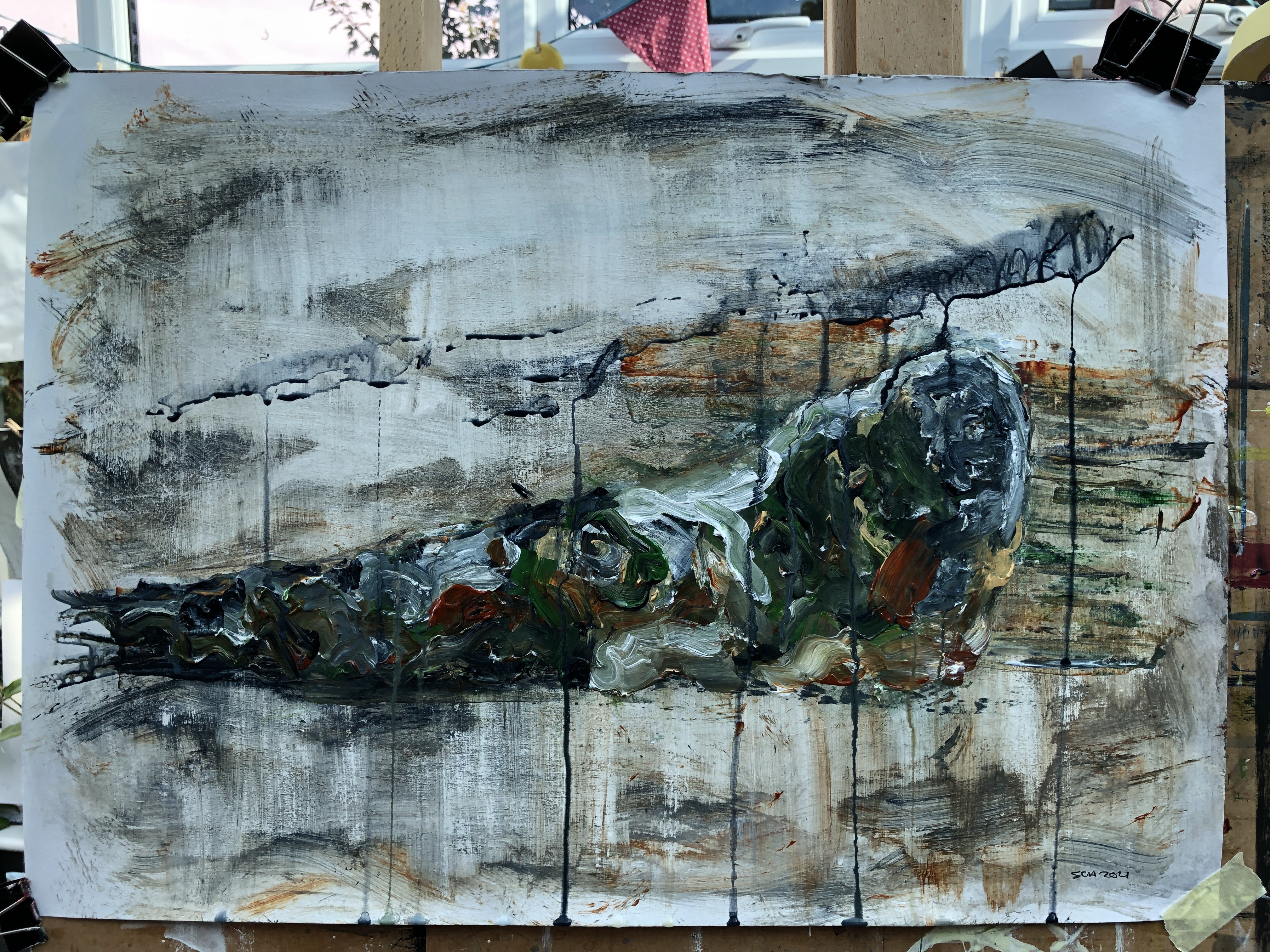
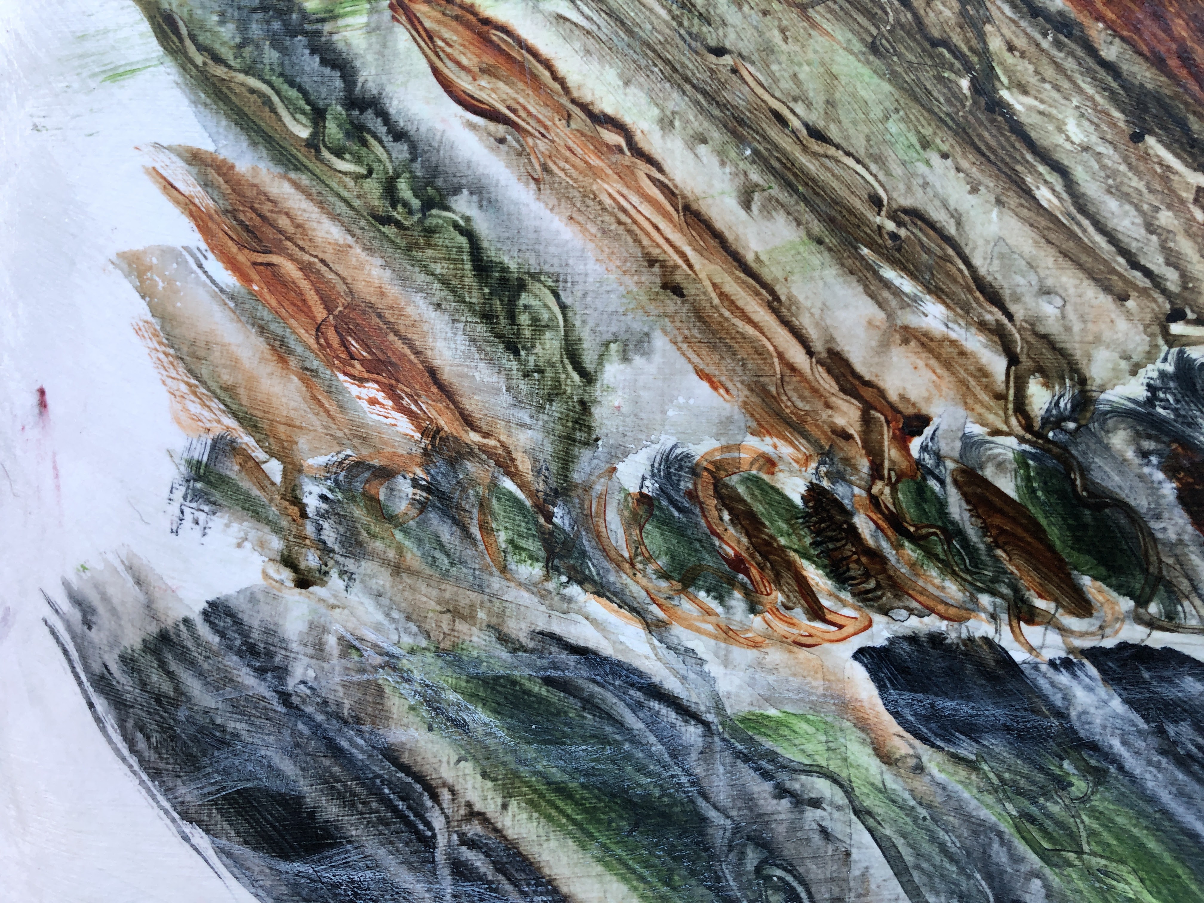
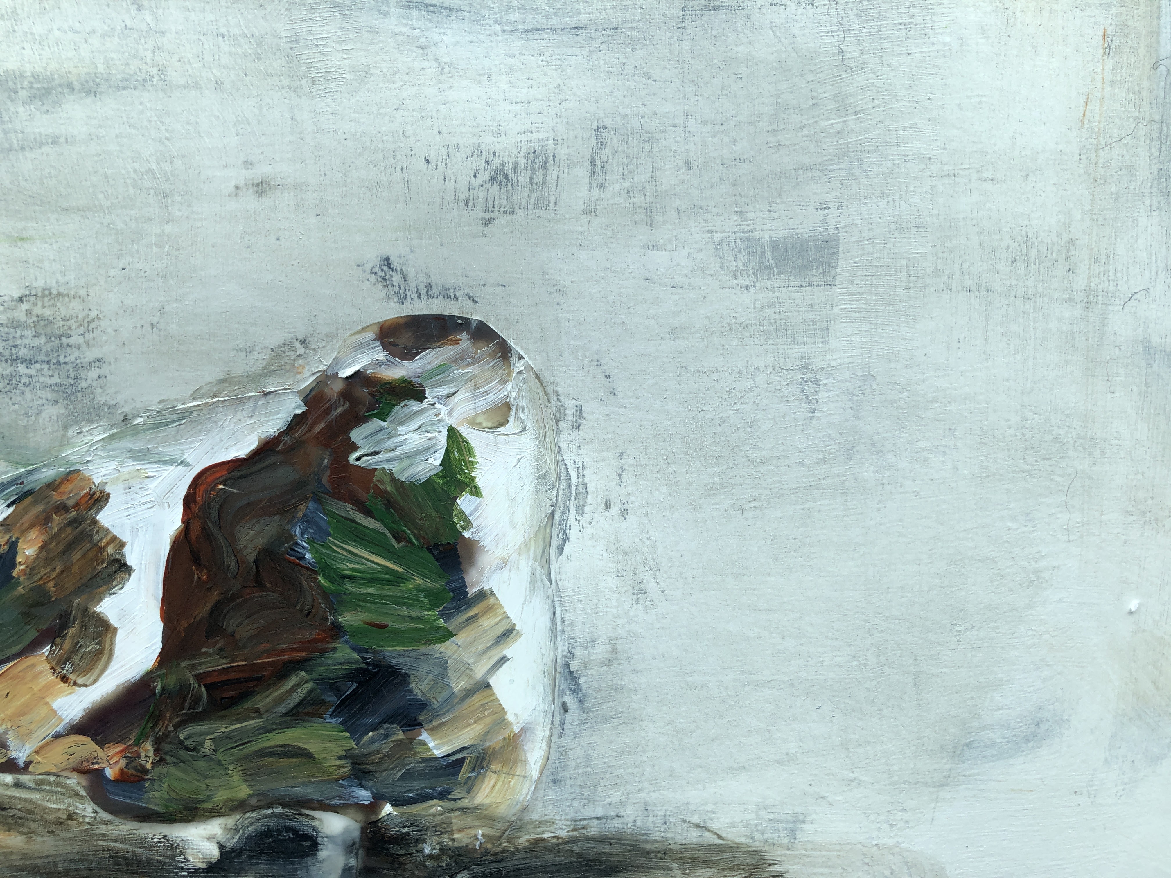
First pass. Following the lines of shadow on the seal rather than its features, I’ve blocked in patches of army camo colours and added a small area of platform for it to be sitting on. I’ve used the dry brush technique to make shapes by removing paint in small trails and twirls, and I was tempted to leave it here; simple and clean.

But I wanted to darken the ground a little and indicate foliage to break up the seal’s outline which itself is quite pronounced as it’s the edge of the photographic paper I cut it from. I quite like that artificiality, the abruptness of it, and then the process of muting it into a question of where it ends and the background begins.

Finally, to take away the starkness of the background, I’ve added/removed/applied/scrubbed white, payne’s grey, and burnt sienna into the glossed and primed paper, pulling some of it into the seal and some of the seal out into the background. There’s something about that scratchy, old stucco, cave wall, crumbling plaster effect that I find really appealing, albeit ‘out there’ and not in the house!

When (if) I’m a much better painter, I’ll maybe come back to it, but for now I think I’m done and really it’s the version I’m happiest with.
Dazzle camouflage. Wikipedia. [online] Available at https://en.wikipedia.org/wiki/Dazzle_camouflage. Accessed 27th September 2021.

2 thoughts on “Mitigation revisited #2”