
Yinka Shonibare | Artist | Royal Academy of Arts This man makes products of his work and his work is in the Bisa Butler mould of total colour and like her he addresses colonialism, race, class, and identity. Fab. Another Goldsmith’s grad.
Working with colour when working quickly. I don’t really; I’m more thoughtful and considered about where my paint goes and what purpose it serves. I use media that delays drying for that purpose. Speed doesn’t suit me but if it did, I would do what I do now which is to sometimes mix on the palette and sometimes on the painting.
Paula Rego. Probably the first artist I was introduced to on this course and one I warmed to for her robustly built dancers. She uses soft pastels and acrylics mixed in her paintings and a stand-in, Lila, for herself when she’s making self portraits. Much of her work is disturbing and reflective of a rather bizarre upbringing with, I think, grandparents keen on gruesome mythologies. Her narratives seem self-exploratory, as though she is working through the difficult parts of her life on canvas.
Pawel Althamer’s 2002 ‘Self Portrait as a Businessman’. So he turns up in Potsdamer Platz, dressed in a suit and carrying a briefcase, then takes the lot off and leaves, totally naked. I can’t say I’m impressed with this kind of exhibitionism dressed up as art. According to The Tate’s summary;
“The artist considers the pile of clothing and objects to be a sculpture that represents an aspect of himself. As his body is entirely absent, the corporate persona of Pawel Althamer may be read as being a costume which he assumes, or a role that he plays, and from which he may also dissociate himself.” https://www.tate.org.uk/art/artworks/althamer-self-portrait-as-a-businessman-t11913
Bravo, very clever.
I don’t think it’s possible to compare use of paint from copied prints and onscreen images and I’m not sure how you can make a judgement about the speed of application. What I do see is three very different styles of painting (Guston – flat and almost illustrative/graphic; Van Gogh – detailed, full of perspective and with a roughness that reflects the subject, the work boots; and Milroy – photorealistic with shine and accuracy). These were all made in oils so how quick was the execution of the paintings in reality? There is time with this medium that is not the case with acrylics, inks, or watercolour.
Other artists using clothing in their work.
Are there particular works that [you] enjoy and relate to? Why? How and to what effect is clothing used in these artists’ works?
I find this interesting: recycling clothes as installations, by Alain Guerra et de Neraldo de la Paz. This again is colourful and has a purpose. There’s strong imagery that is hard to miss. I want one of those snakes!
Other artists, and Frida Kahlo comes to mind, make statements of their painted clothes. Kahlo is often dressed in ways that show the wounds, the damage, the scars of her injuries and surgery. And there she is, upright, and staring with contained defiance right back out of the canvas. Kahlo is a far cry from the naked women who, according to some, are empowered by their nakedness in the various contexts in which they appear.
9th June. Today I find myself in a similar position to people who remark, ‘If that’s the answer, I don’t want to see the question’, except in this instance, I feel it’s a response to the materials per se, I’m just not sure I can be specific. I’ve read through the whole module and it’s clearly left its mark because there are elements belonging to both previous and later Parts, projects, and exercises. Also the style comes from somewhere I can’t put my finger on. The identity though, that’s definitely Helena Bonham Carter in The Corpse Bride!
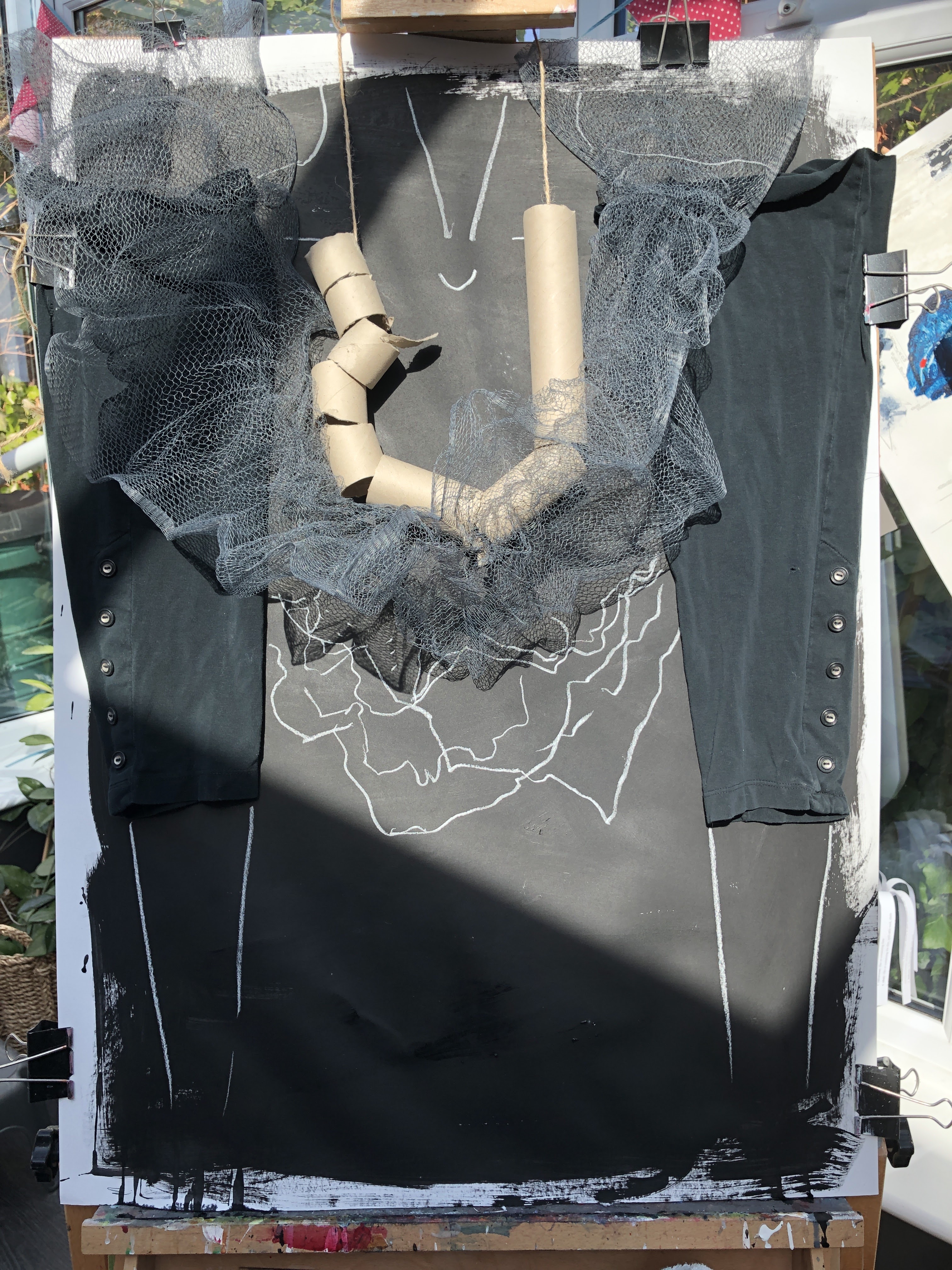
From a standing start, this is black primer on white cartridge. The elements are the pieces of loo roll tube strung on gardening string and the netting bath sponge from the original table assembly in Part 1. The black fabric is the cutoffs from a pair of old leggings which features somewhere in Part 3, and the white conte tracing of shadows is from Part 2. Time. This was the point it became a portrait of sorts showing a woman from the neck down in a dress with black sleeves, a frilly neckline, and a very blocky necklace. It was developing as a cartoonish, simplistic representation and the work of the artist whose name I can’t place was in the forefront of my mind.
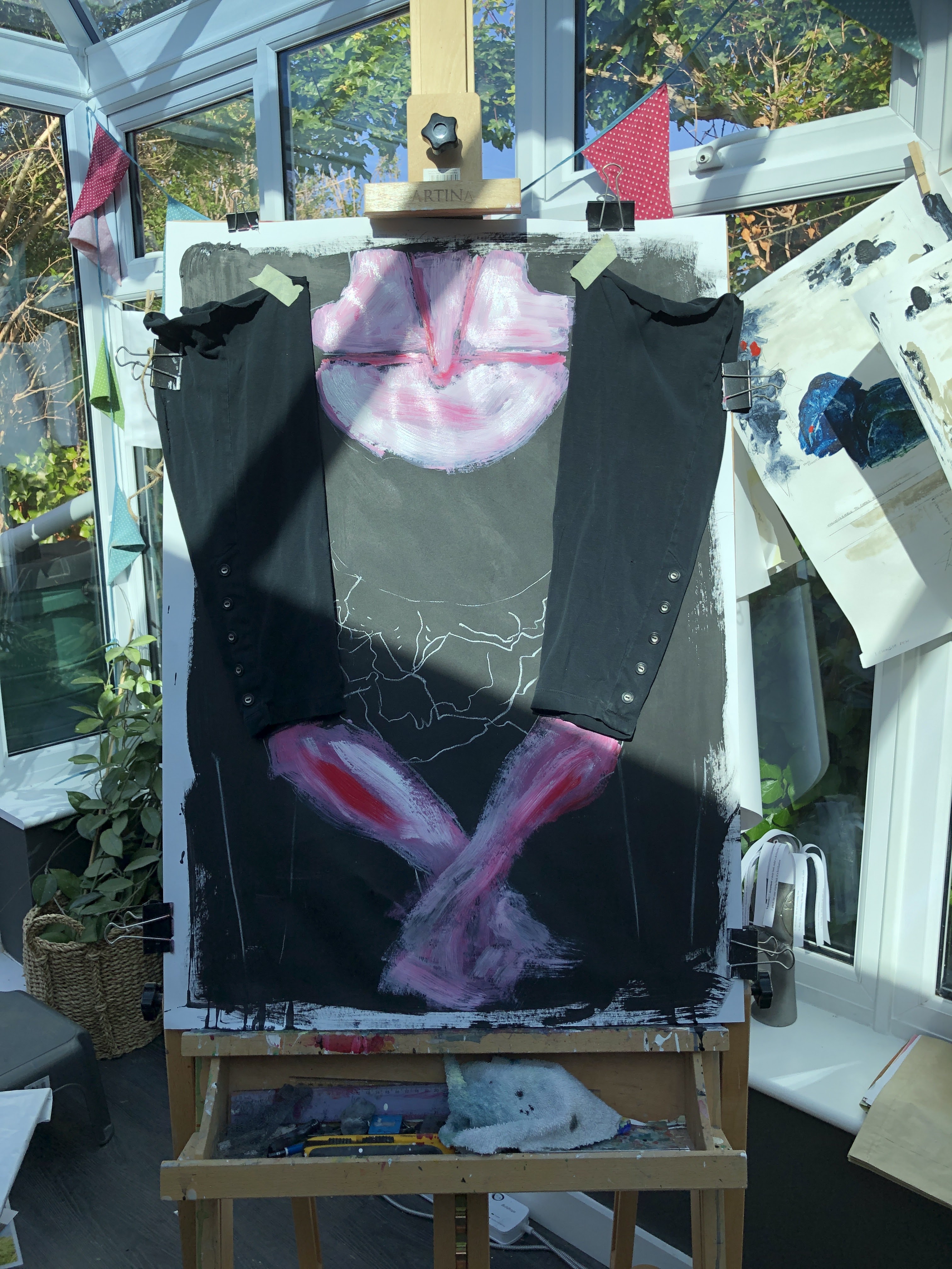
I wanted very pink skin, almost like raw bacon although I’ve no idea why.

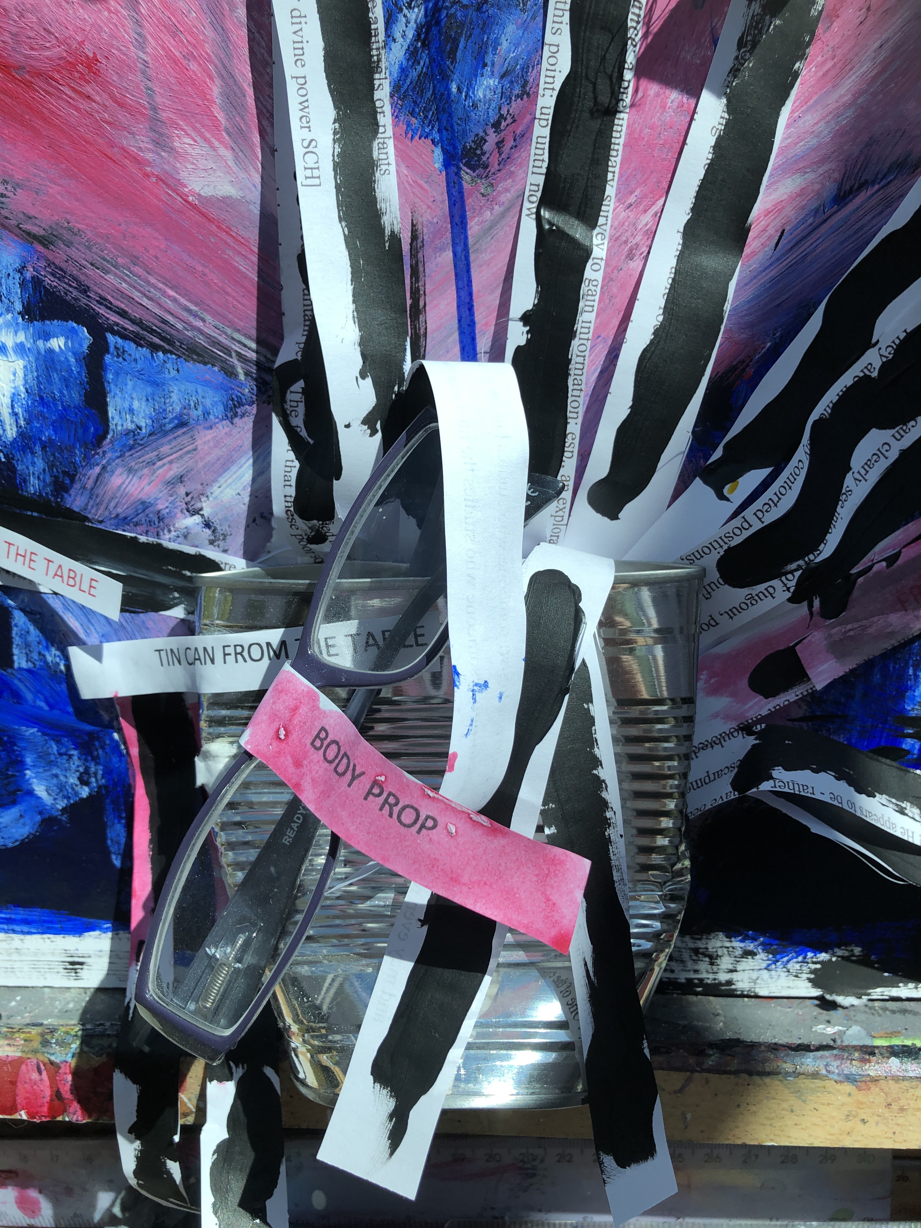
It became apparent very quickly that I had the arms all wrong and that I needed to cut those leggings down a little further. In fact I took them off and drew out the arms so I had them properly attached to the shoulders. The netting and necklace came off too so I could see how the neck was working. This stage was looking better but not quite as I wanted; not that I had a clear idea of what that was – this is organic, it’s growing on its own. The new elements include the tin can and a frill of paper from the table in Part 1 and a pair of glasses from Part 3 (clothing as props or proxies). I’ve rolled the necklace in yellow/orange paint to give it contrast with the rest of the image and to add to the somewhat gross presentation.
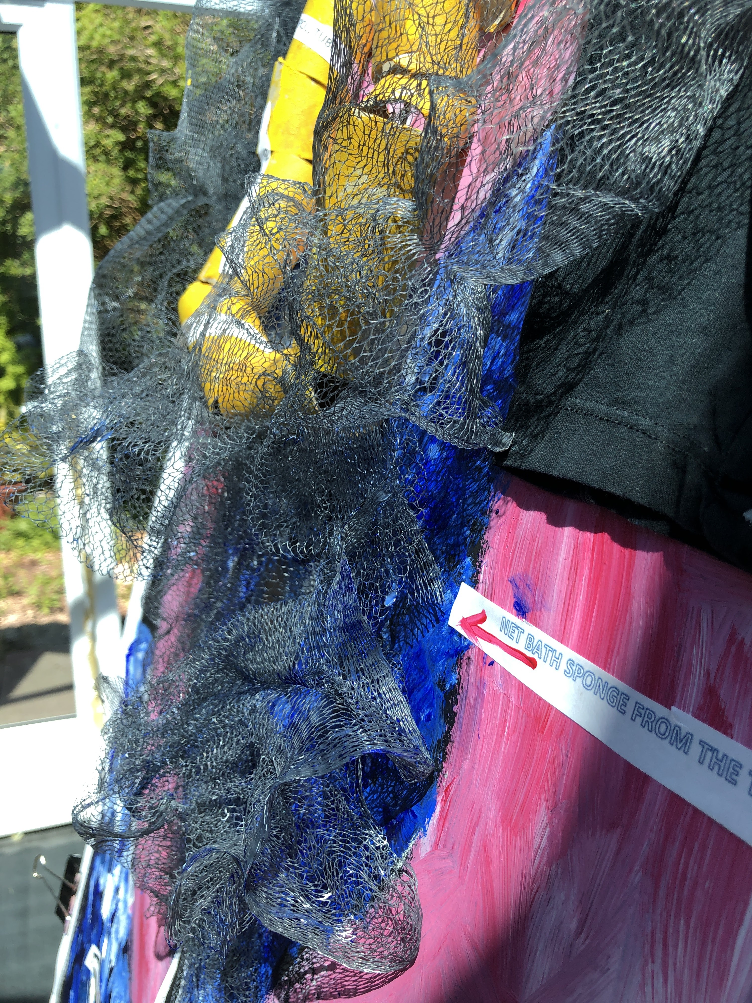
At this point, I decided to keep the retaining gaffer tape as a feature and to make the composite nature of the piece explicit. I also tackled that neck by checking out in a mirror how my own works. The blue of the dress comes from the one I wore to my sister’s wedding in the late 1980s and which I still have. Very much of its time, especially with a neat little black pinched waist jacket and an actual hat with actual netting on it.

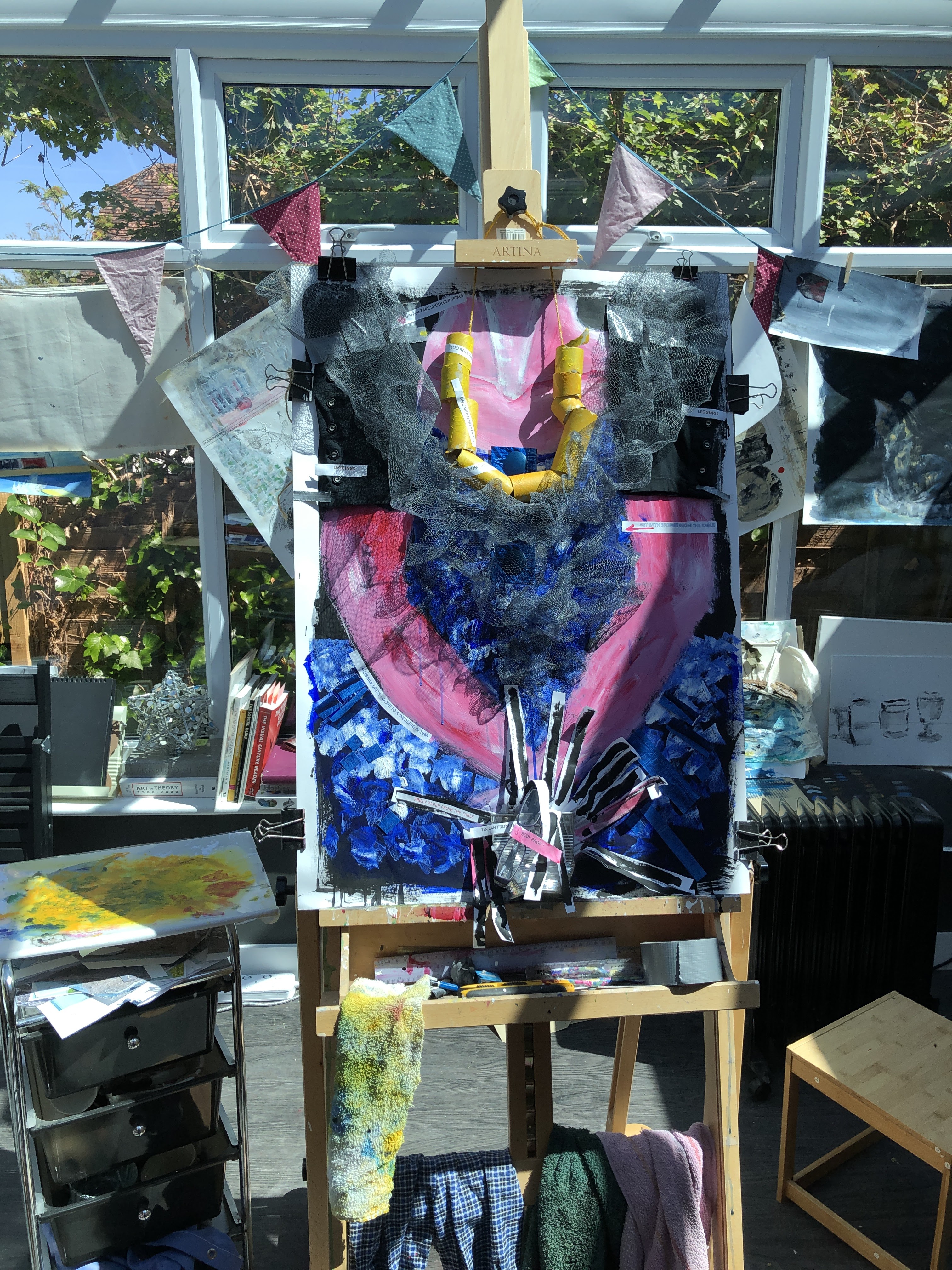
Now it has signposts about the origins of each element, constituting a narrative (project 3).

I’ve also added strips and small rectangles cut from gloss prints of the dress fabric and placed two of the buttons centrally.

There is something grossly attractive about this now it’s complete, although I suspect my feelings about it owe more to Tim Burton’s film and Bonham-Carter’s delivery of it than the actual piece.
This isn’t really something I like making although I’ve been surprised before at how something has turned out. What I can say is that it has grown itself pretty well from nothing much, which bodes well for my organic ‘pantzer’ approach to making art.
