
Because I have difficulty even taking photos where this requires leaning at an angle, I have reinterpreted this task in terms of different groups of items rather than the same one from above/below and so forth. I know I can’t draw or paint from this angle and so I’ll be using photographs. My plan is to look at ways of isolating shapes, using continuous lines, making wide sweeps, scrambling tangles of lines – a process that I hope will take me away from the items themselves and into their spaces and negative spaces. Distance helps as my close vision is not good, but I can also enlarge the photos.


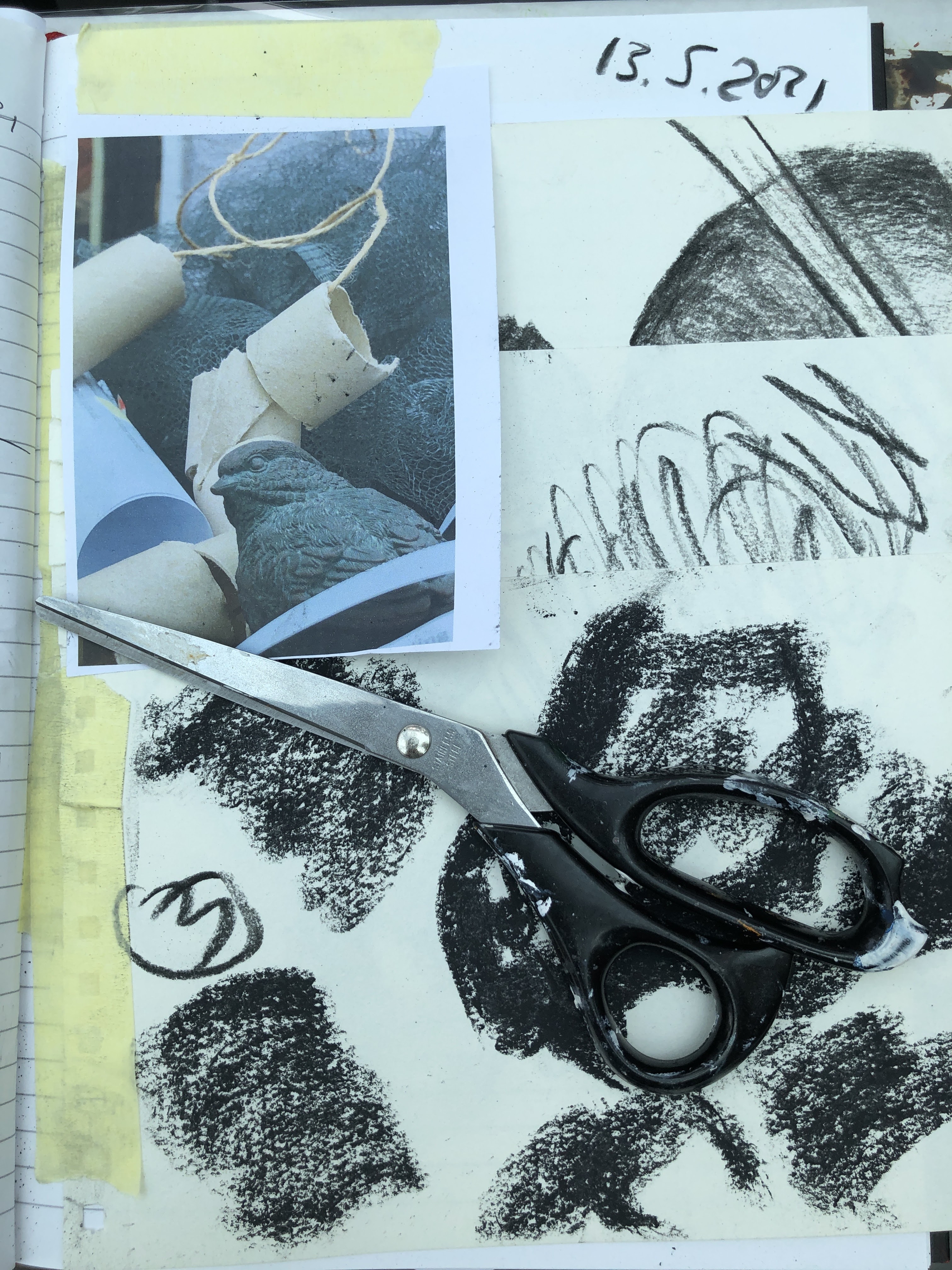
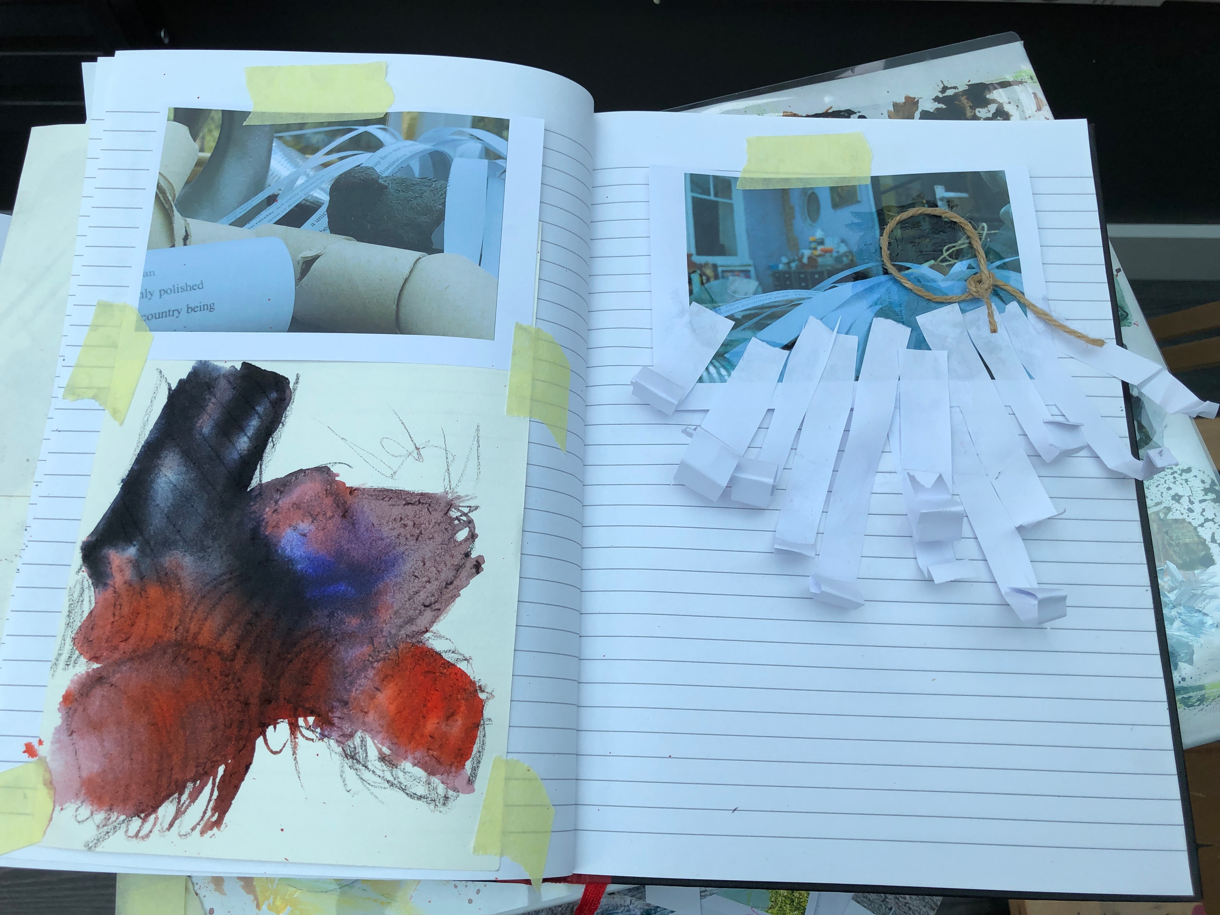
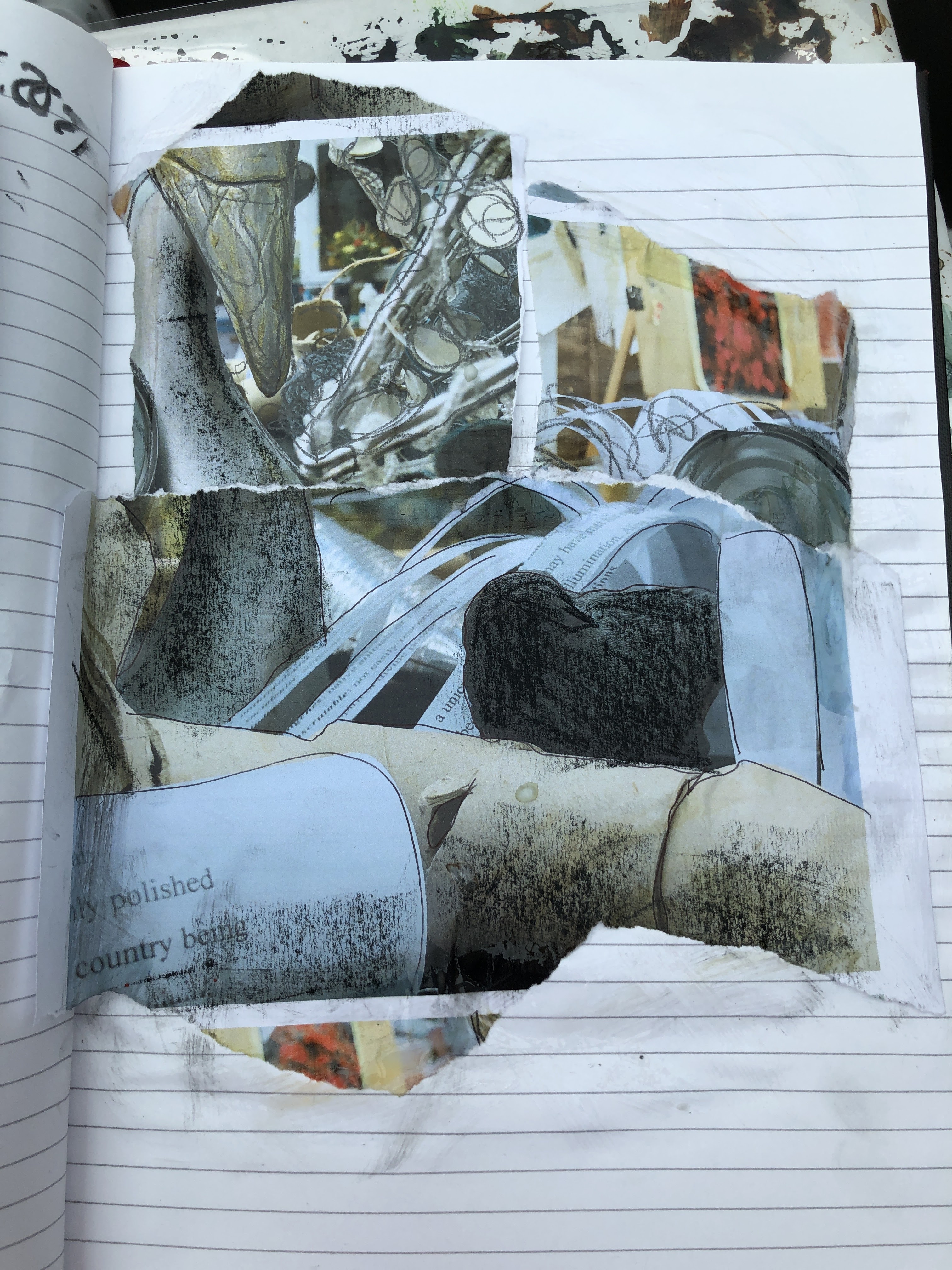
I printed these onto plain paper and drew into the images with charcoal, biro, acrylic pen, and pastel.
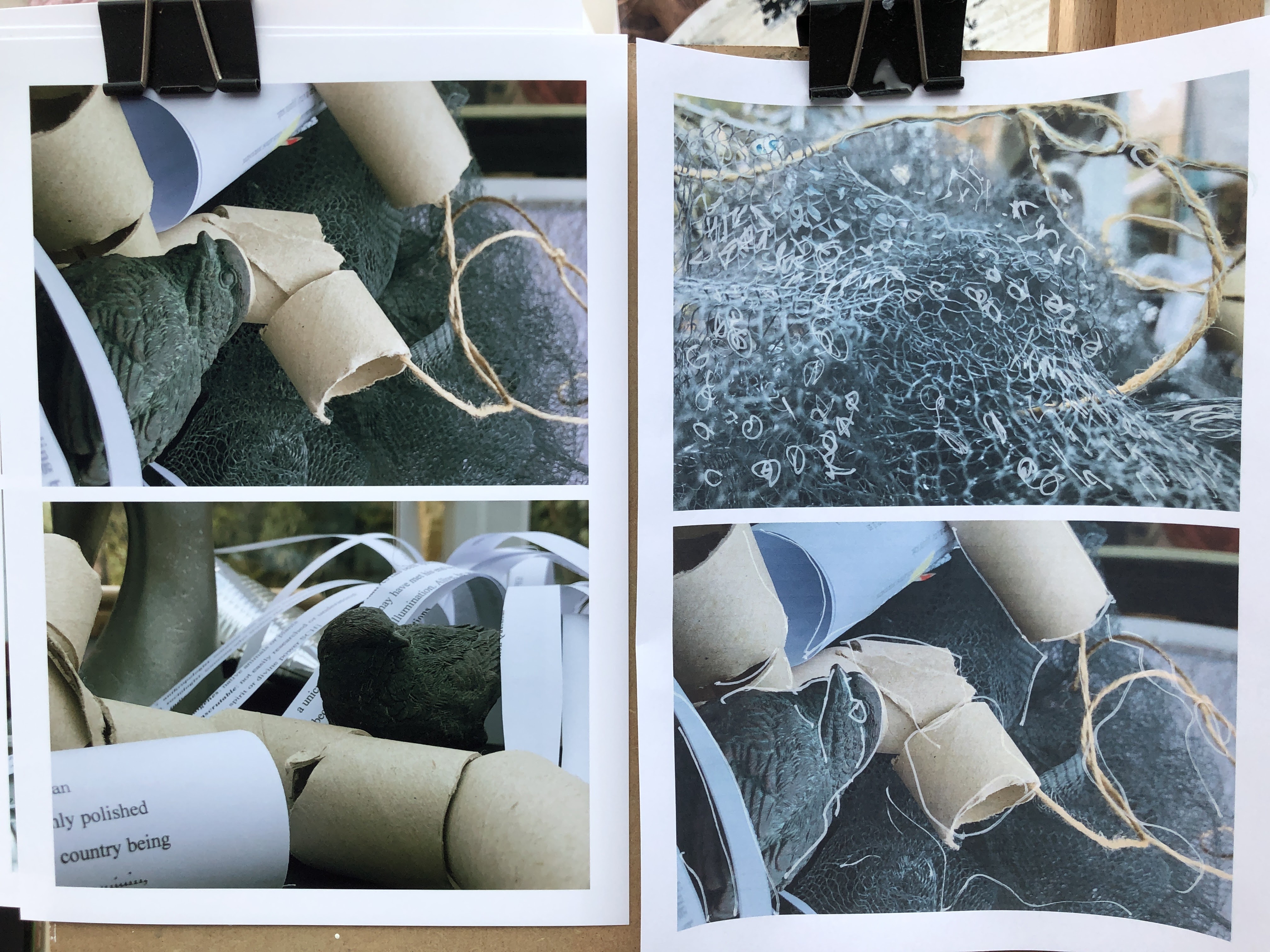

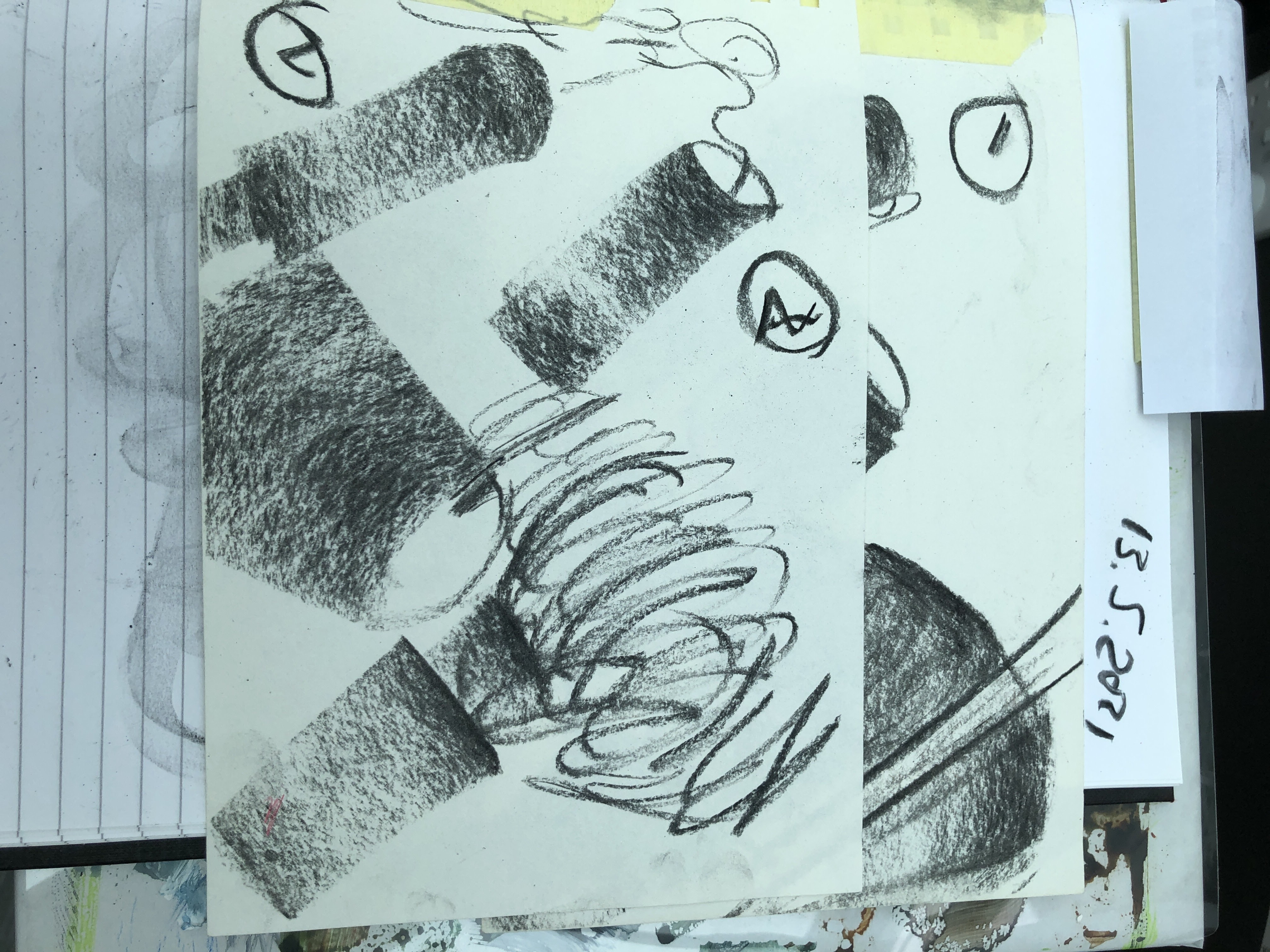
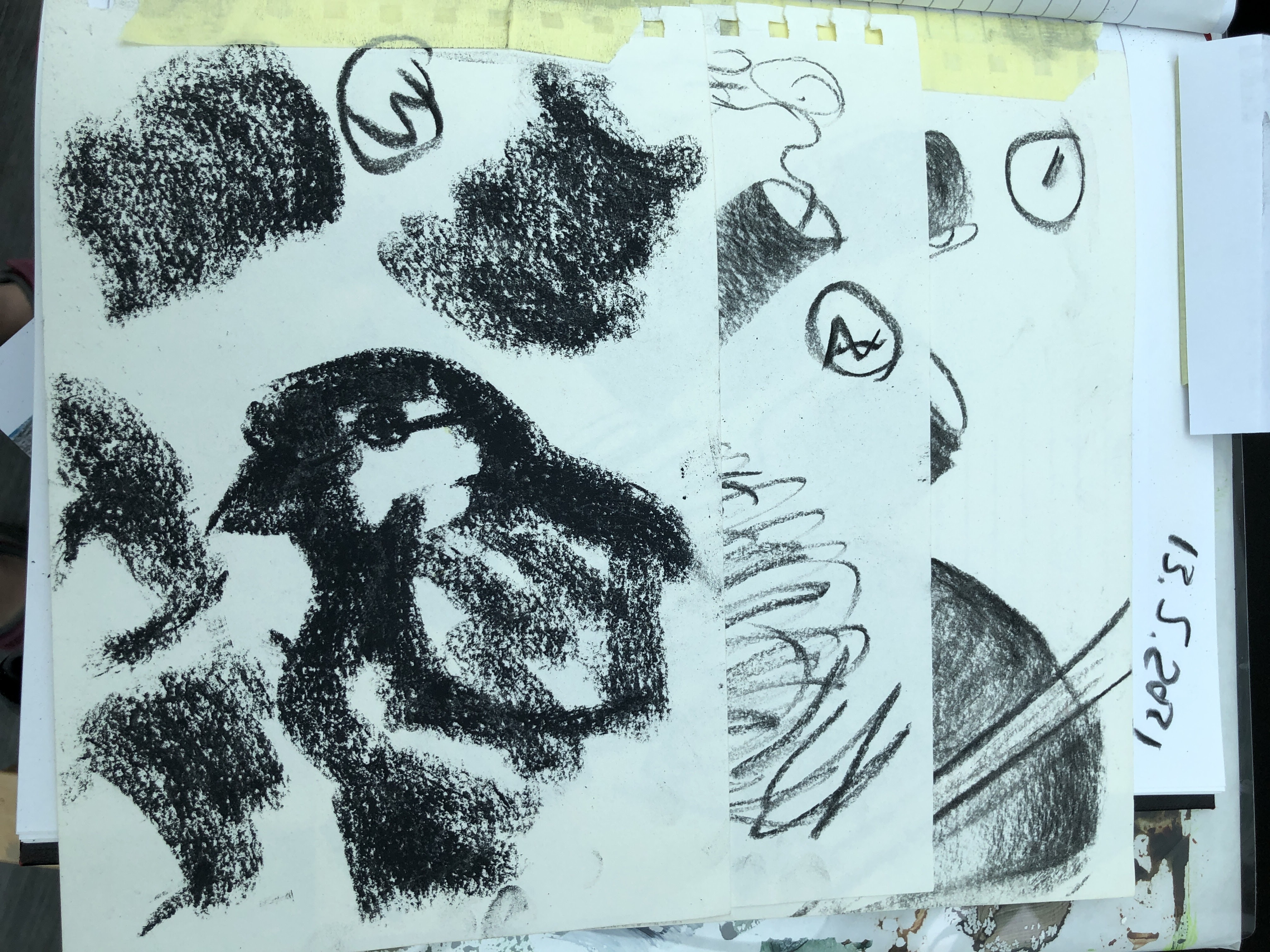
Then cropped them into my notebook and made sketches using charcoal and soft pastel.


Some ideas are beginning to emerge involving collage and maybe building up shapes on the support but I don’t know how I’ll do that yet.
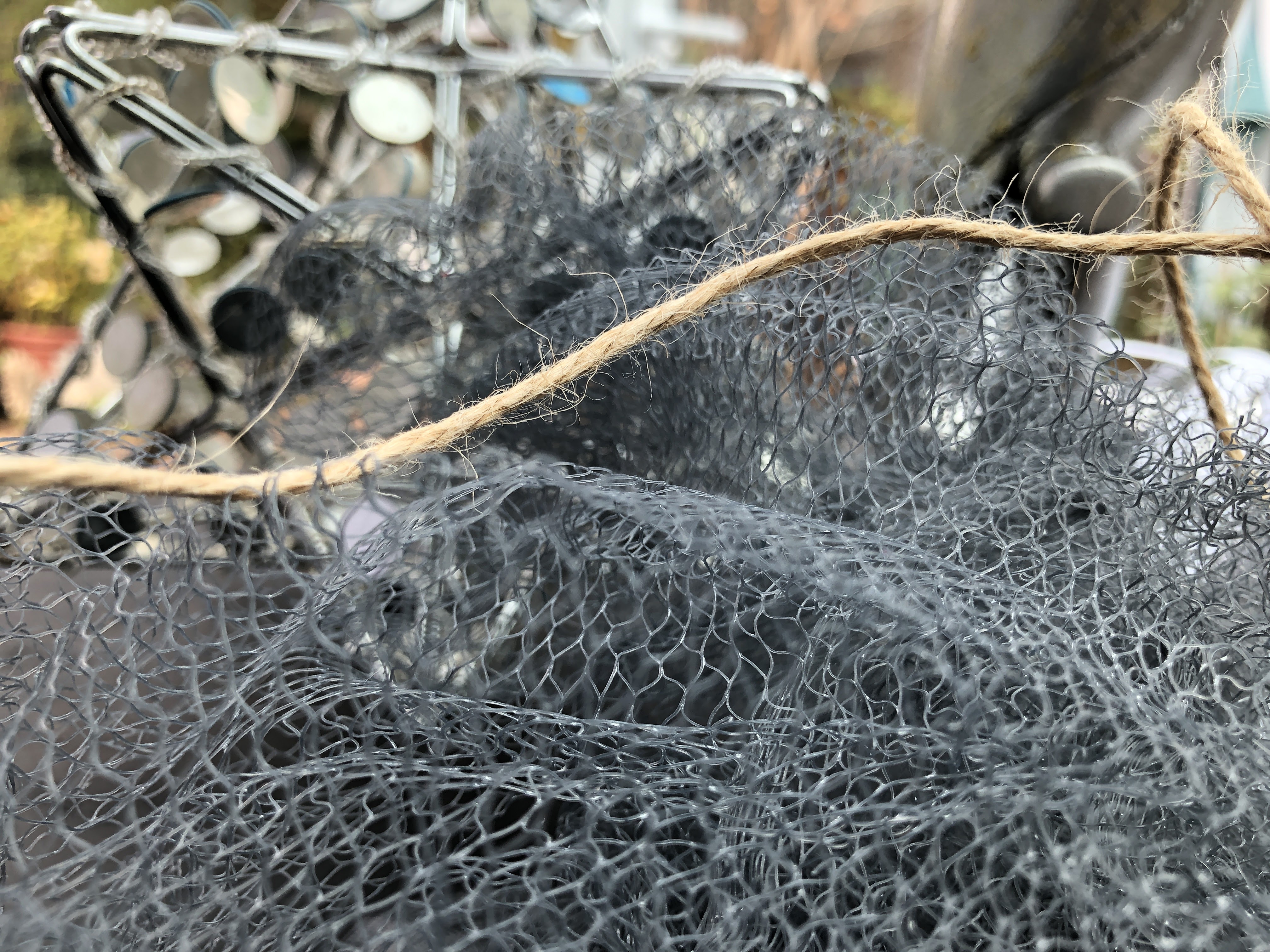
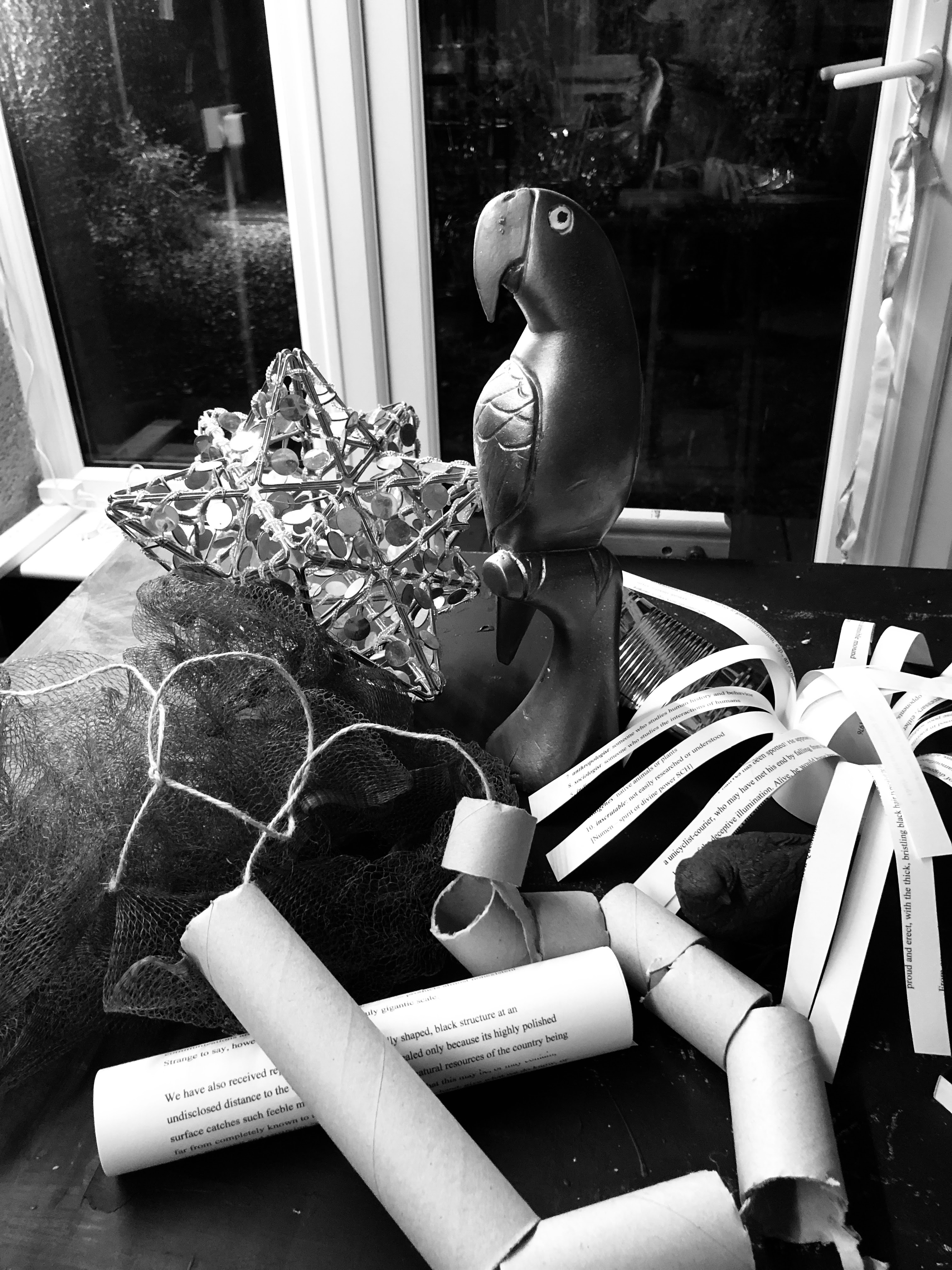
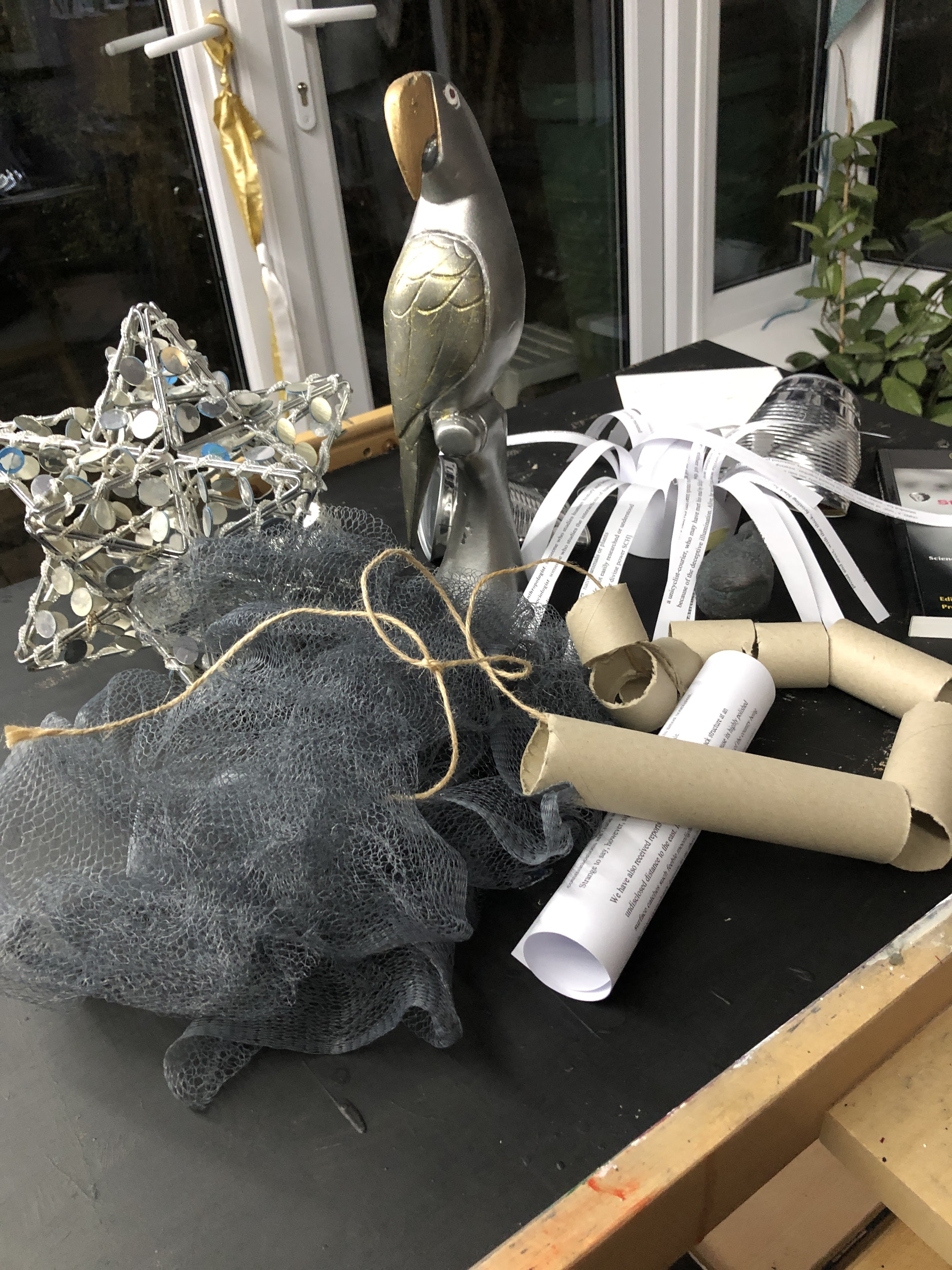
I’m wondering now if I might make the images using pieces cut from photos of different images altogether; or perhaps from larger painted pieces with added base materials such as some of the netting, cardboard, string and maybe feathers. There are plenty of birds around and always an abundance of discarded feathers.
I would mostly be building out from a vertical surface rather than up from a horizontal one, which puts me in mind of those portraits/sculptures made from bits and pieces of dolls and debris that only make sense from one perspective. I’m searching my head and Google for the name of the artist whose work I can ‘see’ as I write but I may have to come back to that. My work will be nowhere near so complex and it should make sense whichever viewing position, vertical or horizontal, is taken.
I’m thinking now of architectural modelling, map contours, pull-out paper dolls and those christmas decorations we used to make with strips of paper you had to lick at each end to loop them.
May 15th. This will need to speak to me when it’s dry. A mix of transparent primer, Payne’s grey, and silver acrylic over an old sheet of cartridge with its own residual marks, this will be a unique colour reflecting some of the shades in the physical set-up. In this gem of a book, The Secret Lives of Colour (St. Clair, 2018), it falls somewhere around woad/woad-lite. Reminding myself that this section is titled Contemporary Approaches to Still Life is a helpful focus.


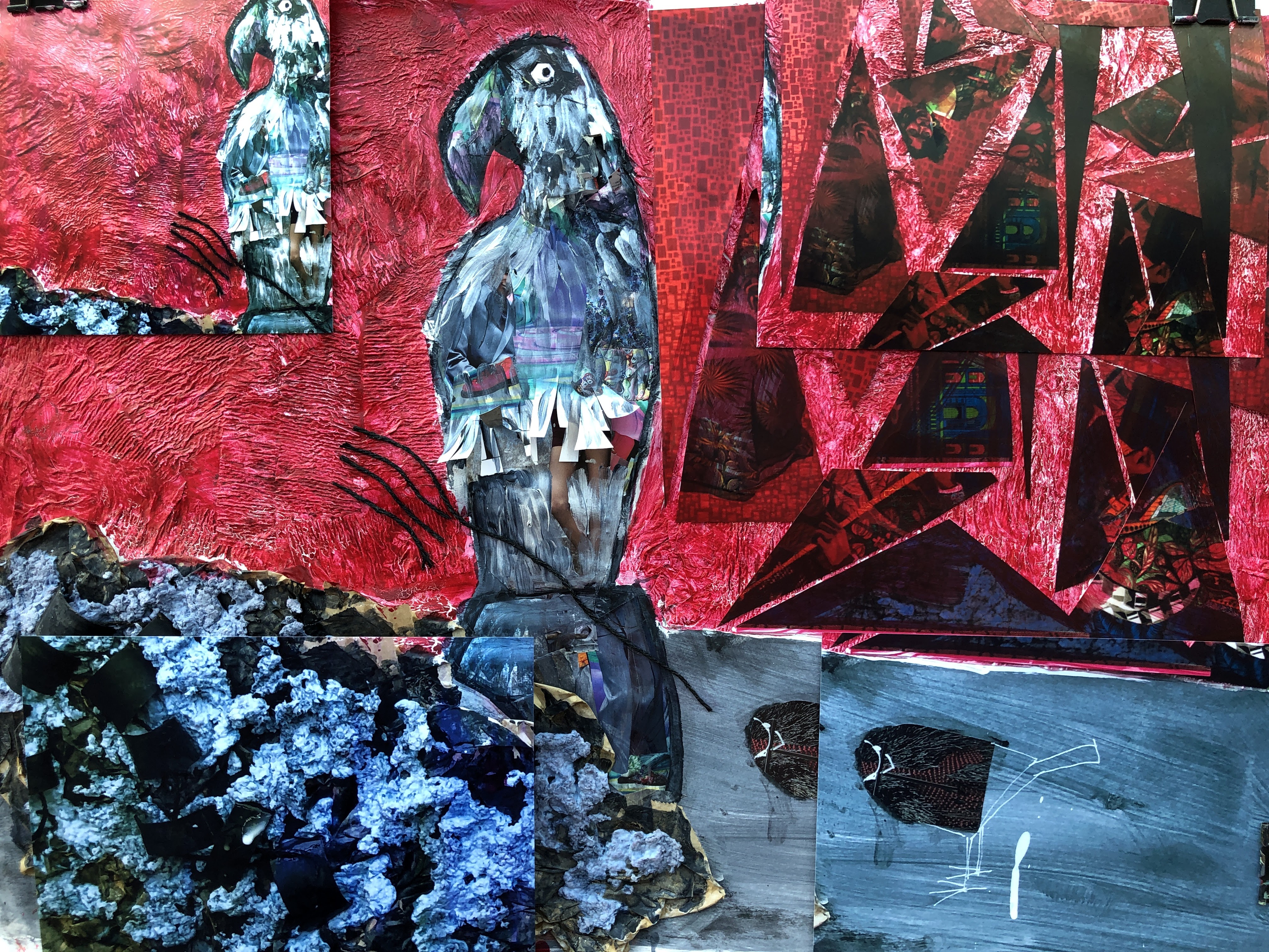
16th May and it’s gone in two different directions simultaneously. One is very much an imprecise collage, the other a very illustrative cameo.
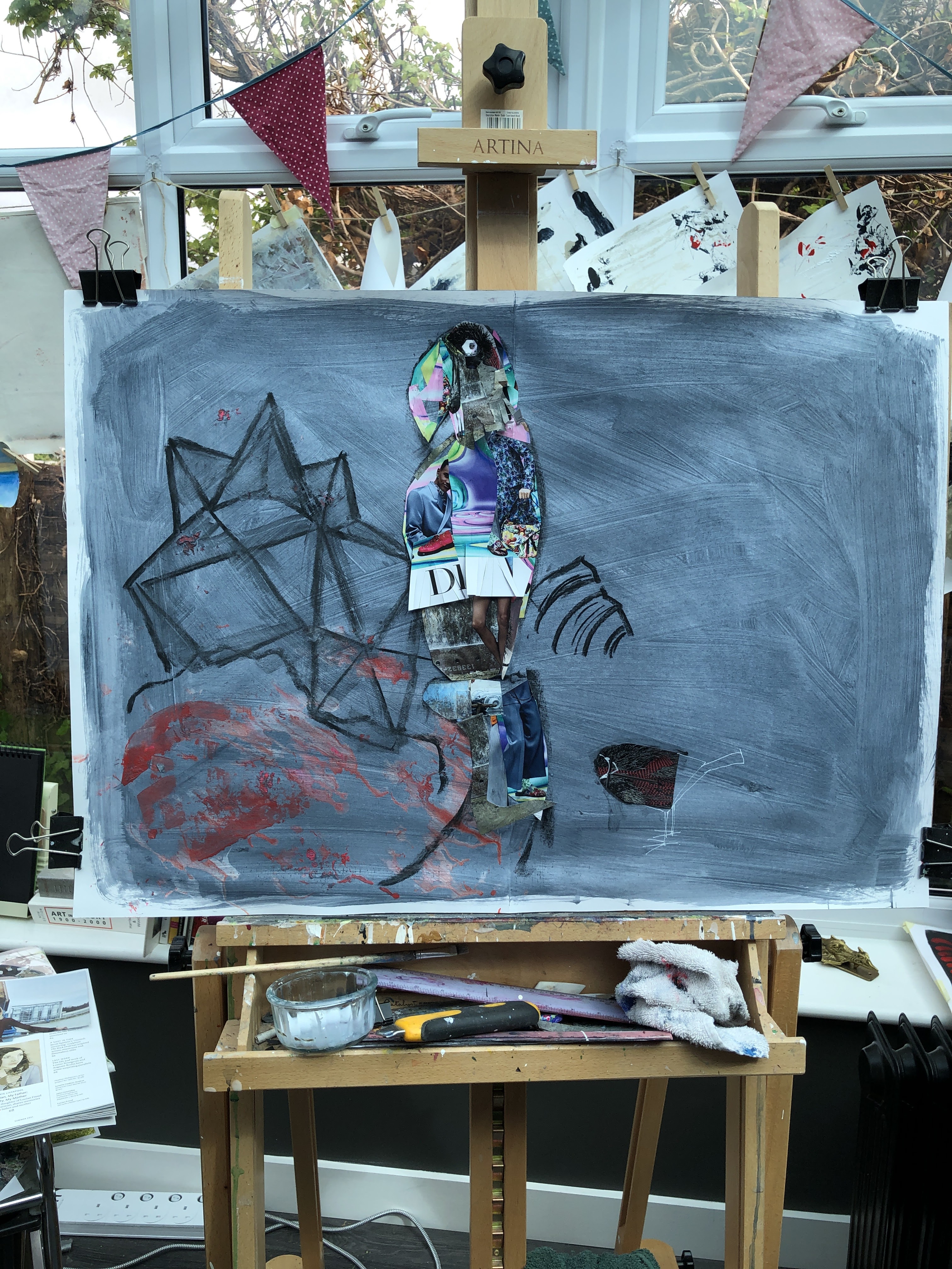
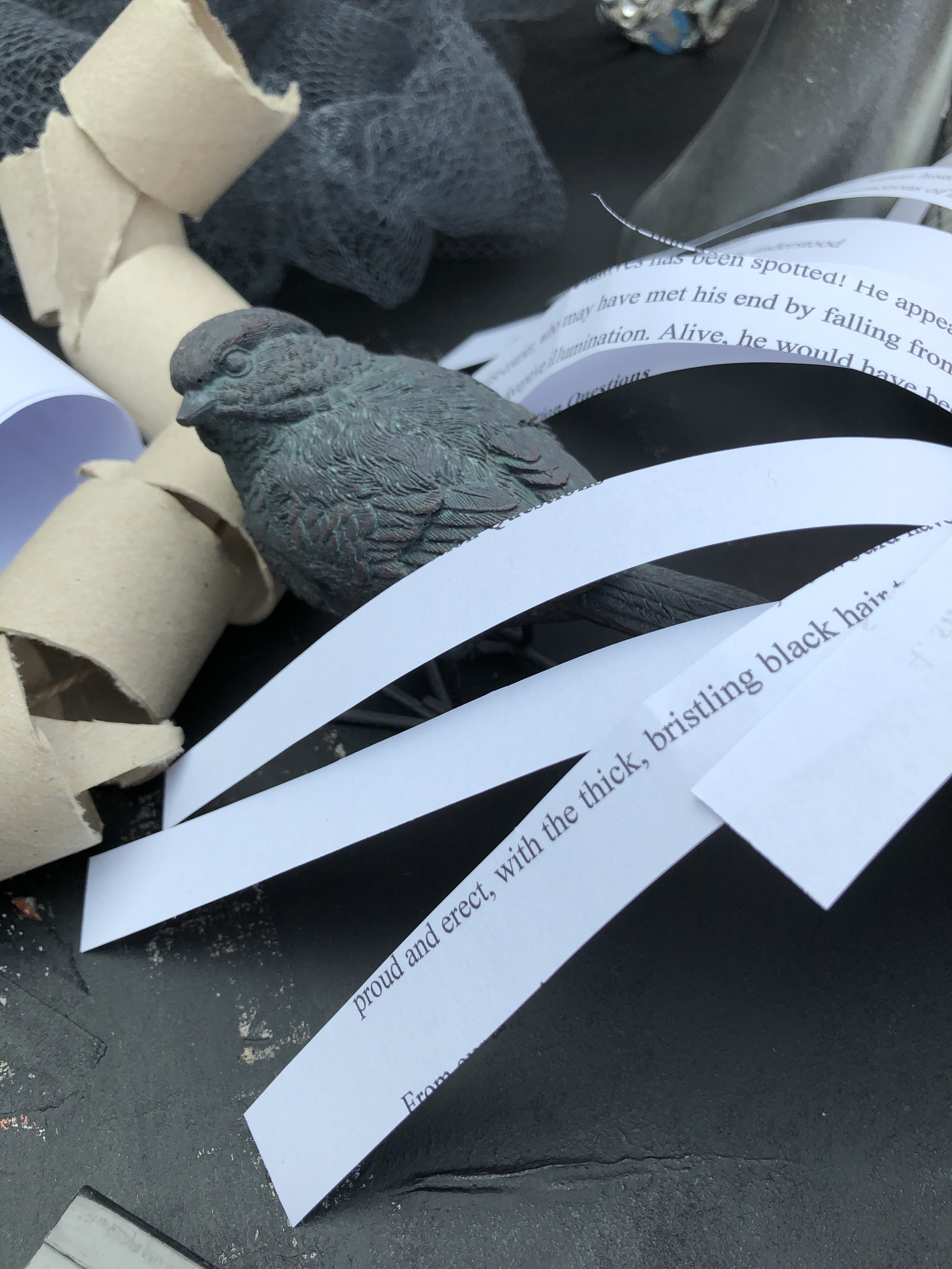
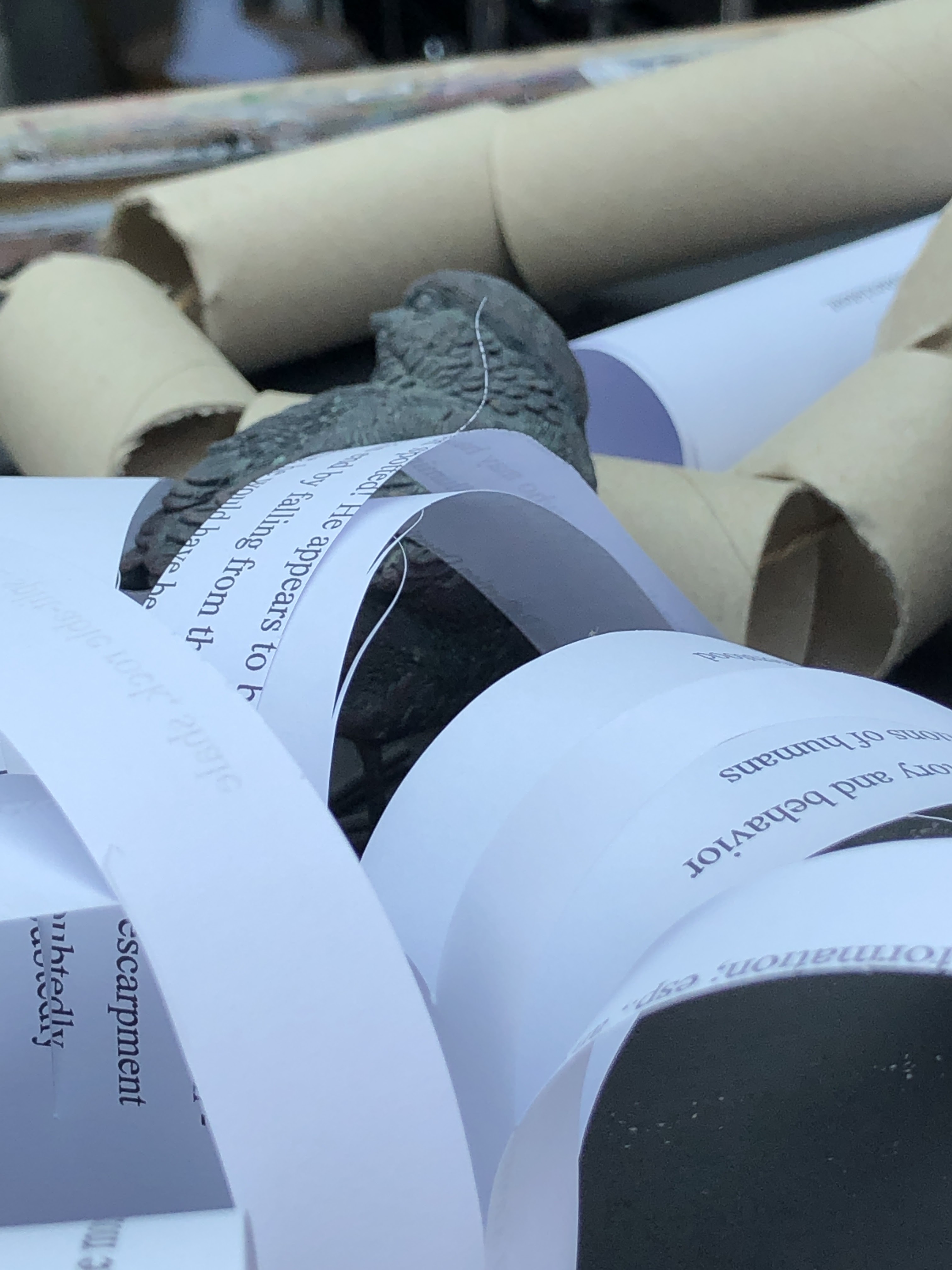
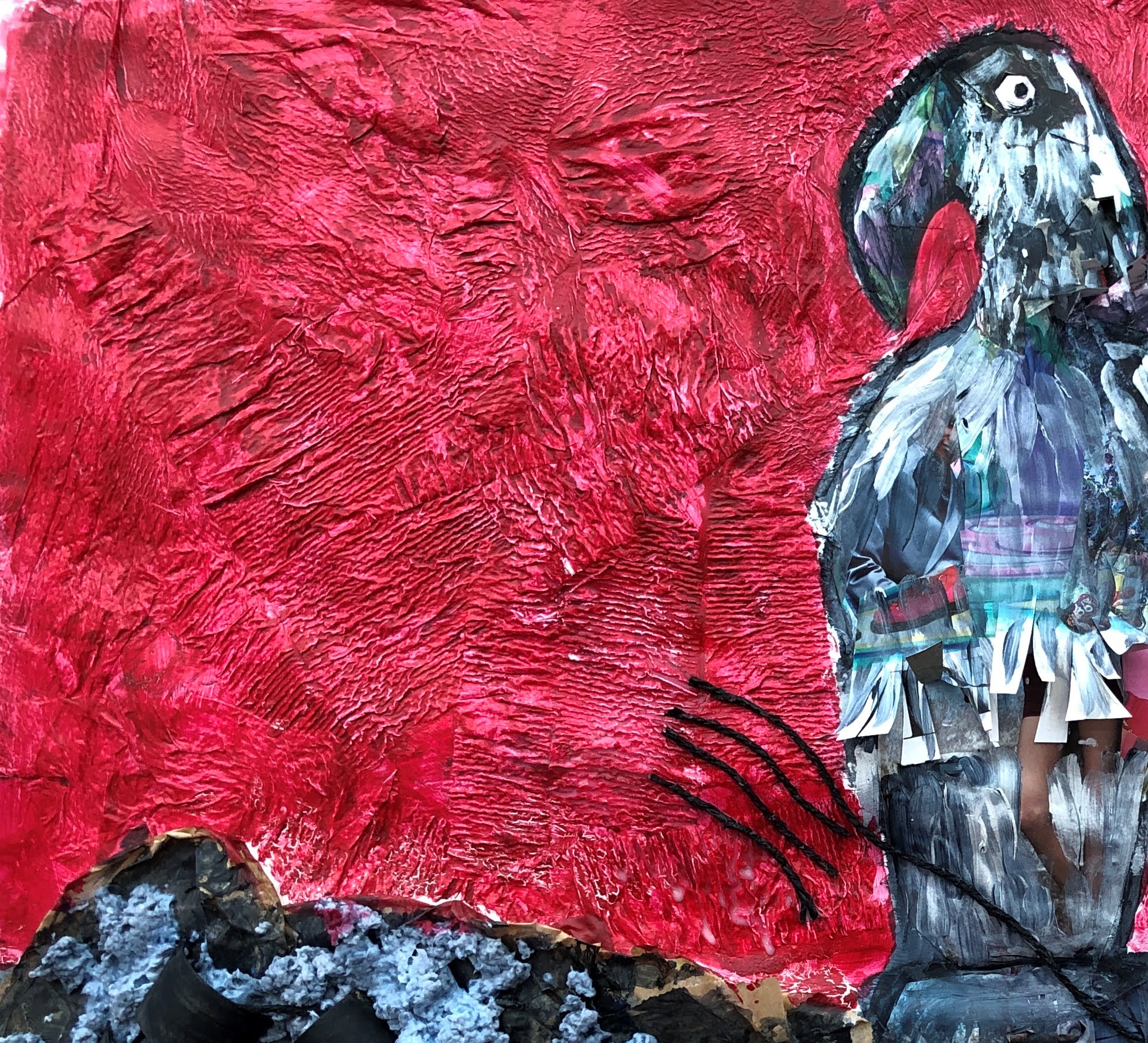
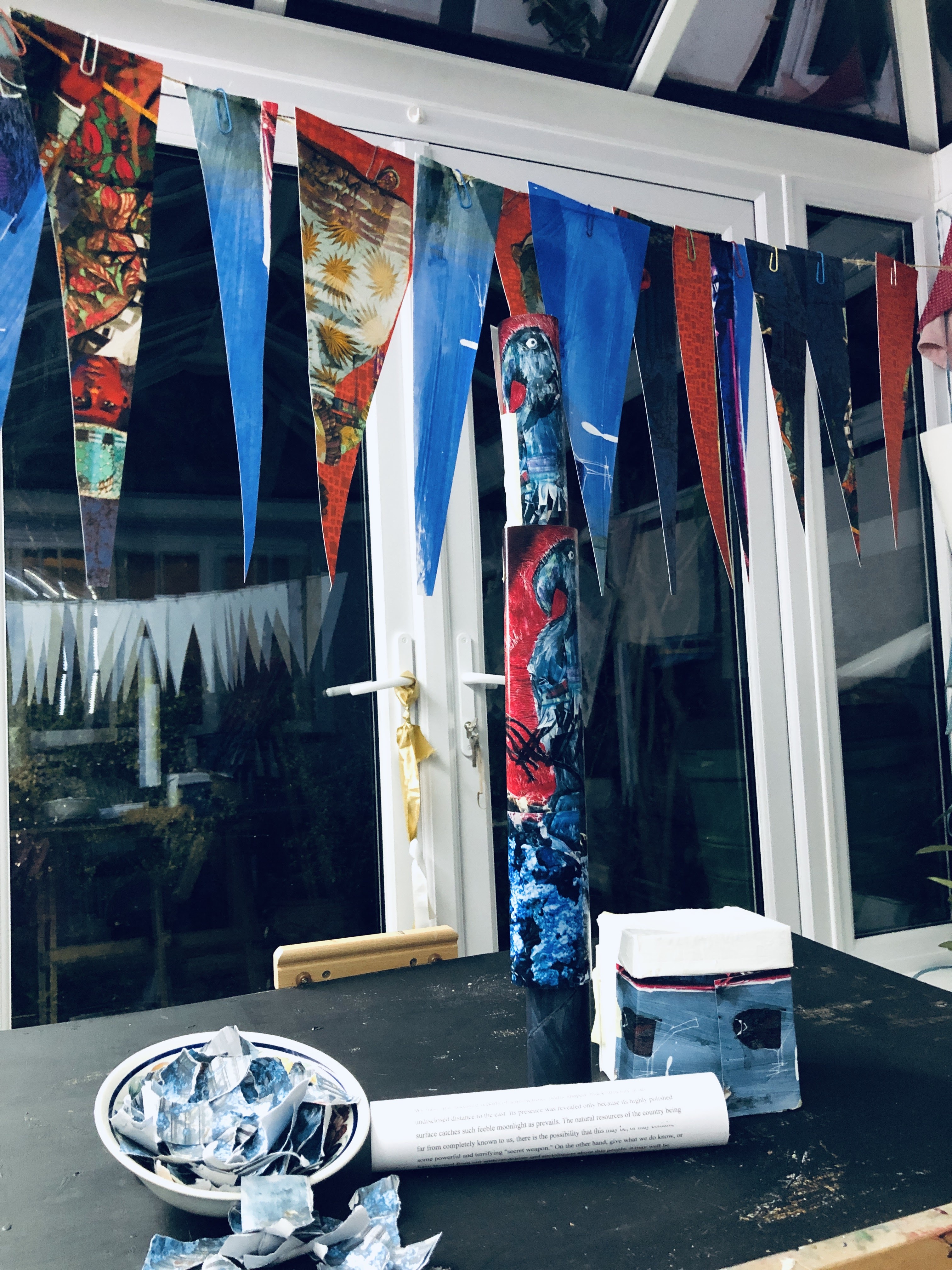
First pass. Drawing out is in charcoal and the collage uses cuts from the Tate Modern magazine. The idea was to leave the area on the right almost unfinished as per the small bird, and to elaborate the large bird and the area to the left.
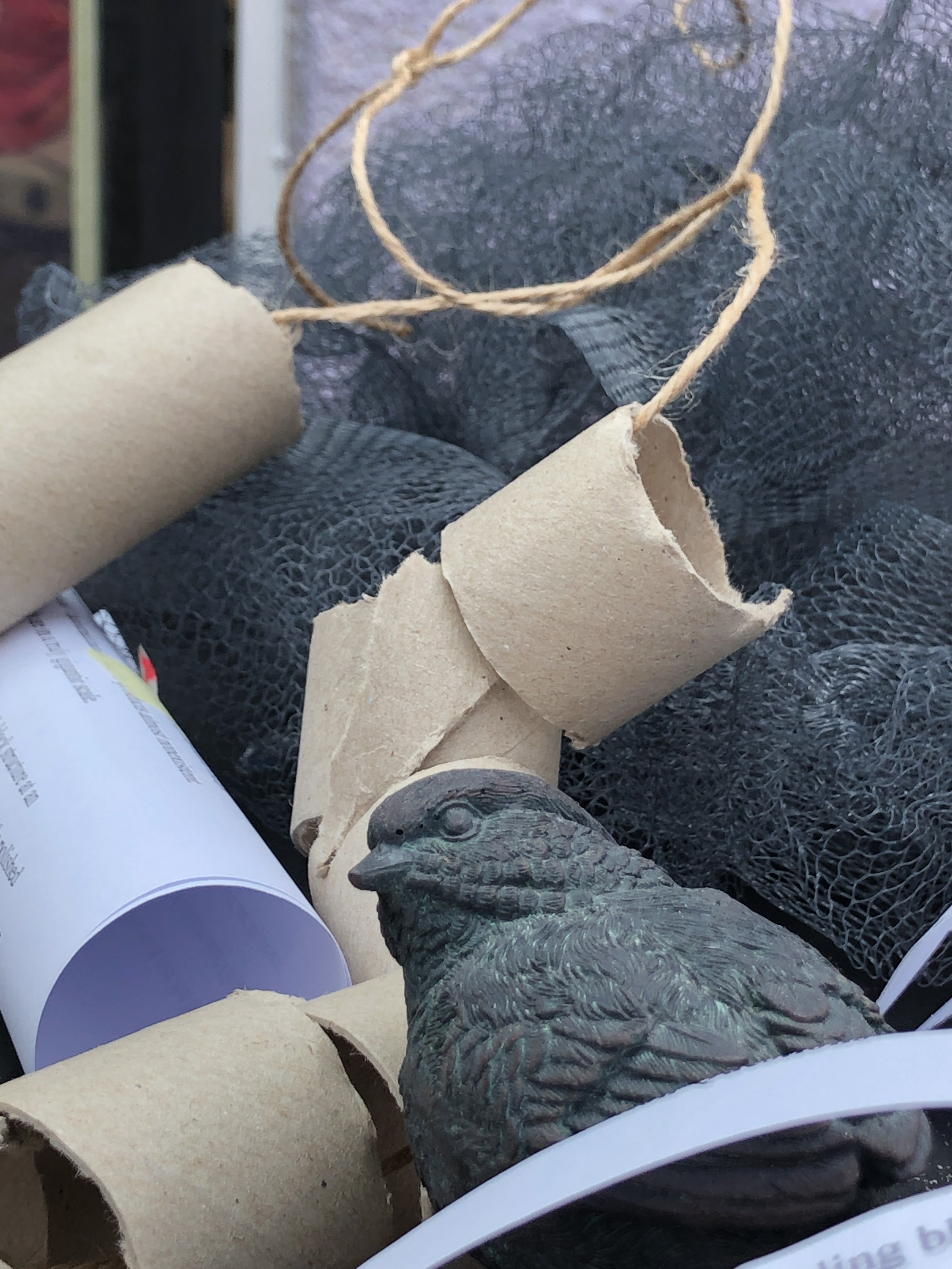
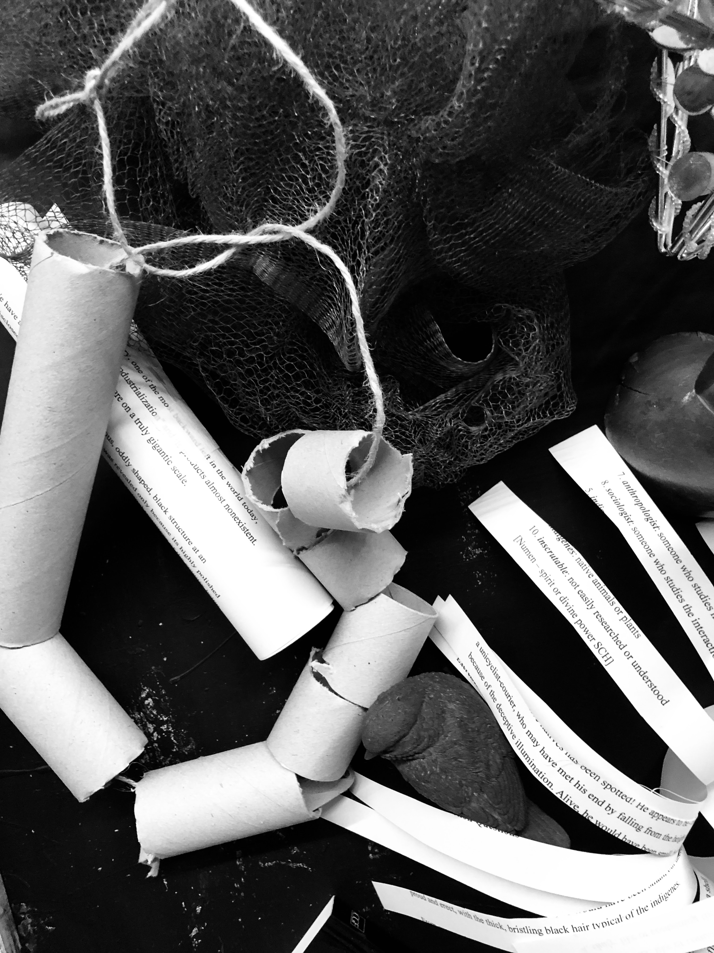
This really didn’t work. It looked cluttered and so I considered ways of remedying that. I chose to use paper towel roll glued to the cartridge, knowing I could push it around while it was wet, and that its appearance would change as it dried. I checked the ‘horizon’ from the camera angle and drew that in with charcoal, then tore up and applied the towel roll pieces. I’d thought neat would be the way at first but that proved impossible due to the nature of the paper.
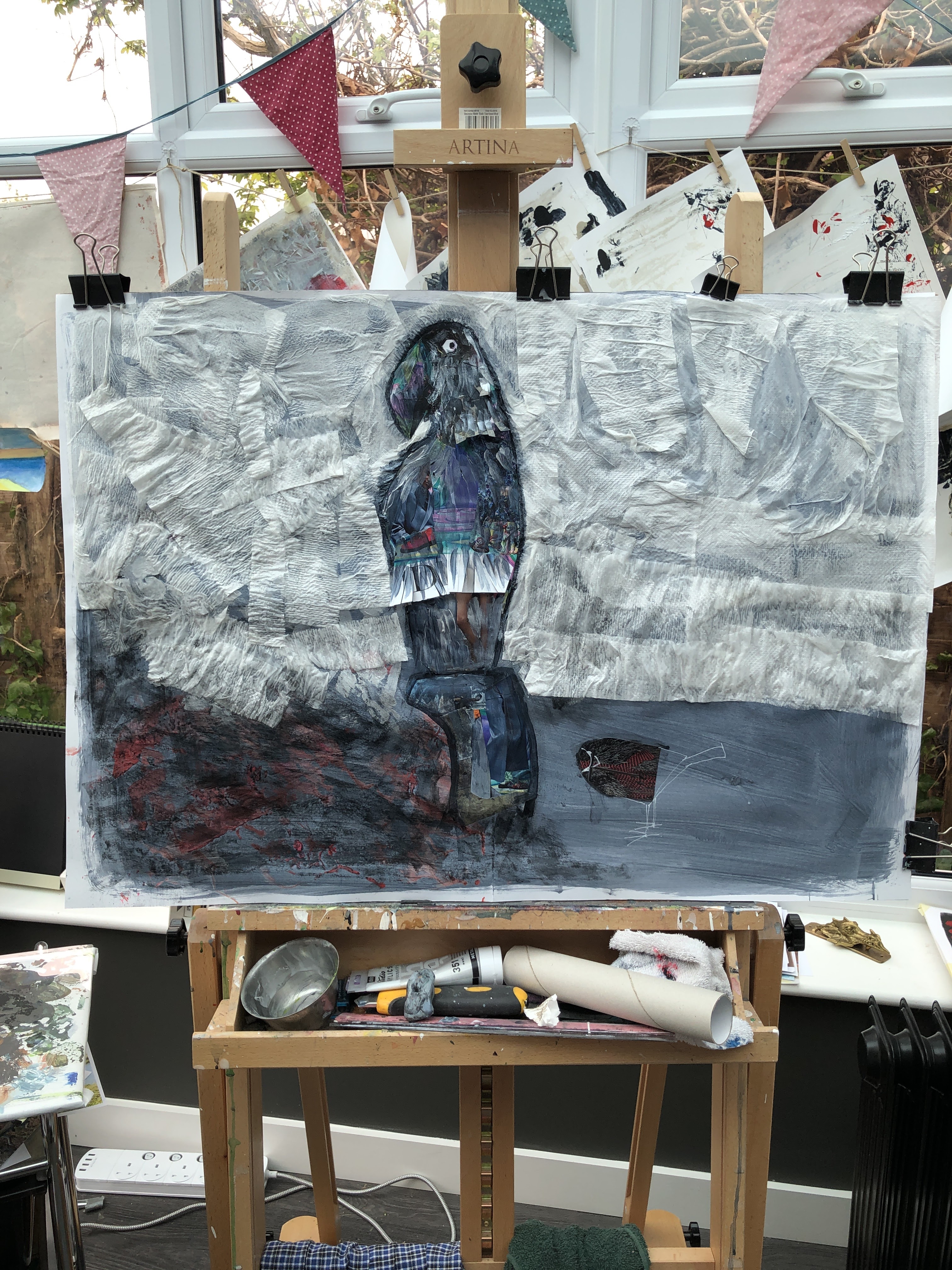
So this is where we are now; a somewhat mismatched pair of birds in an unbalanced setting. I like that small bird – a piece of magazine paper and acrylic pen; and I like the large bird which is putting me in mind of Bisa Butler’s fabulously colourful quilt portraits. Tomorrow, when this is dry, I can see a possibility keeping the ‘woad’ at the base, ghosting in the objects to the left as unfinished structures, and painting a robust Butleresque red background on top of the towel roll. I may try it in a digital programme first. Rebelle4 probably because it has a real paint feel – the stuff runs down the page.
I might need to add some geometric elements in the ghosting to give the small bird a raison d’etre.
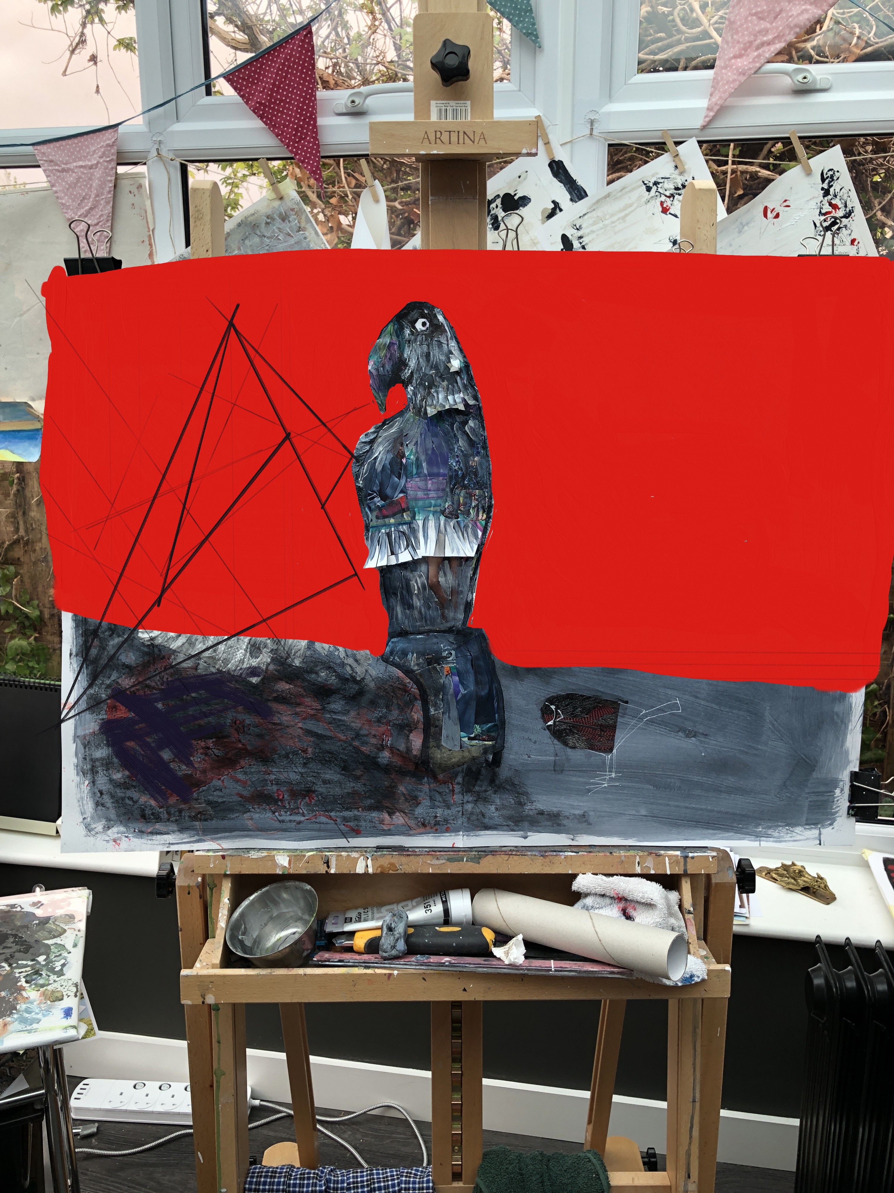
17th May. Painted in a layer of T white to harden up the towel roll strips while I think about Butlerising it as per the digital version. I should have tilted the easel back a little to stop drips and dribbles, but then this wouldn’t have happened …

Whatever I decide to do about this shameless example of avian incontinence as regards its place in the main painting, it definitely stays as a cameo!

My plan is still to populate the left of the painting with 3D and fully rounded representations of the items on the table, moving across to the right towards linear, incomplete skeletons. Screwed up papers bags could provide proxy texture for the netting, string for the straight lines of the lamp shade.
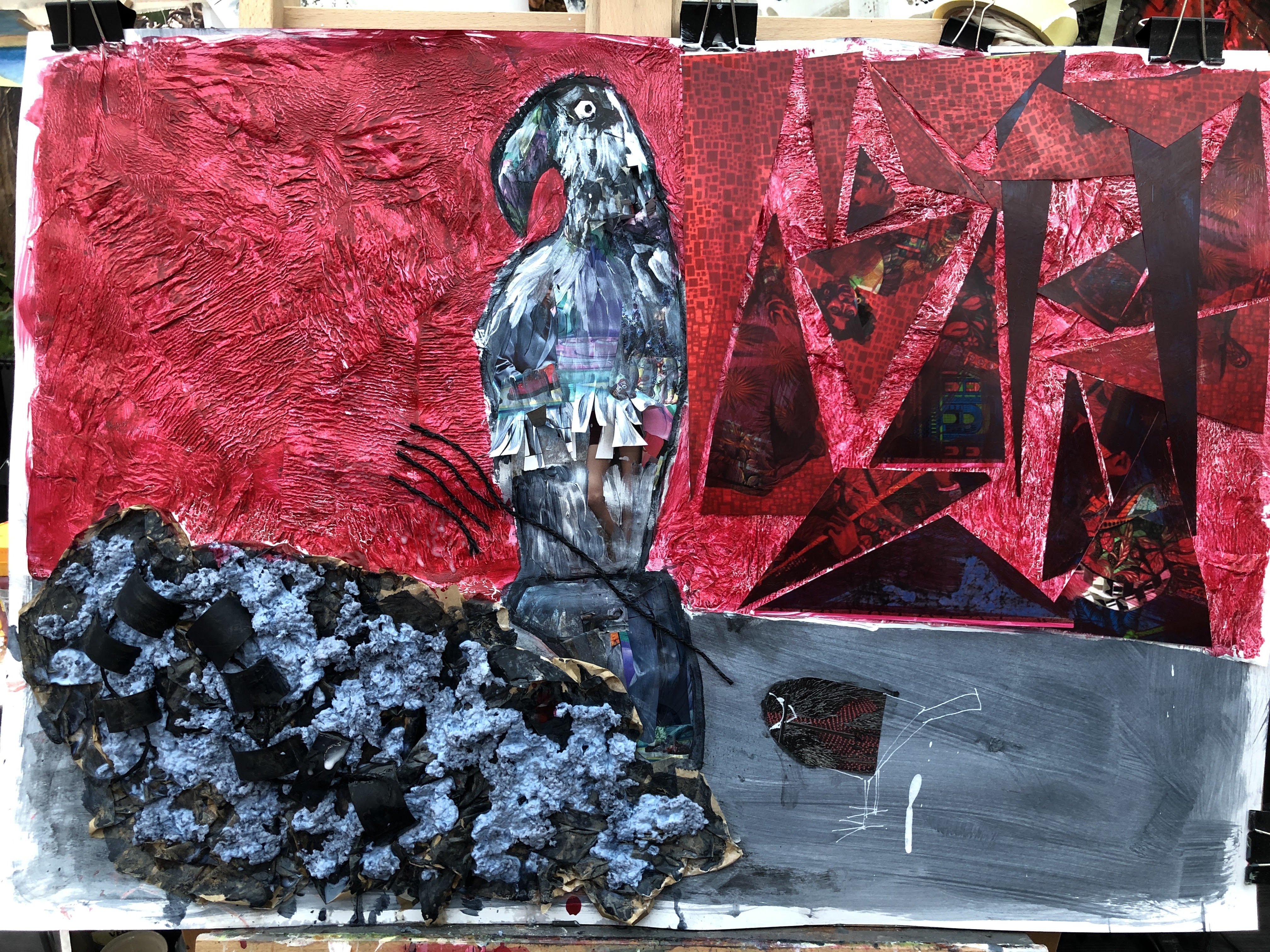
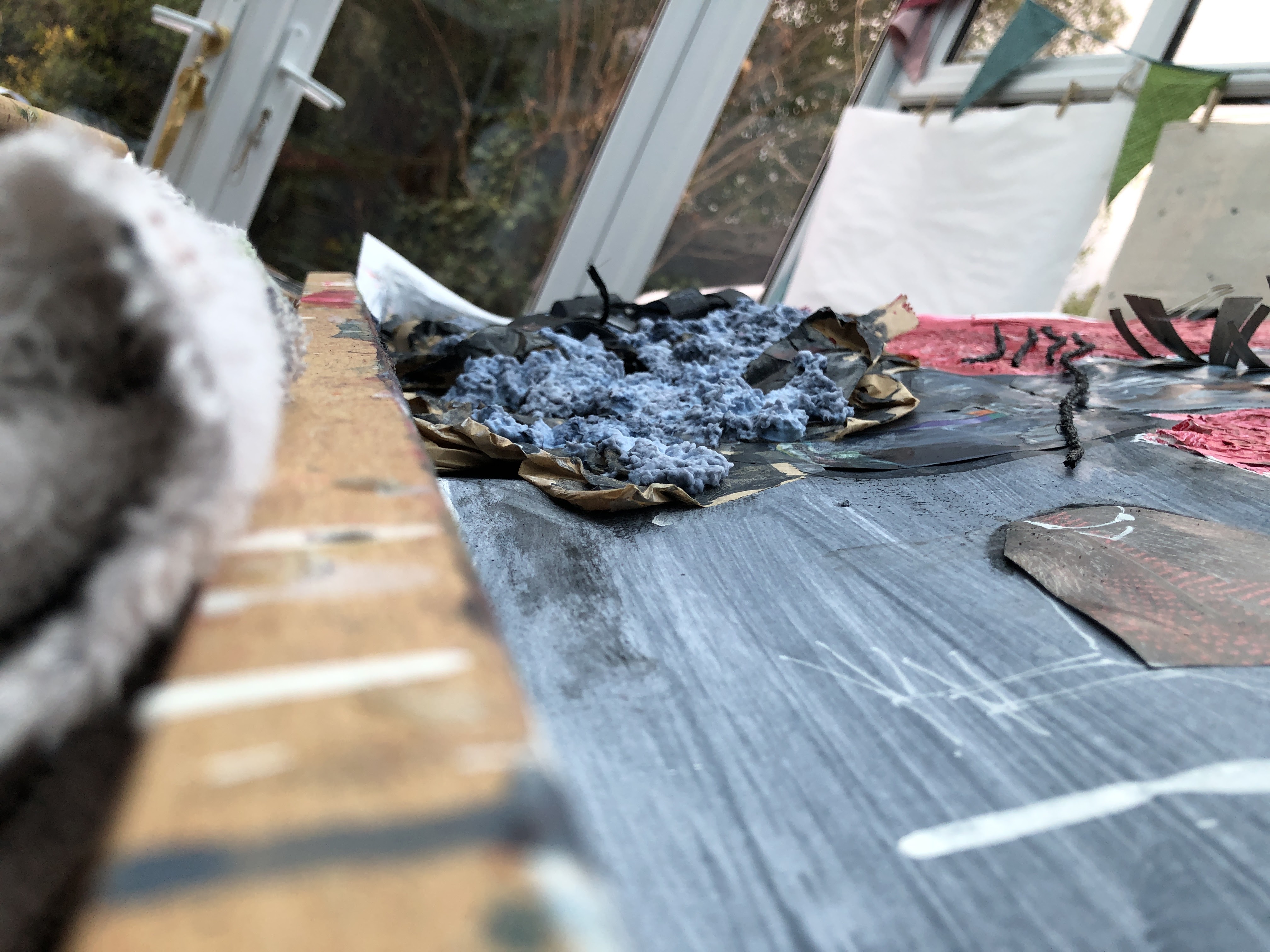
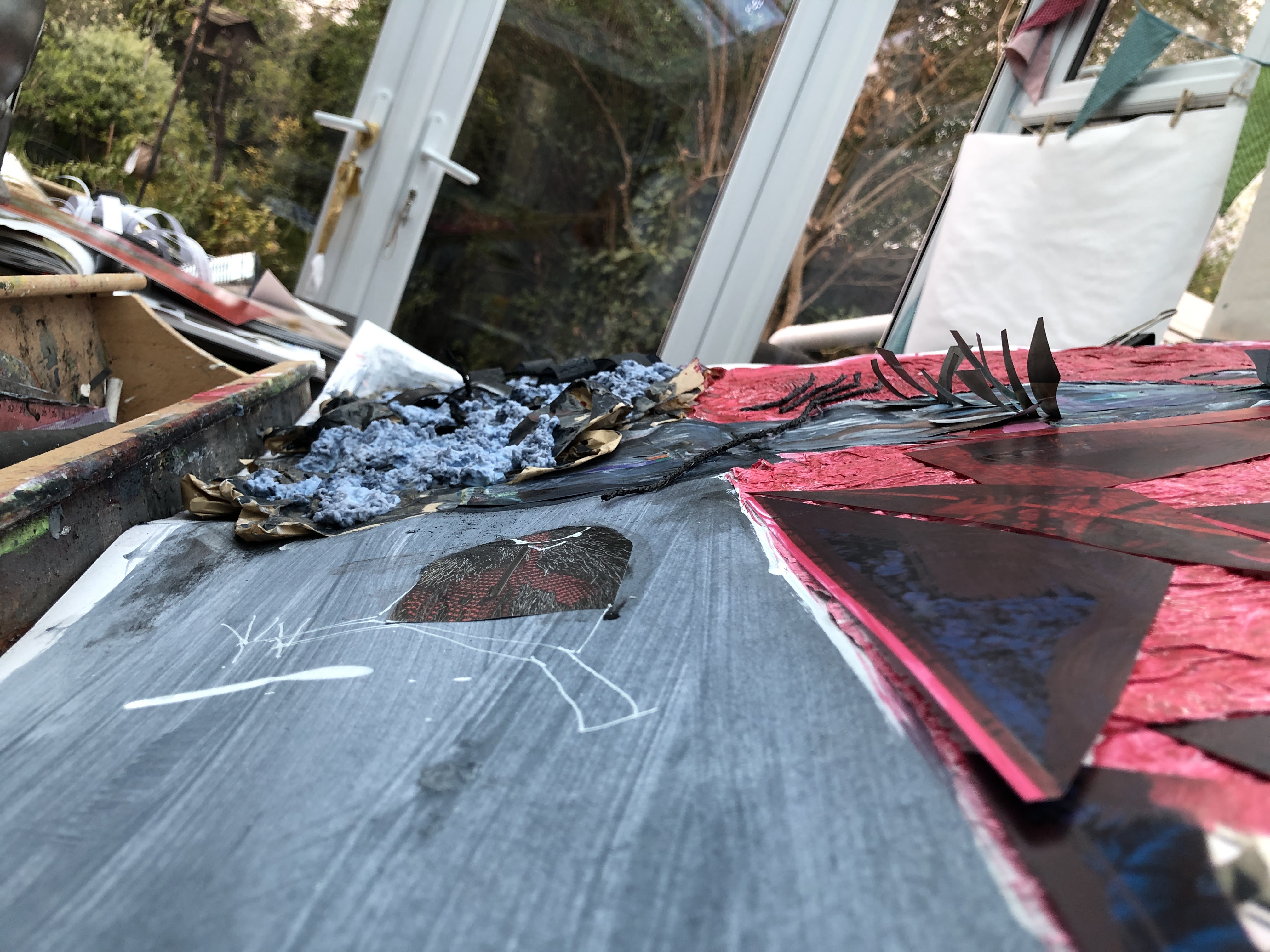
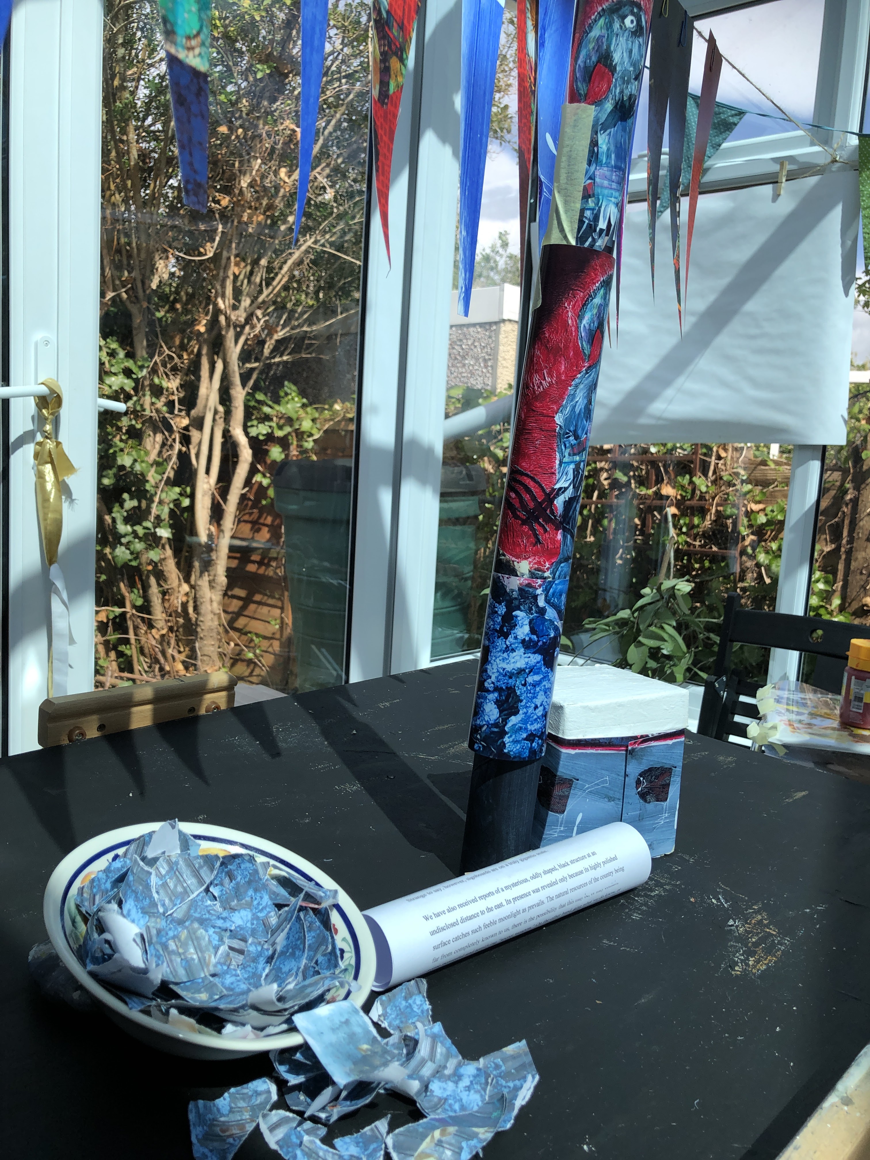
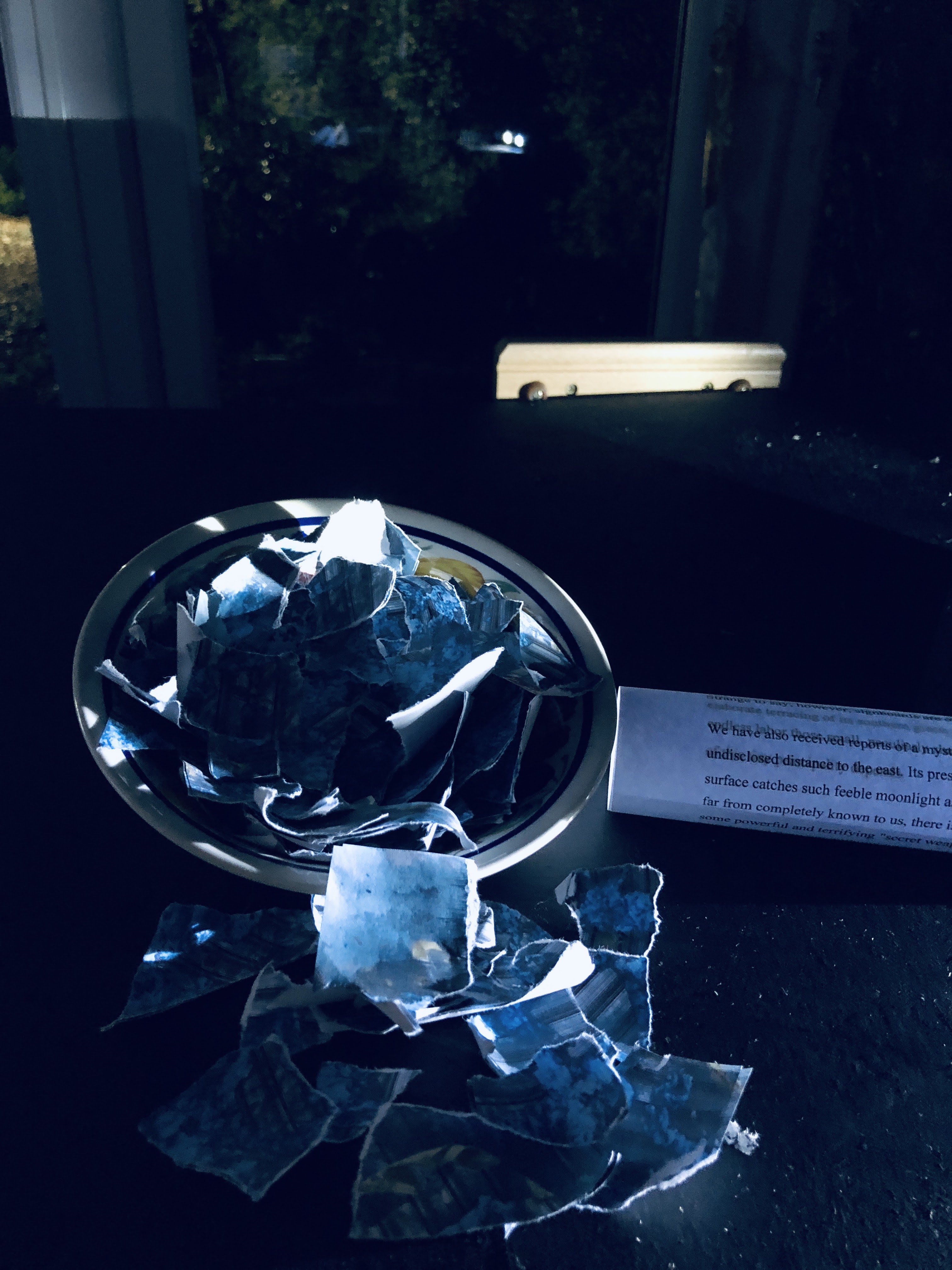
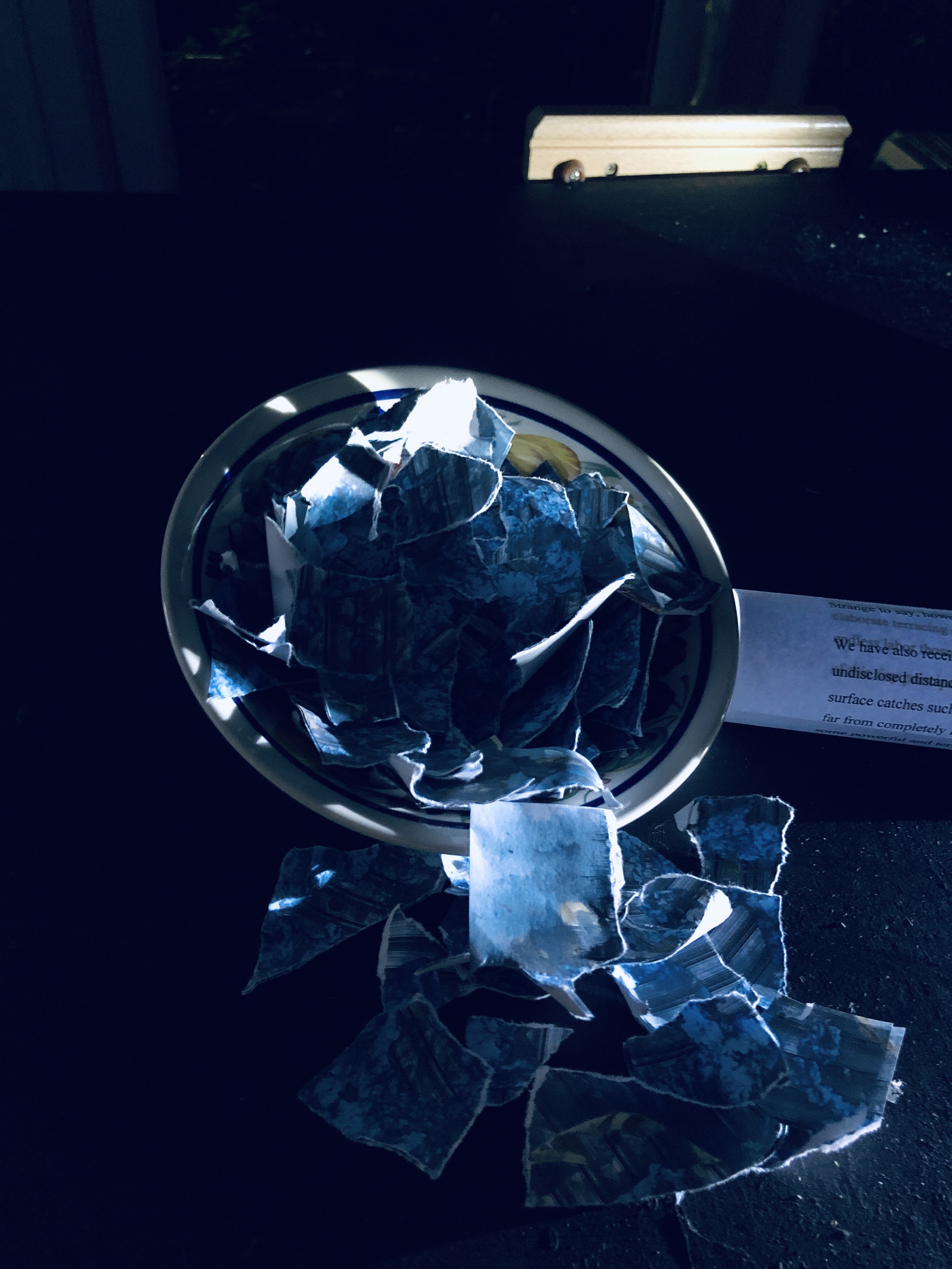
The blue ‘porridge’ on the left is shredded paper mashed with water, salt, and glue. It took over a day to drain, and 24 hours on is still damp so I’ll be taking a hairdryer to it.
I’m not entirely sure what I’ve achieved here. The two birds are stylistically disconnected, as are all four of the discrete backgrounds, and while there are 3D elements, not much projects above the surface. I like the colours and there are some ‘moments’; it might be worth pulling these out.


Somehow, this composite is more interesting to me than the painted piece alone. But the photos have given me an idea that can only be realised in the dark.
This is the daylight version.


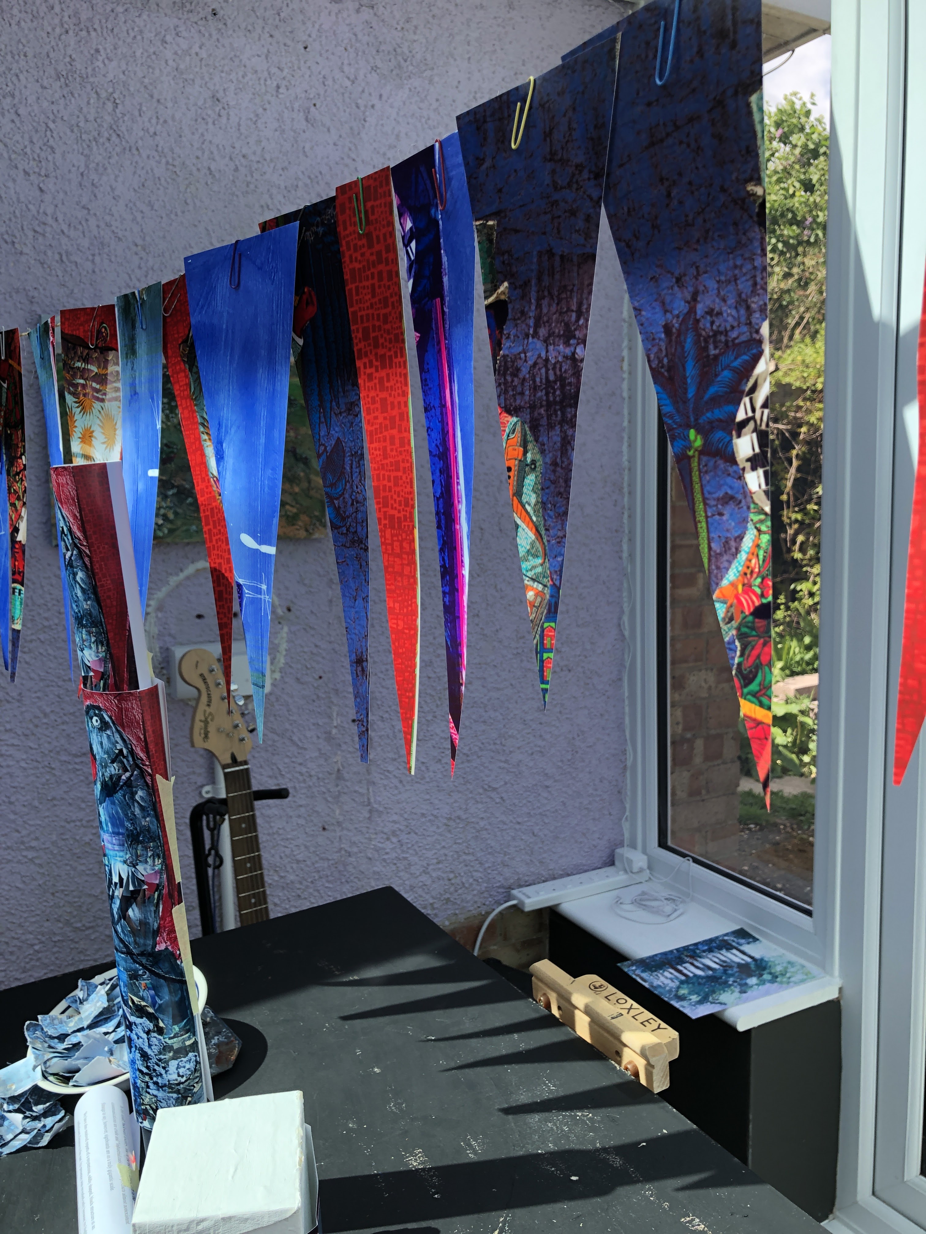
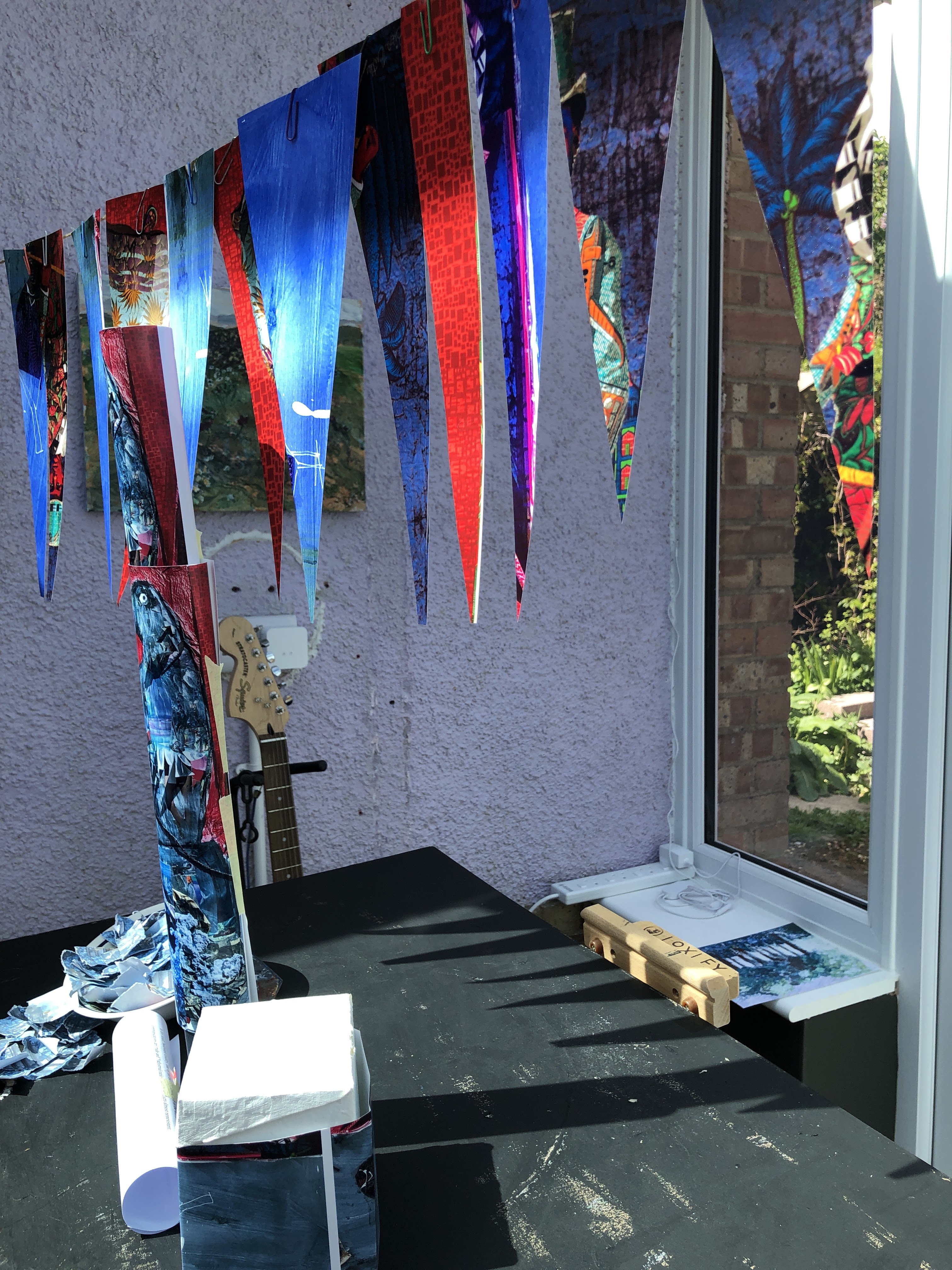
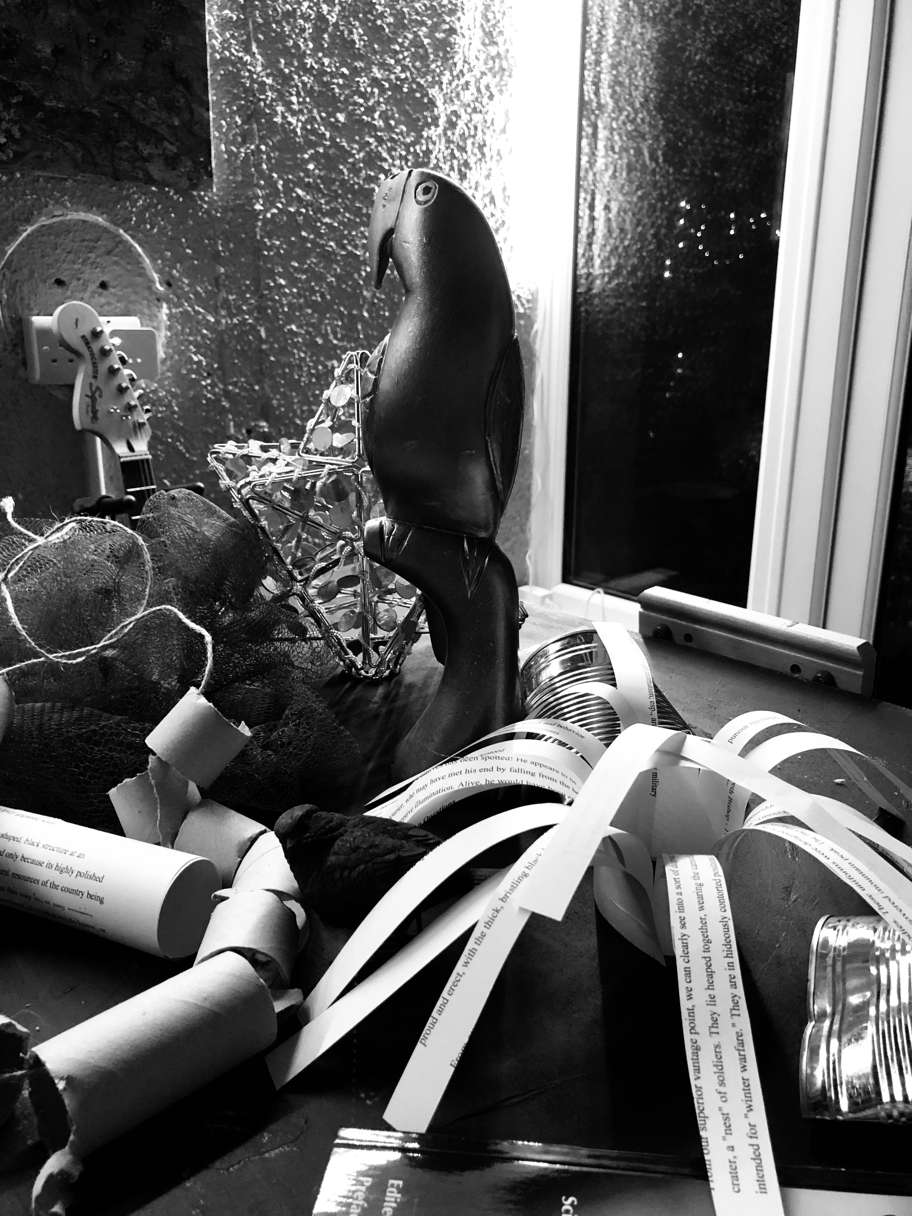
These are the low light images with corresponding shadows. The first group is lit by a narrow strip of LED lights up near the ceiling.


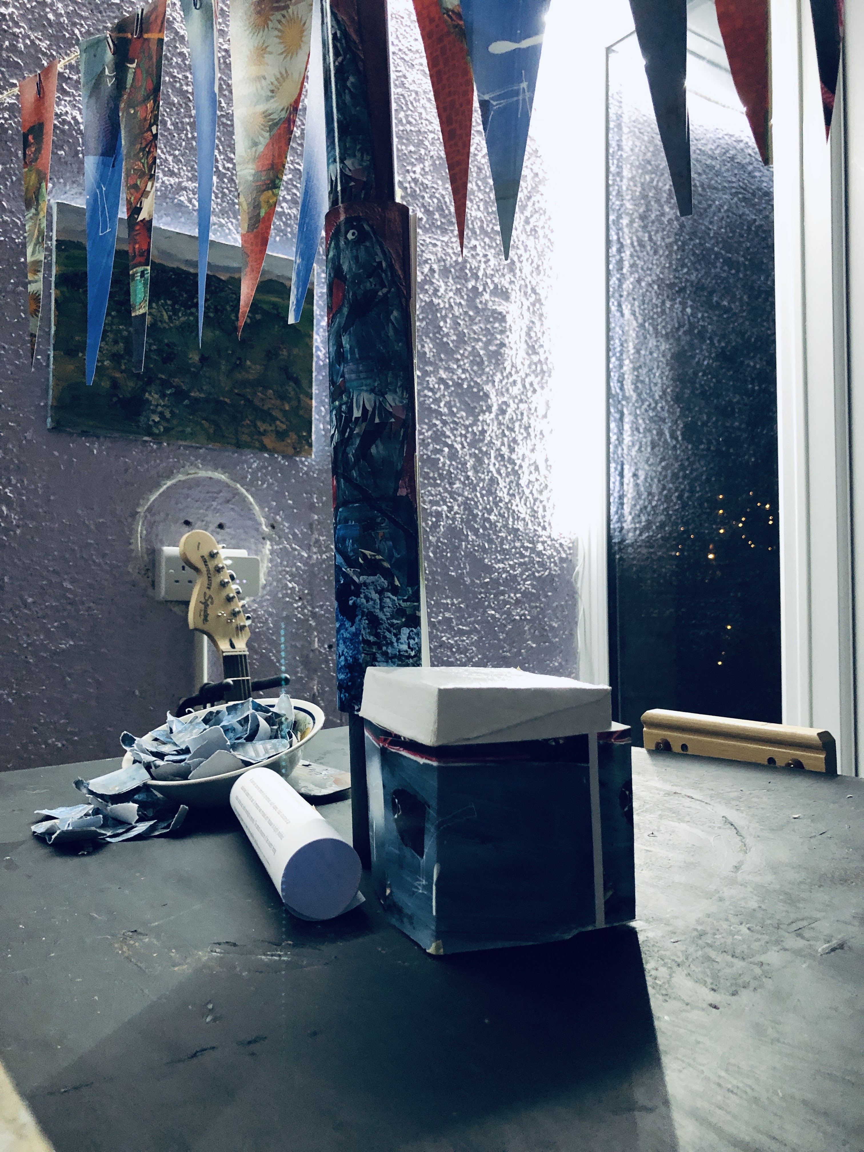


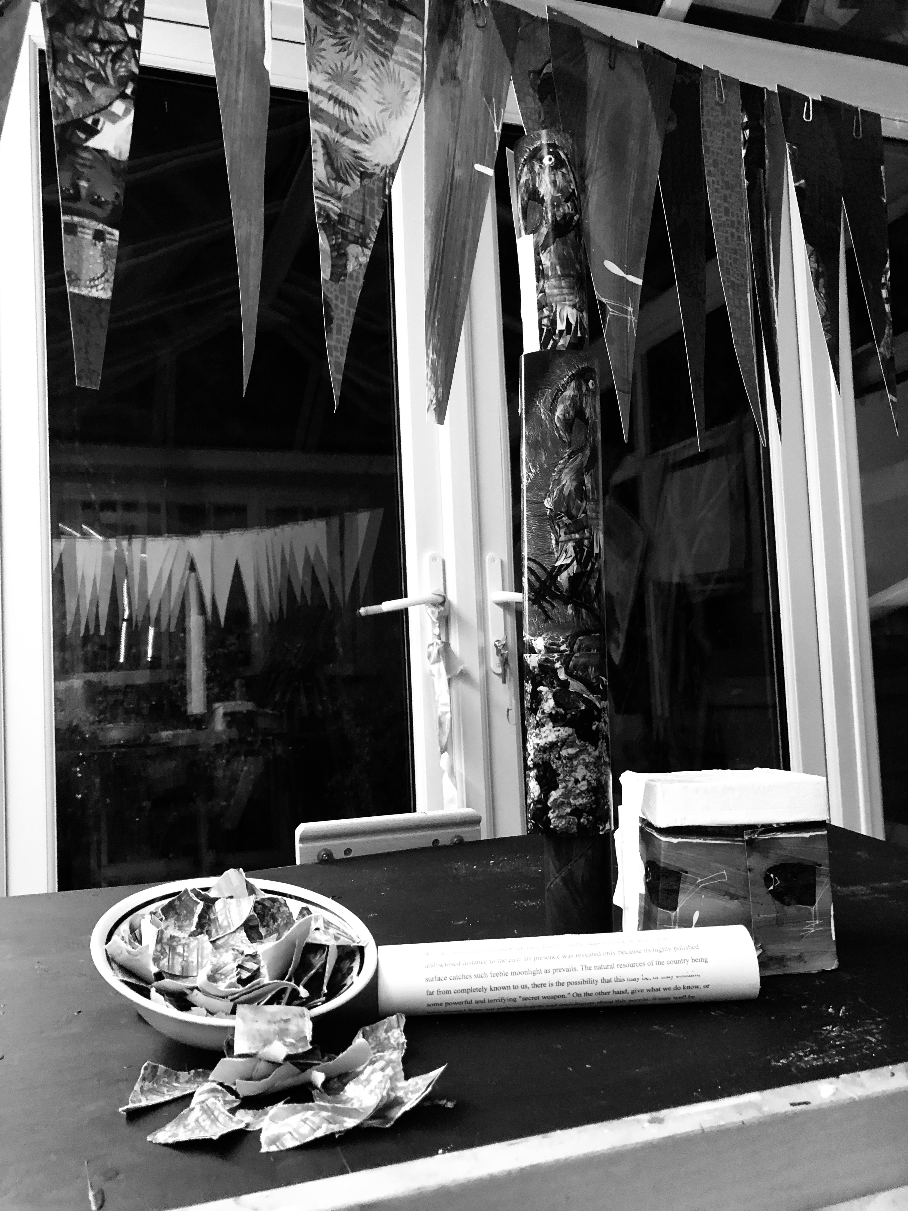

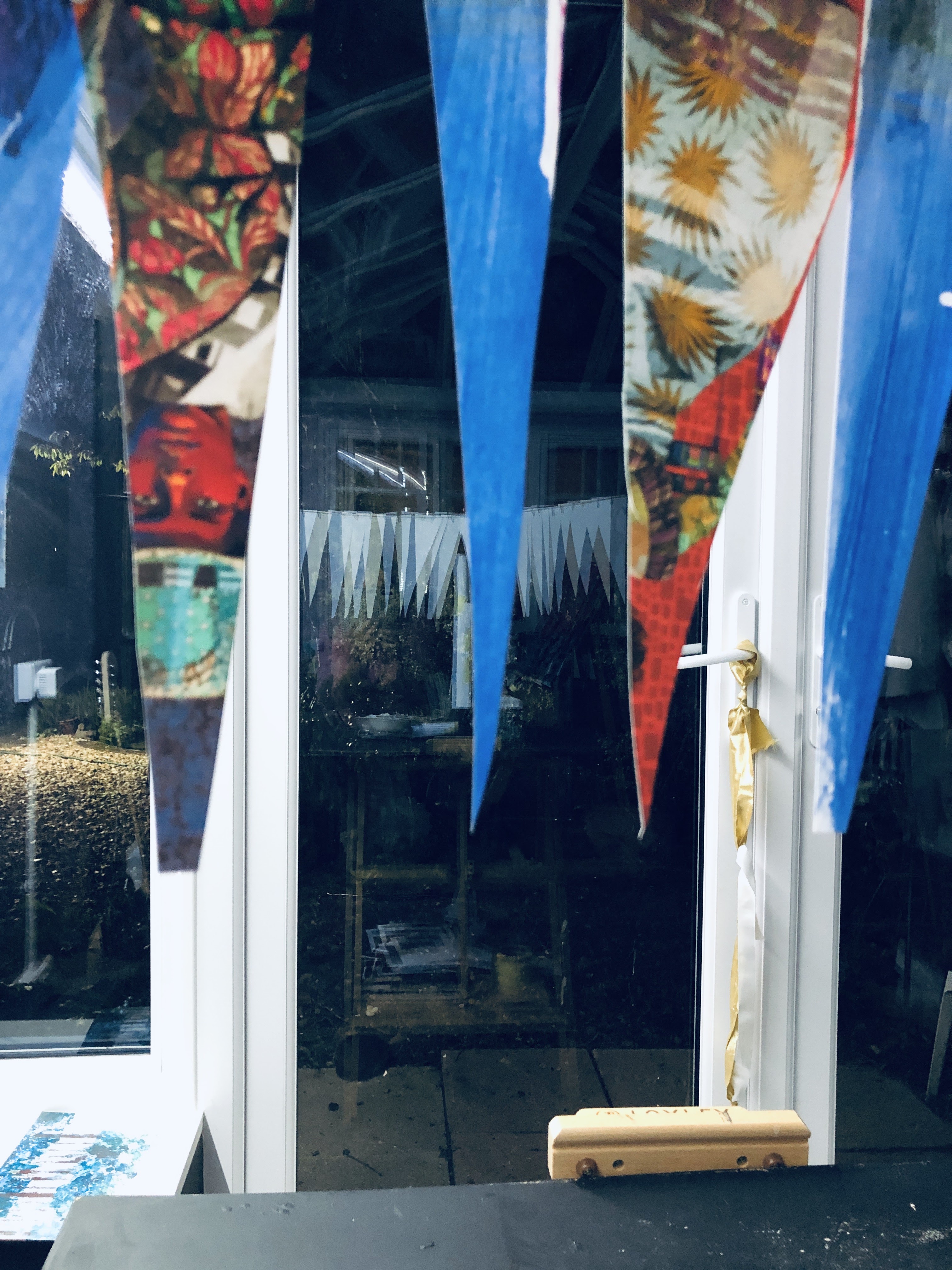
The second and third groups are lit by a directional hand-held (or head worn) LED spotlight that has a red light function. I was quite taken by the ‘porridge’ bowl but equally interesting is the shadow pattern made by the pennants on the wall behind and the reflection of the white reverse sides in the door windows.
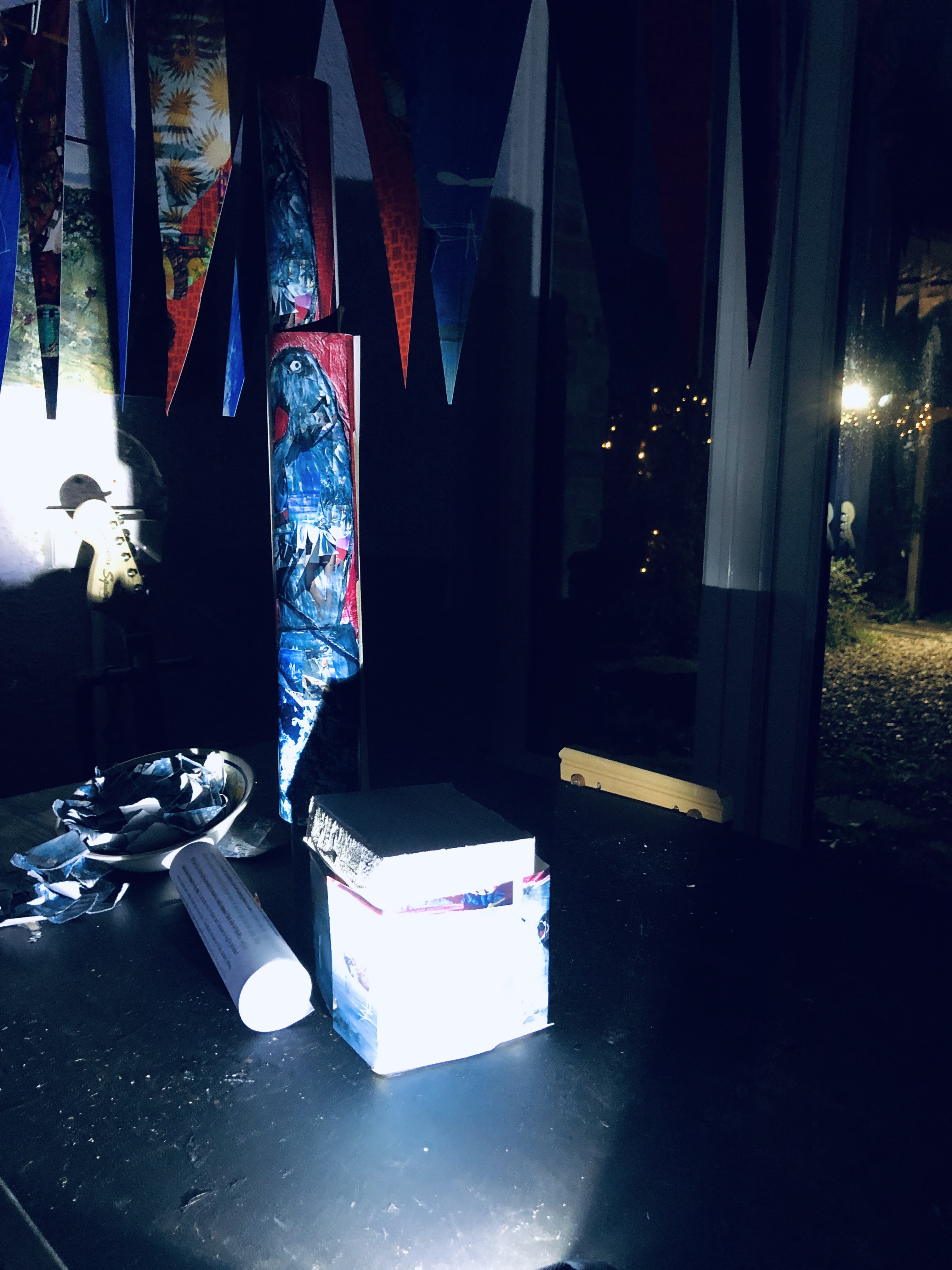


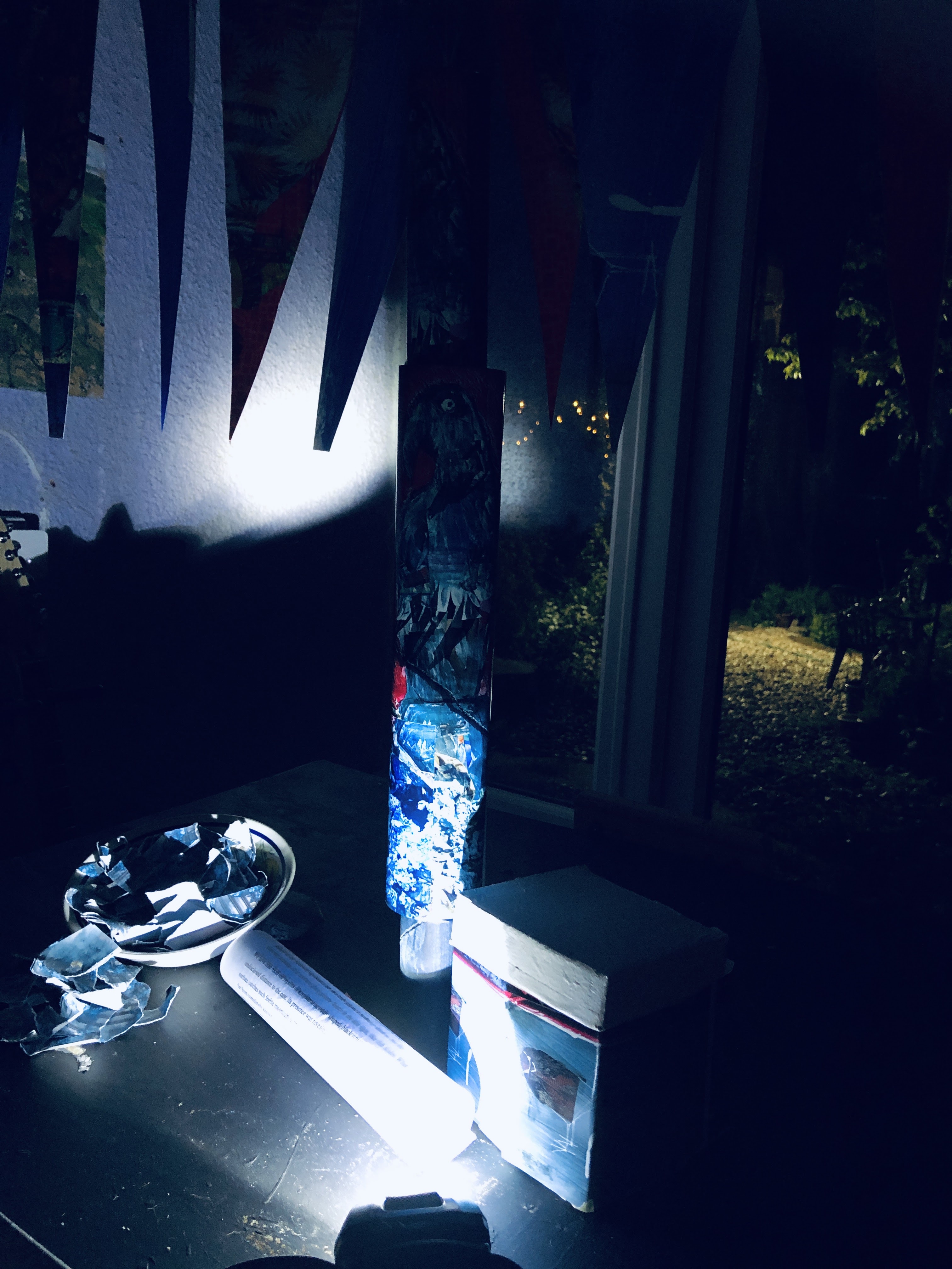
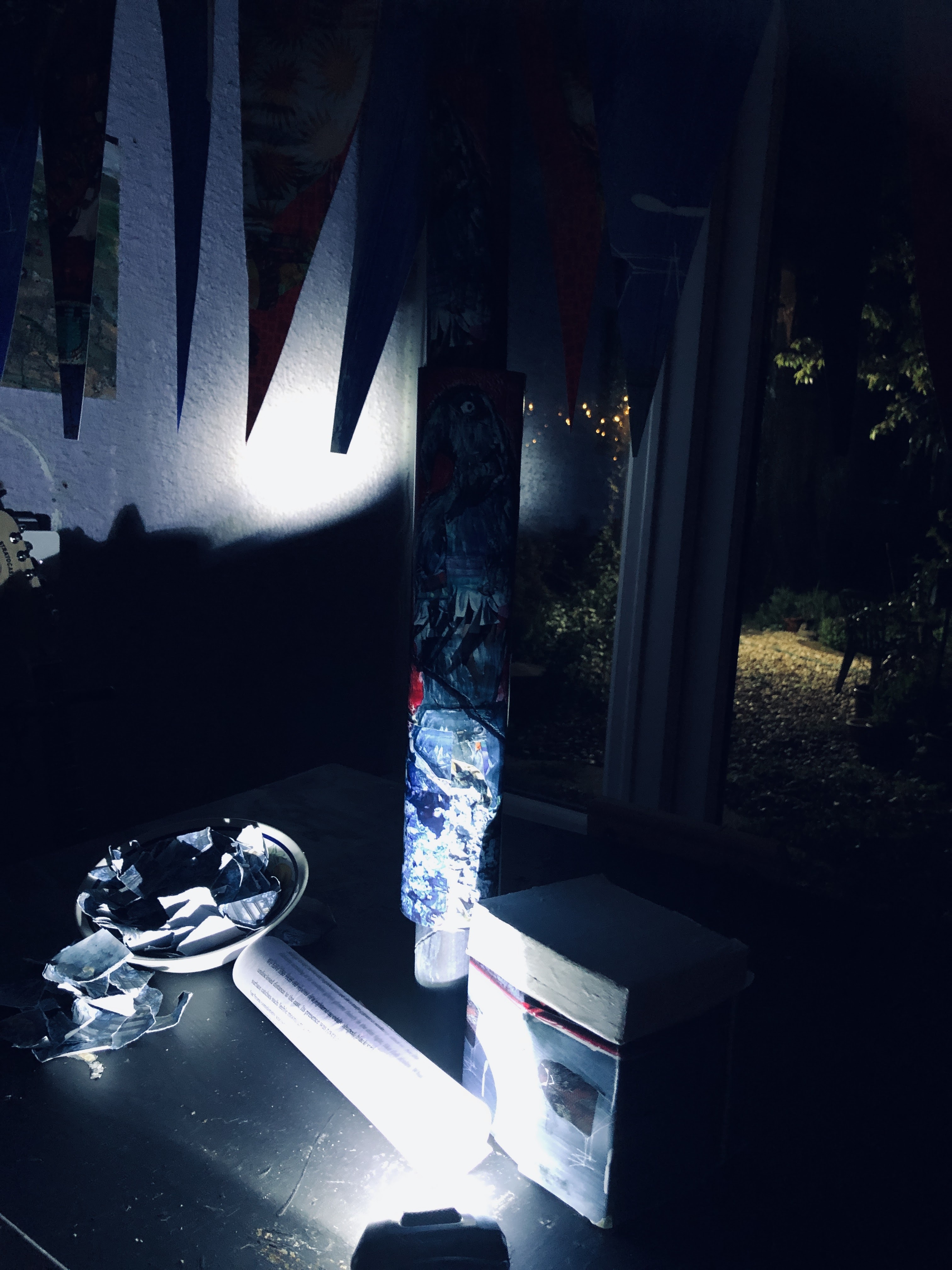
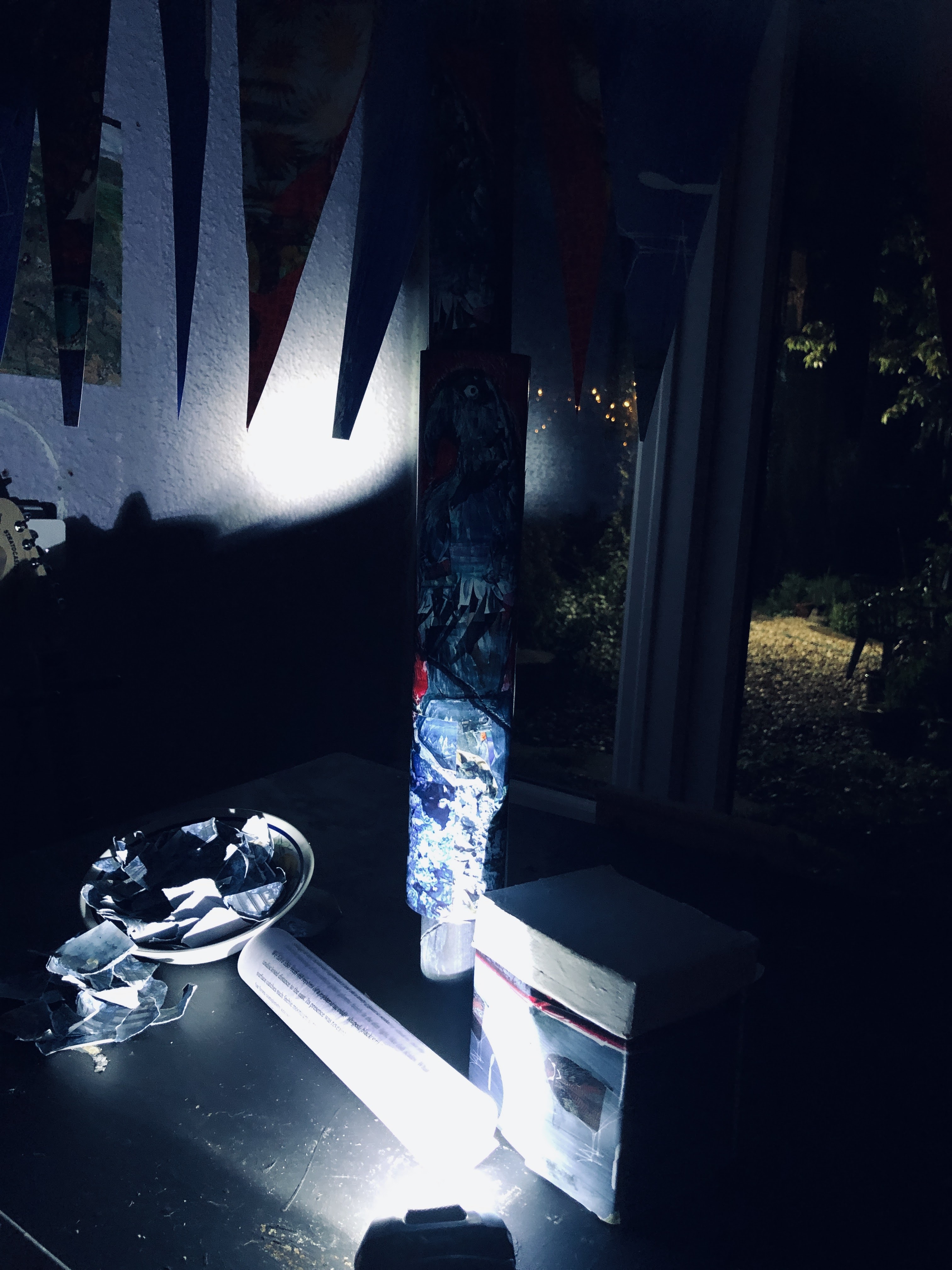


I find these photographically interesting but not really as potential paintings. The course materials seemed to bias my thinking away from painting and into construction so I was interested to hear, in yesterday’s tutor feedback, more emphasis on use of paint. We clarified the nature of the parallel project in this session too, and it feels to have a much more primary role than I’d thought. Freedom of style, content, and delivery makes this a very attractive proposition.
In light of this, and realising now that I’ve dismantled the supposedly permanent table arrangement to make the final tableau (installation?), I will probably review the positioning, lighting, and content in accordance with the various tasks.
St Clair, K. 2018. The Secret Lives of Colour. John Murray. Pp 198 – 200.
Bisa Butler 1973 – “an American fiber artist known for her vibrant, quilted portraits celebrating Black life–from everyday people to notable historical figures. Through her quilts, Butler aims to “tell stories that may have been forgotten over time.” Wikipedia. Bisa Butler – Wikipedia. For images see Bisa Butler (@bisabutler) • Instagram photos and videos.
Bishop, E. 12 o’clock news. circa 1976.
