
The task is to “develop a series of pieces based around the ideas, approaches, and reflections explored in Part One.”
This is quite a broad brief which means it has the potential to be free of specifics but also somewhat unboundaried. My experience of the exercises and the notion of becoming physically involved in the work is not as positive as it might be. I’m happy with an element of passivity in making art but it needs to be knowing passivity and to occur within a boundaried context, however broad that might be. To address the reflective questions about:
- physical presence in the work: I don’t think we have a committed relationship. If anything it’s a projection of some internal processes mediated by an arm and an instrument of some kind. I don’t see myself as part of it.
- painting as action and event. Clearly there’s action, at least in terms of setting the conditions – the various ‘feet’ pieces for instance, but I see a process not an event.
- the parts played by chance, endurance, and time. For all sorts of reasons discussed elsewhere, I have intentionally circumscribed these elements or acknowledged their limitations due to the capabilities of, for instance, shoulder/elbow/wrist joints.
- my relationship to painting. Discussed in the previous post but I’d add that I am an intentional painter/maker who allows for the unintentional to happen and capitalises on it where it moves the work forwards.
- new possibilities. There are always new possibilities where controls are light touch rather than reflective of Victorian corsetry. I’ve discovered these throughout the previous modules and widened my practice as a result. I don’t doubt this module will do the same, however alien these first exercises seem to be.
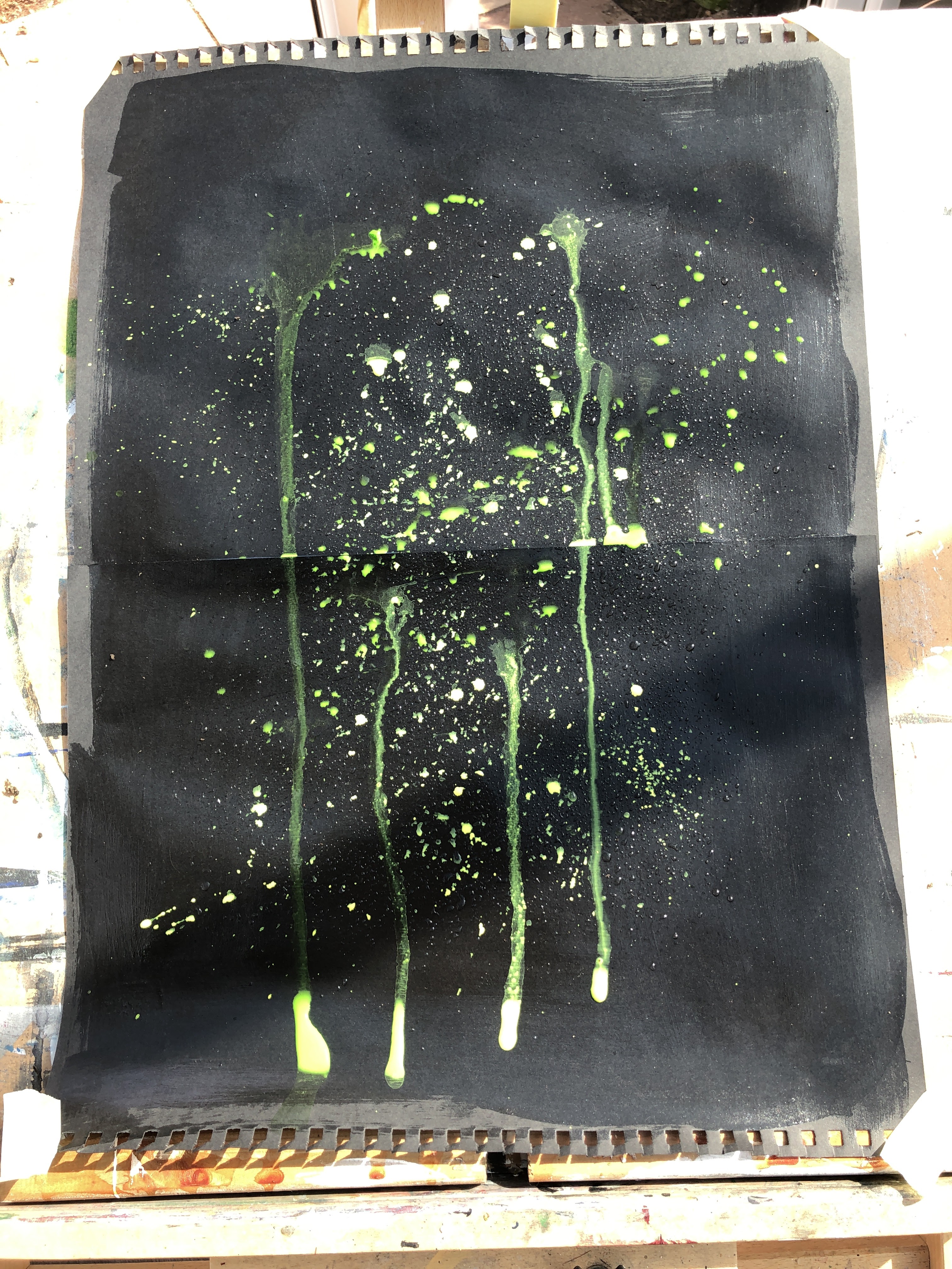
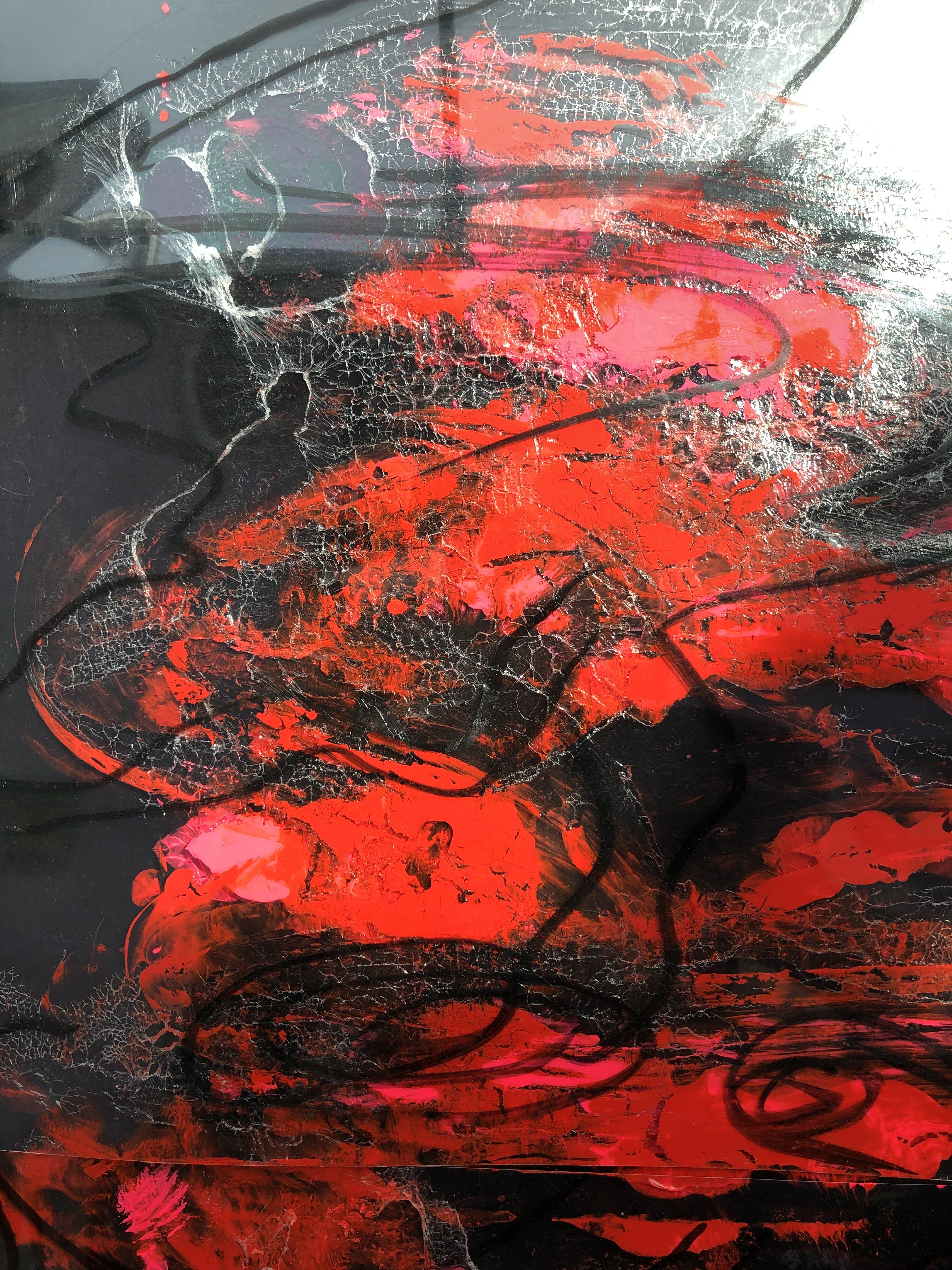
Feeling somewhat adrift with this, I taped two sheets of A3 black cartridge together to make an A2 piece, applied a layer of gloss varnish to it because I saw how paint sprayed or dripped onto that would at first run and then dry in semi-random shapes. I used some very bright yellow and green acrylic first flicked, then tilted to run down the sheet, and then scattered with a small dust blower used to clean keyboards and the like.

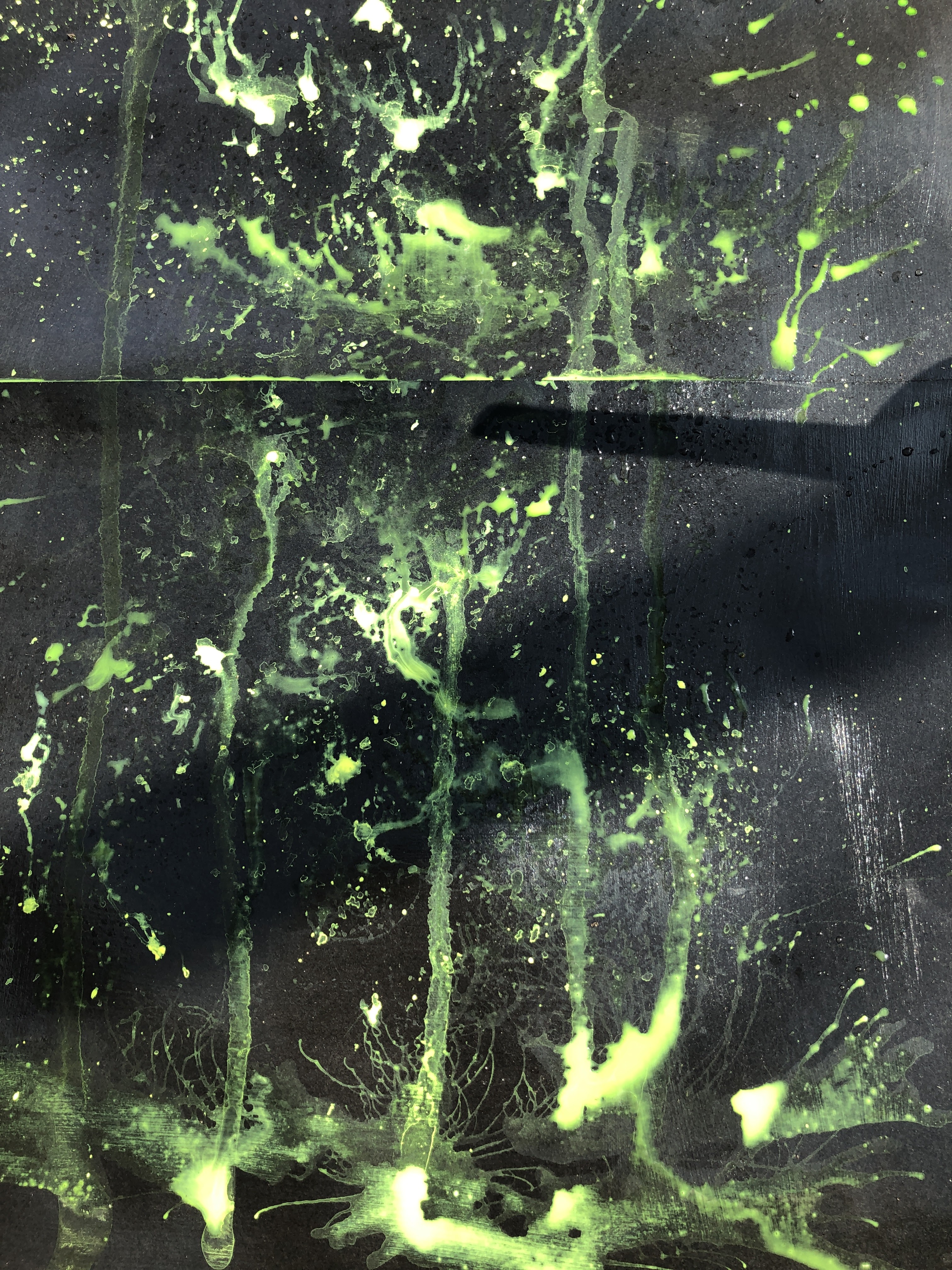

I was at a loss as to where to go with this and so I thought I might place some sheets of OHP (over head projector) film over it and perhaps apply wet paint over the painted areas underneath, much as digital systems do – adding a layer that can be worked without affecting the previous one. I know from experience how this surface responds to paint and so I planned to start with a paint pen to pull out some shapes.
But I hadn’t bargained for the reflections and distortions made by the light on the film, and how these distorted further as I applied the pen. The lines – or swirls and pools of dark and shade – are the reflections of the conservatory roof – and they move both with pressure and with my own movement so despite my previous protestations about not becoming part of the art, I became part of the art.
This doesn’t translate too well into static images although a progressive series of photos gives some idea. For best effect, I’ve made a slide show of these, and for the experience of movement, I made a video.

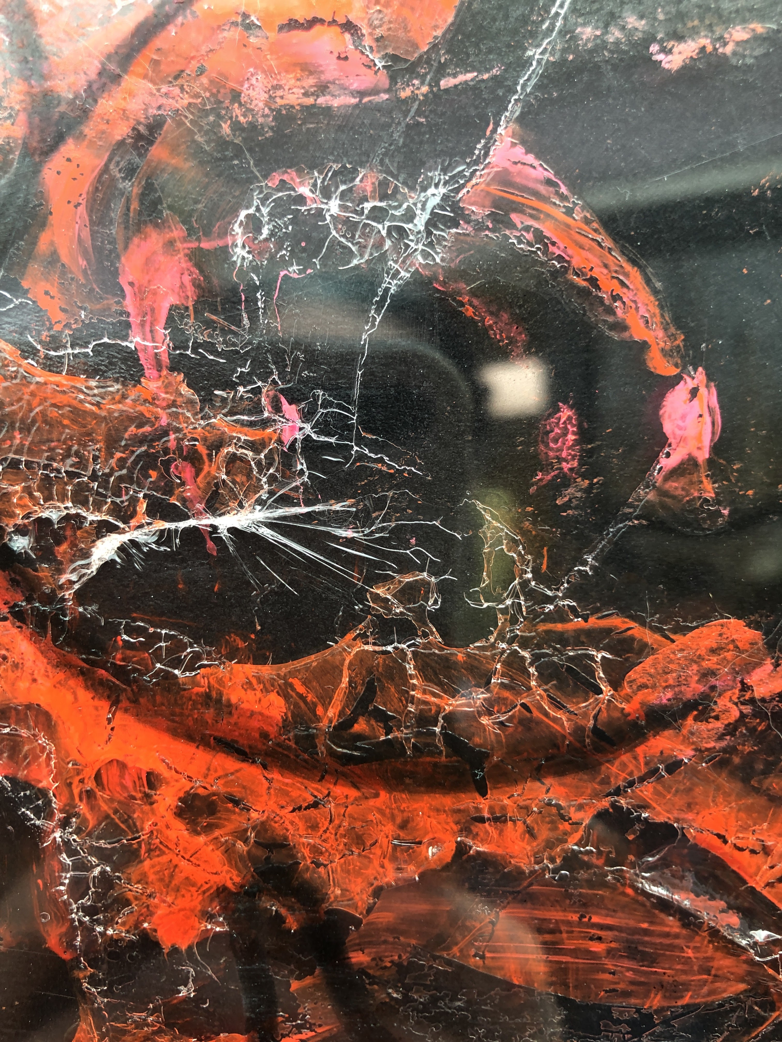
This got suddenly better. Using the same base – black cartridge painted with gloss varnish – and with the idea to use a print technique I’d found interesting in UPM, I took the OPH films still roughly taped together, turned them over, painted into them, following the pen lines, with acrylics mixed with drying retardant, and inverted them onto the paper. With pressure applied via a domestic paint roller and the films peeled off, the effect is again one of appearing and disappearing shapes, sizzles, and contours. This time it comes from the paper only here. I’ll reapply the film when both surfaces are dry. I chose the colours because again I’d tried these earlier on black paper and saw how they worked.
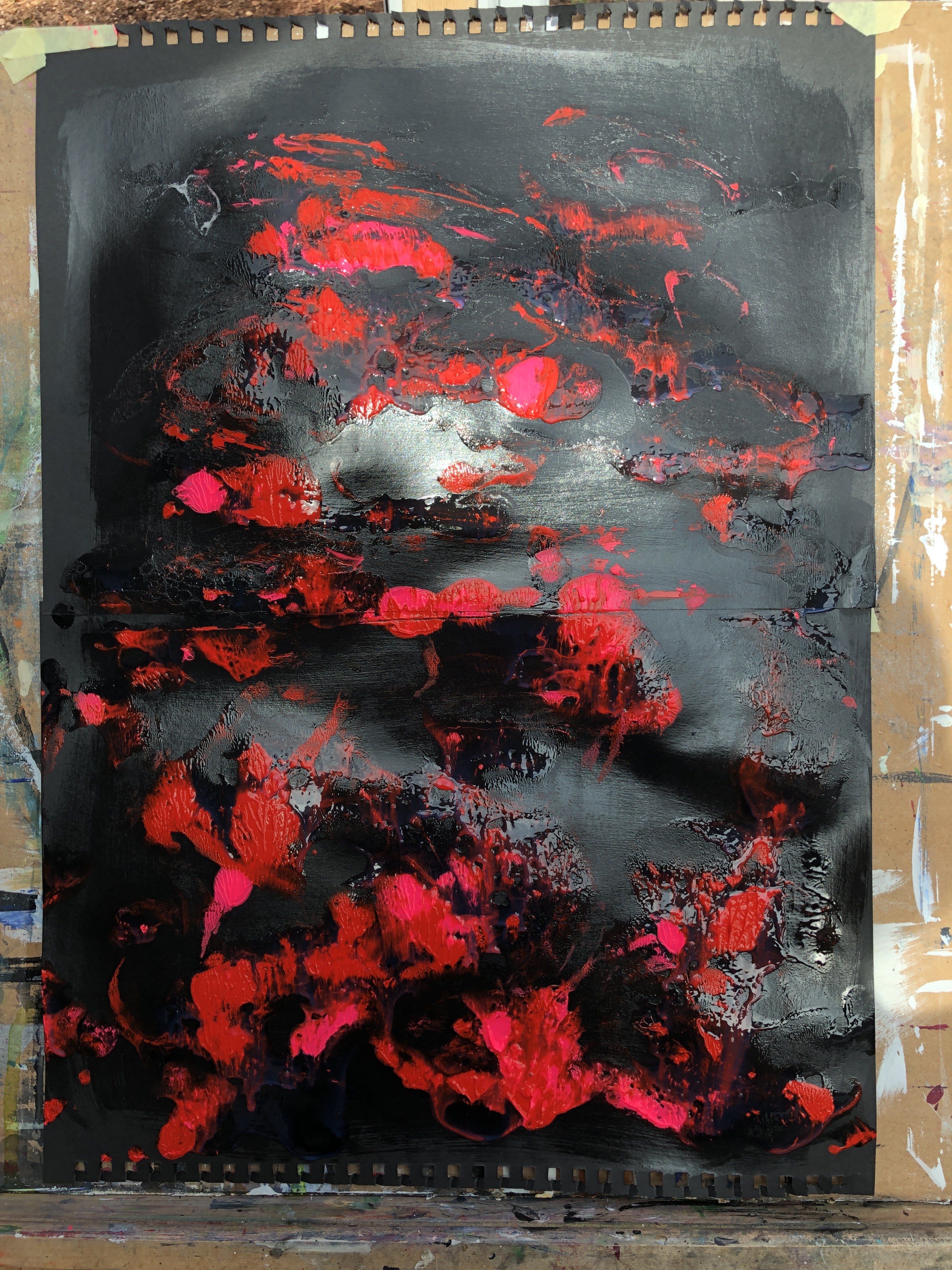
Everything here is about light and how this shifts depending on the bumps in the paper and the position of the camera. That’s the magic, I think.

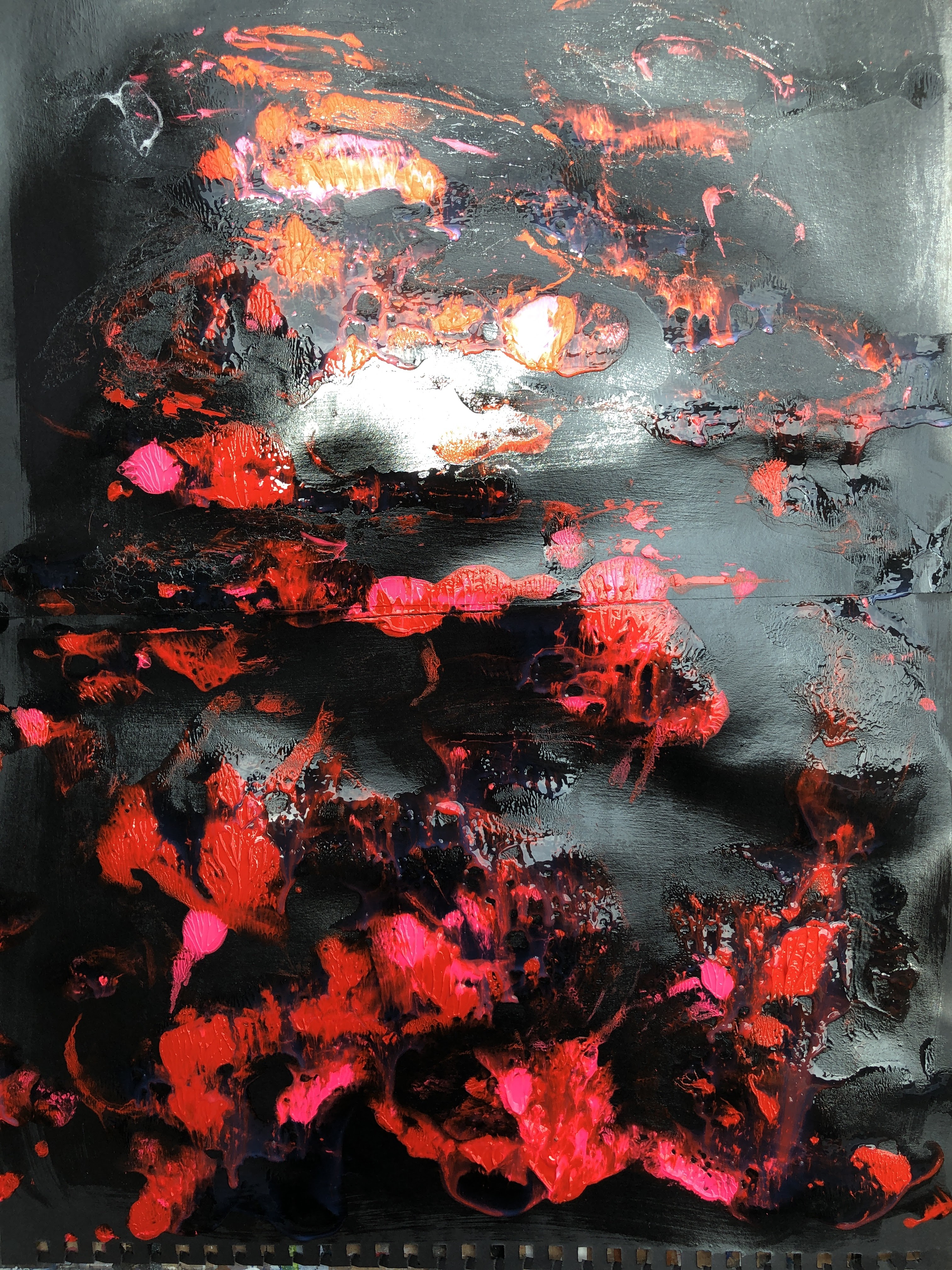
With OHP film applied. This adds interesting detail where the surface of the film has begun to detach and looks like silver webs in amongst the paint.

The third piece.

Staying with the black cartridge/gloss varnish theme, this time I’ve used a stylus to scratch into the gloss surface and create channels, then I’ve applied silver and copper paint to the top of the sheet and dragged it down towards the bottom with the long edge of a ruler. While still wet, I’ve used a stylus again to introduce some gestural marks – ripples moving from the bottom left up to the top right and widening as they go.
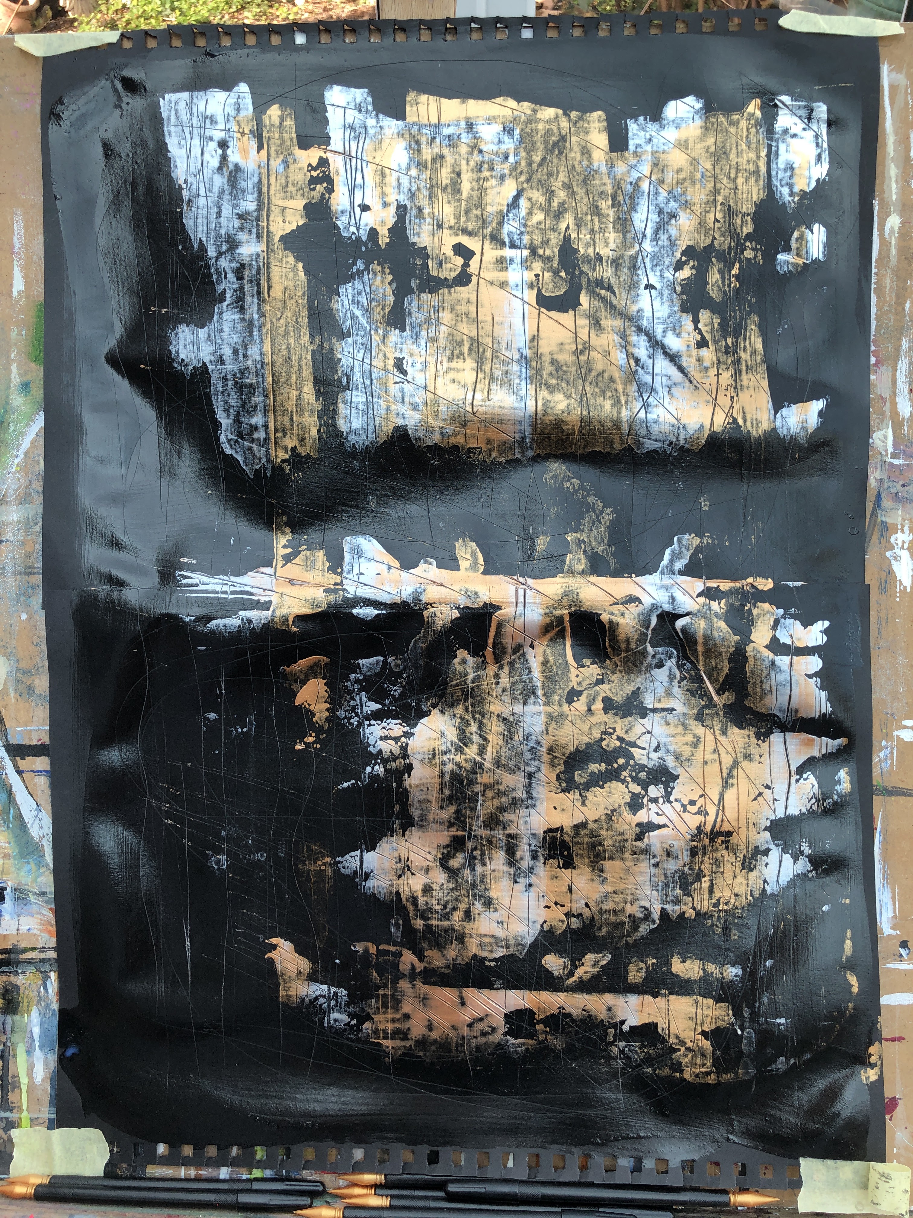
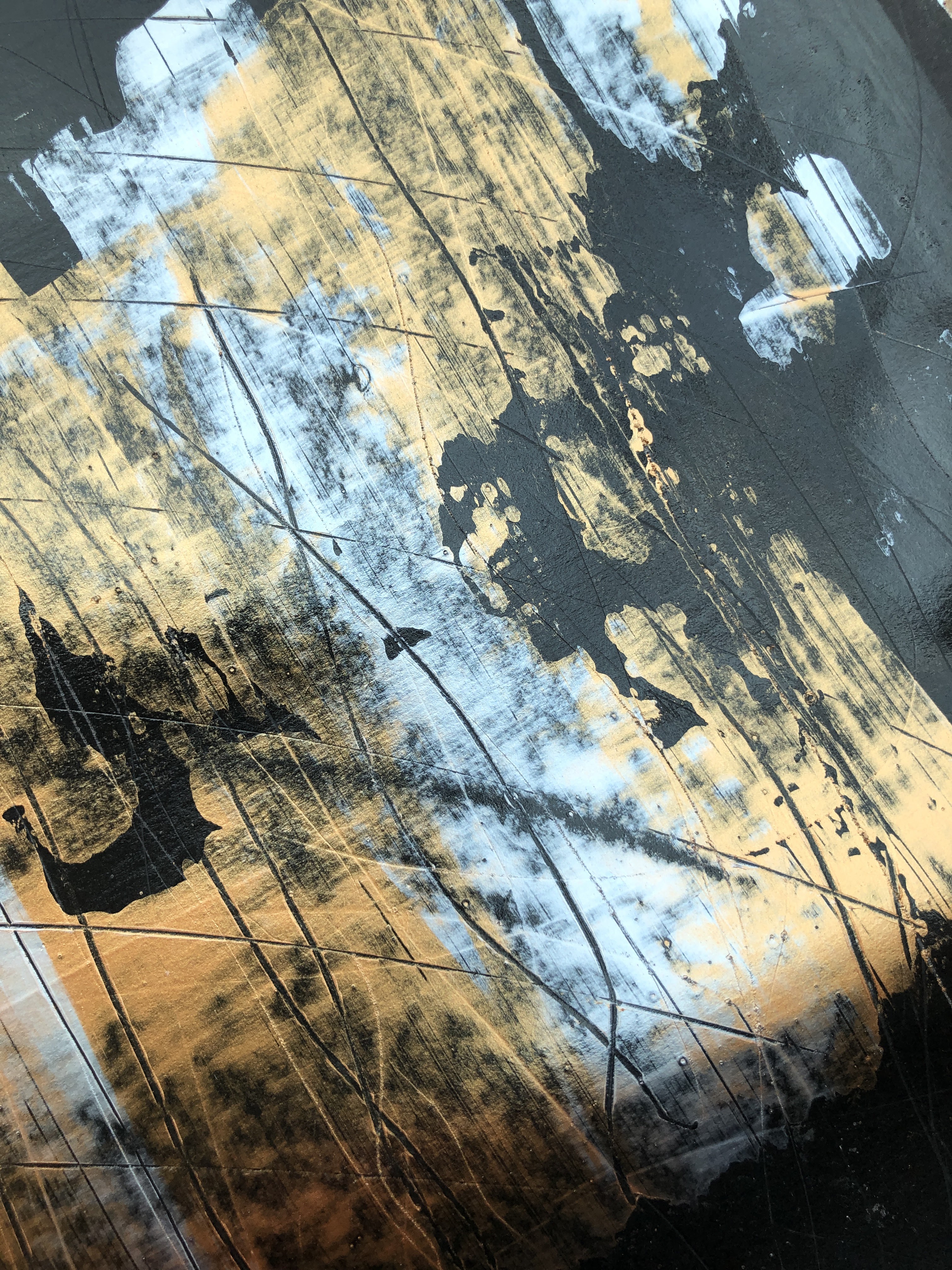

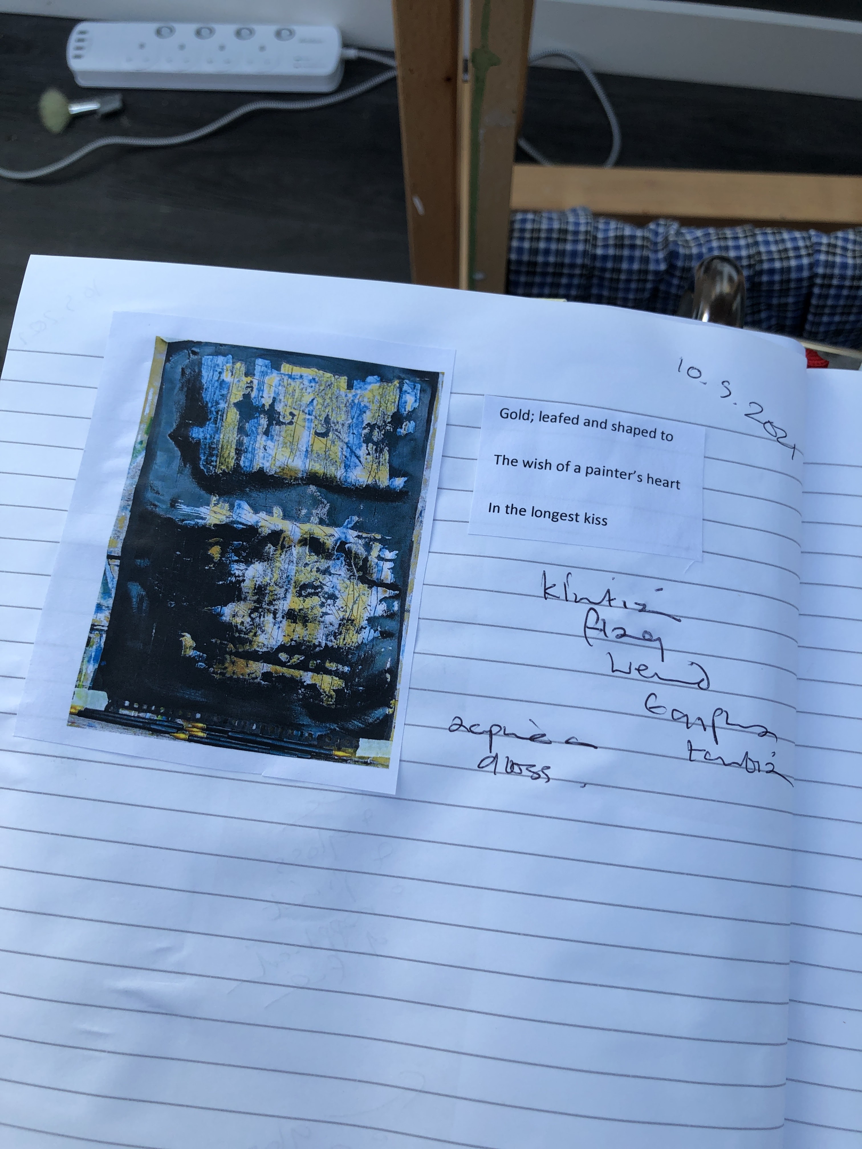
There’s a touch of Klimt about these; and something about armour and engraving too. And the strange gaps towards the top seem to hint at text – Korean or Japanese or just something indeterminate on what looks now like a flag.
I think should stop here or risk becoming repetitive. That and because I’m not sure of what I’m doing so getting some feedback before I go on would be a good plan.

2 thoughts on “Part 1, Assignment 1”