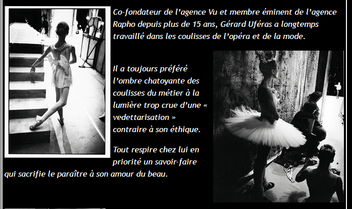
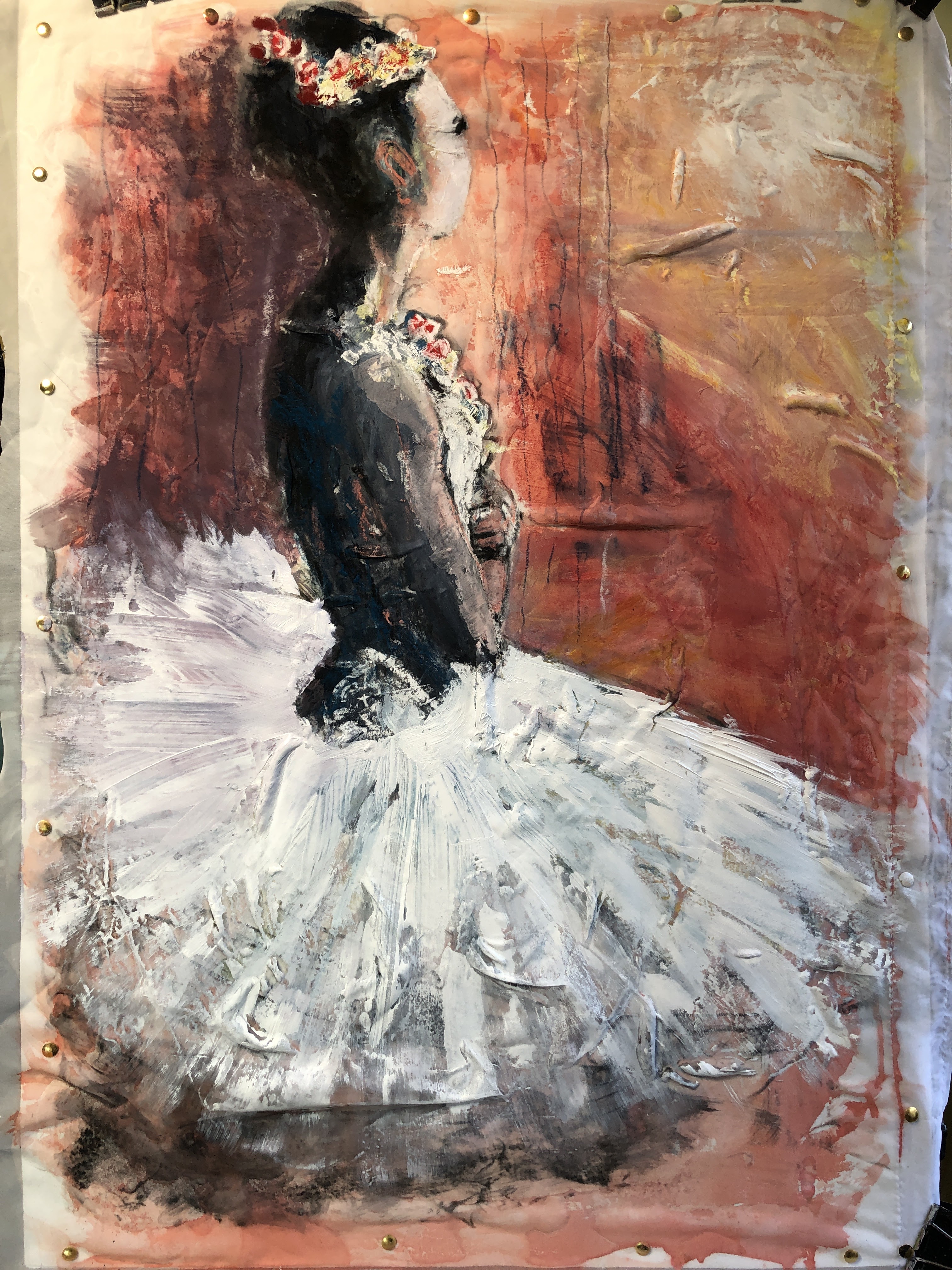
Last time I took a pop at painting light, I copied and then updated a Degas. This time, I’ve taken a photograph I found that purports to be backstage at the Bolshoi although for now I can’t confirm that or find any details of the photographer. It’s absolutely stunning though, and my plan is to use it as the basis of a painting that will be informed by Degas’ style.
2nd March 2021. UPDATE: the credit for this photograph belongs to Gerard Uferas who kindly and very promptly replied to my request concerning his intellectual property rights and claiming no rights to my painting (below) beyond acknowledgement.

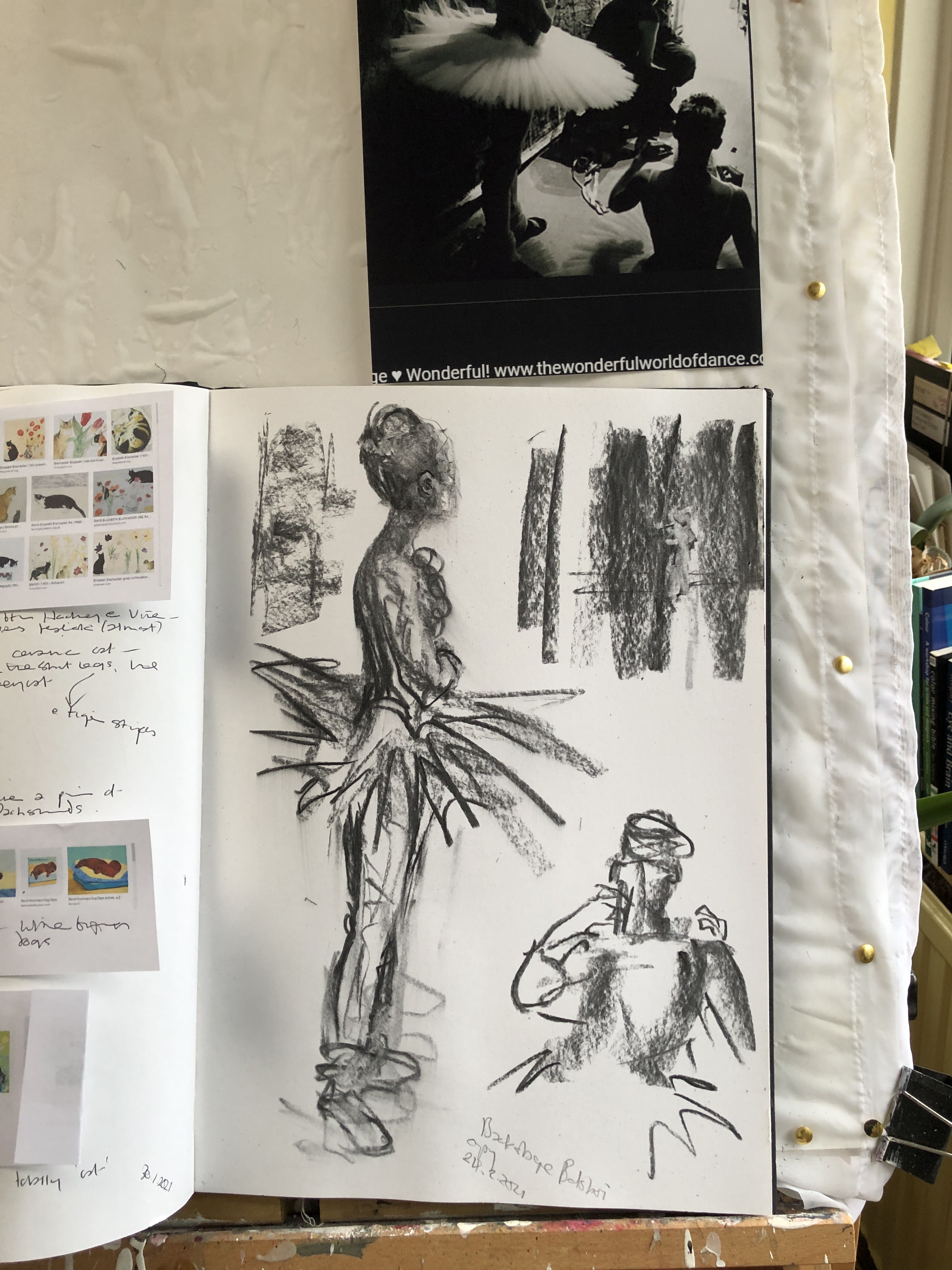

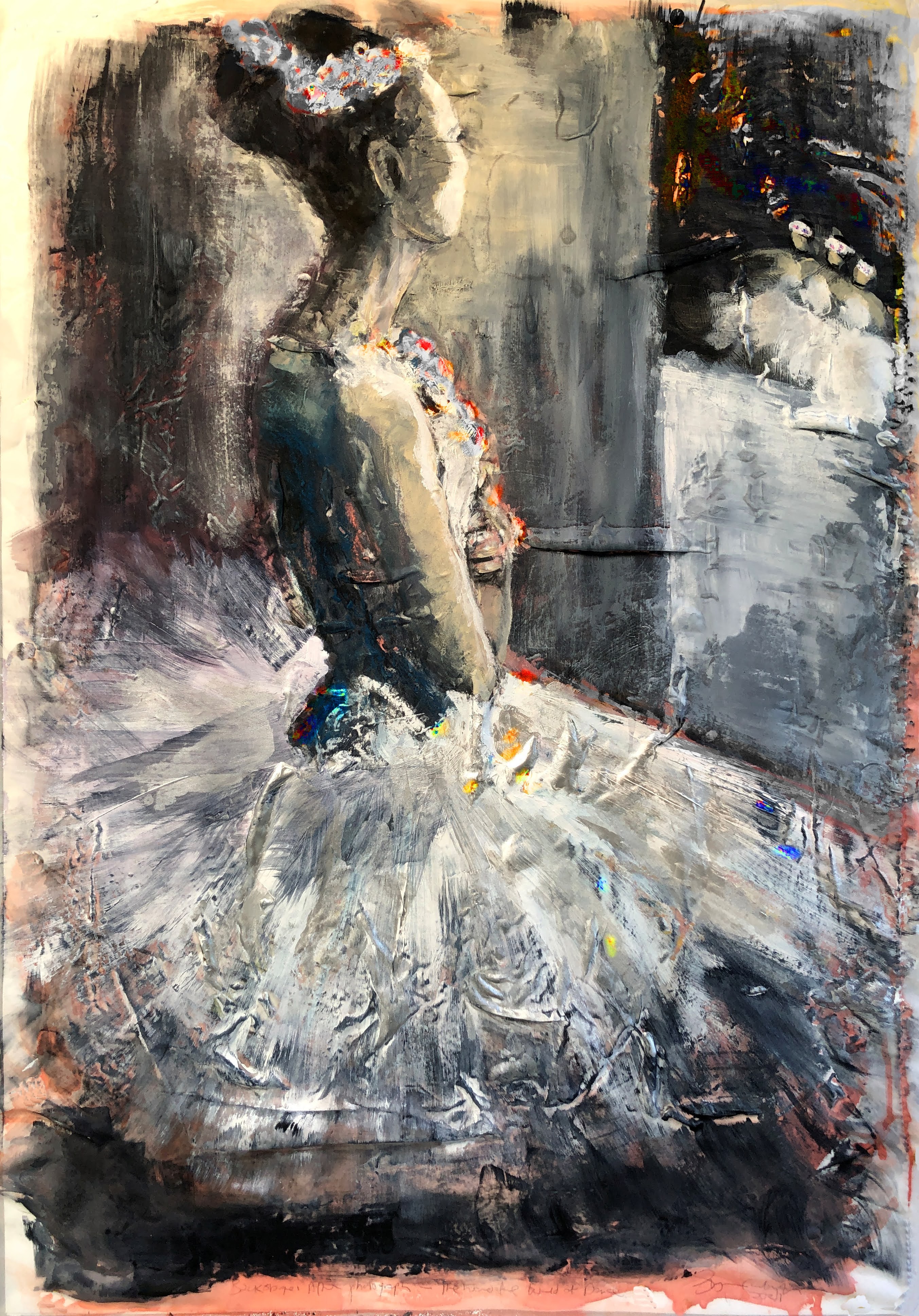
This woman’s semi-profile and shoulder angle is a real challenge. The sketches helped iron some of the problems out but I’m relying now on a few deft brush strokes to create the right impressionistic language.

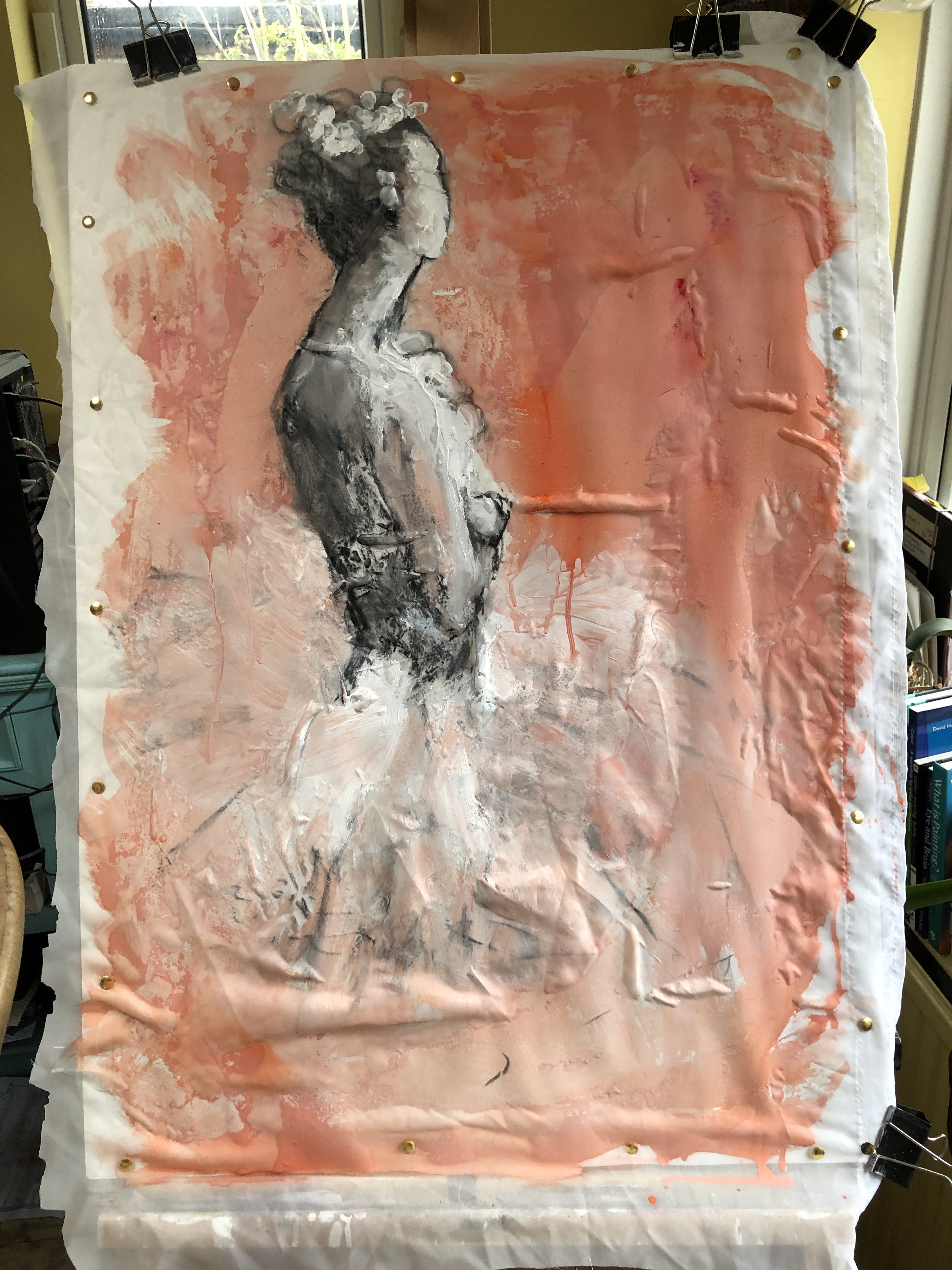
At the moment this looks more illustrative than painterly I think (and I’m wondering both if I’m right and how I came to that conclusion). Right or wrong, it’s an expression of dissatisfaction but as this is still ‘under construction’, that’s fair enough.
26th February.
As this blog is operating as some kind of journal and because today’s event may affect the shape of next few days, let it be known that I have an armful of Pfizer today. I don’t think I’ve seen so many people sitting on so much barely contained excitement for a very long time.
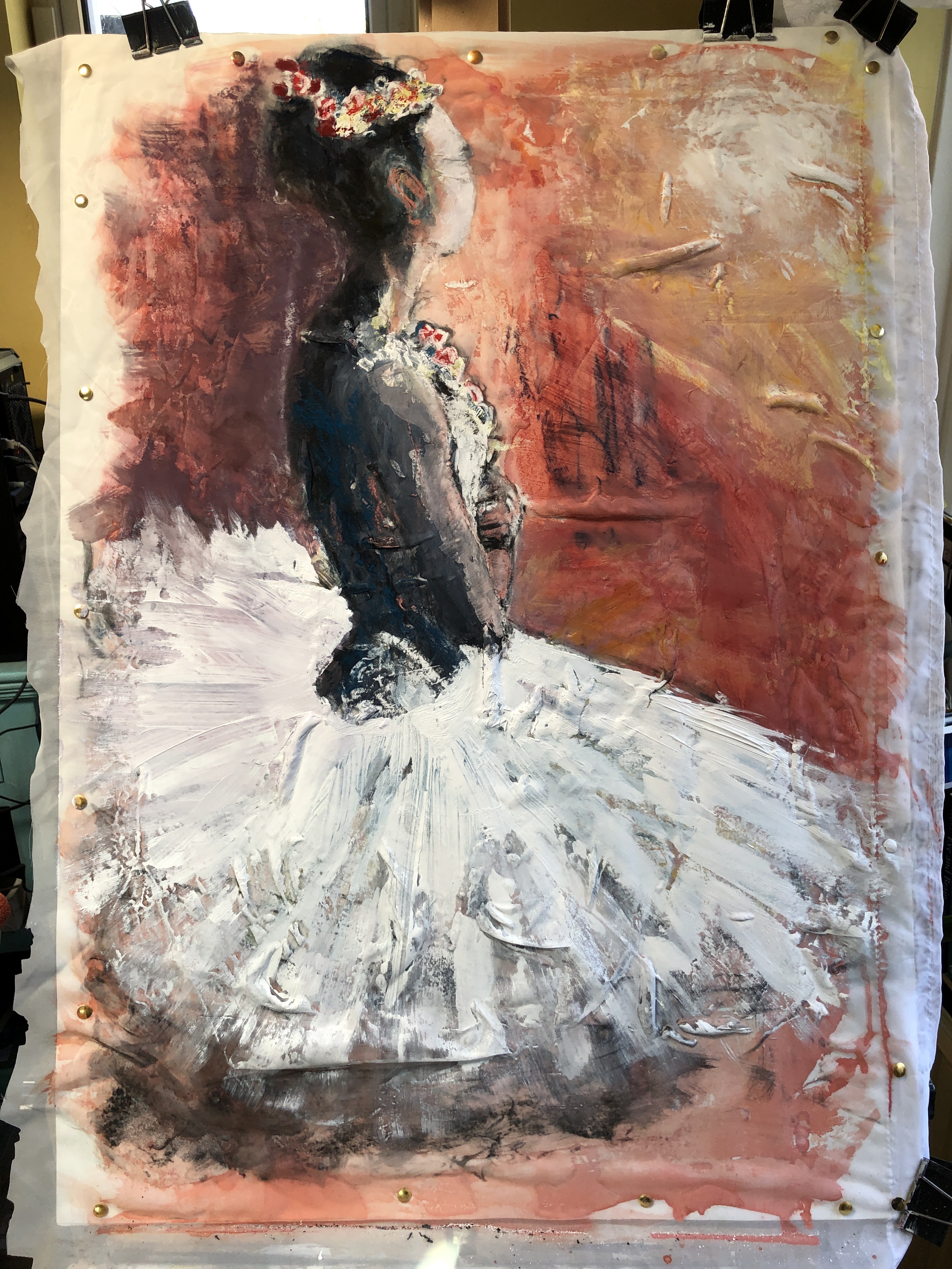
I’m adding an imagined background of corps de ballet performers to provide focus because the single male figure has, for me, more of an oratorial stance than a balletic one. Also, if the corps de ballet is on stage, this dancer becomes one of the Principals doesn’t she? I may add some silver to her costume.
We’re in the realms of tiny adjustments now. The silver acrylic is on – swept over the ridges made by the net to capitalise on the suggestion of brocade that creates – and some black acrylic pen to the dancers top right to fine down some of the shapes I’d put in place with a finger. I’m beginning to like it.
27th February.
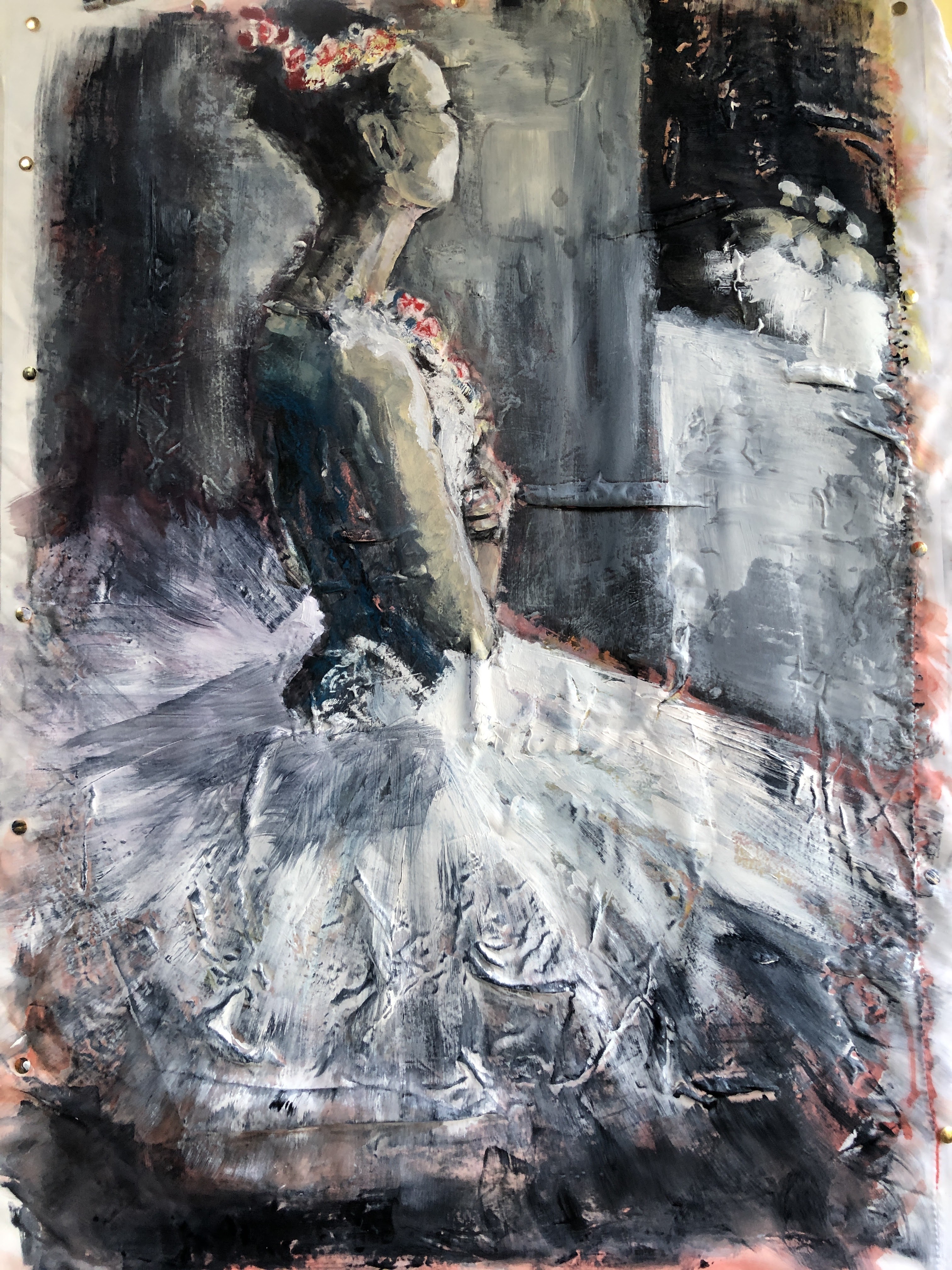
This still has a slightly kitsch look to it and I’m wondering if that’s because my reference image and my mental image are worlds apart. Degas’ dancers are robust, rounded, and he paints them as happy whereas this modern dancer is stick-thin and everything is angular, including her costume. I would argue that they’re both idealised according to their context so was Degas’ work also kitsch in its time?
I think what I’ve made here is a bedroom wall print which allows me to think now of digital enhancements and modifications. I have one or two minor adjustments to make to the physical work first but then I’ll run it through a few filters and see what comes up.

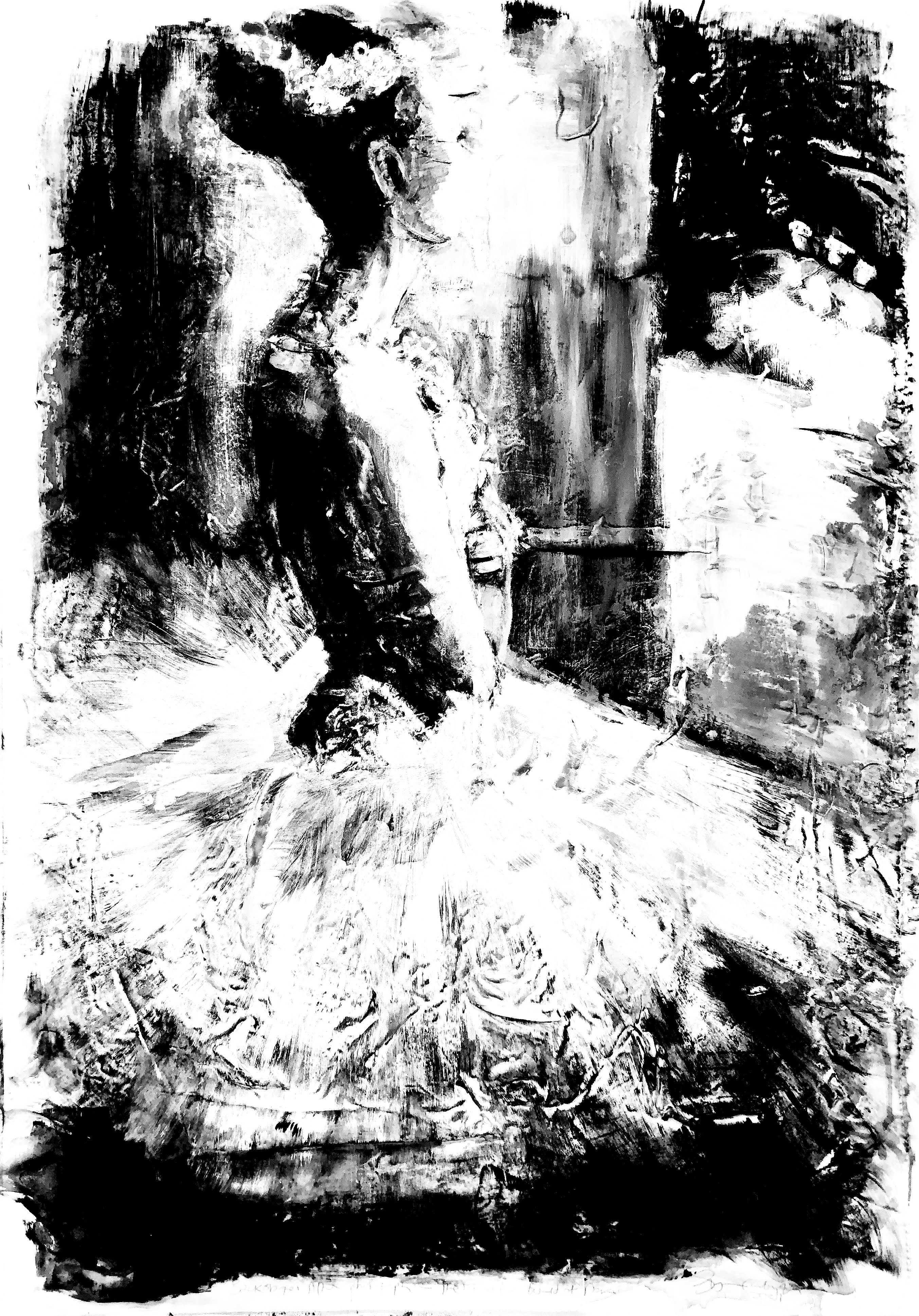
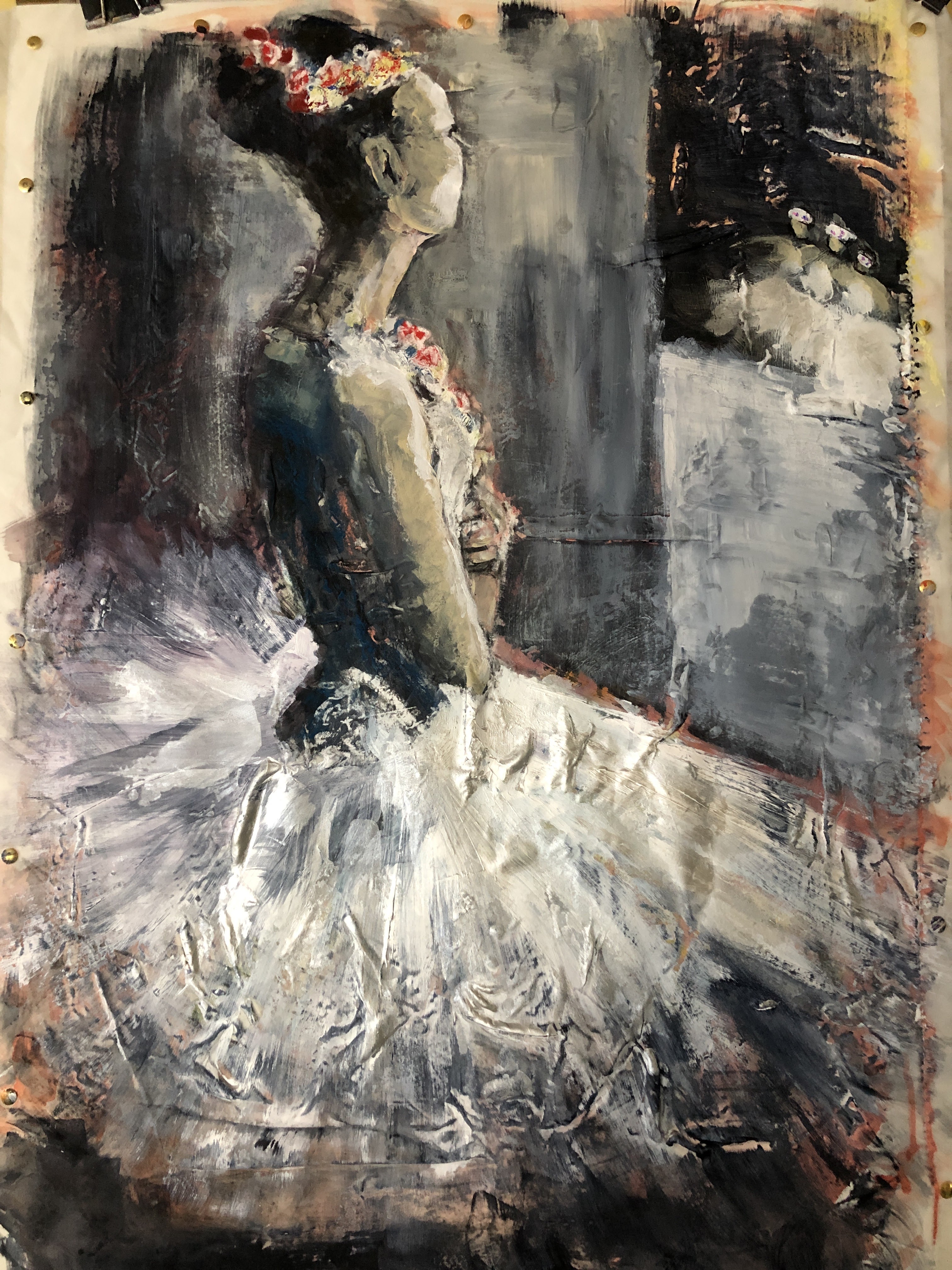
I tried several other filters but these seemed to upscale the kitsch value which is beginning to suggest to me that there is something about the image itself. Does this come back to the harsh reality concerning what makes a good painting? Good photographs often don’t and this is a spectacular photograph.
Still, painting on net curtain has been an experience. It allows fluid paint to pass through it and stain the cartridge underneath but keeps the more solid paint on the surface. It wrinkles (although it might not if you iron, glue it, and flatten it onto the board then pin it before it has a chance to move) which provides fortuitous texture and for me that’s made brocade of the costume which lent itself to a dragged coat of silver acrylic. Although this often works against me, I find I do rather enjoy the challenge and the serendipity of ‘collaborating’ with an unruly surface. It fits with my principles of copying for practice but making the end result my own, something that’s often easier to achieve as a left hander than it might be for a right hander in this right handed world. Watch me with a tin opener, it’s acrobatic.
___
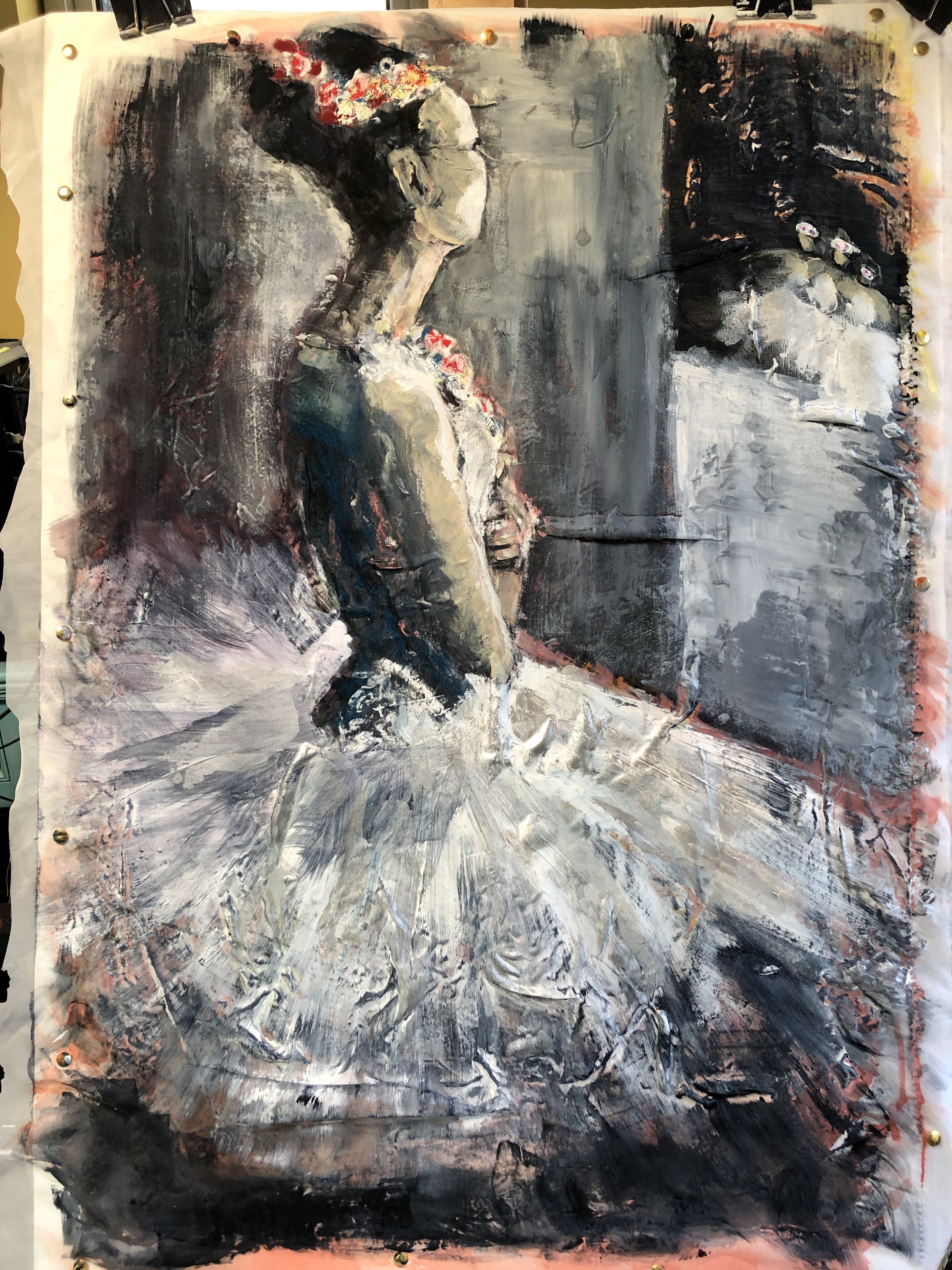
Finally, this is the painting in a different room where there is cool light and the nearest I can get to a plain gallery wall. I think it gives an indication of how it would look on a wall.

___
I may have tracked down the photographer who made the original image. After landing on numerous Pinterest pages, I eventually arrived here via Tin Eye reverse image search and saw, now confirmed, that Gerard Uferas is the photographer: