
Again focusing on the circular format, this requires a painting of one of the previous given selection of items. As before, I am conjuring the spirit of the exercise requirement rather than its letter and also making use of previous experience with my own version of mono prints. Looking ahead to the assignment I can see there is some overlap in terms of subject matter as I’ve chosen another part of the same corner of the room I used for the previous task and which might meet the requirements of the assignment. To date though, my experience has been that this kind of overlap often results in progression.
To make the fluid painting, I have begun with a photograph with each quarter enlarged and printed so that the whole covers an A2 area. I’ve superimposed OHP film after first selecting a circular focus, and then used fineliner to define the to-be-painted areas. In the meantime, I’ve prepared two circular supports; one primed with acrylic gesso, the other with gloss varnish. The idea is to use the glossed surface to pick up the wet medium from the OHP film and then to transfer a proportion of that to the primed surface. The result should (should!) be a loose, sparse print on the glossed surface which is likely to be interesting in itself, and a further sparse print on the primed surface to which I might consider adding more paint.
And as I’m writing this, I wonder if really it is the assignment.

Source photo 
Gloss surface
30th November. Remembering my experience of acrylics when I was making prints before, I used my remnant watercolour and gouache tubes this time, but found I still needed to add the slow dry medium to keep them fluid. I painted small areas at a time then printed across the two prepared surfaces, one after the other, using a small register at the top to line them up.

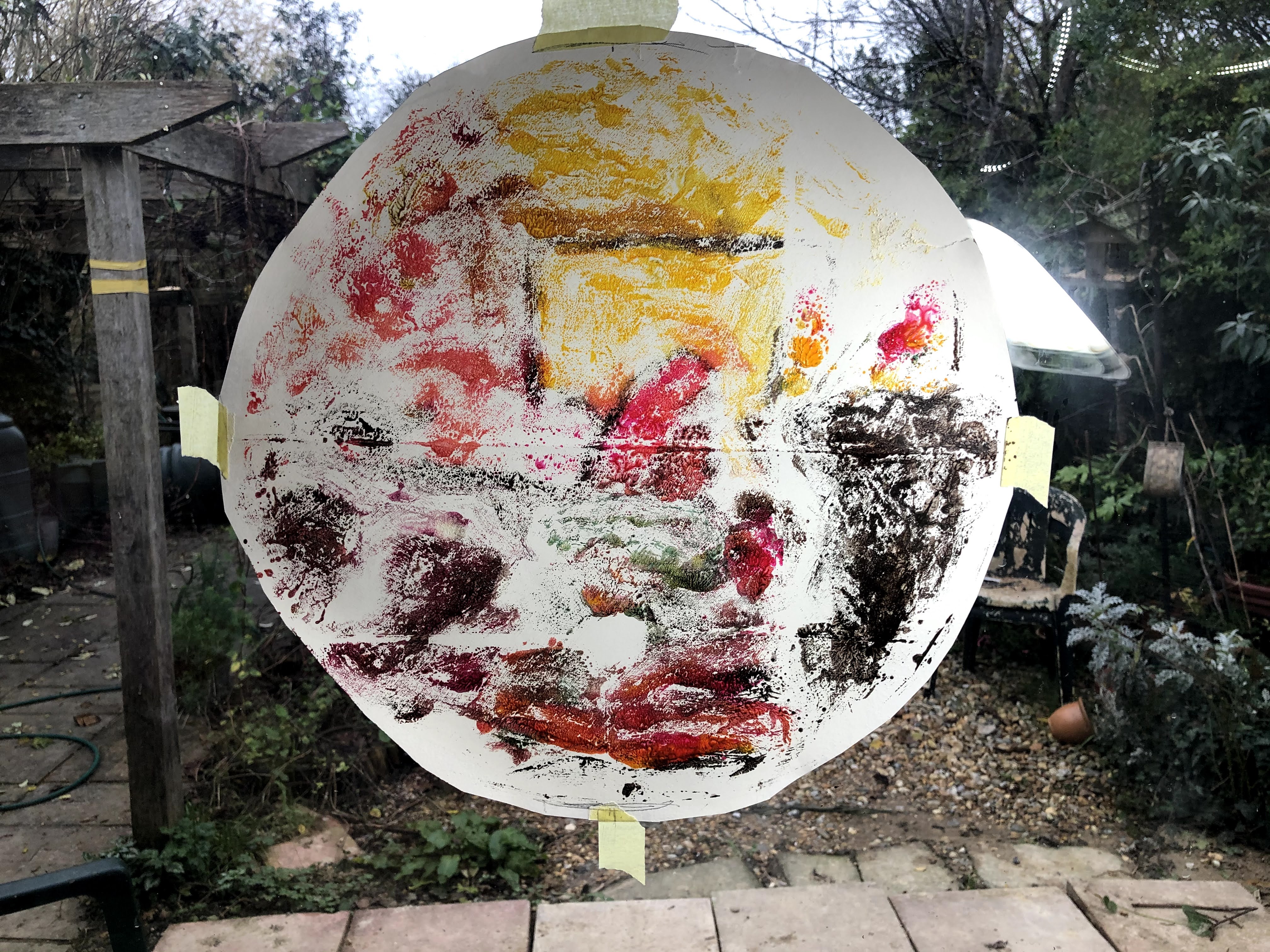
The immediate observation is that the photograph adds a great deal of weight to the painted film sitting on top of it. Both the prints have expanses of white space that seem too light for the subject – a no-flash image in the corner of a darkened room. So my next step is to consider a solution that deals with that space without leading to my constant bête noir of over working. Another consideration is how these look when lit from behind.
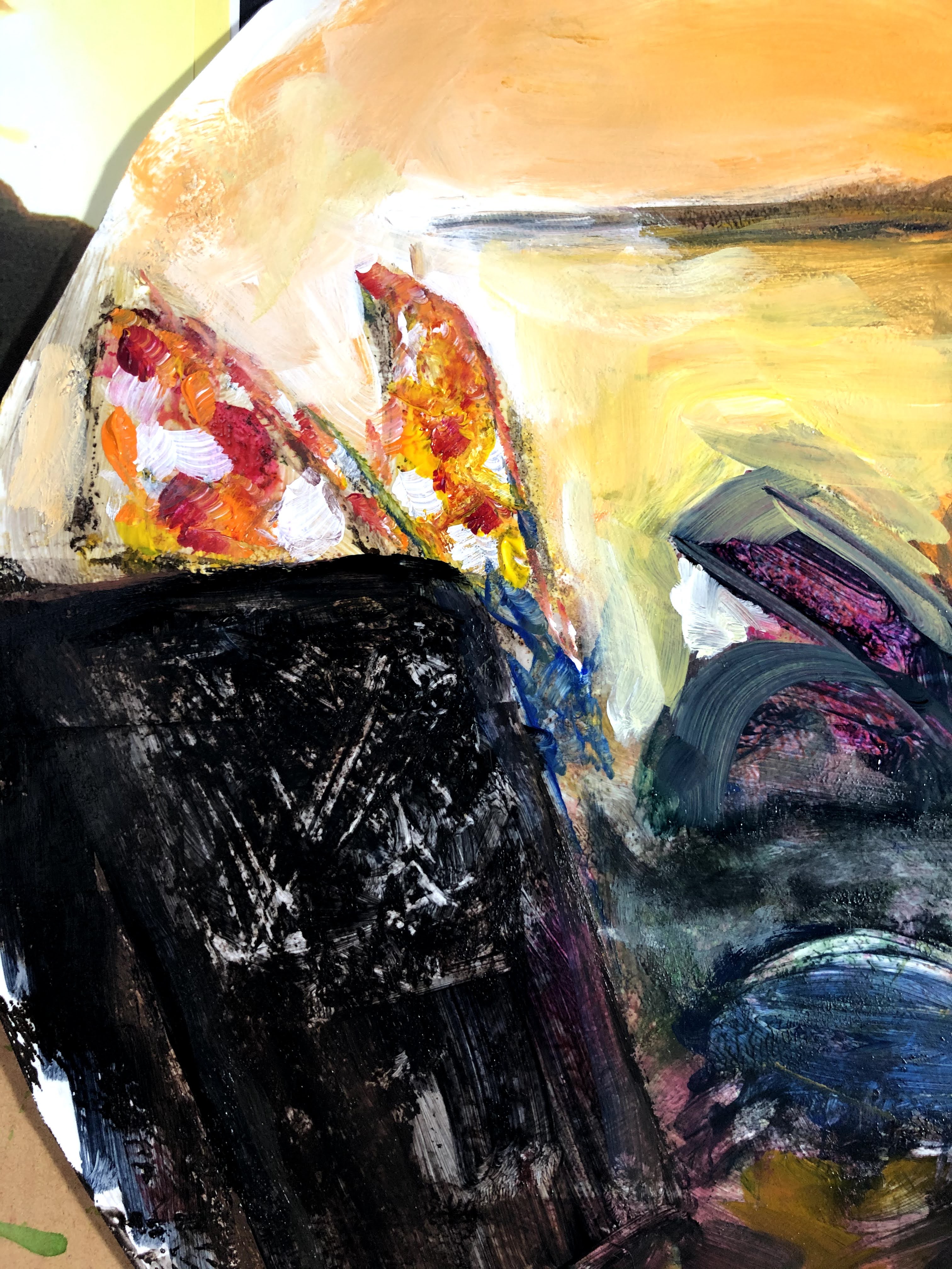
In a further development, I’ve cobbled together two sheets of black cartridge, cut around the individual pieces of the OHP film jigsaw, and glued them together onto the new background with the photo removed. The light isn’t the best and the film is reflective, hence the odd angle, but I think I can see how this piece can become either the exercise or the assignment. The other two have their own potentials to explore.
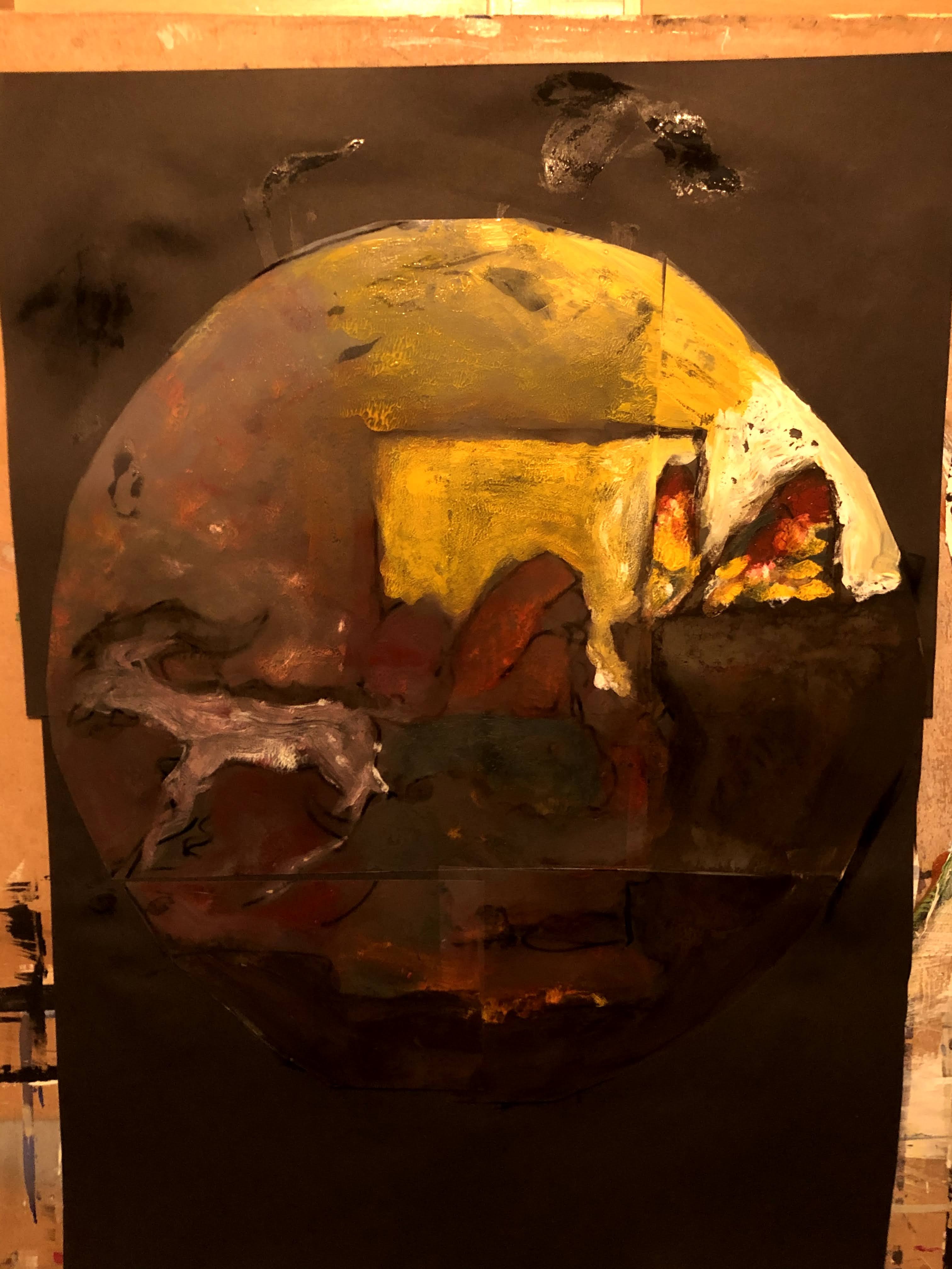
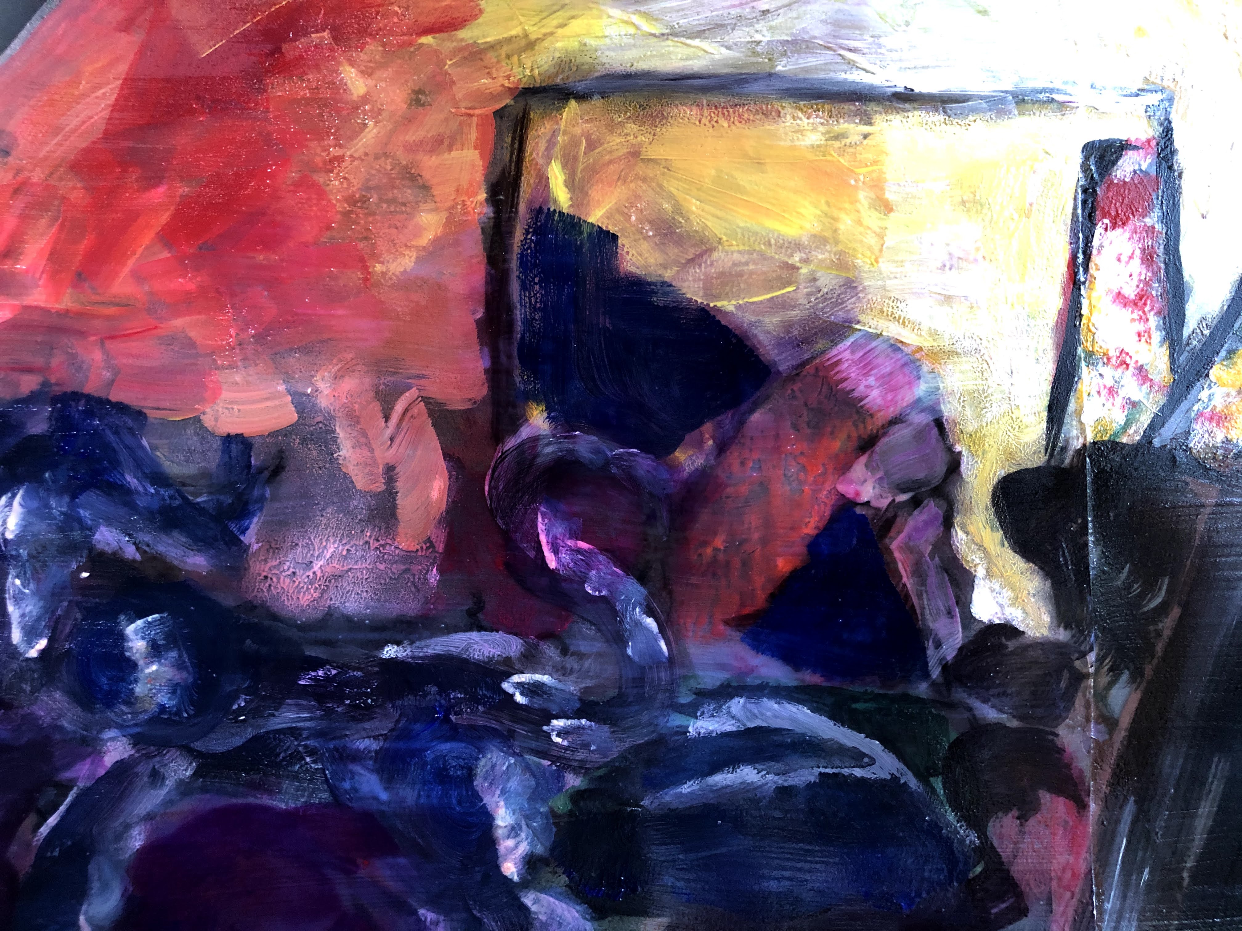
1st December and I’ve added more watercolour/gouache/slow-dry mix to the film, drawing somewhat on Kim Baker’s modern vanitas style but with smaller twirled and swirled brush strokes.


My intention now is to treat this as the exercise and apply gloss, much as I had with the personal project from which the idea came. I learned from that not only how gloss pulls up the colours and gives them a feel of stained glass, but also to use sprayed on varnish rather than brushed on glaze to prevent reactivation of the paint and dragging pigment across its intended boundaries. OHP film has a natural shine which the paint does not so gloss should restore that as an all-over effect.


Photographing a glossy surface is never easy and with lights coming at it from three angles, this was complicated to achieve, so I made a video to illustrate the changes on the surface as the camera moved across it. This not only shows the reflective effect but also manifests as a moving, shimmering, taffeta-like sheen. An unexpected abstract ballet.
I am still conflicted as to whether this is effectively my assignment, which does actually call for ‘an area in the house’, or fulfilment in spirit of exercise 4-3. I have my two prints that also could be either so I’ll give them some attention now and see how they develop. I hadn’t seen this painting as particularly promising until the final stages, the other two might be equally revelatory, given the chance.
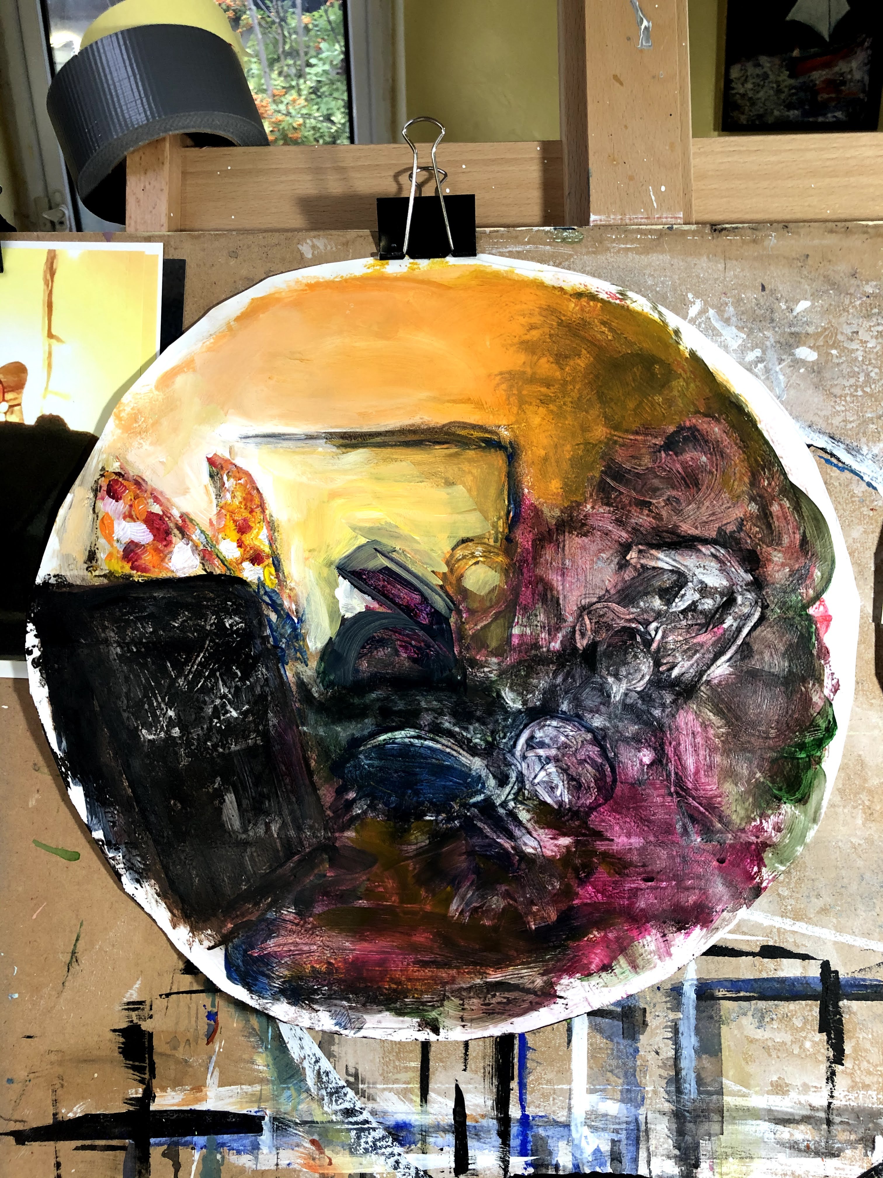
2nd December. I have painted now onto the pre-varnished tondo surface to which I added a further layer of gloss medium.

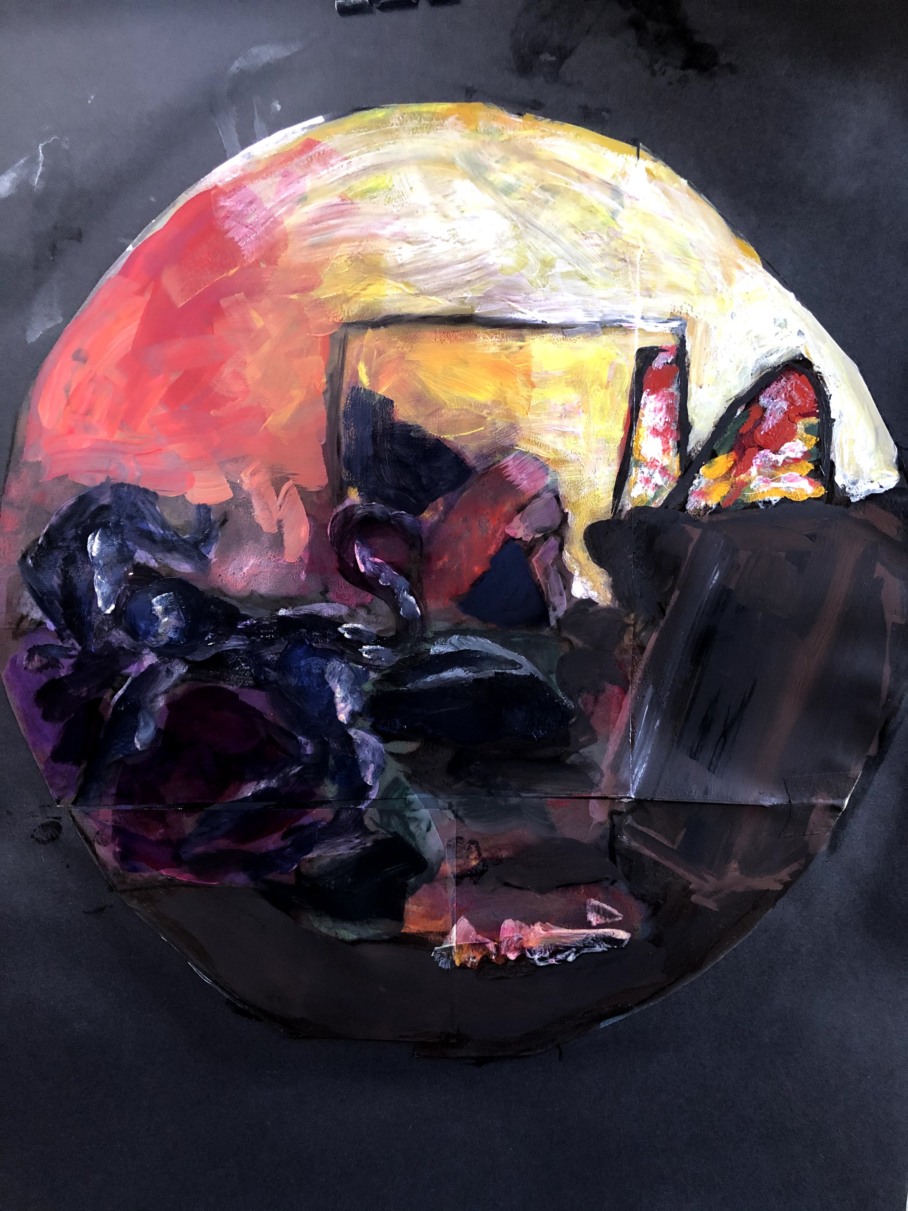
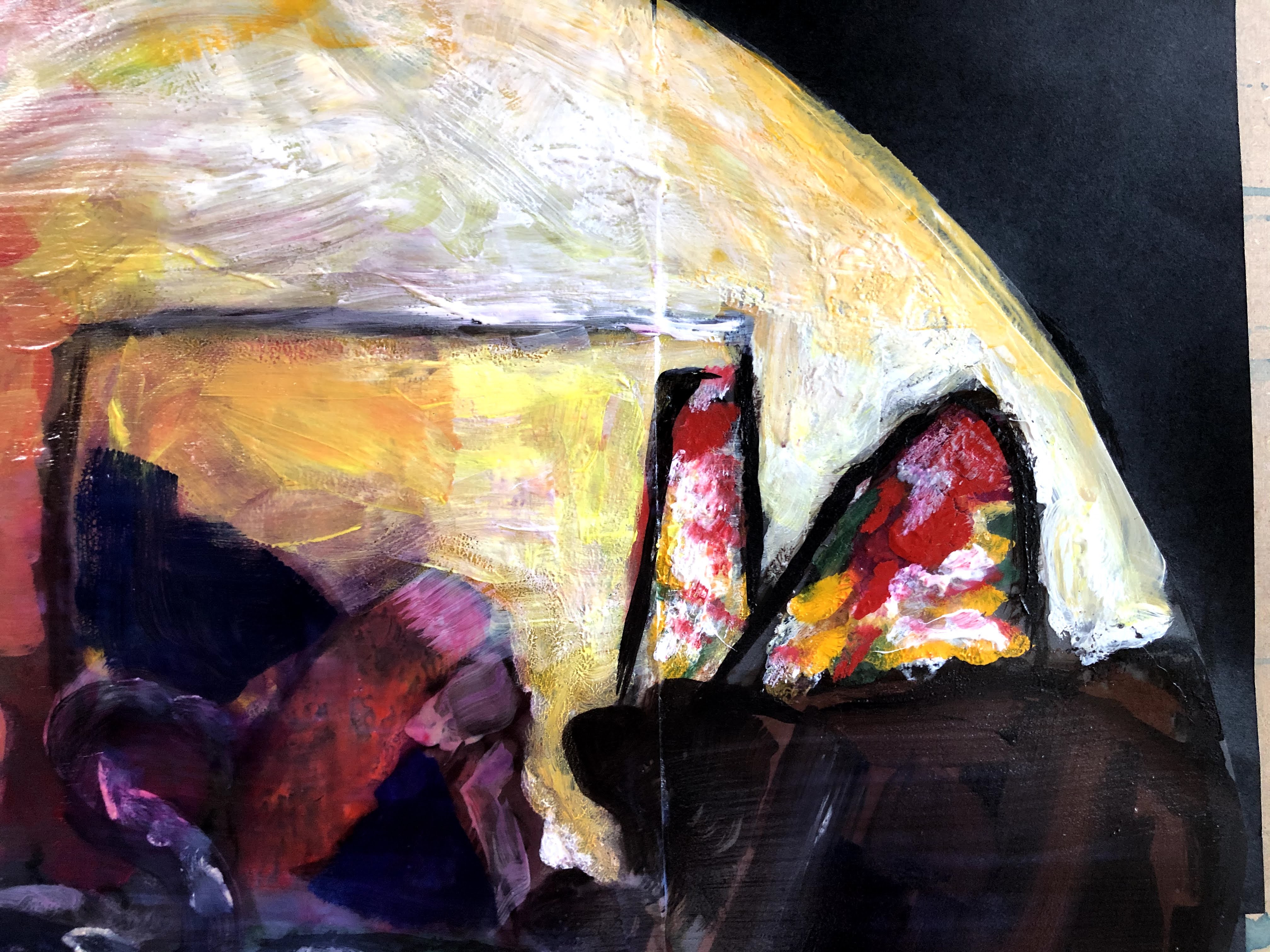
I will spray varnish this piece to finish it, then begin work on the print that came from it and that is the right way round. This is quite sparse and rests on a primed surface but I’ve selectively added gloss medium to some of the pigmented areas with a view to isolating them while I flood the empty spaces with a dark wash.

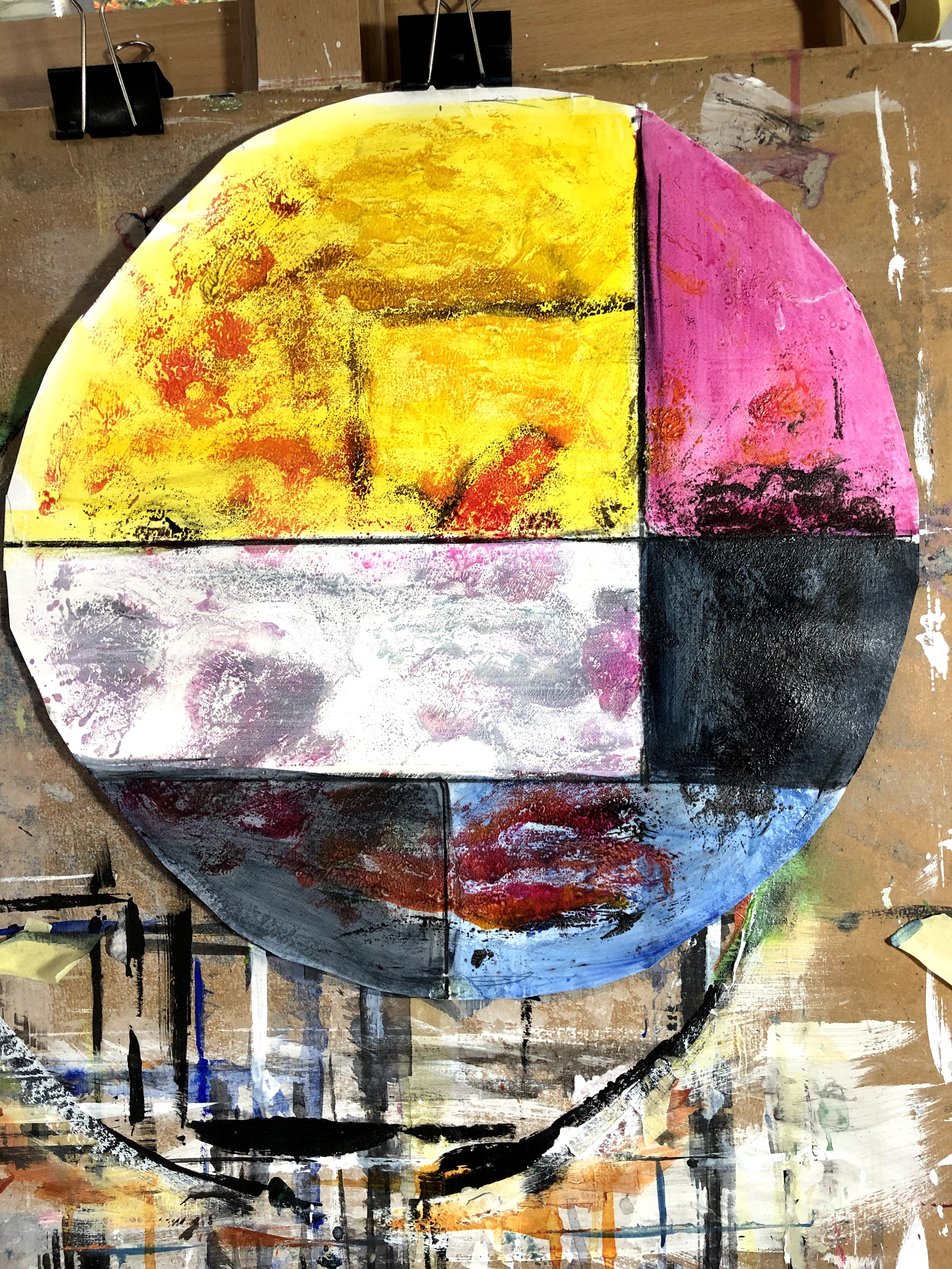
December 3rd. The lines made by the boundaries of the cut pieces of film show up in this print taken from the one above prior to additional layers. They reminded me in the film version of stained glass pieces but in this much brighter and more abstract piece, it brought Mondrian to mind – those black lines of demarcation separating areas of stark colour, usually blue, black, yellow, and red. My tutor asked me to think about what it was that didn’t appeal to me about abstraction and I said that it was about meaning, communication, and relatability. My understanding of many abstract artists is that, while stripping meaning out of their work seems among some to be a goal (the men of the New York Art School, for instance), they nevertheless imbued much of it with considerable passion. Pollock is said to have ‘put his soul’ into his action paintings, and Rothko is reputed to have hoped viewers of his work would be emotionally overwhelmed by it.
For me, though, without some clue about this covert content, it may be hard for the average viewer to cotton on to the message being carried by the work and so, unless they’re privy to back channel information via documentaries or interviews, they’re likely to dismiss them as pointless unless they coincidentally find them visually attractive.
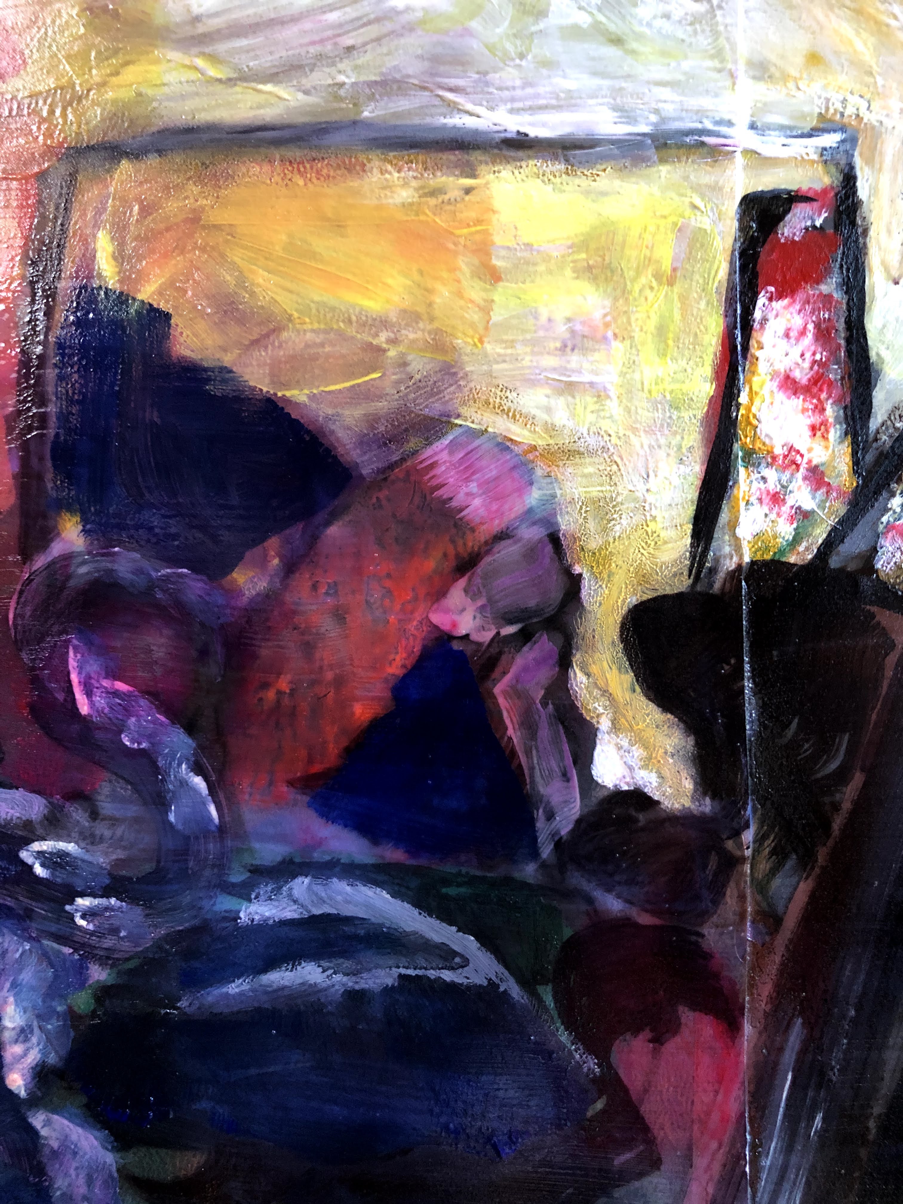
Because of this, and my sense that if art is to be accessible to everyone it must accept some responsibility for the viewer’s capacity to derive meaning from it, my preference is always for work that gives some kind of hint about what it’s about. For this piece, then, instead of obliterating the selected areas with colour, or replicating Mondrian’s palette directly, I have used washes of allied colours to make transparent masks, imprecise charcoal lines to delineate them, and judiciously applied reductive scrubbing to create a more modernistic grunge appearance under the bright top layers. If I were showing these, I would show the sequence to offer insights into its provenance – this is how we got here, see the shapes in the separate areas and how they overlap despite the bold lines? Maybe you’re viewing that very first painting through a stained glass window with bold lights directed at it that blur what lies beyond.
Briefly, I’d argue that, for me anyway, abstraction needs to have an origin in a world recognisable to most people and that artists need to give a little to help viewers get a foothold. When I did a creative writing course, one of my tutors* explained to me that, for any story to be successful, there had to be a way for a reader to ‘read themselves into it’ in the first couple of paragraphs. This meant using language and structures that set the linguistic scene for the rest of the novel or short story. ‘Once upon a time’ is the obvious but that would have been punishable by a thousand metaphorical red pen slashes. We all know what’s going to follow though, don’t we? I think the same kind of ‘reading in’ or maybe ‘seeing in’ is necessary for art, and maybe that comes in the form of a few of those words the artist would be happy to provide in an interview.
So here is the final piece in this exercise, gloss sprayed to finish.

Pixaloop animations
Sara Maitland, tutor to the MA in Creative Writing at Lancaster university and author of numerous short stories, including Moss Witch (2013). Comma Press. Moss Witch: And Other Stories: Amazon.co.uk: Sara Maitland.

4 thoughts on “Part 4, exercise 4.3 or maybe Assignment 4 – fluid painting on film with prints”