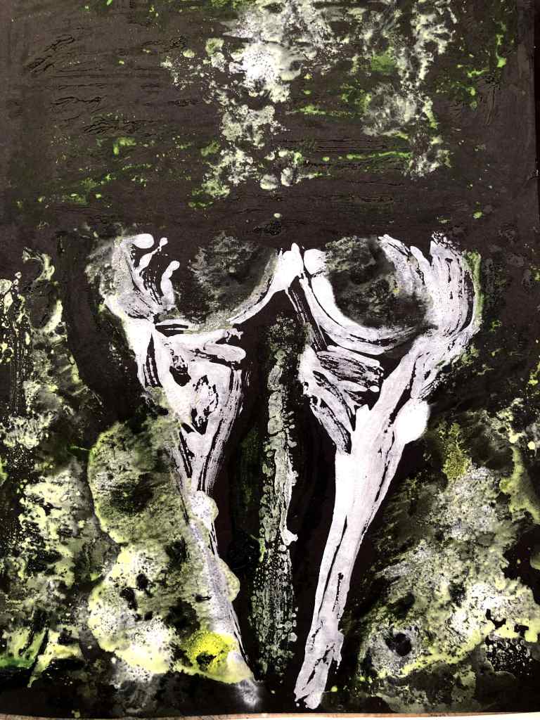
If this is really Assignment 3 then I’ve figured something out just in time – which is that acrylics are a rubbish medium for this task. I dug out some old tubes of watercolour and gouache paints; neither is a full set of anything but between them they have most colours covered. I also pressed a jar of petroleum jelly into service for two of the prints because if not now, when? I wanted to see if I could make these paints ‘float’ over the places I’d applied it, but in the end the OHP film had enough float to it due to its shiny surface. However, since I also made some fold prints, the grease will have transferred to those and its effect come into play when I think about working more paint into them.
I also chose this time to mark out key areas in fineliner brush. This helped me ‘see’ where the different colours might go and, because I’d need to work quickly, this would be important. That said, there’s been a torrential downpour and the roof has sprung another leak so the question of drying out may be academic!
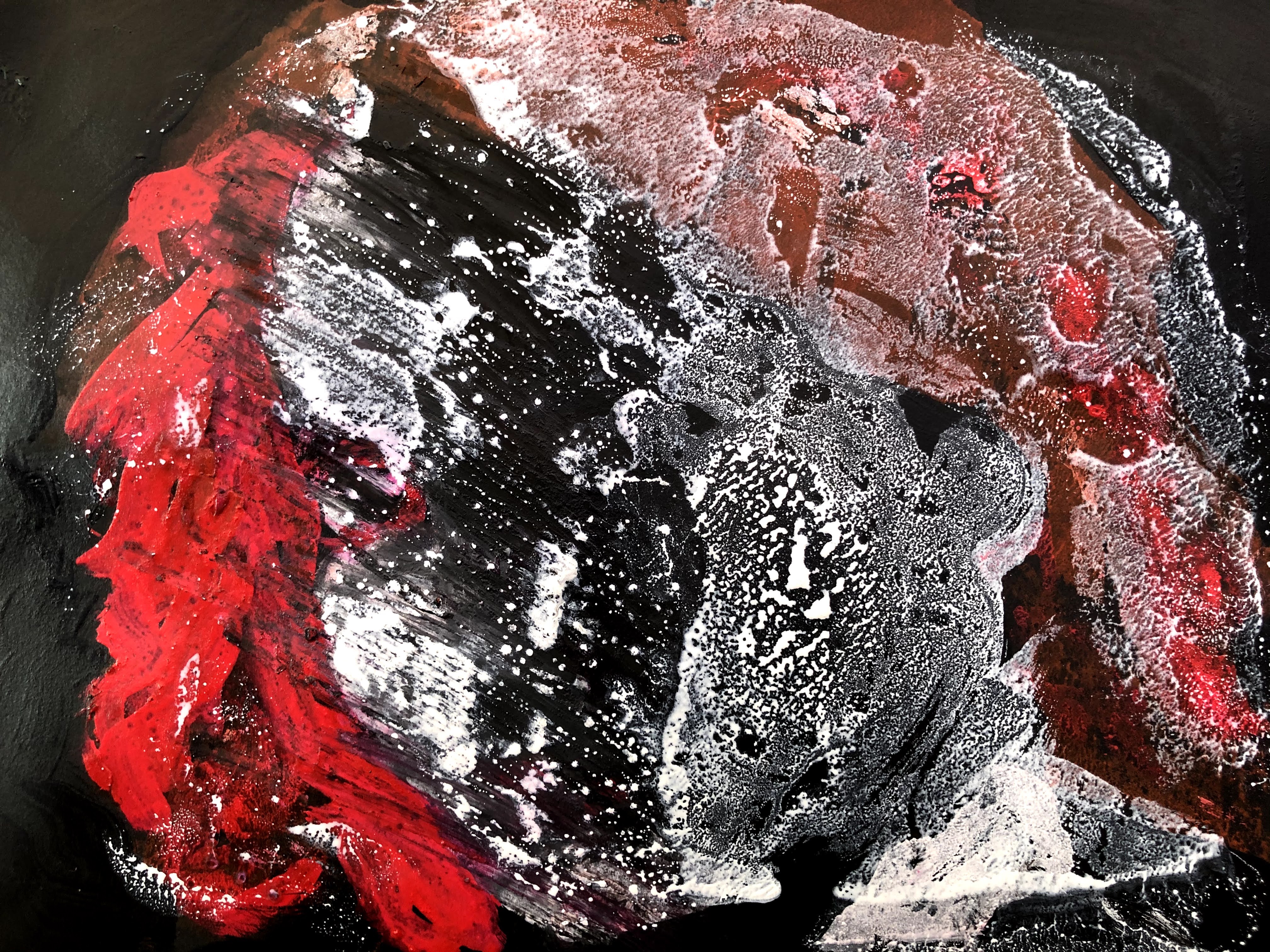
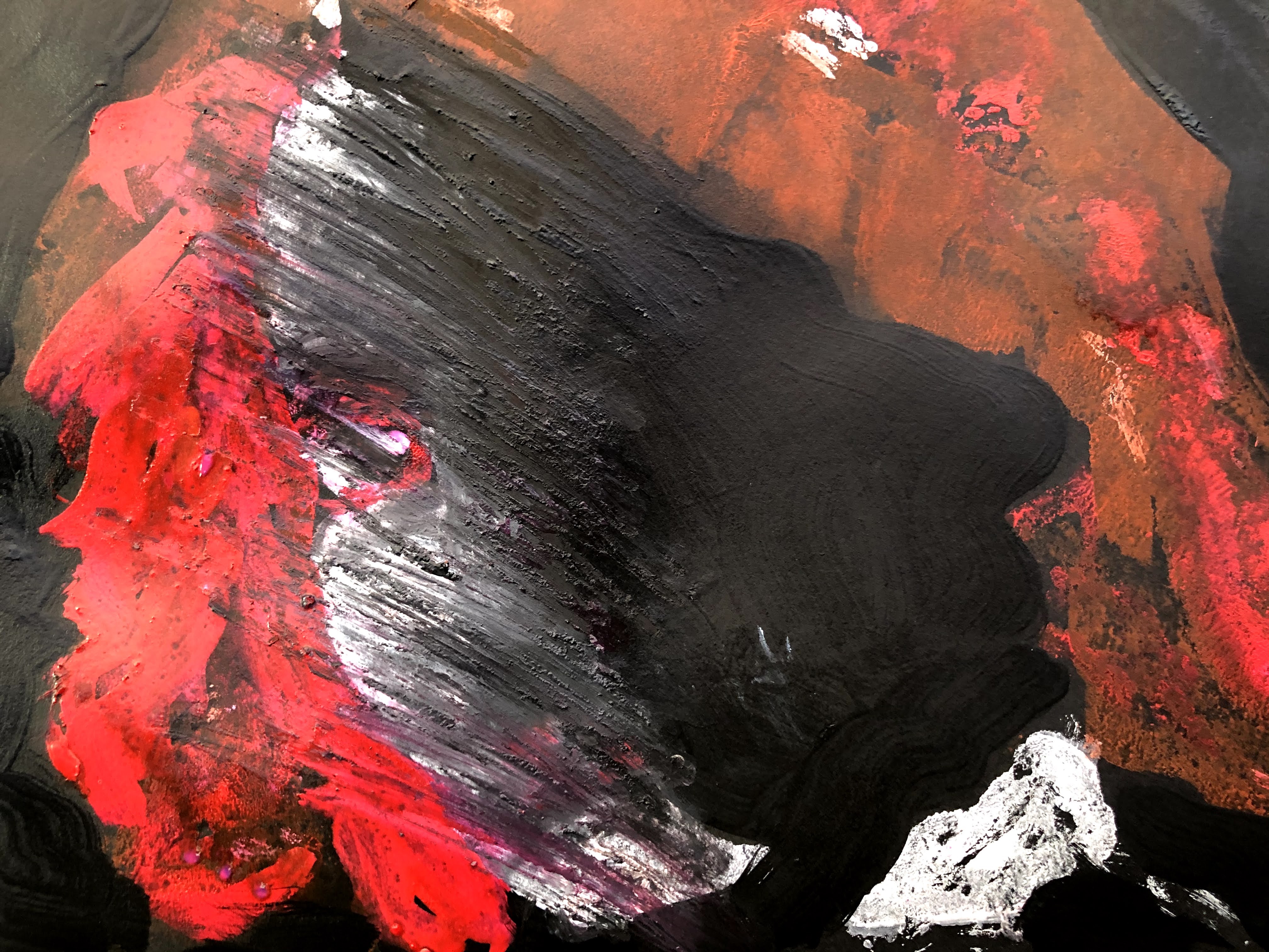
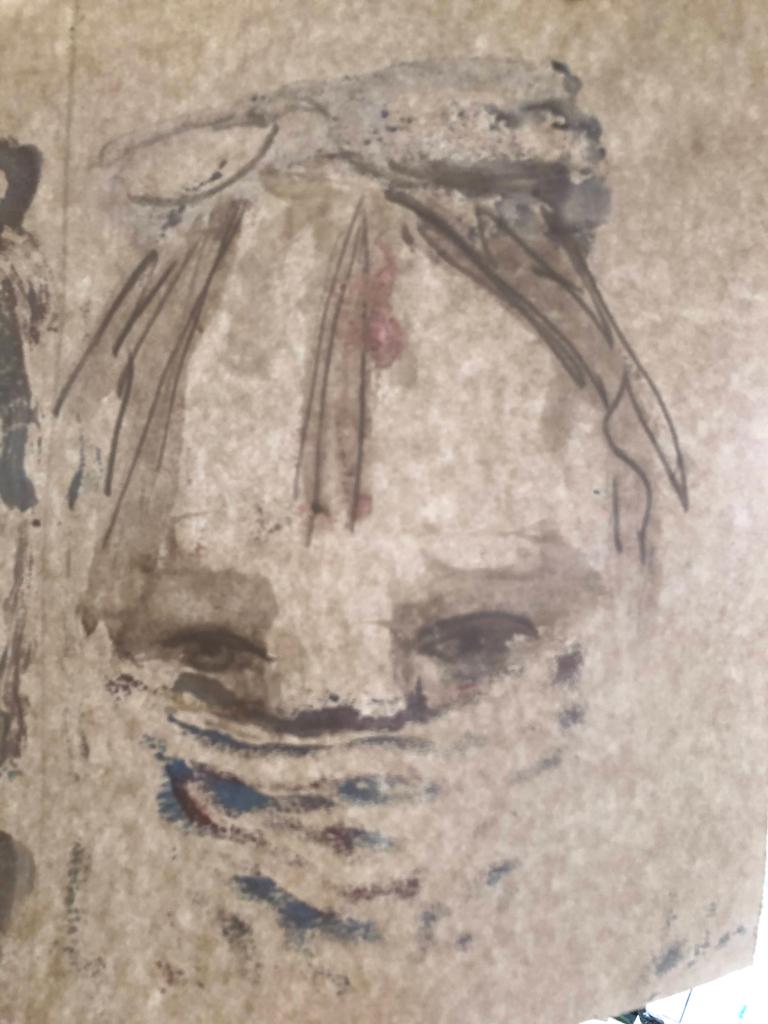
This is the batch along with the photographs I used. The theme is masks – good bad, and ridiculous.

This was quite good fun and surprisingly rewarding given the trials of the earlier efforts. I wanted to take masks as a theme partly because I already had photos of myself in them, but also because they illustrate the whole mask and face covering debacle.


I’m very aware of a need to go easy on the paint peddle when I try to work some of these a little more. Ideally, I would leave all of them as they are but I think that’s less about judgment than cowardice! Assuming the roof hasn’t fallen in completely by tomorrow, I will take a good look and assess them all for further work.
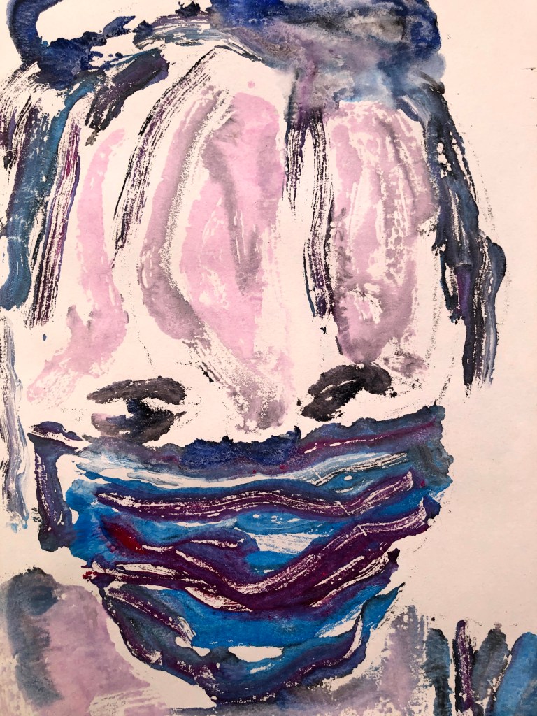
17th October. I’ve got into the habit of pegging the most recent pieces of work to brown string that’s, well, strung along the sill of a high window between the kitchen and the back room, an extension built long before I came here. They stay till they’re solidly dry or something else takes priority. At the moment, it’s the monotypes and their folded mirrors and suddenly I saw the light, literally, through one of them. This is the fold print from the monotype so it’s already depleted and now it’s also lost its colour. It’s a shadow, the fabric of the paper is almost stronger than the paint marks, and it’s ghostly, which is appropriate for the time of year. So many reasons I find it much more interesting than the rest and totally serendipitous.
Now I’m seeing this onscreen, which always gives me a different perspective – possibly by creating a distance between me and the physical piece so it’s possible to see it more objectively – I’m beginning to think of how to use this kind of transformative action to better effect, and quite by coincidence, I have just now seen the work of a Brighton MA Fine Art student’s graduate in her online show. Josie Taylor uses photography primarily to make her work, and her show comprises images of trees printed on tracing paper and hung away from the wall. She talks of them as having an appearance of Japanese calligraphy and I can see how something similar might work with my fold prints.