Part 3, exercise 3.1/3.2 – making a monoprint from a self portrait or portrait
The options here include a photograph of myself, of one found on the internet, or of one of 20 ink sketches of myself via a mirror.
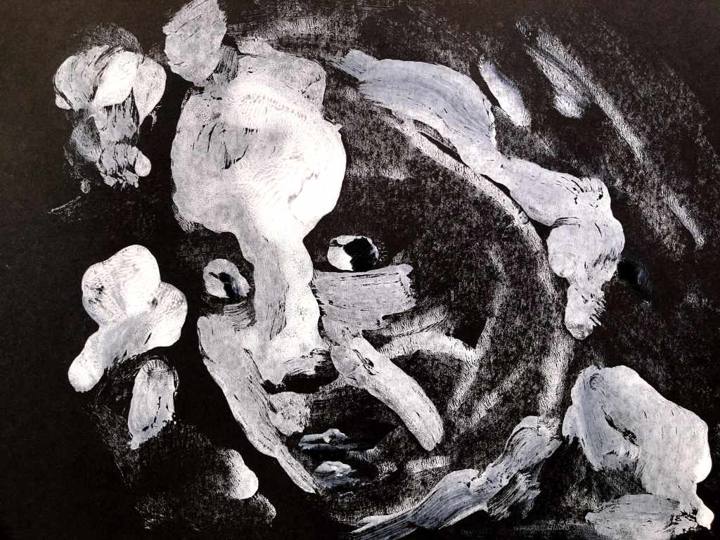
I chose to use a photograph taken by a friend many years ago because I like the deep contrasts he achieved. His job was actually to photograph fossils for the Natural History Museum in London but on this occasion he got to the specimen before that happened!
Original photograph. Credit: Phil Palmer circa 1980Painted OHP plate. Acrylics + drying retardant.The monoprint is on the left in this series, the images on the right are made by folding the paper over the print. The result is a dryer, more sparse print that exposes the more heavily painted areas on the OHP film.First mono print on black cartridge. I chose this because the photo is dramatically contrasting and I wanted to see if I could replicate this. The marks are interesting and quite definitely reveal a face.This is the fold-print of the mono above, It has quite an evil look to it, aided by an unintended gash of a mouth!This is the second mono following an additional load of paint onto the film. I had blotted more into general shapes and highlights this time to see how that translated. It’s a little scary!This is the fold-print from the previous mono and instead of scared this time the face seems worried. This is one of the more interesting of the outcomes, I think. Sparse and with strong contrasts.This time I printed on white, rather flimsy cartridge to see how the black/white palette worked in this context. I’d also sprayed the film with water to make the paint more loose. The result is somewhat amorphous and indistinct, but because there are eyes, it becomes a face.This is the fold-print from the previous mono. I like the textures here – bumpy, striated, almost cracked in places. It reminds me of faded paintings on crumbling plaster.This is blue sugar paper and I’m surprised at how this lifts the image. It’s another surprise success from what was an impulsive choice.The fold-print I think is equally interesting due to its sparse, minimalistic marks. It seems to say a lot with very little.This is the set as a group.
I’m going to think about what I might add to these – all or some of them. I’m tempted to leave the very minimal ones alone and perhaps just add a few painted or ink-drawn marks on some of the others.
Tiny touches of fineliner to three of these:
This really just adds a note of definition here and there. I think I might have been channelling the 1960s in the first and third of these; it was ubiquitous – not quite Beardsley, not quite stained glass, and not quite uninfluenced by exotic substances much of the time!
What do I take from this? I think it’s that there is value in a technique that places a degree of distance between the painted image and the outcome. In this case, there is a second degree of distance with the subsequent prints made from the first prints and I’m drawn more to those in some instances than to the monos because of how rudimentary but essentially communicative they are.