
The task is to complete twenty paintings of the found images used earlier in this section, the size and support to be a consistent 6″ x 6″ HP watercolour paper. While completing the previous exercises, I began to realise that I really should have selected for ‘paintability’ rather than personal relevance and so I have substituted a few.
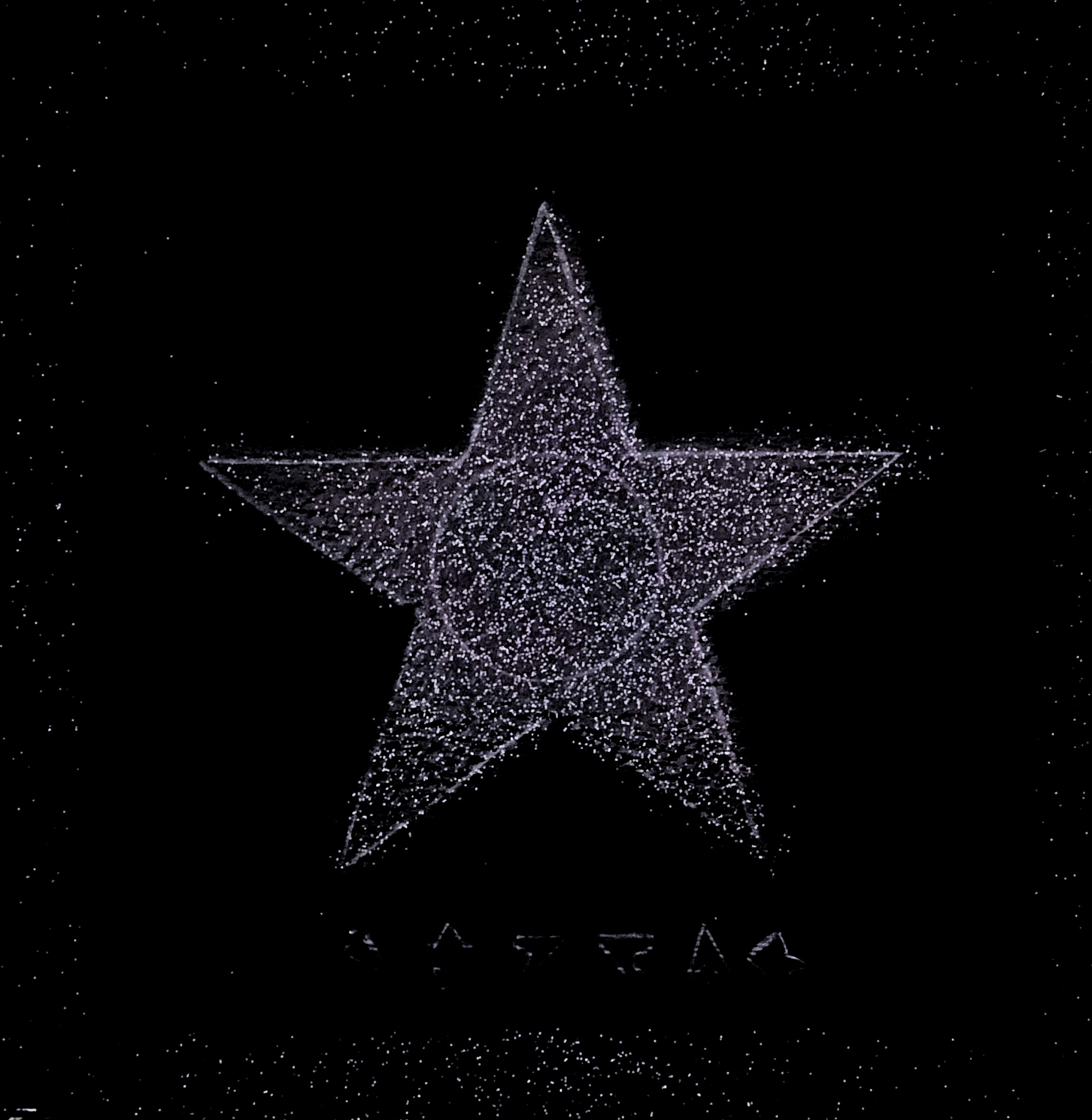
28th August. My first substitute is this, the dramatic Black Star album cover which was impossible to photograph because I have not removed the film wrap. I have every version of this album, Bowie’s last, but the CDs are white with the black star in the centre and nowhere near as deeply affecting as the vinyl. This image has shades of black, some of it with a slight gloss, and people are still decoding the hieroglyphs at the bottom.
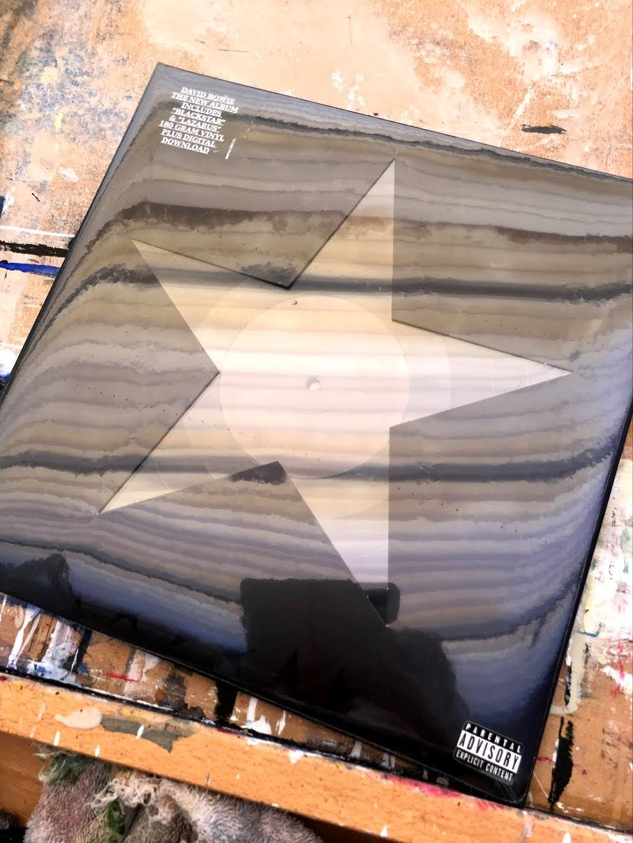

To make my image, I used the best photograph I could find on the internet then cut out the star to use as a stencil on the black primer. I had applied this as thinly as possible (after Barnett Newman, painter of zips) so that it would leave a smooth surface. Then I used the card with the star missing as the stencil and sprayed glitter paint into the space. I let this go wider so as to leave an area of plain black around the star itself, echoing the layers of black on the album cover itself. The glitter and the way it spreads a little beyond the star, I think of as Bowie’s universe.

Solution: I’ve run this through Paintshop Pro (like Photoshop but a great deal cheaper) to pull the black up and reduce the pink tinge. To my eye, this is much closer to my experience of it in reality.
29th August. Second painting. For this, I chose one of Henry Moore’s sheep drawings from his sketchbook. I hadn’t known Moore for anything other than sculptures until I saw this and then I could see how his 3D mind was working – these are wire frames in biro, 3D computer models on paper. And they’re sheep which are the most inscrutable of animals.
This is the pair. Mine is in watercolour pencil drawn into puddles of water and allowed to flood at the edges. My sheep has more of a dome to its head, clearly the Einstein of its flock.


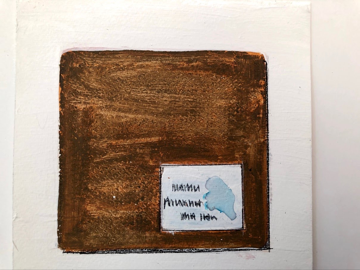
This pair is an envelope full of cards and information about exhibits at Brighton University’s MA show last year. I went with a friend and we grilled any graduates willing to be approached about their work. These people from the inclusive arts programme were the most forthcoming* with information about the work, who they collaborated with, and what the point of the pieces might be.


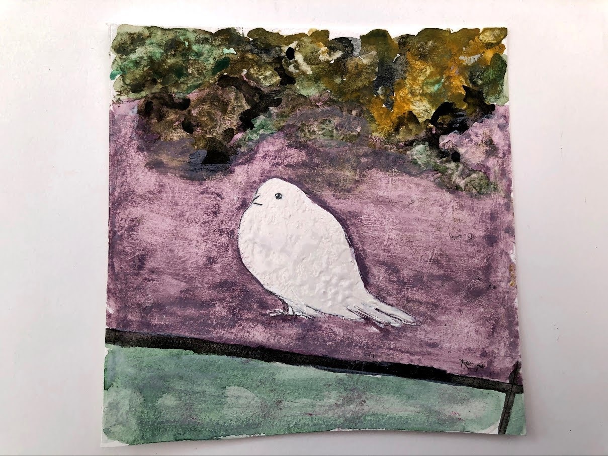
My aim with this picture was to simplify what is actually quite a stark image – that bird stands out (probably to its detriment if it was an escapee from an aviary) and I wanted to emphasise that. I had Brian Alfred in mind with the palette and the slight shift towards the graphical, but the brushwork is intentionally variable and untidy although I picked out the bird using a stylus to give it prominence and I’m in half a mind to give it a kind of Mondrian frame of black lines. This might happen or it might not!
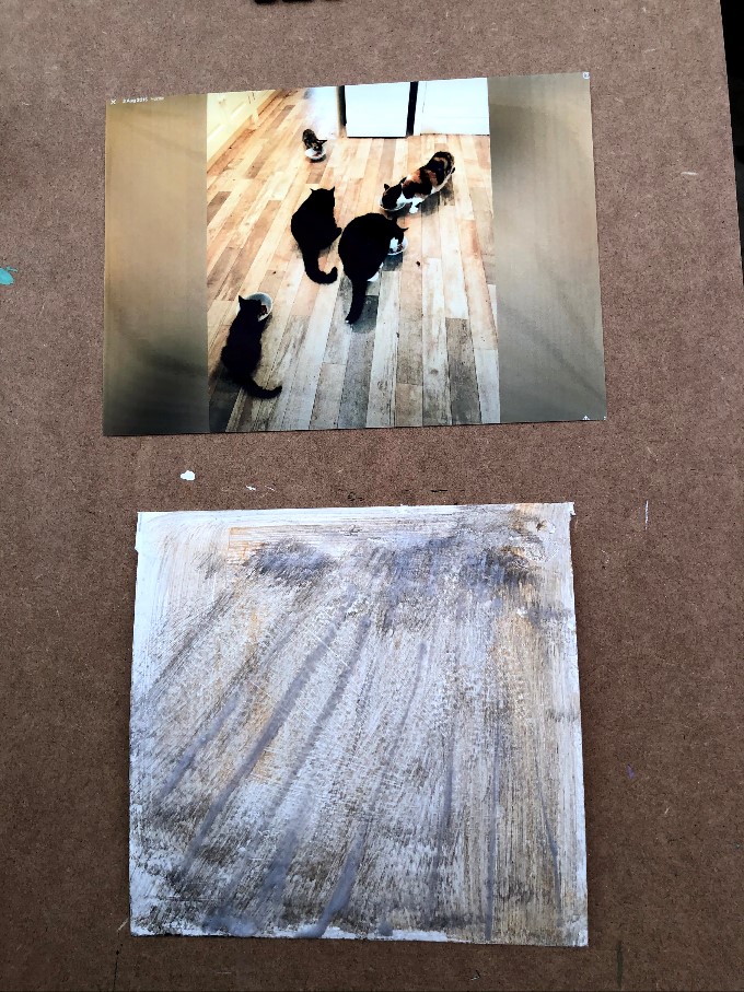
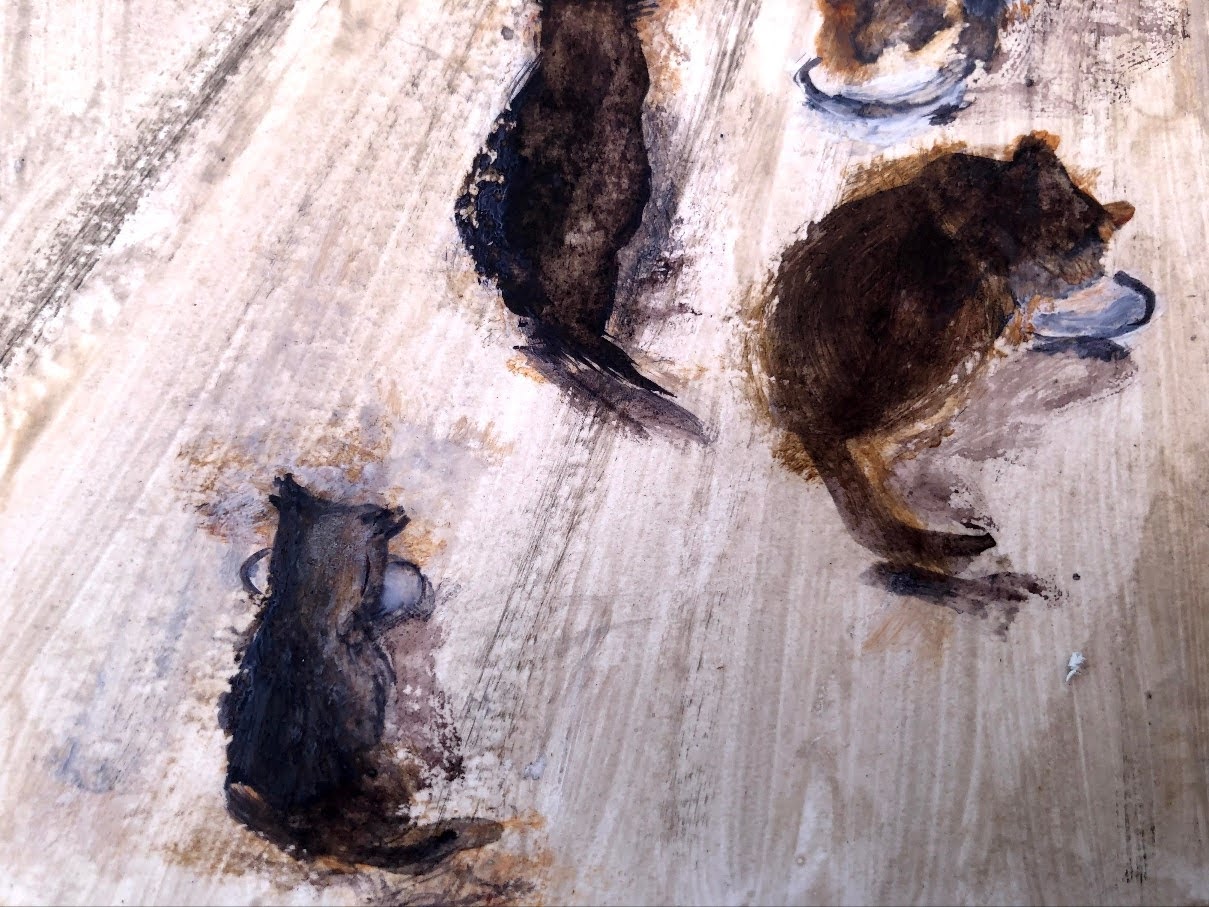
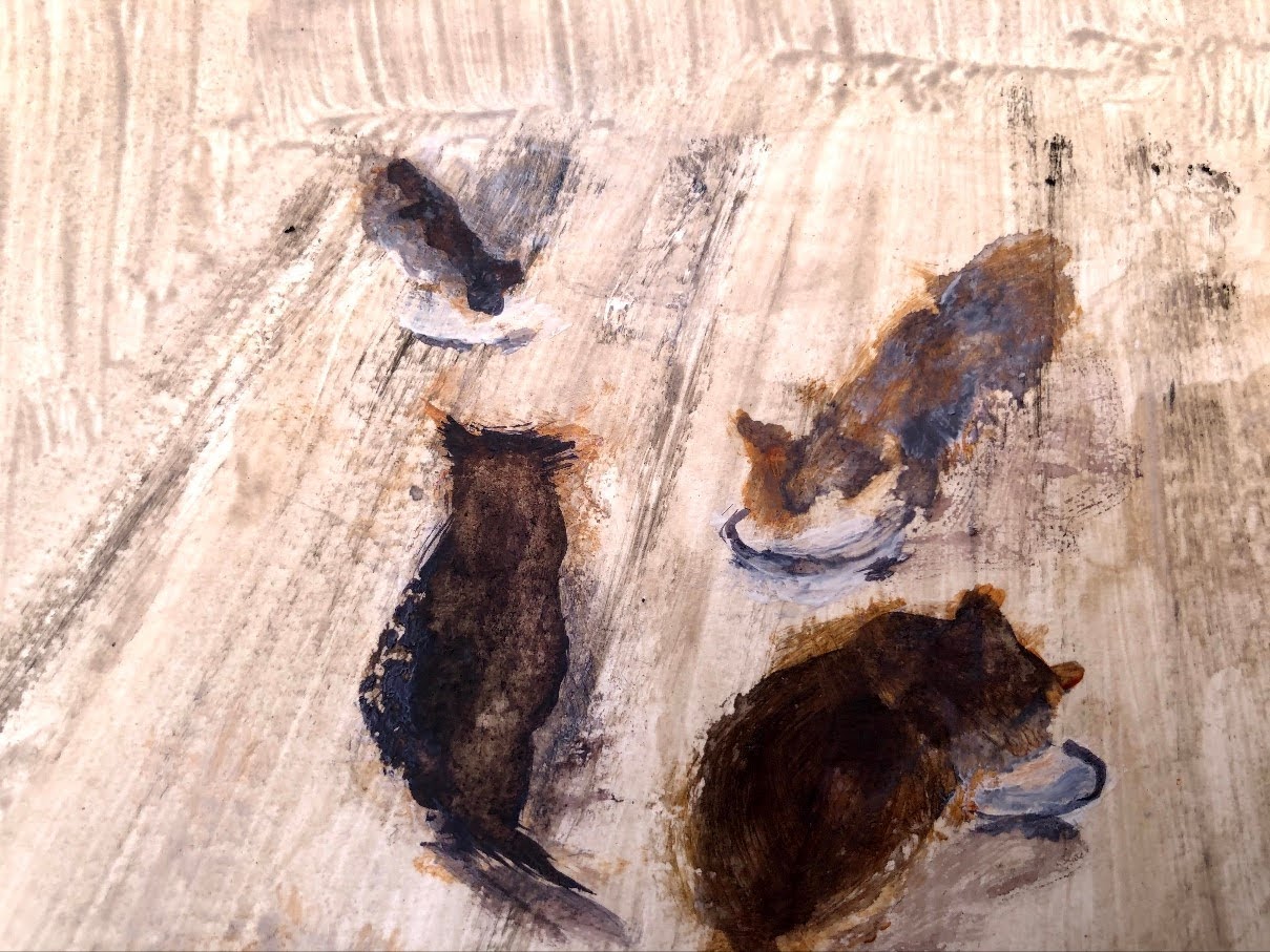
I haven’t tried mixing paint with wet polymer gloss but it will give me a water resistant surface which, if I remember from some of the earlier exercises, is likely to give rise to an interesting process. There are pigmented smudges up towards the top, I wonder if artistic licence permits shifting all the cats up there. If so, maybe that’s the painting.
30th August. The ‘ghost cats’ were definitely not it but the technique was so I used it again on a fresh piece of HP paper.


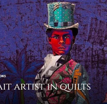
I used dilute Payne’s grey to make this image, the outlines drawn in fineliner. I was looking for a graphical appearance, almost a print. Butler’s work is actually quilts and so there are clear sections which she emphasises with borders and juxtaposed colours. They’re impressive and not only for their colours but for their intent; these works are designed explicitly to give Black people the dignity they’re often denied in the real world. I’ve added one colour, a bit of a cliche maybe, but I wanted those eyes to be illuminated. I quite like the effect of the watery drift in the unlined areas at bottom right, I was hoping this might give a sense of both foliage and shadow. I was also keen to stop at the right moment and I feel I might just have missed that by about three blobs.
Birthday card.


31st August. Before this dried, I was doubtful about it, but now, with its faint sheen, the texture has emerged and I quite like it. I’m not sure I translated the long-ish rectangular shape into the constraints of the square though so I might take another crack at it later.
Meanwhile …


Again, I found the translation of rectangular image into a square one tricky, and smooth edges where there is such a contrast was always going to be problematic. The biro lines are there not to mask the overlaps but to emphasise them while at the same time providing a solid anchor. The paper buckled and couldn’t easily be held still. Annoyingly, the varnish straightened it out.
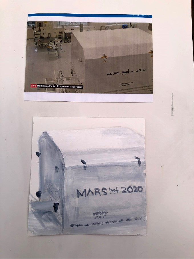

I found the shape of the container ridiculously challenging – that slope from the flat top down to a vertical was somehow elusive as it has been in the past. I may have delivered it by tonal changes and the locks but I can’t escape the fact of the perspective on the slope which seems to be a persistent issue.
The rover itself is here because I had watched it being built since autumn 2019 on NASA’s live stream. Its departure was quite a moment but not as much of one as watching the launch in July between tight fingers, and nowhere near as much as the landing will be next February.
This is the tenth of twenty paintings. Blackberries, home grown (in my garden anyway), and I managed to get some before the birds.


This is a weighty exercise and so the next ten paintings will appear in a separate post.
___
Moore, H. Henry Moore’s Sheep Sketchbook. Thames and Hudson, reprint 2017.
Bisa Butler. I discussed Butler and her work on my PoP blog here.
The Kemlo series was written by Reginald Alec Martin under the pseudonym E.C. Eliot. They were published between 1954 and 1963. Our library, which visited on a Saturday morning, had them in 1956 if not before, which makes that librarian a pretty progressive individual.
*The most communicative were the digital arts graduates – interactive and participatory, full of enthusiasm for their multi sensory work. The Fine Art graduates though were mysteriously unaware of any need to tell anyone anything but did so very willingly when asked.

One thought on “Assignment 1: 10 of 20 paintings of found images”