There are two main parts to this task, the first being to review all my landscape paintings to consider which have been the most appealing.
This is my collection from the current module and what strikes me is the colours; I am not subtle! With the exception of the hand sanitisers (group 2 – large image), the piece of wood (group 3, top left), and the two sea front pieces (group 3, top right and bottom left), they are all some way off naturalistic. The ones that appeal to me most from a visual point of view are the hand sanitisers because that was a re-purposing of an existing painting (Evening landscape with two men by Caspar David Friedrich c 1830/35); the rather other-worldly landscape from my own photo top left in the same group; and the final one (group 1, top left) because of the relatively close approximation to the reference photo but with a selectivity and palette adjustment I wouldn’t have made before. I’m quite fond of the first two swans (group 1, top right) too but that’s hardly a landscape!
I have often made two pieces in response to an exercise and almost always the second has felt better. Exceptions are the landscape in group 1, bottom right because I didn’t feel I had pulled off the impression I had in mind and ended up over-working it; and the fragmented piece using, literally, the palette I had used for the first (group 2, bottom left) which is so wildly different from the original that I don’t know how to classify it. Quite where this leaves me in relation to this assignment isn’t clear, but I know that every one of these pieces has built on every previous piece and I expect that will be the case for the assignment.
The second requirement is to make a landscape painting of ‘around 90 cm x 60 cm’ which is about the size of an A1 board (84 cm x 60 cm). This can be begun in situ, that is, outside and completed indoors, or it can be built from previous studies, reference photos, and notes. Working outdoors which would be an issue even without a pandemic but the size requirement is not an issue as many of my ‘sketches’ are A1. I am considering some way of addressing the ‘or larger’ component of the instruction; can I make a larger piece by painting a number of smaller pieces to be assembled, or maybe find a way to paint on a roll of wrapping paper taped to the door?
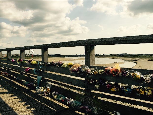
Searching my stock of photos, I came across some from 2015 that changed my ideas about what to do. They’re of the memorial flowers on the footbridge at Shoreham-by-Sea that appeared in their thousands overnight following the crash of a display jet onto the A27 which killed eleven people, and I wanted to go with that as the focus rather than an experimental effort.
The people, all men, killed were in their cars or on bikes at the traffic lights waiting for green. One man, a chauffeur, had let someone in ahead of him just moments earlier and that person got through before the lights changed to red. The drivers travelling east saw the whole nightmare played out before them.
I know these traffic lights well; just the week before at the same time of day I had been waiting there with my two newly adopted kittens going for their first vaccination boosters, their carrier strapped into the passenger seat. I still wonder what I would have done if I’d seen that jet in my rear view mirror; could I have got them and myself free and out of the car, would I have just saved myself, or would I have stayed with them because I couldn’t free us all?
The fifth anniversary will be on August 22nd.
This is a crimson/burnt sienna wash on a white gesso surface. The size is A1 cartridge.

The sky on the day was a deep blue, a perfect summer day, so my plan is to use that instead of this later, paler sky. I also want to manipulate the way the wooden structure of the bridge appears, to adjust the focus as it were and aim it at the area tight to the left of fourth gap which is close to the site of the crash. I may shift the whole thing down and left so that there is closer to two thirds sky and less bridge so that the glimpse of landscape – the Adur estuary – is in the where the eye falls even though it is quite distant. True to the spirit if not the actuality. I really don’t know how easy this will be. What I do know is that I need to get some background in before I start detailing anything in front of it.
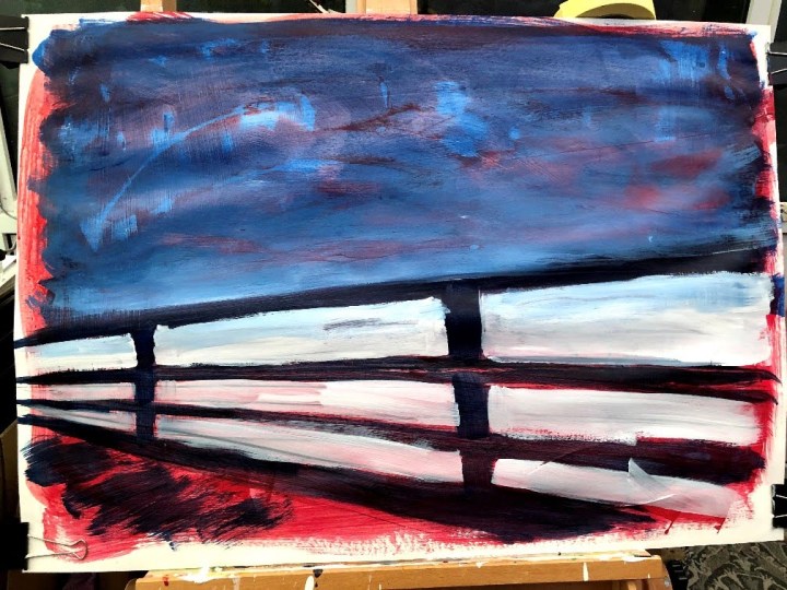
Wandered temporarily into Munch territory a bit here. The intent was to get some colour into the sky areas and fix the bridge woodwork so that job is done. Phthalo blue which has a reddish tinge, and titanium white. Washed on and scrubbed with a flannel while wet to pull back into the red and the gesso base.
I’m really not liking this at the moment! Admittedly, it’s like being caught between track suit bottoms and no make up and your full-on posh frock and hair-do but still. What I want now is to make the bridge almost transparent, maybe even just a ghost and an outline, with the estuary and skyline the key features. That’s going to mean getting all of that painting to a finished quality before doing what would normally be the detailed foreground.
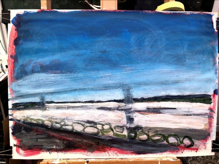
I may have gone full war artist now. The plane was a Hawker Hunter jet, ex-military, which may be how the sky has become almost populated with munitions, the estuary is a wasted landscape, and the bridge has vanished. This last was intentional prior to putting it back in as light lines but now I’m not sure about doing that. The colours are redolent now of the RAF.
Clearly the image is an imagined one, or at least the overlay is because I wasn’t there at the time. I have seen photographs but I haven’t used them for reference. I’ve also changed the directionality of my gestural strokes in parts of the sky, my usual as a left-hander being left to right downward, because I wanted marks reflecting the flight of the plane which was east to west – right to left. Because the first marks are still visible, this has left a crisscross effect which is really quite war time in my mind.
So, do the bridge and the flowers go in or do they stay out? Or do I just consider this a sketch and make another? My feeling is I have nothing to lose by making a second version, especially as my ‘seconds’ often turn out to be better.

First a semi-transparent border and a crop to tidy things up. Still a bit grim though; I’m not Turner yet, am I?

After a bit of reflection I think I can see why this is so problematic and the main reason is that it isn’t really a landscape, it’s an emotionally charged image, much of which I have had to generate mentally, and I am not up to the job of doing it justice. There are some odd moments that I quite like – parts of the sky and the estuary, and the stark line of the horizon – but the rest is something of an artistic wasteland. I need to find an image I am less invested in.
Meanwhile, and with nothing to lose, I imported this into Rebelle3 to try out some adjustments and additional layers. Again, imagined.

On the grounds that it’s impossible to ruin the irredeemable, I’ve followed the digital experiment and put in the bridge structure. There are no flowers because the jet has only just crashed. Tomorrow, an actual landscape.

I found another photo taken a few years ago; a classic country village scene which I would be aiming to brighten up as I had a previous image. I would also like to be selective about the scene but cropping it (this is an A4 print) changes the aspect ratio and would mean it then not translating to the larger A1 support in anything other than letterbox format, which would be smaller than that required by the task. Ideally, I would have the bottom quarter/third out, leaving the boat/bridge complex in the lower third of what remains and the expanse of bridge taking up the mid-ground. If I were taking this shot again (and also if I were a goat) I would be much lower on the bank near the water so that the boat, while still some way off, energises the centre right and lower area of the composition.
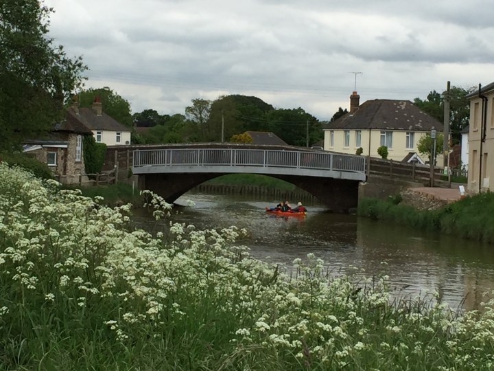
I wonder, by a process of elimination in that it would not be portraiture, figurative or abstract, does that window of boat/arch/banks/foliage qualify as landscape? That seems to me the most appealing part of this image and has the most dynamism. I’ll take the risk and go with that because it’s that part I can feel.
I think this has potential. White gesso + some pumice medium in the foliage area, Payne’s grey wash to key blocks. I wonder if I can keep it this loose and fluid.

Payne’s grey, Naples yellow, titanium white, Hooker’s green in mixed washes and more solid patches roughly applied and wiped when almost dry with a piece of flannel. I need to proceed very carefully now; this is a style I haven’t tried before and that has come about just by ‘getting some paint on the thing’. All the colours are dialled down and there are some ‘moments’ – the cottage tucked up against the left margin and the side of the house right of centre. Also some anti-moments – the house at the right margin and the edge of the bridge structure on the left. That’s over and above the fact that this is early in its development and there is a lot else to do yet.
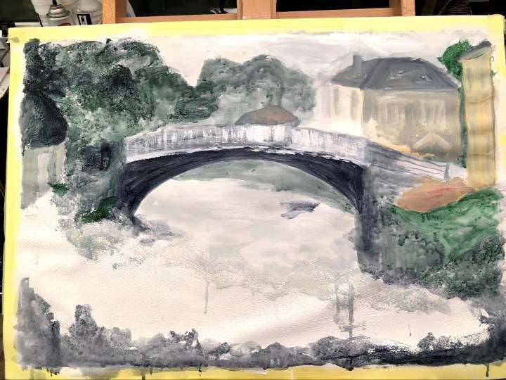
Another day, another pass with dilute medium. I have really simplified this picture, leaving what detail there is to the foliage in the foreground, applied with a broad flat brush (sap green), a toothbrush (Hooker’s green/Payne’s grey), and a stencil brush (titanium white + Naples yellow). One of the background trees looks like a stereotypical mountain and needs fixing, as do some of the nearer trees that are lighter than the more distant one, but the building at the right margin is improved I think. The boat may be a bit smaller than it is in reality and possibly needs muting a little; and there’s a ‘glow’ at the end of the bridge under the house. I have trouble depicting light so before I un-depict it, I need to take a good look at how that happened!

Glow detail: unadulterated Naples yellow on white gesso.
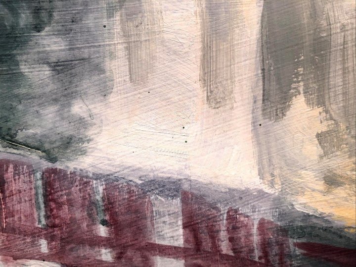
Quite a lot of the structure of the bridge and the two banks is less than accurate so that locals would wonder where a wall or a cottage has gone. Nevertheless, there are parts that work and still some that don’t and I’m reaching the point where I will end up a mish-mash of inconsistent styles. I can see three even now. And the pathway to the right seems to be shot through with blood vessels. My plan is to tackle the glow, slightly un-mute the boat, deal with a gap between the bridge and the path on the left, and turn that piece of liver back into gravel. Then I will consider it done and think about whether or not to try again with a different style. I have to admit, finding out about the variety of styles and techniques and having them begin to influence my own work is a bit like being let loose with a dressing up box and trying not to end up with a tiara, rugby scarf, and wellies over your Nan’s old dressing gown.
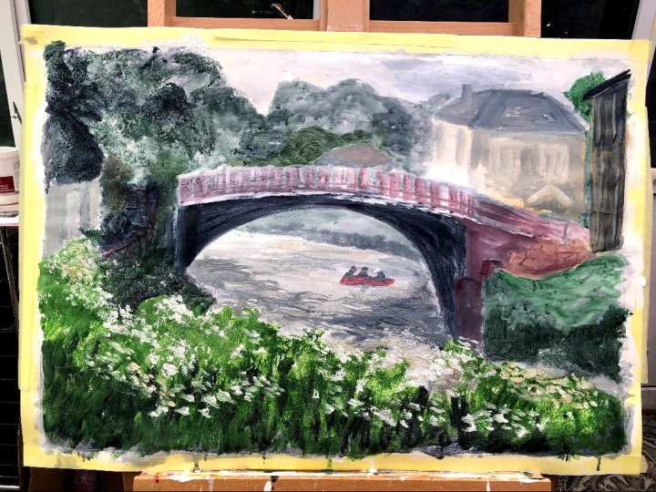
I’ve seriously lost interest in this now; I think I prefer the very first iteration where it was just wash and gesso. Back to the dressing up box tomorrow.

Round three. I have painted this scene twice; it’s called Tin Pots Hill and I see it whenever I walk down the river path. I discovered later that the tiny dots on the horizon are pigsties and downwind of them the air is quite ripe so they are not very popular.
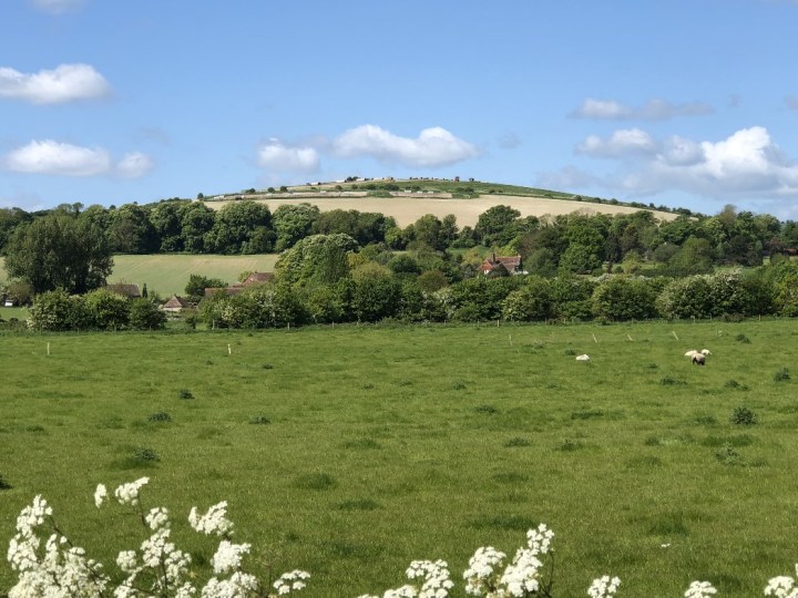
First pass. Titanium white base (learning from where the mysterious glow came from in the earlier painting), then Sap green, Hooker’s green, cad yellow, Naples yellow, and Payne’s grey – some mixed with mixing white for tint. Tomorrow I may just even up the edges on the left, add some darker wash to the base of the top mound, and very softly lighten the tops of some foliage and deepen some shadows. Then, for better for worse I should leave the darned thing alone and decide which of the two should be the actual submission. Not the bridge, definitely not the bridge.

Today I have washed some darker pigment into the tree/shrub line just above the field and added a tiny amount of magenta to an area mid-right both to reflect a couple of trees at that point and also to create a slight diagonal down through the roof tops towards the lower left. I am calling this finished because I know if I fiddle any more with it things will just go downhill. No pun. The line across the centre on the right is a crease that was present in the previous photograph but seems more pronounced in this one, possibly due to the different light direction and intensity.

I have a strip of duck cotton left over so harking back to the good old days of pressing the ridiculous head gear nurses were required to wear, I took a risk that pressing this through the spare strip would remove the crease. It did, but this stuff has a memory and it springs back and I’ve caught it here just before it fully reappeared. Another lesson learned – iron this stuff before you start and make sure it understands resistance is futile.
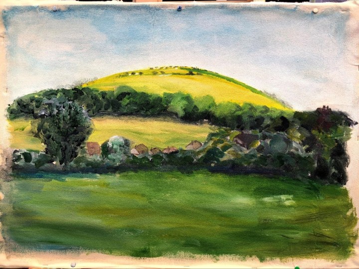
Looking at all three paintings, each very different in subject, degree of adherence to a reference photo, and execution, I am choosing this one as the assignment submission. It may be significant that I’ve painted it before, and I’m pleased that this version, larger than the others, feels more studied but also less constrained. I like the middle tree line for its lack of definition, and the unembellished roof tops in the mid ground. I would have fiddled with those in the past. Similarly the hint-of-sheep in the foreground which previously I would have tried to render more clearly.
The top mound of the hill is too big and too high and some other aspect are less true to the reference than might be ideal. I think, though, that it would be recognisable to anyone who has stopped to look on the same path I’ve stopped to look so many times, and hope to again when the current threat is gone.
Finally, there should be consideration of what, if any, has been the influence of significant landscape artists on the work itself.
This is difficult because I have a tendency to absorb imagery without labels so it settles somewhere in my unconscious ready to exert its influence but without telling me where it came from. I can see some impressionism but none of the bold outlined German variety. Also, despite being brighter than the photograph, no hint of Fauvism which I had almost anticipated as being influential. It’s definitely contemporary; an essence of landscape rather than a documented one. Perhaps it’s a fusion; that confused state between trying to mimic other work and finding a voice of one’s own. A glance at the three paintings here probably show just how confused that is!
Meanwhile, I watched a video about Whistler by Tim Marlow yesterday and was surprised to find he liked to work much as I do, dragging medium across the support and building colour by mixing on the canvas itself. Personally, I’ve become a fan of the dirty brush where two, maybe even three colours, can be applied at once and either left to create lines of light or shadow, blended while wet, or left to dry and scrubbed back to leave intermittent patches of residue behind which make their own texture. I know I’ve seen some of Whistler’s work in various books; perhaps I picked up some of his ways of working and stored them for later.
___
2015 Shoreham Air Crash. Wikipedia. [online] Available at https://en.wikipedia.org/wiki/2015_Shoreham_Airshow_crash Accessed 7 June 2020.
Remembering Shoreham. Shadow by Lyn Jennings, Ducks in a Row by Suzanne Conboy-Hill. Audio and text. [online] Available at https://readalongreads.com/2016/07/31/remembering-shoreham/ Accessed 7 June 2020. From the anthology Let Me Tell You a Story 2014. Suzanne Conboy-Hill [ed]. Waif Sands.
Marlow, T., Great Artists with Tim Marlow. 2003. Amazon Prime. [online] Available at https://www.amazon.co.uk/gp/video/detail/B07FNT8TRH/ref=atv_dp_season_select_s2 Accessed 13 June 2020.


