
There is only one exercise requirement for project 4 and as things stand, it’s impossible to achieve. Working with photographs is the next project but, as with many instances during this course, I’ll need to do that here. I’m going to add that even without current lockdown conditions, I would struggle to take any equipment into an outdoor space, or to stay there long enough to paint anything, so photographs enhanced by place-memory would always have been my solution. It’s unfortunate but as the saying goes, it is what it is.
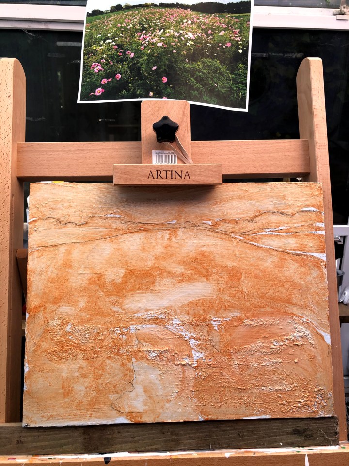
This is a re-purposed canvas that once was a landscape I considered the bee’s knees. I have plastered it with white gesso and I intend to take advantage of the pumice medium down at the bottom in the service of foliage. The photo is one of my own, which means I have a relationship with the location; I saw the scene, and framed the shot. I used to bring my dog here and often it was just scrubby land to the east of the Adur estuary but this time it was covered in almost Pointilistic wild flowers. I seem to have unconsciously absorbed the rule of thirds although these are not strictly mathematical. There is a drifting diagonal from bottom left, and a number of partitioned horizontals near the horizon. The sky is British white – blue-ish, grey-ish, dove-ish.
I have applied a shaped wash of burnt sienna and dabbed/rubbed at some areas to get a feel for the scene’s structure which I’ve marked out lightly with black conte. Sometimes this is the most daunting point in a painting’s development, sometimes the most exciting, but what I’m beginning to find is that these are one and the same, the one being just a little more what was I thinking starting on this? than the other.
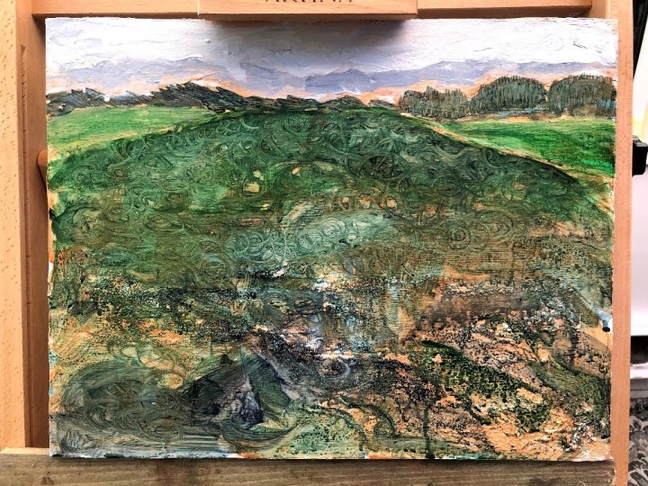
It’s going to take some guts to put those flowers in now! I have washed another layer in various mix levels of Hooker’s green and Payne’s grey, leaving small margins of burnt sienna to show through. Using a technique I discovered while painting fancy lockdown pebbles to leave outside for people, I have swirled shapes into the top layer using a dry brush. I found that this technique with the pebbles, when there was a darker layer (green/blue worked best) over a brighter base (gold acrylic was marvellous) gave the surface a look of something from the Sutton Hoo burial site – Celtic swirls on bronze or aged silver. My plan is to use these shapes to contain drifts of flowers but at the moment I am dithering. I’ll need a rescue strategy before I begin, I think.
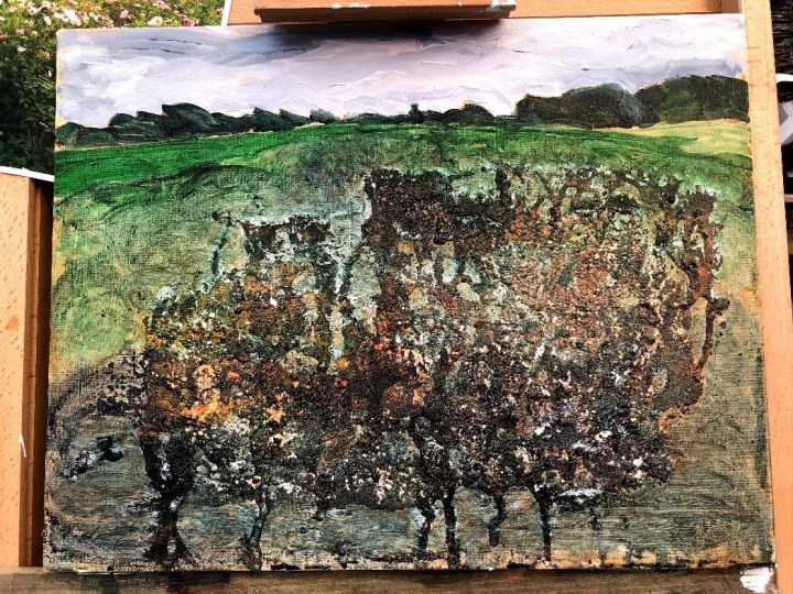
Wash is the rescue and paint with more substance in between dots and dabs for definition. I used dabs of titanium white first to provide a light base for the colours, then began dabbing crimson and Naples yellow into groups of these marks. I’ll look at this again tomorrow but my feeling now is that the pinks need to be muted. I like the serendipitous gravelly area near the bottom – it’s redolent of beach or estuary at low tide so even though that isn’t the context of this image, it is the context of this location.

This morning, I think I’m just going to darken those pinks and reds, add some muted yellow to the centres of a few and blue/black to the centres of some others to hint at the crown.
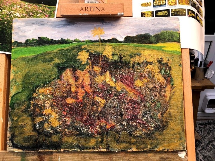
I have added some white flowers, some flower centres, and some stalks, but I’m on the verge of over-doing it now so I will stop even though I don’t have the sense of height that comes from being below the flower heads and instead they look as though they’re on a hill. I do like the tones and the way the burnt sienna wash impacts on the subsequent layers, and I like the impressionistic feel whereby the elements are suggested rather than described. So while some things have not worked, others have emerged that make this a different painting from the one I maybe had in mind at the beginning. Scruffy Millais-esque perhaps. Looking back though, I’m rather more taken by the version without the flowers which has a touch of the Middle Earth about it.

—
___
Of course I had to have another go at this. I’ve used the same sized canvas, prepped with white gesso and pumice medium, the latter applied with a palette knife. I dribbled some PVA glue down the surface to see what effect that might have, then put it in the garden to bake.
As before, I marked out the broad areas of colour then applied a shaped wash of burnt umber before layering up with Hooker’s green, Payne’s Grey, and some Naples yellow. While these were still damp, I made swirls in the wet surface to expose the under-layers. This worked very well in the places the PVA was quite thick because it pulled off pigment down to the gesso. I put in a couple of thick layers of titanium white/Payne’s grey for the sky with another idiosyncratic hand movement I’ve noticed in my self – a twisting, twiddling stroke that leaves edges and drifts behind it. The first layer for the trees is there now too.
What I see now is something like an inverted underground root system made by the pumice and I’m wondering how I can use this to good effect. Part of the brief is to respond subjectively to the image and having earlier been directed towards the surrealists, it would seem that a fantastical interpretation might not be much of a stretch. That bronze buckle feel is there still, as is Middle Earth, and while I have no intention of populating it with hobbits, there may be scope for a Celtic emphasis.
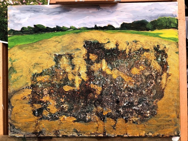
So here we are the next day throwing caution into a strong breeze with a layer of gold acrylic which I’m rationalising in terms of the use of gold leaf by the likes of Klimt. Now the whole image has changed and it’s showing me an underground chamber exposed like a pepper chopped in half. I had intended to wash that and treat it the way I’ve been treating my painted pebbles but now I’m less sure. What happens there will determine whether or not I add any detail to the tree line. At the moment I’m thinking their slightly unreal appearance might be the contrast with another reality happening beneath them.
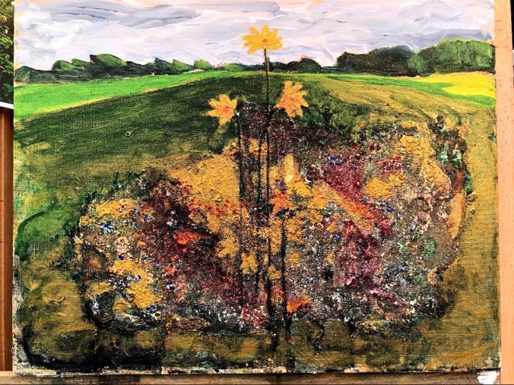
This impression changed as I stood back from it; it had reverted to foliage, albeit non-naturalistic. I cut out some rough, non-naturalistic flowers to assess their placement as symbols of the whole, then applied some alizarin crimson wash to seep into some of the less densely pigmented areas and reflect the garnet often used in the Sutton Hoo items.
I had my heart in my mouth, painting in this central flower head because there it is, up in the sky. The other two were less alarming to paint, being sited on quite rough support territory. The next step will be to add some definition at least to the stalks, and to work some more on the Celtic theme. I think the slightly dampened appearance of the painting in this shot is an artefact of the camera lens adjusting to the brightness being thrown back from the gold acrylic as the sun moves around.
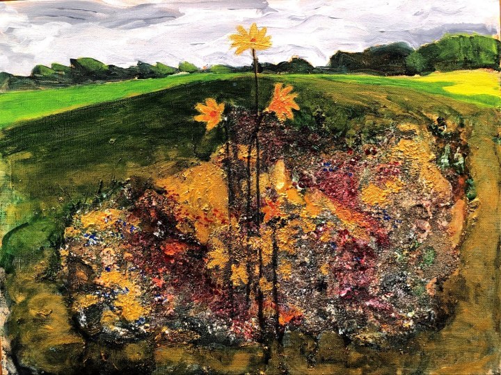
Straightened out and stylised with some blue dots that reflect the blue glass found in many of the Sutton Hoo items.
Different light.
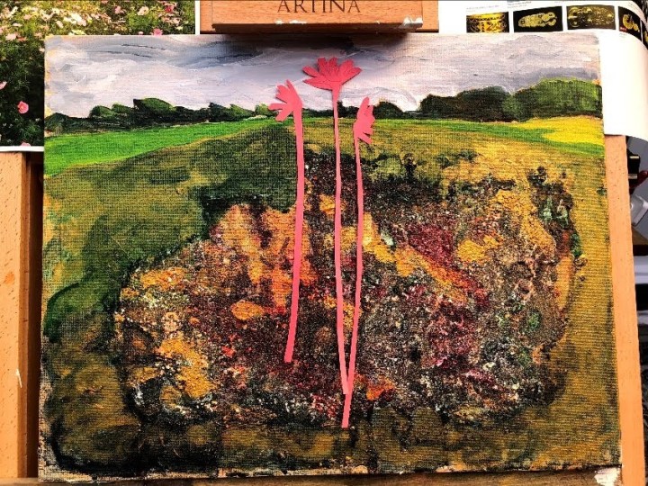
Details.

Two things: first I prefer my original version to this, and second I prefer the collaged pink flowers to the painted ones. In its defence, this actually looks better in reality than on screen. I’m putting the first version forward as the key response to the exercise, and calling this done because I can’t see any improvement coming from further fiddling.
It is undoubtedly a challenge to make a landscape from memory and a photograph, and to fulfil a brief which focuses on the experience of working outside. I think though there is evidence of responding to the available material at levels beyond the superficial, making a painting that is more impressionistic than naturalistic, and using materials that, in the first instance (the re-purposed canvas), existed as entities in their own right originally.
I think I am developing a style or a voice although I can see this will be subject to change at short notice as I experiment with different materials, tools, and influences. This has been fun.
Post script: this painting by Gustav Klimt is one I’ve known in my mind if not by name and looking more closely at it, I can see the swirls I have attributed to Celtic jewelry. Maybe both are true. Plenty of gold there too!
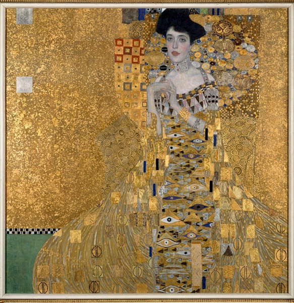
Portrait of Adele Bloch-Bauer 1907. Bridgeman Edcuation. June 2020. Also known as The Woman in Gold, this painting was ‘acquired’ by the Nazis during WWII. It was tracked down and brought to New York by family member Maria Altman in around 1998. A film, one I saw a while ago, of the quest and discovery starred Helen Mirren as Altman.
___
Sutton Hoo. I remember talking about the Sutton Hoo ship burial site at primary school. I doubt we went to Suffolk but I wonder if the artefacts went on tour at some point because the gold belt buckle made a real impression on me. There is a wikipedia page here https://en.wikipedia.org/wiki/Sutton_Hoo, and a picture of the buckle is here at the British Museum site https://www.britishmuseum.org/collection/death-and-memory/anglo-saxon-ship-burial-sutton-hoo
J. E. Millais’ Ophelia (c1851) is a picture I used to sit in front of when I was able to get to the Tate; it’s likely that this was rumbling around under the surface as I was making this painting. Image via Bridgeman Education.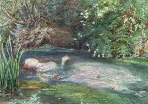
The Woman in Gold: theft. Wikipedia Portrait of Adele Bloch-Bauer. [online] Available at https://en.wikipedia.org/wiki/Portrait_of_Adele_Bloch-Bauer_I Accessed 2 June 2020.
Woman in Gold (film). Wikipedia. [online] Available at https://en.wikipedia.org/wiki/Woman_in_Gold_(film) Accessed 2 June 2020.
Time taken: around ten hours.

I love the textures that you have achieved with the repurposing, Suzanne, and the colors are vibrant and fresh. Well done!
LikeLiked by 1 person
Thanks, maybe Mucky Millais is my style-in-waiting!
LikeLike