
I was very, very pleased with the positive feedback from assignment 3. I’d had a feeling my artist voice was emerging but it’s very gratifying to have that confirmed.
An issue that my tutor highlighted is that quite often my work is graphical, flat, rather than showing volume. This is not a problem if that is the intention but it isn’t and I need to address that without losing the voice that seems to be developing.
Some other areas to address may help with this: questioning my palette more in terms of how to change it, how to choose which of the bold colours I like to use might work with or against each other.
Under-working is another point to pick up and I recognise this totally. How to know when to stop is as important as how to know when to go on. I have definitely over-worked several pieces, and reviewing potential submissions for the imminent Drawing1 assessment, I find I’ve included almost none of the assignments for that exact reason. Too tense, too constrained, too ‘finished’ in a way that stops them breathing.
I decided to go back to basics and paint an apple. This is the same apple balanced on the edge of my easel and viewed from slightly different angles as I moved away to the right. The support is A3 hot pressed water colour paper that is quite substantial but also very absorbent so that paint dries very quickly.

If I ever found an apple looking like this in my fruit bowl it would be out in the wormery pronto! I have been trying different layers, drawing materials such as charcoal pencil, and dilute washes to bring about depth and highlights. Tomorrow, I think I’ll try some black-biro-Henry-Moore-wire-frame drawing on top of at least one of these images to see if his magic will pull out a sculptor’s volume.
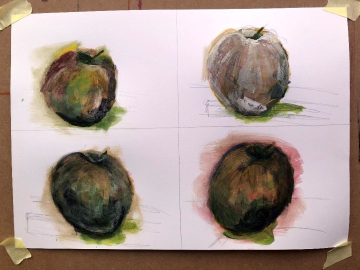
Probably the definition of over-worked so it’s time to leave this alone. I’m not sure what I’ve achieved beyond a number of increasingly grungy putative fruit. If I were to blame the tools, I’d say acrylics on this kind of support aren’t lending themselves to my style because everything sinks into it and leaves no light – hence the touches of white conte. On the other hand, it could just be skill deficit. There’s been some decent practice in this though, so I may take another run tomorrow after finding some expertly painted apples to act as guides.
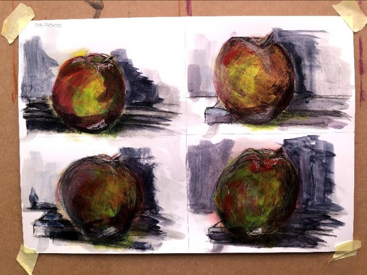
To say this is not going well would be an understatement. So far I’ve produced apples in dull, zombie, and grunge and today it’s an apple disguised as a tomato and a planet. Is there volume though? I think maybe there’s a hint in the lighter scrubbed area at the top and the dab of dark paint at the bottom in the first image, and the deeper tones to the left of the second. I think the contrast with the Payne’s Grey background wash which, with its bluish notes, is complementary to the yellow/orange of the fruit also adds something. I would have liked those factors to be intentional but they were not. Maybe next time.

I realise I was going to find examples of volume – in paintings of apples since that was my target object – but only got as far as Cezanne who seems to put outlines round everything. Van Gogh appears to do that too. Are they line rather than tone painters? I’ll have to do some more research.
Tomorrow it will have to be a pear or a banana because I have eaten my model.
And it’s a pear. Pears remind me of stylised birds with their longish necks and upturned beaks so even with one in front of me, there’s a tendency for there to be more bird than fruit in the drawing.
These are on black sugar paper prepped with white gesso to give it resistance and stop it sucking up wet paint in seconds. The middle one was first, then the one on the right, with the left hand side painted drawing last. They go predictably from tight to loose, even with the outline I was using to reflect Cezanne’s approach.
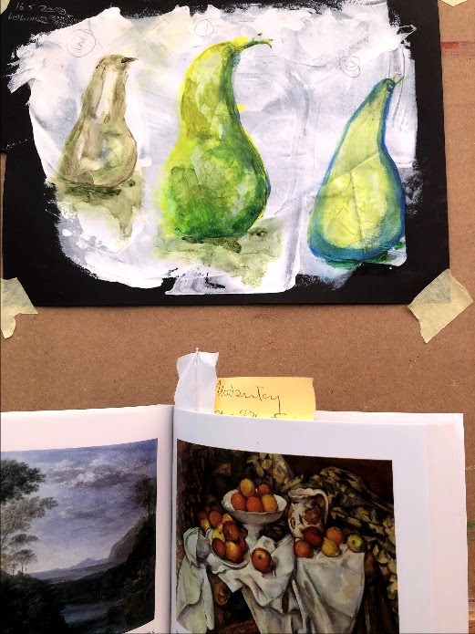
Two is very stylised and looks to me like a 1960s ornament; One has texture but feels over-worked; and while Three looks more pear than bird, I think a viewer would be hard pressed to identify it as such without context. I think there may be volume there though, in One and Three.
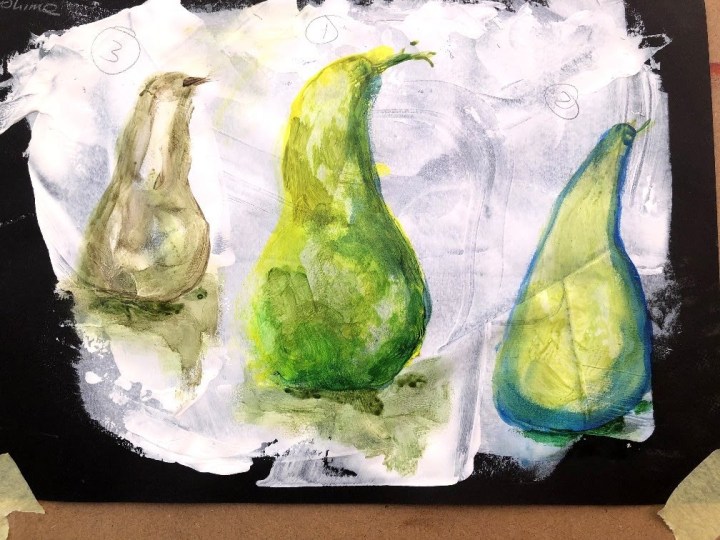
In these painted drawings, I’ve tried to remove myself from the detail even more until in the fourth iteration, the first ‘layer’ is just water with very dilute medium allowed to bleed into the same shapes. The first image has a yellow line round it, made by painting a wide swathe of dilute yellow into the shape then rubbing it with damp towel, pushing the pigment to the edges. After that, I used another dilute wash to make tones within the line and moved these around with my finger. I did much the same with the second attempt but limiting the colours and the interventions. The third is even more minimally manipulated – just shape and wash and a bit of guidance. If anything, I think that one has more ‘pear’ about it than the others, but I like the ghostliness of the fourth.
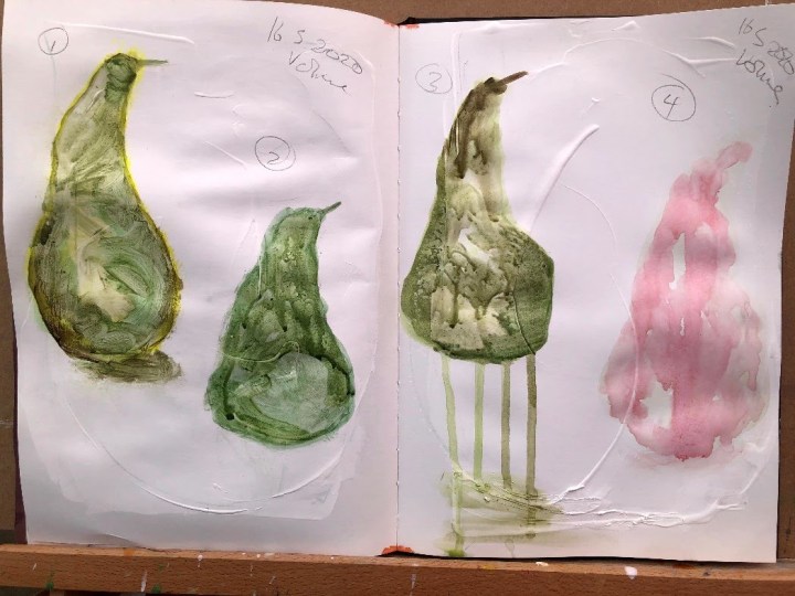
The paint media are Hooker Green, lemon yellow, raw umber, and a dash of primary cyan. The red is cadmium red.
I’m not sure I’ve answered my question about making volume but as with most experiments, if there is progress and yet still more questions at the end, that’s usually a good thing.

One thought on “Painting for volume”