
In the absence of available sitters, I turned to some sketches I made for my own interest during the Drawing module and chose a very characterful image I had found on the internet. I had drawn this person once in charcoal and this time I was going to use paint. I had in mind the rather austere look of the German Expressionists which I had been researching but instead of making the image in black on white, I used an 8×10″ canvas board I had covered a year or so ago with black acrylic to obscure the disaster that had been there before. There also seems to be an issue* with titanium white (heavy body) which is out of stock wherever I look and so I chose a silver acrylic because this seemed the pigment I would be least likely to be using over the coming weeks.
This is a photograph of my original sketch alongside the photograph itself.

This is the painting, which looks more like a personal extrapolation from the German Expressionism I’d had in mind but which satisfies me more because it feels like mine. It reflects the sketch but with the added qualities that the texture from the much over-painted surface beneath and the solidity of the medium itself.

The black is Mars black and I applied the paint with a 1/2″ flat brush and a small pointed (unmarked) brush for detail.
I was thinking of tackling this again in the Fauvist style but I am not at all sure it suits this man. I probably need to find another subject.
So have I conveyed character? My guess is that I have, at least to myself or otherwise I would not have been hesitant about using a different style. He presents as somewhat in need and anxious, dignified but in want of something which he hopes another person will see and offer him. His shoulders sit above his chin and mouth, as if in resignation. I imagine him homeless and hoping for money from passers-by. The stark monochrome I think suits that interpretation and, oddly, the silver acrylic seems to stop short of glitzy and is less bright than white might have been. It’s quite thin so it swept over the texture quite well. I don’t know how well it ages.
The original sketch took 20 minutes, this painting took around an hour.
Another day, another experiment. I really wanted to do something using bright Fauvist colours and I had in mind Bisa Butler’s extraordinary quilt portraits. The previous image still seemed unsuitable and so I went looking for another of my internet photo models. The one I felt fitted the mood is a woman with a defiant look about her, her chin is raised and her eyes barely visible for the angle and the narrowing she has adopted. She seems proud and I wanted to give her some vibrant colour.
Again, I found an old piece of work that suddenly seemed nowhere near as good as it had a couple of years ago. It was on a canvas – the first one I’d tried – and I covered it in white gesso and said goodbye. The colour leaked through a little as I’d expected. On the left is a photo of my charcoal sketch and the image I had copied. On the right is a clip of one of Bisa Butler’s wonderful quilts.
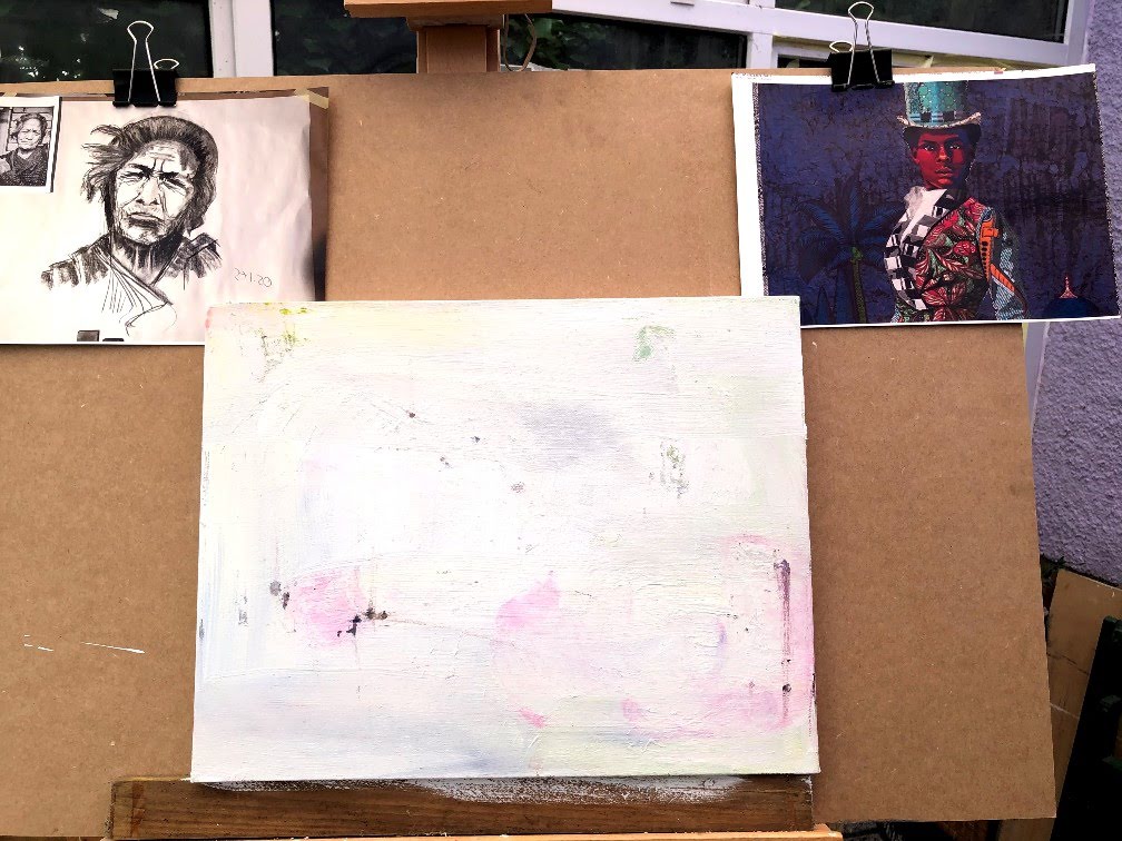
This is the first iteration, aka stop NOW and let it rest! I applied a layer of Alizarine Crimson to make a base that would lift the blue I wanted for the background and allow me to leave spaces in the face for this to show through. In the interests of preserving good quality materials for more important pieces of work while some are unavailable and deliveries can take some while due to the current crisis, I used a cheap cadmium orange and a similarly weak metallic bronze to underlie colours that might come later. I scrubbed the background with Prussian blue mixed with Lamp black, and then applied lighter colours to the face to bring up and knock back different features. At the moment she looks a little ‘painted’ and while I haven’t set out to replicate Butler’s style, only her colours, I don’t want a ‘war paint’ impression. I am impatient, I don’t leave things to dry as long as I should. By tomorrow it will be ready to wash and detail and some of the background areas adjusted.

Next day I tackled the fabric, knocked back some colour, added some highlights – keeping an eye on both the original sketch and Butler’s palette – messed up the eyes and spent an hour trying to unmess them. This last (for today) iteration with its new layer of Naples yellow is ready now for some of the red and blue I was imagining.
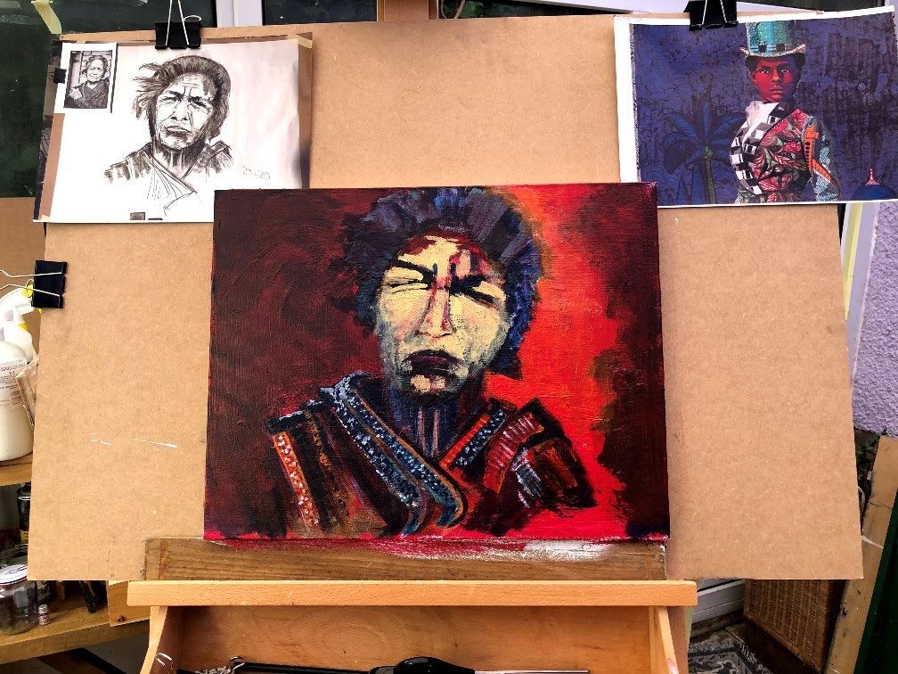
While her face has changed shape slightly (and can be fixed with some shading I think) this yellow base will I hope ping out the reds without losing the structure. Those eyes need detailing but I think are better as representations of the original than they were before. I have no idea of this woman’s ethnicity but at the moment I’d guess it’s quite different from where it started!

I have just realised where the colours and patterns may have come from; I’ve been watching Noughts and Crosses (BBC TV) which is a story of racial power reversal where Albion (England) is a colony of Aprica (Africa). It’s beautiful and stark in its illustration of racism.
In danger now of over-working; arguably that has already happened. I want to adjust the mouth again to get the tilt and the thrust-out lower lip. That might change the expression from rather upset auntie back to self-assured and proud no-messing. I’ve used a pebble along with the brushes to scrape paint across the textured layers, and I had to re-draw the nose and mouth when I realised they didn’t tilt as the eyes do.
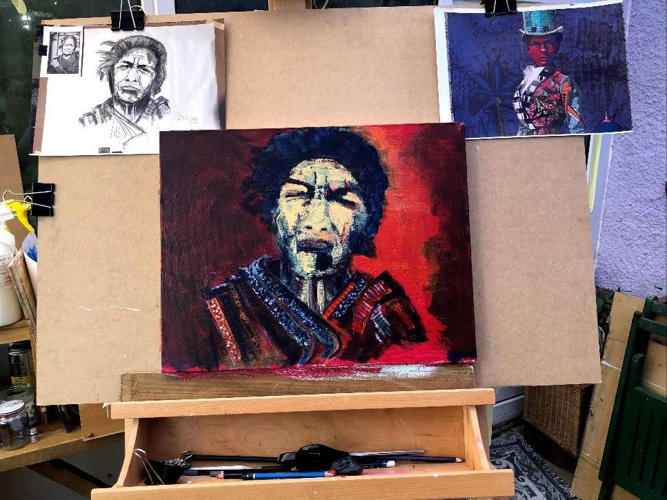
I’ve decided in the interests of containment, I’m going to limit the amount of attention I give this today. I feel I’ve lost the spirit of the earlier versions and that can only worsen at my level of skill. I need to tilt the mouth by lifting it bottom left and dropping it top right, then I should stop.
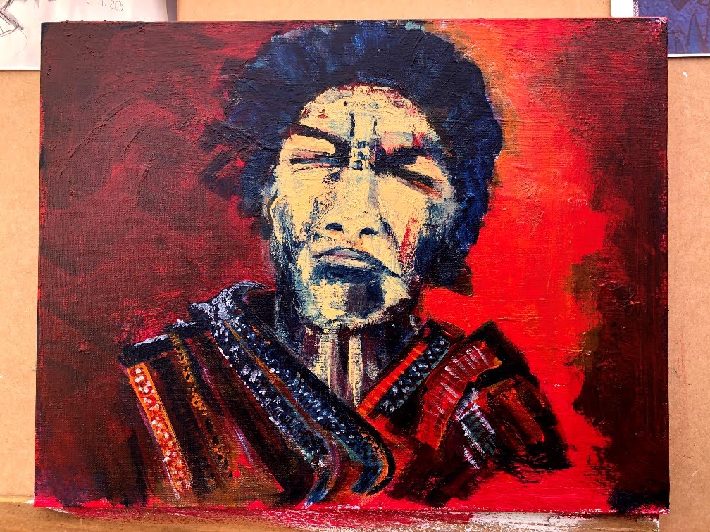
Five or six strokes and a thumb smudge and I’m calling this done. I think the mouth is better, the nose is improved somewhat by a dab to each nostril, and the blue block shade under the lip feels less prominent after a quick wash with dilute Naples yellow. The support is canvas ~45 x 35 cm.
____
*For historical reference, we are in the midst of the coronavirus pandemic, many of us on lock-down and reliant on deliveries for everything. It would seem toilet rolls are not the only items subject to panic buying.
Time taken: approx 9 1/5 hours.
I think this post addresses LO1, LO3, and LO4. I think my practice of making more than one response to an exercise is exploratory (LO1), the references to contemporary artists and influences (Butler and TV’s Noughts and Crosses) speak to LO3; and my contemporaneous and evaluative narrative to LO4.

One thought on “Part 3, project 2, exercise 4 – conveying character”